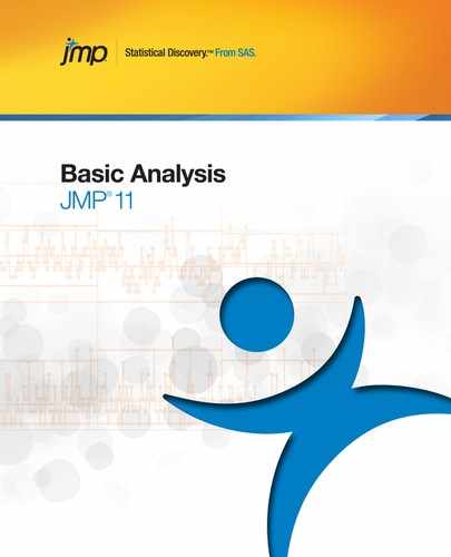
Example of Contingency Analysis
This example uses the Car Poll.jmp sample data table, which contains data collected from car polls. The data includes aspects about the individual polled, such as their sex, marital status, and age. The data also includes aspects about the car that they own, such as the country of origin, the size, and the type. Examine the relationship between car sizes (small, medium, and large) and the cars’ country of origin.
1. Open the Car Poll.jmp sample data table.
2. Select Analyze > Fit Y by X.
3. Select size and click Y, Response.
4. Select country and click X, Factor.
5. Click OK.
Figure 7.2 Example of Contingency Analysis
From the mosaic plot and legend in Figure 7.2, notice the following:
• Very few Japanese cars fall into the Large size category.
• The majority of the European cars fall into the Small and Medium size categories.
• The majority of the American cars fall into the Large and Medium size categories.
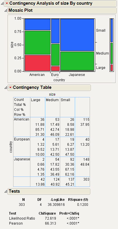
Launch the Contingency Platform
You can perform a contingency analysis using either the Fit Y by X platform or the Contingency platform. The two approaches are equivalent.
• To launch the Fit Y by X platform, select Analyze > Fit Y by X.
or
• To launch the Contingency platform, from the JMP Starter window, click on the Basic category and click Contingency.
Figure 7.3 The Contingency Launch Window
For more information about this launch window, see “Introduction to Fit Y by X” chapter.
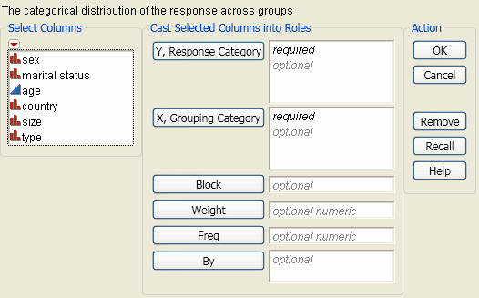
The Contingency Report
To produce the plot shown in Figure 7.4, follow the instructions in “Example of Contingency Analysis”.
Figure 7.4 Example of a Contingency Report
Note: Any rows that are excluded in the data table are also hidden in the Mosaic Plot.
The Contingency report initially shows a Mosaic Plot, a Contingency Table, and a Tests report. You can add other analyses and tests using the options that are located within the red triangle menu. For details about all of these reports and options, see “Contingency Platform Options”.
Contingency Platform Options
Note: The Fit Group menu appears if you have specified multiple Y variables. Menu options allow you to arrange reports or order them by RSquare. See the Fitting Linear Models book for more information.
Use the platform options within the red triangle menu next to Contingency Analysis to perform additional analyses and tests on your data.
|
Mosaic Plot
|
A graphical representation of the data in the Contingency Table. See “Mosaic Plot”.
|
|
Contingency Table
|
A two-way frequency table. There is a row for each factor level and a column for each response level. See “Contingency Table”.
|
|
Tests
|
Analogous to the Analysis of Variance table for continuous data. The tests show that the response level rates are the same across X levels. See “Tests”.
|
|
Set α level
|
Changes the alpha level used in confidence intervals. Select one of the common values (0.10, 0.05, 0.01) or select a specific value using the Other option.
|
|
Analysis of Means for Proportions
|
Only appears if the response has exactly two levels. Compares response proportions for the X levels to the overall response proportion. See “Analysis of Means for Proportions”.
|
|
Correspondence Analysis
|
Shows which rows or columns of a frequency table have similar patterns of counts. In the correspondence analysis plot, there is a point for each row and for each column of the contingency table. See “Correspondence Analysis”.
|
|
Cochran Mantel Haenszel
|
Tests if there is a relationship between two categorical variables after blocking across a third classification. See “Cochran-Mantel-Haenszel Test”.
|
|
Agreement Statistic
|
Only appears when both the X and Y variables have the same levels. Displays the Kappa statistic (Agresti 1990), its standard error, confidence interval, hypothesis test, and Bowker’s test of symmetry, also know as McNemar's test. See “Agreement Statistic”.
|
|
Relative Risk
|
Calculates risk ratios. Appears only when both the X and Y variables have only two levels. See “Relative Risk”.
|
|
Odds Ratio
|
Appears only when there are exactly two levels for each variable. Produces a report of the odds ratio. For more information, see “Statistical Details for the Odds Ratio Option”.
The report also gives a confidence interval for this ratio. You can change the alpha level using the Set α Level option.
|
|
Two Sample Test for Proportions
|
Performs a two-sample test for proportions. This test compares the proportions of the Y variable between the two levels of the X variable. Appears only when both the X and Y variables have only two levels. See “Two Sample Test for Proportions”.
|
|
Measures of Association
|
Describes the association between the variables in the contingency table. See “Measures of Association”.
|
|
Cochran Armitage Trend Test
|
Tests for trends in binomial proportions across levels of a single variable. This test is appropriate only when one variable has two levels and the other variable is ordinal. See “Cochran Armitage Trend Test”.
|
|
Exact Test
|
Provides exact versions of the following tests:
• Fisher’s Test
• Cochran Armitage Trend Test
• Agreement Test
See “Exact Test”.
|
Mosaic Plot
The mosaic plot is a graphical representation of the two-way frequency table or Contingency Table. A mosaic plot is divided into rectangles, so that the area of each rectangle is proportional to the proportions of the Y variable in each level of the X variable. The mosaic plot was introduced by Hartigan and Kleiner in 1981 and refined by Friendly (1994).
To produce the plot shown in Figure 7.5, follow the instructions in “Example of Contingency Analysis”.
Figure 7.5 Example of a Mosaic Plot
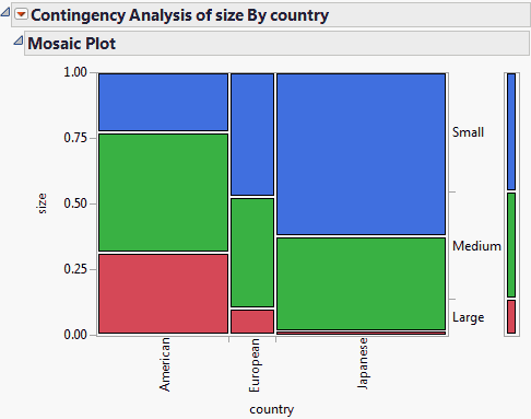
Note the following about the mosaic plot in Figure 7.5:
• The proportions on the x-axis represent the number of observations for each level of the X variable, which is country.
• The proportions on the y-axis at right represent the overall proportions of Small, Medium, and Large cars for the combined levels (American, European, and Japanese).
• The scale of the y-axis at left shows the response probability, with the whole axis being a probability of one (representing the total sample).
Clicking on a rectangle in the mosaic plot highlights the selection and highlights the corresponding data in the associated data table.
Replace variables in the mosaic plot by dragging and dropping a variable, in one of two ways: swap existing variables by dragging and dropping a variable from one axis to the other axis; or, click on a variable in the Columns panel of the associated data table and drag it onto an axis.
Context Menu
Right-click on the mosaic plot to change colors and label the cells.
|
Set Colors
|
Shows the current assignment of colors to levels. See “Set Colors”.
|
|
Cell Labeling
|
Specify a label to be drawn in the mosaic plot. Select one of the following options:
Unlabeled
Shows no labels, and removes any of the other options.
Show Counts
Shows the number of observations in each cell.
Show Percents
Shows the percent of observations in each cell.
Show Labels
Shows the levels of the Y variable corresponding to each cell.
Show Row Labels
Shows the row labels for all of the rows represented by the cell.
|
Note: For descriptions of the remainder of the right-click options, see the Using JMP book.
Set Colors
When you select the Set Colors option, the Select Colors for Values window appears.
Figure 7.6 Select Colors for Values Window
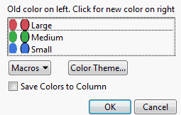
The default mosaic colors depend on whether the response column is ordinal or nominal, and whether there is an existing Value Colors column property. To change the color for any level, click on the oval in the second column of colors and pick a new color.
|
Macros
|
Computes a color gradient between any two levels, as follows:
• If you select a range of levels (by dragging the mouse over the levels that you want to select, or pressing the SHIFT key and clicking the first and last level), the Gradient Between Selected Points option applies a color gradient to the levels that you have selected.
• The Gradient Between Ends option applies a gradient to all levels of the variable.
• Undo any of your changes by selecting Revert to Old Colors.
|
|
Color Theme
|
Changes the colors for each value based on a color theme.
|
|
Save Colors to Column
|
If you select this check box, a new column property (Value Colors) is added to the column in the associated data table. To edit this property from the data table, select Cols > Column Info.
|
Contingency Table
The Contingency Table is a two-way frequency table. There is a row for each factor level and a column for each response level.
To produce the plot shown in Figure 7.7, follow the instructions in “Example of Contingency Analysis”.
Figure 7.7 Example of a Contingency Table
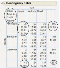
Note the following about Contingency tables:
• The Count, Total%, Col%, and Row% correspond to the data within each cell that has row and column headings (such as the cell under American and Large).
• The last column contains the total counts for each row and percentages for each row.
• The bottom row contains total counts for each column and percentages for each column.
For example, in Figure 7.7, focus on the cars that are large and come from America. The following table explains the conclusions that you can make about these cars using the Contingency Table.
|
Number
|
Description
|
Label in Table
|
|
36
|
Number of cars that are both large and come from America
|
Count
|
|
11.88%
|
Percentage of all cars that are both large and come from America (36/303)1.
|
Total%
|
|
85.71%
|
Percentage of large cars that come from America (36/42)2
|
Col%
|
|
31.30%
|
Percentage of American cars that are large (36/115)3.
|
Row%
|
|
37.95%
|
Percentage of all cars that come from America (115/303).
|
(none)
|
|
13.86%
|
Percentage of all cars that are large (42/303).
|
(none)
|
1 303 is the total number of cars in the poll.
2 42 is the total number of large cars in the poll.
3 115 is the total number of American cars in the poll.
Tip: To show or hide data in the Contingency Table, from the red triangle menu next to Contingency Table, select the option that you want to show or hide.
|
Count
|
Cell frequency, margin total frequencies, and grand total (total sample size).
|
|
Total%
|
Percent of cell counts and margin totals to the grand total.
|
|
Row%
|
Percent of each cell count to its row total.
|
|
Col%
|
Percent of each cell count to its column total.
|
|
Expected
|
Expected frequency (E) of each cell under the assumption of independence. Computed as the product of the corresponding row total and column total divided by the grand total.
|
|
Deviation
|
Observed cell frequency (O) minus the expected cell frequency (E).
|
|
Cell Chi Square
|
Chi-square values computed for each cell as (O - E)2 / E.
|
|
Col Cum
|
Cumulative column total.
|
|
Col Cum%
|
Cumulative column percentage.
|
|
Row Cum
|
Cumulative row total.
|
|
Row Cum%
|
Cumulative row percentage.
|
Tests
The Tests report shows the results for two tests to determine whether the response level rates are the same across X levels.
To produce the report shown in Figure 7.8, follow the instructions in “Example of Contingency Analysis”.
Figure 7.8 Example of a Tests Report
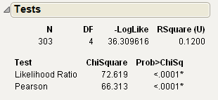
Note the following about the Chi-square statistics:
• When both categorical variables are responses (Y variables), the Chi-square statistics test that they are independent.
• You might have a Y variable with a fixed X variable. In this case, the Chi-square statistics test that the distribution of the Y variable is the same across each X level.
|
N
|
Total number of observations.
|
|
DF
|
Records the degrees of freedom associated with the test.
The degrees of freedom are equal to (c - 1)(r - 1), where c is the number of columns and r is the number of rows.
|
|
-LogLike
|
Negative log-likelihood, which measures fit and uncertainty (much like sums of squares in continuous response situations).
|
|
Rsquare (U)
|
Portion of the total uncertainty attributed to the model fit.
• An R2 of 1 means that the factors completely predict the categorical response.
• An R2 of 0 means that there is no gain from using the model instead of fixed background response rates.
For more information, see “Statistical Details for the Tests Report”.
|
|
Test
|
Lists two Chi-square statistical tests of the hypothesis that the response rates are the same in each sample category. For more information, see “Statistical Details for the Tests Report”.
|
|
Prob>ChiSq
|
Lists the probability of obtaining, by chance alone, a Chi-square value greater than the one computed if no relationship exists between the response and factor. If both variables have only two levels, Fisher’s exact probabilities for the one-tailed tests and the two-tailed test also appear.
|
Fisher’s Exact Test
This report gives the results of Fisher’s exact test for a 2x2 table. The results appear automatically for 2x2 tables. For more details about Fisher’s exact test, and for details about the test for r x c tables, see “Exact Test”.
Analysis of Means for Proportions
If the response has two levels, you can use this option to compare response proportions for the X levels to the overall response proportion. This method uses the normal approximation to the binomial. Therefore, if the sample sizes are too small, a warning appears in the results.
Note: For a description of Analysis of Means methods, see the document by Nelson, Wludyka, and Copeland (2005). For a description of the specific Analysis of Means for Variances method, see the paper by Wludyka and Nelson (1997).
|
Set Alpha Level
|
Selects the alpha level used in the analysis.
|
|
Show Summary Report
|
Produces a report that shows the response proportions with decision limits for each level of the X variable. The report indicates whether a limit has been exceeded.
|
|
Switch Response Level for Proportion
|
Changes the response category used in the analysis.
|
|
Display Options
|
Shows or hides the decision limits, decision limit shading, center line, and needles.
|
Correspondence Analysis
Correspondence analysis is a graphical technique to show which rows or columns of a frequency table have similar patterns of counts. In the correspondence analysis plot, there is a point for each row and for each column. Use Correspondence Analysis when you have many levels, making it difficult to derive useful information from the mosaic plot.
Understanding Correspondence Analysis Plots
The row profile can be defined as the set of rowwise rates, or in other words, the counts in a row divided by the total count for that row. If two rows have very similar row profiles, their points in the correspondence analysis plot are close together. Squared distances between row points are approximately proportional to Chi-square distances that test the homogeneity between the pair of rows.
Column and row profiles are alike because the problem is defined symmetrically. The distance between a row point and a column point has no meaning. However, the directions of columns and rows from the origin are meaningful, and the relationships help interpret the plot.
Correspondence Analysis Options
Use the options in the red triangle menu next to Correspondence Analysis to produce a 3-D scatterplot and add column properties to the data table.
|
3D Correspondence Analysis
|
Produces a 3-D scatterplot.
|
|
Save Value Ordering
|
Takes the order of the levels sorted by the first correspondence score coefficient and makes a column property for both the X and Y columns.
|
The Details Report
The Details report contains statistical information about the correspondence analysis and shows the values used in the plot.
|
Singular Value
|
Provides the singular value decomposition of the contingency table. For the formula, see “Statistical Details for the Details Report”.
|
|
Inertia
|
Lists the square of the singular values, reflecting the relative variation accounted for in the canonical dimensions.
|
|
Portion
|
Portion of inertia with respect to the total inertia.
|
|
Cumulative
|
Shows the cumulative portion of inertia. If the first two singular values capture the bulk of the inertia, then the 2-D correspondence analysis plot is sufficient to show the relationships in the table.
|
|
X variable (Cheese) c1, c2, c3
|
The values plotted on the Correspondence Analysis plot.
|
|
Y variable (Response) c1, c2, c3
|
The values plotted on the Correspondence Analysis plot.
|
Cochran-Mantel-Haenszel Test
The Cochran-Mantel-Haenszel test discovers if there is a relationship between two categorical variables after blocking across a third classification.
|
Correlation of Scores
|
Applicable when either the Y or X is ordinal. The alternative hypothesis is that there is a linear association between Y and X in at least one level of the blocking variable.
|
|
Row Score by Col Categories
|
Applicable when Y is ordinal or interval. The alternative hypothesis is that, for at least one level of the blocking variable, the mean scores of the r rows are unequal.
|
|
Col Score by Row Categories
|
Applicable when X is ordinal or interval. The alternative hypothesis is that, for at least one level of the blocking variable, the mean scores of the c columns are unequal.
|
|
General Assoc. of Categories
|
Tests that for at least one level of the blocking variable, there is some type of association between X and Y.
|
Agreement Statistic
When the two variables have the same levels, the Agreement Statistic option is available. This option shows the Kappa statistic (Agresti 1990), its standard error, confidence interval, hypothesis test, and Bowker’s test of symmetry.
The Kappa statistic and associated p-value given in this section are approximate. An exact version of the agreement test is available. See “Exact Test”.
|
Kappa
|
Shows the Kappa statistic.
|
|
Std Err
|
Shows the standard error of the Kappa statistic.
|
|
Lower 95%
|
Shows the lower endpoint of the confidence interval for Kappa.
|
|
Upper 95%
|
Shows the upper endpoint of the confidence interval for Kappa.
|
|
Prob>Z
|
Shows the p-value for a one-sided test for Kappa. The null hypothesis tests if Kappa equals zero.
|
|
Prob>|Z|
|
Shows the p-value for a two-sided test for Kappa.
|
|
ChiSquare
|
Shows the test statistic for Bowker’s test. For Bowker’s test of symmetry, the null hypothesis is that the probabilities in the square table satisfy symmetry, or that pij=pji for all pairs of table cells. When both X and Y have two levels, this test is equal to McNemar’s test.
|
|
Prob>ChiSq
|
Shows the p-value for the Bowker’s test.
|
Relative Risk
Calculate risk ratios for 2x2 contingency tables using the Relative Risk option. Confidence intervals also appear in the report. You can find more information about this method in Agresti (1990) section 3.4.2.
The Choose Relative Risk Categories window appears when you select the Relative Risk option. You can select a single response and factor combination, or you can calculate the risk ratios for all combinations of response and factor levels.
Two Sample Test for Proportions
When both the X and Y variables have two levels, you can request a two-sample test for proportions. This test determines whether the chosen response level has equal proportions across the levels of the X variable.
|
Description
|
Shows the test being performed.
|
|
Proportion Difference
|
Shows the difference in the proportions between the levels of the X variable.
|
|
Lower 95%
|
Shows the lower endpoint of the confidence interval for the difference. Based on the adjusted Wald confidence interval.
|
|
Upper 95%
|
Shows the upper endpoint of the confidence interval for the difference. Based on the adjusted Wald confidence interval.
|
|
Adjusted Wald Test
|
Shows two-tailed and one-tailed tests.
|
|
Prob
|
Shows the p-values for the tests.
|
|
Response <variable> category of interest
|
Select which response level to use in the test.
|
Measures of Association
You can request several statistics that describe the association between the variables in the contingency table by selecting the Measures of Association option.
For details about measures of association, see the following references:
• Brown and Benedetti (1977)
• Goodman and Kruskal (1979)
• Kendall and Stuart (1979)
• Snedecor and Cochran (1980)
• Somers (1962)
|
Gamma
|
Based on the number of concordant and discordant pairs and ignores tied pairs. Takes values in the range -1 to 1.
|
|
Kendall’s Tau-b
|
Similar to Gamma and uses a correction for ties. Takes values in the range -1 to 1.
|
|
Stuart’s Tau-c
|
Similar to Gamma and uses an adjustment for table size and a correction for ties. Takes values in the range -1 to 1.
|
|
Somers’ D
|
An asymmetric modification of Tau-b.
• The C|R denotes that the row variable X is regarded as an independent variable and the column variable Y is regarded as dependent.
• Similarly, the R|C denotes that the column variable Y is regarded as an independent variable and the row variable X is dependent.
Somers’ D differs from Tau-b in that it uses a correction for ties only when the pair is tied on the independent variable. It takes values in the range -1 to 1.
|
|
Lambda Asymmetric
|
• For C|R, is interpreted as the probable improvement in predicting the column variable Y given knowledge of the row variable X.
• For R|C, is interpreted as the probable improvement in predicting the row variable X given knowledge about the column variable Y.
Takes values in the range 0 to 1.
|
|
Lambda Symmetric
|
Loosely interpreted as the average of the two Lambda Asymmetric measures. Takes values in the range 0 to 1.
|
|
Uncertainty Coef
|
• For C|R, is the proportion of uncertainty in the column variable Y that is explained by the row variable X.
• For R|C, is interpreted as the proportion of uncertainty in the row variable X that is explained by the column variable Y.
Takes values in the range 0 to 1.
|
|
Uncertainty Coef Symmetric
|
Symmetric version of the two Uncertainty Coef measures. Takes values in the range 0 to 1.
|
Each statistic appears with its standard error and confidence interval. Note the following:
• Gamma, Kendall’s Tau-b, Stuart’s Tau-c, and Somers’ D are measures of ordinal association that consider whether the variable Y tends to increase as X increases. They classify pairs of observations as concordant or discordant. A pair is concordant if an observation with a larger value of X also has a larger value of Y. A pair is discordant if an observation with a larger value of X has a smaller value of Y. These measures are appropriate only when both variables are ordinal.
• The Lambda and Uncertainty measures are appropriate for ordinal and nominal variables.
Cochran Armitage Trend Test
This Cochran Armitage Trend tests for trends in binomial proportions across the levels of a single variable. This test is appropriate only when one variable has two levels and the other variable is ordinal. The two-level variable represents the response, and the other represents an explanatory variable with ordered levels. The null hypothesis is the hypothesis of no trend, which means that the binomial proportion is the same for all levels of the explanatory variable.
The test statistic and p-values given in this section are approximate. An exact version of the trend test is available. See “Exact Test”.
Exact Test
The following table describes the exact versions of three of the tests available in the Contingency platform.
|
Fisher’s Exact Test
|
Performs Fisher’s Exact test for an r x c table. This is a test for association between two variables. Fisher’s exact test assumes that the row and column totals are fixed, and uses the hypergeometric distribution to compute probabilities.
This test does not depend on any large-sample distribution assumptions. This means it is appropriate for situations where the Likelihood Ratio and Pearson tests become less reliable, like for small sample sizes or sparse tables.
The report includes the following information:
Table Probability (P)
gives the probability for the observed table. This is not the p-value for the test.
Two-sided Prob ≤ P
gives the p-value for the two-sided test.
For 2x2 tables, the Fisher’s Exact test is automatically performed. See “Tests”.
|
|
Exact Cochran Armitage Trend Test
|
Performs the exact version of the Cochran Armitage Trend Test. This test is available only when one of the variables has two levels. For more details about the trend test, see “Cochran Armitage Trend Test”.
|
|
Exact Agreement Test
|
Performs an exact test for testing agreement between variables. This is an exact test for the Kappa statistic. This is available only when the two variables have the same levels. For more details about agreement testing, see “Agreement Statistic”.
|
Additional Examples of the Contingency Platform
This section contains additional examples using the options in the Contingency platform.
Example of Analysis of Means for Proportions
This example uses the Office Visits.jmp sample data table, which records late and on-time appointments for six clinics in a geographic region. 60 random appointments were selected from 1 week of records for each of the six clinics. To be considered on-time, the patient must be taken to an exam room within five minutes of their scheduled appointment time. Examine the proportion of patients that arrived on-time to their appointment.
1. Open the Office Visits.jmp sample data table.
2. Select Analyze > Fit Y by X.
3. Select On Time and click Y, Response.
4. Select Clinic and click X, Factor.
5. Select Frequency and click Freq.
6. Click OK.
7. From the red triangle menu next to Contingency Analysis, select Analysis of Means for Proportions.
8. From the red triangle menu next to Analysis of Means for Proportions, select Show Summary Report.
Figure 7.9 Example of Analysis of Means for Proportions
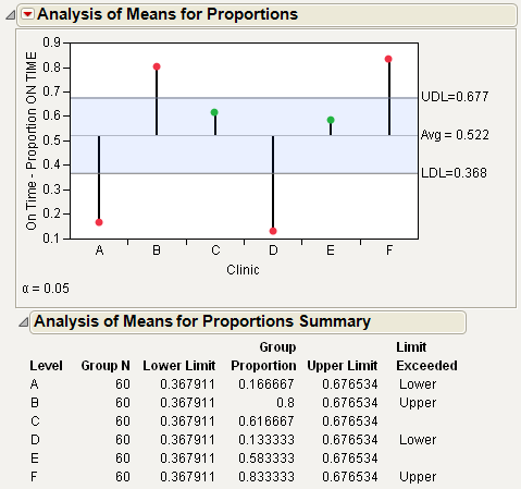
Figure 7.9 shows the proportion of patients who were on-time from each clinic. From Figure 7.9, notice the following:
• The proportion of on-time arrivals is the highest for clinic F, followed by clinic B.
• Clinic D has the lowest proportion of on-time arrivals, followed by clinic A.
• Clinic E and clinic C are close to the average, and do not exceed the decision limits.
Example of Correspondence Analysis
This example uses the Cheese.jmp sample data table, which is taken from the Newell cheese tasting experiment, reported in McCullagh and Nelder (1989). The experiment records counts more than nine different response levels across four different cheese additives.
1. Open the Cheese.jmp sample data table.
2. Select Analyze > Fit Y by X.
3. Select Response and click Y, Response.
The Response values range from one to nine, where one is the least liked, and nine is the best liked.
4. Select Cheese and click X, Factor.
A, B, C, and D represent four different cheese additives.
5. Select Count and click Freq.
6. Click OK.
Figure 7.10 Mosaic Plot for the Cheese Data
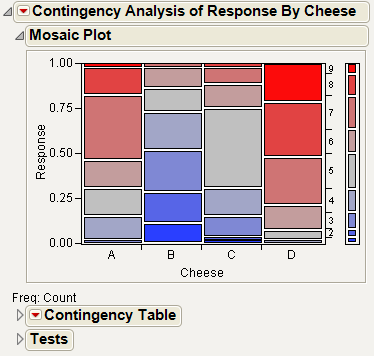
From the mosaic plot in Figure 7.10, you notice that the distributions do not appear alike. However, it is challenging to make sense of the mosaic plot across nine levels. A correspondence analysis can help define relationships in this type of situation.
7. To see the correspondence analysis plot, from the red triangle menu next to Contingency Analysis, select Correspondence Analysis.
Figure 7.11 Example of a Correspondence Analysis Plot
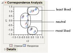
Figure 7.11 shows the correspondence analysis graphically, with the plot axes labeled c1 and c2. Notice the following:
• c1 seems to correspond to a general satisfaction level. The cheeses on the c1 axis go from least liked at the top to most liked at the bottom.
• c2 seems to capture some quality that makes B and D different from A and C.
• Cheese D is the most liked cheese, with responses of 8 and 9.
• Cheese B is the least liked cheese, with responses of 1,2, and 3.
• Cheeses C and A are in the middle, with responses of 4,5,6, and 7.
8. From the red triangle menu next to Correspondence Analysis, select 3D Correspondence Analysis.
Figure 7.12 Example of a 3-D Scatterplot
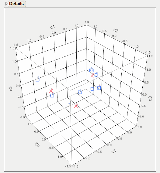
From Figure 7.12, notice the following:
• Looking at the c1 axis, responses 1 through 5 appear to the right of 0 (positive). Responses 6 through 9 appear to the left of 0 (negative).
• Looking at the c2 axis, A and C appear to the right of 0 (positive). B and D appear to the left of 0 (negative).
• You can have two conclusions: c1 corresponds to the general satisfaction (from least to most liked). c2 corresponds to a quality that makes B and D different from A and C.
Additional Example of Correspondence Analysis
This example uses the Mail Messages.jmp sample data table, which contains data about e-mail messages that were sent and received. The data includes the time, sender, and receiver. Examine the pattern of e-mail senders and receivers.
1. Open the Mail Messages.jmp sample data table.
2. Select Analyze > Fit Y by X.
3. Select To and click Y, Response.
4. Select From and click X, Factor.
5. Click OK.
6. From the red triangle menu next to Contingency Table, deselect everything except Count.
Figure 7.13 Contingency Analysis for E-mail Data
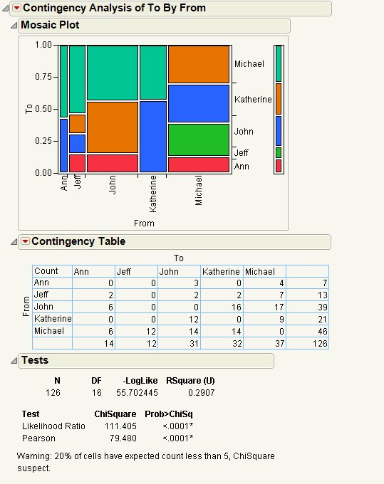
Looking at the frequency table, you notice the following differences:
• Jeff sends messages to everyone but receives messages only from Michael.
• Michael and John send many more messages than the others.
• Michael sends messages to everyone.
• John sends messages to everyone except Jeff.
• Katherine and Ann send messages only to Michael and John.
Further visualize the results of the contingency table with a correspondence analysis. From the red triangle menu next to Contingency Analysis, select Correspondence Analysis.
Figure 7.14 Correspondence Analysis for E-mail Data
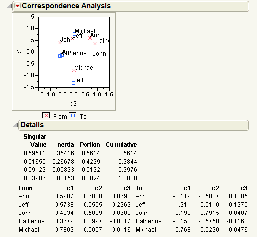
From the Details report in Figure 7.14, you notice the following:
• The Portion column shows that the bulk of the variation (56% + 42%) of the mail sending pattern is summarized by c1 and c2, for the To and From groups.
• The Correspondence Analysis plot of c1 and c2 shows the pattern of mail distribution among the mail group, as follows:
‒ Katherine and Ann have similar sending and receiving patterns; they both send e-mails to Michael and John and receive e-mails from Michael, John, and Jeff.
‒ Jeff and Michael lie in a single dimension, but have opposite sending and receiving patterns. Jeff sends e-mails to everyone and receives e-mails only from Michael. Michael sends e-mail to everyone and receives e-mail from everyone.
‒ John’s patterns differ from the others. He sends e-mail to Ann, Katherine, and Michael, and receives e-mail from everyone.
Example of a Cochran Mantel Haenszel Test
This example uses the Hot Dogs.jmp sample data table. Examine the relationship between hot dog type and taste.
1. Open the Hot Dogs.jmp sample data table.
2. Select Analyze > Fit Y by X.
3. Select Type and click Y, Response.
4. Select Taste and click X, Factor.
5. Click OK.
6. From the red triangle menu next to Contingency Analysis, select Cochran Mantel Haenszel.
7. Select Protein/Fat as the grouping variable and click OK.
Figure 7.15 Example of a Cochran-Mantel-Haenszel Test
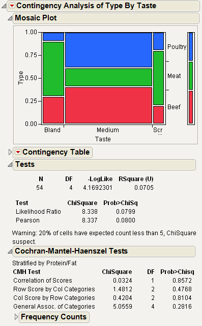
From Figure 7.15, you notice the following:
• The Tests report shows a marginally significant Chi-square probability of about 0.0799, indicating some significance in the relationship between hot dog taste and type.
• However, the Cochran Mantel Haenszel report shows no relationship at all between hot dog taste and type after adjusting for the protein-fat ratio. The Chi-square test for the adjusted correlation has a probability of 0.857, and the Chi-square probability associated with the general association of categories is 0.282.
Example of the Agreement Statistic Option
This example uses the Attribute Gauge.jmp sample data table. The data gives results from three people (raters) rating fifty parts three times each. Examine the relationship between raters A and B.
1. Open the Attribute Gauge.jmp sample data table.
2. Select Analyze > Fit Y by X.
3. Select A and click Y, Response.
4. Select B and click X, Factor.
5. Click OK.
6. From the red triangle menu next to Contingency Analysis, select Agreement Statistic.
Figure 7.16 Example of the Agreement Statistic Report
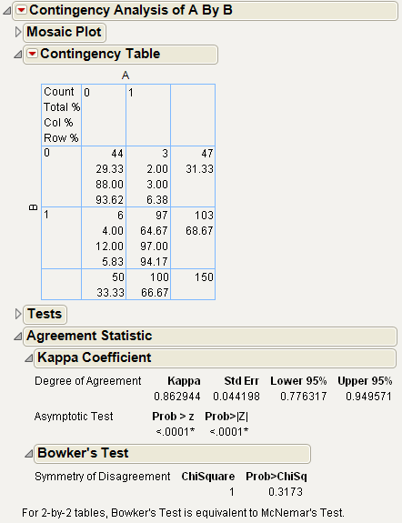
From Figure 7.16, you notice that the agreement statistic of 0.86 is high (close to 1) and the p-value of <.0001 is small. This reinforces the high agreement seen by looking at the diagonal of the contingency table. Agreement between the raters occurs when both raters give a rating of 0 or both give a rating of 1.
Example of the Relative Risk Option
This example uses the Car Poll.jmp sample data table. Examine the relative probabilities of being married and single for the participants in the poll.
1. Open the Car Poll.jmp sample data table.
2. Select Analyze > Fit Y by X.
3. Select marital status and click Y, Response.
4. Select sex and click X, Factor.
5. Click OK.
6. From the red triangle menu next to Contingency Analysis, select Relative Risk.
The Choose Relative Risk Categories window appears.
Figure 7.17 The Choose Relative Risk Categories Window
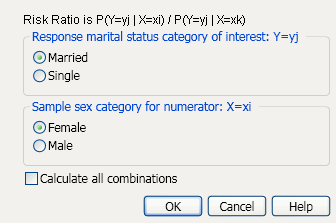
Note the following about the Choose Relative Risk Categories window:
• If you are interested in only a single response and factor combination, you can select that here. For example, if you clicked OK in the window in Figure 7.17, the calculation would be as follows:
• If you would like to calculate the risk ratios for all ( =4) combinations of response and factor levels, select the Calculate All Combinations check box. See Figure 7.18.
7. Ask for all combinations by selecting the Calculate All Combinations check box. Leave all other default selections as is.
Figure 7.18 Example of the Risk Ratio Report
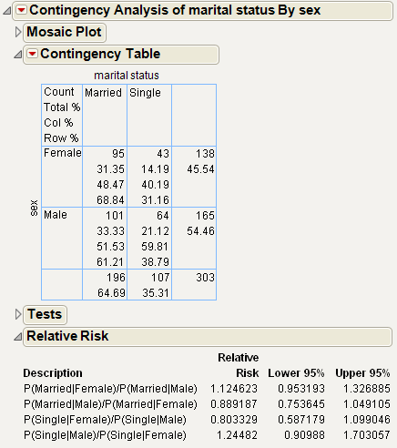
To see how the relative risk is calculated, proceed as follows:
1. Examine the first entry in the Relative Risk report, which is P(Married|Female)/P(Married|Male).
2. You can find these probabilities in the Contingency Table. Since the probabilities are computed based on two levels of sex, which differs across the rows of the table, use the Row% to read the probabilities, as follows:
P(Married|Female)=0.6884
P(Married|Male) = 0.6121
Therefore, the calculations are as follows:
P(Married|Female)/P(Married|Male) = = 1.1247
Example of a Two Sample Test for Proportions
This example uses the Car Poll.jmp sample data table. Examine the probability of being married for males and females.
1. Open the Car Poll.jmp sample data table.
2. Select Analyze > Fit Y by X.
3. Select marital status and click Y, Response.
4. Select sex and click X, Factor.
5. Click OK.
6. From the red triangle menu next to Contingency Analysis, select Two Sample Test for Proportions.
Figure 7.19 Example of the Two Sample Test for Proportions Report
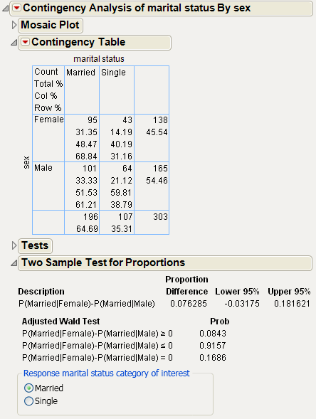
In this example, you are comparing the probability of being married between females and males. See the Row% in the Contingency Table to obtain the following:
P(Married|Female)=0.6884
P(Married|Male) = 0.6121
The difference between these two numbers, 0.0763, is the Proportion Difference shown in the report. The two-sided p-value (0.1686) is large, indicating that there is no significant difference between the proportions.
Example of the Measures of Association Option
This example uses the Car Poll.jmp sample data table. Examine the probability of being married for males and females.
1. Open the Car Poll.jmp sample data table.
2. Select Analyze > Fit Y by X.
3. Select marital status and click Y, Response.
4. Select sex and click X, Factor.
5. Click OK.
6. From the red triangle menu next to Contingency Analysis, select Measures of Association.
Figure 7.20 Example of the Measures of Association Report
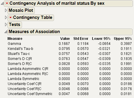
Since the variables that you want to examine (sex and marital status) are nominal, use the Lambda and Uncertainty measures. The confidence intervals include zero, so you conclude that there is no association between sex and marital status.
Example of the Cochran Armitage Trend Test
1. Open the Car Poll.jmp sample data table.
For the purposes of this test, change size to an ordinal variable:
2. In the Columns panel, right-click on the icon next to size and select Ordinal.
3. Select Analyze > Fit Y by X.
4. Select sex and click Y, Response.
5. Select size and click X, Factor.
6. Click OK.
7. From the red triangle menu next to Contingency Analysis, select Cochran Armitage Trend Test.
Figure 7.21 Example of the Cochran Armitage Trend Test Report
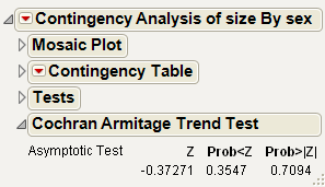
The two-sided p-value (0.7094) is large. From this, you can conclude that there is no trend in the proportion of male and females that purchase different sizes of cars.
Statistical Details for the Contingency Platform
This section contains statistical details for selected options and reports in the Contingency platform.
Statistical Details for the Agreement Statistic Option
Viewing the two response variables as two independent ratings of the n subjects, the Kappa coefficient equals +1 when there is complete agreement of the raters. When the observed agreement exceeds chance agreement, the Kappa coefficient is positive, with its magnitude reflecting the strength of agreement. Although unusual in practice, Kappa is negative when the observed agreement is less than chance agreement. The minimum value of Kappa is between -1 and 0, depending on the marginal proportions.
Quantities associated with the Kappa statistic are computed as follows:
The asymptotic variance of the simple kappa coefficient is estimated by the following:
See Fleiss, Cohen, and Everitt (1969).
For Bowker’s test of symmetry, the null hypothesis is that the probabilities in the two-by-two table satisfy symmetry (pij=pji).
Statistical Details for the Odds Ratio Option
The Odds Ratio is calculated as follows:
where pij is the count in the ith row and jth column of the 2x2 table.
Statistical Details for the Tests Report
Rsquare (U)
Rsquare (U) is computed as follows:
The total negative log-likelihood is found by fitting fixed response rates across the total sample.
Test
The two Chi-square tests are as follows:
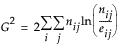
The Likelihood Ratio Chi-square test is computed as twice the negative log-likelihood for Model in the Tests table. Some books use the notation G2 for this statistic. The difference of two negative log-likelihoods, one with whole-population response probabilities and one with each-population response rates, is written as follows:
This formula can be more compactly written as follows:
The Pearson Chi-square is calculated by summing the squares of the differences between the observed and expected cell counts. The Pearson Chi-square exploits the property that frequency counts tend to a normal distribution in very large samples. The familiar form of this Chi-square statistic is as follows:
where O is the observed cell counts and E is the expected cell counts. The summation is over all cells. There is no continuity correction done here, as is sometimes done in 2-by-2 tables.
Statistical Details for the Details Report
Lists the singular values of the following equation:
where:
• P is the matrix of counts divided by the total frequency
• r and c are row and column sums of P
• the Ds are diagonal matrices of the values of r and c
..................Content has been hidden....................
You can't read the all page of ebook, please click here login for view all page.