
Chapter 7. Theming and styling applications with jQuery UI
This chapter covers
- Using the jQuery UI themes
- Building custom themes with ThemeRoller
- Styling with the jQuery UI CSS framework
We’ve discussed the widgets in jQuery UI and how they work, but we’ve yet to discuss an important part of any set of UI widgets: how they look.
jQuery UI includes a theming system that makes it easy to apply a consistent look to all widgets. The library includes 24 prebuilt themes, as well as an online tool for customizing them.
The library’s theming system is implemented as a series of CSS class names, collectively known as the jQuery UI CSS framework. The class names in the CSS framework let you create themeable components, as well as perform a number of common web development tasks such as styling error messages, using any of the jQuery UI icons, and styling widgets based on their state. We’ll discuss what these class names are, how to use them, and the powerful things you can do with them.
Each individual widget uses a separate set of class names to allow for widget-specific customization. We’ll end the chapter by looking at what widget-specific class names are available and how they work.
Before digging into the jQuery UI CSS class names, let’s look at how to use the themes built in to jQuery UI.
7.1. Using built-in and custom themes
Thus far, all widgets you’ve used in this book have had a grayish appearance because you’ve been using the default jQuery UI theme: smoothness. The smoothness theme, and its grayish appearance, was designed to easily integrate into existing sites because it’s a lot easier to drop a gray datepicker into an existing design than a bright red one. But wait, how did you specify which theme to use?
Recall the example boilerplate introduced in chapter 1:

The smoothness string in the path is what selects the theme to use for this page. To use a different theme, replace smoothness with the name of another theme. Importing http://code.jquery.com/ui/1.11.0/themes/le-frog/jquery-ui.css uses the le-frog theme.
The one limitation of changing the file names is you can’t view multiple themes simultaneously to compare them, but don’t worry—for that there’s ThemeRoller, an online tool for previewing the provided themes as well as designing your own. ThemeRoller is available at http://jqueryui.com/themeroller/ and is shown in figure 7.1.
Figure 7.1. The steps needed to build a jQuery UI theme with ThemeRoller. First, select a starting theme on the Gallery tab, then customize it by playing with CSS properties in the sidebar. As a final step, download the theme with the Download theme button.

When you first visit ThemeRoller, the best place to begin is the Gallery tab  . The tab lets you preview all 24 jQuery UI themes and see the effect they have on each jQuery UI widget live. Despite the
many options, it’s unlikely that a theme will work perfectly for you without any alterations.
. The tab lets you preview all 24 jQuery UI themes and see the effect they have on each jQuery UI widget live. Despite the
many options, it’s unlikely that a theme will work perfectly for you without any alterations.
After you’ve found a theme you like, switch to the Roll Your Own tab. Here you can make customizations—including font, colors,
and borders  —to the theme you selected.
Warning
Despite years of trying, your author’s artistic skills remain comparable to the average five-year-old with a box of crayons. As a result—as much as I would love to—this book won’t give advice on how to choose colors for your apps. Several online resources can help you, though. Adobe Kuler provides a series of color selections that you can experiment with. See https://kuler.adobe.com/explore/.
The nice thing about ThemeRoller is you can visually see the effect a CSS property change has on all widgets instantly; they rerender themselves as changes are made. This is shown in figure 7.2.
Figure 7.2. As you change CSS properties in ThemeRoller, all widgets are automatically updated to display the change. Here, the font family is changed to cursive, and all widget text changes to cursive instantly.

If you like your changes and want to use them, click the Download theme button on the Roll Your Own tab  (in figure 7.1). This sends you to the jQuery UI Download Builder with your custom theme preselected. If you scroll to the bottom of the
Download Builder, you’ll see the screen shown in figure 7.3.
(in figure 7.1). This sends you to the jQuery UI Download Builder with your custom theme preselected. If you scroll to the bottom of the
Download Builder, you’ll see the screen shown in figure 7.3.
Figure 7.3. The theme selector on the jQuery UI Download Builder with a custom theme from ThemeRoller selected. You can use a CSS Scope to scope the theme to a specific part of a page.
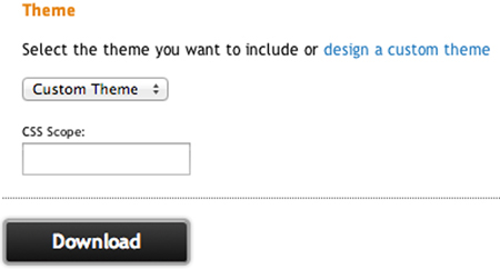
The CSS Scope input sets a scope that the custom theme should be limited to. If you use a CSS scope of div#sidebar, the theme’s CSS rules only apply in a <div id="sidebar"> element. In the vast majority of situations, you won’t need a CSS scope; it makes sense only if you want to use multiple themes on one page.
Clicking the Download button downloads a zip file containing the files shown in figure 7.4.
Figure 7.4. The contents of a jQuery UI download with a custom theme. The jquery-ui.css and jqueryui.min.css files contain the CSS for the theme (jquery-ui.min.css is minified and jquery-ui.css is not), the images directory contains images that the theme depends on, and index.html is a demo page where you can see how all of the jQuery UI widgets look with your theme.
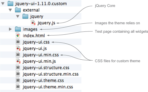
What are those jquery-ui.structure.css and jquery-ui.theme.css files? jQuery UI breaks its CSS rules into two categories: structural (margin, width, height, and so forth) and theming (the ones you configured in ThemeRoller). These rules are placed into jquery-ui.structure.css and jquery-ui.theme.css, respectively. This gives you the ability to manage multiple themes without duplication, as jquery-ui.structure.css remains the same regardless of which theme you use. Unless you plan on managing multiple themes—and the majority of developers don’t—use jquery-ui.css, as it’s the structure and theme concatenated together.
If you open jquery-ui.css, you’ll see that it starts with the following comment block:
/*! jQuery UI - v1.11.0 - 2014-01-01
* http://jqueryui.com
* Includes: core.css, draggable.css, ...
* To view and modify this theme, visit http://jqueryui.com/themeroller/?ffDefault=Verdana...
* Copyright 2014 jQuery Foundation and other contributors; Licensed MIT */
The key part is the URL starting with http://jqueryui.com/themeroller/. If you navigate to this URL in your browser, you go to ThemeRoller with all your custom changes in place. This is great for keeping your theme up to date as new versions of jQuery UI are released. When jQuery UI x.y.z comes out, you can import your theme, see how it looks with the updated library, and then download an updated CSS file with your changes preserved.
Tip
In general, it’s a bad practice to directly edit a ThemeRoller-built CSS theme file. Leaving the file intact makes it easier to upgrade when new versions of jQuery UI are released. Create a new CSS file for your application, and do any additional styling there.
Although ThemeRoller is a great starting point for styling applications, you can’t do everything in it. You’re limited to specific CSS properties, and you can’t target individual widgets. ThemeRoller is just the beginning of the styling capabilities provided by jQuery UI.
To see other things that are possible, let’s dig into the jQuery UI CSS framework.
In addition to the themes provided in jQuery UI, a number of themes created by the jQuery community are available. The most popular of these is jQuery UI Bootstrap, which integrates the popular Bootstrap library with jQuery UI. You can learn more about Bootstrap at http://getbootstrap.com/ and check out jQuery UI Bootstrap at http://jquery-ui-bootstrap.github.io/jquery-ui-bootstrap/.
7.2. Using the jQuery UI CSS framework to customize applications
jQuery UI comes packaged with a full CSS framework with CSS class names that serve a variety of purposes. To get a sense of the names, a full list is documented at http://api.jqueryui.com/theming/css-framework/.
In this section, we’ll go over the class names and what you can do with them. The main three categories of class names are widget containers, interaction states, and interaction cues. We’ll go over each, starting with widget containers.
Tip
To avoid naming conflicts, every class name used by jQuery starts with a ui- prefix. Names are lowercased, and words are separated with hyphens—for instance, ui-widget-content.
7.2.1. Styling widget containers
The first set of class names creates a visual consistency between the widgets used in an application. This set has only three class names, so they’re not too hard to remember:
- ui-widget —Class name applied to the outer container of all widgets.
- ui-widget-header —Class name applied to header containers.
- ui-widget-content —Class name applied to content containers. The content container can be the parent or sibling of a ui-widget-header.
Internally, jQuery UI consistently applies these class names to all its widgets. Figure 7.5 shows how the class names are applied to a few widgets. The solid border is around the ui-widget-header element, and the dotted black border is around the ui-widget-content element.
Figure 7.5. Locations of widget container class names ui-widget-header (solid border) and uiwidget-content (dotted border) on the tabs, dialog, accordion, and datepicker widgets. The accordion header uses neither because it is clickable; it uses the interaction states we’ll cover in the next section.
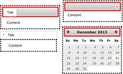
In the case of the tabs, dialog, and datepicker widgets, the ui-widget-content class name is on the outer container of the widget. The accordion widget places ui-widget-content on each content pane.
Note
In general, ui-widget-content is placed on the outer widget container as it’s desirable to have a border around the whole widget. If you don’t want a border—as with the accordion—it’s placed on a separate child element.
Because the class names are consistently applied, you can write CSS rules that target all widgets at the same time. The following code shows an example of this:
.ui-widget {
    font-size: 1.2em;
    font-family: Tahoma;
}
.ui-widget-header {
    border: 5px solid blue;
    background: red;
    color: white;
}
.ui-widget-content {
    border: 2px solid green;
    background: purple;
    color: gray;
}
Although this example doesn’t produce pretty widgets, it shows the types or rules that are safe to apply to these class names. Because the ui-widget class name is applied to all widgets, you can apply only a few CSS rules safely without breaking the display of some widgets. In fact, the jQuery UI themes internally specify only a font-size and font-family. For the header and content class names, border, background, and color are the most common rules used.
Unless you’re a designer creating a custom look, it’s uncommon to need to add CSS rules to these class names beyond the rules that are configurable in ThemeRoller. But as you’ll see in the next chapter, if you know how to apply these class names to HTML elements, you can create custom widgets that work with the jQuery UI theming system automatically. If you want to add a container to your application that looks the same as your widgets, you can use the following markup:
<div class="ui-widget ui-widget-content">
    <div class="ui-widget-header">
        Hello
    </div>
    Content
</div>
The container class names handle the widget’s default look, but they don’t handle styling based on user interaction—such as the display of a tab after it’s activated. The next category of framework classes addresses these states.
7.2.2. Styling interaction states
You may have noticed that when you hover over a button widget, its display changes. Or when you click an accordion header, it’s automatically highlighted. What you may not have noticed is all these changes happen by manipulating a few core class names. The class names for the four widget states are
- ui-state-default —Applied to clickable elements such as a button, tab, or accordion header.
- ui-state-hover —Applied to clickable elements when the mouse hovers over them.
- ui-state-focus —Applied when clickable elements receive keyboard focus.
- ui-state-active —Applied when a clickable element is activated. The active tab and accordion header are given this class name.
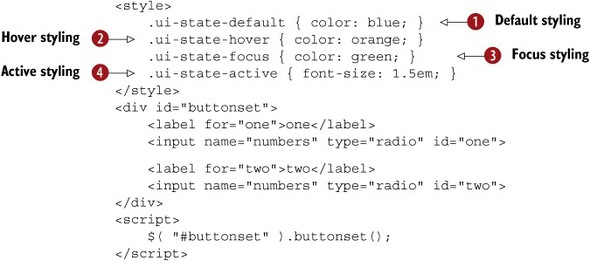
To get a sense of how these class names work, consider the following example:
Tip
This example is easier to see visually. You can try this example out at http://jsfiddle.net/tj_vantoll/78vQL/.
You have a buttonset widget containing two radio buttons. Because the buttons are clickable, the widget places the ui-state-default class name on each of them. As a result, your buttons start with blue text .
If you hover over either button, its text changes to orange . If you give either button focus with the keyboard, its text changes to green . Finally, if you select either radio button, the selected button’s font-size increases  .
.
As with the container class names, jQuery UI consistently applies the interaction state class names to all clickable elements in all widgets. By writing rules to target these states, you can again style widgets simultaneously.
Before we look at more comprehensive examples of how all these class names come together, we’ll discuss one last category: interaction cues.
7.2.3. Styling interaction cues
Interaction states are directly related to clickable elements, but interaction cues can be applied to any element. The six interaction cue class names are
- ui-state-highlight —Represents a highlighted container element.
- ui-state-error —Represents an erred container element.
- ui-state-error-text —Utility class name to style error text without applying a background. It can be used on the labels of erred form fields.
- ui-state-disabled —Represents a disabled element.
- ui-priority-primary —Represents a higher priority element in a set, such as a button you want to stand out to the user.
- ui-priority-secondary —Represents a lesser priority element in a set, such as a button you don’t want to stand out; for example, a cancel button.
Of these six, only ui-state-disabled is used by the jQuery UI widgets internally; the rest are intended for utility use in your applications. To show how, let’s dig into more robust examples that use these class names.
Let’s start by revisiting the accordion widget to add the ability to disable and display errors for individual headers. How could you use this functionality? Suppose you run an online service where users have accounts they can manage. An accordion provides an excellent way to divide the various settings into categories such as profile, billing information, preferences, and so forth.
With such a setup, erring individual headers lets you draw the user’s attention to a collapsed panel to take some action—such as changing an expired password.
Disabling lets you prevent the user from interacting with individual headers. You have to be careful, though. In most situations, it’s better to hide rather than disable elements; many users become confused when presented with controls they can’t use. But in this example, you’ll look at one way that disabling can be advantageous.
The accordion control you’ll build is shown in figure 7.6.
Figure 7.6. An accordion control with an erred header and a disabled header

The first tab displays with a red background, border, and text and contains a warning icon. The second tab appears disabled to the user. The following listing shows the code to build this accordion.
Note
The full source of this example is available at http://jsfiddle.net/tj_vantoll/z6w6P/.
Listing 7.1. Erring and disabling accordion panels
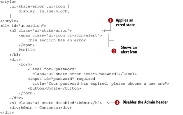
For the first tab, you apply the erred styling by adding the ui-state-error class name , which applies the red border, background, and text color to the header. The class name doesn’t, however, apply the warning
icon as shown in figure 7.6. This comes from the <span> in the header .
You’ve used the jQuery UI icons several times throughout this book, but you’ve only looked at using icons as options of the jQuery UI widgets, such as the button widget’s icons option. All the jQuery UI icons can be used in HTML directly by applying two class names: ui-icon and the name of the specific icon, in this case, ui-icon-alert. You can find a full list of the icons available at http://api.jqueryui.com/theming/icons/.
Note
If <span class="ui-icon ui-icon-alert"></span> creates the icon, why do you give the “This section has an error” text in it? The text is provided for screen reader users who can’t see the red styling or the warning icon. The ui-icon class name hides this text from sighted users and leaves it accessible to assistive technologies such as screen readers.
That takes care of the first panel, so let’s move on to the disabled panel. You disable an accordion panel by applying the
ui-state-disabled class name to the appropriate header element . The widget now automatically prevents this panel from being opened. This technique of disabling with ui-state-disabled works for several of the jQuery UI widgets—specifically, tabs, menu, and button.
But you need to take care of one last thing. Disabled UI elements can confuse users unless they’re given an indication of
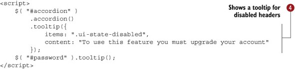
why the elements are disabled. For this example you add a tooltip to the disabled accordion header to let the user know why the header is disabled—the user needs to upgrade the account to
use this panel.
Although this is not a complete example, it shows how the jQuery UI CSS framework makes it easy to customize a widget’s built-in behavior to meet your needs. The accordion widget has no built-in options to error or disable individual tabs, but you can build this display using a few of the framework’s class names. Let’s look at another example of how you can customize widgets with the jQuery UI CSS framework.
We haven’t specifically looked at one category of class names: the layout helpers. The layout helpers are a series of utility class names you may have a use for in your applications:
- ui-helper-hidden —Hides the element visually and from screen readers.
- ui-helper-hidden-accessible —Hides the element visually but leaves it accessible to screen readers.
- ui-helper-reset —A CSS style reset. It resets margin, padding, border, outline, line-height, text-decoration, font-size, and list-style to a baseline value that’s consistent across browsers. Read more about what CSS resets do at http://meyerweb.com/eric/tools/css/reset/.
- ui-helper-clearfix —Clears floating child elements. Learn more about CSS floats and clearing them at https://developer.mozilla.org/en-US/docs/Web/CSS/float.
- ui-front —jQuery UI uses this class name internally to manage the z-index-based stacking of elements on the screen. Read more about ui-front at http://api.jqueryui.com/theming/stacking-elements/.
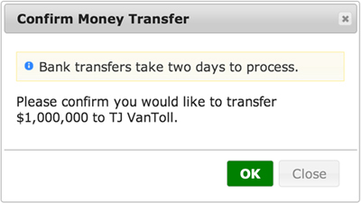
7.2.4. Building a styled confirmation dialog
In chapter 4, you built a dialog to get the user’s confirmation before you deleted the user’s data. Now that you know about the CSS framework, let’s see how you can use the CSS class names in jQuery UI to improve the look of a confirmation dialog. This time, you’ll build a dialog for a different use case: confirming a money transfer. If you’ve ever banked online, a dialog such as that shown in figure 7.7 should look familiar.
Figure 7.7. A confirmation dialog to show before a money transfer
The code to build this dialog is shown in the next listing.
Note
The full source of this example can be found at http://jsfiddle.net/tj_vantoll/a3zkQ/.
Listing 7.2. Building a styled confirmation dialog

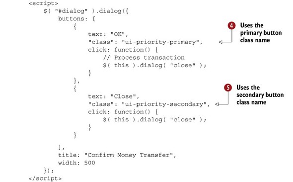
Let’s start with the HTML. For the informational message about bank transfers, you use the jQuery UI ui-state-highlight class name to make the message stand out to the user . Inside the message, you use another of the CSS framework icons, ui-icon-info, to visually indicate that this is an information message . You also provide a text fallback for screen readers that can’t read the icon.
In JavaScript, you create a dialog widget—using the widget’s buttons option to create the two buttons. On each button’s object, you include a class property to add the class names—ui-priority-primary and ui-priority-secondary  , respectively—to each button. The class names add emphasis to a primary action and reduce emphasis from a secondary action.
You want to draw the user’s eye and attention to the OK button to encourage the user to complete the transaction.
, respectively—to each button. The class names add emphasis to a primary action and reduce emphasis from a secondary action.
You want to draw the user’s eye and attention to the OK button to encourage the user to complete the transaction.
Internally, jQuery UI bolds the primary button and decreases the opacity of the secondary button to achieve this effect. To
further draw the user’s attention, you also change the background and text color of the primary button .
Tip
The word class is a reserved word in JavaScript; to use it in code you must quote it as in this example. Although the language doesn’t currently use class, it will be used in the next version of JavaScript (ECMAScript 6).
One last note before we move on: did you notice the difference between the three CSS rules you used?
.ui-dialog .ui-state-highlight { ... }
.ui-dialog .ui-icon-info { ... }
.ui-widget-content .ui-priority-primary { ... }
See how the first two rules are prefixed with a ui-dialog class name and the third with ui-widget-content? The first two use widget-specific class names, and the last uses a framework-wide rule. As you saw in this section, framework-wide rules let you add CSS rules that apply to all widgets. Because you made your button green using ui-widget-content, any future widgets with primary buttons will be styled the same.
Although the ability to style all widgets at the same time is powerful, sometimes you don’t want changes to apply everywhere. In this example, the highlighting changes are prefixed with ui-dialog because you want the CSS rules to apply only when ui-state-highlight is used in a dialog. ui-dialog is one of many class names that jQuery UI provides for each individual widget. Next, let’s look at what class names are available and what you can do with them.
7.3. Styling with widget class names
Each widget uses a comprehensive set of CSS class names so you can easily target any section of any widget. The class names are documented in each widget’s API documentation. The dialog class names are documented at http://api.jqueryui.com/dialog/#theming. The documentation uses nesting to show the structure of each widget’s markup. The dialog widget’s ui-dialog-titlebar, ui-dialog-content, and ui-dialog-buttonpane elements are direct children of the ui-dialog element. This relationship is shown in figure 7.8.
Figure 7.8. On the left is a simplified version of the markup the dialog widget uses. On the right is the dialog widget’s class name documentation. Notice that the nesting in the documentation matches the nesting used in the rendered HTML markup.

The widget-specific class names give you the ability to target specific parts of widgets without having to worry about affecting other widgets. Figure 7.9 shows how you could use the dialog class names to customize its appearance.
Figure 7.9. A sampling of the dialog-specific CSS class names available. The ui-dialog class name applies a solid border to the whole dialog; ui-dialog-title applies a larger font size to the title bar; ui-dialog-content uppercases the content’s text; and ui-dialog-titlebar applies a dotted border to the title bar.

Admittedly, putting a 15-pixel green border around dialogs isn’t practical for most applications, but you can do it! Let’s look at how you can use the widget-specific class names to make powerful customizations to the jQuery UI widgets.
7.3.1. Building vertical tabs
Recall from chapter 4 that the jQuery UI tabs widget displays tabs horizontally on top of the active tab’s content. Although this is the most common use case, suppose you want the tabs to display vertically on the side of the content, as shown in figure 7.10.
Figure 7.10. A jQuery UI tabs widget with CSS rules applied to the tabs-specific class names to stack the tabs vertically.

Although you may think you need JavaScript to rearrange elements to create this display, the class names provided by jQuery UI make it possible to do this in CSS alone. The key portions of the CSS are shown in the following listing. The full source and a live demo are available at http://jsfiddle.net/tj_vantoll/SL44T/.
Listing 7.3. Displaying tabs vertically

The main tabs container has a class name of ui-tabs, and it has four immediate children: the navigation (ui-tabs-nav) and three panels (ui-tabs-panel), one for each of the tabs. The key to this example is that both the navigation and the panels are floated , which makes them appear side by side. To make this work, you also need to give both the navigation and the panels an explicit
width, which we’ll get to momentarily.
After this is done, you need to replicate one visual detail from the default horizontal tabs by removing the border between the active tab and the content panel. If you look at figure 7.10, you can see that there’s no border between One and One Contents.
To make this happen, you don’t remove the border from the navigation; rather, you position the individual list items directly
on top of it . Notice how both the .ui-tabs-nav and .ui-tabs-nav li selectors are given the same border. Now all you have to do is remove the border from the currently active list item.
The tabs widget makes this easy as ui-state-active is automatically applied to the active tab; you use this selector to apply a white border , which gives the appearance that the border has been removed.
Your last task is to determine the widths to use for both the tabs navigation and panels. In this example, you use a width of 10 em for the navigation and the default 100% width for the parent ui-tabs container. To make your content responsive to different screen sizes, and leave the width of the navigation a static 10 em, you use a new feature of CSS to calculate the width of the content panels: the calc() function.
By specifying a width of calc(100% - 11em) for the tab panels , you tell the browser to take the default width of the panels, subtract 11 em (to account for the navigation), and use the result as the width of the panels. The calc() function makes it easy to calculate percentages based on widths and static values. Now you can resize the window to your
heart’s desire, and the content panels adapt to the screen size automatically.
Warning
The calc() function isn’t supported in Internet Explorer versions earlier than 9 as well as Android versions earlier than 4.4. If you need to support these browsers, you unfortunately need to hardcode widths for both ui-tabs and ui-tabs-panel to make this vertical tabs approach work.
As you can see from this example, the class names provided by the tabs widget give you the ability to perform complex customizations without any JavaScript. Although building vertical tabs is cool, you may have noticed one limitation of this approach: because ui-tabs is styled, you can’t use vertical and horizontal tabs side by side. We’ll return to this example to build a more robust implementation in chapter 9 when we look at widget extensions.
Next, let’s look at another handy use of the jQuery UI widget class names.
7.3.2. Building a mobile-friendly datepicker
The jQuery UI datepicker is great for letting users select dates from a calendar, but on touch devices, the calendar days are small; it’s too easy for fingers to accidentally select the wrong day. Let’s see how you can use the CSS class names on the datepicker to make the widget mobile friendly.
You’ll build the inline datepicker shown in figure 7.11. The code to build this datepicker is shown in the following listing.
Figure 7.11. An inline datepicker displayed on an iPhone

Listing 7.4. A mobile-friendly inline datepicker

Because the datepicker displays appropriately on larger screens, you start your CSS with a media query to limit your changes
to screens with a viewport of under 600 pixels wide . Media queries are a quick way to scope CSS rules based on the characteristics of the browser it’s running on—most commonly
its width. Media queries aren’t supported in Internet Explorer versions earlier than 9, although because you’re building for
mobile devices, this isn’t a concern; older versions of the browser ignore the media query.
Tip
Media queries are the primary tool for building responsive web applications as they let you conditionally apply CSS rules based on the browser’s height and width. A full exploration of media queries is outside the scope of this book, but a good place to get started is https://developer.mozilla.org/en-US/docs/Web/Guide/CSS/Media_queries.
Next, you use the datepicker-specific CSS class names to make the datepicker larger for mobile devices. Specifically, you
first use the outer uidatepicker class name to make the datepicker take up the full width of the screen . Then, you increase the padding of all links in the ui-datepicker-calendar to make them bigger and easier to click with fingers .
Although this is great, most developers want to use a mobile datepicker tied to an <input>, not an inline one. Because this is a common requirement, you’ll implement this use case as well. But because this is a nontrivial task that requires a decent amount of JavaScript, you’ll build it in chapter 9 as a widget extension.
For now, let’s look at one last use of the jQuery UI widget-specific class names.
7.3.3. Adding arrows to tooltips with CSS
The jQuery UI tooltip widget makes it easy to show additional information for controls on a web page. But the tooltip widget doesn’t provide one common UI pattern out of the box: adding arrows. If you’re not sure what I’m talking about, take a look at the image shown in figure 7.12.
Figure 7.12. A jQuery UI tooltip with a CSS-drawn arrow

Notice how the arrow points from the tooltip to the form control itself. This small visual touch helps the user associate the tooltip with the input. And believe it or not, you can draw the arrow in CSS alone. This is shown in the following listing. You can view the example live at http://jsfiddle.net/tj_vantoll/cAz6T/.
Listing 7.5. Adding arrows to a tooltip widget

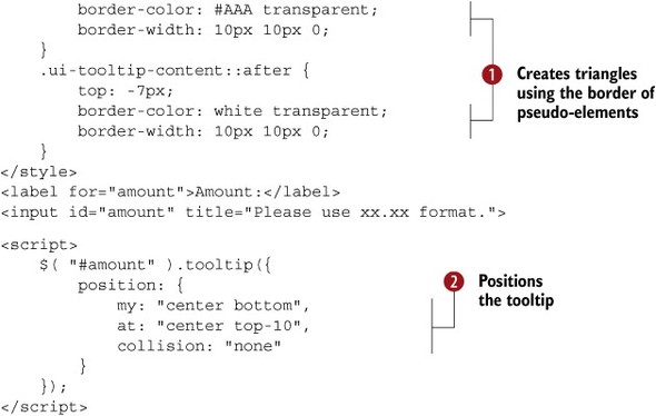
The tooltip widget provides only two CSS class names: ui-tooltip and ui-tooltip-content. But as it turns out, that’s all you need to build this cool effect. Most of the magic here comes from using the ::before and ::after pseudo-elements on the ui-tooltip-content element. If you haven’t used ::before and ::after, they’re two bonus elements every DOM node has that you can use to add supplementary content or styling.
Warning
Although the two-colon syntax for ::before and ::after is now standard, Internet Explorer 8 supports only the now-outdated single-colon versions—:before and :after. The double-colon syntax is technically correct per the CSS specification, but all modern browsers support both the single- and double-colon syntax. Personally, because it’s not a big deal if the pointers aren’t present, I prefer sticking with the technically correct ::before and ::after.
Even if you understand how pseudo-elements work, this example is still likely a mystery. How in the world is this CSS turning
into a pointer? This code uses an odd trick to draw triangles with a single element in CSS: if you give an element with no
height and no width a border on three sides, it creates a triangle . If this makes no sense to you, you’re not alone; this is a nearly impossible thing to conceptualize. There’s a great demo
at http://codepen.io/chriscoyier/pen/lotjh that walks through exactly what’s going on here. If you’re near a computer or phone, watch this now.
If you’re not able to watch the demo, just accept that by some CSS magic the ::before and ::after pseudo-elements on the ui-tooltip-content element are triangles. The ::before triangle is the same color as the border, and the ::after triangle is white. The white triangle obscures most of the dark triangle. This gives the appearance of a single, cohesive border for the tooltip.
Tip
http://cssarrowplease.com is an online tool for building these CSS-based pointers without having to understand the magic going on.
Because you’re using a pointer, you have to make sure the pointer points at the correct element. To do this, you use the tooltip’s
position option. As you saw in chapter 4, the position reads like an English sentence: position my (the tooltip’s) horizontal center vertical bottom at the horizontal
center vertical top (of the input) . Don’t worry about the positioning specifics here; we’ll return to this example when we discuss the position utility in detail
in chapter 12.
7.4. Summary
jQuery UI provides a number of tools to style and theme your applications. You started with ThemeRoller, an online tool to build themes. You can use it to build a theme from scratch, or one based on the 24 built-in themes. You can also import your theme back into ThemeRoller to make further changes.
From there, you can use the two sets of CSS class names that the library provides: framework-wide and widget-specific. The framework-wide class names let you change the look of all widgets at once, and the widget-specific class names let you write CSS that targets specific widgets. Between these two sets of class names, you have the ability to build highly customized UIs. You used the class names to build a vertical tabs UI, a mobile-friendly datepicker, and tooltips with CSS-based arrows.
We’ll continue to discuss the jQuery UI CSS framework throughout the book. In the next chapter, you’ll build a custom widget from scratch, and you’ll see how applying the jQuery UI class names makes a widget automatically themeable.