
Chapter 9. Extending widgets with the widget factory
This chapter covers
- Building on top of the jQuery UI widgets
- Using and creating extension points
- Extending datepicker
We’ve spent the greater part of this book looking at myriad things you can do with the jQuery UI widgets. But although the jQuery UI widgets handle the most common development use cases, real-life applications often have specific—often crazy—requirements. To give a few concrete examples: the jQuery UI team has had feature requests asking for accordions that store their open panel in a cookie, draggables that have a Cancel button, and autocompletes within autocompletes. (I’m not sure what those last two even mean, but someone asked for them.)
Widgets can’t solve every niche problem that developers have, so to allow for highly customized solutions to these unique issues, the widget factory allows you to extend existing widgets. The ability to extend widgets lets you add, remove, or tweak the behavior of an existing widget without reinventing the wheel. Because of the customizability it provides, the widget factory’s extensions mechanism is—in my opinion—the single most powerful feature in jQuery UI.
In this chapter, we’ll look at how to create widget extensions, then we’ll build a few examples to see what they make possible. We’ll look at datepicker specifically, as it’s the only jQuery UI widget that doesn’t use the widget factory yet and requires tricky workarounds.
Let’s dig in.
9.1. Building widget extensions
Widget extensibility is built directly into the widget factory; you can use all the widget mechanisms you’ve learned, along with a few mechanisms specific to widget extensions that you’ll learn throughout this chapter. In fact, extending widgets is as easy as passing the constructor function of the widget to extend into $.widget(). The following builds an extension of the jQuery UI dialog widget named superDialog:
$.widget( "tj.superDialog", $.ui.dialog, {} );
superDialog is an exact clone of the dialog widget. You can use its constructor function to create a new dialog
$.tj.superDialog( "<div>" );
or you can use its plugin
$( "<div>" ).superDialog();
With the widget factory, you aren’t limited to one level of inheritance; you can build extensions of extensions. The following creates a third superDuperDialog widget that extends the superDialog widget:
$.widget( "tj.superDuperDialog", $.tj.superDialog, {} );
All three widgets are complete widgets, each with its own plugin; each of the following creates a new dialog:
$( "<div>" ).dialog();
$( "<div>" ).superDialog();
$( "<div>" ).superDuperDialog();
Although it’s cool that you can create a copy of a widget in one line of code, these extensions aren’t useful; they’re the same widget with different names. To make your widget extensions useful, you have to make them do something their parent widget doesn’t. Let’s start by altering options.
9.1.1. Changing existing and adding new options to a widget
With widget extensions you have the full power of the widget factory at your disposal. Anything you can do with a widget, you can do with a widget extension—including altering options, or adding new ones.
To show this, let’s return to the confirmation dialog that you built in chapter 2. That example created a new <div> and converted it to a dialog widget with an OK button.
$( "<div>Your transaction processed successfully.</div>" ).dialog({
    options: {
        buttons: {
            OK: function() {
                $( this ).dialog( "close" );
            }
        }
    }
});
This works, but you repeat the five lines to create the OK button every time you want to create a confirmation dialog. You could change $.ui.dialog.prototype .options.buttons, but that would change the defaults of all dialogs, not just confirmation ones.
To consolidate this configuration, let’s create a confirmationDialog widget extension:
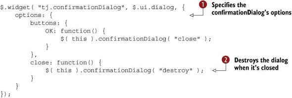
You define options for your confirmationDialog  and when you extend another widget, the widget factory intelligently merges the widget’s default options with its parent’s
defaults. So your widget still has all the dialog widget’s options—height, width, modal, and so on—without needing to explicitly list them. Any options you do provide override those of the parent widget. The following
creates a confirmation dialog using your new widget’s plugin:
and when you extend another widget, the widget factory intelligently merges the widget’s default options with its parent’s
defaults. So your widget still has all the dialog widget’s options—height, width, modal, and so on—without needing to explicitly list them. Any options you do provide override those of the parent widget. The following
creates a confirmation dialog using your new widget’s plugin:
$( "<div>Your transaction processed successfully.</div>" )
    .confirmationDialog();
This dialog is shown in figure 9.1. Although you passed no options to confirmationDialog(), it automatically has an OK button that closes the dialog.
Figure 9.1. A confirmation dialog built with the confirmationDialog widget
The other option you pass is a close event callback that calls the confirmationDialog’s destroy() method  . Because you’re creating a new <div> every time you build a confirmation dialog, this prevents the dialog from staying in the DOM when you no longer need it.
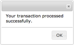
The confirmation dialog sets the default value of its parent widget’s options. Next, let’s show a widget that adds a new option altogether. Remember the vertical tabs example that you built in chapter 7? You added CSS to the tabs widget to stack the tabs vertically instead of horizontally:
.ui-tabs {
    padding: 0;
    overflow: hidden;
}
.ui-tabs .ui-widget-header {
    border: none;
}
/* etc */
This works if all your tabs are vertical, but what if you want horizontal and vertical tabs in the same application, or even on the same page? We’ll look at a couple of ways to make this possible, starting with adding a new option to the tabs widget.
For consistency with the jQuery UI slider widget (which can also display horizontally or vertically), you’ll use an orientation option that can be set to "horizontal" or "vertical". The final display of this widget is shown in figure 9.2.
Figure 9.2. Display of a tabs extension that adds an orientation option
To implement this widget, you need to change your custom CSS so that it no longer adds rules to the ui-tabs class name. Instead, you prefix all rules with a ui-tabs-vertical class name, as shown here:
.ui-tabs-vertical {
    padding: 0;
    overflow: hidden;
}
.ui-tabs-vertical .ui-widget-header {
    border: none;
}
/* etc */
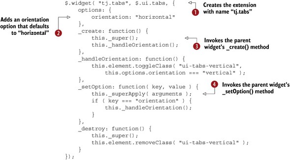
Your widget extension now has to manage this class name to determine whether the tabs display horizontally or vertically. The first step is to add logic to conditionally add the ui-tabs-vertical class name when the tabs are initialized in _create(). But there’s a problem with this. The tabs widget’s existing _create() method already does a lot, and if you override it, you lose all that behavior.
No need to worry; the widget factory has a trick up its sleeve to make the parent widget’s method available in all extended methods. To see this in action, look at the tabs extension shown in the following listing.
Listing 9.1. Tabs widget extension with an orientation option
Note
This example is available at http://jsfiddle.net/tj_vantoll/S6bCN/.
We’ll start at the top before getting into _create(). The call to $.widget() defines the widget’s full name as "tj.tabs" . How can you have two widgets that have the same name? Because the widgets have different full names, "tj.tabs" and "ui.tabs", these two widgets can coexist; their constructor functions are available at $.tj.tabs() and $.ui.tabs(), respectively.
But because you can’t have multiple jQuery plugins with the same name, the tabs() plugin is now associated with $.tj.tabs() and not $.ui.tabs(). This can be confusing; we’ll look at a better way to handle this in the next section.
Next, you define a new option for your tabs widget extension: orientation, which defaults to "horizontal" . Because your extension inherits all options from its parent widget—in this case $.ui.tabs—this is the only option you need to explicitly list.
After the options, you provide a few methods on your new widget’s prototype—the first being _create(). In _create() you can see the utility function the widget factory provides for accessing the parent widget’s method of the same name: _super()  .
.
_super() is incredibly useful in extensions because, instead of having to duplicate the logic in the jQuery UI tab widget’s _create(), you can directly invoke it and then add your custom logic to manage the ui-tabs-vertical class name.
The rest of this example manages this class name. In _destroy() you ensure the class name is removed, and in _setOption() you ensure the class name is added or removed appropriately when the orientation option changes.
_setOption() uses one other method you haven’t seen before: _superApply(). _superApply() and _super() both invoke the parent widget’s method of the same name. The difference is in the arguments the methods accept; _super() accepts zero to many arguments passed individually, and _superApply() accepts an array of arguments. For example, you call _superApply( arguments )  , but you could have invoked _super() with the two arguments of _setOption() explicitly listed—that is, _super( key, value ). Because the two methods do the same thing, which one you use is a matter of personal preference.
Tip
The arguments object is an array-like local variable available in all functions. It contains the arguments passed to the function. For more information on arguments, see https://developer.mozilla.org/en-US/docs/Web/JavaScript/Reference/Functions_and_function_scope/arguments.
This extension approach added a new orientation option, but you could have taken other approaches. You could’ve used a different plugin name as shown in the following code:
$.widget( "tj.verticalTabs", $.ui.tabs, {
    _create: function() {
        this._super();
        this.element.addClass( "ui-tabs-vertical" );
    },
    _destroy: function() {
        this._super();
        this.element.removeClass( "ui-tabs-vertical" );
    }
});
This implementation creates two separate plugins: tabs() and verticalTabs(). Developers call tabs() to create horizontal tabs and verticalTabs() to create vertical ones. The only difference is this implementation doesn’t let you change the orientation of the tabs using the option() method.
The widget factory makes different approaches possible so that you can create the widget that best meets your needs. In the next section you’ll return to your initial vertical tabs implementation to see how you can clean it up.
9.1.2. Redefining widgets with the widget factory
Often you perform a small alteration to an existing widget, but you have no need to create a brand-new widget from scratch. Your first vertical tabs extension is the perfect example of this—you added a new option, but you had no need to create a new widget.
When you create widget extensions that define new plugins, such as the vertical-Tabs example, the parent widget’s plugin cannot be used to invoke methods on elements that are instances of the child widget. This is a bit of a mouthful, so let’s look at an example:

Here, you create a superDialog widget that extends the dialog widget, and then create a superDialog instance on a newly created
<div>. Because the <div> is a superDialog instance, you can invoke methods on it through the superDialog() plugin , but you cannot use the parent widget’s dialog() plugin .
Before jQuery UI 1.9, there was no good way to do this. Your only option was to change the widget’s methods on its prototype. The following example does this for the tabs widget’s _create() method:
$.ui.tabs.prototype._create = function() {
     this.element.addClass( "some-class-name" );
};
The problem with this approach is that you have no access to the _super() and _superApply() methods; therefore, to invoke the tabs widget’s original _create() method, you must store off a reference to it before overriding it:

This code is a lot of work to perform a single action in _create(). You have to manually set the context (this) of the parent method’s _create() —something that the widget factory handled for you.
The biggest problem with this approach is that it requires you to duplicate boilerplate code to store a reference to the parent method. You override only one method, but if you had more, you’d have to duplicate the same code for each.
To make this process easier, a new feature was added to the widget factory in the jQuery UI 1.9 release: the ability to redefine widgets. To see how this works, let’s look at the same example implemented with the widget factory:
$.widget( "ui.tabs", $.ui.tabs, {
    _create: function() {
        this._super();
        this.element.addClass( "some-class-name" );
    }
});
This example is also four lines of code, but it’s far cleaner. You don’t have to worry about saving references to the parent widget’s method—you just call _super(). This approach ends up being cleaner for more complex examples. Let’s return to your widget that added an orientation option to the tabs widget:
$.widget( "tj.tabs", $.ui.tabs, {
    options: {
        orientation: "horizontal"
    },
    ...
});
As discussed, the issue here is that you’re creating two widgets: $.tj.tabs and $.ui.tabs. To change this widget to redefine $.ui.tabs, you change the namespace from "tj" to "ui":
$.widget( "ui.tabs", $.ui.tabs, {
    options: {
        orientation: "horizontal"
    },
    ...
});
Instead of creating a new widget on a different namespace, you alter the jQuery UI tabs widget’s behavior. Because of this, all instances of the tabs widget are affected—any new and existing tabs widget instances now have an orientation option.
In general, whether to build a new widget or redefine an existing one is a matter of personal preference and depends on the specific scenario, but I’ll give a few recommendations. For quick changes, redefining a widget is preferred—as users of the widget don’t have to remember two different widget names and plugins.
For more complex changes, a new widget is preferred. A different name helps to clearly differentiate the widget from its parent; otherwise, users of the widget might attribute the additional functionality to the parent. As an example, a developer using your updated tabs widget might assume that the orientation option is part of jQuery UI, and wonder why it’s not documented on the API documentation.
Regardless of which approach you use, widget extensions make all sorts of powerful customizations possible. Let’s look at a few more practical examples of this, starting with your todo widget from the last chapter.
9.1.3. Extending a custom widget
Widget extensions aren’t limited to the jQuery UI widgets. Any widget built with the widget factory can be extended, even completely custom widgets like the to-do list you built in the previous chapter. To show this, you’ll build two extensions of this widget, one that makes items in the list removable and another that makes them sortable.
Let’s start with the removable example. Remember from chapter 8 that each item in the list could be checked and unchecked, but there was no way to remove items from the list; therefore, you’ll build an extension that adds this functionality. The display of this widget is shown in figure 9.3.
Figure 9.3. A todo widget extension that adds remove icons
The implementation of this widget is shown in the following listing.
Listing 9.2. A todo widget extension with removable items

Note
This example is available at http://jsfiddle.net/tj_vantoll/umrmm/. If you need to reference the code for the original todo widget, you can view that at http://jsfiddle.net/tj_vantoll/zStp7/.
This example works by adding a <button> element to each <li> in the list. In _create(), after calling _super(), you use _on() to attach an event listener for buttons in the list . The listener determines which item was clicked, then calls the todo widget’s remove() method you added in chapter 8 to remove the <li> from the DOM .
Next, you have to inject the <button> elements into each <li>. Because the todo widget’s _renderList() method is called every time the list is manipulated (when items are added, removed, checked, or unchecked), it makes for a perfect extension point for the todo widget. We’ll discuss extensions points in more detail in the next section, but for now know that extensions points are methods that are convenient to extend.
You remove all buttons from the list , before you call _super(). You do this because the parent widget relies on getting the text of each <li>, and having button elements in the <li> messes with that logic. I’m specifically using this approach to show that there’s no rule for where to call _super() in an extension. You can call it in the beginning, the middle, or the end of a method—you can avoid calling it completely
if you don’t need the parent widget’s behavior.
After the _super() call, your list’s markup structure is in place, so you can now add your buttons. You do so by looping over each <li>, creating a new button for each , and appending the new button to the <li>.
Your last task is to eliminate the buttons when the widget is destroyed. You accomplish this by extending the todo widget’s
_destroy() method, removing all <button> elements  , and invoking the parent widget’s _destroy() with _super().
To get the display you need, you have to add a little CSS to make your buttons look right. The following CSS handles the positioning and sizing of the buttons:
.tj-todo .tj-todo-item {
    position: relative;
}
.tj-todo .tj-todo-item button {
    position: absolute;
    right: 5px;
    height: 1.5em;
    width: 1.5em;
    top: 0.4em;
}
And with that, you have a todo widget in which users can remove items from the list—all in about 25 lines of code. This example shows off the true power of the widget factory. Because you’re building on top of an existing solution, you don’t have to write much code to create a custom UI component.
Let’s look at one more extension example: a sortable list. Figure 9.4 shows the sortable to-do list in action.
Figure 9.4. An extension of your to-do list widget that lets users reorder items in the list

The implementation of the sortable todo widget is shown in the following listing.
Listing 9.3. A sortable todo widget


Note
This example is available at http://jsfiddle.net/tj_vantoll/vfJ65/.
The code here is similar to the vertical tabs extension. You define a sortable option and default it to false . In _create(), when the option is set, you convert the todo widget’s element to a sortable widget . (Remember that there’s no reason a single element can’t be associated with multiple widgets.)
To handle the sortable option being changed, you override _setOption(). When sortable is set to true, you make the todo widget’s element sortable . Because the widget factory prevents dual instantiation, there’s no harm in calling sortable() on an element that’s already sortable; it has no effect.
When the sortable option is set to false, the situation is a bit more complex. Before calling destroy() to remove the sortable functionality, you first must make sure that the todo widget’s element has been initialized with a
sortable widget . You need this check because calling a widget method before the widget is initialized—in this case sortable( "destroy" )—throws an error.
To determine whether the element is sortable, you use this.element.is ( ":data(ui-sortable)" ) . We’ll look at how the :data() selector works in chapter 12, but for now know that it selects elements that have data stored under the specified key. If the element has data stored
with the widget’s name, then that element has that widget initialized on it. (Remember that destroy() cleans up that data.)
In the todo widget’s _destroy() method, you need to clean up the sortable widget  . You use the same _isSortable() method you defined earlier to determine whether the element is a sortable and, if so, call its destroy() method.
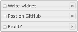
Now you can create sortable to-do lists by setting the sortable option to true:
<ul>
    <li>Write widget</li>
    <li>Post on GitHub</li>
    <li>Profit?</li>
</ul>
<script>
    $( "ul" ).todo({ sortable: true });
</script>
You can change whether the list is sortable by changing the option:
$( "ul" ).todo( "option", "sortable", false );
Just as in the vertical tabs example, this is only one possible implementation. You also could’ve created a new widget that’s always sortable. An implementation of this is shown here:
$.widget( "tj.sortableTodoList", $.tj.todo, {
    _create: function() {
        this._super();
        this.element.sortable();
    },
    _destroy: function() {
        this.element.sortable( "destroy" );
        this._super();
    }
});
With this approach, you can create a sortable to-do list by calling this new widget’s plugin:
<ul>
    <li>Write widget</li>
    <li>Post on GitHub</li>
    <li>Profit?</li>
</ul>
<script>
    $( "ul" ).sortableTodoList();
</script>
As before, neither approach is better; they’re different ways of extending the todo widget with additional behavior. If you prefer having a separate plugin with a different name, then create a new widget; if you have no need for a completely different widget, then redefine the original widget.
Before we end this section, there’s one final question worth discussing: why didn’t you implement removable and sortable items directly in the todo widget? Why build this functionality as extensions?
The answer is one the jQuery UI team itself has learned the hard way: widgets with lots of options are difficult to use and maintain. For every option you add to a widget, you have to think about how it interacts with every other option. Worse, every option you add makes extending your widget harder (extensions also have to worry about supporting every single option).
The interaction between options is a consistent source of bugs and code complexity in jQuery UI. Think of all the combinations of datepicker’s 50 options! Plus, the vast majority of use cases don’t require more than a couple of options. I’ve yet to see a datepicker that required a quarter of datepicker’s 50 options.
Because of this, from now on the jQuery UI team will attempt to implement only commonly needed options. To make the jQuery UI widgets customizable for highly specific situations, the library has recently implemented a brand-new means of customization: extension points.
Limiting the number of options a widget has is a widget API design best practice. Another is to avoid creating options that depend on other options.
jQuery UI itself violates this best practice in a few places for backward compatibility. As an example, the resizable widget has animate, animateDuration, and animateEasing options. These APIs are confusing because animateDuration and animateEasing are irrelevant when animate isn’t set to true.
If you need multiple values for a single option, the preferred approach is to accept an object. For instance, the dialog widget’s show and hide options accept an object with multiple properties set, as shown here:
$( "<div>" ).dialog({
    hide: {
        duration: 500,
        easing: "linear",
       effect: "puff"
    }
});
9.2. Customizing widgets with extension points
Although any method in a widget can be overridden with the widget factory, the jQuery UI team has realized that it’s useful to create methods specifically for extension. These methods are designated as extension points and have the same API stability as options, methods, and events—meaning jQuery UI will never rename or remove an extension point in a bug fix release.
The extension point mechanism doesn’t apply only to jQuery UI. By adding extension points to custom widgets, you make them easier to use, and easier for other developers to build widgets on top of. We’ll look at examples of this later in the section.
The jQuery UI extension points are now listed on each widget’s API documentation—right alongside the widget’s options, methods, and events. Figure 9.5 shows the dialog widget’s single extension point.
Figure 9.5. The dialog widget’s extension points list on http://api.jqueryui.com/dialog/. Not all widgets have extension points, but the ones that do will always show up in this location on the API docs.

As discussed, extension points are nothing more than widget methods; you know the mechanism to override the dialog’s _allowInteraction() method:
$.widget( "ui.dialog", $.ui.dialog, {
    _allowInteraction: function() {}
});
The dialog widget’s _allowInteraction() method is specifically used for modal dialogs. Normally, modal dialogs don’t allow users to interact with elements outside of the dialog. This behavior is almost always what you want, but suppose you have an element outside the dialog that’s positioned to look as if it’s inside the dialog.
Many third-party plugins take this approach. Consider the following code that uses the third-party Select2 jQuery plugin in a modal dialog:
<div id="dialog">
    <label for="country">Country:</label>
    <select id="country">
        <option>Afghanistan</option>
        <option>Albania</option>
        <option>Algeria</option>
        ...
    </select>
</div>
<script>
    $( "#dialog" ).dialog({ modal: true });
    $( "#country" ).select2();
</script>
The display of this example is shown in figure 9.6.
Figure 9.6. Display of the Select2 plugin with a modal dialog

As you can see from figure 9.6, the Select2 plugin automatically provides an <input> for the user to filter options in the list. Unfortunately, the dialog widget blocks this <input> from getting focus. Why? Take a look at the generated markup structure of this example, shown here:
<body>
    <div id="dialog" class="ui-dialog" ...></div>
    <div class="select2-drop" ...>
        <input class="select2-input">
        ...
    </div>
</body>
Although the <input> looks as if it’s inside the dialog, it’s actually in a sibling <div>, and is absolutely positioned on top of the dialog: the dialog widget blocks any interactions with this <input>.
This is where the _allowInteraction() method comes in. The method lets you whitelist elements the user can use that aren’t children of modal dialogs. The following code uses the _allowInteraction() extension point to allow the use of the Select2 plugin:
$.widget( "ui.dialog", $.ui.dialog, {
    _allowInteraction: function( event ) {
        return $( event.target ).is( ".select2-input" ) ||
            this._super( event );
    }
});
You perform two checks here. First, you see if the element that received the event has a select2-input class name. This is what allows the Select2 <input> to receive focus. Second, you call _super() so that you still do the checks in the parent widget’s method. $.ui.dialog.prototype._allowInteraction(), for instance, has a workaround to ensure datepickers work within dialogs.
Tip
The autocomplete and selectmenu widgets automatically work within modal dialogs because of their use of the ui-front class name and appendTo option. Read more about the technique these widgets use at http://api.jqueryui.com/theming/stacking-elements/. The datepicker widget will take the same approach when its rewrite is complete, which will remove the need for the workaround in the dialog widget’s _allowInteraction() method.
Now you have a Select2 plugin that works in a jQuery UI modal dialog, and, because _allowInteraction() is a documented extension point, you can feel comfortable that this fix will work in future releases.
Because extension points are a relatively new mechanism in jQuery UI, there are still few documented extension points. What do you do if you want to extend an undocumented method?
9.2.1. Using undocumented extension points
If you use jQuery UI long enough, you’ll almost certainly want to extend a method that isn’t an official extension point. Although only some methods are documented as extension points, any widget method can be overridden using the widget factory. And sometimes it can be advantageous to override the undocumented methods (we’ll look at an example in a bit).
Despite this, overriding undocumented methods should always be considered a last resort during development. Because jQuery UI is free to rename or replace any undocumented method during any release (even a bug fix release), you risk having your application break as new versions of jQuery UI come out.
But sometimes it can be worth the risk to truly customize the behavior of the widget. To give a concrete example of this, let’s return to the dialog widget. The dialog widget does some logic to manage focus for you. When you open a dialog, focus is automatically set to the first of the following:
1. An element with the autofocus attribute
2. A tabbable element in the dialog’s content
3. A tabbable element in the dialog’s button pane
4. The dialog’s close button
5. The dialog itself
This is done for accessibility purposes. Shifting focus lets screen reader users know that there is new content to interact with.
Note
The dialog widget also moves focus when a dialog is closed. When you open a dialog, the widget remembers which element had focus, and when you close the dialog, focus is returned to that element.
Usually, this behavior gives focus to an appropriate element in the dialog, but not always, for instance, in the following example:
<div id="dialog">
    <p>The transaction processed successfully. For details,
       see <a href="/account">your account</a>.</p>
</div>
<script>
    $( "#dialog" ).dialog({
        buttons: {
            OK: function() {
                $( this ).dialog( "close" );
            }
        }
    });
</script>
The display of this dialog is shown in figure 9.7. Notice that the your account <a> received focus.
Figure 9.7. Display of a dialog widget with focus placed on a link in the content

If you refer to the dialog’s focus algorithm, you’ll see why. Because there’s no element with an autofocus attribute, the dialog looks for a tabbable element in the dialog’s content. Because <a> tags with href attributes are tabbable, the dialog widget selects the link and gives it focus.
Here this isn’t desirable behavior. Because this is a simple confirmation dialog, you want to focus the OK button so the user can easily close the dialog with the Enter key. Having focus on the link also draws the user’s attention to the link, and you have no reason to do that in this example.
How do you change this behavior? Although there are no documented extension points to control this, if you look at the source of the dialog widget (https://github.com/jquery/jquery-ui/blob/master/ui/dialog.js), you’ll see that there is a method that controls this behavior: _focusTabbable().
You can use this method to alter the focus logic in your example. The following code shows an extension that does that:
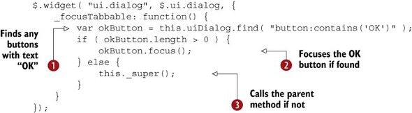
This extension overrides one method: _focusTabbable(). You use a reference to the dialog’s outer DOM element (this.uiDialog) to look for any <button> elements that contain the text "OK" .
If you find one, you give it focus ; otherwise, you call the parent widget’s _focusTabble() with _super() to let it determine which element should receive focus .
With this extension in place, your example dialog now gives focus to the OK button when opened rather than to the link. You could’ve written this extension other ways. You could’ve looked for the first button in the button pane, regardless of its text. You also could’ve assumed there would always be an OK button and given it focus without checking whether it exists.
The point here isn’t the specific implementation, as what you’ll need to do is specific to what you’re building. The point is that you could change the widget’s behavior only by extending an undocumented method of the dialog widget.
Is this all right? Although developers coming from a server-side background may cringe at using undocumented APIs, it’s sometimes the only option you have to implement your requirements. As we discussed, using undocumented extension points should always be a last resort.
Creating extensible widgets is an important goal of the jQuery UI project. If you think a specific method should be listed as an extension point, let us know! Or if you think some logic in a widget could be refactored to make it more extensible, create a ticket requesting it. Better yet, after you create the ticket, submit a pull request implementing the new extension point! For more information on contributing to jQuery UI, see appendix E.
9.2.2. Adding your own extension points
Extension points make a widget more extensible, and therefore it’s easier to build complex solutions on top of the widget. Because jQuery UI tries to adhere to this methodology in its widgets, you should try to do the same in your own custom widgets as well. As a general rule, if you think someone may want to change the behavior of something you’re writing, put it in a method.
Let’s return to the extension you built earlier in this chapter that added remove buttons to your to-do list. For a refresher, the code for that extension is shown again here:
$.widget( "tj.todo", $.tj.todo, {
    ...
    _renderList: function() {
        var listItems = this.element.find( "li" );
        ...
        listItems.each(function() {
            var button = $( "<button>Remove</button>" ).button({
                icons: { primary: "ui-icon-closethick" },
                text: false
            });
            $( this ).append( button );
        })
    }
});
The code that builds the remove <button> elements is embedded in the _renderList() method. If you want to customize how the buttons work, you need to reimplement the entire, nontrivial _renderList() method. Let’s move the button creation to its own method to make it an extension point.
The following code implements a new _buildRemoveButton() extension point:
$.widget( "tj.todo", $.tj.todo, {
    ...
    _renderList: function() {
        var listItems = this.element.find( "li" ),
            that = this;
        ...
        listItems.each(function() {
            var button = that._buildRemoveButton();
            $( this ).append( button );
        })
    },
    _buildRemoveButton: function() {
        return $( "<button>Remove</button>" ).button({
            icons: { primary: "ui-icon-closethick" },
            text: false
        });
    }
});
Functionality-wise, this implementation does the exact same thing, but you now have the ability to alter the code that builds the remove <button> elements without needing to reimplement _renderList(). This extension shows text on the button instead of an icon. (Notice that the text option is no longer set; it takes its default value of true.)
$.widget( "tj.todo", $.tj.todo, {
    _buildRemoveButton: function() {
        return $( "<button>Remove</button>" ).button({
            icons: { primary: "ui-icon-closethick" }
        });
    }
});
Is this an extension of an extension? Yes, it is. With the widget factory you can extend or redefine the same widget as many times as you’d like.
Because of the power of extending widgets, it’s important to think about extension points during the development of a widget. By putting your button-creating code in its own method, you allow developers to customize the button’s creation without having to repeat code from your widget.
Before we end our discussion of widget extensions, there’s one last widget we need to discuss: datepicker.
9.3. Extending the datepicker widget
Remember that datepicker is the only widget in jQuery UI that isn’t built with the widget factory. Because of this, it also can’t be extended using the widget factory—which unfortunately means that none of the techniques we’ve discussed throughout this chapter will work on datepicker.
You can do some things, although the implementations aren’t nearly as clean as widgets built with the widget factory. To show this, let’s tackle one common datepicker request: changing what the Today button does.
Recall that setting the datepicker’s showButtonPanel option to true displays the datepicker along with the two buttons shown in figure 9.8.
Figure 9.8. A datepicker with a button pane. The button pane contains two buttons: Today and Done.

If you had to guess, what do you suppose the Today button does? Most people, including me, believe that it should select today’s date, place today’s date value in the <input>, and close the calendar. Alas, this isn’t the behavior of the Today button—instead, the button links to today’s date.
To understand what this means, you have to know that there’s always an active date when the datepicker is open. The active date is today’s date by default, but it can be altered with datepicker’s keyboard shortcuts, the next and previous month buttons, or by typing dates directly in the datepicker’s <input>. You can select the active date at any time using the Enter key.
When you click the Today button, it makes today’s date the active date. If you navigate the datepicker in figure 9.8 to February and click Today, you’re taken back to January, but today’s date isn’t selected.
This behavior confuses almost everybody who uses the datepicker; it’s counterintuitive. So how do you change it?
There are no options to control the behavior, and no events triggered when the Today button is clicked; you must resort to a technique mentioned in the last chapter: duck punching.
Internally, datepicker runs $.datepicker._gotoToday() whenever the Today button is clicked. You still need $.datepicker._gotoToday() to run—as you need to make Today’s date active—but you need to add to what it does.
With the widget factory this was simple; you used _super() to call the parent’s method, then did your custom logic. But because datepicker isn’t built with the widget factory, that’s not an option here. So what do you do?
This is where the duck-punching technique comes into play. Duck punching lets you extend a function while maintaining a reference to the original function. Let’s look at the implementation:
$.datepicker._gotoToday = (function( orig ) {
    return function( id ) {
        orig.call( this, id );
        this._selectDate( id );
    };
})( $.datepicker._gotoToday );
Let’s break this down, starting with the first and last lines:
$.datepicker._gotoToday = (function( orig ) {
    ...
})( $.datepicker._gotoToday );
This is an assignment; you’re assigning a new value to $.datepicker._gotoToday. What is being assigned is where this gets tricky.
function( orig ) {} defines an anonymous function and ( $.datepicker ._gotoToday ) immediately invokes that function—passing it a reference to $.datepicker._gotoToday; after this executes, orig is set to the original version of $.datepicker._gotoToday. Because this whole block of code is an assignment, whatever you return from this anonymous function will become the new value of $.datepicker._gotoToday.
Here’s the function that you return:
return function( id ) {
    orig.call( this, id );
    this._selectDate( id );
};
Because you have a reference to the original $.datepicker._gotoToday as orig, you invoke that first, then you add your custom behavior: calling another internal method $.datepicker._selectDate(), which selects the active date and places it in the <input>. Now your datepicker’s Today button selects today’s date instead of linking to it.
Duck punching is a clever technique to implement a new version of a function, while maintaining the ability to call the original version. The widget factory’s _super() and _superApply() methods are implemented using a similar approach internally.
Although this technique is clever, is this approach to extending datepicker safe to add to your production applications? Like undocumented extension points, there’s a definite risk when altering undocumented methods in datepicker. jQuery UI can change the name, behavior, or the existence of these methods at any time.
But unlike other jQuery UI widgets, a long-term rewrite of the datepicker is in progress, which means two things:
1. You shouldn’t have to keep these hacks in long-term. Eventually, there will be far easier ways to alter the datepicker.
2. The API of the current datepicker isn’t changing in any way.
In many ways, datepicker is a victim of its own success. Datepicker is such a popular widget—easily the most popular in jQuery UI—that any change is a breaking change for many users; therefore, the team is focusing almost exclusively on the rewrite. Because of this, however crazy it may seem, duck punching datepicker’s methods is a reasonable solution to customize datepicker’s behavior until it’s rewritten.
The technique of duck punching functions is a bit tricky to wrap your head around, but it’s incredibly powerful. It lets you add to the behavior of any JavaScript function without needing to change the original function. Internally, jQuery UI duck punches a few of jQuery Core methods to add to their behavior.
If you find a bug in jQuery UI, or there’s some behavior you want to modify that isn’t part of a public API, you may be tempted to alter the jQuery UI source code to change the behavior to meet your needs. Resist that urge. Modifying the library’s source code makes upgrading difficult, because as each new version of jQuery UI is released, you have to remember every change you have made, and reapply each of those changes to the new version—which is a manual and error-prone task.
Using undocumented extensions points and duck punching, albeit not ideal, provide appealing alternatives to modifying the source code. These techniques let you alter the library’s internal behavior without having to reapply your changes at every upgrade.
To help drive the duck punching concept home, let’s look at one more example.
9.3.1. Building a mobile-friendly datepicker extension
In chapter 7 you used CSS to make an inline datepicker that displayed nicely on mobile devices. We avoided discussing a datepicker that’s tied to an <input> because it requires nontrivial customization using the duck-punching technique we just discussed. To show the problem, consider the following example:
<label for="date">Date:</label>
<input id="date">
<script>
    $( "#date" ).datepicker();
</script>
Figure 9.9 shows how this example looks on an iPhone running iOS7.
Figure 9.9. Display of a vanilla datepicker widget when its <input> receives focus on iOS

Obviously, this behavior isn’t ideal; the user sees only a portion of the datepicker, and the positioning of everything is off. And unfortunately, changing a few options isn’t going to fix this situation.
The code to improve the mobile experience requires a variety of changes, including duck punching a few more of datepicker’s methods. I’ll present the implementation first, then we’ll go over each piece individually. The updated datepicker implementation is shown in listing 9.4.
Note
Some of the visual CSS is omitted to focus on the JavaScript aspect of this example. To view the full source of this example, see http://jsfiddle.net/tj_vantoll/RZVKS/.
Listing 9.4. A mobile-friendly datepicker


The first problem to fix is the zoom issue. The reason the <input> and datepicker are so large in figure 9.9 is that mobile browsers automatically zoom in to <input> elements that have a computed font-size under 16 pixels when they receive focus. The fix for this is making sure the <input> has a font size of at least 16 pixels .
Tip
By default, 1 em is equivalent to 16 px; because em values cascade, parent elements have the ability to alter this value. For more on how ems work, see http://css-tricks.com/css-font-size/.
Even with this change, seeing a full datepicker on focus can be disorienting to users on a small screen; because of this,
you set the datepicker’s showOn option to "button"  . This tells the datepicker to generate a <button> and to show the datepicker only when that button is clicked—not on focus of the <input>. Because the datepicker no longer shows on focus, you add a placeholder attribute to the <input> to tell the user the format you’re expecting . (You can see the display of the placeholder in figure 9.10.)
Figure 9.10. The improved datepicker widget display on iOS—with a new placeholder, a button widget, and CSS to make the datepicker more mobile friendly

Although the button the datepicker builds from showOn: "button" can be configured with the buttonImage, buttonImageOnly, and buttonText options—and is given a uidatepicker-trigger class name—you have no means of controlling the creation of the <button> itself. You can’t, for instance, use a themed jQuery UI button widget.
To work around this, you duck punch the method that datepicker uses to generate the button: $.datepicker._attachments() . You call the original $.datepicker._attachments() and convert the <button> it created to a button widget with a calendar icon .
There’s one last workaround to discuss, this time for positioning. The datepicker always attempts to align the calendar’s left edge with the left edge of its <input> and gives you no means of configuring this position. This is almost always fine on desktop browsers, but on mobile browsers this has a tendency to push the calendar outside of the browser’s viewport, and having any portion of a calendar off the screen renders it unusable.
To work around this, duck punch another of the datepicker’s methods: $.datepicker._findPos() _findPos() returns an array in which the first value is the calendar’s left coordinate and the second value is its top coordinate. In your override, you first call the original method and then set the left coordinate to 0. This ensures the calendar is positioned on the left edge of the screen and takes up the full viewport.
The updated version of your mobile datepicker is shown in figure 9.10.
Although this example works, the implementation is less than ideal because you can’t use the widget factory. Because you altered the datepicker’s methods directly, this isn’t an extension of datepicker; all datepicker instances are affected by your changes. You can’t use a mobile datepicker alongside a desktop one, for example.
In many ways, looking at how hard it is to customize datepicker is the best way to show how much the widget factory does for you.
As you’ll recall from the HTML5 discussion in chapter 3, most mobile browsers now have a native means of collecting dates from the user—without any JavaScript or configuration you used in the preceding example.
Remember that if all you need is a date from a mobile user, you should attempt to use the HTML5 input first, as it’s going to use the same picker the user is accustomed to.
But also remember that the HTML5 datepicker is extremely limited; if you need to make customizations—disabling individual days, highlighting individual days, controlling the formatting, custom styling, and so on—you can use the approach we just discussed.
9.4. Summary
In this chapter, you looked at extension, the most powerful feature of the widget factory. You saw that extending an existing widget is as easy as passing the widget’s constructor function to $.widget(). A widget can even redefine itself to change its behavior without generating a new widget with a different name.
Although you can extend any method in a widget extension, jQuery UI is moving toward documenting its extensible methods as extension points. These extension points appear on each widget’s API documentation alongside the widget’s options, methods, and events. You also saw how to add extension points to the todo widget you built in the previous chapter.
Although sticking to the publicly documented extension points is recommended, in unique situations you can override any method in any of the jQuery UI widgets. If you believe an existing method in a widget should be an extension point, let the jQuery UI team know! Creating extensible widgets is an important goal of the project, and it’s feedback that we’d love to have. For more, see appendix E.
Finally, you looked at how to extend the only widget in jQuery UI not using the widget factory: datepicker. You saw that it’s messy, but you can use a technique known as duck punching to alter the behavior of the widget.
Now that you’ve built and extended widgets, let’s look at how to get your application using jQuery UI ready for production.