
Chapter 3. Building complex web forms with jQuery UI
This chapter covers
- Using the jQuery UI form widgets
- Building an enhanced contact form
- Comparing the jQuery UI widgets to their HTML5 counterparts
Building forms with native HTML is difficult; a limited number of controls offers a limited set of functionality. In this chapter we’ll look at how the five form widgets of jQuery UI—autocomplete, button, datepicker, selectmenu, and spinner—enhance these native HTML elements and make it easy to build nontrivial forms.
To learn about the widgets and what they do, you’ll build a sample form, one that patients can use to make appointments at a local doctor’s office. No one likes visiting the doctor, and your job is to make the appointment process as easy as possible for the user.
You’ll explore new elements that appeared on the web with HTML5, many with functionality similar to the jQuery UI form widgets. We’ll compare and contrast the HTML5 elements with the jQuery UI widgets and discuss which make sense for you to use today.
Let’s get started by looking at the form you’ll build.
3.1. The challenges of building modern web forms
Let’s assume you’re a small web development company and you get an email from a US-based doctor’s office. They want to add a form to their website that allows patients to request office appointments, and they want you to do it. They list the following requirements:
- Collect the name of the user’s insurance company. The office has a database of insurance companies the user should be allowed to filter and select.
- Collect the language the patient speaks—English or Spanish.
- Let the patient select a doctor or nurse. The doctors and nurses should be separated into distinct groups.
- Collect the appointment date from the patient. The office isn’t open on weekends, and Dr. Smith doesn’t work on Tuesdays. The date should be localized for English and Spanish speakers.
- Collect the number of days the user has been sick. Don’t let the user pick invalid values like negative numbers.
- All controls in the form should match the current website’s black-and-white color scheme.
- The form should work in all browsers.
Although this list is long, it’s not an uncommon list of requirements for a modern web form. As more and more of our daily interactions move to the web, the forms that developers are expected to build are increasingly complex. Think how you’d build a form to meet these requirements.
Without any libraries, you’re limited to the native HTML controls—<input>, <button>, <select>, and <textarea>. Although you can build forms that collect this data with native HTML, those forms tend to be neither user friendly nor developer friendly.
Note
The list of form controls is now slightly larger due to increasing HTML5 form support in some browsers. We’ll discuss how HTML5 impacts your form development in the last section of this chapter.
One of your criteria is to allow the user to select an appointment date. This raises a few questions. How do you let the user know what format the date should be in? How do you confirm that the user picked a valid date? No developer wants to write code that manually checks for leap years or number of days in a month. No user wants to try different values to determine which one is correct.
Another frustrating issue with HTML elements is that it’s difficult to alter their display. HTML form controls weren’t created with styling or themeability in mind; it’s impossible to perform some customizations, such as changing the height of a <select> element, the size of a radio button, or anything about the <option> elements of a <select>.
The jQuery UI form widgets alleviate these concerns by providing powerful and customizable controls. The widgets have an attractive appearance and have CSS hooks to customize the display to your desire. Figure 3.1 shows the appointment form built with jQuery UI.
Figure 3.1. Converting form controls into a jQuery UI widget gives them a consistent look. It also makes the controls more usable. When users give focus to the Date input, they see a datepicker. When users enter text into the Insurance input, they see potential options in a menu.

On the left side of figure 3.1 is the form without enhancement—rather dull and uninspiring. In the middle is the form after the controls are converted to widgets. The set of controls has a consistent look and feel that you can use with any of the jQuery UI themes. The user interacts with friendlier controls—a calendar to select a date from and an autocomplete list that filters companies as the user types, shown on the right side.
We’ll spend the next several chapters looking at how to build this form with the jQuery UI widgets. Let’s start the journey with a widget that helps users search and filter through values: autocomplete.
Tip
If you’d like to follow along, you can view the final version of this example at http://jsfiddle.net/tj_vantoll/Dt8pW/.
All browsers allow some level of control over the display of form elements, but few styles can be consistently applied. Firefox and Internet Explorer let you change the color of a <select>, but Chrome and Safari don’t. Internet Explorer allows you to change the height of a <select>, but other browsers don’t.
Furthermore, browsers have specific styling hooks to customize the display of individual form elements. The pseudo-element ::-ms-check can be used to change the height, width, color, and background of check boxes and radio buttons in Internet Explorer 10 and 11. A full list of these styling hooks and how they work can be found at http://tjvantoll.com/2013/04/15/list-of-pseudo-elements-to-style-form-controls/.
Because of the differences in styling forms across browsers, it’s highly recommended to test the display of any form customizations in as many browsers as possible. jQuery UI removes much of this guesswork by providing widgets that look great and are consistent across browsers.
3.2. Autocomplete: suggesting input options to users
Autocompletion is a pattern that all web users are familiar with. When you type a phrase in your search engine, it suggests results; when you compose an email, your mail client suggests recipients. Although this pattern is commonplace, implementing it on the web is nontrivial. The jQuery UI autocomplete widget provides a powerful means of associating an input field with a series of suggested values.
You’ll use the autocomplete widget to tackle the first of your requirements: collecting the name of the user’s insurance company.
Why do you build this as an autocomplete and not a <select>? Large drop-down menus can overwhelm users and make it difficult to find the value they’re looking for. Have you ever been frustrated by sifting through a country drop-down menu with 300+ options?
Also, when using a <select> you need to retrieve all values from the database before displaying the form. This is a potentially expensive operation on the server and delays the time when the user sees the form.
By using an autocomplete, you let the user filter values by typing. The autocomplete widget also gives you flexibility; you can still load all data on page load, but you can also defer loading it until it’s needed—and only load values that match what the user typed. Let’s discuss each approach.
A few examples in this section include PHP to show how the autocomplete widget interacts with server-side code. To run these examples on your own computer, you must set up a PHP server. Don’t feel compelled to do this. The PHP code is thoroughly explained, so you don’t have to go through the hassle unless you want to tinker with the examples.
If you do, the easiest way to run PHP is to download and install a preconfigured PHP server, such as the following:
- WAMP—http://www.wampserver.com/ (Windows)
- MAMP—http://www.mamp.info/ (Mac) Alternatively, you can download PHP directly from http://php.net/ and start a new server from the command line. For more information on this option, see http://php.net/manual/en/features.commandline.webserver.php.
3.2.1. Using local data
The easiest way to use the autocomplete widget is with local data—which means that the options are available to JavaScript directly, without needing to contact a remote server. To drive the autocomplete widget with local data, pass an array for the source option. The following is an example of an autocomplete that uses local data:
<input id="autocomplete">
<script>
    $( "#autocomplete" ).autocomplete({
        source: [ "Alligator", "Ant", "Anteater", "Ape", "Armadillo" ]
    });
</script>
The five options specified in the source option are suggested to the user in a menu as the user types. Figure 3.2 shows what happens when the user types an a, and then selects the first option with the mouse.
Figure 3.2. How the autocomplete widget displays suggestions to the user. Here the user selects “Alligator” with the mouse, and the input is filled with the user’s selection.

In your appointment example, the list of insurance companies you need is stored in a server-side database. In this case, to use a local array you load that data to a JavaScript array. How you implement this depends on the type of database and server-side environment you’re using. The following shows a sample PHP structure:

This gives you the autocomplete behavior you’re looking for. Although the local form of the source option is convenient, you have to load all options before the form is displayed and store them in JavaScript. This is fine if you have a few dozen or a few hundred options; however, when you have thousands or tens of thousands of options, managing this data in the browser becomes problematic, and often leads to a slow experience for users. To handle large datasets, let’s look at how to load data from a remote source.
Often back-end structures need to associate a code with each option in an autocomplete. For example, a back end might require the code “UK” instead of the label “United Kingdom”. For this scenario, the source option accepts an array of objects with label and value properties. The following shows an autocomplete that displays country names and maps them to country codes on selection:
<input id="autocomplete">
<script>
    $( "#autocomplete" ).autocomplete({
        source: [
            { label: "United Kingdom (UK)", value: "UK" },
            { label: "United States of America (USA)", value: "USA" }
        ]
    });
</script>
When the user selects an option, the value is entered in the text box rather than the label. This is shown in this figure.

When labels and values are used, the user sees the labels, but the values are placed in the input after selection. Here, the user selects the “United Kingdom (UK)” label, and its corresponding value—"UK"—is placed in the input.
Notice that in this example you include the value of each option within its label (“United Kingdom (UK)” instead of “United Kingdom”). There are a couple reasons for doing this. First, it allows the user to type either labels or values to see autocomplete options. In the country example, this means the user can type "un" or "us" to see the United States. Second, including the value in the label makes it less surprising when the value ends up in the input after selection. For instance, the user could be surprised by their “Switzerland” selection changing to "CHE", whereas they would likely understand the change after selecting “Switzerland (CHE)”.
We’ll look at a real-world example of how to use codes when we build a flight search application in chapter 11.
3.2.2. Loading from a remote source
Loading data from a remote data source provides a quick way for users to filter though large datasets. To show how the autocomplete widget can load remote data, let’s look at an example:

Note that the source option is a string rather than an array. This string is a URL where you send AJAX requests to retrieve matched options as the user types. In this example, the autocomplete widget makes GET AJAX requests to /path/to/server after the user types into the <input>.
The autocomplete widget doesn’t filter results when using a remote source; rather, the request made to the server includes a term request parameter containing the characters the user typed, allowing the server to filter suggestions. This workflow is shown in figure 3.3.
Figure 3.3. When using a remote source, the autocomplete widget sends the typed value as a term request parameter, and the server returns the filtered options. On the left, the user types "j", the widget sends a request to the server with a query string of "term=j", the server responds with an array containing three matches, and the widget displays them in a menu. On the right, the user has continued to type, and the new term ("jQuery U") is sent to the server. The server responds with a single match, which the widget displays.

The remote server must return a JSON-encoded array. As when using local data, the array can contain strings or objects with label and value properties. jQuery UI doesn’t provide server-side implementations to filter the options based on user-typed terms, but most server-side environments provide an easy means to compare strings and encode data to JSON. A sample PHP implementation is shown in the following listing.
Listing 3.1. Filtering autocomplete options in PHP

Don’t worry about the PHP details in this listing; it’s offered as a sample because it’s infeasible to list the numerous server-side environments that exist. The point is that the server-side code—regardless of what language or framework it uses—needs to take the request parameter term, identify the options that match it, and return the valid options as JSON. If the data for the autocomplete is stored in a database, this filtering can be done at the database level.
By default the browser denies any AJAX request to another domain. For instance, requests to http://example2.com from http://example.com will be blocked. This is per the browser’s same origin policy, which prevents malicious sites from grabbing sensitive information from other sites and executing actions on their behalf.
Cross-domain access to web assets and APIs has recently been made available through a specification known as cross-origin resource sharing (CORS).
For information on CORS, see http://www.w3.org/TR/cors/.
Because remote data is loaded as the user types, you no longer have to load the entire database on page load. Nevertheless, loading remote data could create a large demand on the server receiving the requests. You can mitigate this with the delay and minLength options.
The delay option determines the number of milliseconds between when the user types and when a search is done. The default value is 300; changing the delay to 0 makes sense for local data when you have a small number of potential options. The following code shows this:
<input id="autocomplete">
<script>
    $( "#autocomplete" ).autocomplete({
        source: [ "Alligator", "Ant", "Anteater", "Ape", "Armadillo" ],
        delay: 0
    });
</script>
Conversely, increasing the delay makes sense if you’re using remote data and you’re concerned about the load on the server. The following example waits a full second before performing a request:
<input id="autocomplete">
<script>
    $( "#autocomplete" ).autocomplete({
        source: "/path/to/server",
        delay: 1000
    });
</script>
One second is a long time for a user to wait before seeing results. Try not to go over 500 milliseconds unless you need to. Another option to reduce server load is to set a minLength.
The minLength option determines the minimum number of characters the user must type before a search is performed. The default value of 1 is fine for most cases, but can be increased when a single character can match a large number of values—or if server load is a concern. The following requires the user to type two characters before a search is done:
<input id="autocomplete">
<script>
    $( "#autocomplete" ).autocomplete({
        source: "/path/to/server",
        minLength: 2
    });
</script>
Let’s use this knowledge for your insurance carrier autocomplete. Because your requirements stated there were a large number of insurance companies, you use a minLength of 2 as shown in the previous example. But you leave the default delay in place, as you aren’t concerned about server load.
Your final implementation of the company autocomplete is shown in the next listing.
Listing 3.2. Final implementation of the insurance company autocomplete
################## index.html ####################
<input id="autocomplete">
<script>
    $( "#autocomplete" ).autocomplete({
        source: "search.php",
        minLength: 2
    });
</script>

################## search.php ####################
<?
$term = $_GET[ "term" ];
$companies = array(
    "AUTOMOBILE CLUB INTER-INSURANCE EXCHANGE",
    "AMERICAN FAMILY MUTUAL INSURANCE COMPANY",
    "BANKERS STANDARD INSURANCE COMPANY",
    ...
);

$result = array();
foreach ($companies as $company) {
    if ( strpos( strtoupper($company), strtoupper($term) )
      !== false ) {
        array_push( $result, $company );
    }
}

echo json_encode( $result );?>
This is the version of the insurance carrier autocomplete you’ll use in your example. But before we finish with the autocomplete widget, we need to discuss one more scenario: integrating with services that you don’t control.
3.2.3. Using autocomplete with third-party services and APIs
In your appointment form, the insurance company lookup was done on your own servers. You were free to tailor the returned data to match your expected format, but often this isn’t the case. Applications need to integrate with third-party APIs that don’t return simple arrays or data in convenient label-value pairs.
To make it possible to integrate with these services, the source option has a variation that accepts a callback function. The function is called after each character the user types and determines which options should display. To show how the source callback function works, let’s look at an example that uses local data before moving on to a third-party call.
All autocompletes you’ve seen to this point have matched terms anywhere in the options. For example, “a” matches “ant”, but it also matches “cat”. You can use a callback function to alter the widget so that it matches only at the beginning. This is shown in the following code.
Listing 3.3. Autocompletes that only match at the beginning
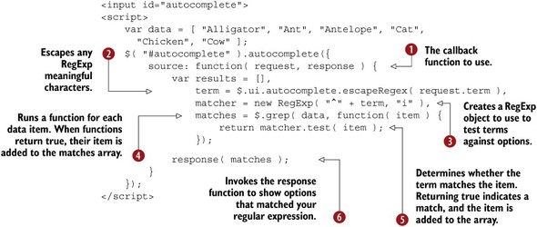
The callback function you use for source receives two arguments  . The first, request, is an object that has a single term property. The term has the string that’s currently in the <input>. The second, response, is a function that needs to be called with an array of options that should be displayed. With a callback function, determining
which options match the term is your responsibility.
. The first, request, is an object that has a single term property. The term has the string that’s currently in the <input>. The second, response, is a function that needs to be called with an array of options that should be displayed. With a callback function, determining
which options match the term is your responsibility.
To do so, you first escape any RegExp meaningful characters from the term the user typed (request.term)  . If you didn’t escape it, the user’s term would be interpreted as a regular expression. (The "." character would match all options!)
Next, you create the regular expression you’ll use to compare the term against the options  . The “^” character tells the RegExp to match characters only at the start of the strings. This makes “a” match “ant” but not “cat”. The second argument, “i”,
tells the RegExp to perform a case-insensitive match. For example, both “a” and “A” match “Ant”.
. The “^” character tells the RegExp to match characters only at the start of the strings. This makes “a” match “ant” but not “cat”. The second argument, “i”,
tells the RegExp to perform a case-insensitive match. For example, both “a” and “A” match “Ant”.
After this, you loop over each potential option in the data array using $.grep()  . You pass to $.grep()the array to filter and a function that’s invoked for each item in the array. For each item, if the function returns true, it’s added to the array returned by $.grep(); otherwise, it’s not. In your case, you use the RegExp you created earlier to determine whether the term matches each option
  .
.
Now the matches array contains only the options that match the user-typed term based on your criteria. The final step is to invoke the source callback’s response argument with the array of matched options you have built  . This displays the options to the user.
The callback function gives you complete control over what options the user sees. You can adapt the example to make the autocomplete case sensitive, display an option regardless of what the user typed, and more.
Although this approach uses local data, it’s easy to adapt to hit third-party services. To show this, let’s use GitHub’s JSON API to build an autocomplete for the names of all public Git repositories. If you look at the API’s documentation (http://developer.github.com/v3/search/#search-repositories), you’ll see that a ton of information is returned. How can you sift through all this to get the repository names? An implementation of this is shown in the following listing.
Listing 3.4. An autocomplete of jQuery Git repositories on GitHub

Note
You can view this example at http://jsfiddle.net/tj_vantoll/jck37/.
The code here is similar to the previous example. The main difference is that you start the source callback function by asynchronously loading data using $.getJSON(). The GitHub search API takes the keyword to search with as a "q" request parameter . The rest of the search string, "in:name", is known as a qualifier—which is a GitHub-specific syntax for restricting a search. By default the GitHub search matches repositories based on their
names, descriptions, and more. The "in:name" qualifier tells GitHub to match on names only.
Tip
You can read more about GitHub search qualifiers, including a full list of the qualifiers available, at https://help.github.com/articles/searching-repositories.
Next, you use the then()method to attach a function to run when the $.getJSON() call completes . Inside that function, you need to aggregate the data GitHub returned into something that autocomplete can use. A simplified
version of the data returned by GitHub is
{
  items: [
    { name: "jquery", full_name: "jquery/jquery", ... },
    { name: "jquery-ui", full_name: "jquery/jquery-ui", ... },
    ...
  ]
}
You loop over the items array , and place each repository’s full_name into a matches array. Then you pass the matches array to the response function to show the list. The callback option gives you flexibility. You could push repo.full_name + " (Forks: " + repo.forks + ")" into the matches array to display the number of forks a repository has alongside its name.
Between local data, remote data, and third-party services, the autocomplete widget gives you the ability to create autocompletes with almost any source of data. Now that you’ve explored autocompletes, and built the insurance company autocomplete you need for your appointment form, you’re going to shift focus to how you can improve the form’s buttons.
Many mobile OSes have a mechanism known as autocorrection that automatically corrects misspelled words as you type. Although occasionally helpful, autocorrection is almost never helpful in autocomplete inputs, where you have a predefined list of options. You can turn autocorrection off on any <input> by setting its autocorrect attribute to "off"—for instance, <input autocorrect="off">.
So that you don’t have to explicitly include this attribute on all autocomplete <input> elements, you can use the following autocomplete extension that adds the attribute automatically:
$.widget( "ui.autocomplete", $.ui.autocomplete, {
    _create: function() {
        this._super();
        this.element.attr( "autocorrect", "off" );
    }
});
You’ll learn how this works when you look at widget extensions in chapter 9. Some mobile browsers also automatically capitalize the first letter of every <input>. You can turn this behavior off by setting the <input> element’s autocapitalize attribute to "off"—that is, <input autocapitalize="off">. This is helpful on fields where it makes no sense to capitalize the first letter, such as email addresses and usernames.
3.3. Button: enhancing native buttons, inputs, and links
Although HTML has plenty of button controls, it’s difficult to change their display to match the rest of your application, and it’s nontrivial to perform common actions such as adding icons or grouping buttons.
The jQuery UI button widgets provide a means to convert native buttons to themeable and customizable controls. You’ll use the button widget to fulfill your second requirement: collecting the language the patient speaks.
This requirement is easy to meet with a set of radio buttons or a <select>, so why use radio buttons? In general, when you have a small number of options, radio button controls are preferred as the user can see all options at once. When you have many options or space is limited, a drop-down menu is preferred.
Why can’t you meet this requirement by creating HTML radio buttons? Keep in mind that you have to build controls that match the current site’s color scheme—and radio buttons are nearly impossible to style.
Luckily, the jQuery UI button widgets can turn <button>, <input type= "button|checkbox|image|radio|reset|submit">, and <a> elements into controls that are styleable and themeable. To show the effect of the widget, the following converts each supported element to a button widget:

Figure 3.4 shows the display before and after the conversion.
Figure 3.4. The button widget creates a consistent and themeable control from buttons, checkboxes, radio buttons, and links. Here, each of these controls is converted in a single call.

In figure 3.4 you can see how easy it is to use the button widget to create a consistent and decent-looking display for button controls. Now you need to create the radio buttons to collect the user’s language.
Tip
jQuery UI does a bit of magic to make radio buttons and check boxes styleable. The visual controls—the “checkbox” and “radio” buttons in figure 3.4—are those inputs’ <label> elements. jQuery UI styles the <label> elements and hides the check box/radio buttons in a manner that leaves them available to assistive technologies, such as screen readers. You’ll dig into this technique in more detail in chapter 8 when you build a custom widget that uses the same behavior.
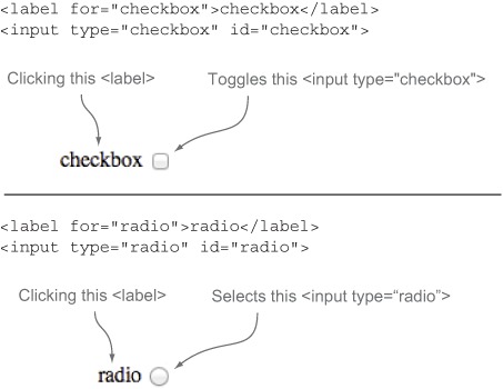
Note from the previous example that check box and radio button controls required a <label> before the button widget was instantiated on them:
<label for="checkbox">checkbox</label>
<input type="checkbox" id="checkbox">
<label for="radio">radio</label>
<input type="radio" id="radio">
The for attribute of the label must match the id attribute of the form control. This is a requirement for form building as it helps assistive devices such as screen readers connect the <input> element to its associated <label>. It also allows you to click the label to toggle check boxes and select radio buttons. Figure 3.5 shows this behavior.
Figure 3.5. The importance of associating <label> elements with <input> elements: clicking the labels toggles check boxes and selects radios. This increases the clickable area of these small controls, which is especially important on mobile devices, where fingers can easily miss small targets.
Why does the button widget force you to provide the <label> elements instead of generating them for you? All the jQuery UI widgets are built with accessibility and graceful degradation in mind. If JavaScript were to fail on this page, the user—as well as assistive devices—would still have a usable form with semantic controls. If all goes well, the button widget enhances the markup to something prettier.
Also remember that one of your requirements is to make sure the form works in all browsers. By using semantic HTML, you ensure that the form works everywhere, even in browsers that jQuery and jQuery UI no longer support.
Here’s the code you use to build the language control:
<label for="language-en">English</label>
<input type="radio" id="language-en" name="language" value="" checked>
<label for="language-es">Español</label>
<input type="radio" id="language-es" name="language" value="es">
<script>
    $( "input" ).button();
</script>
This produces the buttons shown in figure 3.6.
Figure 3.6. Two radio buttons that have become jQuery UI button widgets. The English <input> has a checked attribute, and therefore appears as the selected button.
Although these controls look much better than the native radio buttons, you can do better. jQuery UI also includes a buttonset widget designed to logically and visually group button controls. To create buttonsets, call the buttonset plugin on the parent element of button controls.
The following example switches your language control to use a buttonset:
<span id="buttonset">
    <label for="language-en">English</label>
    <input type="radio" id="language-en" name="language" value="" checked>
    <label for="language-es">Español</label>
    <input type="radio" id="language-es" name="language" value="es">
</span>
<script>
    $( "#buttonset" ).buttonset();
</script>
The updated display of the radio buttons is shown in figure 3.7.
Figure 3.7. When the parent element of button controls—in this case two radio buttons—is converted into a buttonset, the widget automatically applies the CSS necessary to group the buttons together.
The buttonset widget provides this visual association between the buttons, and the underlying button widgets ensure the browser’s native keyboard controls are preserved. The space bar can still be used to toggle check boxes, and the arrow keys can still be used to toggle the selected radio button.
Note
The buttonset widget isn’t limited to radio buttons; it can group any element that can be converted to a button widget.
This concludes your language control for this form, but you have one last customization to make with the button widget. To create a consistent form display, let’s also convert the form’s Submit button to a button widget, using the following HTML and JavaScript:
<button>Make Appointment</button>
<script>
    $( "button" ).button();
</script>
To add customization, let’s use the button’s icons option to display a small icon next to the button. The icons option takes an object with two optional properties—primary and secondary. The primary icon displays on the left side of the button, and the secondary icon displays on the right. The values of these two properties must match one of the 173 jQuery UI icon class names listed at http://api.jqueryui.com/theming/icons/. The following code adds a calendar icon to your Submit button:
<button>Make Appointment</button>
<script>
    $( "button" ).button({
        icons: {
            primary: "ui-icon-calendar"
        }
    });
</script>
We’ll continue to discuss the button in examples throughout this book. Next, let’s look at the jQuery UI replacement for native drop-down menus: selectmenu.
The HTML specification originally contained only four button types.
- <input type="reset"> —Resets a form to its original state
- <input type="submit"> —Submits a form
- <input type="button"> —Buttons that aren’t used to submit forms
- <input type="image"> —An image to act as a control to submit forms
Unfortunately, <input> elements can’t contain child elements, and that limits what you can do with them. Thus, <button> elements (which can contain children) were created.
<button> elements can have a type of reset, submit, or button. The default type is submit. Because images can be added as children of <button> elements, a <button type="image"> is not needed.
The original <input>-based buttons have never been deprecated or removed from the HTML specification, meaning you have two sets of controls with overlapping functionality. Because <button> is more powerful, its use is preferred.
3.4. Selectmenu: enhancing native <select> elements
<select> elements are one of the most difficult elements to customize in HTML. Almost no CSS properties work across browsers, and it’s impossible to style or position their associated <option> elements.
The selectmenu widget solves these problems by replacing the <select> element with a customizable and themeable control that retains the accessibility and behavior of the original element. You’ll use the selectmenu widget to meet the third of your requirements: allowing the user to select a doctor or nurse.
The selectmenu widget works by converting <select> elements as shown in the following example:

Per your requirements, the options should be grouped into doctor and nurse categories. The native <select> element allows this behavior by grouping <option> elements within <optgroup> tags.
Although <optgroup> elements are implemented in all major browsers, they suffer the same difficulties with styling and customization that the <select> and <option> elements do. Fortunately, the selectmenu widget handles <optgroup> elements without any extra configuration; you call the selectmenu plugin after selecting the appropriate <select> element. This is shown in the following example:

Note that in each example you assign an explicit width to <select> elements . The selectmenu widget requires this width be set to determine the width of the rendered control.
Why can’t the widget figure out an appropriate width on its own? By default, native <select> elements are set to a width of auto, where auto resolves to the width of the longest option in the menu. Although it’s desirable to replicate this behavior, it’s impossible to get the width of an <option> element in JavaScript; you must manually set an explicit width on <select> elements when using the widget.
Tip
You can also set the width of a selectmenu using its width option.
Figure 3.8 shows the effect of transforming your doctor <select> into a selectmenu in Google Chrome.
Figure 3.8. The effect of transforming a <select> with <optgroup> elements into a selectmenu widget in Google Chrome on OS X

You’ve seen that the selectmenu widget is an easy and powerful replacement for the native <select> element. Next, we’ll look at the most complex and powerful form widget in jQuery UI: datepicker.
3.5. Datepicker: selecting dates from a pop-up calendar
Dates are common pieces of data that forms collect. It should be easy to collect a date from a user on the web, but that has a number of nontrivial challenges. What format do you need the date in? How do you handle the number of days in a month? Leap years?
These problems frustrate users and programmers alike. Have you ever input a date in a form and been frustrated when you discovered the month needed a leading zero, or used dashes (-) instead of slashes (/)?
In your case, you need to collect an appointment date from the patient. You have to ensure that the user isn’t allowed to pick weekends, or Tuesdays if the user wants to see Dr. Smith. Finally, you have to display the calendar in multiple locales.
You saw how to create datepickers in chapter 1 (calling the datepicker plugin on an <input>). For your appointment datepicker, you start with
<label for="date">Date:</label>
<input type="text" name="date" id="date">
<script>
    $( "input" ).datepicker();
</script>
To enforce the available days, you need to use the beforeShowDay option. The option takes a function that’s called once for each individual day before it’s displayed. If December is about to be shown, the beforeShowDay function is invoked 31 times—once for each day. The function is passed a date and must return an array with three values:
- A Boolean that determines whether the day should be enabled
- An optional string to use as a CSS class name for the day’s cell
- An optional string to use as a tooltip for the day’s cell
The following code disables Christmas with a custom display:

For your use case of disabling weekends, the datepicker widget provides a utility function: $.datepicker.noWeekends(). The following code uses this function:
<label for="date">Date:</label>
<input type="text" name="date" id="date">
<script>
    $( "input" ).datepicker({
        beforeShowDay: $.datepicker.noWeekends
    });
</script>
But you also need to disable Tuesdays when Dr. Smith is selected. Let’s create a function to handle this
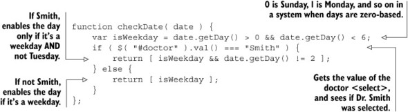
then, use this function as the beforeShowDay function:
$( "input" ).datepicker({
    beforeShowDay: checkDate
});
This creates the behavior you desire, but there’s one issue: if the user manually types in a date or changes the doctor, the form could be submitted with an invalid value. You need to validate that the user selected a correct date on submission, and datepicker has the tools to do that.
Tip
You can also use the minDate and maxDate options to customize which dates are available. In your appointment example, a minDate of 0 would prevent users from selecting dates in the past; a minDate of 2 would force the user to pick an appointment at least two days into the future. For details on the data types these options accept, see http://api.jqueryui.com/datepicker/#option-minDate and http://api.jqueryui.com/datepicker/#option-maxDate.
Datepicker is the most customizable widget of jQuery UI, with a daunting 50 options. Don’t worry about knowing all them, or even a small fraction of them. Most are for specific use cases that you’ll likely never need. In fact, it’s quite common to have datepickers in production that don’t set any options at all. The following figure shows common options you may want to experiment with.

A datepicker with a variety of options set to customize the display. You may want to experiment with these options for the datepickers you need in your applications.
3.5.1. Parsing and formatting dates
Although JavaScript has a native Date object built in, it doesn’t tackle one common problem: converting Date objects to strings and strings to Date objects. This is a tricky problem when you consider the solution has to handle leap years, the number of days in each month, and the many formats in which dates can be displayed.
For your appointment field you need to determine whether the string in the <input> represents a valid date. To do this, you use two of datepicker’s utility functions to convert dates to strings and vice versa—$.datepicker.formatDate()and $.datepicker.parseDate().
Note
Utility functions can be invoked without being tied to an instance of the widget. You don’t have to create a datepicker to use $.datepicker.formatDate() and $.datepicker.parseDate(); you just call them.
The first parameter each of these functions takes is a string that specifies the format of the date. Here are the common ones:
- d —Day of the month with no leading zeros
- dd —Day of the month, always two digits
- D —Short day name (Mon, Tue, Wed)
- DD —Long day name (Monday, Tuesday, Wednesday)
- o —Day number of the year (no leading zeros)
- oo —Day number of the year (always three digits)
- m —Month of the year with no leading zeros
- mm —Month of the year, always two digits
- M —Short month name (Jan, Feb, Mar)
- MM —Long month name (January, February, March)
- y —Two-digit year
- yy —Four-digit year
Note
These same formats can be passed to the dateFormat option to configure the format of the user-selected date in its associated <input>.
Let’s start with $.datepicker.formatDate, which converts Date objects to strings. The following listing shows how the same date can be displayed in multiple formats using formatDate().
Listing 3.5. Formatting dates with formatDate()

See how easy it is to output dates in a variety of formats? Also notice that characters in the format strings that aren’t recognized are transferred to the output string directly—for example, the commas, slashes, and dashes. One warning: if you want to include characters in your formatted date that are also special formatting characters, you need to quote them. Suppose you wanted to output the day number of the year. You might try
$.datepicker.formatDate( "Day o of yy", new Date( 2014, 0, 2 ) );
but this unexpectedly outputs "Thua14 2 2f 2014", because the "D" in "Day" and "o" in "of" are interpreted as formatting characters. The following code outputs the expected "Day 2 of 2014":
$.datepicker.formatDate( "'Day' o 'o'f yy", new Date( 2014, 0, 2 ) );
formatDate() converts Date objects to strings, but parseDate() does the opposite: it converts strings back to Date objects. All these statements return a Date object representing January 2, 2014:
$.datepicker.parseDate( "d / m / y", "2 / 1 / 14" );
$.datepicker.parseDate( "dd / mm / yy", "02 / 01 / 2014 " );
$.datepicker.parseDate( "dd-mm-yy", "02-01-2014" );
$.datepicker.parseDate( "D M d, yy", "Thu Jan 2, 2014" );
$.datepicker.parseDate( "DD M d, yy", "Thursday Jan 2, 2014" );
$.datepicker.parseDate( "DD MM d, yy", "Thursday January 2, 2014" );
parseDate() throws an exception if the string can’t be parsed into a valid Date object, making it perfect for determining whether user-inputted values are valid dates. The following function determines the validity of a date:

That’s it. You don’t need to manually check for leap years or the number of days in September. You can use this approach to validate the date in your appointment form. This is shown in the following code:
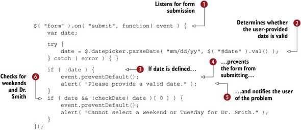
You attach a submit event listener to your appointment form , then call parseDate with the user-provided date in a try/catch block . If the date can be parsed, it’s assigned to the date variable. If the date can’t be parsed, date remains undefined and you go to the conditional . If you have an error, you prevent the default event action (submission of the form) , and then display an error to the user . Finally, you use the checkDate() function you created earlier to ensure that the user didn’t select Dr. Smith on Tuesday, or a day on the weekend .
Tip
Although alert() works well for examples, in a production application you should display text error messages on the screen and highlight inputs that have errors. Not only do these best practices make your form look more professional, they also make it significantly more usable. Currently, when you close the alert, you have no way of knowing what the problem is. You’ll dig deeper into form validation when you build a more complex example in chapter 11.
Although parsing and formatting dates are tricky problems, you have one final problem to tackle: globalization.
Datepicker is some of the oldest code in jQuery UI and therefore doesn’t follow some of the modern conventions used by the library. It is the only widget in jQuery UI that isn’t built with the widget factory. Not to worry; a lot of work has been done to mimic the widget factory’s APIs so that datepicker works like the other widgets of jQuery UI.
One difference is that datepicker has no events. It does, however, have five callbacks that can be specified as options: beforeShow, beforeShowDay, onChangeMonthYear, onClose, and onSelect. Because these are options and not events, this works
$( "#datepicker" ).datepicker({ onClose: function() {} });
but this doesn’t:
$( "#datepicker" ).datepicker().on( "datepickeronclose", function() {} );
3.5.2. Handling date globalization
Collecting dates from users of varied languages and cultures is a difficult task. You need to use different words for the days of the month and the months of the years, but you also need to deal with the structure of the date. Should the month or the day be displayed first? Does the culture read from left to right or right to left?
Although you need to handle only English and Spanish in your form, the jQuery UI datepicker handles 70+ locales. A few of these locales are shown in figure 3.9.
Figure 3.9. The jQuery UI datepicker widget supports over 70 different locales. This figure shows three: French, Hebrew, and Japanese (left to right).

The datepicker widget stores locale information in $.datepicker.regional: an array of locale information indexed by language code. $.datepicker.regional [ "fr" ] and $.datepicker.regional[ "ja" ] contain the information needed to build the datepicker for the French and Japanese languages, respectively. The default locale is English and is stored at $.datepicker.regional[ "" ].
You can set the locale for a datepicker in multiple ways. At datepicker initialization you can pass the locale information to the plugin. The following code creates a datepicker using the French locale:
$( "#datepicker" ).datepicker( $.datepicker.regional[ "fr" ] );
Additionally, you can call the option()method to change the datepicker’s locale after initialization. The following example changes the datepicker’s locale to Japanese:
$( "#datepicker" ).datepicker( "option", $.datepicker.regional[ "ja" ] );
Datepicker provides a setDefaults()utility function to set the default values all future datepickers should use. You can use this function to default all datepickers to a given locale, such as defaulting all datepickers to the Hebrew locale:
$.datepicker.setDefaults( $.datepicker.regional[ "he" ] );
Due to file size considerations, the locale information that datepicker needs to build locale pickers isn’t packaged in the main jQuery UI CDN file and has to be imported separately. If you download the jQuery UI zip archive from https://github.com/jquery/jquery-ui/releases, the locale information is in the ui/i18n folder (ui/i18n/datepicker-fr.js, for example, contains French locale data).
Note
i18n stands for internationalization and a11y stands for accessibility. These terms have become common because “internationalization” and “accessibility” are painful to type.
Let’s bring this back to your example. The following code takes your language radio buttons and updates them to change the locale of the datepicker in a change event:

You first import the Spanish locale data . This line assumes you have jQuery UI accessible in a scripts folder in the same directory as the HTML for the example. (Remember that the locale data is not available on the jQuery CDN.)
Then you attach a change event to the language buttonset’s radio buttons ; it’s invoked whenever the selected radio button changes. You call the option() method to change the locale to the selected value . Outside of the change event, you create the datepicker widget and set the default locale to English .
This concludes our whirlwind tour of the datepicker widget. Because datepicker has a ton of options, it may be helpful to peruse its API documentation at http://api.jqueryui.com/datepicker/ to see some other things that are possible. Next, we’ll look at the final widget for your form: spinner.
3.6. Spinner: enhancing native <input> elements to collect numeric data
Like dates, numbers are another common piece of information to collect from users. Normal text inputs offer little control over the data that users input. What’s the maximum value allowed? The minimum? How do you handle more complex values like decimals and currency?
The spinner widget solves these problems by providing an easy way for users to input numbers in any format. You’ll use the spinner to build the last field in your form: an input to collect the number of days the user has been sick.
To create spinner widgets, select <input> elements and invoke the widget’s plugin. The following code shows this:
<input id="spinner" value="1">
<script>
    $( "#spinner" ).spinner();
</script>
The display of this spinner is shown in figure 3.10.
Figure 3.10. The spinner widget adds two buttons that allow the user to increment and decrement the value of an <input>.

The spinner widget has two controls to increase and decrease the value of the spinner by one step. When the <input> has focus, the user can additionally use the up and down arrow keys to do the same.
The default step value of spinner controls is 1. In figure 3.10 if the user clicks the up arrow the value changes from 1 to 2. But this step value can be changed with the step option. The following example creates a spinner that steps by values of 10:
<input id="spinner">
<script>
    $( "#spinner" ).spinner({ step: 10 });
</script>
Now the user can choose values of 0, 10, 20, 30, and so forth. But the user can also choose values of -10, -20, and so on. To cap the range of a spinner, the widget provides min and max options. The following spinner allows the user to select multiples of 10 from 0 to 100:
<input id="spinner">
<script>
    $( "#spinner" ).spinner({
        min: 0,
        max: 100,
        step: 10
    });
</script>
The HTML5 specification added min, max, and step as valid HTML attributes, and the spinner widget uses them if they’re present. You can declaratively specify the min, max, and step options in HTML rather than passing them to the plugin:
<input id="spinner" min="0" max="100" step="10">
<script>
    $( "#spinner" ).spinner();
</script>
Warning
If min, max, and step are specified as both attributes and options, the option values will be used. Make sure you only use one for clarity.
To create a spinner for your number-of-days-sick control, you only need to prevent the user from picking numbers less than one:
<label for="days">Number of Days Sick:</label>
<input type="text" id="days" name="days">
<script>
    $( "#days" ).spinner({ min: 1 });
</script>
But, like datepicker, the user can still submit any value for this field—including negative numbers, fractional numbers, and alphabetic characters. To prevent this, let’s add another check to your submit event handler:

You call spinner’s isValid() method to determine the validity of the spinner’s value. The method checks that the value is a valid number that adheres to the
widget’s min, max, and step constraints.
You now have a complete number picker to use in your form. The spinner has more to offer, including support for decimal, currency, and time pickers in over 350 cultures. We’ll cover those in appendix D.
3.7. Completing the appointment form
You’ve made it through all the pieces of the appointment form, so let’s see how it all comes together. The source of the form is shown in listing 3.6.
Note
The full example is available at http://jsfiddle.net/tj_vantoll/Dt8pW/.
Listing 3.6. The complete appointment form


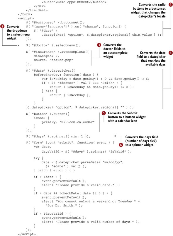
Converting the language <input type="radio"> controls to a buttonset overcomes the impossibility of styling native radio buttons with a themeable control.
Converting the doctor <select> to a selectmenu overcomes the difficulties of styling the native element. You have a themeable and customizable control that matches the
other elements in the form and groups the options.
Converting the insurance company <input> to an autocomplete presents users with a list of potential insurance companies after they type. This is helpful for users who may not remember
the name of their company or know what options are available. It also helps server load, because you only look up options
as you need to.
Converting the date <input> to a datepicker gives the user a calendar control to select a date from. You also restrict the available appointment days and change the
locale based on the user’s language.
Converting the submit <button> to a button widget gives a button that looks the same as the rest of the form controls with an easily customizable icon.
Converting the sick days <input> to a spinner gives the user buttons and keyboard shortcuts to increment and decrement the value of the <input>. By setting the min to 1, you indicate to the user that you’re looking for a positive value.
But wait, don’t you have two requirements left?
- All controls in the form should match the current website’s black and white color scheme.
- The form should work in all browsers.
Because you built the form with jQuery UI, these last two requirements have taken care of themselves. All widgets in the form conform to the jQuery UI theming framework; therefore, changing the form’s theme is a matter of changing the style sheet imported. This is great for pesky clients who say they want a black-and-white form, but suddenly have a thing for green the next day. You’ll look at the specifics of swapping out themes in chapter 7.
What about browser support? As you saw in chapter 1, jQuery UI supports all modern browsers as well as Internet Explorer 7 and above. But this client said they wanted “all” browsers. You’re in luck. This form works everywhere because of the progressive enhancement approach jQuery UI takes for building widgets.
The initial HTML is a functional form that works fine without JavaScript. If JavaScript fails because of an authoring error, if the user has JavaScript disabled, or if the user is using a relic of the past like Internet Explorer 5.5, the form still works. If JavaScript is enabled and functioning, the form is enhanced with more functional controls that are easier on the eyes.
Now that you’ve seen how to build an appointment form using jQuery UI widgets, let’s look at how these widgets compare to the controls in HTML5.
3.8. HTML5 elements vs. jQuery UI widgets
The HTML5 specification added several components to the HTML platform that were inspired by JavaScript libraries such as jQuery UI. This includes new elements like <progress> and <datalist>, as well as a slew of new input types: color, date, datetime, datetime-local, email, month, number, range, search, tel, time, url, and week. Because the specification was inspired by JavaScript libraries, the functionality of the new native controls and libraries overlap—both <input type="date"> and the datepicker widget can be used to collect a date from the user.
What’s a web developer to do? We’ll focus on two of the elements from your appointment form—the datepicker and the number picker—and discuss the pros and cons of using the HTML5 control versus the jQuery UI widget. Although this doesn’t provide a comprehensive overview of all HTML5 elements and jQuery UI widgets, the arguments for and against each is similar with each of these controls.
Here is the HTML that you turned into datepicker and spinner widgets:
<label for="date">Date:</label>
<input type="text" name="date" id="date">

<label for="days">Number of Days Sick:</label>
<input type="text" id="days" name="days">
The equivalent elements from the HTML5 specification are <input type="date"> and <input type="number">. Let’s swap in the HTML5 controls by changing the type of the <input> elements:
<label for="date">Date:</label>
<input type="date" name="date" id="date">

<label for="days">Number of Days Sick:</label>
<input type="number" id="days" name="days">
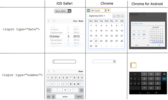
That’s it. The main appeal of the HTML5 controls is that they’re simple to use and dependency free. Another advantage is that the browser determines how input is presented to the user. Why is this a big deal? Check out figure 3.11, which shows the display of <input type="date"> and <input type="number"> on various platforms.
Figure 3.11. The display of HTML5 date and number inputs on iOS Safari, Chrome, and Chrome for Android. Notice how the two mobile browsers—iOS Safari and Chrome for Android—optimize the UI to make it easy to input values.
Tip
On iOS Safari, you can use a keyboard that only shows numbers 0–9 by including a pattern attribute set to "[0-9]*"—that is, <input type="number" pattern="[0-9]*">.
Note the highly customized keyboard display used on the mobile browsers. These controls are optimized to make it easy for users to input data quickly. With all this power, why are you reading a chapter on jQuery UI form widgets?
As it turns out, along with the advantages of HTML5 form controls, there are also some serious (and usually show-stopping) disadvantages. For one, although giving the browser the ability to control how the input is displayed leads to the custom mobile inputs, it also means that you have little to no control over the display on desktop browsers. Need to change the spacing in the calendar? It’s not possible. Need to change the colors to match your application’s look and feel? That’s not possible either.
The second major disadvantage of the native controls is that they only handle basic use cases. Need to collect a date from the user? The native control can do that. Need to disable days, show multiple months, or show the picker on the click of an icon? You’re out of luck.
The third major disadvantage of the native controls is browser support. As of this writing, <input type="date"> isn’t supported in Internet Explorer (any version), Firefox, Safari, or the default Android browser. <input type="number isn’t supported in Internet Explorer, and isn’t fully implemented in Android or iOS Safari (no min, max, or step attribute support). Therefore, unless you’re writing the rare web application that only has to work on one platform, you’re going to run into issues using these new elements.
To conclude, the major advantages of the HTML5 controls are
- They’re easy to use.
- They’re dependency free.
- The browser controls how data is inputted (helpful mobile UIs).
The main detriments are
- You have little control over the display.
- They handle only trivial use cases.
- Limited browser support.
Although we’ve addressed only a few of the many form controls of HTML5, the same arguments hold true for the others; the only real difference is that some HTML5 features are better supported by browsers than others.
For the vast majority of applications, the native controls aren’t a viable option yet due to their limited support and functionality. But you have one additional option. If you have a basic use case, and your only problem is browser support, you can use jQuery UI to polyfill the native functionality. We’ll discuss this, and a number of additional HTML5 elements, in chapter 11 and appendix F.
3.9. Summary
The jQuery UI form widgets assist with the complex task of building modern web forms. Specifically, they
- Provide accessible replacements for elements that are nearly impossible to style, such as dropdowns and radio buttons
- Add functionality that is not natively available on the web, such as robust calendar controls and server-backed autocompletes
- Apply a consistent and configurable theme
- Are accessible to all users—even users on assistive technologies such as screen readers
- Work in IE versions 7+ and all modern browsers
- Take a progressive enhancement approach, so that even users in unsupported browsers get a functional form
HTML5 includes a number of controls with functionality that overlaps that of the jQuery UI form widgets. The new controls are easy to use and great for input on mobile devices, but they’re not customizable and suffer from limited browser support. You’ll look more at how to practically use these HTML5 controls in chapter 11.
jQuery UI has widgets for more than form building. Next, you’ll look at the layout and utility widgets included in the library.