
Chapter 6. Creating rich animations with effects
This chapter covers
- Building animations with effects
- Using effects in the jQuery UI widgets
- Animating CSS class name changes
jQuery UI includes 15 built-in animations, that provide ways to show and hide elements, draw the user’s attention to elements, or add visual appeal to your UIs. These effects stand on their own with the effect()method, tie into existing widgets such as dialog, and work with jQuery Core methods such as show() and hide(). But it doesn’t stop there. jQuery UI also adds powerful abilities to animate CSS class name changes, transition between colors, and a whole lot more.
The jQuery UI effects are so powerful they’ve helped inspire changes made to the CSS specification, and you can now perform transitions and animations directly in CSS. At the end of this chapter, you’ll explore what you can do with CSS directly, and compare that to the APIs in jQuery UI.
It’s important to note that just because jQuery UI lets you make an element explode into 50 pieces over 10 seconds (yes, you can do that), it doesn’t mean that you should. As we go through this chapter, we’ll discuss where these effects make sense for practical use.
Let’s get started with the core method of the jQuery UI effects: effect().
6.1. Using effects and the effect() method
The most common—and easiest—way to run the jQuery UI effects is through the effect() plugin method. In its simplest form, you pass the effect() plugin the name of the effect to use. The following code shakes a blue box:
<style>
    div {
        background: blue;
        height: 100px;
        width: 100px;
    }
</style>
<div></div>
<script>
    $( "div" ).effect( "shake" );
</script>
What effects are there? As of jQuery 1.11, the following 15 effects are available:
|
|
|
|
|
As with widgets, each effect has detailed API documentation on how the effect is used and the available configurations. The URL to use is http://api.jqueryui.com/{NAME}-effect/. For example, http://api.jqueryui.com/shake-effect/ takes you to the API documentation for the shake effect and is shown in figure 6.1.
Figure 6.1. The API documentation for each jQuery UI effect lists the options that can be used to configure the animation. For the shake effect (shown here), you can configure the direction of the shake, the distance to shake, and the number of times to shake.
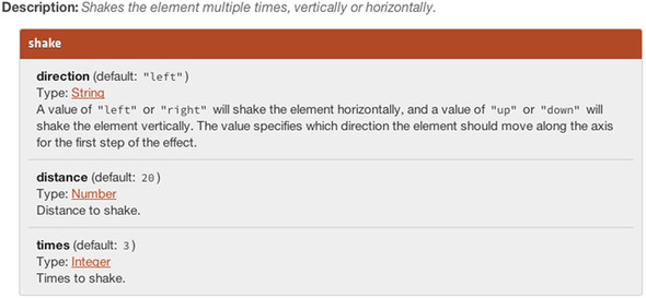
The values listed in bold—direction, distance, and times—are options that configure the effect. To pass these options, provide them as objects as the second argument to effect(). The following code alters the previous example to shake the blue box 10 times over a distance of 100 pixels:
$( "div" ).effect( "shake", {
    times: 10,
    distance: 100
});
If you test this example, the effect runs so fast that it looks like a blur. This is because the next parameter of effect()—duration—defaults to 400 milliseconds, which isn’t nearly enough time to shake a box 10 times. The following code increases the duration to 3 full seconds:

Now your animation has plenty of time to do its shaking. The final argument of the effect() plugin is a function that runs as a callback when the animation completes. The following code adds a callback to your example that makes the box red after the shaking finishes:
$( "div" ).effect( "shake", {
    times: 10,
    distance: 100
}, 3000, function() {
    $( this ).css( "background", "red" );
});
Although this is powerful, the API is starting to feel messy; the previous code certainly isn’t clear to read. Because of this, the effect() plugin offers an alternative signature in which all arguments are passed as a single object. The following code alters your example to use the object signature:

Take note of two changes here. First, the name of the effect to use is passed as an effect property  . This is the only required property when using the effect() object signature. The other change is the properties that apply only to the shake effect (times and distance) are no longer in a separate “options” argument; they’re included directly in the object passed to effect().
The object form of effect() takes one additional property we haven’t discussed: an easing.
6.1.1. Customizing effects with easings
What are easings? An easing is a function that dictates the rate at which an animation progresses. jQuery Core includes two of them: linear and swing. The linear easing runs the entire animation at a constant pace, and the swing easing starts the animation slowly and speeds up toward the end. The swing easing is the default easing used in both jQuery Core and jQuery UI. A full list of easings in jQuery UI can be found at http://api.jqueryui.com/easings/ and is shown in figure 6.2.
Figure 6.2. A list of the easings provided by jQuery UI from http://api.jqueryui.com/easings/. Each graph plots the progress of the animation (the y-axis) against time (the x-axis). Clicking on each graph runs an animation with the corresponding easing. If you’re having trouble understanding easings, it’s worth taking a minute to run these; easings are far easier to understand visually.

Each graph in figure 6.2 plots the progression of the animation (the y-axis) against time (the x-axis). The linear easing is the easiest to understand as the rate of the animation remains constant throughout. Some easings—such as easeOutElastic—run the animation beyond its final value before the animation completes. Although these easings offer plenty of options, why would you want to use any of them?
To answer, let’s look at a few examples. The following code uses the jQuery UI explode effect to split a green box into four pieces over 5 seconds:
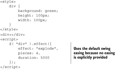
Although this effect is cool, the default easing—swing—doesn’t provide the ideal, realistic exploding experience. And if you’re going to make an element explode, you may as well do it right.
What would be better is an easing that starts off slow, and then builds to a fast finish. If you look at figure 6.2, you see a few easings that meet this criterion, but the best choice looks to be easeInExpo. To use this easing, include it as a property on the object passed to effect(), as shown in the following code:
$( "div" ).effect({
    effect: "explode",
    easing: "easeInExpo",
    pieces: 4,
    duration: 5000
});
Easings are a nice way of configuring any animation to meet your needs, and they’re not used only in the effect() method. You can use these easings with any of the jQuery Core animation methods: animate(), hide(), fadeIn(), fadeOut(), fadeToggle(), hide(), show(), slideDown(), slideToggle(), slideUp(), and toggle().
Suppose you need to move an element in your interface from one side of the screen to the other over 1 second:

This works, but is rather boring. Let’s liven it up with animation using the easeOut-Elastic easing (the third argument to animate()is an easing):
$( "div" ).animate({
    left: $( window ).width() - 100
}, 1000, "easeOutElastic" );
It’s worth running this example to see how changing the easing can have a great effect. By using an easeOutElastic easing, the box swings out past its final value, then gradually settles back into it.
Why do this? By changing the easing, you create a more lively animation that’s more fun and more engaging for users. And you can do this by playing with a few property names—no math required!
Next, let’s look at another practical use of effects: making visual associations.
6.1.2. Making visual associations with the transfer effect
The interfaces you build on the web today are increasingly complex, and it can be difficult for users to learn how the various controls work. One of the jQuery UI effects, transfer, lets you assist users with an easy-to-use animation. Consider the grocery list builder application shown in figure 6.3.
Figure 6.3. A small application that builds grocery lists. You will use the transfer effect to help the user associate the Add Groceries form with the Grocery List.
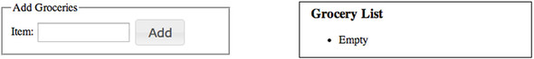
From the screenshot, this UI seems easy to use. When you click the Add button, the grocery item is added to the list. But suppose this functionality were integrated in a more complicated example—such as a site that additionally manages coupons or personal expenses. In this type of situation—when more information is on the screen—users may not instantly recognize where the grocery list is after they add items. The user may be confused about what the application is doing.
Using the transfer effect, you help users make this association. The effect works by transferring the outline of one element to another. As it’s easier to see this visually, figure 6.4 shows the effect you’ll add.
Figure 6.4. Progression of the transfer effect to associate the form with the grocery list

The code to build this is shown in the following listing. Some of the visual styling has been removed to keep this example succinct. The full source is available in the book’s code samples or online at http://jsfiddle.net/tj_vantoll/7HQDK/.
Listing 6.1. A grocery list builder that uses the transfer effect


You start by applying a dotted border to the ui-effects-transfer CSS class name . The transfer effect creates and animates this element, but it leaves the styling up to you. The CSS you apply creates the
look of the dotted box shown in figure 6.5.
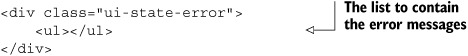
Figure 6.5. The contact form you built in chapter 3 with a formatted list of error messages. You’ll use the jQuery UI shake effect to draw the user’s eyes to these messages.

Next, in your HTML, you have a form for the user to add items and a list to display those items in. In JavaScript, you listen
for the form to be submitted, select the <input> in the form, and perform a transfer effect on it  . The transfer effect takes a required to property that determines an element that the selected element’s outline is transferred to. You set the to property to "#grocery-list ul"
  , which tells the transfer effect to animate an outline from the <input> to the grocery list’s <ul> element.
When the animation completes, you add the new item to the list and empty the contents of the <input>  .
.
The example showcases how you can use effects to teach users how an interface works. Instead of assuming users knows where the cart is, you use a transfer effect to draw their eyes in that direction.
Although these types of effects can be powerful, they can also annoy users if used excessively. As a future enhancement of this form you might consider performing the animation only on the first one or two additions to the list. After this, the effect is no longer useful, and may annoy power users who just want to build a grocery list.
In the next section, we’ll continue to look at practical applications of the jQuery UI effects. This time, instead of looking at the effect() method, we’ll look at how effects tie into familiar methods from jQuery Core.
6.2. Animating visibility changes
One of the most common tasks performed by JavaScript in the browser is showing and hiding elements. In jQuery Core this is done using three methods: show(), hide(), and toggle(). jQuery UI enhances these same APIs with the ability to use the effects and easings you saw in the previous section.
The enhanced APIs for show(), hide(), and toggle() work almost exactly like the effect() method. As with the transfer effect, this is easier to see in an example.
6.2.1. Building form validation messages
Let’s return to the appointment form you built in chapter 3. Recall that you had a few errors that the user could run into—specifically, invalid dates and numbers. In chapter 3, you used alerts to show these errors, which isn’t user friendly. Let’s build a more robust means of displaying these errors in a list, and use effects to show the list at the appropriate times. The list you’ll build is shown in figure 6.5.
As the form from chapter 3 is lengthy, we won’t dig back into the full source here. You can view the final state of this example at http://jsfiddle.net/tj_vantoll/Rc4J2/ to follow along. To implement an error box for this form, you add the following HTML:
You place this <div> in the appointment <form>, and set its display to none so the user doesn’t see the error box by default:
.ui-state-error { display: none; }
Tip
The ui-state-error class name applies all the styling for the “Please provide...” box in figure 6.5; no custom CSS is used. This is one of the many class names that the jQuery UI CSS framework provides. You can view a full list at http://api.jqueryui.com/theming/css-framework/, and we’ll discuss these class names when we talk about themes in chapter 7.
Now that you have a box, you have to fill it with error messages. Let’s define a handle-Errors function for managing error messages. handleErrors accepts an array of error messages—[], [ "Invalid date." ], and so on—and figures out how to display them appropriately. An implementation of this function is shown in the following code:

You start by getting a reference to the error container and list . You hide the container and empty the list to return each element to its initial state. Next, because you don’t want to show
the error box with no errors in it, you check whether you received an empty errors array . If so, there’s nothing more to do, and you return.
If you did get errors, you have to display them, so you create a new <li> for each message and add it to the list .
The last thing you do is show the error box, and you use the jQuery UI version of the show()method to do it  . The arguments you pass to show() may look familiar as they’re the same ones that the effect()method accepts. The first argument is the name of the effect, the second is the effect-specific options, and the third is
the duration to use. The fourth argument to show() is a function to run when the animation finishes, but you don’t need to use it here.
. The arguments you pass to show() may look familiar as they’re the same ones that the effect()method accepts. The first argument is the name of the effect, the second is the effect-specific options, and the third is
the duration to use. The fourth argument to show() is a function to run when the animation finishes, but you don’t need to use it here.
Like effect(), the show() method accepts a single object as an argument. The same call to show() could be written as follows:
container.show({
    effect: "shake",
    times: 2,
    duration: 100
});
Although the effects tie into many of jQuery UI and jQuery Core APIs, they use the same consistent API. You haven’t specifically looked at how hide() and toggle() work because the API is identical. The following code hides the same container using the shake effect
container.hide( "shake", { times: 2 }, 100 );
and the following toggles it (shows it if it’s hidden, hides it if it’s visible):
container.toggle( "shake", { times: 2 }, 100 );
Why use an effect? Isn’t it easier to show and hide the error box without any effects?
This example demonstrates the same use of effects you saw in the previous section: drawing the user’s eyes. Have you been frustrated when you attempt to submit a web form? This is a common occurrence, and it’s often because forms don’t make error messages obvious to the user. It helps to use a bright color such as red, but often it’s not enough. By using a shake effect, you attempt to make the error messages more obvious by drawing the user’s eyes to them on each failed submission.
Although making form validation messages visually stand out improves the usability of your form, the messages aren’t announced to screen readers; blind users have no idea there was an issue.
After an invalid form submission, a more robust implementation would move focus to the first invalid field, and give it an aria-invalid attribute set to true. The implementation would also place the error message in an alternative DOM element, and link the message element to the invalid form element using the aria-describedby attribute. If the date were the only invalid field, you could do that with the following code:
$( "#date" )
    .attr( "aria-invalid", true )
    .after( "<span id='message'>Please provide a valid date.</span>" )
    .attr( "aria-describedby", "message" )
    .focus();
You’ll look at how to implement accessible form validation when you build a more complex form in chapter 11.
To show another use of the jQuery UI effects with the jQuery Core visibility methods, let’s look at one more example.
6.2.2. Building portlets with jQuery UI
Portlets are web UI elements that are made to look like desktop application windows. Like desktop windows, most portlets can be dragged, minimized, and maximized. Portlets frequently appear in large web portals and can be used to display anything from static content to highly dynamic content such as weather reports or sports scores.
Let’s look at how you create portlets using jQuery UI. Figure 6.6 shows an example of the portlets you’ll build.
Figure 6.6. Three portlets, or web UI elements made to look like desktop windows, built using jQuery UI. The user can expand or collapse the content of each portlet using the icon in the top-right corner.

The following listing shows the implementation of these portlet controls. The listing only includes the HTML for one portlet window and omits the CSS. The full demo shown in figure 6.7 is available at http://jsfiddle.net/tj_vantoll/5caqN/.
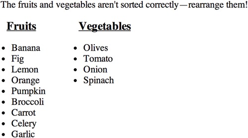
Figure 6.7. The fruit and vegetable game you built in chapter 5. Notice that the instructions are not especially noticeable—a user can easily miss them.
Listing 6.2. Implementation of portlet controls


Note
Confused about the ui-* class names being used here? Don’t worry, we’ll cover what each of these do when we talk about the jQuery UI CSS framework in chapter 7.
You start by making each portlet draggable and set two options: handle and stack . The handle option controls which portion of a draggable the user can initiate a drag from. Because you want to allow users to drag a
portlet only by its header, you set handle to a CSS class name that matches it. The stack option manages the CSS z-index property of draggables so that the currently dragged item is always brought to the front. If you didn’t use this, and the
user were to drag a second portlet on top of the first, the second would appear behind the first.
Now that the portlets are draggable, you have to make them collapsible. To do this, you convert their header buttons to button
widgets and attach a click event handler to them . Inside the handler, you first change the clicked button’s options such that its icon is switched from plus to minus (or
vice versa), and its label is changed from maximize to minimize (or vice versa) . Why do you bother updating the label option—which is the button’s text—for a button with no visible text? Even though the text is invisible, jQuery UI ensures
that it remains accessible to assistive technologies such as screen readers. The library also places the text in the button’s
title attribute, so even sighted users see the text when they hover over the button. It’s very important to keep this text up to
date, even though it doesn’t visually appear within the button.
After this, you get a reference to the clicked button’s associated content and toggle it using the blind effect . The blind effect shows and hides an element by altering its height vertically or horizontally, much like an accordion widget.
Using this effect helps to mimic the desktop behavior of minimizing windows. Also, the animation helps tell the user that
the content is being collapsed, and not being removed completely. To ensure this animation doesn’t get in the user’s way,
you set the duration to a quick 200 milliseconds.
Note
In addition to changing an element’s height, the blind effect uses the CSS overflow property to prevent the browser from repositioning the element’s text as its height changes—producing a smoother animation. As such, the blind effect works well on elements that contain text.
And that’s all it takes to build portlet controls using jQuery UI. As the API to create these effects is so simple, it’s easy to experiment with different effects and easings to customize the experience. Try using the explode or pulsate effects on this example for a little fun.
To continue our look at how effects tie into existing APIs, let’s look at how you can use them directly in the jQuery UI widgets.
6.3. Using effects with the jQuery UI widgets
If you’ve perused the jQuery UI API documentation, you may have noticed that some widgets—specifically dialog, tabs, and tooltip—have show and hide options that use the jQuery UI effects. These options give you an easy way to configure how these widgets are shown and hidden. The values they accept are similar to the arguments you invoked show(), hide(), and toggle() with, but with a few differences.
6.3.1. The show and hide options
To explore these, let’s use the dialog widget as an example. By default, the dialog widget uses no animations when it opens and closes. Internally, this is because its show and hide options are set to null. Like all effect-based methods, you can pass an effect name for these two options. The following code opens a dialog with the puff effect and closes it with the blind effect:
$( "<div>" ).dialog({
    show: "puff",
    hide: "blind"
});
Similar to other effect methods, you can pass an object with the full configuration of the effect. The following code uses objects for show and hide:

You can see that the syntax here is the same as the object you can pass to effect(), show(), hide(), and toggle(). The dialog opens with a puff effect over 3 seconds with a linear easing. The dialog closes with a blind effect, the default duration (400), and the default easing ("swing").
Thus far, the show and hide options have used the exact same syntax you’ve already seen. So what’s different? Unlike the effect methods—effect(), show(), hide(), and toggle()—the show and hide options offer Boolean and number shorthand.
The Boolean shorthand determines whether a preconfigured animation should be used. If set to true, the widget uses the jQuery Core fadeIn()or fadeOut()methods (for show or hide, respectively) with the default duration and easing.
The number shorthand determines the duration to use for the animation. It also uses fadeIn() or fadeOut() and the default easing.
The following example creates a dialog that uses each of these shorthands. It opens with a fade-in animation over the default 400 milliseconds and closes with a fade-out animation over a full second:
$( "<div>" ).dialog({
    show: true,
    hide: 1000
});
The Boolean and number shorthand for these options are provided because they’re the most common animations used. Setting show and hide to true is a way to use a small animation to improve the visual appeal of your widgets. But if this is the case, why might you want to use the more advanced options? Let’s look at an example where they make sense.
Note
Although we didn’t specifically look at the tabs and tooltip widgets, the configuration for the show and hide options is identical. In fact, the implementation of these options is in the widget factory directly. You can use these options and effects in custom-built widgets. We’ll start looking into custom widgets in chapter 8.
6.3.2. Showing a message in a dialog
To show more advanced options in actions, let’s return to the fruit and vegetable sorting example you built in the previous chapter. To help you remember the game, an image of it is shown in figure 6.7.
In your implementation of the game, we didn’t discuss the instructions, which are a sentence located above the game itself. The current instructions have one problem: they don’t stand out in any way; therefore, users can easily miss them. Although you could make the instructions stand out visually—with bright colors or a bigger font size—that would distract the user during the game itself. Let’s try a different approach: showing the instructions in a dialog.
The HTML for the instructions is a paragraph tag:
<p>The fruit and vegetables aren't sorted correctly—rearrange them!</p>
You’ll start by converting this paragraph to a dialog as the first thing in your game’s JavaScript:
$( "p" ).dialog();
The display of this dialog is shown in figure 6.8.
Figure 6.8. Showing the instructions for the game pulls them out of the main content and makes them stand out to the user.

Although this does make the instructions stand out, several things aren’t ideal here:
- The user can interact with the game while the dialog is still open.
- The user can only close the dialog using a small 20-pixel-wide close button.
- The user sees this dialog every time a new game starts. You want users to see the dialog only once.
Let’s add effects and options to your dialog to improve the user experience. The next listing shows an updated dialog.
Note
You can view the updated game at http://jsfiddle.net/tj_vantoll/MaKKX/. Note that the sessionStorage check is commented out because it makes the example difficult to test. You can uncomment the check to see its effect.
Listing 6.3. A message dialog with instructions

You start with a check to make sure that the user hasn’t already seen the message . We’ll discuss how this works momentarily.
Next, you create your dialog with several more options set. First, you define a scale effect to use when showing and hiding the dialog. Using a scale effect when displaying the dialog makes it jump out and grab the user’s attention. To make the
dialog stand out even more, you use an easeOutElastic easing, which runs the first part of the animation quickly.
When the dialog closes, you also use the scale effect. The goal here is slightly different than when you opened the dialog. Because the scale effect shrinks the dialog to hide it, it draws the user’s eyes in the direction of the game, which is where the user should look after reading the instructions. You set the duration to a tiny 100 milliseconds to get the dialog out of the way of the game quickly.
After this, you set the modal option to true to prevent the user from interacting with the game until the dialog is closed. Modal dialogs place a semitransparent overlay
over the content behind the dialog while it’s displayed. Because the overlay grays out the game a bit, this is yet another
technique for grabbing the user’s attention.
Next, you set the buttons option to create an OK button that allows the user to close the dialog . This gives the user a far bigger target to close the dialog with, which is important on small screens such as mobile devices.
As a last step, you specify a close event callback that sets a "messageViewed" variable in sessionStorage  . How does sessionStorage work?
You may recall from earlier chapters that localStorage is a means of storing key-value pairs in the browser. sessionStorage and localStorage share an identical API and behave the same way, with one important difference: localStorage is persisted indefinitely, but sessionStorage is only persisted for the user’s session. After the user closes the browser, or the page’s tab, sessionStorage is emptied. If you open the game, close the instructions, and refresh the page, you don’t see the instructions again. But if you open the game in a new tab, you do.
sessionStorage makes sense for your example because, although you don’t want the user to see the instructions on subsequent plays of your game, you do want the user to see them when returning to the game the next day, or next month.
The updated version of your dialog is shown in figure 6.9.
Figure 6.9. The updated version of the instructions dialog does two things to draw the user’s attention: it uses an effect to jump off the page, and it uses a modal dialog to gray out the rest of the content. This dialog includes an OK button, which makes it easy for the user to close the dialog to get to the game.

This example shows how the jQuery UI effects can be used in a practical manner to enhance an application. In this case, with a few lines of configuration you took static instructions and made them bounce out and grab the user’s attention. To avoid annoying users, you showed the instructions once per session, made the instructions easy to close, and used a short duration on the hide effect.
Before we complete our look at effects, we need to look at one last way they integrate with existing APIs.
6.4. Animating CSS class name changes
Like showing and hiding elements, another extremely common operation in web development is managing CSS class names to control the display of DOM elements. Up until CSS3 transitions—which we’ll look at in the next section—it was impossible to transition between the values specified by the class name. If you have a <div> with a top of 100px, and then add a class name that changes it to 200px, the <div> doesn’t animate to its new position; it instantly hops 100 pixels.
jQuery UI makes these transitions easy by extending familiar methods from jQuery Core. Specifically, it extends the addClass(), removeClass(), and toggleClass() methods. Let’s see how.
6.4.1. Enhancing addClass(), removeClass(), and toggleClass()
As an example of how jQuery UI enhances jQuery Core, the following code animates a <div> from a 50 x 50-pixel box to a 100 x 100-pixel box over a full second:
<style>
    div {
        height: 50px;
        width: 50px;
        background: red;
    }

    div.big {
        height: 100px;
        width: 100px;
    }
</style>
<div></div>
<script>
    $( "div" ).addClass( "big", 1000 );
</script>
The same as the other effect methods you’ve seen, each of the three class name manipulation methods that jQuery UI extends has two forms.
The first—and the one used in the previous example—specifies each property individually in the order of class name, duration, easing, and complete callback function. The following code also increases the size of the <div>, but does so over 2 seconds with a linear easing and logs a message when the animation completes:
$( "div" ).addClass( "big", 1000, "linear", function() {
    console.log( "complete" );
});
The other form of the class name manipulation method takes an object. The previous example could also be written as follows:
$( "div" ).addClass( "big", {
    duration: 1000,
    easing: "linear",
    complete: function() {
        console.log( "complete" );
    }
});
Tip
To hit the jQuery UI extensions of the jQuery Core class name methods, you must pass at least two arguments. $( "div" ).removeClass( "big", 1000 ) performs a transition, but $( "div" ).removeClass( "big" ) doesn’t. If you want a transition but don’t need any customization, you can pass an empty object, for instance, $( "div" ).removeClass( "big", {} ).
If you’ve used the jQuery Core animate() function before, you may know that you can perform these exact same effects with it. The following code has the same functionality—growing the <div> to 100 x 100 with a linear easing and logging when it finishes—using animate() instead of addClass():
$( "div" ).animate({
    height: 100,
    width: 100
}, 1000, "linear", function() {
    console.log( "complete" )
});
Because the end result is exactly the same, why use CSS class names? To explore this, let’s look at an example that has become popular lately: off-canvas navigation.
One little-known fact about the jQuery Core class name manipulation methods is that they can operate on multiple class names simultaneously. The following adds three class names to all paragraphs. In accordance with the HTML class attribute, the class names need to be space delimited:
$( "p" ).addClass( "red big spaced" );
The jQuery UI class name–based animations also work with multiple class names, and provide a powerful means to combine several class names in a single animation. The following code performs a single animation that transitions the color, font-size, and padding on a paragraph over 3 seconds:
<style>
    .red { color: red; }
    .big { font-size: 5em; }
    .spaced { padding: 1em; }
</style>
<p>jQuery UI Rocks!</p>
<script>
    $( "p" ).addClass( "red big spaced", 3000 );
</script>
6.4.2. Building an off-canvas navigation menu for mobile
If you’ve browsed the web on a mobile device, you’re almost certainly familiar with off-canvas navigation menus. These menus are initially hidden and “fly-out” over the main content after the user takes an action—usually clicking a link or button. Because the menus are initially hidden, they’re popular on mobile and responsive sites as they help conserve limited space.
The off-canvas navigation menu you’ll build is shown in figure 6.10.
Figure 6.10. An off-canvas navigation menu for settings shown on a mobile device. Clicking the Settings button displays the menu. Clicking the Close button hides it.

How do these menus work? The most common way of implementing them is by animating the CSS left property. You give the menu an initial, negative left value that positions it off the screen, then update it to 0 after the button is clicked to show it.
Your implementation of this menu uses this approach and is shown in listing 6.4.
Note
Some of the visual CSS and boilerplate HTML is omitted from this listing for simplicity. The full source of this demo can be viewed online at http://jsfiddle.net/tj_vantoll/4ytAn/ or in the book’s code examples.
Listing 6.4. An off-canvas navigation menu


Note
This example doesn’t display correctly in Internet Explorer versions earlier than 9 because it uses the HTML5 <header> element. You can add support for the new HTML5 semantic elements in Internet Explorer versions earlier than 9 using the HTML5 shiv. See https://github.com/aFarkas/html5shiv for details.
You start with the menu positioned at a left of -200px , which—because the menu is 200 pixels wide—places it off the screen. Next, you define a visible CSS class name that has a left value of 0 , which, when applied, places the menu completely within the visible viewport on the left-hand side of the screen.
In this example’s JavaScript, you attach a click event handler to each of the two buttons on the page . In the handler, you toggle the "visible" class name using the toggleClass() method . This uses the jQuery UI extension to the jQuery Core toggleClass() methods, and jQuery UI animates all properties associated with the change—in this case, left. You use a short duration (300 milliseconds) and an easing that accelerates the first part of the animation ("easeOutQunit") so that the user sees the menu quickly.
This example demonstrates why the class name changes are cleaner than using a more low-level method such as animate(). For one, your JavaScript code is easier to read. Someone unfamiliar with this codebase will have an easier time understanding code that adds a "visible" class name than code that hardcodes individual CSS properties.
More importantly, using CSS class names to drive animations helps you group your code and separate your concerns. The JavaScript controls the state of the menu (whether or not it’s visible), and your CSS defines what that state means visually. This gives you more flexibility with the maintenance of this application. If you want this menu to come in from the right-hand side of the screen, you don’t have to change any JavaScript code.
This CSS-driven approach to animations is so powerful that jQuery UI effects have inspired changes to the web platform directly, via CSS3 animations and transitions. In the next section, we’ll look at how the native transitions work and whether you should be using them today.
jQuery Core doesn’t have the ability to animate the color of elements. For example, if you run $( "*" ).animate({ color: "red" }) on a page with only jQuery Core loaded, nothing happens. jQuery UI adds this support through the jQuery color plugin, which is packaged with the library.
You can animate colors using the jQuery Core animate() function or with the CSS class manipulation methods we looked at in this section. The color plugin supports colors as hex values, rgb(), rgba(), and valid CSS color names like "red" and "blue". The following code animates a number of CSS color properties on a <div> over 2 seconds:

A full list of the properties supported and additional documentation can be found on the color plugin’s documentation at https://github.com/jquery/jquery-color.
6.5. Effects vs. CSS3 animations and transitions
Like many of the jQuery UI widgets, some of the functionality offered by the jQuery UI effects is now natively implemented in many browsers. Whereas the widget equivalents have been incorporated in the HTML specification, the effect equivalents have inspired changes in the CSS specification—specifically, CSS animations and transitions. Let’s look at CSS3 transitions first.
6.5.1. CSS3 transitions vs. the jQuery UI class name methods
CSS3 transitions provide a way to control changes to CSS properties. Transitions are often associated with class names; they’re best compared to the jQuery UI versions of the addClass(), removeClass(), and toggleClass()methods.
The following listing shows two identical transitions of text from black to red. One uses the jQuery UI class name animations, and the other uses CSS3 transitions.
Listing 6.5. Comparison of class name animation in jQuery UI and CSS3

The jQuery UI method should look familiar, as it’s the same code you’ve looked at in this chapter. The CSS-based transition,
however, may look a bit odd at first. To start, the configuration for the transition is in CSS rather than JavaScript. Let’s
look at each of the pieces of the transition CSS rule :
- color —The property name to transition. This can list specific property names as is done here, or the keyword all to transition all property changes.
- 5000ms —The equivalent of the duration property from jQuery UI. The one difference is that in CSS you must also provide the unit (s for seconds and ms for milliseconds).
- linear —The equivalent of the easing property from jQuery UI. CSS provides ease, ease-in, ease-out, ease-in-out, and linear easings. The default value is ease.
This one line is all you need to configure the transition. But the code has two lines of CSS: a transition and a –webkit-transition. What is this about?
Originally, most major browsers—specifically, Firefox, Chrome, Safari, Opera, the default Android browser, and iOS Safari—implemented CSS3 transitions behind a vendor-specific prefix. The prefixes have now been removed in the latest version of all browsers, although older versions of several WebKit-based browsers still receive significant use—most notably the default Android browser, which didn’t remove the prefix until Android 4.4, and has a considerable market share. For this reason, the transition rule must be explicitly stated twice—once with the –webkit- prefix and once without it.
Note
You can view more thorough documentation on which browser versions use vendor prefixes for CSS transitions at http://caniuse.com/#feat=css-transitions. Note that Internet Explorer implemented transitions without a prefix in Internet Explorer 10.
The last part of this example is the equivalent of the jQuery UI effect complete property: the transitionend event . As the name implies, the transitionend event is fired when a CSS transition completes. As with the transition CSS property, you must additionally listen for a vendor-specific event name for more comprehensive browser support.
Which approach should you use?
In general, CSS3 transitions are preferred over jQuery-based transitions as the browser can execute the CSS-based ones faster. On desktop browsers, the performance difference is of little concern, as the browser can perform most JavaScript and CSS-based transitions effortlessly, but on mobile browsers, the device’s limited processing power makes the performance difference pronounced. If you’re developing applications for the desktop, it makes sense to use whichever approach works best for you; but if you’re developing for mobile use, lean toward CSS-based transitions for optimal performance.
Computer scientist Donald Knuth famously said that “premature optimization is the root of all evil,” and that sentiment applies here. Test your applications on the devices that you support. Start with the transition approach that you prefer, and if you don’t notice any performance issues, then it’s not worth worrying about.
Although browser support for CSS transitions is good, you need to provide vendor prefixes for some browsers, and Internet Explorer versions earlier than 10 have no support. If it’s important to you to have functioning transitions in these browsers, stick with the jQuery UI class name–based transitions.
Next, we’ll compare another CSS3 feature, animations, to the jQuery UI effects.
6.5.2. CSS animations vs. effects
CSS3 animations offer more power than simple transitions. Instead of changing a property from one value to another, you can control the value of multiple properties at different intervals. In this sense, CSS animations are more like the jQuery UI effects. Consider the shake effect. One of the positioning properties (left, right, top, or bottom) must be changed in several directions over the course of the animation. It’s not as simple as changing a property from one value to another.
The best way to compare effects to animations is with an example. The following listing shows two paragraphs. One is shaken with the jQuery UI shake effect, and the other is shaken with a CSS animation.
Listing 6.6. Comparing CSS animations to the jQuery UI effects

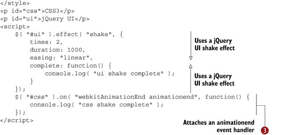
The jQuery UI–based shake effect should look familiar. You shake a paragraph two times over a second with a linear easing. As with CSS transitions, CSS animations can be tricky to understand if you haven’t seen them before.
The @keyframes declaration defines the animation and gives it a name—in this case, shake . Each keyframe, or entry in the @keyframes declaration, defines the CSS rules to be applied to selected elements during the animation. For the shake animation, you
see that the left property is moved in 20-pixel increments back and forth to mimic the jQuery UI shake effect (whose default distance property is set to 20).
After you have a CSS animation defined with @keyframes, you apply animation rules to elements. The syntax for animation is similar to that of the transition property you saw earlier. The shake 1s linear value specified tells the browser to perform the shake CSS animation on this element over 1 second using a linear easing .
Finally, you listen for the animationend event to show the equivalent of the jQuery UI complete function .
As with CSS transitions, most browsers initially implemented CSS animations behind a vendor prefix. However, many browsers have yet to drop the prefix. As of this writing, the latest versions of Chrome, Safari, Opera, the default Android browser, and iOS Safari all use the –webkit- prefix for CSS animations. Firefox dropped its –moz-prefix in version 16, and Internet Explorer 10 shipped with CSS animations unprefixed. The @keyframes declaration, animation property, and animationend event used in this example all include a WebKit vendor-prefixed version.
Because the example creates identical animations, this again begs the question of whether you should be using jQuery UI or CSS. Unfortunately, there is no easy answer.
As with CSS transitions, the browser can perform CSS animations quicker, so if you’re experiencing performance issues, you should look to CSS animations first. Desktop browsers can run the majority of JavaScript-based animations without issue, but mobile browsers may have issues—particularly with complex animations that require a great deal of processing power.
Although CSS transitions are succinct, CSS animations are verbose and more difficult to configure than the convenient APIs provided by jQuery UI. You need to do math to configure the @keyframes in the previous example, but not with the jQuery UI effect. The jQuery UI APIs are more convenient when they hook directly into widgets. Although you could configure a CSS animation to open a dialog with a blind effect, using $( "<div>" ).dialog({ show: "blind" }) is much easier and more maintainable in a large application.
To complicate things further, some things can be done using the jQuery UI effects that can’t be done with CSS animations, and vice versa. You can’t write a CSS animation that makes a <div> explode into 100 pieces:
$( "<div>" )
    .appendTo( "body" )
    .css({ height: 500, width: 500, background: "red" })
    .effect( "explode", { pieces: 100, duration: 10000 });
On the flip side, no jQuery UI effect lets you infinitely spin a <div> in three dimensions, as this code does:
@-webkit-keyframes spin-3d {
    50% {
        -webkit-transform: rotateX( 360deg ) rotateY( 360deg )
            skewY( 180deg );
    }
    100% {
        -webkit-transform: rotateX( 0deg ) rotateY( 0deg ) skewY( 0deg );
    }
}
@keyframes spin-3d {
    50% {
        transform: rotateX( 360deg ) rotateY( 360deg ) skewY( 180deg );
    }
    100% {
        transform: rotateX( 0deg ) rotateY( 0deg ) skewY( 0deg );
    }
}
div {
    height: 500px;
    width: 500px;
    background: red;
    position: absolute;
    -webkit-animation: spin-3d 10s linear infinite;
    animation: spin-3d 10s linear infinite;
}
Tip
For more examples of using 3D in CSS, as well as an excellent tutorial on how to build your own, see http://desandro.github.io/3dtransforms/.
Unfortunately, it’s not easy to handle this overlapping behavior. To summarize, the advantages of using CSS-based animations are
- They provide optimal performance.
- They’re defined in CSS and can be used without JavaScript.
and the detriments are
- They can be verbose, especially for complex animations.
- You must specify vendor prefixes when using them.
- They don’t work in older browsers.
If performance is critical, use CSS animations. If browser support is important, stick to jQuery UI. Otherwise, use whichever makes more sense for you and your projects.
Tip
If you need the performance of CSS transitions and animations, but prefer the jQuery syntax for performing animations, there are several plugins that provide a jQuery-like animation syntax, but use CSS under the hood for optimal performance. The two most popular of these plugins are Velocity.js (https://github.com/julianshapiro/velocity) and jQuery Transit (http://ricostacruz.com/jquery.transit/).
6.6. Summary
jQuery UI includes 15 effects that can be used with the effect() method, integrate with jQuery UI widgets, and even tie into jQuery Core methods such as show() and hide(). The jQuery UI effects also add functionality such as advanced easings and the ability to animate class name changes. But just because these effects let you do crazy things doesn’t mean that you should.
You saw a number of reasons why effects are practical in real-life applications. You built a small grocery list builder that used the transfer effect to help the user learn the interface. You added the shake effect to an error box in a form to draw the user’s attention. You also moved a game’s instructions into a dialog for a similar effect.
As with many of the jQuery UI widgets, the jQuery UI effects have inspired similar functionality on the web natively as CSS transitions and animations. You looked at how these worked and compared them to the jQuery UI effects. CSS-based transitions and animations are faster, but they can be more verbose and don’t work in all browsers yet.
Now that you’ve seen the powerful ways jQuery UI lets you animate elements, let’s look at the tools the library provides to style elements with themes.