
Chapter 8. Using the widget factory to build stateful plugins
- Creating widgets with the widget factory
- The benefits of using the widget factory
- Accessing a widget’s data and inner workings
Throughout this book, you’ve looked at the widgets jQuery UI provides and all the things you can do with them. Although the jQuery UI widgets let you do a lot, the widgets don’t cover all the UI controls you need to build modern web applications. Don’t worry—the most powerful part of jQuery isn’t its widgets, it’s the mechanism that all its widgets are built with: the widget factory.
The widget factory evolved from the early days of jQuery UI. Recall that the jQuery UI project started as a collection of popular plugins from a variety of authors, coding styles, and APIs. Over time, common patterns and best practices emerged. Implementations of these patterns gradually moved out of individual plugins and into a common base, which eventually became the widget factory. The widget factory itself is a jQuery plugin that builds jQuery plugins that adhere to these common conventions.
The widget factory is also a standalone component; you can use it independently of the jQuery UI library. In fact, the widget factory serves as the basis of all the jQuery Mobile widgets and numerous third-party jQuery plugins. By learning to use the widget factory, you’ll have the ability to build widgets that work anywhere that jQuery Core is available.
In this chapter, you’ll walk through the development of a custom widget built from scratch. You’ll see that, like all of jQuery UI, the widget factory packs a whole lot of functionality in a few, easy-to-use APIs.
Let’s get started.
A widget’s differentiating feature is its concept of state. Many jQuery plugins don’t have—or need—the concept of state. Consider the following jQuery plugin that replaces the selected element’s contents with a random number:
$.fn.randomNumber = function() {
    return this.each( function( index, element ) {
        $( element ).html( Math.random() * 1000 );
    };
};
This plugin is designed to run once and be done. The plugin doesn’t remember which elements it changed or anything about them. Contrast that with any of the jQuery UI widgets, such as the dialog widget created in the following code:
<div id="dialog"></div>
<script>
    $( "#dialog" ).dialog({ title: "Hello World" });
</script>
The randomNumber() plugin knew nothing about the element it operated on; the dialog widget knows a whole lot about the <div id="dialog"> element. It knows that it’s a dialog, that its title is "Hello World", and more. (We’ll look at how it remembers this information later in the chapter.)
Dialog is an excellent candidate for a widget because it has a state to manage; you can open it, close it, change its title, change its height, and so forth. Conversely, the randomNumber() plugin isn’t a good widget candidate because it has no state. The general rule is this: use the widget factory when you want to build a plugin that maintains state.
8.1. Building a widget
Building a fully featured widget is a complex, multistep process; we’ll break widget creation into a set of steps that you’ll follow in this chapter. The nine steps are shown in the following checklist. Don’t worry about what each step means; we’ll walk through each individually.
2. Markup structure
3. _create()
4. Make themeable
5. Add options
6. Expose methods
7. Trigger events
8. Enable/Disable
9. _destroy()
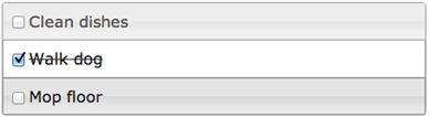
To walk through these steps, you need a widget to build, and in this chapter, you’ll build a to-do list. In this case it will be a list of tasks that the user can check and uncheck. Such a list could be used for any set of tasks—for example, a grocery list or your widget-creation checklist. An image of the to-do list you’ll build is shown in figure 8.1.
Figure 8.1. The to-do list you’ll build in this chapter
Let’s dig right in with the API to create widgets: $.widget().
Note
The finished version of this widget is available at http://jsfiddle.net/tj_vantoll/zStp7/ if you’d like to follow along or play with the examples as we go.
8.1.1. Constructing widgets with $.widget()
As discussed at the beginning of this chapter, the widget factory itself is a jQuery plugin located on the $ global object. To invoke it, call $.widget() as shown in the following code:

You invoke $.widget() with two parameters  . The first is the name of the widget: "tj.todo". Why is the name in two parts, separated by a period?
The first half of the name determines the widget’s namespace  . The namespace determines the location where the widget’s constructor function and prototype are stored on the global $ object. All jQuery UI widgets use a "ui" namespace; therefore, they’re accessible at $.ui ($.ui.dialog, $.ui.tabs, and so on).
The "ui" namespace is reserved for the jQuery UI widgets; you need to create your own namespace for your own widgets. In this example, the namespace is my first name: "tj". We’ll look at how the widget’s constructor function works momentarily.
The second half of the name is the string to use as the plugin name  . Because you used "todo", a todo() plugin was created for you.
The last parameter to $.widget() is an object to use as the widget’s prototype object  . You can use the prototype object to override default widget behavior and expose methods to users of the widget. We’ll go
over how this object works in the next section when we look at _create(). For now, because it’s a required argument, you pass an empty object.
. You can use the prototype object to override default widget behavior and expose methods to users of the widget. We’ll go
over how this object works in the next section when we look at _create(). For now, because it’s a required argument, you pass an empty object.
Note
$.widget() takes one additional, optional parameter: the constructor function of another widget to extend. This powerful feature lets you alter and build on top of existing widgets. We’re skipping the parameter for now to focus on developing a widget from scratch. Chapter 9 covers widget extension in detail.
When you execute $.widget( "tj.todo", {} ), a lot happens. This is shown in figure 8.2; let’s look at that figure in detail.
Figure 8.2. An overview of what happens when creating a widget
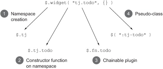
Namespace creation
The widget factory created an object at $.tj to use as a namespace for the todo widget. $.widget() is smart enough to create the namespace only if it doesn’t already exist. If you create another widget on the same namespace—for instance, $.widget( "tj.awesome", {} )—the original namespace isn’t overridden.
Constructor Function
Although you haven’t used constructor functions, they exist for each of the jQuery UI widgets. For example, you can create a new dialog using the following code:
new $.ui.dialog({ title: "The Widget Factory Rocks!" }, "<div>" );
The first argument is an object for configuring the widget’s options.. The second argument determines the element to convert to a widget—in this case, a newly created <div>. When using constructor functions, you can optionally omit the new keyword:
$.ui.dialog({ title: "The Widget Factory Rocks!" }, "<div>" );
By running $.widget(), you get this behavior for free. The following creates a new <ul> and converts it to a todo widget:
$.tj.todo( {}, "<ul>" );
Chainable Plugin
The chainable plugin should look familiar, as it’s the mechanism you’ve used to initialize widgets up to this point. $.widget() created this plugin for you automatically; you can now initialize todo widgets by selecting elements and calling todo(). The following converts all <ul> elements to todo widgets:
$( "ul" ).todo();
Because the plugin is also automatically chainable, you can append additional jQuery method calls. The following code initializes todo widgets and then hides them:
$( "ul" ).todo().css( "display", "none" );
Pseudo-Class
The widget factory creates a pseudo-class with the widget’s full name—in this case, ":tj-todo". CSS pseudo-classes are selectors that match elements based on the state they’re in. For example, :focus matches the element that currently has focus. Pseudo-classes are always prefixed with a single colon. The pseudo-class can be used to find all elements that have a widget associated with them, or to determine whether a given element is a widget. This behavior is shown in the following listing.
Listing 8.1. Using the pseudo-class created by the widget factory

Warning
The pseudo-class created by the widget factory only works in jQuery’s selector engine. $( ":tj-todo" ) matches all todo widgets, but document.querySelectorAll( ":tj-todo" ), or a CSS selector such as :tj-todo { color: red; }, won’t.
You’ve now seen all the functionality you get by running $.widget(), but your widget still doesn’t do anything. The next step in your process is choosing the HTML markup structure for your widget to use.
8.1.2. Choosing a markup structure
All widgets built using the widget factory work by associating themselves with a DOM element. For most widgets, a single DOM node is all you need to build the widget. For instance, autocomplete, datepicker, and spinner require only an <input> element to be initialized.
Some widgets, however, require a more complex structure. Recall the expected markup to build a tabs widget shown in the following code:
<div>
    <ul>
        <li><a href="#one">One</a></li>
    </ul>
    <div id="one">One Contents</div>
</div>
What markup structure should you use for a to-do list? You need to consider two things when choosing the markup structure of your widget:
1. It should be as easy as possible to create a widget.
2. The markup should be semantic.
The first consideration means that you should aim to require as little markup as possible. For instance, the spinner widget could require developers to create DOM elements for the up and down arrows. But this would make the spinner far harder for developers to use; the widget generates these elements for you.
The second consideration means that the markup should make sense, even when the element isn’t a widget. Consider the required markup of the tabs widget. If JavaScript were to fail, the user would still have a set of functioning links to content. This rule is applied across all the jQuery UI widgets. If the button widget fails, the user still has a functioning unenhanced button; if the spinner widget fails, the user still has a functioning <input>.
With these criteria in mind, you’ll need the following markup to build your todo widget:
<ul>
    <li>First todo</li>
    <li>Second todo</li>
    <li>Third todo</li>
</ul>
As this is a to-do list, you use an HTML unordered list (<ul>) to represent it. You’ll require that the initial items on the list be specified as list items (<li>s). That way, if something goes wrong in JavaScript, users can still view the items on the list, even if they can’t edit them.
To build a complete todo widget, you need more markup than this—most notably, you need to add check boxes. How do the jQuery UI widgets add the extra markup they need when widgets are initialized? They use one of many hooks the widget factory provides: _create().
Warning
Take note of the underscore prefix. The method name is _create(), not create(). We’ll go over why an underscore prefix is used for most of the widget factory’s methods in section 8.3.2 when we discuss methods; for now, make sure you include the underscore.
8.1.3. Overriding _create() to initialize widgets
In addition to the features you’ve seen, the widget factory also provides a number of methods and properties to aid with widget development. To add custom behavior to your new widget, you have to override a few of these methods—starting with _create(). To see how to do this, recall your call to $.widget():
$.widget( "tj.todo", {} );
The last argument to $.widget() is an object to use as the widget’s prototype. If you don’t understand the details of how prototype objects in JavaScript work, don’t worry. For now, know that the default set of methods and properties a widget uses is stored in $.Widget.prototype (note the capital W). When you pass methods and properties to $.widget(), they’re used instead of those on $.Widget.prototype.
Tip
A full list of the methods and properties on $.Widget.prototype is documented at http://api.jqueryui.com/jquery.widget/.
This is easier to see with an example. The first method you override in any custom widget is the _create() method. The widget factory invokes _create() anytime an element is converted to a widget. The default _create() on $.Widget.prototype does nothing. To make your widget do something useful, you must provide your own _create():
$.widget( "tj.todo", {
    _create: function() {
        this.element.addClass( "tj-todo" );
    }
});
You provide a _create() method for the todo widget’s prototype, and the widget factory uses it instead of $.Widget.prototype._create(). Although the _create() method doesn’t have any parameters, it does have this.element set to the element the widget was initialized on, and this.options set to any options that were passed. You use the this.element reference to add a CSS class name to the element that was converted to a widget.
The following example creates a new <ul>, appends it to the <body>, and initializes a todo widget on it:

When the todo plugin runs , your _create() method is invoked, and a "tj-todo" class name is added to the <ul> element.
One other important thing takes place when an element is initialized with a widget. Under the hood, the widget factory invokes the widget’s constructor function—in this case, $.tj.todo—which performs a number of initialization tasks, including calling _create(), and then returns an object with all properties and methods available on the widget. This object is known as the widget’s instance.
The instance object gives direct access to the methods and properties on a widget without going through the widget’s plugin. To see how it works, let’s return to your todo widget.
Remember that for your to-do list, the markup you need to add is a check box for each item on the list. The following code alters your _create() method to do that:
_create: function() {
    this.element.addClass( "tj-todo" );
    this._renderList();
},

_renderList: function() {
    this.element.find( "li" ).each(function() {
        var li = $( this ),
            label = $( "<label></label>" ),
            checkbox = $( "<input>", {
                type: "checkbox",
                value: li.text()
            });

        label.append( checkbox ).append( li.text() );
        li.html( label );
    });
}
This code adds a <label> element and a check box to each <li> in the element. The _renderList() method—which does all the work here—is abstracted out of _create() because you’re going to need it in other methods later.
Take note of one more thing: you were able to invoke _renderList() using a reference to this. In this case, this is set to the widget’s instance object; you can use the this reference to invoke any widget methods directly. As you’ll see throughout this chapter, the widget factory automatically sets this to the widget’s instance object in most of its methods.
You now have the markup that you need, and a CSS class name to use for styling. But your to-do list still doesn’t look like a jQuery UI widget. Next, let’s see how to make this widget themeable.
If you’re coding a widget, the widget’s instance is easy to access as it’s set as the context (a.k.a this) of most methods. But what if you need to access a widget’s instance when using its plugin? The widget factory provides two external mechanisms for doing so.
The first is the instance() method. The following code creates a new dialog widget, and then accesses its instance using the instance() method:
$( "<div>" ).dialog().dialog( "instance" );
The second option relies on the fact that—internally—the widget factory stores the instance object using the $.data() method in jQuery Core, with the widget’s full name as a key; you can use $.fn.data() to retrieve it:
$( "<div>" ).dialog().data( "ui-dialog" );
The widget factory utilizes this API to remember which elements have been initialized with a widget, which makes a number of things possible, including protection against multiple instantiation. If the widget’s plugin is called multiple times on the same element, _create() will be invoked only once, as shown in the figure.

View of the JavaScript console where a widget is created and its plugin is invoked twice
8.1.4. Making widgets themeable
One of the major advantages of using jQuery UI widgets is that you get a consistent, easily configurable display. In chapter 7, you saw how to configure the theming hooks provided by the widgets. Let’s look at how to add these hooks to your custom widget.
To make a widget themeable, you must correctly apply the appropriate class names from the jQuery UI CSS framework, specifically the following:
- Widget containers—ui-widget, ui-widget-header, ui-widget-content
- Interaction states—ui-state-default, ui-state-hover, ui-state-focus, ui-state-active
Let’s start with the widget containers. For your to-do list, you have no header; ui-widget-header isn’t relevant. But you do need to add ui-widget and ui-widget-content to the outer container of the list. You’ll add these class names in _create():
_create: function() {
    this.element.addClass( "tj-todo ui-widget ui-widget-content " +
        "ui-corner-all" );
    this._renderList();
}
Tip
The jQuery UI CSS framework has helper class names for adding CSS border-radius values that are configurable in ThemeRoller. The previous example uses ui-corner-all to round all corners. The full list of corner class names is available at http://api.jqueryui.com/theming/css-framework/.
Next, you need to add the interaction states. But first you need to determine which elements in the widget are clickable. For your to-do list, the only clickable elements are the check boxes. But you may recall from chapter 3 that check boxes are nearly impossible to style with CSS. How can you theme a check box? How does the jQuery UI button widget make this possible?
To answer, let’s start by looking at the markup you use for each item in the to-do list:
<li>
    <label>
        <input type="checkbox">
    </label>
</li>
Recall from chapter 3 that browsers have a built-in feature for interacting with form elements: clicks on an element’s <label> are automatically transferred to the element itself. You can take advantage of this behavior to work around the styling limitations of check boxes.
Instead of styling the check box, you’ll make its <label> the full height and width of the <li>, and style the whole <li> as clickable. With this setup, all clicks on the <li> also click the <label>, which toggles the underlying check box appropriately. The jQuery UI button widget uses this technique for styling check boxes and radio buttons. The native buttons themselves are hidden (in an accessible manner), and the button’s <label> elements are styled instead.
This approach has one other advantage. Because check boxes are tiny, they’re tough to click with a mouse, and painfully difficult to tap on touch devices. By styling the <li>, you give the user a much larger target.
To make the to-do list themeable, you alter your _renderList() to use the following code:
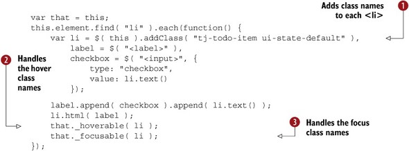
You add two class names to each <li> in the list: ui-state-default and tj-todo-item . As you recall from the previous chapter, ui-state-default is the class name that indicates the default state of clickable elements in a widget. This applies the same clickable look
as the jQuery UI buttons, tabs, and so forth.
You want to provide widget-specific class names. You already added a tj-todo class name to the <ul>, and here you add tj-todo-item to each <li>. Widget-specific class names give developers who use your widget flexibility in how they style it.
The ui-state-default class name takes care of the default display of the <li>, but remember that clickable elements can have three other states: active, hover, and focus.
For the hover and focus states, the widget factory provides two helper methods: _hoverable() and _focusable() . These methods add event handles to the passed element—in this case, the <li>—such that the ui-state-hover and ui-state-focus class names are automatically managed. When the user mouses over the <li>, the <li> receives the ui-state-hover class name; when the user mouses out of the <li>, the class name is removed. The ui-state-focus is managed similarly on focus-in and focus-out of the element.
You have an almost fully themeable widget. You’re missing only the ui-state-active class name. For the todo widget, you’ll want to add the active class name to any checked items. And to do that, you need to listen for clicks on the check box. But where do you put that code? The widget factory has a helper method for this as well.
8.1.5. Listening for events with _on()
Throughout this book, you’ve been using the on() method to bind to DOM events. Although you can use on() to listen to events in widgets, the widget factory provides an additional method with a few widget-specific niceties: _on() (note the underscore prefix).
Remember that for your todo widget, you need to listen for clicks on check boxes, and then toggle the ui-state-active class name on the <li> appropriately. When the check box is checked, its <li> should have ui-state-active. When the check box is unchecked, it shouldn’t. To keep your logic consolidated in one place, you’ll want to manage the class name in _renderList(), but how do you call it?
Let’s start with looking at how you would do it with on() (the jQuery Core one with no prefix). As a general rule, the _create() method is used to attach all event listeners; you’ll add your code there:
_create: function() {
    ...
    this.element.on( "click", "input",
        $.proxy( this._renderList, this ) );
}
This code listens for clicks on the todo widget <ul>, and—when the target is an <input>—invokes _renderList(). The $.proxy() call is necessary so that this in _renderList() is set to the widget instance, instead of the DOM element the event occurred on.
Next, let’s look at the same functionality implemented with _on():
_create: function() {
    ...
    this._on( this.element, {
        "click input": this._renderList
    });
}
Although the code for the two approaches is similar, _on() offers a few conveniences for widget development. First, it sets this to the widget instance automatically. There’s no need for a $.proxy() call.
_on() also automatically suppresses events on disabled widgets and cleans up event handlers when a widget is destroyed. We’ll get to the specifics of both later in this chapter.
Now that you call _renderList() when the user clicks check boxes, you have to make it toggle the ui-state-active class name. The updates to _renderList() are shown in the following code:
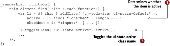
With this update, you determine whether the <li>’s check box is checked , and then use that to decide whether the ui-state-active class name should be added or removed from the <li> itself .
Tip
The jQuery Core toggleClass() method takes an optional second parameter. When passed, as in _renderList(), true indicates the class name should be added and false indicates the class name should be removed.
You now have a widget that works seamlessly with all the jQuery UI built-in themes, as well as third-party ones. With all class names in place, let’s add a bit of CSS to give the widget its final display:

The most important rule here is setting the display of the <label> to block. Your <label> elements need to take up the full dimensions of the parent <li> to ensure that all clicks toggle the appropriate check box (remember that clicks on <label> elements are transferred to their corresponding check box).
Now, not only is your widget themeable, but it also has its final look in place. But developers still can’t do a lot with your widget. It’s time to make it customizable.
8.2. Customizing widgets with options, methods, and events
We’ve covered a lot of territory, so let’s review where we are. You created your widget using $.widget(), chose a markup structure to use, built your markup with _create(), and made your widget themeable. Your checklist shows your progress:
2. Markup structure
3. _create()
4. Make themeable
5. Add options
6. Expose methods
7. Trigger events
8. Enable/Disable
9. _destroy()
What you haven’t yet tackled is how to make your widget customizable. You need to add the same options, methods, and events that the jQuery UI widgets have. Let’s start with options.
8.2.1. Making widgets configurable with options
Options are properties you can provide to customize the behavior of a widget. You’ve been using them in the widgets presented so far. Let’s look at how to add them to your custom widget.
For the to-do list, you’ll implement an option that gives developers the ability to place the todo widget in a submittable form: a name attribute. Providing name as a configurable option lets developers choose the name of the key submitted to the server.
To start, you need to add an options object to your widget’s prototype:
$.widget( "tj.todo", {
    options: {
        name: "todo"
    },
    ...
});
The options object should have a key-value pair for each option the widget has. Each key—in this case, name—is the name of the option, and each value—in this case, "todo"—is the default value of the option. Your widget has a single name option that defaults to "todo".
After you define the option, you have to use it. The following code adds it to your _renderList() method:

Tip
The use of a variable named that is a JavaScript convention to store a reference to an outer function’s this so it can be used in an inner function. In this example, you save a reference to the widget’s instance as that , and then use the reference to access the instance’s options in an inner function .
With this approach, all check boxes have a name of "todo" by default. To use a different value, you pass it when the widget is initialized. The following code uses a name of "tasks":
$( "ul" ).todo({ name: "tasks" });
To see how this could be used, refer to the following code:
<form method="POST" action="/path/to/server">
    <ul>
        <li>Clean dishes</li>
        <li>Walk dog</li>
        <li>Mop floor</li>
    </ul>
    <button>Submit</button>
</form>
<script>
    $( "ul" ).todo({ name: "tasks" });
</script>
If the user were to check the first two tasks on the list and then submit, tasks=Clean+dishes&tasks=Walk+dog would be submitted to the URL at /path/to/server. The formatting of the post-data string isn’t specific to jQuery or jQuery UI. Per the HTML specification, only check boxes that are checked are serialized and sent on HTTP requests. You need to deduce unchecked check boxes by their omission—for example, “Mop floor” wasn’t checked because it wasn’t included in the post-data.
You now have a functioning option, but you need to handle one more thing. Recall that the option() method lets you change any option at any time. Currently, if you call the option() method on your widget, it doesn’t work. The name of this to-do list remains "todo", when it should be changed to "tasks":
$( "ul" ).todo()
    .todo( "option", "name", "tasks" );
To see how to respond to changes, you need to use another of the widget factory’s methods: _setOption(). To add a _setOption() method, you pass it on the widget’s prototype:
$.widget( "tj.todo", {
    options: { name: "todo" },
    _setOption: function( key, value ) {
        ...
    },
    ...
});
_setOption() is called every time an option is changed on the widget. It is passed the name of the option as key and the value of the option as value. If you run todo( "option", "name", "tasks" ), _setOption() is called with "name" and "tasks". In _setOption(), you have to implement the code to alter the widget based on the option change.
In your case, you have a method that does that: _renderList(). (Remember how I said abstracting that method would come in handy later?) All you need to do is call _renderList() in _setOption():
_setOption: function( key, value ) {
    this._super( key, value );
    this._renderList();
}
What about the _super() method call? This calls your parent widget’s method, in this case $.Widget.prototype._setOption(), which updates the appropriate property on the instance’s options object; for example, setting this.options.name. Because _renderList() uses this.options.name, the _super() call has to happen before the call to _renderList(). Don’t worry about the specifics of _super(); extending widgets is the topic of the next chapter, and we’ll go over the details then.
You now have a completely functional option, but that’s only one way of letting developers configure a widget. We’ll look at adding methods next.
If you have perused the widget factory’s documentation, you may have noticed that both _setOption() and _setOptions() are methods. _setOptions() is always called first when options are changed, and it’s responsible for invoking _setOption(). In fact, the base implementation in $.Widget.prototype._setOptions()loops over the options and calls _setOption() on each:
_setOptions: function( options ) {
    var key;
    for ( key in options ) {
        this._setOption( key, options[ key ] );
    }
    return this;
}
The only reason to provide your own _setOptions() method is if you want to perform optimizations when multiple properties are changed at the same time. Consider a hypothetical “box” widget with height and width options. Suppose both options are updated at the same time:
$( "div" ).box( "option", { height: 200, width: 200 });
Instead of resizing the box twice—once for height, once for width—you could perform the resizing in _setOptions() to ensure it happens only once:
_setOptions: function( options ) {
    this._super( options );
    if ( options.height || options.width ) {
        this.resize();
    }
}
The dialog widget performs a similar optimization for its numerous dimension-related options.
8.2.2. Changing the widget’s state with methods
Options let you customize a widget, but they don’t let you perform actions on it. If you were to use the to-do list you’ve built to this point, wouldn’t you need some way of adding items to it? In this section, you’ll add four methods to your widget: add(), check(), uncheck(), and remove().
To add a method, you add a function to the widget’s prototype. The following code defines a hello widget with a single world() method. The hello( "world" ) call invokes the method and the alert():
$.widget( "tj.hello", {
    world: function() {
        alert( "hello world" );
    }
});
$( "<div>" ).hello().hello( "world" );
Have you noticed that all the methods you’ve used in the todo widget thus far—_create(), _renderList(), and _setOption()—have been prefixed with an underscore? In widget methods, the underscore prefix determines whether the method can be invoked through its widget’s plugin:

You define two methods: available() and _notAvailable(). Invoking available() through the widget’s plugin works fine, but attempting to invoke _notAvailable() throws a JavaScript error .
Although they have similarities, don’t think of underscore-prefixed methods like private members from other languages. The methods aren’t available through the plugin, but they’re still accessible on the widget’s instance. The following code invokes the previous example’s _notAvailable() method:
$( "<div>" ).hello().hello( "instance" )._notAvailable();
Use an underscore when it doesn’t make sense to invoke the method through the plugin. _create() is a perfect example: explicitly invoking it is unnecessary (as the widget factory does it for you); it doesn’t make sense to expose it.
Conversely, if developers could use the method’s functionality—make it available. The methods you’ll add in this section will all be publicly exposed. Let’s start with the add() method; an implementation is shown in the following code:
$.widget( "tj.todo", {
    ...
    add: function( value ) {
        this.element.append( "<li>" + value + "</li>" );

        this._renderList();
    }
});
Because all your logic is consolidated in _renderList(), there’s not much to this method. The widget factory sets this equal to the widget instance; you use the this.element reference to append a new list item.
Having an add() method makes it possible for developers to build UI elements that interact with the to-do list. The following listing shows a form that utilizes the new add() method.
Listing 8.2. Adding items to the to-do list
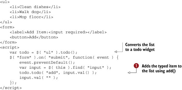
This example uses a form with a single text box. When the user submits the form, you take the value the user typed and invoke
the to-do list’s add() method with it . This workflow is shown in figure 8.3.
Figure 8.3. An external form that adds items to the to-do list

One more question worth considering is, why didn’t you build a <form> into the widget itself? You certainly could have _create() build a <form> that adds items to the list. The downside of this approach is that it makes the widget far less extensible. If you were to bake the <form> into the widget and a user wanted to fill the list with an alternative UI, the user would have to hide or remove the <form> to use the todo widget.
If you keep the widget minimal, and expose its API through methods, developers can build solutions on top of it. We’ll look at some of those things in the next chapter, but before we end our methods discussion, you have three more methods to implement: check(), uncheck(), and remove(). The implementation of these three methods is shown in the following code:

All three methods take the value of the item to operate on—for example, "Walk dog". The remove() method finds the check box with this value, and then removes its parent <li> from the DOM .
Warning
You’re dealing with two different remove() methods here: the method you’re adding to the to-do list ($.tj.todo.prototype.remove) and the jQuery Core $.fn.remove method, which removes elements from the DOM. Normally, I don’t like introducing potentially confusing APIs, but in this case, I went with remove() because it’s a direct antonym of add(). Also, I can’t use delete because it’s a JavaScript reserved word, and the other words the thesaurus gave me sound silly—for example, abolish(), eliminate(), or expel(). Because of the ambiguity, I’ll try to clarify when this comes up to avoid confusion.
Because the implementation of the check() and uncheck() methods is so similar, you place the logic in a shared _toggleCheckbox() method. _toggleCheckbox() finds the appropriate check box and checks or unchecks it appropriately . It then calls _renderList() so ui-state-active is added or removed from the appropriate <li>.
All these methods give developers flexibility when using your widget. In the next chapter you’ll use the todo widget’s remove() method to build an extension with which items can be removed from the list.
At this point your widget is configurable. Developers can add items with add(), check off items with check(), uncheck them with uncheck(), and remove them with remove(). Your next step is to allow developers to respond to changes that take place in the widget. You do that by triggering events.
8.2.3. Triggering widget events with _trigger()
Like options and methods, events need little introduction because you’ve been using them throughout this book. The jQuery UI widgets trigger events whenever their state changes—a dialog is closed, a tab is activated, and so on.
When writing a widget, you have to decide what events to trigger. This is a judgment call, but in general, you should trigger events for anything that could be useful for developers to subscribe to. For the to-do list, the most important use case is checking and unchecking items in the list, so let’s start there.
Recall that you’re using _on() to update your widget’s markup whenever a check box is clicked:
this._on( this.element, {
    "click input": this._renderList
});
The following code alters this code to trigger "check" and "uncheck" events:

The only addition here is another one of the widget factory’s convenience methods: _trigger(). _trigger() takes three arguments: the name of the event, an event object, and an object with data associated with the event. You trigger
either a "check" or an "uncheck" event (depending on whether the check box is checked), and you pass the value of the check box .
As with all the jQuery UI widget events, you can now subscribe to events with callback functions or event handlers. For instance, when a user checks an item, each of these functions logs the value of the check box checked:

Before we move on, remember that in the last section you added check() and uncheck() methods; you need to trigger check and uncheck events there as well. The following code adds this behavior to the methods:
check: function( value ) {
    this._toggleCheckbox( value, true );
    this._trigger( "check", null, { value: value } );
},
uncheck: function( value ) {
    this._toggleCheckbox( value, false );
    this._trigger( "uncheck", null, { value: value } );
}
These examples use null in place of an event object. Whenever you provide data to an event (in this case, the value of the check box), you must provide all three parameters to _trigger(). In the click event handler, you had an event to pass along, but here you don’t. In these situations, pass null to indicate that there’s no native event.
You now have comprehensive coverage for the check and uncheck events; they’ll be triggered regardless of whether the user clicks check boxes in the UI or a developer uses the check() or uncheck() methods.
This consistency gives developers flexibility in what they can implement with the todo widget. If you want to sync changes to a back-end database as they’re made, you can use the check and uncheck events to do that.
Now that you’re triggering events, you’re near the end of your widget development checklist. The last things we need to cover are enabling, disabling, and destroying widgets.
You may recall from chapter 2 that some jQuery UI widget events are cancellable—that is, you can cancel an event to prevent some action from occurring. If you prevent the default action of the dialog widget’s beforeClose event, the dialog does not close.
How do you implement your own cancellable events? The same _trigger() method you just used to trigger events returns a Boolean that indicates whether the default action was prevented. You can use that Boolean to determine whether to continue with the action.
As an example, you can make the todo widget’s check event cancellable with the following change to the check() method:
check: function( value ) {
    if ( this._trigger( "check", null, { value: value } ) ) {
        this._toggleCheckbox( value, true );
    }
}
Now, if a user subscribes to the check event and prevents the default action, _trigger() will return false and the check box will not be checked. For instance, the following code creates a todo widget, appends it to the <body>, and invokes the check() method on its only item:
var list = $( "<ul><li>One</li></ul>" ).todo({
    check: function( event ) {
        event.preventDefault();
    }
});
list.appendTo( "body" );
list.todo( "check", "One" );
Because the todo() call includes a check event callback that calls prevent-Default(), the _trigger() call within the widget’s check() method returns false, and the widget’s checkbox is not checked.
8.3. Enabling, disabling, and destroying widgets
Let’s take one last look at your widget checklist.
1. $.widget()
2. Markup structure
3. _create()
4. Make themeable
5. Add options
6. Expose methods
7. Trigger events
8. Enable/Disable
9. _destroy()
Your new widget is almost complete. The last two steps are allowing developers to disable and destroy widgets. As in most of the widget steps, much of the functionality to do this is baked into the widget factory, but you have to override a few methods for your todo widget. Let’s get started by looking at how to enable and disable widgets.
8.3.1. Enabling and disabling a widget
Disabling UI elements is a common UI pattern to prevent users from interacting with a control. Native form elements <input>, <select>, <textarea>, and <button> can be disabled by adding a disabled attribute—for example, <input disabled>.
Most of the jQuery UI widgets can be enabled or disabled. Some of the functionality is built in to the widget factory itself.
Note
The two widgets that can’t be disabled are datepicker and dialog. Datepicker doesn’t support the same disabling mechanism because it’s the only widget not built with the widget factory. The dialog widget doesn’t support disabling because it doesn’t make any sense to disable a dialog (more on this momentarily).
Specifically, the widget factory provides a disabled property, disable() method, and enable() method for all widgets. Let’s look at how these work in a button widget example. The following code creates a disabled button by setting its disabled option:
var magicButton = $( "<button>Magic Button</button>" )
    .appendTo( "body" )
    .button({ disabled: true });
You can then enable the same button by calling its enable() method
magicButton.button( "enable" );
and call its disable() method to disable it again:
magicButton.button( "disable" );
How can you let developers disable your widget? First, let’s look at what the widget factory provides. To start, your to-do list already has enable() and disable() methods. The following code creates a new to-do list and calls its disable() method:
$( "<ul><li>One</li></ul>" )
    .todo()
    .appendTo( "body" )
    .todo( "disable" );
If you were to try this out, you’d see that it has no visual effect on the widget. You can still check and uncheck the item on the list. To see why, let’s look at the full implementations of the base enable() and disable() methods your widget uses: $.Widget .prototype.enable() and $.Widget.prototype.disable():
enable: function() {
    return this._setOptions({ disabled: false });
},
disable: function() {
    return this._setOptions({ disabled: true });
}
The default methods set only the widget’s disabled option. To implement disabling logic, you must respond to the change in the disabled option. And—you’ll recall from section 8.3.1—you do this with _setOption(). The following code alters your widget so it can be disabled and enabled:

The first addition to _setOption() is a check for the disabled option . Remember that _setOption() is called for any option change, so you need this check to make sure your code runs only when dealing with the disabled option.
If you’re dealing with disabled, you do two things: toggle the disabled property on all check boxes , and toggle the ui-state-disabled class name on all <li>s . Because this is the disabled option, when the value is true, you disable all check boxes and add ui-state-disabled. When the value is false, you enable all check boxes and remove ui-state-disabled.
Now that you have the functionality in place, what about styling your disabled widget? Because you’re using the themeable ui-state-disabled class name, your disabled state is styled according to your theme. No extra work is needed!
If you do want to tweak the disabled look, you can target the disabled list items using .tj-todo .ui-state-disabled. The widget factory also adds a namespace-widgetname-disabled class name to the outer container of the widget. In the case of your todo widget, the outer <ul> has a tj-todo-disabled class name when disabled.
Now that you have a widget that can be enabled and disabled, you’re nearing the end of your widget checklist. You have only one thing left to handle: destruction.
Although most widgets can be disabled, there are exceptions. Disabling a dialog widget would be bizarre, for example; at the least, the jQuery UI team couldn’t come up with a practical reason to allow it.
The dialog widget does two things. First, it sets the enable() and disable() methods it inherits from the widget factory to an empty function—specifically, $.noop, a convenience property provided by jQuery Core that’s literally set to function() {}:
disable: $.noop,
enable: $.noop
The dialog widget still has disable() and enable() methods, but they do nothing. The second thing the dialog widget does is ignore the disabled option. The following code appears near the beginning of the dialog widget’s _setOption() method:
if ( key === "disabled" ) {
    return;
}
If you’re developing a widget that it doesn’t make sense to disable, this approach is recommended.
8.3.2. Undoing a widget’s effects with _destroy()
In the terms of the widget factory, destroying a widget is like hitting the undo button in a text editor. When a widget is destroyed on an element, any markup that was added is removed; any class names that were added are removed; any events that were bound are unbound. The element is returned to its prewidget state.
All the jQuery UI widgets provide a destroy() method that undoes their effects. As an example, the following code initializes a <button> with a button widget, and then destroys the widget using destroy():

Now that you’re on the implementing end, you have to provide this functionality as well. How do you do it? Like most of the topics in this chapter, the widget factory gives you a method to provide this functionality: _destroy().
Warning
Take note of the underscore prefix again—destroy() and _destroy() are different methods with different purposes. We’ll get to that in a minute.
Here’s the implementation of your todo widget’s _destroy() method:

Your first step is to remove all class names that the widget added. You first do that from your main <ul> element , then for each <li>.
Next, you determine whether the check box of each <li> is checked. If it is, you remove the <li> from the DOM . Because of this implementation, checked to-do items are removed from the list when it’s destroyed. We’ll look at why you
take this approach in a moment.
Finally, you revert the contents of all list items that aren’t checked. To see how this works, let’s recall the HTML you used when you created the widget in _create(). You took a list item—for example, <li>Walk dog</li>—and turned it into the following markup:
<li>
    <label>
        <input type="checkbox" value="Walk dog">
        Walk dog
    </label>
</li>
To undo this, you set the innerHTML of each <li> (using jQuery Core’s html() method) back to the text of the <li>, in this case, “Walk dog” .
That’s the end of your method. You may be wondering why you didn’t need to do more. You didn’t unbind any events, and there were some class names you didn’t remove. As it turns out, the widget factory handles this for you.
Whenever a widget’s destroy()method (no underscore prefix) is called, the widget factory performs common cleanup tasks in $.Widget.prototype.destroy() and then delegates to the widget’s _destroy()method (with an underscore prefix) for widget-specific cleanup. The following code shows an abridged version of $.Widget .prototype.destroy(). Don’t worry if you don’t understand everything here; we’re looking at the code to give an overview of the things destroy() does for you.

destroy() invokes the _destroy() method for widget-specific cleanup . This is the method you implemented for your to-do list earlier in this section.
To understand the next line , remember that the widget factory stores instance data using $.data() with a key of the widget’s full name—in this case, tj-todo. Calling removeData() removes the instance from jQuery’s internal data store to avoid memory leaks.
Both disabled class names—ui-state-disabled and the widget-specific tj-todo-disabled—are removed from the widget .
The next line may also seem a bit cryptic. this.bindings is a collection of elements in the widget with events bound to them with _on() The unbind() call removes those events. Remember earlier in the chapter when I said that if you use _on(), all events are cleaned up for you? This is the code that makes that happen.
The code at  and
and  removes the ui-state-hover and ui-state-focus class names from all elements that were made hoverable or focusable using _hoverable() and _focusable().
You only need to worry about cleaning up things specific to your widget in _destroy(). The widget factory takes care of all generic cleanup tasks for you. Before leaving the topic of widget destruction, we need to discuss one thing: why bother destroying a widget?
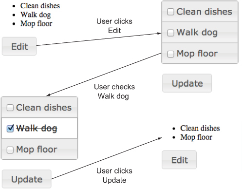
For one, it can be useful to have the ability to completely undo a widget’s effect when building a UI. The following listing uses the todo widget to build an editable list of items.
Listing 8.3. An editable list built with the todo widget

In this example, you have two buttons: Edit and Update. The Edit button converts the example’s <ul> to a todo widget . The user can then check off items on the list.
When the user clicks Update, the todo widget’s destroy() method removes the todo widget from the <ul> , leaving a list of items. Because of your implementation of _destroy(), items that the user checks are removed from the <ul> when it’s destroyed. This workflow is shown in figure 8.4.
Figure 8.4. Workflow of the destroy() example. The user can check off items to remove them from the list.
Beyond the UI niceties, there’s one other good reason to implement _destroy() on your widgets: destroy() (which, as you recall, invokes _destroy()) is called when the widget’s element is removed from the DOM using any of the jQuery Core methods. In the following code a button widget is initialized on a <button>, and then it’s removed from the DOM because the innerHTML of its parent is changed using the jQuery Core html() method.
<div>
    <button>Button</button>
</div>
<script>
    $( "button" ).button();
    $( "div" ).html( "Some other content" );
</script>
Even though the code doesn’t explicitly call destroy(), it does invoke the button widget’s destroy() (and _destroy()) methods. This is another piece of magic that the widget factory provides. Internally, the widget factory duck punches jQuery Core’s internal $.cleanData() method. When it detects that a widget has been removed, it invokes its destroy() method to give the widget a chance to clean up and avoid memory leaks. Even if you have no intention of providing undo functionality, it’s important to include a _destroy() method to avoid leaks.
Tip
Duck punching refers to a technique of extending some piece of a library without altering its original source. (The technique is also sometimes known as monkey patching the proxy pattern.) Paul Irish has a great explanation of the technique and concrete implementations of it at http://www.paulirish.com/2010/duck-punching-with-jquery/. You’ll use the duck punching technique to build datepicker extensions in the next chapter.
Although building a custom widget is powerful, it can also be a lot of work, and someone else may have built what you need. You can look for third-party widgets on jQuery’s plugin repository at http://plugins.jquery.com/ or with a Google search.
Remember, though, that unlike the jQuery UI widgets, you have no idea what you’re going to get from widgets you find on the internet. You can find robust widgets that save you time and development effort, and you can find widgets that don’t work.
When evaluating unofficial jQuery widgets, here are a few questions to ask. The more of these questions you can answer affirmatively, the more likely the widget will work well in your application:
- Does the widget use the widget factory? If so, all the conventions we’ve discussed throughout the book for options, methods, events, and such still apply. Usually, widget maintainers mention whether the widget factory is used in the widget’s documentation; if not, you can look for a call to $.widget() in the widget’s code.
- Is the widget themeable? If it is, the existing jQuery UI themes will work fine with the new widget. To see if the widget is themeable, check for the CSS framework’s class names (ui-widget, ui-widget-content, and so on) on the widget’s markup.
- Does the widget have tests? Unit tests are a sign that the widget’s code is stable and all its APIs work. Furthermore, because unit tests aid with code maintenance, their presence is a good sign that the widget will be updated as future versions of jQuery are released.
- Is it well documented? This one is a bit self-explanatory; thorough documentation makes it easier to get started with a widget and to use it.
- Is it maintained? A widget that was last updated a month ago is more likely to be actively maintained than a widget that was last updated two years ago. Look for the release date of the latest version of the widget, and when the last few commits were.
- Is it battle tested? If you’re the 10,000th person to use a widget, chances are you’ll have a smoother experience than the 10th person to use it. Widgets that have been used in numerous production applications are more likely to have the kinks worked out. If the widget is on GitHub, look for projects that have a lot of watchers and stars. If the project isn’t on GitHub, look for how much information is available with a Google search or on Stack Overflow.
8.4. Summary
That’s it! In this chapter, you saw that the widget factory is used to build stateful plugins, and then you went through a nine-step process of building a widget with it. The nine steps you took were
1. Create the widget with $.widget().
2. Decide on a markup structure to use.
3. Build the markup structure with _create().
4. Make the widget themeable by applying the appropriate class names from the jQuery UI CSS framework.
5. Add options to make the widget configurable.
6. Expose methods.
7. Trigger events as the widget’s state changes using _trigger().
8. Allow developers to disable and enable the widget.
9. Undo the widget’s effects using _destroy().
You can refer back to this chapter and follow these nine steps anytime you want to build a stateful plugin with the widget factory.
But what if you don’t want to build a complete widget from scratch? Sometimes you need to make a quick alteration to an existing widget, and the widget factory has an extension mechanism built in that does that. We’ll spend the next chapter looking at how it works.