
Chapter 12. Under the hood of jQuery UI
- Advanced positioning of elements
- Tips and tricks for dealing with widget instances
- Working with widget properties
- Building declarative widgets
Although we’ve covered the core of jQuery UI, we have yet to dig into a series of utilities, methods, and properties intended for more advanced usage of the library. As you explore these utilities, you’ll also get a look at how jQuery UI works under the hood. You’ll learn things like how jQuery UI manages instances, how it structures prototype chains, and how some of jQuery Mobile works.
Let’s start by looking at how the jQuery UI widgets handle positioning.
12.1. Positioning elements with the position utility
Positioning an element relative to another element on the web is surprisingly hard. Besides the brute-force mathematical computations—comparing heights, widths, and offsets—you also have to worry about CSS positioning mechanisms (static, relative, absolute, and fixed), not to mention accounting for the window’s scroll offset, or collision detection if the element doesn’t fit.
This is where the jQuery UI position utility comes in. The position utility provides an elegant API that makes positioning elements a trivial task. It’s what the jQuery UI widgets use to perform all their positioning magic, including centering dialogs, showing tooltips, and placing nested menus in the right spots.
Tip
The autocomplete dialog, menu, and tooltip widgets have a position option to configure how the widgets are positioned. We’ll look at how those work momentarily.
We’ll look at how to do cool things with the position utility, but let’s start with an example to get the syntax down—because it can be tricky at first. The following code makes two boxes—one red and one blue:
<style>
    div { height: 100px; width: 100px; }
    #red { background: red; }
    #blue { background: blue; }
</style>
<div id="red"></div>
<div id="blue"></div>
Suppose you want to position the red box on the right-hand side of the blue box. The following code does that
$( "#red" ).position({
    my: "left",
    at: "right",
    of: "#blue"
});
What’s cool about this API is that it reads like an English sentence. Position my (the red box) left side at the right side of the element with an id of "blue". See how easy that was? There was no need to calculate the blue box’s offset or either box’s dimensions; it just worked. And we’re just getting started with what the position utility can do. Using the same red-and-blue-box example, figure 12.1 shows different positioning options.
Figure 12.1. Options for positioning elements with the position-utility

Note
I highly recommend playing with this example to get a feel for how the options for the position utility works. Although I explain each option here, there’s no substitute for experimentation with live code. You can play at http://jsfiddle.net/tj_vantoll/LgGQH/.
We’ll start with the red box at the bottom of the blue box. This box shows that the my and at options of the position utility accept two positions, which—to be consistent with CSS conventions—are listed in the order of horizontal, vertical. If you were to read this code, it would read, “Position my (the red box) horizontal left, vertical top, at the horizontal right, vertical bottom of the blue box.”
If you specify only one position, that position is normalized using the same parsing rules CSS uses (for properties such as background-position). For instance, "left" equates to "left center", or the horizontal left, vertical center of an element, and "top" equates to "center top", or the horizontal center, vertical top of an element.
To show this in action, let’s move on to the red box on the left-hand side of the blue box—the one that uses the following positioning:
$( "#red" ).position({
    my: "right-50%",
    at: "left",
    of: "#blue"
});
Here, because only one horizontal direction is specified, the my and at options are each assumed to be vertically centered. So this code reads, “Position my (the red box) horizontal right at the horizontal left of the blue box.” But you’ll notice there’s one additional twist here: the use of -50%. This is an offset, which each direction of the my and at options optionally accepts as percentages or pixels. (We’ll get to pixels momentarily.) The offset is relative to the element being positioned; 50% here refers to half the width of the red box, or 50 pixels. Offsets can be positive or negative. Your use of "right-50%" means that the right position of the red box should be adjusted by -50%; that is, the red box should be moved 50 pixels to the left.
Offsets can also be in pixels, which is what you use in your final box (the one on the top).
$( "#red" ).position({
    my: "left bottom",
    at: "right+10 top-10",
    of: "#blue"
});
This example reads, “Position my (the red box) horizontal left, vertical bottom 10 pixels beyond the horizontal right, and 10 pixels above the vertical top of the blue box.” The position utility assumes that numbers without percentages are pixel values and uses them as an offset.
This gives you a sense of the things you can do with the position utility. If you’re still having trouble understanding the syntax, it’s worth taking a few minutes to play in jsFiddle and understand how the keywords work.
Although moving red boxes around the screen makes for a nice learning exercise, chances are you aren’t building a production application full of blue and red boxes to move around the screen. (But if you are, that’s awesome!) Let’s look at useful applications of the position utility.
12.1.1. Building a UI walkthrough with the position utility and dialog widget
If you create an account on a web service, there’s a decent chance you’ll be given a tutorial or walkthrough of the UI. These walkthroughs are designed to introduce parts of the interface and what they do. Figure 12.2 shows part of the walkthrough you go through after creating a Gmail account.
Figure 12.2. A UI walkthrough that Gmail gives new users

With the position utility and dialog widget, building such a walkthrough is relatively easy. For simplicity, let’s say your application includes the following three UI elements that you want to introduce to the user:
<header>My awesome header</header>
<aside>My awesome sidebar</aside>
<footer>My awesome footer</footer>
You’ll use the following code to accomplish this.
Note
The following example is available at http://jsfiddle.net/tj_vantoll/59eZq/. Unless you’re on a very large screen, it’s easier to see this example in action at http://jsfiddle.net/tj_vantoll/59eZq/show (which runs the example outside of the jsFiddle development interface).

The core of this example is a single dialog with three instructional <p> tags in it, one for each step you want to walk the user through. With a little CSS, you configure the dialog to only show
the paragraph that matches the value of the dialog’s data-step attribute  . Because the dialog starts with a data-step of "1", the #dialog[data-step="1"] #step-1 { display: block; } rule applies and shows the first message.
The rest of the code is responsible for managing the dialog’s position option and data-step attribute. You start by defining a positions array containing the three locations you want the dialog to display: under the header, to the left of the aside, and above
the footer  . When you initialize the dialog widget, you set its position option to position[ 0 ] so the dialog initially displays under the header. To let the user move through the walkthrough, you add a Next button with
the buttons option. When it’s clicked, you retrieve the current value of the data-step attribute
. When you initialize the dialog widget, you set its position option to position[ 0 ] so the dialog initially displays under the header. To let the user move through the walkthrough, you add a Next button with
the buttons option. When it’s clicked, you retrieve the current value of the data-step attribute  . If the attribute is 3, you’re at the last step so you close the dialog
  . If not, you move the dialog to the next position in the array
  and then increment the dialog’s data-step attribute
  . (Remember that because of your CSS, a new data-step value will show a new message that corresponds to the new position.)
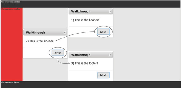
The result of this code is a dialog that moves around the screen as the user progresses through the walkthrough. This is shown in figure 12.3.
Figure 12.3. A UI walkthrough as a series of dialogs that explains parts of the interface to the user
Note
Please excuse the horrible “design” of the header, sidebar, and footer elements. The point here is you can easily position the dialog next to any element in your interface.
Although you can do plenty of things with positioning dialogs, the widget where custom positioning is most often used is the tooltip widget. We’ll look at things you can do with tooltips, but first we have to discuss one last of piece of functionality the position utility provides: collision detection.
12.1.2. Handling collisions elegantly
A common problem when positioning elements—and especially tooltip elements—is dealing with collisions. Let’s say you want to globally show tooltips below elements, and you implement that with the following code:
$( document ).tooltip({
    position: {
        my: "center top",
        at: "center bottom+10"
    }
});
This shows a tooltip on all elements with a title attribute that appears 10 pixels below the element. This works great, except for one problem: what happens if the element is already at the bottom of the screen? With the preceding code you may expect the user to never see the tooltip, but instead, the tooltip displays 10 pixels above of the element. Why?
Built in to the position utility is the concept of collision detection. The utility automatically detects that the element it’s positioning—in this case a tooltip—is outside the bounds of the window and, if so, attempts to reposition it in the window.
Tip
The position utility does collision detection against the window by default, but that can be configured using the within option. This is useful when you need to position elements within a scrollable container, and want to make sure they fit.
The position utility has two means of repositioning an element: flipping and fitting. Flipping is the default means of handling collisions, and what it does is straightforward: if the utility detects that the element doesn’t fit in the window, it flips it to the opposite side of the element it’s being positioned against. That’s exactly what happened in the earlier example. Because the tooltip wouldn’t fit below the elements on the bottom of the screen, the utility flipped it from the bottom to the top.
If flipping doesn’t work, the other mechanism available is fitting, which moves the element in an attempt to get it on the screen. If you tried to display a tooltip and it was off the screen by a few pixels, fitting would move it back in the screen.
All this is configurable using the position utility’s collision option, which has four values: "flip", "fit", "flipfit", and "none". Understanding these values is one of those situations where a picture is essential. Figure 12.4 shows a few <input> elements that have tooltips. The first input shows the default tooltip positioning, whereas the other four show the effect of applying the various collision values.
Figure 12.4. Values for the position utility’s collision option and their effects

The top <input> here is the control; it shows where a tooltip appears when it’s not near the screen’s boundaries (left-aligned with the <input>). The next four apply the four available collision values:
- flip —This collision type flips the element to the opposite side of the element it’s being positioned against. The name can be a bit confusing, as the tooltip isn’t literally flipping vertically or horizontally on the x- or y-axis; instead, it’s moving from one side of the element it’s being positioned against to the other. In figure 12.4, because the second <input> element’s tooltip does fit on the left-hand side of the <input>, it’s moved to align on the right-hand side.
- fit —Rather than flipping, the fit collision type shifts the element in an attempt to keep it on the screen. Notice that the third <input> element’s tooltip is shifted a few pixels from its default horizontal position (aligned with the left-hand side of the <input>).
- flipfit —This type is a combination of the previous two. First, the flip logic is applied, then—if the element still isn’t within the screen—the fit logic is applied to show as much of the element as possible. In this example, because the flip logic is sufficient to place the tooltip on the screen, its behavior is identical to the flip <input>.
- none —The final collision type tells the position utility to ignore collision detection altogether. The last <input> element’s tooltip doesn’t fit, but because its collision is set to "none", it remains off the screen.
Tip
You can specify different means of handling horizontal and vertical collisions by passing a pair of strings for the collision option. A collision of "flip none" tells the position utility to use flip collision handling for horizontal collisions, and no collision handling for vertical collisions.
Although these values give you flexibility in how you handle collisions, sometimes this isn’t enough. Sometimes you need to know whether the element fits so you can take some custom action. To see what I mean, let’s return to a tooltip example from chapter 7.
12.1.3. Controlling the collision detection
In chapter 7, you saw how to build tooltips with arrows that pointed at their corresponding element (which was an <input>). Also remember that, to ensure that the arrows always displayed on the correct side of the tooltip, you had to turn the position utility’s collision detection off.
Although turning collision detection off does keep the arrow pointing at the element appropriately, it also means that the tooltip can potentially display outside of the screen. You know now that you can use the position utility’s flip collision mechanism to move the arrow tooltip above or below the <input>. But that leaves a problem. You used CSS to draw the arrow, and you need to alter the CSS based on whether the tooltip is above or below the <input>. To make this possible, the position utility exposes this information to the using property. Before we show this in action, first remember that your example from chapter 7 used the following HTML:
<label for="amount">Amount:</label>
<input id="amount" title="Please use xx.xx format.">
You’ll take this HTML and build an arrow tooltip that can display on either side of its <input>.
Note
The full source of this example is available at http://jsfiddle.net/tj_vantoll/587n9/. Also, the result of this code is shown in figure 12.5. If you’re having trouble understanding what this code is trying to accomplish, it may help to look at the picture first.
Figure 12.5. The tooltip displays above the <input> by default (left picture), but if you scroll to move the <input> to the top of the window, the tooltip no longer fits within the viewport, so the tooltip flips to the bottom (right picture).


You start by defaulting the tooltip to display above the <input> . You subtract 10 pixels from the top of the tooltip (which moves the tooltip up 10 pixels) to make room for the pointer.
Next, you set your collision to "flip" so the position utility automatically flips the tooltip below the <input> when it doesn’t fit above .
Next, you specify a using option. With a using option, the position utility continues to do its collision detection work, but it doesn’t alter the position of the element; instead, you’re responsible for that, and the using function is passed the information that you need to do it.
Specifically, the using function is passed two objects, named position and feedback by convention. The position parameter has the coordinates the position utility has calculated for the element as two properties: top and left. This format—an object with top and left properties—is designed to be passed directly into the jQuery Core css() method to do the positioning—which is exactly what you do here .
The advantage of the using function is you can perform logic before the positioning takes place. And this is what the feedback argument is for. It’s an object that contains a variety of data about the element being positioned and the element it’s being
positioned against. You can refer to http://api.jqueryui.com/position/ for a full list of the feedback argument’s properties, but here you have a specific need: you need to know if the tooltip should display above or below the
bottom of the <input>. This information is available in the feedback object’s vertical property—which is set to "top" or "bottom" accordingly. You use this property to apply an appropriate CSS class name to the tooltip .
Now that you have a "top" or "bottom" class name on the tooltip, you can add CSS to move the tooltip’s pointer to the appropriate side of the <input>:
.bottom .ui-tooltip-content::before {
    bottom: -10px;
}
.bottom .ui-tooltip-content::after {
    bottom: -7px;
}
.top .ui-tooltip-content::before {
    top: -10px;
}
.top .ui-tooltip-content::after {
    top: -7px;
}
And with this you have a tooltip that not only points at an <input>, but also automatically adjusts to keep itself within the screen. This functionality is shown in figure 12.5.
For most of your positioning needs, the my and at properties are sufficient. When you need to keep elements within the screen at all times, you can configure the collision option to suit your needs. And in the case where you need fine-grained control over how the collision detection works, the using option gives you advanced control. The great thing about the position utility is that when you need these advanced configuration options, you’re still spared the details of the mathematical computations and collision detection algorithms.
Let’s move from the position utility to additional jQuery UI internals that can help you improve your own code, starting with a few utilities in jQuery UI Core.
12.2. Using the utility functionality in jQuery UI Core
When we looked at managing dependencies in chapter 10, we saw that almost every single file in jQuery UI depends on core.js, or jQuery UI Core (notable exceptions are the widget factory and the position utility, which are intended for easy use without any jQuery UI dependencies). jQuery UI Core is a collection of utilities that are used by the library internally, but because they’re potentially useful outside the internal jQuery UI, the utilities are exposed and documented on the jQuery UI API site.
Let’s look at some of the functionality that’s available.
12.2.1. Generating unique ids
Sometimes when developing widgets you need elements to have an id attribute. Suppose you need to generate an <input> and a <label>, and you need their id and for attributes to match.
But generating your own ids is no easy task. By definition, id attributes must be unique, so you have to make sure you’re not conflicting with any other ids already present. As a concrete example, recall the tooltips widgets you used to show validation messages in chapter 11. Following is a reduced version of that code:
<input name="to" required>
<script>
    $( "input" )
        .attr( "title", "You must provide an airport code." )
        .tooltip();
</script>
You used this approach because you wanted to make your form validation accessible, and the tooltip widget does this by associating the tooltip element with the <input> using an aria-describedby attribute.
Note
Despite popular belief, screen readers don’t read the HTML title attribute. For details, see http://blog.silktide.com/2013/01/i-thought-title-text-improved-accessibility-i-was-wrong/.
When the tooltip widget is active, the rendered markup is something like the following:
<input name="to" required aria-describedby="ui-id-1">
<div role="tooltip" class="ui-tooltip ..." id="ui-id-1">
    <div class="ui-tooltip-content">
        You must provide an airport code.
    </div>
</div>
The association between the <input> element’s aria-describedby attribute and the tooltip element’s id tells the screen reader to read the contents of the element with an id of "ui-id-1" (when the <input> receives focus).
The thing to note here is the "ui-id-1" value. It wasn’t present in your initial markup, so the tooltip widget had to generate that value (and clean it up when the tooltip is no longer used). Internally, the tooltip widget uses jQuery UI Core’s uniqueId() and removeUniqueId() methods to make this happen. Here’s the code the widget uses to create the tooltip element:
var tooltip = $( "<div>" )
    .attr( "role", "tooltip" )
    .addClass( "ui-tooltip ui-widget ui-corner-all ui-widget-content " +
        ( this.options.tooltipClass || "" ) )
    .uniqueId();
The call to uniqueId() at the end is what adds the "ui-id-1" id attribute. jQuery UI Core adds the uniqueId() method to $.fn so it can be used on any jQuery object. For example, $( "<div>" ).uniqueId() creates a <div> that has a unique id attribute. The uniqueId() method is also smart enough to not add an id attribute if the element already has one. In the following code the uniqueId() call does nothing:
$( "<div id='foo'>" ).uniqueId();
The counterpart to uniqueId() is the removeUniqueId() method, which removes the id that uniqueId() added. The tooltip widget doesn’t need removeUniqueId()—as the tooltip element is removed from the DOM when a tooltip is destroyed—but some jQuery UI widgets do.
The accordion widget, for example, adds an aria-controls attribute that associates its headers with its content panels. And like the aria-describedby attribute, the aria-controls association requires the headers and content panels to have unique id attributes. The accordion widget’s _destroy() method includes the following code to remove the attributes when the accordion is destroyed (where this.headers is a reference to a jQuery object containing all the accordion’s headers):
// clean up headers
this.headers.removeUniqueId();

// clean up content panels
this.headers.next().removeUniqueId();
The removeUniqueId() is smart enough to remove only the id attributes that the uniqueId() method generated; the following leaves the "foo" id attribute in place:
$( "<div id='foo'>" ).removeUniqueId();
In general, any time you have a need to generate an id attribute to associate elements, the uniqueId() and removeUniqueId() methods provide an elegant way to do so.
12.2.2. Using key code constants
jQuery UI Core provides a series of key code constants in the $.ui.keyCode object. If you want to detect Enter key presses in your code—and don’t want to hardcode that the Enter key is equivalent to key code 13—you can use the following code:
$( document ).on( "keydown", function( event ) {
    if ( event.keyCode === $.ui.keyCode.ENTER ) {
        alert( "Enter was pressed!" );
    }
});
You can view a full list of the key codes jQuery UI provides at http://api.jqueryui.com/jQuery.ui.keyCode/.
The last piece of jQuery UI Core we need to discuss is the handy :data pseudo-selector, but to show what it’s best used for, we’ll include it in the broader context of dealing with widget instances.
If you dig into core.js, you’ll see that there’s far more to jQuery UI Core than ID and key code handling. So what’s all that other stuff?
About half of the code in jQuery UI Core is code that manipulates logic in jQuery Core—either to add functionality or work around bugs in older versions. Remember that jQuery UI supports multiple versions of jQuery Core, so a user of jQuery UI 1.11 could be using any version of jQuery Core >= 1.6.
Before jQuery 1.8 you couldn’t use the jQuery Core outerHeight() and outer-Width() functions as setters. jQuery UI needs this functionality, so it adds the functionality for users using jQuery Core < 1.8. Interestingly enough, jQuery UI Core uses the same duck-punching technique we discussed in chapter 9 to change the jQuery Core functionality.
In general, the hope is that in the near future jQuery UI Core will no longer exist as these workarounds become unnecessary. (The outerHeight() and outerWidth() workarounds will be removed when jQuery UI no longer supports jQuery Core versions < 1.8.) The utility functions—uniqueId(), removeUniqueId(), keyCode, and so on—in jQuery UI Core will be moved into their own files to make the library more modular.
As a final note, jQuery UI Core has some deprecated functions that I won’t be discussing to discourage their use in new code. If you’re curious, you can learn about these deprecated utilities at the jQuery UI Core documentation at http://api.jqueryui.com/category/ui-core/.
12.3. Accessing and managing widget instances
We’ve talked about widget instances on and off throughout the book, but now let’s take an in-depth look at what they are and some of the things you can do with them. We’ll start with a review before we get into the trickier stuff.
Every time you instantiate a widget on a DOM element, the widget factory creates an object—the instance—and associates it with the element using $.data(). The key used to store the instance on the element is the widget’s full name—that is, the widget’s namespace, plus a dash, plus the widget’s name. The dialog widget is stored under a key of "ui-dialog" because its namespace is "ui" and its name is "dialog".
You can retrieve the instance a few ways. The first is to use $.data(), as shown in the following code, which assigns the instance of a newly created dialog to a variable (named instance):
var myDialog = $( "<div>" ).dialog(),
    instance = myDialog.data( "ui-dialog" );
As of jQuery UI 1.11, you can also retrieve the instance using the widget’s instance() method. The following code assigns a newly created dialog instance to an instance variable:
var myDialog = $( "<div>" ).dialog(),
    instance = myDialog.dialog( "instance" );
The instance() method is the preferred means of accessing the instance as it doesn’t rely on the jQuery UI internal implementation (storing the instance using $.data()). But regardless of how you access the instance, what might you want to do with it?
Unlike interacting with widgets through their plugins, instance references give you access to a number of things: all the widget’s methods and properties, as well as the methods and properties on parent widgets’ prototypes (more on additional things you can do with those references momentarily).
Furthermore, some developers prefer the instance-based method calls to plugin-based method calls. Consider the following example that creates a dialog with an OK button that closes it:
$( "<div>" ).dialog({
    buttons: {
        OK: function() {
            $( this ).dialog( "close" );
        }
    }
});
Some developers find the dialog( "close" ) syntax awkward and prefer the following instanced-based approach:
var myDialog = $( "<div>" ).dialog({
    buttons: {
        OK: function() {
            myDialog.close();

        }
    }
}).dialog( "instance" );
You use the instance() method to store a reference to the instance in a myDialog variable. When the button is clicked, you use the instance reference to invoke the close() method with a more familiar JavaScript syntax. It’s important to note that neither the instance-based nor plugin-based method invocation syntax is “correct”; it’s a matter of personal preference.
Before we leave the topic of instances, there’s one more technique we need to discuss.
Tip
Earlier you learned that trying to invoke widget methods through the widget’s plugin throws an error if that element is not a widget, such as $( "#not-a-dialog" ).dialog( "open" ). The instance() method is the one exception to this rule. $( "#not-a-dialog" ).dialog( "instance" ) returns undefined rather than throwing an error.
12.3.1. Detecting widget instances with :data()
Besides the syntax conveniences, instances are also the way that jQuery UI detects whether a given element has a widget initialized on it. Say you have the following element on the DOM:
<div id="foo"></div>
How do you know if the element is a dialog? As it turns out, internally jQuery UI has to ask this type of question a lot. When a dialog’s draggable option is changed to false, the dialog’s _setOption() method needs to know whether the dialog has a draggable instance on it to know if it’s safe to call draggable’s destroy() method. (Remember that calling widget methods before the widget is initialized—with the exception of instance()—throws an error.) As another example, when you drop a draggable on a droppable, the droppable widget needs to search for nested droppable widgets to fire events in the correct order. (It also affects the behavior of the greedy option. See http://api.jqueryui.com/droppable/#option-greedy.)
Because of this need, jQuery UI Core extends the jQuery Core selector engine (Sizzle) to add a custom :data() pseudo-selector.
It works by selecting elements that have data stored with a key that matches the value given to :data(). This is easier to see in an example.
Tip
jQuery UI adds the pseudo-selector with Sizzle’s createPseudo() method. To learn more about Sizzle’s APIs, including how to add your own pseudo-selectors, see its documentation at https://github.com/jquery/sizzle/wiki/Sizzle-Documentation.
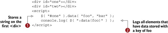
You use $.data() to store the key/value pair of "foo" and "bar" on the first <div> . Then, you use the :data() pseudo-selector to select all elements that have data stored with a key of "foo" . Because the first <div> has data stored with that key, it’s selected and logged.
Because the jQuery UI widgets store their instances using $.data(), this same technique can be used to detect widgets. The following selects all dialog widgets:
$( ":data(ui-dialog)" );
Although finding all widgets can be handy for debugging, the more common scenario is determining whether a given element is a widget, and you can accomplish that by combining the :data() pseudo-selector with the jQuery Core is() method. Consider the following example:

The first check returns true as the <div id="dialog"></div> has a dialog widget initialized on it, and the second check returns false as the <div id="not-dialog"></div> doesn’t.
Tip
Because the mechanism of storing widget instances with $.data() is built in to the widget factory, the same :data() checks work with custom widgets. For example, $( ":data(tj-todo)" ) finds all elements with your custom todo widget initialized on it.
We’ve now looked at things you can do with instances. Next, let’s look at what the instance gives you access to: prototype objects.
12.4. Advanced widget prototype methods and properties
Although we’ve discussed most of what you can do with widgets built with the widget factory, we’ve glossed over the details of how the widget’s methods are structured internally—such as how the widget factory automatically manages a prototype chain for you.
Having an understanding of a widget’s prototype structure is important so you know all the things you can do with widget instances, and is vital for creating custom widgets, especially widgets that extend other widgets. You’ll see how to use these methods and properties to streamline widget initialization, make widgets work in <iframe> elements, and make a <div data-role="dialog"></div> magically turn into a dialog widget.
But before we do that, we have to dig in deep to see how a widget’s prototype chain works.
12.4.1. A widget’s prototype chain explained
As with your instance discussion, let’s begin with a quick review of what we’ve discussed on widget prototype objects. Suppose you create the following widget:
$.widget( "tj.custom", {
    _create: function() {}
});
Recall that the last argument to $.widget() is an object to use as the widget’s prototype. You provide an object with a single _create() method. Because you didn’t extend an existing widget, the widget factory uses $.Widget as a base widget by default. If you do specify a widget, that widget is extended. The following code extends the dialog widget:
$.widget( "tj.customDialog", $.ui.dialog, {} );
We’ve discussed all this before, but now let’s get into more detail on what’s happening behind the scenes. When you create widgets, the widget factory automatically structures the widget’s prototype chain such that instances of the widget can access methods and properties on any parent widget’s prototype objects. That sentence can be a mouthful, so let’s break it down.
First, an explanation of prototype chains in JavaScript. Whenever you use the dot notation in JavaScript (as in myObject.value), the JavaScript interpreter looks for the subsequent string ("value", in this case) as a property in the object itself. If it finds myObject.value it uses it, but if not, the interpreter then looks for the member (property or method) in the object’s prototype object. And if it can’t find the member there, it goes to the next prototype object and so on, until the interpreter reaches Object.prototype. This lookup chain is what gives the prototype chain its name.
As an example, consider the following:
"jQuery UI".trim();
"jQuery UI".hasOwnProperty( "whatever" );
Both lines of code invoke methods on String objects. On the first line, when the JavaScript interpreter sees trim(), it first looks for a trim() method on the String object’s prototype (that is, String.prototype.trim). In this case, String.prototype.trim exists, so the interpreter invokes it.
On the second line, when the JavaScript interpreter sees hasOwnProperty(), it again looks for String.prototype.hasOwnProperty, but this time it doesn’t find it, so it looks to the next object in the prototype chain: which in this case is Object.prototype. Object.prototype.hasOwnProperty exists, so the interpreter invokes it.
Tip
Object.prototype.hasOwnProperty returns whether the current object has the passed property defined. For more details, see https://developer.mozilla.org/en-US/docs/Web/JavaScript/Reference/Global_Objects/Object/hasOwnProperty).
Note
For a more thorough explanation of prototype chains in JavaScript, see http://yehudakatz.com/2011/08/12/understanding-prototypes-in-javascript/.
Having a complete understanding of prototype chains isn’t necessary as the widget factory automatically builds the chain for you when you create widgets. Say I write the following code:
$.widget( "tj.customDialog", $.ui.dialog, {} );
var instance = $.tj.customDialog( {}, "<div>" );
This defines the same customDialog widget that inherits from the jQuery UI dialog. Then it creates an instance of the new customDialog and assigns it to an instance variable. After this code runs, suppose you want to add a new line that uses the instance:
instance.[?]
Because of the widget’s prototype chain, when you use the dot notation here, the interpreter looks up members in the following order. Note that the order is extremely important as many of these objects contain methods and properties with the same names:
- The instance object —The instance object itself has data unique to the element it’s instantiated on; it’s not shared by other instances of the widget. The instance has an options object containing the current state of its options, for example, and an element property that refers to the DOM element the instance is associated with.
- $.tj.customDialog.prototype —If a member isn’t found on the instance, the interpreter checks the customDialog widget’s prototype object next. Because your code to create this widget specified an empty prototype object, this object contains only a few properties added by the widget factory (widgetName, namespace, and so on).
- $.ui.dialog.prototype —If a member isn’t found on the customDialog’s prototype, the interpreter consults its parent widget—in this case, dialog—next. The dialog widget’s prototype has all the dialog widget’s methods and properties.
- $.Widget.prototype —If a member isn’t found on dialog’s prototype, the interpreter moves on to the base widget prototype. The $.Widget.prototype methods and properties are documented at http://api.jqueryui.com/jquery.widget/.
- Object.prototype —This is the end of the line for all prototype chains. If the interpreter doesn’t find a property here, it returns undefined. If you’re invoking a method and the interpreter doesn’t find it, the interpreter throws a TypeError (because undefined is not a function).
Figure 12.6 shows a visual representation of this lookup process.
Figure 12.6. Visualization of the JavaScript interpreter accessing a property or method on an instance. The first example looks for an element property and immediately finds it on the instance object. The second example looks for a destroy() method and has to go through the instance object, the custom widget’s prototype, and the dialog widget’s prototype, before finding the method on the base widget’s prototype.

Having an understanding of a widget’s prototype chain is important when building custom widgets. When you extend a widget, you inherit members from parent widgets (and ultimately $.Widget.prototype), but you can override them by including a member on new widget’s prototype object. Let’s look at examples of that.
12.4.2. Using a widget’s default element to streamline initialization
One of the properties on $.Widget.prototype is defaultElement, which is an element to use when a widget instance is constructed without providing an element. How do you create a widget instance without providing an element?
Remember from chapter 8 that in addition to plugin-based initialization, all widgets created with the widget factory have constructor functions that can initialize widgets. The following uses the dialog widget’s constructor function to initialize a dialog widget on a newly created <div>:
$.ui.dialog( {}, "<div>" );
The first argument of each widget’s constructor is an object containing the options to use, and the second argument is the element to create the widget on. What we haven’t discussed is that you can omit the second argument, and this example does the same thing:
$.ui.dialog( {} );
This works because when only one argument is provided to the constructor function, the widget factory uses $.Widget.prototype.defaultElement, which is "<div>". Individual widgets can override the defaultElement on their prototype to specify more appropriate elements. For instance, because spinners need to be created on <input> elements, $.ui.spinner.prototype.defaultElement is set to "<input>". The following code creates a new spinner and appends it to the <body>:
$.ui.spinner( {} ).widget().appendTo( "body" );
Note
Remember that the widget() method returns the outer container of a widget. The preceding code needs this call because internally the spinner widget wraps the <input> element with additional markup. So $.ui.spinner( {} ).appendTo( "body" ) alone would append the <input> but lose that additional markup.
When creating custom widgets, it’s important to update this property if it’s necessary for the widget you’re creating. A <div> isn’t appropriate for your todo widget from chapter 8 as it uses <ul> elements. To use a different defaultElement, you include the property on your widget’s prototype object:
$.widget( "tj.todo", {
    defaultElement: "<ul>",
    options: { ... },
    ...
});
With this in place, you can use the constructor functions and omit the second argument. The following creates a new todo widget, adds two tasks, and appends it to the <body>:
var instance = $.tj.todo( {} );
instance.add( "Task One" );
instance.add( "Task Two" );
instance.element.appendTo( "body" );
Let’s look at a few more properties on $.Widget.prototype.
12.4.3. Supporting embedded-window use in widgets
If you have perused the various widget properties, you may be surprised to see $.Widget .prototype.document and $.Widget.prototype.window. On the base widget’s prototype, these properties are references to the browser’s document and window objects. So why do these properties exist?
They exist for widgets used in <iframe> elements—which have their own document and window objects. Real-world uses of <iframe> elements are typically complex, and are frequently used to interact with third-party services, so you’ll build a simple example to show the intention of these two properties.
Let’s start with this:
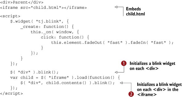
This code defines the extremely useful blink widget, which makes an element blink when the user clicks anywhere on the window.
In this example, you initialize a blink widget on the page’s <div> elements , and, after the <iframe> loads, you initialize a blink widget on each of its <div> elements .
Tip
jQuery UI supports creating widgets in multiple windows as is shown here. But it’s a one-way street; after you create a widget in a window, you can’t move it to another window and expect it to work. (Technically it might work in some cases, but moving widgets across windows in general isn’t supported by jQuery UI.)
With this approach, any click on the window makes all blink widgets, well, blink. This includes elements on the main page, as well as elements in the <iframe>. To switch up this logic, let’s return to the code that attaches the click event handler to the window:
this._on( window, {
    click: function() { ... }
});
For example’s sake, let’s change it to use the window property on the instance (which is set to this):
this._on( this.window, {
    click: function() { ... }
});
Whenever a widget is initialized, its instance object is given window and document properties that point to the window and document objects of the window it was created in. After making this change, blink widgets blink only on clicks of their respective windows.
When creating custom widgets, use of the instance window and document objects (as opposed to the window and document global objects) is recommended to support embedded-window use. Although in this example the code works in both cases (albeit with different behavior), many times this isn’t the case, such as getting coordinates for positioning. jQuery UI uses the window and document instance properties internally.
12.4.4. Displaying elements with _show() and _hide()
Recall from chapter 6 that several of the jQuery UI widgets provide show and hide options that tie into the jQuery UI effects suite. Under the hood, all these widgets defer to $.Widget._show() and $.Widget._hide() to do the dirty work of processing the options.
To see how you can use these methods yourself, let’s build a small example using a widget that adds a notification message to the bottom corner of the screen. The widget is shown in action in figure 12.7.
Figure 12.7. View of the notification widget you’ll build

The code used to build this widget is shown in the following listing.
Note
Some code is omitted to focus on the effects integration. You can find the full code and see this widget live at http://jsfiddle.net/tj_vantoll/phkCB/.
Listing 12.1. A notification widget


The code in _create() performs the setup necessary—creating the close button and positioning the notification—but for the effects integration we’re mostly interested in the two options, as well as the open() and close() methods.
The start of the code declares two options, show and hide, and defaults them to true, which—as you may recall from chapter 6—tells jQuery UI to use a fade in and fade out effect, respectively .
The options are used in the open() and close() methods, which are wrappers of the _show() and _hide() methods. Both _show() and _hide() take three arguments: an element, an options argument, and an optional callback function (which we’re not using here).
What’s cool about this approach is that’s all the code you need to tie into the jQuery UI effects suite. The following creates a notification that fades in over 300 milliseconds and hides with the jQuery UI blind effect:
$( "<div>Your account has been updated.</div>" )
    .appendTo( "body" )
    .notification({
        show: 300,
        hide: "blind"
    });
For a full listing of the types of data you can use for show and hide, either return to chapter 6 where we first discussed this, or check out the options’ documentation at http://api.jqueryui.com/jquery.widget/#option-hide and http://api.jqueryui.com/jquery.widget/#option-show.
12.4.5. Customizing options on the fly
The last widget method we’re going to discuss is one of the more useful ones; it’s the basis of how jQuery Mobile’s autoinitialization works. The method is _getCreateOptions(), and it gives you the ability to define options during widget initialization. When you provide a _getCreateOptions() method, you can define options that override the widget’s defaults. Consider the following code that creates a test widget:

Each time the test widget’s constructor function is called, the _getCreateOptions() method is invoked . Here the _getCreateOptions() method returns a hardcoded foo option, which overrides the widget’s default value for this option ("bar") with "bang".
Because of this override, when you create an instance with no options, its foo option is set to "bang" . Despite the override, user-supplied options still override the values given in _getCreateOptions(); therefore, your second instance maintains the "biz" option that was passed to its constructor .
Now that you have an idea of how _getCreateOptions() works, let’s see how this is useful, starting with a few ways that jQuery UI itself uses these methods. The jQuery UI selectmenu widget uses the following method:
_getCreateOptions: function() {
    return { disabled: this.element.prop( "disabled" ) };
}
The context of _getCreateOptions() (this) is set to the widget instance, which gives access to the element the widget is being created on. The selectmenu widget uses that reference to default its disabled option to whether the <select> it’s initializing is disabled. Deriving widget options from element attributes like this is the most common use of _getCreateOptions(). The spinner widget does something similar.
You may remember from chapter 3 that the spinner widget has min, max, and step options, but you can also provide these values as HTML attributes. The following creates a spinner widget with a min option of 2, a max option of 20, and a step option of 2:
<input min="2" max="20" step="2">
<script>
    $( "input" ).spinner();
</script>
The spinner widget makes this possible with the following _getCreateOptions() method:
_getCreateOptions: function() {
    var options = {},
        element = this.element;

    $.each([ "min", "max", "step" ], function( i, option ) {
        var value = element.attr( option );
        if ( value !== undefined && value.length ) {
            options[ option ] = value;
        }
    });

    return options;
}
Here the widget loops over an array of three strings—"min", "max", and "step"—and checks whether each exists as an option. (The value.length check also makes sure the attribute value has at least one character in it.) The attributes that do have values are added to an options object that’s returned at the end of the method.
The approach of initializing widgets based on their attributes is cool, and leads to another question: why not allow any option to be specified as an attribute? Let’s see how to do that next.
12.5. Using autoinitialization to remove boilerplate code
If you work with jQuery UI long enough, you’ll notice yourself writing a lot of code that initializes widgets. Your flight search example from the previous chapter included this block:
$( "#from-airport" ).autocomplete(...);
$( "#to-airport" ).autocomplete(...);
$( "#date" ).datepicker();
$( "#hops" ).buttonset();
$( "#order-by" ).selectmenu();
This code becomes tedious because you’re doing the same task: selecting elements and converting them to widgets. When the jQuery Mobile project—which uses the widget factory for its widgets—came out, they provided a new technique for initializing widgets known as autoinitialization.
Autoinitialization works by configuring elements with a series of attributes, and then letting jQuery Mobile turn those elements into widgets automatically. Consider the following jQuery Mobile application:
<!doctype html>
<html lang="en">
<head>
    <meta charset="utf-8">

    <meta name="viewport" content="width=device-width, initial-scale=1">
    <title>jQuery Mobile</title>
    <link rel="stylesheet" href="//code.jquery.com/mobile/1.4.2/jquery.mobile-1.4.2.min.css">
    <script src="//code.jquery.com/jquery-1.11.1.min.js"></script>
    <script src="//code.jquery.com/mobile/1.4.2/jquery.mobile-1.4.2.min.js"></script>
</head>
<body>

<div data-role="page">
    <div data-role="header">
        <h1>jQuery Mobile Rocks!</h1>
    </div>
    <div data-role="main" class="ui-content">
        <input type="button" data-icon="gear" value="Settings">
    </div>
</div>

</body>
</html>
When this page loads, three widgets are created: a page, a header, and a button. The display of this page is shown in figure 12.8.
Figure 12.8. Display of a jQuery Mobile app with one button

Notice that you didn’t need to write a single line of JavaScript to create this UI and these widgets, which is cool, but how does this work? And more importantly, how can you get this behavior with jQuery UI? To answer, let’s dig into jQuery Mobile’s code.
12.5.1. How jQuery Mobile’s autoinitialization works
The magic starts in a method that jQuery Mobile adds to $.fn: enhanceWithin(). The primary job of enhanceWithin() is detecting which elements should be enhanced in the given element. The following adds a new <input type="button"> element to the page and converts it to a button widget:
$( ".ui-content" ).append( "<input type='button' value='New!'>" );
$( document ).enhanceWithin();
To make this possible, each jQuery Mobile widget has an initSelector property that tells the enhanceWithin() method what elements should be enhanced. Because $.mobile.button.prototype.initSelector contains "input[type='button']", jQuery Mobile knows to turn it into a button widget.
Internally, jQuery Mobile calls enhanceWithin() on each page to initialize widgets. For your purposes, what’s interesting is what enhanceWithin() does under the hood, or rather, what it doesn’t. The following is a condensed version of jQuery Mobile’s enhanceWithin() method:

This code starts by looping over all of jQuery Mobile’s widgets . $.mobile.widgets is an object where the key is the name of the widget and the value is the widget’s constructor—which is how the name and
constructor functions are assigned to the name and constructor variables in the $.each() callback. For the button widget, name and constructor are set to "button" and $.mobile.button, respectively.
For each widget, the code looks for any elements that match the widget’s init-Selector property and assigns the matches to an elements variable . The context (that, in this case) is set to the jQuery object enhanceWithin() was invoked on. In a $( document ).enhanceWithin() call, that is set to a jQuery object containing the document. If there are elements that matched the widget’s initSelector, they’re added to the widgetElements object .
After that, the code loops over each widget that has matches and invokes those widgets’ respective plugins . The widgetElements[ index ][ index ]() line is a bit weird, because the index variable is the widget’s name. So in your button example, you go into this loop with index set to "button". widgetElements[ "button" ] resolves to a jQuery object with all matched elements, and widgetElements[ "button" ][ "button" ]() is a fancy way of writing widgetElements.button.button(), which invokes the plugin on all matched elements.
To take a step back, remember how I said the important part of this code is what isn’t here? There’s no code to handle options; the enhanceWithin() method invokes the plugin with no arguments. But your original jQuery Mobile example used <input type="button" data-icon="gear" value="Settings"> (note the data-icon="gear" attribute), and figure 12.8 shows that a gear showed up. You can use your knowledge of the widget factory from earlier in this chapter to see that an icon option is indeed set on the element:
So...how did that happen?
12.5.2. jQuery Mobile’s widget extension
The answer is the widget factory’s _getCreateOption() method. jQuery Mobile takes the default $.Widget.prototype._getCreateOptions() method (which does nothing), and changes it to populate options based on the element’s attributes. The following shows the complete code:

This code starts by looping over each option . (Remember the context of _getCreateOptions() is set to the instance object.) For each option, it calls a $.mobile.getAttribute() method . Internally, $.mobile.getAttribute() gets an HTML5 data-* attribute off the element and does some data-type coercion (for instance, converting "false" to false, "2" to 2, and so on). The name of the attribute $.mobile.getAttribute()retrieves is determined by this call:
option.replace( rcapitals, replaceFunction )
This takes the name of the option (the option variable) and replaces all capital letters in the name with a "-" and the letter lowercased. This code would convert the dialog widget’s "autoOpen" option to "auto-open". jQuery Mobile’s $.mobile.getAttribute() would then look for a "data-auto-open" attribute on the element.
The rest of the code is straightforward. When a data-* attribute is found for the given option, it is added to the options object , which becomes the instance’s set of starting options.
This code explains why <input type="button" data-icon="gear" value="Settings"> had its icon option automatically set to "gear". When this widget is initialized, jQuery Mobile’s _getCreateOptions() method loops over all the button widget’s options, searches the element for data-* attributes that align with the options, finds one (data-icon), and initializes the widget with that option set.
This type of initialization is known as declarative initialization. As opposed to imperative initialization—where you need to list out option values explicitly in code—declarative initialization lets you associate a widget’s options directly on the HTML elements. I personally find declarative initialization to be elegant as it removes boilerplate JavaScript code.
But this is jQuery Mobile code, not jQuery UI code. Because this code is so simple, you can port this to use with the jQuery UI widgets. Let’s look at how to do that.
12.5.3. Autoinitializing jQuery UI widgets
If you look at the preceding jQuery Mobile code, the only jQuery Mobile–specific code was the $.mobile.getAttribute() method. Therefore, if you abstract that code from jQuery Mobile, you can bring the benefits of declarative initialization to jQuery UI. This approach is shown in the following listing.
Listing 12.2. Declarative initialization of jQuery UI widgets

There’s a lot of code here, but most of this you’ve seen before. The only real difference is the use of the jQuery Core data() method to retrieve the data-* attributes from the element . To get a sense of what data() is doing for you, look at the following code:

As you can see, the data() method takes care of performing data type conversions, as well as converting multiword attributes into camel-case variables. Why doesn’t jQuery Mobile use this? Its $.mobile.getAttribute() method has additional (jQuery Mobile specific) logic that forces it to replicate some of the functionality built in to data(), which you don’t need here. With this setup in place, you can now write code like this:
<div id="dialog" data-height="200" data-width="500"></div>
<script>
    $( "#dialog" ).dialog();
</script>
This creates a dialog that’s 200 pixels tall and 500 pixels wide, and you didn’t have to specify any of those options in JavaScript. This approach handles reading attributes, but you’re still not autoinitializing widgets. You still had to explicitly select an element and call the dialog plugin on it.
Remember that jQuery Mobile has a whole construct built around this with the initSelector properties. You can build something lightweight that works like that fairly easily. Consider the following approach:
$.extend( $.fn, {
    enhance: function() {
        this.find( "[data-role]" ).addBack( "[data-role]" )
            .each(function() {
                var element = $( this ),
                    role = element.attr( "data-role" );
                element[ role ]();
            });
        return this;
    }
});
This adds a new enhance() jQuery plugin that finds all elements with a data-role attribute and initializes a widget with that value on the element.
Note
Because the find() method selects only child elements, the addBack() call in the preceding code ensures that if a data-role attribute is applied to the element enhance() is invoked on, that element is also selected. For example, $( "<ul data-role='todo'></ul>" ).find( "[data-role]" ) doesn’t select the newly created <ul>, but $( "<ul data-role='todo'></ul>" ).find( "[data-role]" ).addBack( "[data-role]" ) does. For more information on addBack(), see http://api.jquery.com/addBack/.
This new plugin means you can rewrite your previous example as follows:
<div data-role="dialog" id="dialog" data-height="200"
    data-width="500"></div>
<script>
    $( document ).enhance();
</script>
Notice that to make this work, you had to add a data-role="dialog" attribute to the element. You still had to write some JavaScript here, but the great thing is it’ll handle as many widgets as you need, including nested widgets. The following example creates a tabs widget, progressbar widget, and slider widget:
<div data-role="tabs">
    <ul>
        <li><a href="#one">One</a></li>
        <li><a href="#two">Two</a></li>
    </ul>
    <div id="one">
        <div data-role="progressbar" data-value="false"></div>
    </div>
    <div id="two">
        <div data-role="slider" data-min="0" data-max="50"
            data-step="10"></div>
    </div>
</div>
<script>
    $( document ).enhance();
</script>
Because the implementation is based on the widget factory, it also works with custom widgets—such as your to-do list:
<ul data-role="todo">
    <li>Clean dishes</li>
    <li>Walk dog</li>
    <li>Mop floor</li>
</ul>
<script>
    $( document ).enhance();
</script>
This approach also works well when you dynamically insert HTML chunks into an existing document. The technique is common with MVC frameworks like Backbone, so we’ll have a more thorough discussion of that in appendix C (which is specifically about using jQuery UI with Backbone).
If you’re interested, the code we discussed to use declarative widgets is available as a library on GitHub at https://github.com/tjvantoll/Declarative-Widgets. Its only dependencies are jQuery Core and the widget factory, and it supports the use of AMD.
The use of declarative widgets isn’t right or wrong; it gives you flexibility in how you define widgets used in your applications. I personally find it elegant as it usually removes JavaScript boilerplate, but some prefer the explicitness of imperative JavaScript-based initialization. Declarative initialization does get verbose with more complex options—for example, data-icons='{"primary":"ui-icon-heart"}' to get a heart icon on a button widget—but for most options I find HTML-based initialization cleaner and easier to read.
12.6. Summary
The way we built the declarative widgets library shows that it’s valuable to know what’s going on under the hood. Often knowing the inner workings can lead to solutions you may not have thought existed. Who knew the widget factory’s _getCreateOptions() method was one of the cornerstones of the jQuery Mobile project?
And it goes beyond the methods we discussed in this chapter, or in this book. Despite all that it does, the jQuery UI source
code is surprisingly approachable. If you’re stuck in a tricky situation, or are curious how the library works, digging into
the source can be a valuable learning experience. It’s how I got started on the journey that led to this book  .
.