![[Chapter 4] Contrast with Color](https://imgdetail.ebookreading.net/cover/cover/202311/EB9781681985800.jpg)
[CHAPTER 4]Contrast with Color
Typically, photographers understand contrast as the difference between light and dark. Specifically, it is the gap between the lightest lights and the darkest darks. In post-processing, modifying contrast can make a photo look more vivid and intense, or more muted and soft. Color contrast, however, is described as using different dominant colors to create separation, or contrast, in an image. There are many variations of how certain colors can make or break an image. If used correctly, specific combinations can add definition to your photo and make it stand out (figures 4.1a and 4.1b).
Figure 4.1a
70mm | F/2.8 | 1/125s | ISO 100
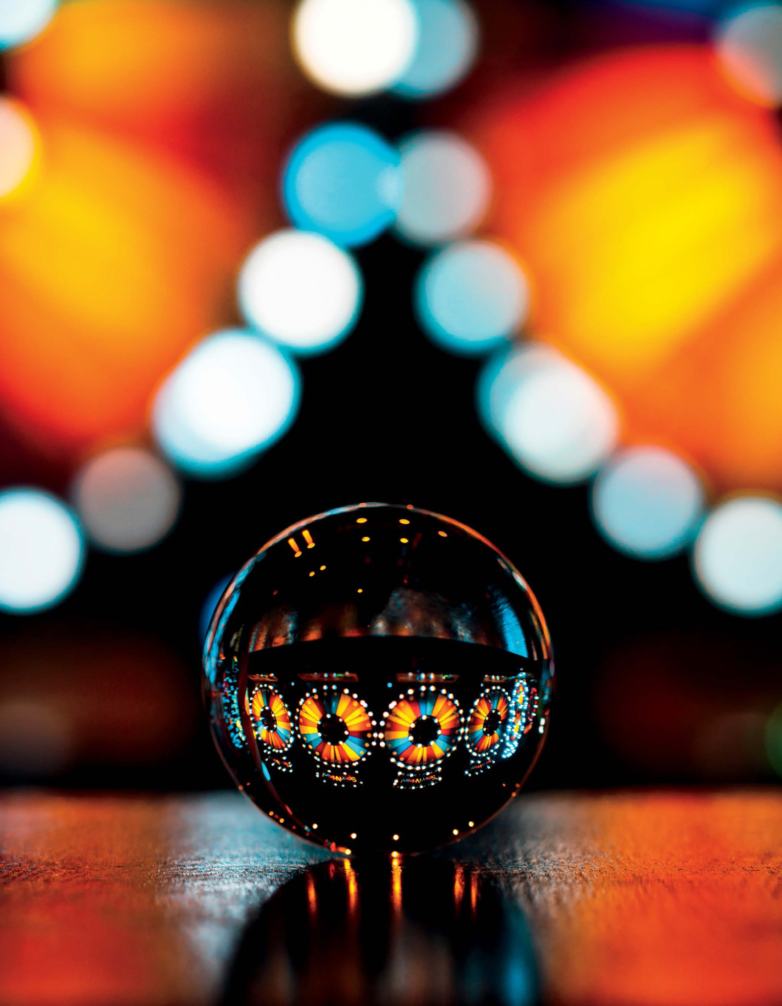
A lack of color contrast can make an image feel dull and lifeless, as seen in figure 4.1a. figure 4.1b exemplifies strong blue and orange tones, which we will later describe as complementary colors. This helps attract the viewer’s eyes to the photo. The lack of a dominant color scheme in the first shot can be hard to work with in post-processing.
Figure 4.1b
70mm | F/2.8 | 1/5000s | ISO 100
You may not think much of it, but color plays a huge role in how we perceive an image. If used purposefully, each color can allude to specific emotions or moods. For example, films are generally shot with two dominant colors, as this gives the cinematographer more control over setting the tone of the scene. This is no different in photography, and if used correctly, this effect can strengthen your image. In this chapter, I’ll cover some different color guides I use often when planning a shot as well as during post-processing.
One of the key elements to creating the perfect image is utilizing the appropriate camera settings for your vision. I won’t go too deep into explaining how to balance the exposure triangle, but there are some basic settings all photographers need to keep in mind during a shoot: aperture, shutter speed, and ISO. I capture most of my images in manual mode and configure the settings in the order mentioned. While it is not necessary to shoot in manual mode to photograph a lensball, it will save you some headache to nail the shot.
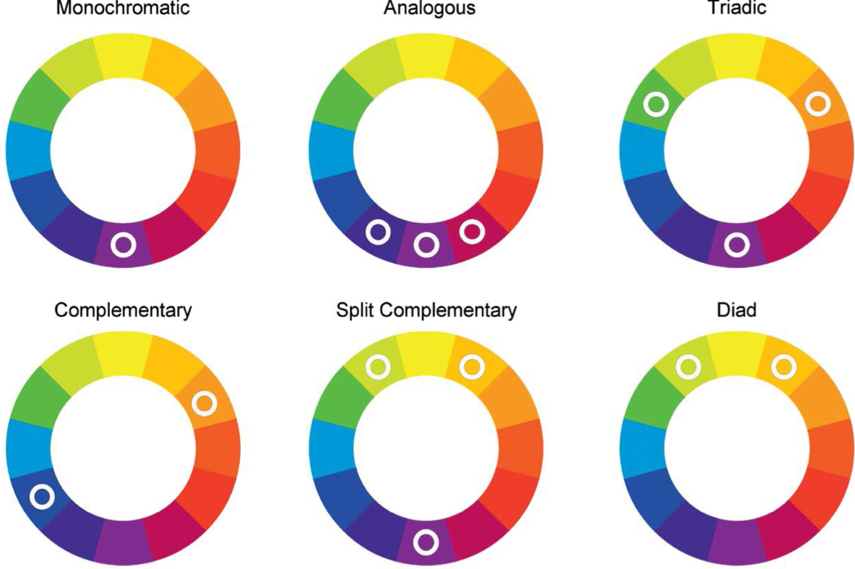
Figure 4.2
Most of you have seen some form of the color wheel, which illustrates the separate color hues in a circle. There are a number of unique color combinations artists use to help tell a story or convey an emotion. In most of my lensball work, I focus on monochromatic, diadic, and complementary colors to set a theme for the overall image.
Monochromatic
This color scheme, as the name suggests, uses only one dominant color to dictate the feel of the image. You can argue that this is the opposite of color contrast, as there aren’t any other colors to contrast with; however, you are free to utilize colors within the similar palette. You can also have other colors present in the photo as long as they don’t compete with the primary color.
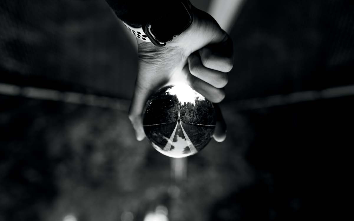
Figure 4.3a
35mm | F/2.8 | 1/200s | ISO 100
Black-and-white photographs devoid of color draw focus to lighting, composition, and texture. You effectively present the feel and the shape of the scene without the common distraction of color. What makes these photographs stand out is that they take away something you see every day and force you into a medium where you pay closer attention to different details.
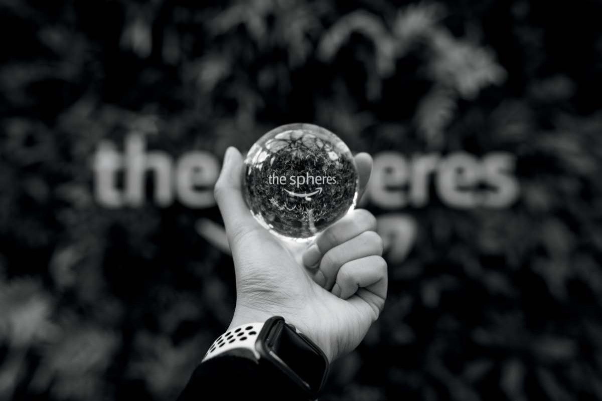
Figure 4.3b
35mm | F/2.8 | 1/100s | ISO 125
The reason you would go this route is to produce a smooth, easy on the eyes photograph. Unlike a black-and-white image (figures 4.3a and 4.3b), where subjects and lighting are emphasized without the distraction of color, a monochromatic color scheme adds an additional layer of storytelling (figures 4.4a and 4.4b).
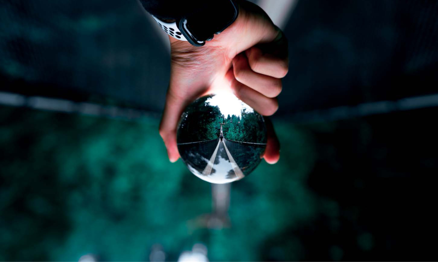
Figure 4.4a
35mm | F/2.8 | 1/200s | ISO 100
Monochromatic photos present the image similarly to black-and-white, but there is more context in either the foreground or background. Things like snow and sand can look very similar in photos, but when their color is given a push to either blue or yellow, the viewer gets a clearer idea of what they’re looking at. When comparing the figures 4.4a and 4.4b to their respective black-and-white counterparts (figures 4.3a and 4.3b), you will notice the blue-green hue gives you the notion that the photo was captured in a forest or in front of foliage.
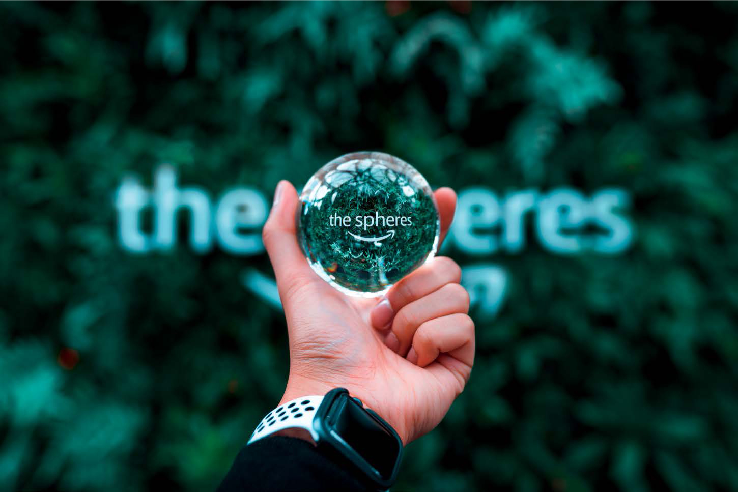
Figure 4.4b
35mm | F/2.8 |1/100s | ISO 125
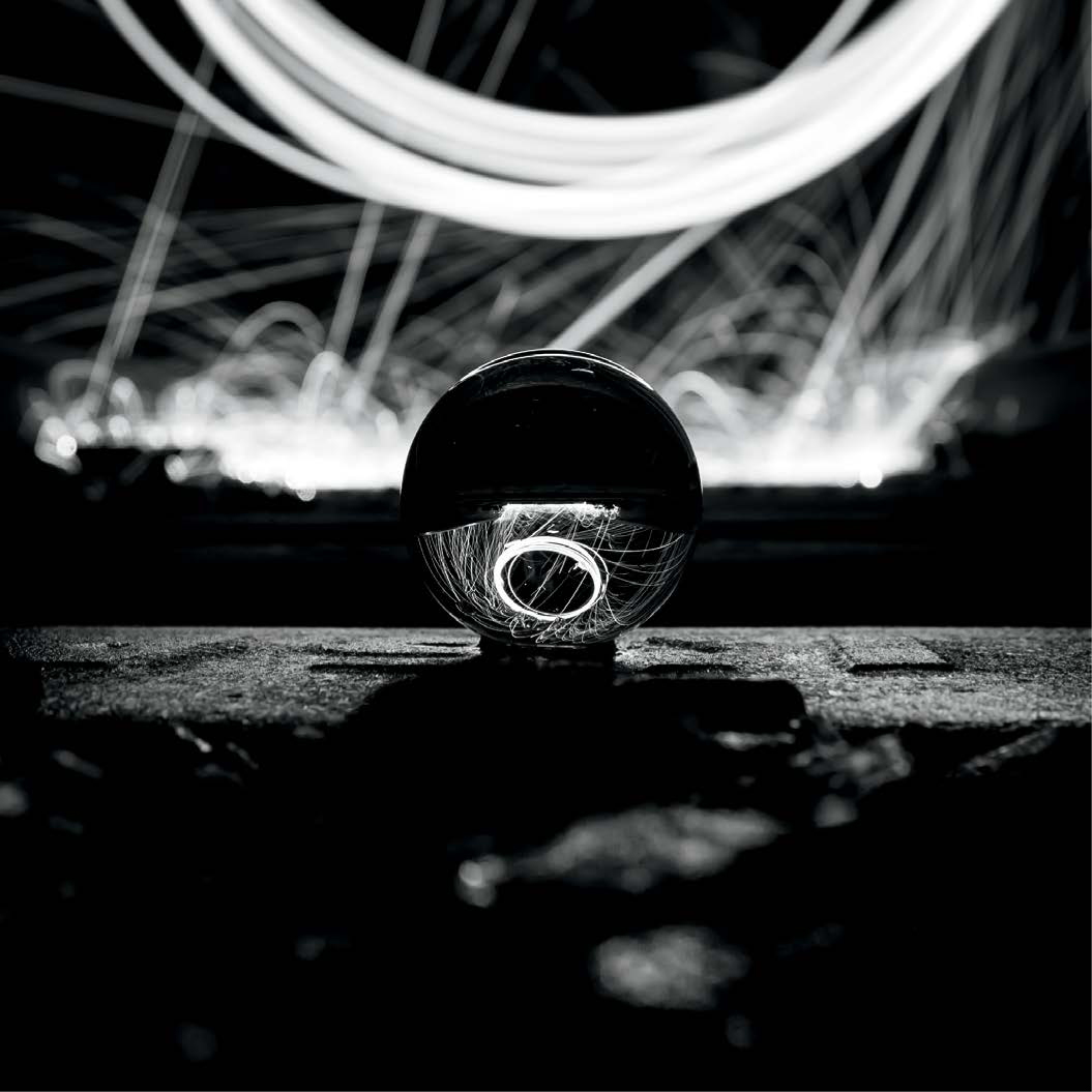
Figure 4.5a
24mm | F/4.0 | 4.6s | ISO 100
This is another great example of a monochromatic edit. figure 4.5a shows a strong definition of the image where it is structured by only whites, grays, and blacks. The source of light may be ambiguous, and it is up to the audience to guess if it is a cool or warm photo. Introducing a blue hue in figure 4.5b alters the feel of the photo, creating a cold ambience.
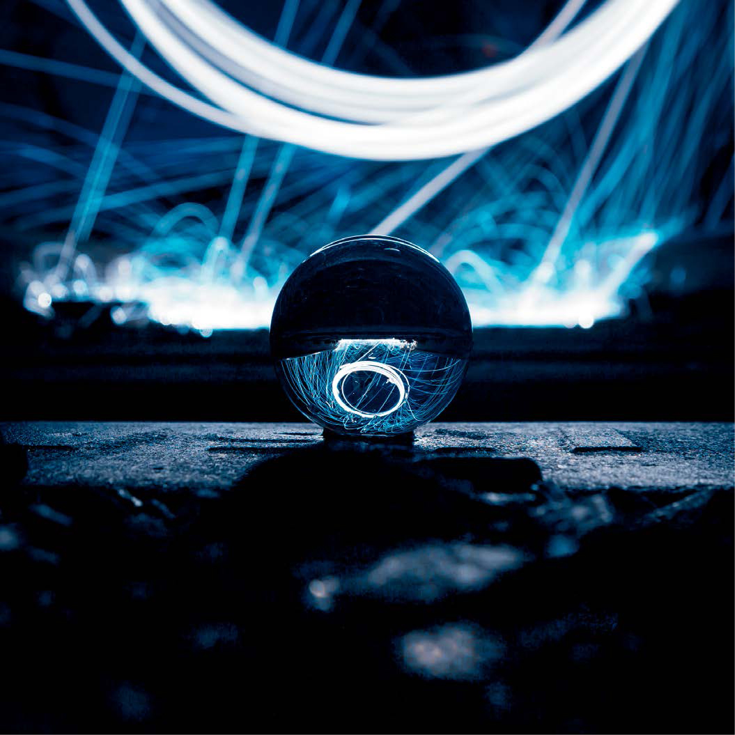
Figure 4.5b
24mm | F/4.0 | 4.6s | ISO 100
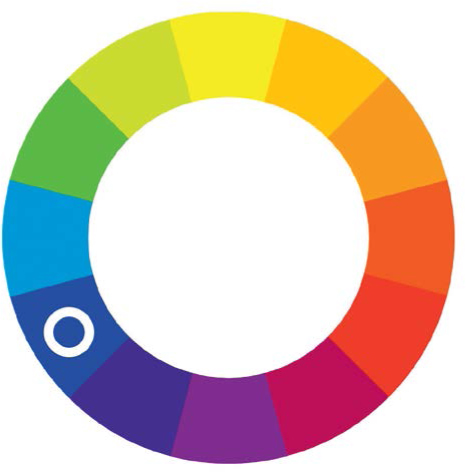
Figure 4.5c
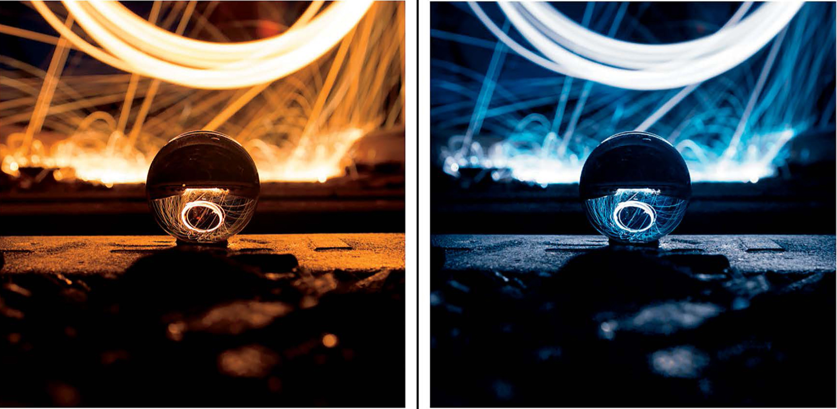
Figure 4.5d
24mm | F/4.0 | 4.6s | ISO 100
I created the light in the background of this photo by swinging lit steel wool tied to a whisk with a long chain. Slowing down the shutter speed to around 4.6 seconds allowed the sensor to be exposed to the light longer, producing the halo effect. The camera was manually focused on the lensball where I would have been standing. If you are shooting in the dark, it is advisable to use a flashlight or lit object to mark your position while focusing behind the camera. Steel wool naturally burns with a yellow-orange hue, but I cooled down the image in post-processing to make it stand out. Also, I must give you a fair warning not to light steel wool in dry areas or public places, as it can start fires if you’re not careful.
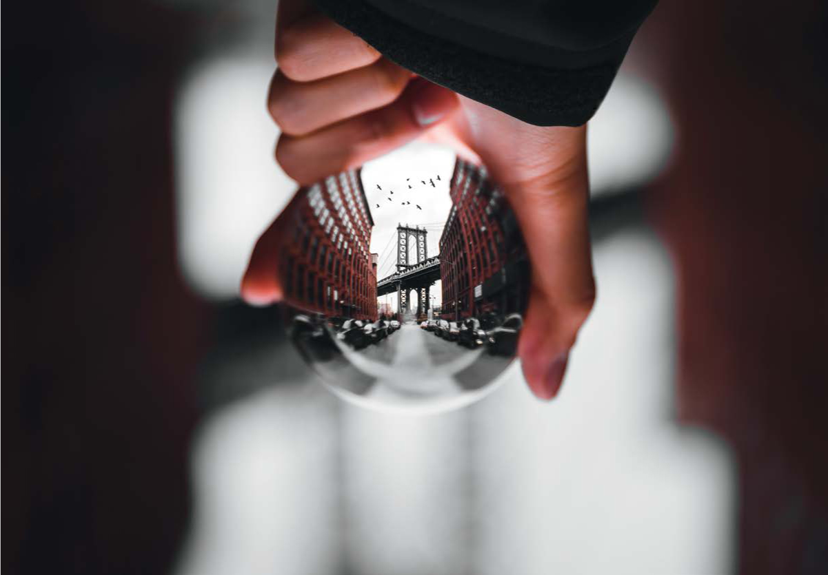
Figure 4.6a
70mm | F/2.8 | 1/320s | ISO 100
This monochromatic capture of the Manhattan Bridge emphasizes the brown and orange colors in the bricks and skin. Although the black-and-white photo brings out the sharp details in the image, the colored photo (figure 4.6b) provides the viewer data into the cold, cloudy weather conditions in which the image was shot, along with the rustic urban aesthetic of the street. Both images can stand well on their own, but each can be used to exemplify a different feeling.
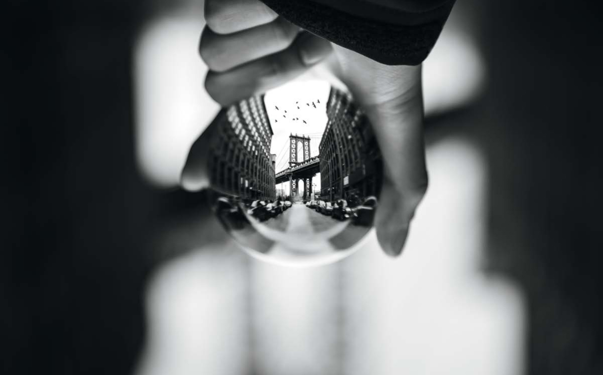
Figure 4.6b
70mm | F/2.8 | 1/320s | ISO 100
Diad
The diad color scheme is described as using two colors that are separated by an adjacent color. For example, blue and violet are divided by blue-violet in the color wheel (figure 4.7). Similar to monochromatic photos, diadic colors still reside on the same end of the color wheel but add a subtle layer of color separation with the additional hue. I typically use this combination when color grading “blue hour” photos where color contrast is lost just as or right after the sun sets (figure 4.8). It may be difficult to find harmonic diadic colors in nature, so another option can be to emphasize them in post-processing. There are many unique photo-editing tools you can use to stretch similar colors into distinct hues (figures 4.9a and 4.9b). I will discuss this later in the photo-editing portion of the book (pages 78–84).
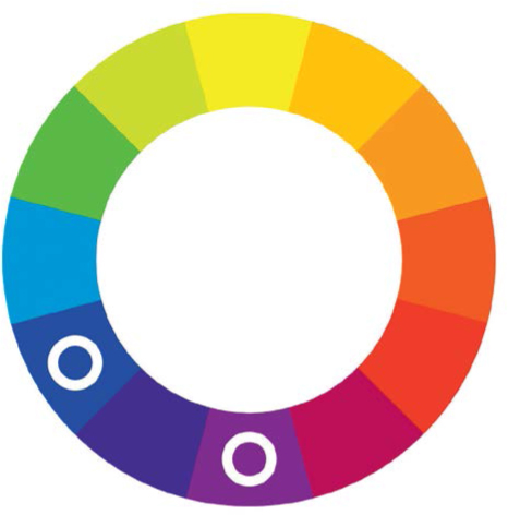
Figure 4.7
Blue and violet are diadic colors—they are separated by one color on the color wheel. Other examples include blue and green, red and orange, etc.
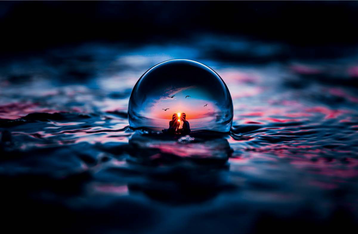
Figure 4.8
70mm | F/2.8 | 1/125s | ISO 100
The colors captured during “blue hour” are relatively similar, ranging from light blue to almost magenta. This photo is a composite—the inner ball image was captured during sunset and color-matched to the background image, which was captured as the sun dipped below the horizon.
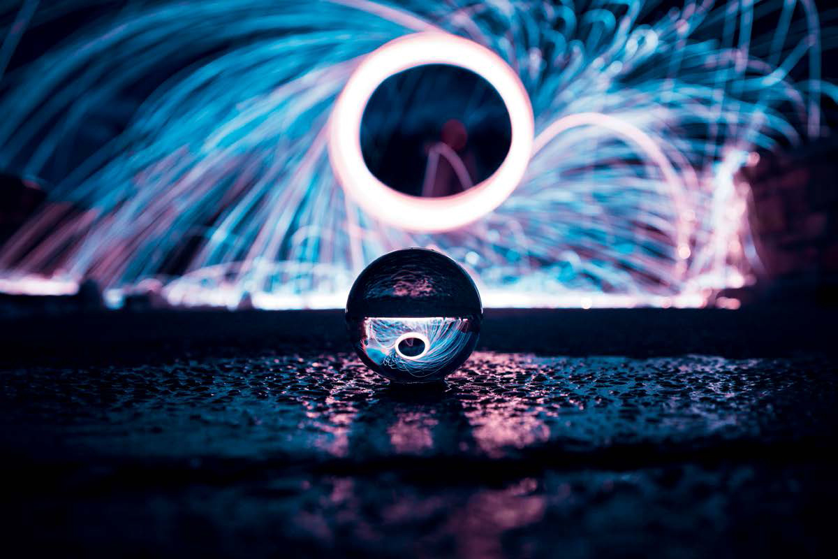
Figure 4.9a
24mm | F/3.5 | 6s | ISO 100
Colors can be stretched into separate hues depending on how they were captured in the original photo. Typically, steel-wool long exposures include colors within the yellow to orange spectrum. For this image, the temperature was cooled to 2250 kelvin and the magenta tint was brought up, revealing a color diad of blue and magenta rather than the monochromatic version with only light orange.
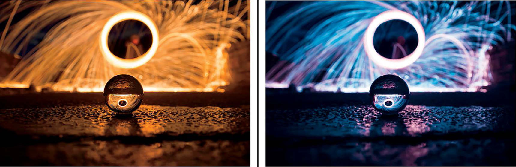
Figure 4.9b
Complementary
Complementary colors refer to two colors on the opposite ends of the color wheel. This color configuration makes your photos appear brighter and more prominent because of the high-contrast look it creates. You may notice this color scheme in everyday pop culture art, as it is very eye-catching and can be found commonly in nature. When I shoot lensball photos, I usually look for existing cool and warm hues in the environment. This is the easiest way to create strong color contrast when post-processing, as the colors will not bleed into each other when adjusting hues. Some examples can be found in the yellow-orange warmth of a sunset in conjunction with the crisp light blue of the sky, or the flowery pink tones of a cherry blossom accompanied by the vivid green in the leaves. There are many combinations of colors you can play with, and once you have a solid understanding of them, you will be able to recreate this look in any photo.
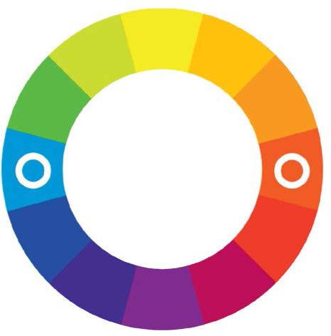
Figure 4.10
Complementary colors represent any two colors that are directly opposite each other on the color wheel. Orange and teal are very common complementary colors used in photography.
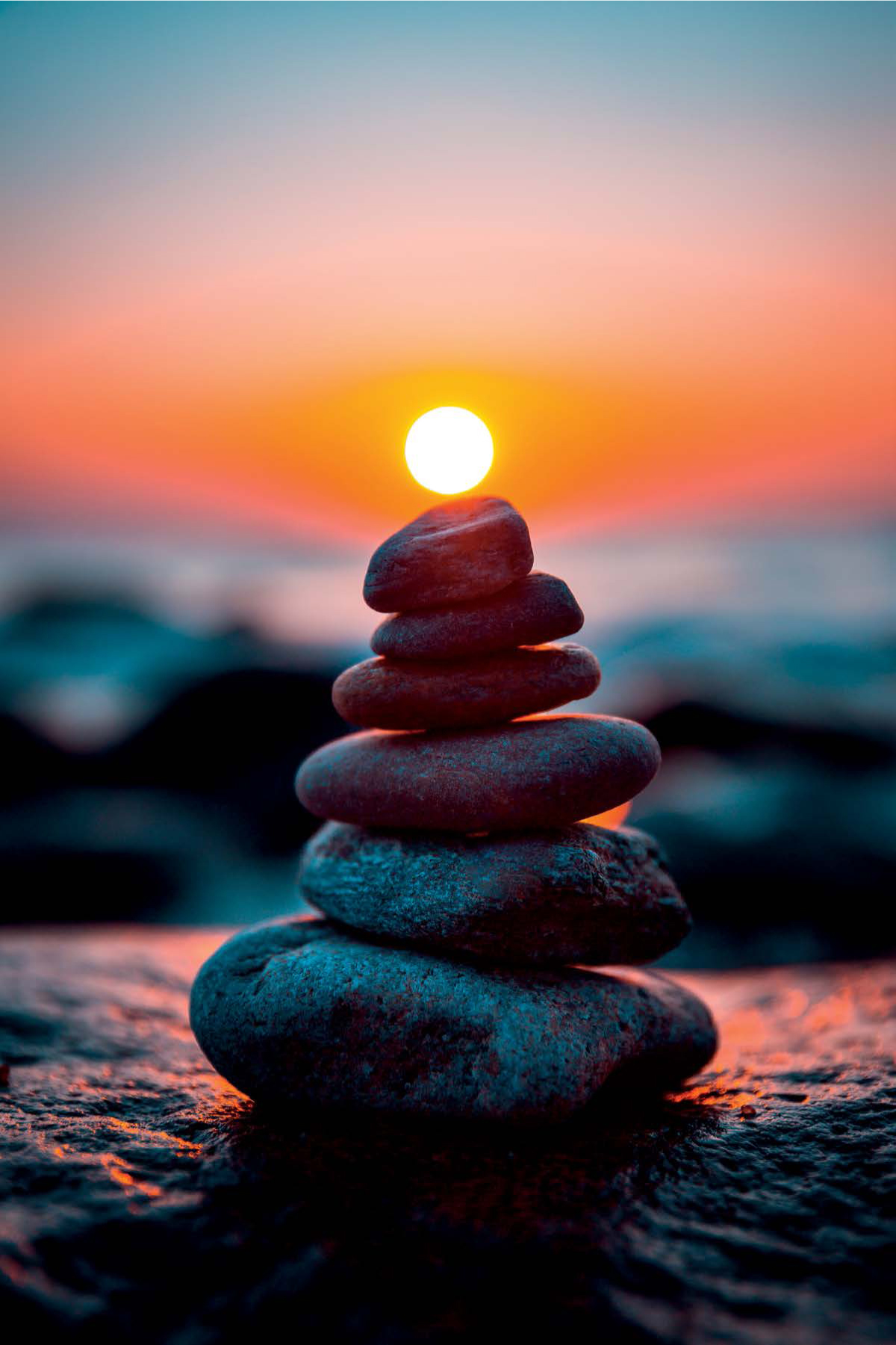
Figure 4.11
42mm | F/2.8 | 1/800s | ISO 100
Orange and teal are prevalent complementary colors found in nature. This sunrise photo uses these colors to create a strong contrast in the photo. Not much post-processing was needed, as the colors were present in the original shot.
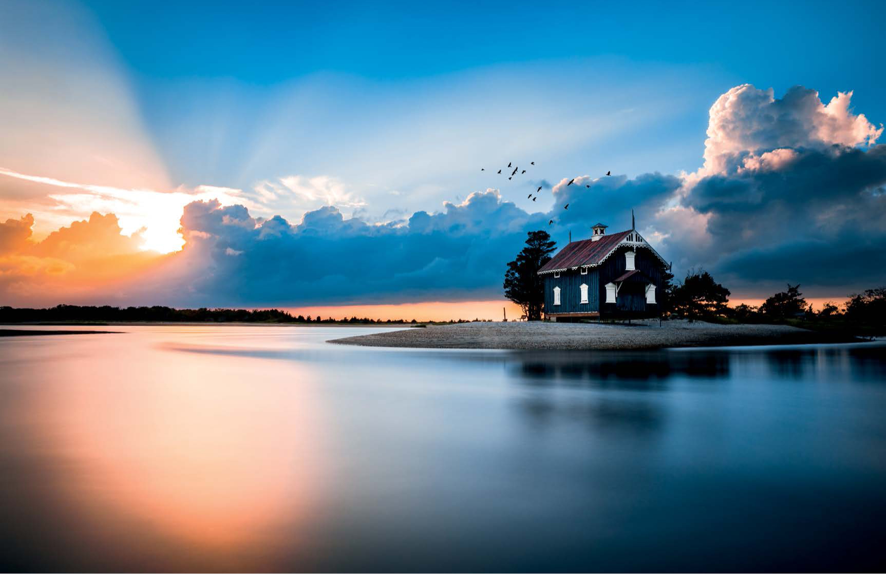
Figure 4.12
24mm | F/2.8 | 10s | ISO 50
Complementary colors can also be used to set a gradient that helps divide the image. This capture of a nearby beach shed during sunset is separated by the warm tones on the left and the cool tones on the right.
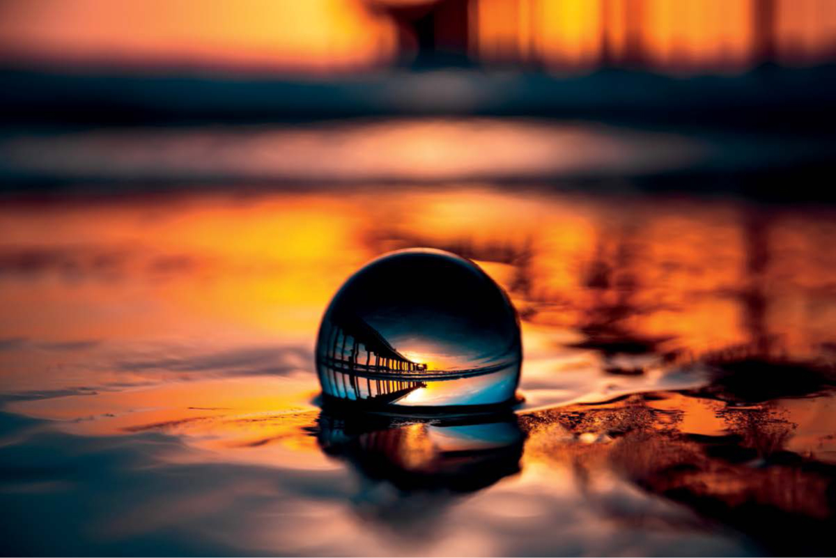
Figure 4.13
70mm | F/2.8 | 1/2500s | ISO 100
The divided colors can be attributed to highlights and shadows to add an additional layer of contrast. In this photo, the golden orange tones boost the highlights and the dark blues reside in the shadows.