
Now, after understanding the aggregations and the various steps of designing a visualization, let's explore each visualization type in detail, with working examples to make things easier to understand. In the following explanation, only step 3 would be used as defined previously, namely visualization canvas.
This is used to display areas below the lines and is similar to Line Charts. It is also used to display data over a period of time.
The chart that we would like to create would show a comparison of top languages in which users tweeted, along with the retweet count for those languages over a period of time. In this we will split the chart on the basis of top languages, split the area on the basis of retweet.retweet_count, and the X-axis will contain the period of time:
- Firstly, specify the metrics on the Y-axis as count (though it's not limited; it can use any other metric as per requirements).
- Then we add a new split chart bucket type and add aggregation of terms specifying the field language with top 2 size. After adding this, we have split the chart, showing the amount of tweets in the top 2 languages tweeted by users.
- Then we will add a Split Area sub-bucket and add sub-aggregation of terms specifying the field
retweet.retweet_countwith top 3 size. After adding this we have split the area showing the top 3 retweet counts in the top 2 languages tweeted by users. - As Area Charts are used to display data over a period of time we will add an X-axis sub-bucket, having the sub-aggregation as Date Histogram using the
created_atfield with the interval of minute. - Finally, we have a visualization that shows the top 3 retweet counts for the top 2 languages in which users have tweeted.
Note
While using Area Charts you may encounter the following error message: Area charts require more than one data point. Try adding an X-Axis aggregation. It shows an error as an X-axis is required as input for providing visualizations in the Area Chart. Also, an error can occur if the Time Filter selected does not fit into the visualization.
To preview the visualization, click the green Apply Changes button ![]() to update your visualization or click the grey Discard Changes button
to update your visualization or click the grey Discard Changes button ![]() to discard changes to the visualization.
to discard changes to the visualization.
You can see the output in the form of a screenshot, shown as follows:

In the previous screenshot, Chart Mode is stacked (by default), which shows all the documents across the buckets from the height of the stacked elements.
Let's save this visualization as Area Chart, which will be used in Chapter 4, Exploring the Dashboard Page.
In the Options tab, by default Chart Mode is set as stacked but can be changed to other chart modes by selecting the following chart modes.
In this view, areas would not be stacked upon each other; instead every area will begin at the X-axis and would be displayed in a semi-transparent way so that all areas are seen properly. It makes it easier to see the values of different buckets but difficult to get a total value of all the buckets:

In this Chart Mode, the height of the chart will always be shown as 100% and the count for each bucket will be displayed in terms of the percentage of the whole chart.
For example, at a particular time (June 2, 12:46) we have 64 as the retweet count of 1, 16 as the retweet count of 2, and 15 as the retweet count of 3, so in percentage mode we will show a 64 retweet count along with 67.4%, meaning [(64 / 95) * 100] where 95 = 64 + 16 + 15:

This Chart Mode displays the aggregation as a stream graph, which is a stacked area graph displaced around a central axis resulting in a flowing shape:

This Chart Mode displays the aggregation as a variance from the central line from which chart evolves in both directions:

Every string field specified in buckets, aggregation, or sub-aggregations have customization options, which can be edited/used by clicking on the Advanced button ![]() shown beneath Order By, and include the following options:
shown beneath Order By, and include the following options:
- Exclude Patterns: This specifies a pattern to exclude from the results
- Exclude Pattern Flags: These are a set of java flags for exclusion pattern
- Include Patterns: This specifies a pattern to include in the results
- Include Pattern Flags: These are a set of java flags for inclusion pattern
- JSON Input: This adds specific JSON properties to merge with aggregation
Also, other view options alter the following behavior of Area Charts:
- Smooth Lines: Check this box to curve the top boundary from point to point:

- Current Time Marker: Check this box to draw a red line on current time data
- Set Y-Axis Extents: Check this box to specify y-max and y-min fields to set specific values for the Y-axis
- Scale Y-Axis to Data Bounds: Check this box to change upper and lower bounds to match values returned in data
- Show Tooltip: Check this box to enable information when hovering over visualization
- Show Legend: Check this box to view the legend that is shown next to the chart
Data Table is used to display a table of aggregated data stored in Elasticsearch. It provides raw data results in tabular format.
The Data Table that we would like to create would show the top languages along with a count of each language's retweets in the ranges of 0 to 10 and 10 to 20. In this, we will split the rows on the basis of top languages and split the rows on the basis of the retweet_count ranges:
- Firstly, specify the metrics as count (though not limited to it, can use any other metric as per requirement).
- Then we add a new Split Rows bucket and add aggregation of terms specifying the field language with top 5 size. After adding this, we created a Data Table showing a count of tweets in the top 5 languages tweeted by users.
- Then we will add a Split Rows sub-bucket and add Range sub-aggregation, specifying the field
retweet.retweet_countwith ranges from 0 to 10 and 10 to 20. - Finally, click on the Apply Changes button to view the visualization, which shows
retweet_countranges for the top 5 languages in which users have tweeted.
You can see the output in the form of a screenshot, as follows:

Let's save this visualization as a Data Table, which will be used in Chapter 4, Exploring the Dashboard Page.
In the Options tab, there are view options that alter the following behavior of Data Table:
- Per Page: This is used for pagination of the table. By default, 10 rows are displayed per page. This option can be changed as per requirements.
- Show metrics for every bucket/level: Check this box to display the intermediate metrics result corresponding to each bucket aggregation.
- Show partial rows: Check this box to display rows even if there is no result.
This is used to display the aggregated data in the form of lines. The lines can be displayed on a linear, log, or square root scale. It is also used to display data over a period of time.
The chart that we would like to create would show the comparison of top languages in which users tweeted, along with the retweet count for those languages over a period of time. In this, we will split the chart on the basis of top languages, split the area on the basis of retweet.retweet_count, and the X-axis will contain the period of time:
- Firstly, specify metrics on the Y-axis as count (though it's not limited, it can use any other metric as per requirement).
- Then we add a new Split Chart bucket and add aggregation of terms specifying the field language with top 2 size. After adding this, we have split the chart showing the count of tweets in the top 2 languages tweeted by users.
- Then we will add a Split Lines sub-bucket and add sub-aggregation of terms specifying the
retweet.retweet_counttweet with top 3 size. After adding this, we have split the area showing the top 3 retweet counts in the top 2 languages tweeted by users. - As Line Charts are used to display data over a period of time, we will add an X-axis sub-bucket, having sub-aggregation as date histogram, using the field
created_at, with minute intervals. - Finally, click on the Apply Changes button to view the visualization, which shows the top 3 retweet counts for the top 2 languages in which users have tweeted.
You can see the output in the form of a screenshot, as follows:
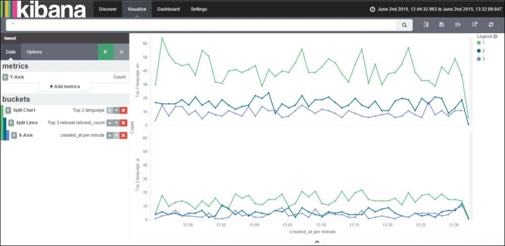
In the previous screenshot, the Y-axis scale is linear (by default), which displays the Y-axis scale as the count of matching documents.
Let's save this visualization as LineChart, which will be used in Chapter 4, Exploring the Dashboard Page.
In the Options tab, by default, the Y-axis scale is set as linear but can be changed to other scales by selecting the following scale options.
In this option, the Y-axis scale calculates its values based on the logarithm of the count value. It is used to display data exponentially:

In this option, the Y-axis scale calculates its values based on the square root of the count value:

Also, other view options alter the following behavior of Line Charts:
- Smooth Lines: Check this box to curve the top boundary from point to point:

- Show Connecting Lines: Check this box to draw lines between points
- Show Circles: Check this box to draw each data point as a circle:

- Current Time Marker: Check this box to draw a red line on current time data
- Set Y-Axis Extents: Check this box to specify y-max and y-min fields to set specific values for the Y-Axis
- Scale Y-Axis to Data Bounds: Check this box to change upper and lower bounds to match values returned in data
- Show Tooltip: Check this box to enable information when hovering over the visualization
- Show Legend: Check this box to view the legend that is shown next to the chart
There is a new variation to Line Charts known as Bubble Charts. Bubble Charts are used to display data points as bubbles.
You can convert a Line Chart visualization to a Bubble Chart visualization by using the following steps:
- Create a Line Chart visualization or load a created LineChart visualization.
- In Data tab, under Metrics, click on Add Metrics and select metrics type as Dot Size, and specify Dot Size Ratio and Aggregation as Count (or choose any other).
- In the Options tab, uncheck the Show Connecting Lines box and click on the Apply Changes button.
Let's save this visualization as Line_Bubble, which will be used in Chapter 4, Exploring the Dashboard Page.

This is a text entry field used to input any type of information or instructions. It is useful in displaying the text, links, code, tables, and so on, entered on the dashboard, which acts as additional information and can be used easily. Kibana renders the text entered and displays the result on the dashboard. It does not have any relation to visualization using your data.
The markdown is a GitHub-flavored markdown. There is a help link that, upon clicking, takes you to the help page for a GitHub-flavored markdown.
Metric visualization is used to display a single number for various metric aggregations. In this, no bucketing is done, the metrics aggregations are applied to the complete data set, meaning the index on which visualizations are being created. The data set can be changed either by choosing another index or querying in the search bar.
It is easy to create by just clicking on the Add Metrics and select Metrics. Then select the aggregation followed by the field name (if aggregation is chosen as count specifying field, a name is not required).
Let's create a very interesting Metric visualization to calculate the unique hashtags in the data set and determine the preferred length of hashtag for Twitter. For this we would require the following inputs:
- Total data set count
- Unique count of hashtags (unique count of the
hashtag.textfield) - Minimum hashtag start position (minimum of the
hashtag.startfield) - Minimum hashtag end position (minimum of the
hashtag.endfield) - Maximum hashtag start position (maximum of the
hashtag.startfield) - Maximum hashtag end position (maximum of the
hashtag.endfield) - Average hashtag start position (average of the
hashtag.startfield) - Average hashtag end position (average of the
hashtag.endfield)
Let's save this visualization as Metrics, which will be used in Chapter 4, Exploring the Dashboard Page.
Finally, click on the Apply Changes button to view visualization as shown in the following screenshot:

From the previous screenshot, we have analyzed the average hashtag length based on 13,695 unique hashtags received. It states an average of approximately 11 characters for hashtags used by users.
This type of analysis can easily be done by companies in order to determine the length of hashtag for trending on Twitter.
This is used to display each source's contribution to the total. It can be displayed either as a pie or as a donut. It is most useful for displaying the parts of some whole. Pie charts use slices; fewer slices is easier to visualize.
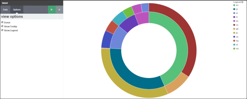
The chart that we would like to create would show comparison of top languages in which users tweeted, along with top country code for those languages over a period of time. In this we will split the chart on the basis of created_at, split slices on the basis of top languages, and split slices on the basis of top country code. In Pie Charts, Split Charts are generally used before Split Slices:
- Firstly, specify metrics on Slice Size as Count (though it's not limited, it can use any other metric as per requirement).
- Then we add a new Split Chart bucket and add aggregation of date histogram on field
created_atwith the interval of hourly. After adding this, we have split the chart on the basis of hours. - Then we will add a Split Slices sub-bucket and add a sub-aggregation of terms specifying the field language with top 5 size. After adding this, we have split the slices in Pie Chart showing the top 5 languages on an hourly basis.
- To display the top country code for those languages, we will add a Split Slices sub-bucket with sub-aggregation as terms specifying the field
place.country_codewith top 2 size. - Finally, click on the Apply Changes button to view the visualization, which shows the top 5 languages along with the top 2 country codes for those languages by hourly intervals.
You can see the output in the form of a screenshot, as follows:

In the previous screenshot, pie charts are split by hourly intervals (as we have data of the 12th hour and 13th hour). Each pie chart is split by the top 5 languages (shown as the inner pie) and each language is split by the top 2 country codes from which users have tweeted (shown as the outer pie). The size of each pie is determined by the count of matching documents in every bucket.
The size in percentage is computed as follows:
For the 12th hour, English language contains United States (US) and Great Britain (GB) as the top 2 countries that have tweeted in the English language. If the total count of tweets by US and GB for English language is 156, out of which the US has 126 tweets, then their slice percentage is equal to (126 / 156) * 100 = 80.77%, and GB has 30 tweets, then their slice percentage is equal to (30 / 156) * 100 = 19.23%. It is shown in the following screenshot:

Let's save this visualization as PieChart, which will be used in Chapter 4, Exploring the Dashboard Page.
In the Options tab there are view options that alter the following behavior of pie charts:
This is used to display GeoHash type aggregation results over the map. It requires a geo_point type field with inputs of latitude and longitude. It uses Geo Coordinates bucketing. The visualization would display the data points captured in the form of circles (by default) where size will depend upon the precision chosen, and color is signified by the actual value calculated by whichever metric aggregation was used.
We would like to map the locations of the countries from which users have tweeted. In this we will use Geo Coordinates in a bucket.
- Firstly, specify metrics on Value as Count (though it's not limited, it can use any other metric as per requirement).
- Then we add a new Geo Coordinates bucket and add aggregation of GeoHash specifying the field location. After adding this, we will see a map that has circles as data points captured by the location field.
- Finally, click on the Apply Changes button to view the visualization, which shows the location on a map from which users have tweeted.
You can see the output in the form of a screenshot, as follows:

In the previous screenshot, the Map type is Scaled Circle Markers, which scales the size of the markers (data points) based on the metric aggregation's value. The size of each circle varies based on the range of metric value.
Let's save this visualization as Map, which will be used in Chapter 4, Exploring the Dashboard Page.
Note
Upon importing sample Twitter data, you will not be able to create the Tile Map visualization as it will return an error stating that no field found matching the geo_point type. In the GitHub repository, within the Readme file, there are steps to fetch twitter data using elasticsearch Twitter river using which sample twitter data was generated and further exported to a sample file using elasticdump utility.
In the Options tab, by default, Map type is set as Scaled Circle Markers but can be changed to other map types by selecting the following options:
In this option, the size of each circle varies with the location of latitude and longitude. The closer to the equator, the smaller the circle size, and the further from the equator, the larger the circle size. It is used to display the markers (data points) with different shades based on the metric aggregations' value:

In this option, markers (data points) are displayed using rectangular cells of GeoHash grid instead of the circles as shown in the previous images. It is used to display the markers (data points) with different shades based on the metric aggregations' value.

This is a special kind of tile map, which is a two-dimensional graphical representation of data having values displayed using colors instead of numbers, text, or markers (data points). It provides an easy way to understand and analyze complex/huge data sets. It applies blurring of markers and shading (dark or light) on the basis of the total amount of overlap.
Heatmap contains the following properties:
- Radius: This is used to set the size of all Heatmap dots occurring on the map. The larger the radius, the bigger the size of overlap of dots; the smaller the radius, the smaller the size of overlap of dots. By default it is 25.
- Blur: This is used to set the blurring amount for all Heatmap dots occurring on the map. The higher the blur, the fewer individual Heatmap dots are shown; the lower the blur, the more individual Heatmap dots are shown. By default it is specified as 15.
- Maximum Zoom: This is used to define the zoom level of the map at which all Heatmap dots are displayed at full intensity. The higher the zoom, the more the intensity of dots; the lower the zoom, the less the intensity of dots. In Kibana tile maps, maximum zoom is supported up to 18 zoom levels. By default it is specified as 16.
- Minimum Opacity: this is used to set the opacity for all Heatmap dots. By default it is specified as 0.1.
- Show Tooltip: check this box to enable information when hovering over visualization.
It is used to desaturate the map color so that the colors appear more clearly. It does not work on any version of Internet Explorer (IE).
The following figure shows Heatmap with the Desaturate map tiles check box ticked:

The following figure shows Heatmap with the Desaturate map tiles not ticked:

Also, after creating the Tile Map visualization, we can explore the map in the following ways:
- Click-and-drag the cursor anywhere on the map to move the map center
-
Click on the Zoom In/Out buttons
 to change the zoom level
-
Click on the Draw a Rectangle button
 to create a filter for the box coordinates by drawing a rectangle box
-
Click on the Fit Data Bounds button
 to automatically adjust the map and display the map boundaries according to the GeoHash bucket that has at least a single result
This acts as a general-purpose chart suited to both time-based data and non-time-based data. The bar chart can be displayed either as stacked, percentage, or grouped. In this type of chart, every X-axis value will have its own corresponding bar where the size of every bar signifies the metric aggregation.
The chart that we would like to create will show the comparison of the top languages in which users tweeted, along with the retweet count for those languages over a period of time. In this, we will split the bars on the basis of the top languages, split the chart on the basis of retweet.retweet_count, and the X-axis will contain the period of time:
- Firstly, specify the metrics on the Y-axis as count (though it's not limited, it can use any other metric as per requirement).
- Then we add a new X-axis bucket, having aggregation as date histogram using the field
created_atwith the interval of minute. After adding this, we will get a count of tweets on a per minute basis in terms of a histogram. - Then we will add a Split Bars sub-bucket and add sub-aggregation of terms specifying the field language with top 2 size. After adding this, we have split the bar showing the top 2 languages which have been tweeted by users on a per minute basis.
- To display the range of retweet count for the top 2 languages we will add a Split Chart sub-bucket having sub-aggregation as Range specifying the field
retweet.retweet_countwith the ranges defined as from 0 to 5 and from 5 to 10. - Finally, click on the Apply Changes button to view the visualization, which shows tweets from users on a per minute basis, specifying the top 2 languages in which users have tweeted, along with splitting the bar chart on the basis of the retweet count range.
You can see the output in the form of the screenshot, as follows:

In the previous screenshot, the bar mode is stacked (by default), which shows all the documents across the buckets from the height of the stacked elements.
Let's save this visualization as BarChart, which will be used in Chapter 4, Exploring the Dashboard Page.
In the Options tab, by default, Bar Mode is set as stacked but can be changed to other bar modes by selecting the following bar modes.
In this bar mode, the height of the bar will always be shown as 100% and the count for each bucket will be displayed in terms of percentage of the whole bar.
For example, at a particular time (June 2, 12:45) we have 52 as the retweet count in range 0 - 5 for the English language, and 12 as the retweet count in range 0 - 5 for Japanese, so in percentage mode we will be shown 52 retweet counts along with 81.3%, meaning [(52 / 64) * 100] where 64 = 52 + 12:

This bar mode groups the results of each bucket and displays them alongside each other:

Also, other view options alter the following behavior of bar charts:
- Current Time Marker: Check this box to draw a red line on current time data
- Set Y-Axis Extents: Check this box to specify the
y-maxandy-minfields to set specific values for the Y-axis - Scale Y-Axis to Data Bounds: Check this box to change upper and lower bounds to match values returned in data
- Show Tooltip: Check this box to enable information when hovering over visualization
- Show Legend: Check this box to view the legend, which is shown next to the chart