
To create a new visualization, we follow a step-by-step process that can be initiated by clicking on the Visualize tab, which is the second tab at the top of the page.
It lists the different visualization types with an option to select any one of the following:
|
Area Chart |
Use Area Charts to visualize the total contribution of several different series. The areas can be displayed as stacked, overlap, percentage, wiggle, or silhouette. |
|
Data Table |
Use Data Tables to display tables of aggregated data stored in Elasticsearch. |
|
Line Chart |
Use Line Charts to display the aggregated data in the form of lines. The lines can be displayed on a scale of linear, log, or square root. |
|
Markdown widget |
Use Markdown widget to display any type of information or instructions related to dashboard. |
|
Metric |
Use the Metric visualization to display a single number on your dashboard for various metric aggregations. |
|
Pie Chart |
Use Pie Charts to display each source's contribution to a total. It can be displayed as a pie or as a donut. |
|
Tile Map |
Use Tile Maps to display a map for results based on GeoHash aggregation, which requires a |
|
Vertical Bar Chart |
Use Vertical Bar Charts as a general-purpose chart. The bar chart can be displayed as stacked, percentage or grouped. |
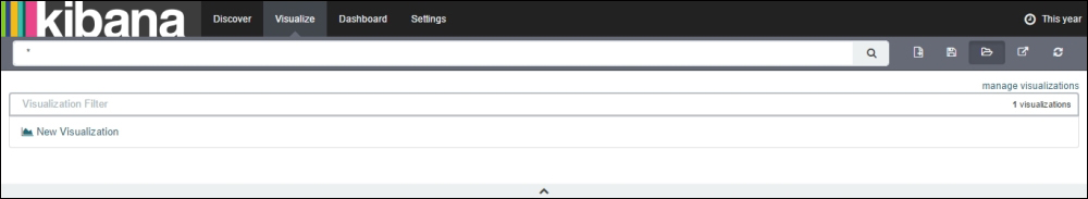
When clicking on the Visualization tab to create a new visualization, you will see the following options as shown in the following image:

In this figure, you have various selection options to create a new visualization, or you can also load a saved visualization (if created earlier). We will discuss the saved visualizations in the Save Visualization section in this chapter.
If the new visualization is of the Markdown widget type, then selecting it will take you to a text entry field where you can enter the information or any text that you require. If you select any other visualization type, you will be taken to step 2.
This step is used to select the search source on the basis of which you would visualize. You can either select a new search or a saved search as the data source for creating visualizations. All the searches are associated with an index or bunch of indices.
You have two options to select a search source:
- From a new search
- From a saved search
When you select from a new search and have multiple indices defined, then you would be given a drop-down menu to select the index on which you want to visualize. It is used to create visualizations based on stored data.
When you select from a saved search, it will link the visualization with the search query saved on the Discover page. As the search is linked with visualization, any changes made to the search, the visualization will be automatically updated.
You will see the following options to select a search source as shown in the following figure:

In this figure, you can see the option of choosing a search source from either a new search or a saved search. Upon selecting either of them, you will be taken to step 3.
This step is very important as it enables you to create, edit, and configure visualizations. The main elements of the visualization canvas are:
- Toolbar
- Aggregation designer
- Previewing visualization

The toolbar is used for powerful analysis of data based on search queries and filters. It is used for specifying the search query on the basis of which visualization changes and updates automatically. It has a search field that is used for interactive searching of data along with controls to create, save, or load visualizations. The toolbar consists of a search bar along with option buttons such as New Visualization, Save Visualization, Load Saved Visualization, Share Visualization, and Refresh.
New Visualization provides the option to create a new visualization. It erases the present visualization and creates a new one to play with. It is done by clicking on the New Visualization button ![]() , which is situated on the toolbar beside the search bar:
, which is situated on the toolbar beside the search bar:

Save Visualization provides the option of saving a created visualization. It is used to save the current created visualization along with the selected index information. This option is situated beside the New Visualization button on the toolbar.
To save a visualization, perform the following steps:
- Create a visualization.
-
Click on the Save Visualization button
 present on the toolbar next to the New Search button:

- Give it a title to save.

- Click on Save to save the visualization.
Load Saved Visualization provides the option of loading any previously created and saved visualization. It is used to load visualization with a specified index. If loading a saved visualization included a different index, then on loading it, the selected index also gets updated. This option is situated beside the Save Visualization button on the toolbar.
To load a saved visualization:

Share Visualization provides the option of sharing your visualization, which is either created or saved and can be shared among the people to view. It also provides the option of either sharing the link to your visualization or embedding the visualization within any HTML page (which would still require access to Kibana for viewing). This option is situated beside the Save Visualization button in the toolbar.
To share visualization, perform the following steps:
-
Click on the Share Visualization button
 present in the toolbar next to the Save Visualization button:

- Upon clicking on it, you will find a link for embedding this visualization and sharing the visualization:

-
Click on the copy to clipboard button
 beside Share a link to copy the link and share it. Otherwise, you can copy to clipboard button beside Embed this visualization, and paste the
 iframesource into an HTML page to display visualizations in a webpage/application.
This is the heart of creating visualizations. It is displayed on the left-hand side of the Visualize page. It is used for configuring the metric and bucket aggregations as discussed previously, which is used for visualizations. Buckets are similar to SQL Group By statements. The aggregation builder consists of two tabs:
- Data: this is used for specifying the metric and bucket aggregations. Metric aggregations include count, average, sum, min, max, standard deviation, unique count, percentile, and percentile ranks. Bucket aggregations include date histogram, histogram, range, date range, IPv4 range, terms, filters, and significant terms.
For each different type of visualization we have different types of metrics and bucket options, which are described briefly in the following table:
Type of visualization
Metrics
Bucket
Area Chart
Y-axis
X-axis, split area, split chart
Data Table
Metric
Split rows, split table
Line Chart
Y-axis
X-axis, split lines, split chart
Metrics
Metric
-
Pie Chart
Slice size
Split slices, split chart
Tile Map
Value
Geo coordinates, split chart
Vertical Bar Chart
Y-axis
X-axis, split bars, split chart
You can set the order of execution for each bucket. The re-ordering of buckets changes the order of execution.
- Options: this is used to display the various types of view options associated with each type of visualization. Each visualization created has its own view options to change a few aspects. These are optional and have options that can be selected or de-selected as per requirements. It provides flexibility in creating different types of visualizations. Some of the options associated with visualizations are briefly stated in the following table:
Type of visualization
View options
Area Chart
Chart mode (stacked, overlap, percentage, wiggle, silhouette), smooth lines, set Y-axis extents, scale Y-axis to data bounds, show tooltip, show legend
Data Table
Per page, show metrics for every bucket/level, show partial rows
Line Chart
Y-axis scale (linear, log, square root), smooth lines, show connecting lines, show circles, set Y-axis extents, scale Y-axis to data bounds, show tooltip, show legend
Metric
Font size
Pie Chart
Donut, show tooltip, show legend
Tile Map
Map type (scaled circle markers, shaded circle markers, shaded GeoHash grid, Heatmap), desaturate map tiles
Vertical Bar Chart
Bar mode (stacked, percentage, grouped) set Y-axis extents, scale Y-axis to data bounds, show tooltip, show legend
To see the visualization on a preview canvas, click on the green Apply Changes button
 at the top right of the aggregation builder, beside the two tabs of Data and
Options.
at the top right of the aggregation builder, beside the two tabs of Data and
Options.