In this section, we will cover the various scenarios described earlier in this chapter, and create visualizations for each scenario. After streaming data into Elasticsearch, we will configure a new index in Kibana and add a Twitter index into it to view the streaming data as covered in Chapter 1, An Introduction to Kibana.
In the first scenario, we want to find out how many tweets are being tweeted over a period of time for a particular brand. Using this, a company would come to know the frequency of tweets for its brand over a certain period of time, which makes it easier to view the trend rather than going through huge amounts of raw data. Accordingly, they can monitor the number of tweets for that brand, either for their marketing campaign or to know the popularity of the brand.
To create a visualization for this scenario, we will use a line chart:
- The y axis will have Count as the metric
- The x axis will contain the aggregation as the date histogram, followed by the timestamp field with the interval specified in minutes
Now view the visualization by clicking on the Apply Changes button, which will be as shown in the following screenshot:

From this, the relevant company can easily monitor the time period when people tweet about them the most, which could help them market their brand or product in specific time periods to get maximum attention. They can also use this as a basic scenario on which they can build up using filters and by digging into the visualization to get more insights. Let's save this visualization as TweetsperTime, which we will use to create a dashboard.
In our next scenario, we want to find out how many people are tweeting in different languages. This helps the company understand which languages are popular among people tweeting about the company's brand or product.
To create a visualization for this scenario, we will use a vertical bar chart:
- The y axis will have Count as the metric.
- Split Bars will contain the aggregation as terms specifying the field as
langwith the Top 10 size. - Go to the Options tab, and select Bar Mode as Grouped from the drop-down list.
Now view the visualization by clicking on the Apply Changes button, which will show you this result:

In the preceding screenshot, we compute the top 10 languages in which people are tweeting about a given product or brand. Let's save this visualization as TopLanguages, and we will use it to create a dashboard.
In this scenario, we want to compute the number of people who are tweeting from different geographical locations. It helps the company understand the geographical location of their existing or prospective customers.
Again, we will use a vertical bar chart to create a visualization for this scenario:
- The y axis will have Count as the metric.
- Split Bars will contain the aggregation as terms specifying field as
place.country_codewith the Top 10 size. - Go to the Options tab and select Bar Mode as Grouped from the drop-down list.
Now check out the visualization by clicking on the Apply Changes button, which will show you the result like this:

Here, we find out the top 10 geographical locations where people tweet about the product or brand. Let's save this visualization as TopCountries, which we will use to create a dashboard.
Note
Sometimes, the field may not show in the Twitter index. To solve this problem, you will need to reload the Index field list. This is covered in Chapter 5, Exploring the Settings Page, in the Reloading the index fields list section.
In this scenario, we want to find out how many tweets are coming from any of Android, Web, iPhone, and iPad devices over a certain period of time. Using this, the company can come to know which devices drive the brand's maximum traffic on Twitter. Accordingly, they can shape their marketing campaign.
To create a visualization for this scenario, we will use an area chart:
- The y axis will have Count as the metric.
- The x axis will contain the aggregation as date histogram, followed by a timestamp field, with the interval specified as hourly.
- Then we will split the area with the sub-aggregation Filters, and specify the filters as
source:android,source:iphone OR source:ipad, andsource:web. - Then we will split the chart with the sub-aggregation Filters and specify the same filters. While splitting the chart, we will select the column to split the chart column-wise. Also, the smooth lines box has to be checked.
Now, view the visualization by clicking on the Apply Changes button. It will show you the result like this:

In the preceding screenshot, we can clearly see the comparison of the number of tweets from different devices. Let's save this visualization as DevicesComparison. We will use this one as well to create a dashboard.
This scenario can also be used to determine on which platform a company should create its mobile applications. For example, if a company has a website and they want to create an Android, iOS, or Windows mobile application, then using this Twitter analysis, they can figure out on which platform the application should be created. If the company is getting its maximum tweets from Android devices, then they can decide to develop an application for Android.
In our next scenario, we want to compute the number of people who are tweeting in various languages using any Android, Web, iPhone, or iPad devices over a period of time. This helps the company understand which languages are popular among people who tweet about the company brand or product.
To create a visualization for this scenario, we will use an area chart:
- The y axis will have Count as the metric.
- The x axis will contain the aggregation as date histogram, followed by a timestamp field, with the interval specified as 3 hours in custom.
- Then we will split the area with the sub-aggregation as terms, specifying the field as
lang, with the Top 5 size. - Next, we will split the chart with the sub-aggregation as Filters, and specify the filters as
source:android,source:iphone OR source:ipad, andsource:web.
Now, take a look at the visualization by clicking on the Apply Changes button, which will show you the following result:

In the preceding screenshot, you can clearly see the comparison of the number of tweets written in various languages using different devices. Let's save this visualization as DevicesLanguage for use in our dashboard.
In this scenario, we want to find out how many people are tweeting from various countries using any of Android, Web, iPhone, and iPad devices. This helps companies to understand the demographic locations popular with the brand or product. It also helps them cater to the needs of different countries.
Once again, we will use a vertical bar chart to create a visualization for this scenario:
- The y axis will have Count as the metric.
- The x axis will contain the aggregation as terms, specifying the field as
place.country_codewith the Top 5 size. - Then we will split the bars with the sub-aggregation as Filters, and specify the filters as
source:android,source:iphone OR source:ipad, andsource:web.
Now, view the visualization by clicking on the Apply Changes button, which will show this result:

Here, we compute the top five countries from which tweets are made; this is followed by using filters to view tweets from different devices. Let's save this visualization as DevicesperCountry, and we will use this one as well to create our dashboard.
In this scenario, we want to find out what the most popular retweeted user names are for a particular brand. This chart also indicates which devices (Android, Web, iPhone, or iPad) the retweets have been made from. It can be useful for companies to reward users who have been retweeted the most, be it for any marketing campaign or event.
To create a visualization for this scenario, we will use a line chart:
- The y axis will have Count as the metric.
- Split line will contain the aggregation as terms, specifying the field as
retweeted_status.user.screen_namewith the Top 7 size. - The x axis will have the sub-aggregation as Filters, and we will specify the filters as
source:android,source:web, andsource:iphone OR source:ipad.
Now, check out the visualization by clicking on the Apply Changes button, which will show you this:

In the preceding screenshot, we have displayed the top seven retweeted user screen names, followed by the different devices used to tweet. Let's save this visualization as DevicesRetweetCount, and we will use it to create our dashboard.
In this scenario, we want to compute the top tweeting user's screen name, who has tweeted the most tweets related to the particular brand or product. This can be useful for companies to reward users who have been the most active on Twitter tweeting about their brand, and companies can even surprise their active users with goodies, vouchers, gifts, and so on to engage more people to build their brand.
To create a visualization for this scenario, we will use a pie chart:
- Slice Size will have Count as the aggregation.
- Split Slices will contain aggregation as terms, specifying field as
user.screen_namewith the Top 7 size.
Yet again, you can view the visualization by clicking on the Apply Changes button, and this is what you will see:

In the preceding screenshot, we have displayed the screen names of the seven people who have tweeted the most. Let's save this visualization as TopTweetedUsers, which we will use for our dashboard.
In our final scenario, we want to find out the most popular hashtags related to the brand or product. This can be used to find out whether any hashtag related to a product or brand has become popular, with more people tweeting about it. It can also be used by the company to decide whether to use any existing hashtag or decide on a new hashtag for their marketing campaign.
To create a visualization for this scenario, we will use a vertical bar chart:
- The y axis will have Count as the metric.
- The x axis will contain the aggregation as date histogram, followed by a timestamp field, with the interval specified as hourly.
- Then we will split the bars with sub-aggregation as terms, specifying the field as
entities.hashtags.textwith the Top 5 size.
Now, check out the visualization by clicking on the Apply Changes button, which will show you the following result:

This figure shows the popular hashtags over a period of time related to the company's product or brand.
Now, before we create a dashboard, let's add another visualization of the Metrics type in which we can put all the visualizations as numbers, and it can act as a single view panel to tell us more about the numbers behind the visualizations.
In metrics, we will add the following fields corresponding to our scenarios:
- The total count of documents in the index
- The unique count of hashtags used (field:
entities.hashtags.text) - The unique count of languages (field:
lang) - The unique count of retweeted languages (field:
retweeted_status.user.lang) - The unique count of screen names of people who have tweeted (field:
user.screen_name) - The unique count of the retweeted status user screen names (field:
retweeted_status.user.screen_name) - The unique count of time zones from which people have tweeted (field:
user.time_zone) - Percentiles of user favorites count percent of 50, 90, and 99 (field:
user.favourites_count) - A percentile rank of 5,000 for the user status count
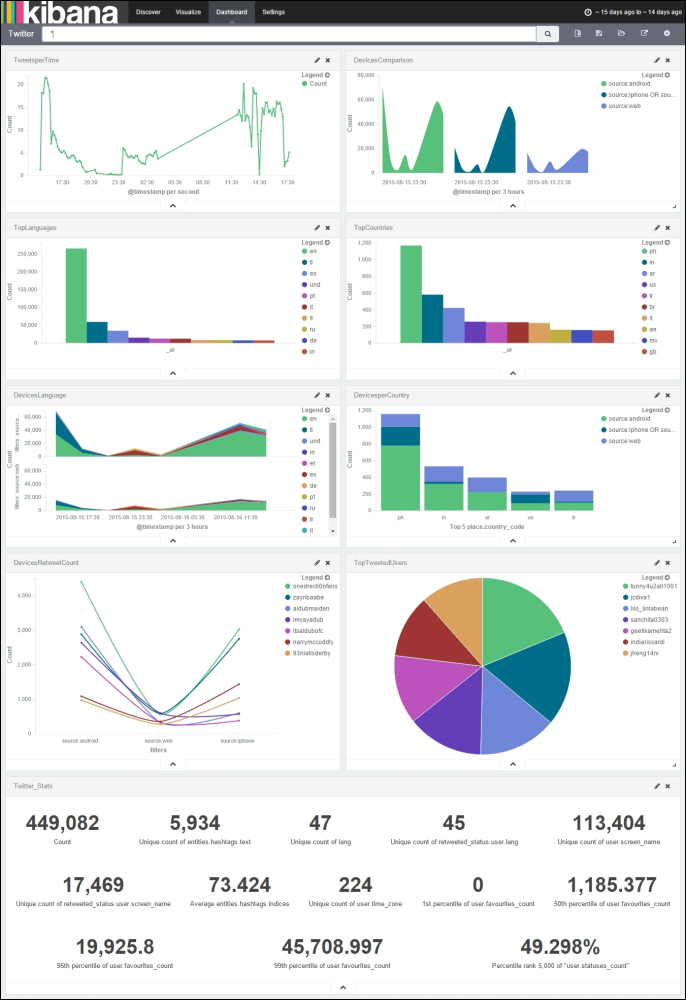
A dashboard containing all the visualizations created earlier is shown here: