
Sparklines are really small, compressed charts that are good for showing a high level volatility or trends in data.
In this recipe, we will create a sparkline with additional indicators at the line end.

To follow this recipe, open B05527_02 – STARTER.twbx. Use the worksheet called Sparkline with Indicators, and connect to the DOHMH New York City Restaurant data source.

The following are the steps to create a sparkline with indicators at the end:
- From Dimensions, drag Inspection Date to the Filters shelf.
- When prompted on what to filter, choose Years.

- In the next window, under the General tab, select all years except 1900.

- From Dimensions, drag Cuisine Description to the Filters shelf and under the Top tab, select Top and
15by Sum of Number of Records.
- From Dimensions, drag Cuisine Description to the Rows shelf.
- From Dimensions, right-click drag Inspection Date to the Columns shelf, and choose continuous month. This is the fourth field from the bottom of the list.

- From Measures, drag Score to the Rows shelf to the right of Cuisine Description.
- Right-click on Score on the Rows shelf and change aggregation to Average.

- Under Dimensions, right-click on Inspection Date and choose Create, and then Custom Date….
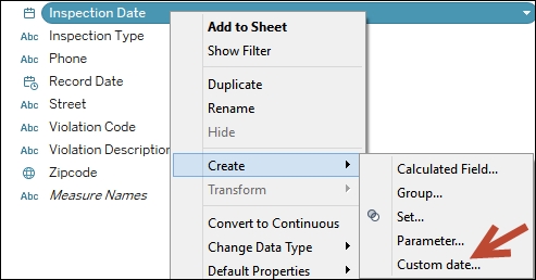
- Choose Months under Detail and provide the name Inspection Date (Cont Months).

- Create a calculated field called Last Inspection Month (Cont), which will hold the last inspection done for that particular cuisine family.

- Create another calculated field called Last Inspection Avg Score, which will hold the average score for the last inspection month for that cuisine family. Note that if the inspection date does not fall on the last inspection month, the score is not included in the average calculation.

- From Measures, drag the new calculated field Last Inspection Avg Score to the Rows shelf, to the right of AVG(Score).
- Right-click on Last Inspection Avg Score pill in the Rows shelf and select Dual Axis.
- From Measures, drag Score to Detail of any of the Marks cards. We will use this to create a quick table calculation on Score that we will save back to the side bar.
- Right-click on Score on the Detail property in the Marks card. Go to Quick Table Calculation and select Percent Difference.
- Drag the Score pill with the table calculation back to the side bar, and rename this field to % Diff. Note that when the quick table calculation was set, this pill automatically got the following formula:

- You can delete the Score in the Detail in the Marks card now. We simply needed this to auto-generate the formula for us.
- Create another calculated field called Last Change, which checks the last change and assign an overall status of Improved if the final % Diff is positive, Worsened if the last % Diff is negative, and No change if there was no change.

- Select the AGG(Last Inspection Avg Score) in the Rows shelf to activate its Marks card.
- From Measures, drag Last Change to Color in the Marks card.
- Change the mark type to Shapes.
- From Measures, drag Last Change to Color in the Shape property in the Marks card, and choose the Filled Shape Palette.
- Choose a filled upwards arrow for Improved, and a filled downwards arrow for Worsened.

- Change the titles of the shape and color legends to display Latest Score. You can do this by right-clicking on the top-right corner of each legend box, and selecting Edit Title….

- Adjust the width and height of the rows and columns. You can do this by moving your mouse pointer to the column or row edge of a film until you see a double-headed arrow. The left-right double-headed arrow allows you to adjust the width, and the up-down double-headed arrow allows you to adjust the height.
- Remove the grid lines. You can do this by selecting Format menu item, and select Lines….
- Under the Rows tab, select Grid Lines and set it to None.
- Go to Format menu again, and this time select Borders….
- Under the Sheet tab, set Pane line to None for both the Row Divider and Column Divider section.
- The format sidebar will replace the original data sidebar. In this Format borders side bar, under the Sheet tab Default section, add borders to the Cell, Pane and Header.
- Right-click on all the green pills in the Columns and Rows shelves and uncheck Show Header.
Sparklines are great for representing a lot of information in a very small space. Creating a sparkline in Tableau requires creating a small multiple and formatting the small multiple so it's smaller and without many of the axis labels.
In this recipe, we started by creating a small multiple of line charts by Cuisine Description. We adjusted the formatting so that the rows and columns are smaller than the default style. Overall, these steps are fairly similar to Creating a small multiple chart recipe in this chapter.
The enhancement to this chart is the addition of indicators at the end of the line. Since the indicators are a different mark, this means we need to use a dual axis chart to accomplish this visual.
What we need to do is to share the same Inspection Date axis with the line chart, and another chart that has a single mark that is color coded depending on whether that last point improved or worsened from the previous period. We can do this by creating a series of calculated fields:
- A calculated field that contains the month/year of the inspection date. We need to use this as axis to both our marks. This field is created using the Create Custom Date option for the Inspection Date field. We called this Inspection Date (Cont Months).

- A calculated field that calculates the last month/year of inspection. This is because we need to have a second axis to put the second mark, which is a single mark that occurs at the end of the inspection period. This calculated field uses a FIXED LOD (level of detail) expression, which means this will be fairly static and will not be affected by any dimension filters. This calculation is fixed to the cuisine. We called this Last Inspection Month (Cont).

- A calculated field that contains the table calculation for percent difference. This calculates the percent difference of the average score from the previous month. We called this % Diff.

- A calculated field that determines whether the score has improved, worsened, or stayed the same. This will be based on whether the last month's average score is higher or lower than (or the same as) the previous month's. We called this Last Change.

Once the calculated fields are set, the steps are fairly similar to creating a dual axis chart. The first measure will be displayed as line, and the second measure—which is a single value represented by the Last Change calculated field—will be represented as Shape. A green triangle represents an improvement from second to the last month's average inspection score, and a red inverted triangle represents an increase in score, hence more violations for that particular cuisine compared to the second to the last month.
Note
Appendix A, Calculated Fields Primer provides a primer on calculated fields in Tableau.
When using sparklines, it is important to not get hung up on not having the details. Often labels and axes headers are removed so only the small graphs remain.
Stocks are a great use case for using sparklines. They allow you to see the volatility of the stocks without having to clutter the screen with too many numbers for individual stocks.
The following is an example of stock information with sparklines from http://finance.yahoo.com/stock-center/:

While traditionally sparklines have meant small line graphs, sparklines are now represented using other chart types including bar charts, area charts, and so on.
- Please refer to the Creating a small multiple chart recipe in this chapter.
- Please refer to the Creating a dynamic column/row trellis chart recipe in Chapter 3, Interactivity.