
In this recipe, we will create an animated chart that shows how population has changed over the years for a few selected countries.

To follow this recipe, open B05527_03 - STARTER.twbx. Use the worksheet called Motion Chart, and connect to the CO2 (Worldbank) data source.

The following are the steps to create a motion chart:
- From Dimensions, drag Year to the Columns shelf.
- From Measures, drag CO2 Emission to the Rows shelf.
- Right-click on the CO2 Emission axis, and change the title to
CO2 Emission (metric tons per capita).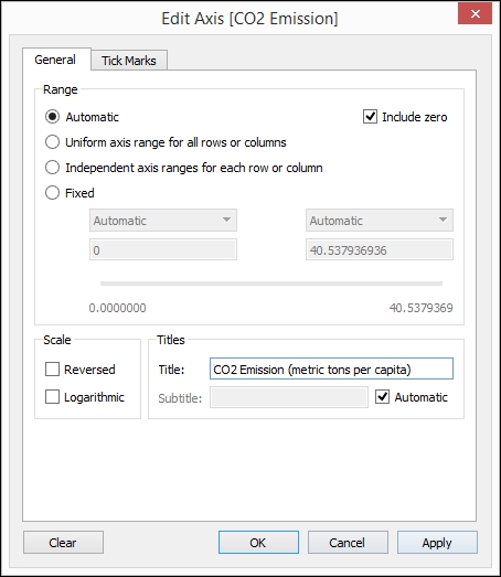
- In the Marks card, click on the dropdown to change the mark from Automatic to Circle.
- From Dimensions, drag Country Name to Color in the Marks card.
- From Dimensions, drag Country Name to the Filter shelf.
- Under the General tab of the Filter window, while the Select from list radio button is selected, select None.
- Select the Custom value list radio button, still under the General tab, and add China, Trinidad and Tobago, and United States.

- Click OK when done. This should close the Filter window.
- From Dimensions, drag Year to Pages. This adds a page control to the view.
- Click on the Show history checkbox to select it.
- Click on the dropdown beside Show history and perform the following steps:
- Select All for Marks to show history for
- Select Both for Show
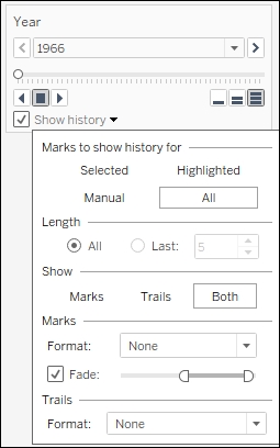
- Using the Year page control, click on the forward arrow to play. This should show how the populations of the three selected countries have changed over the years.
Have you ever doodled in your notebook—stick figures, bouncing ball—and flipped the pages to see doodle move and come to life? I've done it when I was a kid, and it's amazing to see it in action using Tableau! It feels like play but it's really work (right?).
It is possible to create motion charts in Tableau using the Pages shelf. When you drop a field onto the Pages shelf, Tableau creates a series of "pages" that filters the view for each value in that field.
Tableau also presents us with a page control. This is where we can "flip" the pages, enabling our view to come to life. We can control the speed—Tableau offers three predefined speed settings. One bar pertains to the slowest speed, and three bars to the fastest speed. The page control also enables us to further format the marks, and to show the marks or trails or both.
In our viz, we used a circle for our marks. Each year is marked by a circle. Each year, the circle moves to the new position, representing the new population value for a specific country. The circles are all connected by trail lines. By setting the mark and trail histories to both show in the page control, we are simulating a moving time series graph.

If you ever want to loopback the animation, you can click on the dropdown on the top-right of your page control card, and select Loop Playback.

A quick word of caution for motion charts, though. The animation effect that you see when working with motion charts using Tableau Desktop is absent in Tableau Server. Because Tableau wants to have zero footprint when serving the charts and dashboards on server—meaning there is no additional download to enable the functionalities—the play control does not work the same. Fret not, however. You can still click on the slider manually and still have a similar effect.
- Please refer to the recipe in Chapter 2, Creating a Population Pyramid