
In this recipe, we will create a parameter that will help us adjust the number of columns—and indirectly rows—for our trellis chart.

To follow this recipe, open B05527_03 – STARTER.twbx. Use the worksheet called Trellis, and connect to the Population (WDI 1966-2016) data source.
The following are the steps to create a dynamic column/row chart:
- From Dimensions, drag Year to the Columns shelf.
- Right-click on the Year pill in the Columns shelf, and select Continuous.
- From Measures, drag Population to the Rows shelf.
- Right-click on the SUM(Population) pill in the Rows shelf, and under Quick Table Calculation, select Percent Difference.

- Control drag the SUM(Population) pill in your Rows shelf to the Color shelf.
- Right-click on the color legend and choose Edit Colors. Check Stepped Color, and enter 4 as the value for Steps.

- Right-click on the color legend and choose Edit Title. Change the color legend title to % Difference.
- From Dimensions, drag Country Name to Label in the Marks shelf.
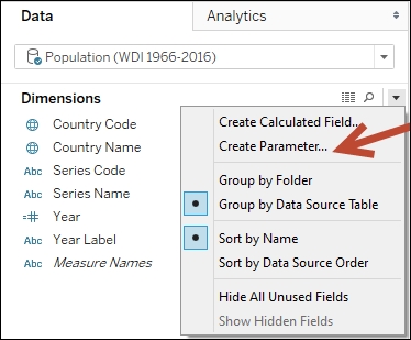
- Right-click on the arrow beside Dimensions section in the sidebar, and select Create Parameter.
- Create a parameter called
# of Columnswith the following settings:- Data type: Integer
- Current value:
8 - Allowable values: All

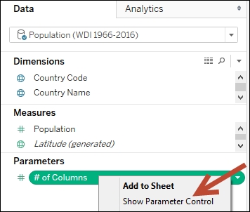
- Show the parameter control for # of Columns. You can do this by right-clicking on the parameter, and selecting Show Parameter Control.
- Create a calculated field called
Index, with the following formula:
- Create a calculated field called
Columns, with the following formula:
- Create a calculated field called
Rows, with the following formula:
- From Measures, drag the calculated field Columns to the Columns shelf, to the left of Year.
- Right-click on the Columns pill in the Columns shelf, and select Compute Using and then Country Name.

- Change the Columns pill to discrete by right-clicking on this pill, and selecting Discrete.
- From Measures, drag the calculated field Rows to the Rows shelf, to the left of SUM(Population).
- Right-click on the Rows pill in the Rows shelf, and select Compute Using by Country Name.
- Change Rows pill to discrete by right-clicking on this pill, and selecting Discrete.
- Click on Label in the Marks card, and use the following settings:
- Marks to Label: Line Ends
- Options: Allow labels to overlap other marks
- Options: Label start of line
- Alignment: Custom

- Right-click on the Columns heading and choose Hide Field Labels for Columns.

- Right-click on the Rows pill in the Rows shelf and uncheck Show Header.
- Right-click on the Year pill in the Columns shelf and uncheck Show Header.
- Right-click on the % Difference in Population axis and:
- Change the Title to
$ Diff - Change Range to Fixed, starting at
-0.4

- Change the Title to
- Go to the Format menu, and choose Lines. This will show a formatting sidebar.
- Under the tabs Sheet, Rows, and Columns, set the Grid Lines to None. Close the formatting sidebar when done.
- Test the parameter. Change the column size and confirm that the chart adjusts the number of columns shown.
A trellis chart is a small multiple chart that is called by many other names such as panel chart or grid chart. A trellis chart is composed of multiple similar, small charts that allow for easier side-by-side comparison of the items being visualized.
Note
See Creating a small multiple chart recipe in Chapter 2, Advanced chart, for additional examples and explanation.
This recipe adds a parameter to a typical small multiple, which allows the consumer of the view to decide or experiment with how many columns side by side would be most effective for the data analysis.
It is important to note that by default, a chart becomes a small multiple when it is sliced into discrete dimensions. If we wanted a small multiple that has columns and rows, we need to add at least one discrete dimension in the Columns shelf, and another in the Rows shelf.
In our recipe, however, we are not slicing our chart based on any other dimensions. We simply want to display the small charts using a specific number of columns and rows. To do this, we need to introduce a discrete dimension in Columns based on what our end user enters in the # of Columns parameter, and then calculate how many rows will result based on the number of columns.
The calculated field called Columns has the following formula:

To create a trellis chart with # of Columns parameter value, we need to technically assign each small graph a number. This is achieved by using the INDEX() function used in the Index calculated field, which assigns a sequential number to each value specified in the Compute Using. This formula then takes the index assigned to each country, and checks for the modulo based on the parameter value. The modulo operator is the %, and this operator finds the remainder after dividing the number by another number.
To visualize this, let's assume that the # of Columns parameter value is 4. The corresponding values are as follows:
|
Country |
INDEX() |
INDEX() % 4 |
Column |
Row |
|---|---|---|---|---|
|
Afghanistan |
1 |
1 |
1 | |
|
Albania |
2 |
2 |
2 | |
|
Algeria |
3 |
3 |
3 | |
|
American Samoa |
4 |
0 |
4 | |
|
Andorra |
5 |
1 |
1 | |
|
Angola |
6 |
2 |
2 |
The number of columns indirectly defines the number of rows. The Rows calculated field determines in which row number a country would be placed, based on that country's Index value divided by the # of Columns parameter value.

The resulting row values are as follows:
|
Country |
INDEX() |
(INDEX()-1) / 4 |
((INDEX()-1) / 4) + 1 |
Column |
Row |
|---|---|---|---|---|---|
|
Afghanistan |
1 |
0 |
1 |
1 |
1 |
|
Albania |
2 |
0 |
1 |
2 |
1 |
|
Algeria |
3 |
0 |
1 |
3 |
1 |
|
American Samoa |
4 |
0 |
1 |
4 |
1 |
|
Andorra |
5 |
1 |
2 |
1 |
2 |
|
Angola |
6 |
1 |
2 |
2 |
2 |
The dynamic column/row trellis chart is really just a play on modulo and integer division. To confirm, when we plug in 4 as our parameter, our chart looks like this, with the headers for Rows and Columns turned on:

- Please refer to the recipe in Creating a small multiple chart recipe in Chapter 2, Advanced chart