
In this recipe, we will use the New York Restaurant Inspections Excel file and use the legacy Jet driver to shape the file so we can have both the inspection date and grade date in the same column. This will allow us to visualize how many restaurants were inspected and graded for a specific date:

To follow this recipe, download the file from the New York City Open Data website using the following URL:
Once you have downloaded the data, save the file as DOHMH_New_York_City_Restaurant_Inspection_Results.xls (Microsoft Excel 97-2003 Worksheet). Note that the records may have been updated between the time of writing and the time of your download.
Here are the steps to prepare the Excel file:
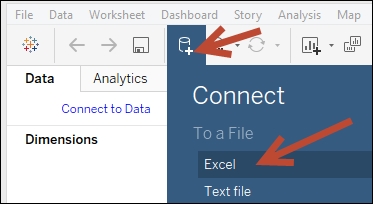
- Click on New Data Source icon, and choose Excel:
- Choose
DOHMH_New_York_City_Restaurant_Inspection_Results.xls, and select Open with Legacy Connection:
- In the Connection window, remove the existing connection to the one sheet in the Excel file:

- Drag New Custom SQL to the main connection pane:

- Add the following code to the Edit Custom SQL window:
SELECT
[DBA],
[CAMIS],
[CUISINE DESCRIPTION],
[INSPECTION DATE],
[GRADE DATE],
[INSPCTION DATE] AS [Date],
'Inspected' AS [Type]
FROM [DOHMH New York City Restaurant$]

UNION ALL

SELECT
[DBA],
[CAMIS],
[CUISINE DESCRIPTION],
[INSPECTION DATE],
[GRADE DATE],
[GRADE DATE] AS [Date],
'Graded' AS [Type]
FROM [DOHMH New York City Restaurant$]
- In the preview window, click on the Abc symbol above the Date field and select Date to change the data type to Date:

- Add a new sheet and create your visualization using this data set.
The challenge in this recipe is that we often have a universal notion of date, that is, a date is a day that isn't specific to any events. We may want to summarize or aggregate measures based on this universal notion of dates. However, in reality, dates may exist in different fields with different contexts, and this can limit our ability to work on them as a single unit.
In the Excel file for this recipe, we want to count how many restaurants were inspected and how many were graded for a specific date. The Excel file does not have a generic date field that allows us to count how many were inspected or graded. Thus, we need to re-shape our data so that the Inspection Date and Grade Date exist in one column instead of two.
If we are using an Excel file as our data source, we can potentially use the legacy Jet connection, which allows custom SQL statements against the Excel file.
Note
The legacy Connection option was introduced in Tableau 8.2. You can learn more about this in the Tableau KB article Differences between Legacy and Default Excel and Text File Connections, which can be found at http://onlinehelp.tableau.com/current/pro/desktop/en-us/help.htm#upgrading_connection.html.
In our recipe, we used the following custom SQL statement against our Excel file:

When we query our Excel spreadsheet, each tab will be treated as a table and referenced as the worksheet name with a $ symbol at the end and enclosed in square brackets, like so [DOHMH New York City Restaurant$].
Note
QuerySurge has a good short tutorial on using SQL against Excel spreadsheets here: http://bit.ly/QuerySurge-SQL-against-Excel.
What we are doing in this query is stacking two copies of the original data set on top of each other using the UNION ALL set operator, and introducing two new fields—Date and Type. This forces one field to contain the two dates we are interested in.
The first set uses the INSPECTION DATE as the value for Date, and Inspected as the value for Type. The second set uses GRADE DATE as the value for Date, and Graded as the value for Type. If you need to add additional fields for your analysis, you can simply add the field names to both SELECT statements.
Once we have the fields in place, we can analyze and visualize our data. For example, we can create a time series graph with trend lines. Since we have a single date field to consider, we can simply drag that Date field and create a continuous axis. Since we also have a single field to differentiate what event that date was related to, we can use that in Color in the Marks card to create two separate lines for the Graded and Inspected events:

The measure in this example is CNT(Date) because Date will have a value if it is related to the event, and null (and will not be counted) if it is not.
Be careful when doing other kinds of analysis. Since we stacked two copies of our data set, we essentially doubled our record count.
We are only using the legacy connection because our data source in this recipe is an Excel file. If your data source is different, for example if you are using a relational data source, you can re-shape the data using those data sources's query mechanisms. In a relational data source, you may be able to do a union or a self-join at the data source level before the data is consumed by Tableau.
Tableau 10 introduces a new feature called cross database join, which we can also consider. The cross database join allows you to connect to multiple data sources and join them from within the Tableau connection interface. In the following example, we have essentially connected to the same Excel worksheet three times:

Each connection is a left join. The first one connects mainly based on the INSPECTION DATE. There are other fields being considered in the join to ensure we are only matching the correct records. Otherwise, we will end up with something called a cross join and may match one record to all other records of restaurants that were inspected on the same date:

The second one connects mainly based on the GRADE DATE. As with the previous join, we also still need to consider other fields in the join to avoid mismatching records:

Once the connections are set up, we can create a similar visualization to the one we created using the legacy connection. The following visualization uses a slightly different approach. Since our measures come from different data sources, we are using a dual axis graph for the COUNT of INSPECTION DATE from one data source, and COUNT of GRADE DATE from another data source:
