The third figure in this chapter is a box plot showing the YearlyIncome variable distribution in classes of the Education variable. Again, it is possible to make this graph even prettier with ggplot. Besides box plots, ggplot can add violin plots as well. A violin plot shows the kernel density for a continuous variable. This is an effective way to see the distribution of a continuous variable in classes of a discrete variable. The following code produces a combination of a violin and a box plot in order to show the distribution of yearly income in classes of Education:
ggplot(TM, aes (x = Education, y = YearlyIncome)) +
  geom_violin(fill = "lightgreen") +
  geom_boxplot(fill = "orange",
               width = 0.2);
The graph produced is not just nice, it is really informative, as you can see in the following screenshot:

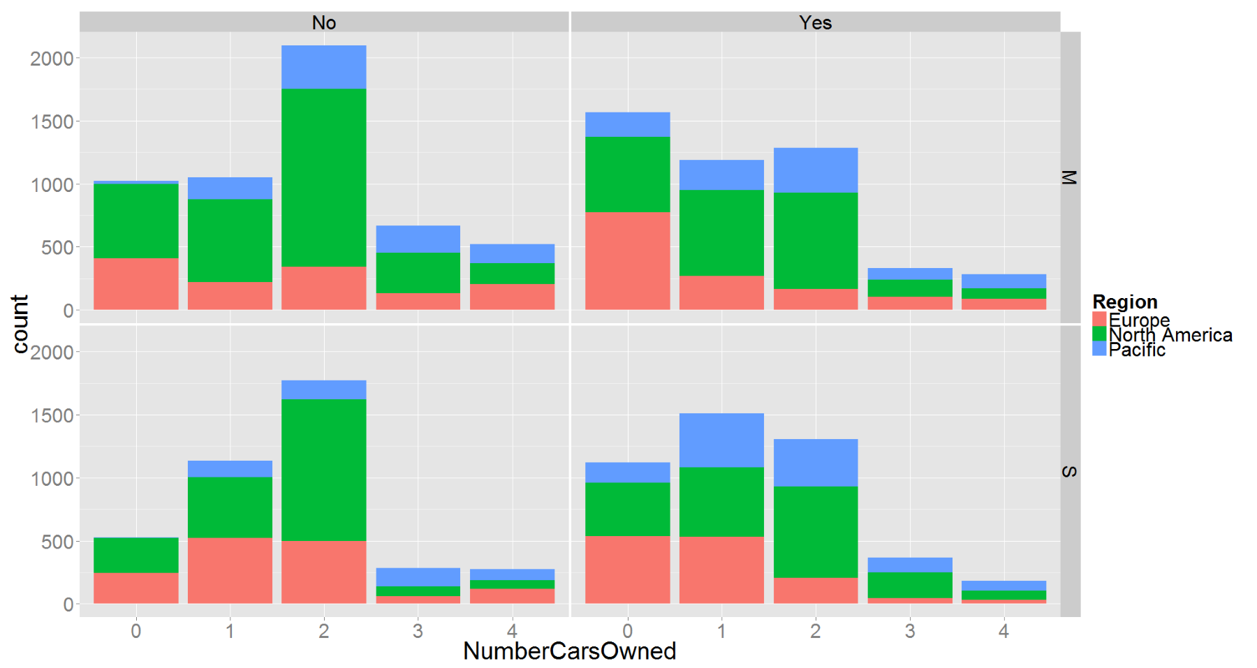
For the last graph in this book, I selected a trellis chart. A trellis chart is a multi-panel chart of small, similar charts, using the same axes and scale. This way you can easily compare them. Trellis graphs are called faceted graphs in ggplot semantics. The facet_grid() function defines the discrete variables to be used for splitting the chart in small multiples over rows and columns. The following code creates an example of a trellis chart:
ggplot(TM, aes(x = NumberCarsOwned, fill = Region)) +
  geom_bar(stat = "bin") +
  facet_grid(MaritalStatus ~ BikeBuyer) +
  theme(text = element_text(size=30));
You can see the results in the next figure. The values of the MaritalStatus variable are used to split the chart into two rows, while the values of the BikeBuyer column are used to split the chart into two columns. The chart has four small multiples, one for each combination of MaritalStatus and BikeBuyer. Inside each of the four small charts, you can see the distribution of the NumberCarsOwned variable, and inside each bar, you can see the distribution of the Region variable for that specific number of cars. The theme() function is used to increase the font size of all of the text in the chart:
This is not the end of capabilities of the ggplot2 package. There are many more additional graphs and visualizations in the package, and the visualization does not stop here. With additional packages, you can plot maps, Google maps, heat maps, areas, circulars, word clouds, networks, tree maps, funnels, and more.