As noted earlier, there are several facilities in R for summarizing data, both in base R, as well as through multiple R packages.
Using plotting functionalities such as correlograms and trellis plots, users can visualize the data in a holistic or homogeneous view.
For plotting the correlogram, we'll use the R package, ggcorrplot, as follows:
install.packages("ggcorrplot")
hcorr <- cor(na.omit(Hartnagel))
ggcorrplot(hcorr,hc.order = T, ggtheme = theme_bw, insig="blank",
  colors = brewer.pal(11,"RdYlGn")[c(1,6,11)])
The output is as follows:

Variables that are more closely correlated are in a darker green shade relative to the ones that are less closely correlated (marked in the reddish-brown color).
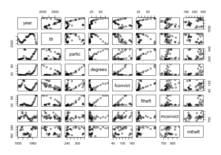
Note that simply facilities such as trellis plots also exist in base R and, as demonstrated, simply calling plot on the Hartnagel dataset will yield the diagram shown as follows:
plot(Hartnagel) # Simply calling plot
Output is as follows:
More complex and in-depth visualisations can be leveraged through other R visualization packages. The tableplot package allows the programmer to plot both categorical and quantitative data in a single elegant plot (tableplot):
library(tabplot)
tableplot(Salaries)
The output is as follows:

The number of visualization packages in R has grown enormously in recent years. Many of them employ ggplot to render images (and often start with the prefix gg). A few of the interesting ones are noted as follows:
- rCharts: A wrapper for multiple JavaScript libraries such as polychart, nvd3, and others
- plotly: R library for plotly with lots of interactive features
- rBokeh: A wrapper for the popular Python-based bokey visualization library
- tmap: For plotting thematic maps
- ggnet: For plotting of network diagrams
- ggmap: A library for plotting maps in R
- gganimate: To create animated charts in R