In this exercise, we will be looking at the life expectancy and expected years of schooling on a per country per year basis starting from 1990 onward. Not all data is available for all countries, due to various geopolitical and other reasons that have made it difficult to obtain data for respective years.
The datasets for the HDP program have been obtained from http://hdr.undp.org/en/data.
In the exercises, the data has been cleaned and formatted to make it easier for the reader to analyse the information, especially given it is the first chapter of the book. Download the data from the Packt code repository for this book. Following are the steps to complete the exercise:
- Launch RStudio and click on File | New File | R Script.
- Save the file as Chapter1.R.
- Copy the commands shown in the following script and save.
- Install the required packages for this exercise by running the following command. First, copy the command into the code window in RStudio:
install.packages(c("data.table","plotly","ggplot2","psych"))
- Then, place your cursor on the line and click on Run:

- This will install the respective packages in your system. In case you encounter any errors, search on Google for the cause of the error. There are various online forums, such as Stack Overflow, where you can search for common errors and learn how to fix them. Since errors can depend on the specific configuration of your machine, we cannot identify all of them, but it is very likely that someone else might have experienced the same error conditions.
We have already created the requisite CSV files, and the following code illustrates the entire process of reading in the CSV files and analyzing the data:
# We'll install the following packages:
## data.table: a package for managing & manipulating datasets in R
## plotly: a graphics library that has gained popularity in recent year
## ggplot2: another graphics library that is extremely popular in R
## psych: a tool for psychmetry that also includes some very helpful #statistical functions

install.packages(c("data.table","plotly","ggplot2","psych"))

# Load the libraries
# This is necessary if you will be using functionalities that are #available outside
# The functions already available as part of standard R

library(data.table)
library(plotly)
library(ggplot2)
library(psych)
library(RColorBrewer)

# In R, packages contain multiple functions and once the package has #been loaded
# the functions become available in your workspace
# To find more information about a function, at the R console, type #in ?function_name
# Note that you should replace function_name with the name of the actual function
# This will bring up the relevant help notes for the function
# Note that the "R Console" is the interactive screen generally #found

# Read in Human Development Index File
hdi <- fread("ch1_hdi.csv",header=T) # The command fread can be used to read in a CSV file

# View contents of hdi
head(hdi) # View the top few rows of the data table hdi
//
The output of the preceding code is as follows:

Read the life expectancy file by using the following code:
life <- fread("ch1_life_exp.csv", header=T)

# View contents of life
head(life)
The output of the code file is as follows:

Read the years of schooling file by using the following code:
# Read Years of Schooling File
school <- fread("ch1_schoolyrs.csv", header=T)

# View contents of school
head(school)
The output of the preceding code is as follows:

Now we will read the country information:
iso <- fread("ch1_iso.csv")

# View contents of iso
head(iso)
The following is the output of the previous code:

Here we will see the processing of the hdi table by using the following code:
# Use melt.data.table to change hdi into a long table format
hdi <- melt.data.table(hdi,1,2:ncol(hdi))
# Set the names of the columns of hdi
setnames(hdi,c("Country","Year","HDI"))
# Process the life table
# Use melt.data.table to change life into a long table format
life <- melt.data.table(life,1,2:ncol(life))
# Set the names of the columns of hdi
setnames(life,c("Country","Year","LifeExp"))
# Process the school table
# Use melt.data.table to change school into a long table format
school <- melt.data.table(school,1,2:ncol(school))
# Set the names of the columns of hdi
setnames(school,c("Country","Year","SchoolYrs"))
# Merge hdi and life along the Country and Year columns
merged <- merge(merge(hdi, life,
by=c("Country","Year")),school,by=c("Country","Year"))
# Add the Region attribute to the merged table using the iso file
# This can be done using the merge function
# Type in ?merge in your R console
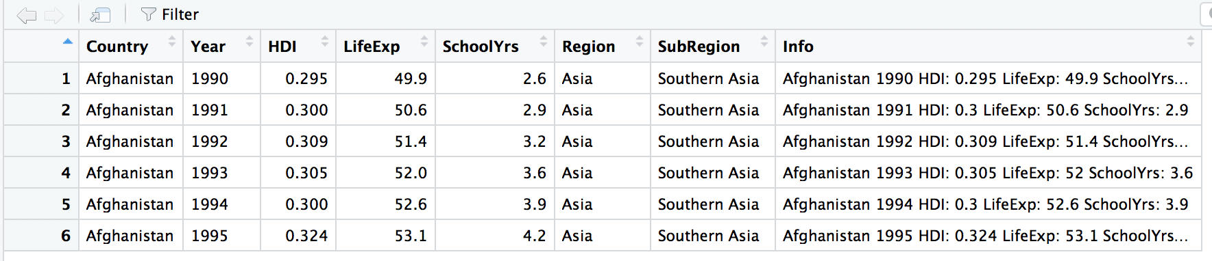
merged <- merge(merged, iso, by="Country")
merged$Info <- with(merged, paste(Country,Year,"HDI:",HDI,"LifeExp:",LifeExp,"SchoolYrs:",
SchoolYrs,sep=" "))
# Use View to open the dataset in a different tab
# Close the tab to return to the code screen
View(head(merged))
The output of the preceding code is as follows:
Here is the code for finding summary statistics for each country:
mergedDataSummary <-
  describeBy(merged[,c("HDI","LifeExp","SchoolYrs")],
  group=merged$Country, na.rm = T, IQR=T)


# Which Countries are available in the mergedDataSummary Data Frame ?
names(mergedDataSummary)
mergedDataSummary["Cuba"] # Enter any country name here to view
#the summary information
The output is as follows:

Useing ggplot2 to view density charts and boxplots:
ggplot(merged, aes(x=LifeExp, fill=Region)) + geom_density(alpha=0.25)
The output is as follows:

Now we will see what the result is for geom_boxplot:
ggplot(merged, aes(x=Region, y=LifeExp, fill=Region)) + geom_boxplot()
The output is as follows:

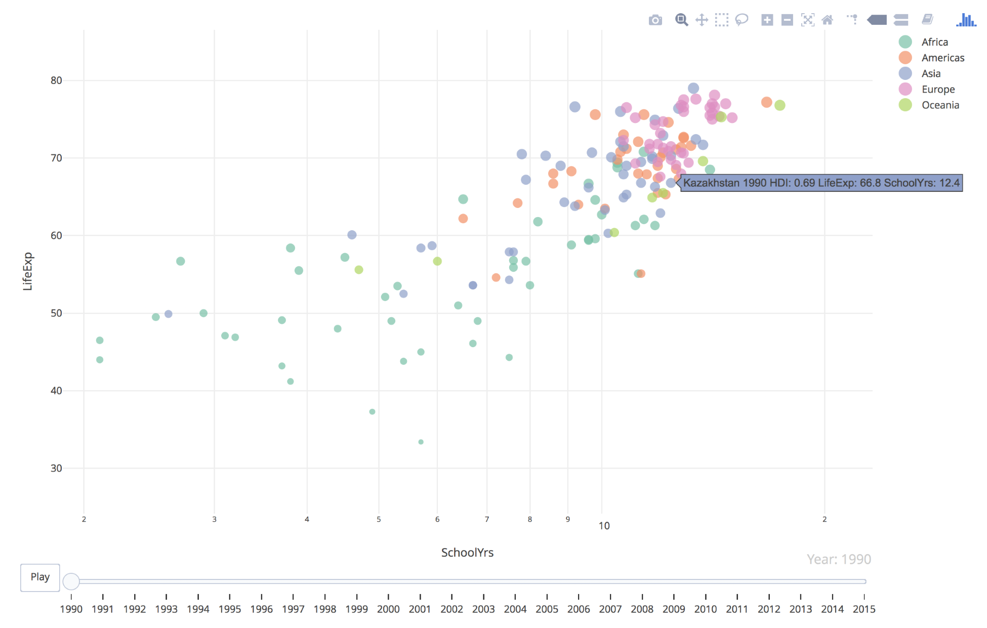
Create an animated chart using plot_ly:
# Reference: https://plot.ly/r/animations/
p <- merged %>%
  plot_ly(
    x = ~SchoolYrs,
    y = ~LifeExp,
    color = ~Region,
    frame = ~Year,
    text = ~Info,
    size = ~LifeExp,
    hoverinfo = "text",
    type = 'scatter',
    mode = 'markers'
  ) %>%
  layout(
    xaxis = list(
      type = "log"
    )
  ) %>%
  animation_opts(
    150, easing = "elastic", redraw = FALSE
  )

# View plot
p
The output is as follows:
Creating a summary table with the average of SchoolYrs and LifeExp by Region and Year by using the following code:
mergedSummary <- merged[,.(AvgSchoolYrs=round(mean(SchoolYrs, na.rm =
  T),2), AvgLifeExp=round(mean(LifeExp),2)), by=c("Year","Region")]
  mergedSummary$Info <- with(mergedSummary,
  paste(Region,Year,"AvgLifeExp:",AvgLifeExp,"AvgSchoolYrs:",
  AvgSchoolYrs,sep=" "))


# Create an animated plot similar to the prior diagram
# Reference: https://plot.ly/r/animations/
ps <- mergedSummary %>%
  plot_ly(
    x = ~AvgSchoolYrs,
    y = ~AvgLifeExp,
    color = ~Region,
    frame = ~Year,
    text = ~Info,
    size=~AvgSchoolYrs,
    opacity=0.75,
    hoverinfo = "text",
    type = 'scatter',
    mode = 'markers'
    ) %>%
  layout(title = 'Average Life Expectancy vs Average School Years
    (1990-2015)',
         xaxis = list(title="Average School Years"),
         yaxis = list(title="Average Life Expectancy"),
         showlegend = FALSE)
# View plot
ps