Undoubtedly, plots are among the best ways to speak to an audience. Some would advocate that plots are so important that, before you start writing an article, presentation, or report, you should first design your figures. There are several advantages to adopting this plot-oriented writing:
- It speeds things up
- It enhances the chances of having self-explanatory graphics
- It improves the chances of holding your audience's attention
Learning how to draw neat graphics isn't easy and requires time and practice, but it does pay off. This chapter alone might not be enough to master such a skill, but it will certainly help.
R is not only famous thanks to its statistical capabilities, but also for its visualization tools. The ggplot2 package was built based on a theory known as the grammar of graphics. Knowing this theory is not a requirement, but it might change the way you look at and design graphics.
You can make good plots so easily with ggplot2 that I've heard of people migrating from Python to R for this package only. Let us kick-off this section by downloading ggplot2:
if(!require('ggplot2')){install.packages('ggplot2')}
Graphics are constructed in a very layered way with ggplot2. It feels as if you are summing methods together. The next code block demonstrates how to build a simple scatterplot using ggplot2:
library(ggplot2)
ggplot(data = dt) +
  geom_point(aes(x = gini,
                 y = mean_yrs_schooling))
Once the package gets loaded, initiate the plot with ggplot(). Name the dataset to be used in the data argument and keep two things in mind:
- For the sake of organization, ggplot2 only works with DataFrames. The object addressed to data must be a DataFrame.
- It's possible to build a plot using more than one dataset.
The geom_point() function was called to add points to the plot. This function received aes() in order to map the aesthetics. The gini variable from dt was mapped in x, while mean_yrs_schooling was mapped in y. The result is displayed in the following diagram:

Figure 10.1 is not the bubble plot we are looking for yet. The aesthetic is size must be mapped:
ggplot(data = dt) +
  geom_point(aes(x = gini,
                 y = mean_yrs_schooling,
                 color = factor(country),
                 size = population), alpha = .4)
The last code block makes sure that the size of each point is related to the population variable. It also asks for different colors for each country. Notice how this last variable was set inside the factor() function. Color aesthetics generally go well with variables of the type factor.
The following figure displays the result:

You might have perceived some transparency. This technique is meant to avoid a common problem known as over-plotting. Set the alpha parameter to add transparency to points. Values between 0 and 1 are accepted—0 means total transparency and 1 means no transparency.
Figure 10.2 could be considered good if it was intended as an exploratory analysis. This chapter won't go after a production quality plot. Nonetheless, it will elaborate on this ggplot a little longer. The following code block is renaming the axes labels, hiding population from the legends, and adding a new custom theme:
ggplot(data = dt) +
  geom_point(aes(x = gini,
                 y = mean_yrs_schooling,
                 color = factor(country),
                 size = population), alpha = .4) +
  xlab('Gini Index') +
  ylab('Mean years of schooling (25+)')+
  guides(size = F) +
  theme_classic(base_size = 16)
The vertical axis is renamed by ylab() and xlab() renames the horizontal axis. The guides() function used to hide the population variable from the legends. The last layer, theme_classic(), adds the classic theme and increases the base font size. The output can be seen in the following diagram:

There are more things to do in order to get a production-grade plot. We could increase the number of ticks in the vertical axis, for example. Changing the fonts is always an option—Roboto Condensed is my favorite. Try the extrafont package to register and load new fonts into R.
Interactive graphics are an ongoing trend. Although interactive plots can be crafted combining ggplot2 and some other packages, such as shiny, the following paragraphs will introduce several packages that focus on interactivity.
Interactive graphics are not only a good fit for websites and applications of all kinds; many academic journals are encouraging writers to submit interactive plots. Enabling the audience to interact with plots is a powerful idea; it leverages the engagement to a whole new level.
There are several ways you can make a graphic interactive: tooltips, zoom (in and out), toggles, and the list goes on. This chapter won't dive into the nuts and bolts of building all of these features. Nevertheless, it will bring a demo from several packages, starting with ggvis. It can be downloaded from the CRAN repository:
if(!require('ggvis')){install.packages('ggvis')}
ggvis is very powerful, especially if combined with shiny. I personally enjoy the toggles that ggvis is capable of delivering, but this chapter is not aiming for that level of detail. Let's just try to make the bubble plot with it. The code is actually very simple and is similar to ggplot2:
library(ggvis)
dt %>%
  ggvis(~gini, ~mean_yrs_schooling, fill = ~factor(country)) %>%
  layer_points(size = ~population, opacity:=.4)
Instead of the plus signs used by ggplot2, ggvis uses pipes (%>%). Notice how the ~ symbol is used to indicate variables from the DataFrame. Also, ggvis has a very clever system that interprets differently the arguments based on whether it was set using := or a single equal sign (=).
The opacity argument stands for transparency. Setting it with := prevents the input from being rescaled—try to set opacity = .4 to actually see what I mean. The result from the last code block is displayed in the following diagram:

There is still a lot more to do with ggvis. Toggles are not that hard to build. One of the strengths of ggvis is speed. Once the figure is rendered, it can dynamically change the information displayed very easily.
For the graphing library, try the https://plot.ly/r/ URL—there are several examples you can dig into. Plotly is one of my favorites. I have a character in Tibia named after it. Plots made with it come with zoom enabled as a default. You can install plotly directly from CRAN:
if(!require('plotly')){install.packages('plotly')}
Graphics built with plotly can be constructed in a layered way too, just like in ggplot2 and ggvis. However, I am going for a more direct approach and designing the whole graphic in a single function, plot_ly():
library(plotly)
plot_ly(dt, x = ~gini, y = ~mean_yrs_schooling,
        type = 'scatter', mode = 'markers',
        color = ~country, size = ~population)
Plotly can try to smart guess which type of plot you're looking for based on the variables assigned, but picking the type by setting type and mode is frequently better:

Even though the preceding figure is static (a print), the original code will output an interactive version where you can zoom and hover the mouse over the points to display information. Information displayed can be easily changed with a little tweak. Set the hoverinfo and text arguments to do so:
plot_ly(dt, x = ~gini, y = ~mean_yrs_schooling,
        type = 'scatter', mode = 'markers',
        color = ~country, size = ~population,
        hoverinfo = 'text',
        text = ~paste('<b>',country,' - ', date, '</b><br>Gini: ', round(gini),
                      '<br>Population:', population,
                      '<br>Mean years of schooling:', round(mean_yrs_schooling)))
Look at how HTML commands were used to format the tooltips—try it on your side and see how it works. Speaking for me, I love building dashboards with plotly. It's important to mention that plotly also goes very well with shiny.
Plotly can also be used to convert ggplot in to the interactive form. Try calling plotly::ggplotly() after you rendered ggplot. Don't forget to have it installed. You can find the reference manual for plotly at plot.ly/r/reference. It also has libraries for Python, MatLab, and JavaScript.
The next package will require devtools to be installed:
if(!require('devtools')){install.packages('devtools')}
Some packages may require you to have some software or another package already installed. For example, the next package we're looking for is rCharts and it requires the yalm package:
if(!require('rCharts')){
  if(!require('yaml')){install.packages('yaml')}
  devtools::install_github('ramnathv/rCharts')
}
With rCharts, you can build plots using several different JavaScript libraries. Versatility might be the biggest advantage of this package. That said, knowing a little JavaScript, JSON, and HTML notation can be very helpful here. The next code block crafts a visualization from Highcharts:
library(rCharts)
p1 <- hPlot(mean_yrs_schooling ~ gini,
                     data = dt, type = 'bubble',
                     size = 'population', group = 'country')
p1$chart(zoomType = 'xy')
p1$exporting(enabled = T)
p1$show()
The hPlot() function uses the Highcharts library. Crafting visualizations using rCharts may be a little bit different than what we've been doing until this point, but it is very layer-wise. The basic plot was assigned to an object called p1. Notice how a formula (<variable 1> ~ <variable 2>) was used to map points across the vertical and horizontal axis.
Next, methods were called to change features from the basic plot, p1:
- p1$chart(zoomType = 'xy') enabled zoom to happen both in the x and y axes
- p1$exporting(enabled = T) created a button to export the interactive plot as a static figure
By the end, p1$show() took care of rendering the final result. The original outcome was interactive, but the one printed as shown in the following diagram could not be:

The preceding diagram looks very different than the previous ones. The scale is different and the legend is displayed at the bottom. All of these could be easily changed. The code block ahead uses $set() to change scales and $legend() to move the entire legends. Additionally, $tooltip() was requested to change the tooltips:
p2 <- hPlot(mean_yrs_schooling ~ gini,
                     data = dt, type = 'bubble',
                     size = 'population', group = 'country')
p2$tooltip(formatter = "#! function() { return 'Gini :' + Math.round(this.x * 100) / 100 +
           '<br>Mean years of schooling :' + Math.round(this.y * 100) / 100; } !#")
p2$legend(align = 'right', verticalAlign = 'top', layout = 'vertical')
p2$chart(zoomType = 'xy')
p2$exporting(enabled = T)
p2$set(width = 528, height = 528)
p2$show()
Many things had changed. The $tooltip() method used HTML and JavaScript to format the way texts are displayed when the mouse hovers a point. Pay attention to how simple quotation marks were used inside double quotation marks. This detail is very important.
Experiment with it. The actual result is very cool. The following diagram only displays a static version:

After rescaling and moving the legends, the final result is closer to the former ones. There is much more one can do with rCharts. Here is a list of JavaScript charting libraries that rCharts work with:
- Polly chart
- Morris
- NVD3
- xCharts
- Leaflet
Knowing how to work with JSON data, JavaScript, and HTML might be of great help whenever drawing with rCharts. Moving on, we have googleVis. It can be described as an interface between R and Google's Chart Tools:
if(!require('googleVis')){install.packages('googleVis')}
Once you're done with the installation, load the package and call gvisBubbleChart() to draw the bubble plot:
library(googleVis)
p3 <- gvisBubbleChart(dt, idvar = 'country',
                      xvar = 'gini', yvar = 'mean_yrs_schooling',
                      sizevar = 'population', colorvar = 'country'
                      ))
plot(p3)
After mapping each variable at the proper aesthetic, we've got the plot stored by p3. Call plot() to render it into your browser. Figure 10.8 shows a screenshot of it:

Lots of defaults were used, which explains why the final result looks kind of weird. The code block in the sequence deploys some changes:
dt$id <- ''
p4 <- gvisBubbleChart(dt, idvar = 'country',
                      xvar = 'gini', yvar = 'mean_yrs_schooling',
                      sizevar = 'population', colorvar = 'country',
                      options = list(
                        width=600, height=600,
                        explorer= "{ actions: ['dragToZoom', 'rightClickToReset'] }"
                      ))
plot(p4)
First, it created a new column in the DataFrame; it's a character column carrying an empty string. Such a column was mapped as idvar, doing the trick of removing the names printed inside the bubbles. Next, it named the options argument. Setting it with a list enables us to tweak several things.
The latter argument was input with a list of length three. The width and height elements rescaled the whole plot. The explorer element received a string in the JSON format. Two actions were stipulated by such string: left-clicking and dragging will make the plot zoom-in; right-clicking will reset the zoom. The following diagram presents the print version of the output:

Reproduce it at your end to check the mentioned features working. There is a lot to be made with googleVis; choropleths are my personal favorite. Those are usually hard to build—data manipulation skills must be sharp to match geospatial data with whatever you desire to show.
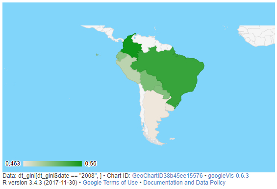
In spite of that, building choropleths with googleVis is actually very easy. The packages abstract several steps that are usually mandatory. Additionally, choropleths made this way are interactive. These can be made with gvisGeoChart():
map <- gvisGeoChart(dt_gini[dt_gini$date == '2008',], locationvar='country',
                 colorvar='gini',
                 options=list(projection='kavrayskiy-vii',
                              backgroundColor = '#81d4fa',
                              region = '005'))
plot(map)
Given that the DataFrame has observations for many years, data input in gvisGeoChart() was filtered for the year 2008. The locationvar argument points to the variable holding the names for the locations in the map; colorvar tells which variable should be used to paint the map.
The remaining argument, options, sets a lot of things: projection type, background color, and scoped region. A static version from the output is displayed in the following diagram:
A great way to improve what you can do with googleVis is to check Google Charts' documentation and gallery:
There is a section fully dedicated to maps:
Knowing how to build neat figures is not only a useful skill for data scientists but for anyone who needs to transmit information precisely. To this point, the reader was presented with several plotting libraries. The next section summarizes the entire chapter, while giving tips related to the discussed topics.