
Cluster analyses are very flexible in terms of tasks they can perform; therefore, it has been proved to be useful in many different situations. To cite some utilities, clusters can be used to build recommenders, extract important features from data that can be used to drive insights, or further feed other models and land predictions.
This section aims to go beyond Chapter 4, KDD, Data Mining, and Text Mining. The goal here is to deepen the discussion about clusters while trying to retrieve important features from the car::Chile dataset using different techniques. Expect to see hierarchical, k-means and fuzzy clusters in this section.
All of the clusters have a huge thing in common; they are all unsupervised learning techniques. Unsupervised means that models won't target a variable during the training; there is no such thing as the dependent variable in clustering. Clusters try to find groups based on how distant/close each observation is from one another.
Primarily, clustering algorithms will differ from each other in what distance measure to use, how to measure the cluster—for instance, I could take one cluster's center as a reference point or alternatively its border—and which steps to follow to find clusters. When it comes to hierarchical clustering, there are top-down (divisive) approaches as well as bottom-up (agglomerative) ones.
Aside from that, some techniques will give you a set of probabilities for a data point to be part of each cluster while others may name a single cluster (probabilityless) for each observation. Although the time complexity of each method is different, I would rather just briefly explain the differences than de facto employing a measure this time.
Let's get started with hierarchical clustering. Let's begin with only 10 observations. Clusters essentially are about how close one observation is from another. That said, work with categorical variables may be challenging. Nonetheless, it could be done; we could, for example, coerce a numerical scale. Most often people will rely only on numerical variables instead.
There is an easy way for us to compute the distance for many variables simultaneously: the dist() function. Check how we could peek the distance for the first five numerical observations, dt_Chile[1:5, c(2,4,6,7)]:
dist(dt_Chile[1:5, c(2,4,6,7)])
The output text may look like the following table:
| 1 | 2 | 3 | 4 | |
| 1 | 27500.02366 | |||
| 2 | 20000.01823 | 7500.00583 | ||
| 3 | 16.12950 | 27500.00727 | 20000.00315 | |
| 5 | 42.05313 | 27500.00066 | 20000.00576 | 26.00010 |
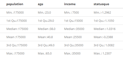
As you can see, there are distances far too great while others are far too small. That happened due to scales. A quick summary(dt_Chile[1:5,c(2,4,6,7)]) will give you hints on that matter:
More often than not, this scale range can negatively affect your cluster. This may be also true for linear regressions, SVMs, and some other models such as neural networks. A usual turnaround to this is data transformation. Yet, there are times when transformation can harass model performance. It could happen due to things such as the following:
- The transformation picked is not suited to the problem
- The problem in question requires data to be untransformed later and this operation can sometimes add unintended biases
- The original bias towards some variable due to its scale was oddly a great hint about how data should be clustered
Mostly used transformations are normalization and standardization. The former will scale your data between the values zero and one while the latter will result in a variable with a mean of zero and a standard deviation of one. Normalization rolls like this:

Where  is the normalized variable and x is the variable to be normalized. This is also called a max-min transformation. There are other types of max-min transformations. The standardization looks like this:
 ,
,
Where z accounts for the standardized variable,  is the variable's simple average and Sx is an unbiased estimator for the standard deviation. Which one will we use? None. Let's see how the untouched data does first:
h_clust <- hclust(dist(dt_Chile[1:10, c(2,4,6,7)]))
Note how the observations used to fit the cluster are nested inside the dist() function—hclust() has to be fed with a dissimilarity structure. Only 10 observations were used; hence, it's way easier to visualize and understand these models. A wonderful way to visualize clusters is with dendrograms (tree diagrams). The plot()method is suited to craft this visualization right away:
plot(h_clust)
The resulting dendrogram can be seen in Figure 6.8:

It's not cute, right? Some leaves are flattened. Yet, we can use this cluster to explain some things. Each leaf corresponds to a row index in the dataset. The difference height between a branch and another shows how similar (small heights) or dissimilar (great heights) the observations are from one another.
This matter aside, looking at the dendrogram we can see anything between 10 clusters or 1 huge cluster. One way to decide how many clusters to have is to think about how many groups would look reasonable and then draw a horizontal line splitting the clusters. The following code takes care of the flattened leaves issue while drawing a horizontal line at the height of 5000:
plot(h_clust, hang = .2)
abline(h = 5000, col = 'red', lwd = 2)
The hang from argument plot()is aligning all of the leaves; the abline() function is drawing the horizontal line at the height, h. The result is displayed in Figure 6.9:

The red line suggests that observations should be clustered around three different groups. Observations 1, 4, 5, and 7 would form a group; 2 and 6 would go together in another group, while observations 3, 8, 9, and 10 would form the last group altogether. What could these groups possibly be used for?
If each observation accounted for products, you could recommend 6 to whoever bought 2. Or we could create a new variable that would be a factor with three levels. A factor like this could be tried as an independent variable for further models, such as decision trees or random forests (feature engineering with clusters).
Another option is to try some labels in order to see whether clusters could or could not be used directly to predict voters directly. Before we do that, let's also try a hierarchical clustering using transformed data. In order to transform data, an anonymous function will be used:
dt_z <- apply(dt_Chile[,c(2,4,6,7)], MARGIN = 2,
              FUN = function(x){ xbar <- mean(x); s <- sd(x); return((x-xbar)/s)}
              )
The apply() function was used to apply the anonymous function over each numerical column from the dt_Chile DataFrame. The anonymous function is named over the FUN argument and was applied to the subsetted columns of the data, given that the margin argument was set to 2 (second dimension means columns, first dimension means rows, and so on).
The following code block will adjust a new cluster using transformed data (only the first 10 observations), plot this new cluster side-by-side with the one that used untransformed data, and give new labels to the leaves; leaves will then account for the voting intentions directly instead of the index:
h_clust_z <- hclust(dist(dt_z[1:10,]))

par(mfrow = c(1,2))

plot(h_clust, hang = .3,
     labels = dt_Chile[1:10, 'vote'],
     main = 'Cluster
(Original data)')

plot(h_clust_z, hang = .3,
     labels = dt_Chile[1:10, 'vote'],
     main = 'Cluster
(Standartized data)')
The result can then be seen in the following diagram:
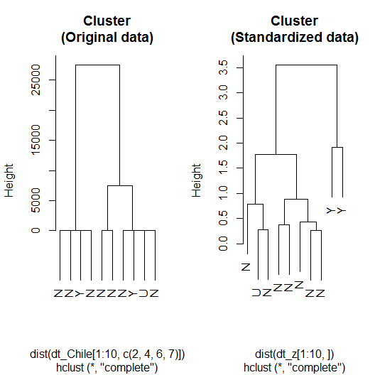
Here is how the code worked:
- hclust()was called using the standardized data (dt_z) to create an object holding the hierarchical cluster with transformed data, which was stored as h_clust_z.
- par()was called to set mfrow = c(1,2), which split the plot window in a single row with two columns.
- Finally, the plot()method was called with different objects (h_clust and h_clust_z) to plot the dendrograms for the clusters that used respectively the original and standardized data. Notice how the labels argument was used to rename the leaves after the voting intentions.
In comparison with the cluster that used original data, the one using standardized data seems to cluster better the groups of N (no) and Y (yes). Considering the really small sample used, this should not be taken as a consistent result. Let's use the whole sample and see whether we can extract any direct relation between clusters and vote intentions or create important features that will boost performance.
The following code block will not only cluster the 2,431 observations available in dt_Chile but also presents a practical way to split data into a given number of clusters:
h_clust_z2 <- hclust(dist(dt_z), method = 'ward.D')
cutree(h_clust_z, k = 4)
Now the dt_z DataFrame, used for clustering, is not limited by its first 10 rows. Also, pay close attention to the method argument. It was set to 'ward.D', which is a different agglomeration method from the default—type ?hclust to check all, the available methods.
In the next line, the code block called cutree(). This method holds two particularly easy ways to split clusters. Once you input it with a cluster object, you can name k and select how many groups you wish to have or you could name h, therefore selecting a height to split the three (similar to what we have done graphically).
Notice that it asked h_clust_z (only 10 observation) and not h_clust_z2. By doing this, we are only preventing the console from being flooded with thousands of entries, but we should use the latter if we aimed at prediction or feature building. Although there are several ways of picking the numbers of groups, researcher's experience, and intuition are usually a better guide.
When done right, there is a non-negligible chance that clustering will give you a hand. Yet, clustering won't extract meaning where there is none. The ultimate test is always real-life applications, but we could start little—that is, checking whether there seems to be a relation among the groups designated and the target variable using table():
table(cutree(h_clust_z2, k = 4)[-i_out],
      dt_Chile[-i_out, 'vote'])
As we had 4 different categories for the variable, vote, I tried to cluster data around four different groups—cutree( *, k = 4) is doing it. The brackets are subsetting only the train dataset. As a result, I've got the following table:

At a glance, we see that the four groups originated from the hierarchical clustering are not discriminating very well the vote intentions. Keep in mind that this is an unsupervised learning technique so it's not really aiming to explain voting intentions. Yet, we could put it to test. Guessing from the table, observations that were clustered into the 1, 3, and 4 group could be assigned as yes (Y) while the remaining ones could be understood as no (N).
Combining mean(), sapply(), an anonymous function, and a Boolean operator, we can retrieve the hit rate for the test sample using this very simple heuristic described by the paragraph behind. The code would look like the following:
mean(
  sapply(factor(cutree(h_clust_z2, k = 6))[test],
         FUN = function(x){
           if(x == 1 | x == 3 | x == 4) return('Y')
           else return('N')} )
  == dt_Chile[test, 'vote'])
# [1] 0.5232877
As you can see, the hit rate is not far from the chance of guessing a single flip of a coin. The four groups did very poorly in terms of predicting voting intentions directly but it's possible for them to do well as a feature that will aid models to predict the voting intentions correctly. To check that, the following code block is creating a new variable and trying it with a random forest model:
dt_Chile$hc_cluster <- factor(cutree(h_clust_z2, k = 4))

#library(randomForest)
set.seed(2010)

rf2 <- randomForest(vote ~ . , dt_Chile[-i_out,])
mean(predict(rf2, type = 'class', newdata = dt_Chile[test,]) == dt_Chile[test,'vote'])
# [1] 0.6520548
In comparison with the latter random forest model (rf), the test sample performance slightly worsened when the groups were included in the model. Some problems are really difficult to tackle given data constraints. I did not know this dataset before I started writing this chapter and its unfortunate ability of misleading models into overfitting has surprised me. Real-life problems are like that sometimes. Some problems are not solved in the blink of an eye.
Hierarchical clustering results are always reproducible; they don't rely on random seeds. Their time complexity with respect to data size is quadratic. That said, they are not suited to handle big data very efficiently but they are wonderful to handle small datasets given that they can be easily represented in diagrams and you can decide how many groups to have from that.
For the sake of big data, there is k-means clustering; k-means' time complexity is linear with respect to data size. It does mostly well with clusters that are globally allocated. The algorithm starts by seemingly randomly selecting the clusters; therefore, you might get different results each time you run it. To select the number of groups (k) beforehand is a requirement.
Compared to hierarchical clustering, k-means is not that simple. Dendrograms are not as useful as they are for hierarchical clustering. There is a special visualization that will help you to determine the optimal number of clusters when it's unclear how many you should have.
This special visualization consists of displaying how the total within sum of squares (WSS) evolves as the number of predetermined clusters grows. Here is a thing about k-means clusters, given the algorithm's nature, the WSS will always diminish as the number of clusters grows. The trick is to visually find a spot where an additional cluster won't land that much improvement. We can effortlessly craft a visualization like this by turning upon the factoextra package:
# if(!require(factoextra){install.packages('factoextra')}
library(factoextra)
fviz_nbclust(dt_z, kmeans, method = 'wss')
Erase the hashtag and run the first line if you are not sure about having the package already installed. As a result, we get the following:

Initially, the error rapidly decreases with the increasing number of clustering. We have to spot a number k for that one additional group won't contribute that much to decrease the WSS. This is known as the elbow method because, at some point, it resembles an elbow.
This method more or less counts on the users' experience and judgment. For example, I clearly spotted an elbow at k = 7. Nonetheless, there is a huge cliff before k =3. I tested both and three lead me to better results. Here is how to do k-means clustering with three clusters with R:
set.seed(10)
k_clust <- kmeans(dt_z, 3)
If you call k_clust alone, lots of information is displayed, for example, the within cluster sum of squares by cluster. You will also see the cluster characterization that shows the mean of each variable for each cluster. To return this characterization and nothing else, you can append $centers to your k-means object (k_clust$centers).
Notice that the mean values reported are related to the transformed data (dt_z) and not the original one (dt_Chile). You can retrieve the characterization with respect to the original data with the aggregate() function:
aggregate(dt_Chile[, c(2,4,6,7)],
          by = list(clusters = fitted(k_clust, method = 'classes')),
          mean)
The first argument is the original dataset (only variables used were subsetted). The second argument, by, is a list giving the groups related to each observation within data. Finally, the last argument is naming the function used to characterize the clusters. We could trust any function, as well. Also, there is no strict rule that will forbid the variables not used to cluster to come along, but make sure to give a function that can handle categorical variables if you are including them.
We could return means for numerical variables and modes for non-numerical ones. Begin by creating a function to find modes (I got it from Chapter 2, Descriptive and Inferential Statistics):
find_mode <- function(vals) {
  if(max(table(vals)) == min(table(vals)))
    'amodal'
  else
    names(table(vals))[table(vals)==max(table(vals))]
}
Now we need a function that checks the variable's class and apply mean() or find_mode() depending on it:
mean_or_mode <- function(x){
  if(is.numeric(x)) return(mean(x))
  else return(find_mode(x))
}
All it takes to get a characterization like the one just described is to run the following code:
aggregate(dt_Chile,
          by = list(clusters = k_clust$cluster),
          mean_or_mode)
There are four points I want you to play very close attention to:
- Data is not subsetted anymore.
- We used k_clust$cluster instead of fitted(k_clust, method = 'classes'); both are the same:
identical(k_clust$cluster, fitted(k_clust, method = 'classes'))
# [1] TRUE
- We replaced mean by mean_or_mode, our tailor-made function.
- None of the data output as a final result (Figure 6.13) were directly used to do the clustering. Only population, income, age and statusquo were used but not before going through standardization.
The latter aggregate()calling will output a table similar to the one displayed in the following diagram:

This is how I retrieved a very customized characterization. Do you remember when we assigned the clusters from the hierarchical algorithm to work as a new variable in the dataset? Check how the mode for it matches the group for k-means clustering. This does not mean that they are exactly the same—as a matter of fact, hierarchical set four different clusters while k-means was asked to only assign three.
Here is the code that creates a new variable based on k-means clusters and tests its performance using the random forests model:
dt_Chile$k_cluster <- fitted(k_clust, method = 'classes')

set.seed(2010)

rf3 <- randomForest(vote ~ . , dt_Chile[-i_out,-9])
mean(predict(rf3, type = 'class', newdata = dt_Chile[test,]) == dt_Chile[test,'vote'])
# [1] 0.660274
A bit of improvement is found here but it's unclear whether this is due to the new feature or the random seeds. k-means itself can be highly influenced by the initial random seeds, also random forests. Fuzzy k-means clustering is another option, we can do this with the fclust package:
if(!require('fclust')){install.packages('fclust')}
After making sure fclust is installed, we can use FKM*() function to do fuzzy clustering:
library(fclust)
set.seed(10)
f_clust <- FKM.ent(dt_z, k = 4, conv = 1e-16)
As usual, we start by loading the package. Next, we set the random seed generator, given that fuzzy k-means clustering also relies on pseudo-randomness. The FKM.ent() function is then used to do fuzzy k-means clustering with entropy regularization. Entropy regularization is a technique that aims to reduce overfitting.
Here is how we can test these clusters with random forests:
dt_Chile$f_cluster <- factor(f_clust$clus[,1])
set.seed(2010)
#library(randomForest)
rf4 <- randomForest(vote ~ . , dt_Chile[-i_out,c(-9,-10)])
mean(predict(rf4, type = 'class', newdata = dt_Chile[test,]) == dt_Chile[test,'vote'])
# [1] 0.6657534
Although the out-of-sample performance is slightly better while adopting the fuzzy k-means clustering, this is not the ultimate proof that it would go that way all the time. In fact, this slightly better improvement can be due to the seeds and not the algorithm itself.
For clustering in general, overleaping data, noise, and outliers can turn out to be quite challenging. As there are several clustering techniques, it is hard to name pros and cons as these might widely vary across different algorithms. The next set of algorithms we're about to see is called neural networks; such a name comes from the biological inspiration that gave birth to it.