
The HMM can be used in the finance field for a great number of things. Features such as regime identification, volatility clustering, and anti-correlation (return and volatility) can all be extracted from financial data through using the HMM. R has several great packages to deal with the HMM. This chapter uses one called ldhmm, which implements the homogeneous first-order HMM.
This link will guide you through the package documentation: https://cran.r-project.org/web/packages/ldhmm/ldhmm.pdf. The word first-order means that the state in time t is only influenced by the state in time t-1. Make sure that you have ldhmm installed by using the following code:
if(!require('ldhmm')){install.packages('ldhmm')}
Let's begin with data. The ldhmm package comes with daily data from the Standard & Poor 500 Index (SPX). Run the following code to load and store the dates, closing prices, and log returns from January 01, 1950 to December 31, 2015:
library(ldhmm)

dt <- ldhmm.ts_log_rtn(symbol = 'spx',
                       on = 'days')
Notice the symbol argument inputted with the 'spx' string. It points toward the index to be returned, in this case, the SPX. An alternative to it could be the CBOE Volatility Index (VIX), which could be returned by using the 'vix' string instead. The on argument dictates the data frequency.
After running the last code block, the data will be stored in a list called dt. Recover vectors for the date, closing prices, and log returns by calling dt$d, dt$p, and dt$x, respectively. You can visualize the closing prices evolution in the long term by running the following code block:
plot(y = dt$d, x= dt$p, type = 'l',
     ylab = 'SPX closing prices',
     xlab = 'time')
It is a good idea to combine ggplot2 with ggthemes draw an improved plot:
library(ggplot2)
library(ggthemes)
ggplot(data = data.frame(x = dt$d, y = dt$p)) +
  geom_line(aes(x = x, y = y), size = 1.5) +
  ylab('SPX closing prices') +
  xlab('time') +
  theme_pander(base_size = 16)
The result is displayed in the following diagram:

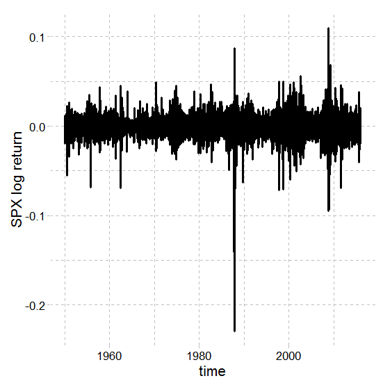
Alternatively, you can visualize the long-term evolution of the log return for the SPX:
plot(x = dt$d, y= dt$x, type = 'l',
     ylab = 'SPX log return',
     xlab = 'time')
Drawing it with ggplot2 and ggthemes is also possible, as follows:
ggplot(data = data.frame(x = dt$d, y = dt$x)) +
  geom_line(aes(x = x, y = y), size = 1.1) +
  ylab('SPX log return') +
  xlab('time') +
  theme_pander(base_size = 16)
The result can be seen in the following diagram:
Even though there are some serious outliers that most possibly will make modeling difficult, removing them is not always advised. Removing observations should always be a well-thought out decision, widely documented, and very well justified; otherwise, any conclusions drafted by such a model might be doubtful.
The most intuitive way of looking at the stock market is as if it has only two regimes: normal and crash. Normal is also known as the bull market. A bull market usually drives both prices and returns up; things are going very well and you should buy and hold stocks. These are some of the characteristics of a regular regime, but what about crash regimes?
Crash regimes are also known as the bear market. A market like this is panicking. Prices are mostly falling, volatility is rising beyond regular levels, and returns tend to be negative. This dualism between bear and bull markets facilitates the understanding because this is the way we are used to seeing things.
Bear and bull will be the hidden states within our HMM. We could go way farther and define 5, 10 hidden states—that is an advantage of using the HMM, you can get a broader spectrum of regimes instead of the two usual ones. Nonetheless, for this example, we will stick with the two states paradigm.
Let's store the number of states in a variable called states:
states <- 2
The ldhmm package defines a parameter space for the HMM within univariate mixing distributions, a transition probability matrix, and an initial state probability vector.
For each state, we need to guess an initial mean and standard deviation in order to start looking for actual values. The better your guess, the easier to the convergence will be. Usually, the initial guess would be done using the actual ldhmm, but we will rather take a shortcut and use k-means clustering instead. To use the k-means cluster, fit and store the clusters in a brand new variable:
set.seed(9)
k_2 <- kmeans(dt$x, 2)
The kmeans() function takes care of fitting the k-means clustering with two clusters (k = 2) on the log of returns. Take note that the random seed generator is being selected, given that k-means relies on pseudo-randomness. The k_2 variable is a list with information about the two clusters. A vector naming each cluster membership can be accessed by entering k_2$cluster.
You can use ggplot2 to visualize the result:
library(ggplot2)
ggplot(data = data.frame(x = dt$d, y = dt$x, k = factor(k_2$cluster))) + geom_point(aes(x = x, y = y, color = k), alpha = .4)
The outcome is displayed in the following diagram:

Keep in mind that we do not intend to draft great insights from this simple trick. The sole intention is to (maybe) take a shortcut and define good initial guesses for the parameters from the mixing distribution. The parameters required are the mean, standard deviation, and lambda for each of the states.
The following code block is estimating the initial mean based on the two clusters:
mean_1 <- mean(dt$x[k_2$cluster == 1])
mean_1
# [1] 0.005838372
mean_2 <- mean(dt$x[k_2$cluster == 2])
mean_2
# [1] -0.007473948
The means for the groups are being stored by the variables mean_1 and mean_2. From these values, you can guess that cluster one (positive returns) means bull market while cluster two (negative returns) means bear market. Take note of these values because they will change as we learn the parameters for the HMM.
The following code block is estimating the standard deviations based on the clusters:
sd_1 <- sd(dt$x[k_2$cluster == 1])
sd_1
# [1] 0.006667836
sd_2 <- sd(dt$x[k_2$cluster == 2])
sd_2
# [1] 0.007827308
Assuming that clusters one and two, respectively, mean bear and bull market, you can guess that the bull regime is slightly more volatile than the bear. Nevertheless, the clusters are only a starting point. The task of characterizing the regimes will be dealt with by the HMM.
One last parameter to define for each state is the lambda. Distributions for each state are parameterized by a mean, a standard deviation, and a lambda—those are called univariate lambda functions. The lambda may be harder to guess; luckily, ldhmm is very efficient in converging to the right value. In the following code block, set the initial value of lambda at 1.3:
param <- matrix(c(
  mean_1, sd_1, 1.3,
  mean_2, sd_2, 1.3),
  states, 3, byrow = T)
Initiate the transition matrix for the two states with the following code:
t <- ldhmm.gamma_init(states)
Start the HMM model using both the transition matrix t and the parameters defined before in param:
hmm <- ldhmm(states, param, t, stationary = T)
Finally, it's time to optimize the HMM using maximum likelihood (MLE). It can take a while:
hmm_mle <- ldhmm.mle(hmm, dt$x, decode = T, print.level = states)
Additionally, the algorithm may fail to converge sometimes—try different parameters (param) and run the last two code blocks again. It may be that you succeed at the first attempt. An object called hmm_mle is created.
A great way to visualize the results is by drawing an awesome plot. The ldhmm package comes with an easy way to draw such a plot; try the ldhmm.oxford_man_plot_obs() function with the recently fitted HMM object (hmm_mle). Make sure you have access to the internet:
ldhmm.oxford_man_plot_obs(hmm_mle)
The result is displayed in the following diagram:

Spot the blue lines. The solid blue line is the SPX price index (rescaled), while the dashed ones show the volatilities from the HMM states. The red lines are the daily volatility, while the red dots are a five-day moving average volatility. The black dots are the expected volatility given by the HMM.
We can easily return the parameters from the mixing distributions using the following code:
hmm_mle@param
#                mu sigma lambda
#[1,] 0.0006179082 0.006958493 1.418622
#[2,] -0.0003603437 0.013167661 1.710069
Type hmm_mle@param to return the mean, the standard deviation, and the lambda for each state. We get one parameterized distribution for each state—together they make the mixing distribution.
You can compare the mean and standard deviation with the very first ones we guessed using k-means clustering. Our initial guesses for the means were actually very close (but do not expect this trick to work this well every situation). The distribution with the positive mean can be associated with the bull market (regular regime) while the one with negative value represents the bear market (crash regime).
If we had discrete observations we would have observations probabilities (B) instead of the mixing distribution. Given that our observations and the log return are continuous, we get the mixing distribution. You can easily return the transitional matrix by looking at @gamma:
hmm_mle@gamma
#           [,1] [,2]
#[1,] 0.99339020 0.006609796
#[2,] 0.01631626 0.983683738
After typing hmm_mle@gamma, the console will output the transitional matrix for our recently fitted HMM model (hmm_mle). Notice that the column's sum is always one. There is another feature, called @delta, which shows how much time the system was in each state:
hmm_mle@delta
#[1] 0.7116907 0.2883093
The system was in regular regime 71.16% of the time. The local statistics for each state can be returned using @states.local.stats:
[email protected]
#              mean sd kurtosis skewness length
#[1,] 0.0005747770 0.006296764 3.821433 -0.05581264 11977
#[2,] -0.0004506958 0.015358800 17.010688 -0.79468256 4628
The columns display the mean, sd, kurtosis, skewness, and length for the two hidden states. These values were empirically obtained through data. The theoretical statistics can be accessed through the ldhmm.ld_stats() function:
ldhmm.ld_stats(hmm_mle)
#              mean sd kurtosis
#[1,] 0.0006179082 0.006326602 3.990262
#[2,] -0.0003603437 0.014766342 4.890151
The result from the last two code blocks can be compared to check whether the theoretical values closely follow the ones empirically obtained. For most of them, the answer is yes, they do follow each other very closely, but not for kurtosis, given by the second state.