
This is the last chapter on layouts before we spend some time focusing on Java and object-oriented programming. We will formalize our learning on some of the different attributes we have already met, and we will also introduce two more cool layouts; the ScrollView and the CardView. To finish the chapter off, we will run the CardView project on a tablet emulator.
In this chapter, we will cover the following:
- Compile a quick summary of UI attributes
- Build our prettiest layout so far using
ScrollViewandCardView - Switch and customize themes
- Create and use a tablet emulator
Let's start by recapping some attributes.
In the last few chapters, we have used and discussed quite a few different attributes. I thought it would be worth a quick summary and further investigation of a few of the more common ones.
As we know, there are thousands of different Android devices. To try and have a system of measurement that works across different devices, Android uses density-independent pixels, or dp, as a unit of measurement. The way this works is by first calculating the density of the pixels on the device an app is running on.
All we must do is use dp in conjunction with a number when setting the size of the various attributes of our widgets. Using density-independent measurements, we can design layouts that scale to create a uniform appearance on as many different screens as possible.
So, problem solved then? We just use dp everywhere and our layouts will work everywhere? Unfortunately, density independence is only part of the solution. We will see more of how we can make our apps look great on a range of different screens throughout the rest of the book.
As an example, we can affect the height and width of a widget, for example, by adding the following code to its attributes:
...
android:height="50dp"
android:width="150dp"
...
Alternatively, we can use the attributes window and add them through the comfort of the appropriate edit boxes. Which choice you use will depend on your personal preference, but sometimes one way will feel more appropriate than another in a given situation. Either way is correct, and as we go through the book making apps, I will usually point out if one way is better than another.
We can also use the same dp units to set other attributes, such as margin and padding. We will look more closely at margin and padding in a minute.
Another device-dependent unit of measurement used for sizing Android fonts is scalable pixels, or sp. The sp unit of measurement is used for fonts and is pixel density-dependent in the exact same way that dp is.
The extra calculation that an Android device will use when deciding how big your font will be, based on the value of sp you use, is the user's own font size settings. So, if you test your app on devices and emulators with normal-sized fonts, then a user who has a sight impairment (or just likes big fonts) and has their font setting set to large will see something different to what you saw during testing.
If you want to try playing with your Android device's font size settings, you can do so by selecting Settings | Display | Font size:
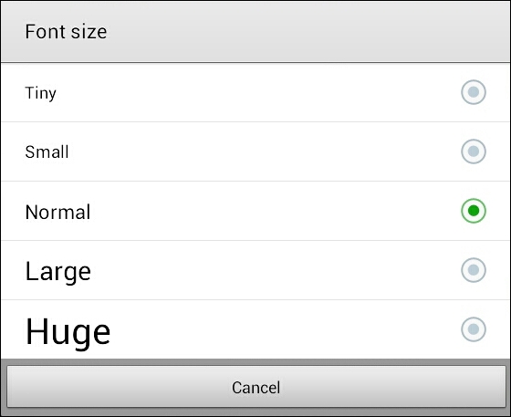
As we can see in the preceding diagram, there are a quite a number of settings, and if you try it on Huge, the difference is, well, huge!
We can set the size of fonts using sp in any widget that has text. This includes Button, TextView, and all the UI elements under the Text category in the palette, as well as some others. We do so by setting the textSize property as follows:
android:textSize="50sp"
As usual, we can also use the Attributes window to achieve the same thing.
We can also decide how the size of UI elements and many other UI elements behave in relation to the containing/parent element. We can do so by setting the layoutWidth and layoutHeight attributes to either wrap_content or match_parent.
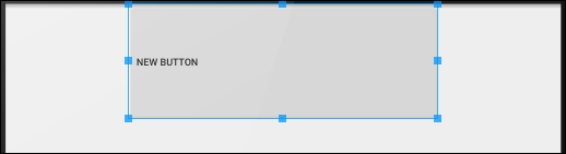
For example, we can set the attributes of a lone button on a layout to the following:
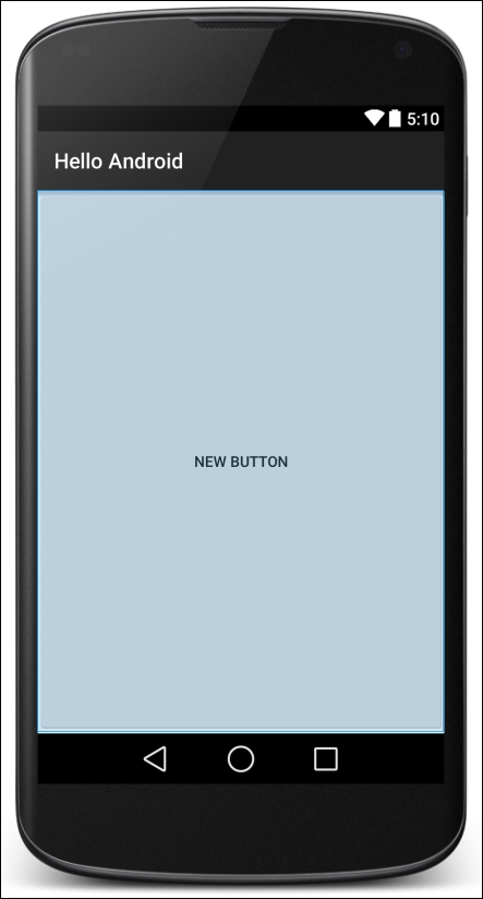
...
android:layout_width="match_parent"
android:layout_height="match_parent"
....
Then the button will expand in both height and width to match the parent. We can see that the button in the next image fills the entire screen:
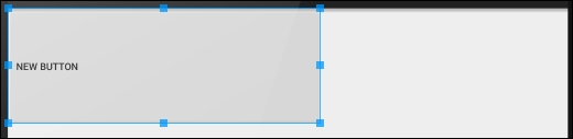
More common for a button is wrap_content, as shown next:
....
android:layout_width="wrap_content"
android:layout_height="wrap_content"
....
This causes the button to be as big as it needs to be to wrap its content (width and height in dp and text in sp).
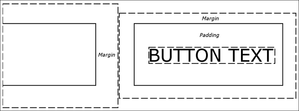
If you have ever done any web design, then you will be very familiar with the next two attributes. Padding is the space from the edge of the widget to the start of the content in the widget. Margin is the space outside of the widget that is left between other widgets—including the margin of other widgets, should they have any. Here is a visual representation:
We can set padding and margin in a straightforward way, and equally for all sides, like this:
...
android:layout_margin="43dp"
android:padding="10dp"
...
Look at the slight difference in naming convention for the margin and the padding. The padding is just called padding, but the margin is referred to as layout_margin. This reflects the fact that padding only affects the UI element itself, but margin can affect other widgets in the layout.
Or we can specify different top, bottom, left, and right margin and padding, as follows:
android:layout_marginTop="43dp"
android:layout_marginBottom="43dp"
android:paddingLeft="5dp"
android:paddingRight="5dp"
Specifying margin and padding values for a widget is optional, and a value of zero will be assumed if nothing is specified. We can also choose to specify some of the different sides' margins and padding but not others, as in the earlier example.
It is probably becoming obvious that the way we design our layouts is extremely flexible, but also that it is going to take some practice to achieve precise results with these many options. We can even specify negative margin values to create overlapping widgets.
Let's look at a few more attributes, and then we will go ahead and play around with a stylish layout—CardView.
Weight refers to a relative amount compared to other UI elements. So, for layout_weight to be useful, we need to assign a value to the layout_weight property on two or more elements.
We can then assign portions that add up to 100% in total. This is especially useful for dividing up screen space between parts of the UI in which we want the relative space they occupy to remain the same regardless of screen size.
Using layout_weight in conjunction with sp and dp units can make for a simple and flexible layout. For example, look at this code:
<Button
        android:layout_width="match_parent"
        android:layout_height="0dp"
        android:layout_weight=".1"
        android:text="one tenth" />

<Button
        android:layout_width="match_parent"
        android:layout_height="0dp"
        android:layout_weight=".2"
        android:text="two tenths" />

<Button
        android:layout_width="match_parent"
        android:layout_height="0dp"
        android:layout_weight=".3"
        android:text="three tenths" />

<Button
        android:layout_width="match_parent"
        android:layout_height="0dp"
        android:layout_weight=".4"
        android:text="four tenths" />
Here is what this code will do:
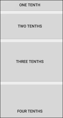
Notice that all the layout_height attributes are set to 0dp. Effectively, the layout_weight is replacing the layout_height property. The context in which we use layout_weight is important (or it won't work), and we will see this in a real project soon. Also note that we don't have to use fractions of 1; we can use whole numbers, percentages, and any other number. As long as they are relative to each other, they will probably achieve the effect you are after. Note that layout_weight only works in certain contexts, and we will get to see where as we build more layouts.
Gravity can be our friend, and can be used in so many ways in our layouts. Just like gravity in the solar system, it affects the position of items by moving them in a given direction, like they were being acted upon by gravity. The best way to see what gravity can do is to look at some example code and diagrams.
If the gravity property on a button (or another widget) is set to left|center_vertical as follows, it will have an effect that looks like this:
android:gravity="left|center_vertical"
Notice that the content of the widget (in this case the button's text) is indeed aligned left and centrally vertical.
In addition, a widget can influence its own position within a layout element with the layout_gravity element, as follows:
android:layout_gravity="left"
This would set the widget within its layout, as expected, like this:
The previous code allows different widgets within the same layout to be affected as if the layout has multiple different gravities.
The content of all the widgets in a layout can be affected by the gravity property of their parent layout by using the same code as a widget:
android:gravity="left"
There are, in fact, many more attributes than those we have discussed. Many we won't need in this book, and some are quite obscure, so you might never need them in your entire Android career. But others are quite commonly used and include background, textColor, alignment, typeface, visibility, and shadowColor. Let's explore some more attributes and layouts now.