
Chapter 5: Understanding Machine Learning
Over the last few years, you have likely heard some of the many popular buzz words such as Artificial Intelligence (AI), Machine Learning (ML), and Deep Learning (DL) that have rippled through most major industries. Although many of these phrases tend to be used interchangeably in company-wide all-staff and leadership meetings, each of these phrases does in fact refer to a distinct concept. So, let's take a look closer look at what these phrases actually refer to.
AI generally refers to the overarching domain of human-like intelligence demonstrated by software and machines. We can think of AI as the space that encompasses many of the topics we will discuss within the scope of this book.
Within the AI domain, there exists a sub-domain that we refer to as machine learning. ML can be defined as the study of algorithms in conjunction with data to develop predictive models.
Within the ML domain, there exists yet another sub-domain we refer to as deep learning. We will define DL as the application of ML specifically through the use of artificial neural networks.
Now that we have gained a better sense of the differences between these terms, let's define the concept of ML in a little more detail. There are several different definitions of ML that you will encounter depending on who you ask. Physicists tend to link the definition to applications in performance optimization, whereas mathematicians have a tendency to link the definition to statistical probabilities and, finally, computer scientists tend to link the definition to algorithms and code. To a certain extent, all three are technically correct. For the purposes of this book, we will define ML as a field of research concerning the development of mathematically optimized models using computer code, which learn or generalize from historical data to unlock useful insights and make predictions.
Although this definition may seem straightforward, most experienced interview candidates still tend to struggle when defining this concept. Make note of the exact phrasing we used here, as it may prove to be useful in a future setting.
Over the course of this chapter, we will visit various aspects of ML, and we will review some of the most common steps a developer must take when it comes to developing a predictive model.
In this chapter, we will review the following main topics:
- Understanding ML
- Overfitting and underfitting
- Developing an ML model
With all this in mind, let's get started!
Technical requirements
In this chapter, we will apply our understanding of Python to demonstrate some of the concepts behind ML. We will take a close look at some of the main steps in the ML model development process in which we will utilize some familiar libraries, such as pandas and numpy. In addition, we will also use some ML libraries such as sklearn and tensorflow. Recall that the process of installing a new library can be done via the command line:
$ pip install library-name
Let's begin!
Understanding ML
In the introduction, we broadly defined the concept of ML as it pertains to this book. With that definition in mind, let's now take a look at some examples to elaborate on our definition. In its broadest sense, ML can be divided into four areas: classification, regression, clustering, and dimensionality reduction. These four categories are often referred to as the field of data science. Data science is a very broad term used to refer to various applications relating to data, as well as the field of AI and its subsets. We can visualize the relationships between these fields in Figure 5.1:
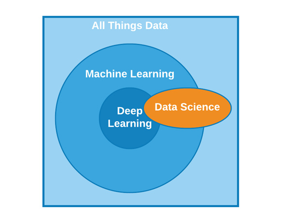
Figure 5.1 – The domain of AI as it relates to other fields
With these concepts in mind, let's discuss these four ML methods in more detail.
Classification is a method of pattern detection in which our objective is to predict a label (or category) from a finite set of possible options. For example, we can train a model to predict a protein's structure (for example, alpha helix or beta sheet), which can be referred to as a binary classifier as there are only two possible outcomes or categories. We can break down classification models even further; however, we will visit this in greater detail in Chapter 7, Supervised Machine Learning. For now, note that classification is a method to predict a label (or category). We begin with a dataset in which our input values (referred to as X) and their subsequent output values (generally referred to as ŷ) are used to train a classifier. This classifier can then be used to make predictions on new and unseen data. We can represent this visually in Figure 5.2:

Figure 5.2 – An example of a classification model
Clustering is similar to classification in the sense that the outcome of the model is a label (or category), but the difference here is that a clustering model is not trained on a list of predefined classes but is based on the similarities between objects. The clustering model then groups the data points together in clusters. The total number of clusters formed is not always known ahead of time, and this depends heavily on the parameters the model is trained on. In the following example, three clusters were formed using the original dataset:
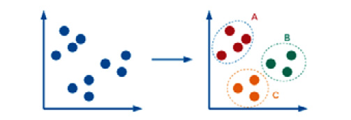
Figure 5.3 – An example of a clustering model
On the other hand, when it comes to regression, we are trying to predict a specific value, such as an isoelectric point (pI) in which the possible values are continuous (pI = 5.59, 6.23, 7.12, and so on). Unlike classification or clustering, there are no labels or categories involved here, only a numerical value. We begin with a dataset in which our input values (X) and their subsequent output values (ŷ) are used to train a regressor. This regressor can then be used to make predictions on new and unseen data:
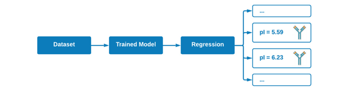
Figure 5.4 – An example of a regression model
Finally, when it comes to dimensionality reduction, ML can be applied not for the purposes of predicting a value, but in the sense of transforming data from a high-dimensional representation to a low-dimensional representation. Take, for example, the vast toxicity dataset we worked with in the previous chapters. We could apply a method such as Principal Component Analysis (PCA) to reduce the 10+ columns of features down to only two or three columns by combining the importance of these features together. We will examine this in greater detail in Chapter 7, Understanding Supervised Machine Learning. We can see a visual representation of this in Figure 5.5:
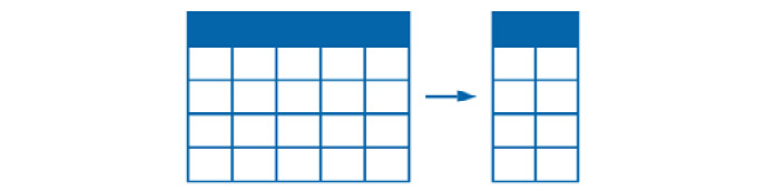
Figure 5.5 – An example of a dimensionality reduction model
The ML field is vast, complex, and extends well beyond the four basic examples we just touched on. However, the most common applications of ML models tend to focus on predicting a category, predicting a value, or uncovering hidden insights within data.
As scientists, we always want to organize our thoughts as best we can, and as it happens, the concepts we just discussed can be placed into two main categories: Supervised Machine Learning (SML) and Unsupervised Machine Learning (UML). SML encompasses all applications and models in which the datasets used to train the models contain both features and ground truth output values. In other words, we know both the input (X) and the output (ŷ). We call this a supervised method because the model was taught (supervised) which output label corresponds to which input value. On the other hand, UML encompasses ML models in which only the input (X) is known. Looking back to the four methods we discussed, we can divide them across both learning methods in the sense that classification and regression fall under SML, whereas clustering and dimensionality reduction fall under UML:
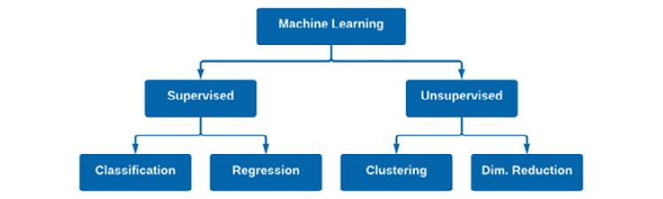
Figure 5.6 – A representation of supervised and unsupervised machine learning
Over the course of the following chapters, we will explore many popular ML models and algorithms that fall under these four general categories. As you follow along, I encourage you to develop a mind map of your own, and further branch out each of the four categories to all the different models you will learn. For example, we will explore a Naïve Bayes model in the Saving a model for deployment section of this chapter, which could be added to the classification branch of Figure 5.6. Perhaps you could branch out each of the models with some notes regarding the model itself. A map or visual aid may prove to be useful when preparing for a technical interview.
Throughout each of the models we develop, we will follow a particular set of steps to acquire our data, preprocess it, build a model, evaluate its performance, and finally, if the model is sufficient, deploy it to our end users or data engineers. Before we begin developing our models, let's discuss the common dangers known as overfitting and underfitting.
Overfitting and underfitting
Within the context of SML, we will prepare our models by fitting them with historical data. The process of fitting a model generally outputs a measure of how well the model generalizes to data that is similar to the data on which the model was trained. Using this output, usually in the form of precision, accuracy, and recall, we can determine whether the method we implemented or the parameters we changed had a positive impact on our model. If we revisit the definition of ML models that from earlier in this chapter, we specifically refer to them as models that learn or generalize from historical data. Models that are able to learn from historical data are referred to as well-fitted models, in the sense that they are able to perform accurately on new and unseen data.
There are instances in which models are underfitted. Underfitted models generally perform poorly on datasets, which means they have not learned to generalize well. These cases are generally the result of an inappropriate model being selected for a given dataset or the inadequate setting of a parameter/hyperparameter for that model.
Important note
Parameters and hyperparameters: Note that while parameters and hyperparameters are terms that are often used interchangeably, there is a difference between the two. Hyperparameters are parameters that are not learned by a model's estimator and must be manually tuned.
There are also instances in which models are overfitted. Overfitted models are models that know the dataset a little too well, and this means that they are no longer learning but memorizing. Overfitting generally occurs when a model begins to learn from the noise within a dataset and is no longer able to generalize well on new data. The differences between well-fitted, overfitted, and underfitted models can be seen in Figure 5.7:
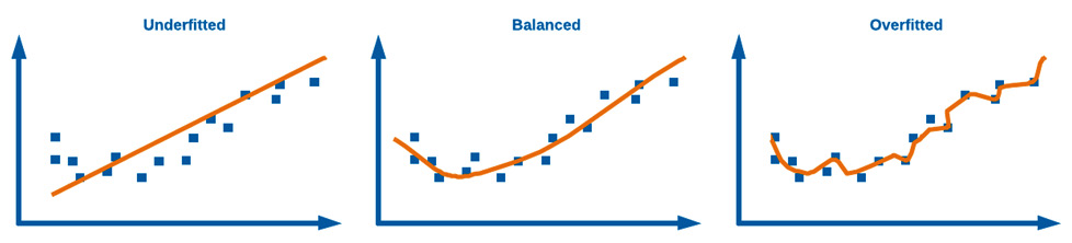
Figure 5.7 – A representation of overfitting and underfitting data
The objective of every data scientist is to develop a balanced model with optimal performance when it comes to your metrics of interest. One of the best ways to ensure that you are developing a balanced model that is not underfitting or overfitting is by splitting your dataset ahead of time and ensuring that the model is only ever trained on a subset of the data. We can split datasets into two categories: training data and testing data (also often referred to as validation data). We can use the training dataset to train the model, and we can use the testing dataset to test (or validate) the model. One of the most common classes to use for this purpose is the train_test_split() class from sklearn. If you think of your dataset with X being your input variables and ŷ being your output, you can split the dataset using the following code snippet. First, we import the data. Then, we isolate the features we are interested in and output their respective variables. Then, we implement the train_test_split() function to split the data accordingly:
import pandas as pd
from sklearn.model_selection import train_test_split
df = pd.read_csv("../../datasets/dataset_wisc_sd.csv")
X = df.drop(columns = ["id", "diagnosis"])
y = df.diagnosis.values
X_train, X_test, y_train, y_test = train_test_split(X, y)
We can visualize the split dataset in Figure 5.8:
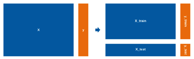
Figure 5.8 – A visual representation of data that has been split for training and testing
With the data split in this fashion, we can now use X_train and y_train for the purposes of training our model, and X_test and y_test for the purposes of testing (or validating) our model. The default splitting ratio is 75% training data to 25% testing data; however, we can pass the test_size parameter to change this to any other ratio. We generally want to train on as much data as possible but still keep a meaningful amount of unseen data in reserve, and so 75/25 is a commonly accepted ratio in the industry. With this concept in mind, let's move on to developing a full ML model.
Developing an ML model
There are numerous ML models that we interact with on a daily basis as end users, and we likely do not even realize it. Think back to all the activities you did today: scrolling through social media, checking your email, or perhaps you visited a store or a supermarket. In each of these settings, you likely interacted with an already deployed ML model. On social media, the posts that are presented on your feed are likely the output of a supervised recommendation model. The emails you opened were likely filtered for spam emails using a classification model. And, finally, the number of goods available within the grocery store was likely the output of a regression model, allowing them to predict today's demand. In each of these models, a great deal of time and effort was dedicated to ensuring they function and operate correctly. In these situations, while the development of the model is important, the most important thing is how the data is prepared ahead of time. As scientists, we always have a tendency to organize our thoughts and processes as best we can, so let's organize a workflow for the process of developing ML models:
- Data acquisition: Collecting data via SQL queries, local imports, or API requests
- EDA and preprocessing: Understanding and cleaning up the dataset
- Model development and validation: Training a model and verifying the results
- Deployment: Making your model available to end users
With these steps in mind, let's go ahead and develop our first model.
We begin by importing our data. We will use a new dataset that we have not worked with yet known as the Breast Cancer Wisconsin dataset. This is a multivariate dataset, published in 1995, containing several hundred instances of breast cancer masses. These masses are described in the form of measurements that we will use as features (X). The dataset also includes information regarding the malignancy of each of the instances, which we will use for our output label (ŷ). Given that we have both the input data and the output data, this calls for the use of a classification model.
Data acquisition
Let's import our data and check its overall shape:
import pandas as pd
import numpy as np
df = pd.read_csv("../../datasets/dataset_wisc_sd.csv")
df.shape
We notice that there are 569 rows (which we generally call observations) and 32 columns (which we generally call features) of data. We generally want our dataset to have many more observations than features. There is no golden rule about the ideal ratio between the two, but you generally want to have at least 10x more observations than features. So, with 32 columns, you would want to have at least 320 observations – which we do in this case!
Exploratory data analysis and preprocessing:
Exploratory Data Analysis (EDA) is arguably one of the most important and time-consuming steps in any given ML project. This step generally consists of many smaller steps whose objectives are as follows:
- Understand the data and its features.
- Address any inconsistencies or missing values.
- Check for any correlations between the features.
Please note that the order in which we carry out these steps may be different depending on your dataset. With all this in mind, let's get started!
Examining the dataset
One of the first steps after importing your dataset is to quickly check the quality of the data. Recall that we can use square brackets ([]) to specify the columns of interest, and we can use the head() or tail() functions to see the first or last five rows of data:
df[["id", "diagnosis", "radius_mean", "texture_mean", "concave points_worst"]].head()
We can see the results of this code in Figure 5.9:

Figure 5.9 – A sample of the Breast Cancer Wisconsin dataset
We can quickly get a sense of the fact that the data is very well organized, and from a first glance, it does not appear to have any problematic values, such as unusual characters or missing values. Looking over these select columns, we notice that there is a unique identifier in the beginning consisting of integers, followed by the diagnosis (M = malignant and B = benign) consisting of strings. The rest of the columns are all features, and they all appear to be of the float (decimals) data type. I encourage you to expand the scope of the preceding table and explore all the other features within this dataset.
In addition to exploring the values, we can also explore some of the summary statistics provided by the describe() function in the pandas library. Using this function, we get a sense of the total count, as well as some descriptive statistics such as the mean, maximum, and minimum values:
df[["id", "diagnosis", "radius_mean", "texture_mean", "perimeter_mean", "area_mean", "concave points_worst"]].describe()
The output of this function can be seen in the following screenshot:

Figure 5.10 – A table of some summary statistics for a DataFrame
Looking over the code, we notice that we had requested the statistics for seven columns, however, only five appeared in the table. We can see that the id values (which are primary keys or unique identifiers) were summarized here. These values are meaningless, as the mean, maximum, and minimum of a set of primary keys tell us nothing. We can ignore this column for now. We also asked for the diagnosis column; however, the diagnosis column does not use a numerical value. Instead, it contains strings. Finally, we see that the concave points_worst feature was also not included in this table, indicating that the data type is not numerical for whatever reason. We will take a closer look at this in the next section when we clean the data.
Cleaning up values
Getting the values within your dataset cleaned up is one of the most important steps when handling an ML project. A famous saying among data scientists when describing models is garbage in, garbage out. If you want to have a strong predictive model, then ensuring the data that supports it is of good quality is an important first step.
To begin, let's take a closer look at the data types, given that there may be some inconsistencies here. We can get a sense of the data types for each of the 32 columns using the following code:
df.dtypes
We can see the output of this code in Figure 5.11, where the column names are shown with their respective data types:
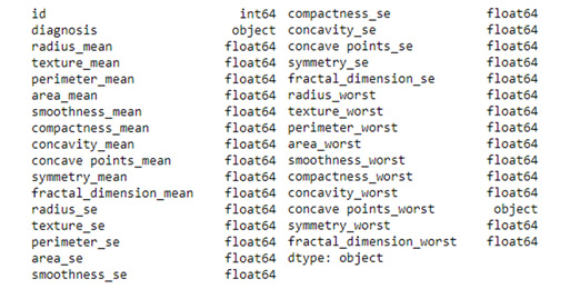
Figure 5.11 – A list of all of the columns in a dataset with their respective data types
Looking over the listed data types, we see that the id column is listed as an integer and the diagnosis column is listed as an object, which seems consistent with the fact that it appeared to be a single-letter string in Figure 5.9. Looking over the features, they are all listed as floats, completely consistent with what we previously saw, with the exception of one feature: concave points_worst. This feature is listed as an object, indicating that it might be a string. We noted earlier that this column consisted of float values, and so the column itself should be of the float type. Let's take a look at this inconsistency sooner rather than later. We can make an attempt to cast the column to be of the float type instead of using the astype() function:
df['concave points_worst'] = df['concave points_worst'].astype(float)
However, you will find that this code will error out, indicating that there is a row in which the \n characters are present and it is unable to convert the string to a float. This is known as a newline character and it is one of the most common items or impurities you will deal with when handling datasets. Let's move on and identify the lines in which this character is present and decide how to deal with it. We can use the contains() function to find all instances of a particular string:
df[df['concave points_worst'].str.contains(r"\n")]
The output of this function shows that only the row with the 146 index contains this character. Let's take a closer look at the specific cell from the 146 row:
df["concave points_worst"].iloc[146]
We see that the cell contains the 0.1865\n\n string. It appears as though the character is printed twice and only in this row. We could easily open the CSV file and correct this value manually, given that it only occurred a single time. However, what if this string appeared 10 times, or 100 times? Luckily, we can use a Regular Expression (regex) to match values, and we can use the replace() function to replace them. We can specifically chain this function on df instead of the single column to ensure that the function parses the full DataFrame:
df = df.replace(r'\n','', regex=True)
A regex is a powerful tool that you will often rely on for various text matching and cleaning tasks. You can remove spaces, numbers, characters, or unusual combinations of characters using regex functions. We can double-check the regex function's success by once again examining that specific cell's value:
df["concave points_worst"].iloc[146]
The value is now only 0.1865, indicating that the function was, in fact, successful. We can now cast the column's type to a float using the astype() function and then also confirm the correct datatypes are listed using df.dtypes.
So far, we were able to address issues in which invalid characters made their way into the dataset. However, what about items that are missing? We can run a quick check on our dataset to determine if any values are missing using the isna() function:
df.isna().values.sum()
The value returned shows that there are seven rows of data in which a value is missing. Recall that in Chapter 4, Visualizing Data with Python, we looked over a few methods to address missing values. Given that we have a sufficiently large dataset, it would be appropriate to simply eliminate these few rows using the dropna() function:
df = df.dropna()
We can check the dataset's shape before and after implementing the function to ensure the proper number of rows was in fact dropped.
Taking some time to clean up your dataset ahead of time is always recommended, as it will help prevent problems and unusual errors down the line. It's always important to check the data types and missing values.
Understanding the meaning of the data
Let's now take a closer look at some of the data within this dataset, beginning with the output values in the second column. We know these values correspond to the labels as being M for malignant and B for benign. We can use the value_counts() function to determine the sum of each category:
df['diagnosis'].value_counts()
The results show that there are 354 instances of benign masses and 208 instances of malignant masses. We can visualize this ratio using the seaborn library:
sns.countplot(df['diagnosis'])
The output of this code can be seen as follows:

Figure 5.12 – A bar plot showing the number of instances for each class
In most ML models, we try to ensure that the output column is well balanced, in the sense that the categories are roughly equal. Training a model on an imbalanced dataset with, for example, 95 rows of malignant observations and 5 rows of benign observations would lead to an imbalanced model with poor performance. In addition to visualizing the diagnosis or output column, we can also visualize the features to get a sense of any trends or correlations using the pairplot() function we reviewed in Chapter 4, Visualizing Data with Python. We can implement this with a handful of features:
sns.pairplot(df[["diagnosis", "radius_mean", "concave points_mean", "texture_mean"]], hue = 'diagnosis')
The following graph shows the output of this:
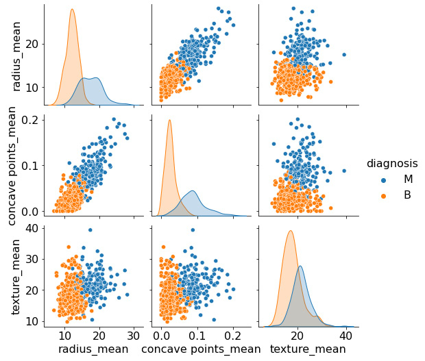
Figure 5.13 – A pair plot of selected features
Looking over these last few plots, we notice a distinguishable separation between the two clusters of data. The clusters appear to exhibit some of the characteristics of a normal distribution, in the sense that most points are localized closer to the center, with fewer points further away. Given this nature, one of the first models we may try within this dataset is a Naïve Bayes classifier, which tends to work well for this type of data. However, we will discuss this model in greater detail later on in this chapter.
In each of these plots, we see some degree of overlap between the two classes, indicating that two columns alone are not enough to maintain a good degree of separation. So, we could ensure that our ML models utilize more columns or we could try to eliminate any potential outliers that may contribute to this overlap – or we could do both!
First, we can utilize some descriptive statistics. Specifically, we can use the Interquartile Range (IQR) to identify any potential outliers. Let's examine this for the malignant masses. We begin by isolating the malignant observations in their own variable called dfm. We can then define the first quartile (Q1) and third quartile (Q3) using the radius_mean feature:
dfm = df[df["diagnosis"] == "M"]
Q1 = dfm['radius_mean'].quantile(0.25)
Q3 = dfm['radius_mean'].quantile(0.75)
IQR = Q3 - Q1
We can then print the outputs of these variables to determine the IQR in conjunction with the mean() and median() functions to get a sense of the distribution of the data. We can visualize these metrics alongside the upper and lower ranges using the boxplot() function provided in seaborn:
sns.boxplot(x='diagnosis', y='radius_mean', data=df)
This gives us Figure 5.14:
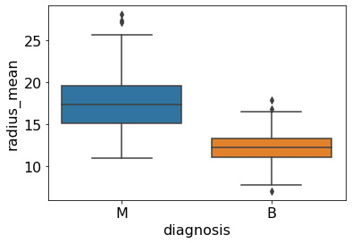
Figure 5.14 – A box-whisker plot of the radius_mean feature
Using the upper and lower ranges, we can filter the DataFrame to exclude any data that falls outside of this scope using the query() class within the pandas library:
df = df.query('(@Q1 - 1.5 * @IQR) <= radius_mean <= (@Q3 + 1.5 * @IQR)')
With the code executed, we have successfully removed several outliers from our dataset. If we go ahead and replot the data using one of the preceding scatter plots, we will see that while some of the overlap was indeed reduced, there is still considerable overlap between the two classes, indicating that any future models we develop will need to take advantage of multiple columns to ensure adequate separation as we begin developing a robust classifier. Before we can start training any classifiers, we will first need to address any potential correlations within the features.
Finding correlations
With the outliers filtered out, we are now ready to start taking a closer look at any correlations between the features in our dataset. Given that this dataset consists of 30 features, we can take advantage of the corr() class we implemented in Chapter 4, Visualizing Data with Python. We can create a heat map visual by using the corr() function and the heatmap() function from seaborn:
f, ax=plt.subplots( figsize = (20,15))
sns.heatmap(df.corr(), annot= True, fmt = ".1f", ax=ax)
plt.xticks(fontsize=18)
plt.yticks(fontsize=18)
plt.title('Breast Cancer Correlation Map', fontsize=18)
plt.show()
The output of this code can be seen in Figure 5.15, showing a heat map of the various features in which the most correlated features are shown in a lighter color and the least correlated features are shown in a darker color:

Figure 5.15 – A heat map showing the correlation of features
As we look at this heat map, we see that there is a great deal of correlation between multiple features within this dataset. Take, for instance, the very strong correlation between the radius_worst feature and the perimeter_mean, and area_mean features. When there are strong correlations between independent variables or features within a dataset, this is known as multicollinearity. From a statistical perspective, these correlations within an ML model can lead to less reliable statistical inferences, and therefore, less reliable results. To ensure that our dataset is purged of any potential problems of this nature, we simply drop the columns that present a very high degree of correlation with any others. We can identify the correlations using the corr() function and create a matrix of these values. We can then select the upper triangle (half of the heat map) and then identify the features whose correlations are greater than 0.90:
corr_matrix = df.corr().abs()
upper = corr_matrix.where(np.triu(np.ones(corr_matrix.shape), k=1).astype(np.bool))
to_drop = [column for column in upper.columns if any(upper[column] > 0.90)]
The to_drop variable now represents a list of columns that should be dropped to ensure that any correlations above the threshold we set are effectively removed. Notice that we used list comprehension (a concept that we talked about in Chapter 2, Introducing Python and the Command Line) to iterate through these values quickly and effectively. We can then go ahead and drop the columns from our dataset:
df.drop(to_drop, axis=1, inplace=True)
We can once again plot the heat map to ensure that any potential collinearity is addressed:

Figure 5.16 – A heat map showing the correlation of features without multicollinearity
Notice that the groups of highly correlated features are no longer present. With the correlations now addressed, we have not only ensured that any potential models we created will not suffer from any performance problems relating to multicollinearity, but we also inadvertently reduced the size of the dataset from 30 columns of features down to only 19, making it a little easier to handle and visualize! With the dataset now completely preprocessed, we are now ready to start training and preparing some ML models.
Developing and validating models
Now that the data is ready to go, we can explore a few models. Recall that our objective here is to develop a classification model. Therefore, our first step will be to separate our X and ŷ values.
- We will create a variable, X, representing all of the features within the dataset (excluding the id and diagnosis columns, as these are not features). We will then create a variable, y, representing the output column:
X = df.drop(columns = ["id", "diagnosis"])
y = df.diagnosis.values
Within most of the datasets we will work with, we will generally see a large difference in the magnitude of values, in the sense that one column could be on the order of 1,000, and another column could be on the order of 0.1. This means that features with far greater values will be perceived by the model to make far greater contributions to a prediction – which is not true. For example, think of a project in which we are trying to predict the lipophilicity of a molecule using 30 different features, with one of those being the molecular weight – a feature with a significantly large value but not that large a contribution.
- To address this challenge, values within a dataset must be normalized (or scaled) through various functions – for example, the StandardScaler() function from the sklearn library:
from sklearn.preprocessing import StandardScaler
scaler = StandardScaler()
X_scaled = pd.DataFrame(scaler.fit_transform(X), columns = X.columns)
- With the features now normalized, our next step is to split the data up into our training and testing sets. Recall that the purpose of the training set is to train the model, and the testing set is to test the model. This is done to avoid any overfitting in the development process:
from sklearn.model_selection import train_test_split
X_train, X_test, y_train, y_test = train_test_split(X_scaled, y, random_state=40)
With the data now split up into four variables, we are now ready to train a few models, beginning with the Gaussian Naïve Bayes classifier. This model is a supervised algorithm based on the application of Bayes' theorem. The model is called naïve because it makes the assumption that the features of each observation are independent of one another, which is rarely true. However, this model tends to show strong performance anyway. The main idea behind the Gaussian Naïve Bayes classifier can be examined from a probability perspective. To explain what we mean by this, consider the following equation:

This states that the probability of the label (given some data) is equal to the probability of the data (given a label – Gaussian, given the normal distribution) multiplied by the probability of the label (prior probability), all divided by the probability of the data (predictor prior probability). Given the simplicity of such a model, Naïve Bayes classifiers can be extremely fast to use in relation to more complex models.
- Let's take a look at its implementation. We will begin by importing our libraries of interest:
from sklearn.naive_bayes import GaussianNB
from sklearn.metrics import accuracy_score
- Next, we can create an instance of the actual model in the form of a variable we call gnb_clf:
gnb_clf = GaussianNB()
- We can then fit or train the model using the training dataset we split off earlier:
gnb_clf.fit(X_train, y_train)
- Finally, we can use the trained model to make predictions on the testing data and compare the results with the known values. We can use a simple accuracy score to test the model:
gnb_pred = gnb_clf.predict(X_test)
print(accuracy_score(gnb_pred, y_test))
0.95035
With that, we have successfully developed a model performing with roughly 95% accuracy – not a bad start for our first model!
- While accuracy is always a fantastic metric, it is not the only metric we can use to assess the performance of a model. We can also use precision, recall, and f1 scores. We can quickly calculate these and get a better sense of the model's performance using the classification_report() function provided by sklearn:
from sklearn.metrics import classification_report
print(classification_report(gnb_pred, y_test))
Looking at the following output, we can see our two classes of interest (B and M) listed with their respective metrics: precision, recall, and f1-score:

Figure 5.17 – The classification report of the Naïve Bayes classifier
We will discuss these metrics in much more detail in Chapter 7, Understanding Supervised Machine Learning. For now, we can see that all of these metrics are quite high, indicating that the model performed reasonably well.
Saving a model for deployment
When an ML model has been trained and is operating at a reasonable level of accuracy, we may wish to make this model available for others to use. However, we would not directly deliver the data or the code to data engineers to deploy the model into production. Instead, we would want to deliver a single trained model that they can take and deploy without having to worry about any moving pieces. Luckily for us, there is a great library known as pickle that can help us gather the model into a single entity, allowing us to save the model. Recall that we explored the pickle library in Chapter 2, Getting Started with Python and the Command Line. We pickle a model, such as the model we named gnb_clf, by using the dump() function:
import pickle
pickle.dump(gnb_clf, open("../../models/gnb_clf.pickle", 'wb'))
To prove that the model did in fact save correctly, we can load it using the load() function, and once again, we can calculate the accuracy score:
loaded_gnb_clf = pickle.load(open("../../models/gnb_clf.pickle", 'rb'))
loaded_gnb_clf.score(X_test, y_test)
Notice that the output of this scoring calculation results in the same value (95%) as we saw earlier, indicating that the model did, in fact, save correctly!
Summary
In this chapter, we took an ambitious step toward understanding some of the most important and useful concepts in ML. We looked over the various terms used to describe the field as it relates to the domain of AI, examined the main areas of ML and the governing categories of supervised and unsupervised learning, and then proceeded to explore the full process of developing an ML model for a given dataset.
While developing our model, we explored many useful steps. We explored and preprocessed the data to remove inconsistencies and missing values. We also examined the data in great detail, and we subsequently addressed issues relating to multicollinearity. Next, we developed a Gaussian Naïve Bayes classification model, which operated with a robust 95% rate of accuracy – on our first try too! Finally, we looked at one of the most common ways data scientists hand over their fully trained models to data engineers to move ML models into production.
Although we took the time within this chapter to understand ML within the scope of a supervised classifier, in the following chapter, we will gain a much better understanding of the nuances and differences as we train several unsupervised models.