
Chapter 11: Adding CRUD Functionalities
This chapter describes how we can implement CRUD functionalities in our frontend. We are going to use the components that we learned about in Chapter 9, Useful Third-Party Components for React. We will fetch data from our backend and present the data in a table. Then, we will implement the delete, edit, and add functionalities. In the final part of this chapter, we will add features so that we can export data to a CSV file.
In this chapter, we will cover the following topics:
- Creating the list page
- Deleting, adding, and updating data using the REST API
- How to show toast messages to the user
- Exporting data to the CSV file from the React app
Technical requirements
The Spring Boot application that we created in Chapter 10, Setting Up the Frontend for Our Spring Boot RESTful Web Service (the unsecured backend), is required, as is the React app that we created in the same chapter (carfront).
The following GitHub link will also be required: https://github.com/PacktPublishing/Full-Stack-Development-with-Spring-Boot-and-React/tree/main/Chapter11.
Check out the following video to see the Code in Action: https://bit.ly/3z78Fcj
Creating the list page
In the first phase, we will create the list page to show cars with paging, filtering, and sorting features. Run your unsecured Spring Boot backend. The cars can be fetched by sending the GET request to the http://localhost:8080/api/cars URL, as shown in Chapter 4, Creating a RESTful Web Service with Spring Boot.

Figure 11.1 – Fetching cars
Now, let's inspect the JSON data from the response. The array of cars can be found in the _embedded.cars node of the JSON response data.
Once we know how to fetch cars from the backend, we are ready to implement the list page to show the cars. The following steps describe this in practice:
- Open the carfront React app with VS Code (the React app we created in the previous chapter).
- When the app has multiple components, it is recommended that you create a folder for them. Create a new folder called components in the src folder. With VS Code, you can create a folder by right-clicking the folder in the sidebar file explorer and selecting New Folder from the menu:

Figure 11.2 – New folder
- Create a new file called Carlist.js in the components folder. Your project structure should look like the following:
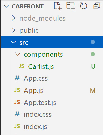
Figure 11.3 – Project structure
- Open the Carlist.js file in the editor view and write the base code of the component, as follows:
import React from 'react';
function Carlist() {
return(
<div></div>
);
}
export default Carlist;
- We need a state for the fetched cars from the REST API. Therefore, we have to declare a state called cars and the initial value is an empty array:
import React, { useState } from 'react';
function Carlist() {
const [cars, setCars] = useState([]);
return(
<div></div>
);
}
export default Carlist;
- Execute fetch in the useEffect Hook. We will pass an empty array as the second argument; therefore, fetch is executed only once after the first render. The cars from the JSON response data will be saved to the state, called cars:
import React, { useEffect, useState } from 'react';
function Carlist() {
const [cars, setCars] = useState([]);
useEffect(() => {
fetch('http://localhost:8080/api/cars')
.then(response => response.json())
.then(data => setCars(data._embedded.cars))
.catch(err => console.error(err));
}, []);
return(
<div></div>
);
}
export default Carlist;
- Use the map function to transform car objects into table rows in the return statement and add the table element:
return(
<div>
<table>
<tbody>
{
cars.map((car, index) =>
<tr key={index}>
<td>{car.brand}</td>
<td>{car.model}</td>
<td>{car.color}</td>
<td>{car.year}</td>
<td>{car.price}</td>
</tr>)
}
</tbody>
</table>
</div>
);
- Finally, we have to import and render the Carlist component in our App.js file. In the App.js file, add the import statement, and then add the Carlist component to the return statement:
import './App.css';
import AppBar from '@mui/material/AppBar';
import Toolbar from '@mui/material/Toolbar';
import Typography from '@mui/material/Typography';
import Carlist from './components/Carlist';
function App() {
return (
<div className="App">
<AppBar position="static">
<Toolbar>
<Typography variant="h6">
Carshop
</Typography>
</Toolbar>
</AppBar>
<Carlist />
</div>
);
}
export default App;
- Now, if you start the React app with the npm start command, you should see the following list page. Note, your backend should be also running:
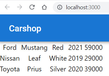
Figure 11.4 – Car frontend
The server URL address can repeat multiple times when we create more CRUD functionalities, and it will change when the backend is deployed to a server other than the local host; therefore, it is better to define it as a constant. Then, when the URL value changes, we have to modify it in one place. With create-react-app, you can also create a .env file in the root of your project and define environment variables there, but that is not covered here.
Let's create a new file, constants.js, to the src folder of our app:
- Open the file in the editor and add the following line to the file:
export const SERVER_URL='http://localhost:8080/';
- Then, we will import SERVER_URL to our Carlist.js file and use it in the fetch method:
//Carlist.js
// Import server url (named import)
import { SERVER_URL } from '../constants.js'
// Use imported constant in the fetch method
fetch(SERVER_URL + 'api/cars')
- Finally, your Carlist.js file source code should appear as follows:
import React, { useEffect, useState } from 'react';
import { SERVER_URL } from '../constants.js';
function Carlist() {
const [cars, setCars] = useState([])
useEffect(() => {
fetch(SERVER_URL + 'api/cars')
.then(response => response.json())
.then(data => setCars(data._embedded.cars))
.catch(err => console.error(err));
}, []);
return(
<div>
<table>
<tbody>
{
cars.map((car, index) =>
<tr key={index}>
<td>{car.brand}</td>
<td>{car.model}</td>
<td>{car.color}</td>
<td>{car.year}</td>
<td>{car.price}</td>
</tr>)
}
</tbody>,
</table>
</div>
);
}
export default Carlist;
We have already used the ag-grid component to implement data grid and that can be used here as well. But, we will use the new MUI data grid component to get the paging, filtering, and sorting features out of the box:
- Stop the development server by pressing Ctrl + C in the terminal and installing the MUI data grid community version. The following is the current installation command but you should check the latest installation command and usage from MUI documentation. Post-installation, restart the app:
npm install @mui/x-data-grid
- Then, import the DataGrid component to your Carlist.js file:
import { DataGrid } from '@mui/x-data-grid';
- We also have to define the columns of the data grid, where field is the property of the car object. The headerName prop can be used to set the title of the columns. We also set the width of the columns:
const columns = [
{field: 'brand', headerName: 'Brand', width: 200},
{field: 'model', headerName: 'Model', width: 200},
{field: 'color', headerName: 'Color', width: 200},
{field: 'year', headerName: 'Year', width: 150},
{field: 'price', headerName: 'Price', width: 150},
];
- Then, remove table and all its child elements from the component's return statement and add the DataGrid component. The data source of the data grid is the cars state, which contains fetched cars, and that is defined using the rows prop. The data grid component requires all rows to have a unique ID property that is defined using the getRowId prop. We can use our link field of the car object because that contains the unique car ID (_links.self.href). We also have to define the width and height of the grid in the div element. Refer to the source code of the following return statement:
return(
<div style={{ height: 500, width: '100%' }}>
<DataGrid
rows={cars}
columns={columns}
getRowId={row => row._links.self.href}/>
</div>
);
- With the MUI data grid component, we acquired all the necessary features (such as sorting, filtering, and paging) for our table with a small amount of coding. Now, the list page looks like the following:
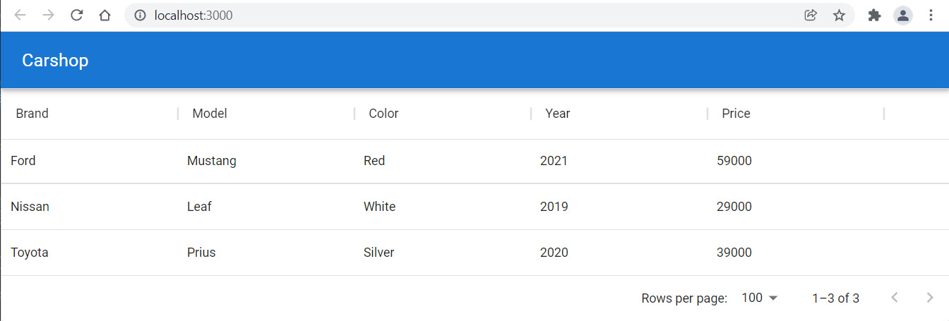
Figure 11.5 – Car frontend
Data grid columns can be filtered using the column menu and clicking the Filter menu item. You can also set the visibility of the columns from the column menu:

Figure 11.6 – Column menu
Next, we will implement the delete functionality.
The delete functionality
Items can be deleted from the database by sending the DELETE method request to the http://localhost:8080/api/cars/{carId} endpoint. If we look at the JSON response data, we can see that each car contains a link to itself and it can be accessed from the _links.self.href node, as shown in the following screenshot. We already used the link field to set a unique ID for every row in the grid. That row ID can be used in deletion, as we can see later:

Figure 11.7 – Car link
The following steps demonstrate how to implement the delete functionality:
- Here, we will create a button for each row in the table. The field of the button will be _links.self.href, which is a link to a car. If you need more complex cell content, you can use a renderCell prop that you can use to define how a cell content is rendered.
Let's add a new column to the table using renderCell to render the button element. The row argument that is passed to the function is a row object that contains all values from a row. In our case, it contains a link to a car in each row, and that is needed in deletion. The link is in the row's id property, and we will pass this value to a delete function. Refer to the following source code. We don't want to enable sorting and filtering for the button column, therefore, the filterable and sortable props are set to false. The button invokes the onDelClick function when pressed and passes a link (row.id) to the function as an argument:
const columns = [
{field: 'brand', headerName: 'Brand', width: 200},
{field: 'model', headerName: 'Model', width: 200},
{field: 'color', headerName: 'Color', width: 200},
{field: 'year', headerName: 'Year', width: 150},
{field: 'price', headerName: 'Price', width: 150},
{
field: '_links.self.href',
headerName: '',
sortable: false,
filterable: false,
renderCell: row =>
<button
onClick={() => onDelClick(row.id)}>Delete
</button>
}
];
- Next, we implement the onDelClick function. But first, let's take the fetch method out of the useEffect Hook. This is necessary because we also want to call fetch after the car has been deleted in order to show an updated list of cars to the user. Create a new function called fetchCars, and copy the code from the useEffect Hook into a new function. Then, call the fetchCars function from the useEffect Hook to fetch cars:
useEffect(() => {
fetchCars();
}, []);
const fetchCars = () => {
fetch(SERVER_URL + 'api/cars')
.then(response => response.json())
.then(data => setCars(data._embedded.cars))
.catch(err => console.error(err));
}
- Implement the onDelClick function. We send the DELETE request to a car link, and when the DELETE request succeeds, we refresh the list page by calling the fetchCars function:
const onDelClick = (url) => {
fetch(url, {method: 'DELETE'})
.then(response => fetchCars())
.catch(err => console.error(err))
}
When you start your app, the frontend should look like the following screenshot. The car disappears from the list when the Delete button is pressed. Note that after deletions, you can restart the backend to reset the database:
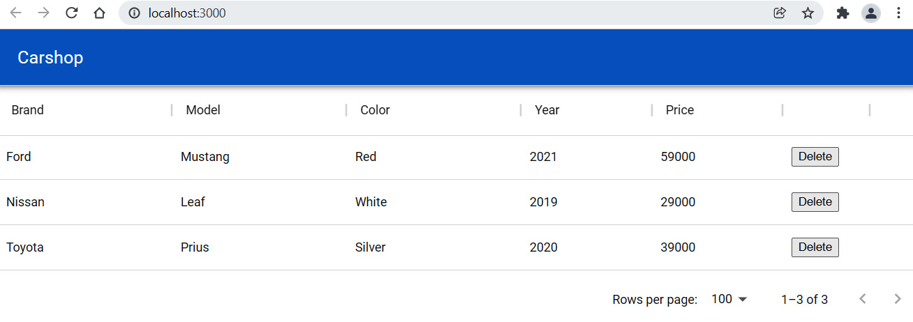
Figure 11.8 – Car frontend
You can also see that when you click any row in the grid, the row is selected. You can disable that by setting the disableSelectionOnClick prop in the grid to true:
<DataGrid
rows={cars}
columns={columns}
disableSelectionOnClick={true}
getRowId={row => row._links.self.href} />
It would be nice to show the user some feedback in the case of successful deletion, or if there are any errors.
- Let's implement a toast message to show the status of the deletion. For that, we are going to use the MUI Snackbar component. We have to import the Snackbar component by adding the following import statement to your Carlist.js file:
import Snackbar from '@mui/material/Snackbar';
The Snackbar component open prop value is a Boolean, and if it is true, the component is shown. Let's declare one state called open to handle the visibility of our Snackbar component. The initial value is false because the message is shown only after the deletion:
//Carlist.js
const [open, setOpen] = useState(false);
- Next, we add the Snackbar component in the return statement after the MUI data grid component. The autoHideDuration prop defines the time in milliseconds when the onClose function is called automatically, and the message disappears. The message prop defines the message to display:
<Snackbar
open={open}
autoHideDuration={2000}
onClose={() => setOpen(false)}
message="Car deleted"
/>
- Finally, we set the open state to true after the deletion and toast message opens:
const onDelClick = (url) => {
fetch(url, {method: 'DELETE'})
.then(response => {
fetchCars();
setOpen(true);
})
.catch(err => console.error(err))
}
Now, you will see the toast message when the car is deleted, as shown in the following screenshot:

Figure 11.9 – Toast message
- To avoid the accidental deletion of the car, it would be nice to have a confirmation dialog after the Delete button has been pressed. We will implement this using the window object's confirm method. Add confirm to the onDelClick method:
const onDelClick = (url) => {
if (window.confirm("Are you sure to delete?")) {
fetch(url, {method: 'DELETE'})
.then(response => {
fetchCars()
setOpen(true);
})
.catch(err => console.error(err))
}
}
If you press the Delete button now, the confirmation dialog will be opened and the car will only be deleted if you press the OK button:

Figure 11.10 – Confirm dialog
Finally, we will also check the response status that everything went fine in the deletion. As we have already learned, the response object has the ok property, which we can use to check that the response was successful:
const onDelClick = (url) => {
if (window.confirm("Are you sure to delete?")) {
fetch(url, {method: 'DELETE'})
.then(response => {
if (response.ok) {
fetchCars();
setOpen(true);
}
else {
alert('Something went wrsong!');
}
})
.catch(err => console.error(err))
}
}
Next, we will begin the implementation of the functionality to add a new car.
The add functionality
The next step is to create an add functionality for the frontend. We will implement this using the MUI modal dialog. We already went through the utilization of the MUI modal form in Chapter 9, Useful Third-Party Components for React. We will add the New Car button to the user interface, which opens the modal form when it is pressed. The modal form contains all the fields that are required to add a new car, as well as the button for saving and canceling.
We have already installed the MUI component library to our frontend app in Chapter 10, Setting Up the Frontend for Our Spring Boot RESTful Web Service.
The following steps show you how to create the add functionality using the modal dialog component:
- Create a new file called AddCar.js in the components folder and write some function component base code to the file, as shown here. Add the imports for the MUI Dialog component:
import React from 'react';
import Dialog from '@mui/material/Dialog';
import DialogActions from '@mui/material/DialogActions';
import DialogContent from '@mui/material/DialogContent';
import DialogTitle from '@mui/material/DialogTitle';
function AddCar(props) {
return(
<div></div>
);
}
export default AddCar;
- Declare a state that contains all car fields using the useState Hook. For the dialog, we also need a Boolean state to define the visibility of the dialog form:
import React, { useState } from 'react';
import Dialog from '@mui/material/Dialog';
import DialogActions from '@mui/material/DialogActions';
import DialogContent from '@mui/material/DialogContent';
import DialogTitle from '@mui/material/DialogTitle';
function AddCar(props) {
const [open, setOpen] = useState(false);
const [car, setCar] = useState({
brand: '',
model: '',
color: '',
year: '',
fuel: '',
price: ''
});
return(
<div></div>
);
}
export default AddCar;
- Next, we add two functions to close and open the dialog form. The handleClose and handleOpen functions set the value of the open state, which affects the visibility of the modal form:
// AddCar.js
// Open the modal form
const handleClickOpen = () => {
setOpen(true);
};
// Close the modal form
const handleClose = () => {
setOpen(false);
};
- Add a Dialog component inside the AddCar component's return statement. The form contains the MUI Dialog component with buttons and the input fields that are required to collect the car data. The button that opens the modal window, which will be shown on the car list page, must be outside of the Dialog component. All input fields should have the name attribute with a value that is the same as the name of the state the value will be saved to. Input fields also have the onChange prop, which saves the value to state by invoking the handleChange function:
// AddCar.js
const handleChange = (event) => {
setCar({...car, [event.target.name]:
event.target.value});
}
return(
<div>
<button onClick={handleClickOpen}>New Car</button>
<Dialog open={open} onClose={handleClose}>
<DialogTitle>New car</DialogTitle>
<DialogContent>
<input placeholder="Brand" name="brand"
value={car.brand} onChange={handleChange}
/><br/>
<input placeholder="Model" name="model"
value={car.model} onChange={handleChange}
/><br/>
<input placeholder="Color" name="color"
value={car.color} onChange={handleChange}/>
<br/>
<input placeholder="Year" name="year"
value={car.year} onChange={handleChange}/>
<br/>
<input placeholder="Price" name="price"
value={car.price} onChange={handleChange}/>
<br/>
</DialogContent>
<DialogActions>
<button onClick={handleClose}>Cancel</button>
<button onClick={handleClose}>Save</button>
</DialogActions>
</Dialog>
</div>
);
- Implement the addCar function to the Carlist.js file, which will send the POST request to the backend api/cars endpoint. The request will include the new car object inside the body and the 'Content-Type':'application/json' header. The header is required because the car object is converted into a JSON string using the JSON.stringify() method:
// Carlist.js
// Add a new car
const addCar = (car) => {
fetch(SERVER_URL + 'api/cars',
{
method: 'POST',
headers: { 'Content-Type':'application/json' },
body: JSON.stringify(car)
})
.then(response => {
if (response.ok) {
fetchCars();
}
else {
alert('Something went wrong!');
}
})
.catch(err => console.error(err))
}
- Import the AddCar component into the Carlist.js file:
import AddCar from './AddCar.js';
- Add the AddCar component to the Carlist.js file's return statement and pass the addCar function as props to the AddCar component. This allows us to call this function from the AddCar component. Now, the return statement of the CarList.js file should appear as follows:
// Carlist.js
return(
<React.Fragment>
<AddCar addCar={addCar} />
<div style={{ height: 500, width: '100%' }}>
<DataGrid
rows={cars}
columns={columns}
disableSelectionOnClick={true}
getRowId={row => row._links.self.href}
/>
<Snackbar
open={open}
autoHideDuration={2000}
onClose={() => setOpen(false)}
message="Car deleted"
/>
</div>
</React.Fragment>
);
- If you start the carshop app, it should now look like the following, and if you press the New Car button, it should open the modal form:
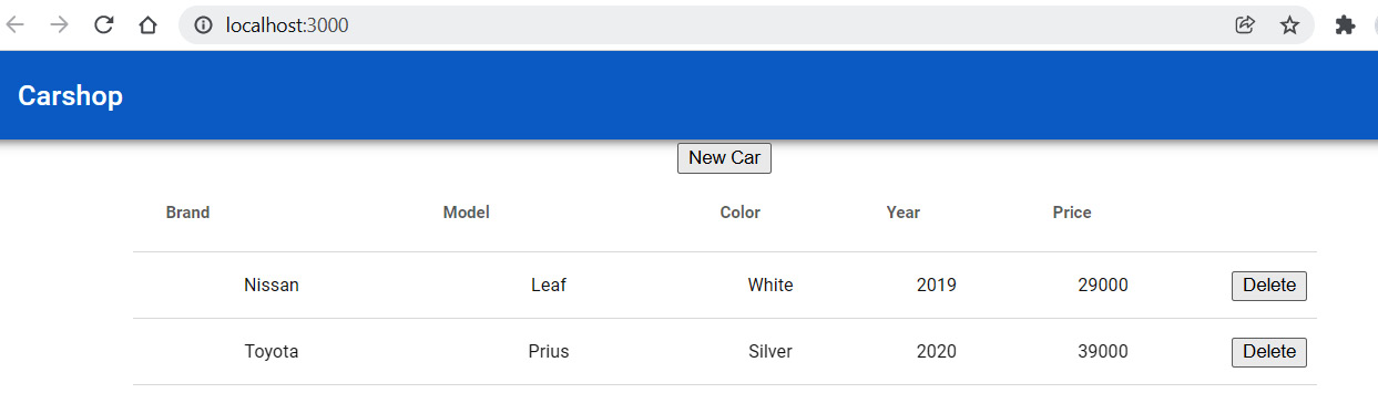
Figure 11.11 – Carshop
- Create a function called handleSave in the AddCar.js file. The handleSave function calls the addCar function, which can be accessed using props, and pass the car state object to it. Finally, the modal form is closed and the car list is updated:
// AddCar.js
// Save car and close modal form
const handleSave = () => {
props.addCar(car);
handleClose();
}
- Finally, you have to change the AddCar component's onClick save button to call the handleSave function:
// AddCar.js
<DialogActions>
<button onClick={handleClose}>Cancel</button>
<button onClick={handleSave}>Save</button>
</DialogActions>
- Now, you can open the modal form by pressing the New Car button. Then, you can fill the form with data and press the Save button. At this point, the form doesn't have a nice appearance, but we are going to style it in the next chapter:
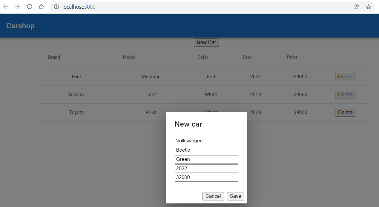
Figure 11.12 – Add new car
After saving, the list page is refreshed, and the new car can be seen in the list:
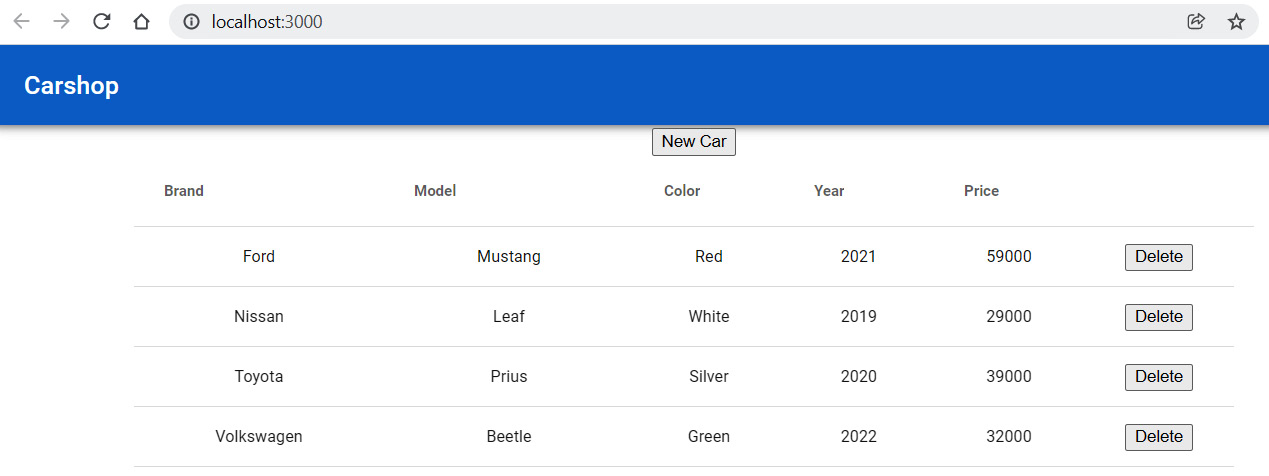
Figure 11.13 – Carshop
Next, we will begin to implement the edit functionality in relation to our frontend.
The edit functionality
We will implement the edit functionality by adding the Edit button to each table row. When the row Edit button is pressed, it opens the modal form, where the user can edit the existing car and finally save the changes:
- First, we will create a skeleton of the EditCar component, which will be the form for editing an existing car. Create a new file called EditCar.js in the components folder. The EditCar component code is similar to the AddCar component, but for now, in the handleSave function, we should call the update function that we will implement later:
import React, { useState } from 'react';
import Dialog from '@mui/material/Dialog';
import DialogActions from '@mui/material/DialogActions';
import DialogContent from '@mui/material/DialogContent';
import DialogTitle from '@mui/material/DialogTitle';
function EditCar(props) {
const [open, setOpen] = useState(false);
const [car, setCar] = useState({
brand: '', model: '', color: '',
year: '', fuel:'', price: ''
});
// Open the modal form
const handleClickOpen = () => {
setOpen(true);
};
// Close the modal form
const handleClose = () => {
setOpen(false);
};
const handleChange = (event) => {
setCar({...car,
[event.target.name]: event.target.value});
}
// Update car and close modal form
const handleSave = () => {
}
return(
<div></div>
);
}
export default EditCar;
- Then, we render the edit dialog form in the return statement:
// EditCar.js
return(
<div>
<button onClick={handleClickOpen}>Edit</button>
<Dialog open={open} onClose={handleClose}>
<DialogTitle>Edit car</DialogTitle>
<DialogContent>
<input placeholder="Brand" name="brand"
value={car.brand}onChange={handleChange}
/><br/>
<input placeholder="Model" name="model"
value={car.model}onChange={handleChange}
/><br/>
<input placeholder="Color" name="color"
value={car.color}onChange={handleChange}
/><br/>
<input placeholder="Year" name="year"
value={car.year} onChange={handleChange}/><br/>
<input placeholder="Price" name="price"
value={car.price}onChange={handleChange}
/><br/>
</DialogContent>
<DialogActions>
<button onClick={handleClose}> Cancel
</button>
<button onClick={handleSave}>Save</button>
</DialogActions>
</Dialog>
</div>
);
- To update the car data, we have to send the PUT request to the http://localhost:8080/api/cars/[carid] URL. The link will be the same as it is for the delete functionality. The request contains the updated car object inside the body, and the 'Content-Type':'application/json' header that we had in the add functionality. Create a new function called updateCar in the Carlist.js file. The source code of the function is shown in the following code snippet.
The function gets two arguments—the updated car object and the request URL. Following a successful update, we will fetch the cars and the list is updated:
// Carlist.js
// Update car
const updateCar = (car, link) => {
fetch(link,
{
method: 'PUT',
headers: { 'Content-Type': 'application/json' },
body: JSON.stringify(car)
})
.then(response => {
if (response.ok) {
fetchCars();
}
else {
alert('Something went wrong!');
}
})
.catch(err => console.error(err))
}
- Next, we will import the EditCar component into the Carlist component so that we are able to show it in the car list. Add the following import statement to the Carlist.js file:
import EditCar from './EditCar.js';
- Now, add the EditCar component to the table columns in the same way that we did with the delete functionality. The EditCar component is rendered to table cells, and it only shows the Edit button. This is because the modal form is not visible before the button is pressed. When the user presses the Edit button, it updates the open state value to true in the EditCar component, and the modal form is shown. We pass two props to the EditCar component. The first prop is row, which will be the row object that contains the link and car data that we need in the update. The second one is the updateCar function, which we have to call from the EditCar component in order to be able to save changes:
// Carlist.js
const columns = [
{field: 'brand', headerName: 'Brand', width: 200},
{field: 'model', headerName: 'Model', width: 200},
{field: 'color', headerName: 'Color', width: 200},
{field: 'year', headerName: 'Year', width: 150},
{field: 'price', headerName: 'Price', width: 150},
{
field: '_links.car.href',
headerName: '',
sortable: false,
filterable: false,
renderCell: row =>
<EditCar
data={row}
updateCar={updateCar} />
},
{
field: '_links.self.href',
headerName: '',
sortable: false,
filterable: false,
renderCell: row =>
<button
onClick={() =>
onDelClick(row.id)}>Delete
</button>
}
];
- We have now added the Edit car button to the data grid, and we are able to open the edit form. Our goal is to populate edit form fields using the data from a row where the Edit button is pressed. We passed one prop called data to the EditCar component and let's now find out what the value of this prop is. Open the app in the browser and open the React developer tools Components tab.
- Click the Edit button and open the edit form in any of the rows, and find EditCar from the developer tools component tree. You should now see the value of passed props in the developer tools. We will find out that we can get car data from data.row and the link to a car from data.id, and we will use these values in the next step:
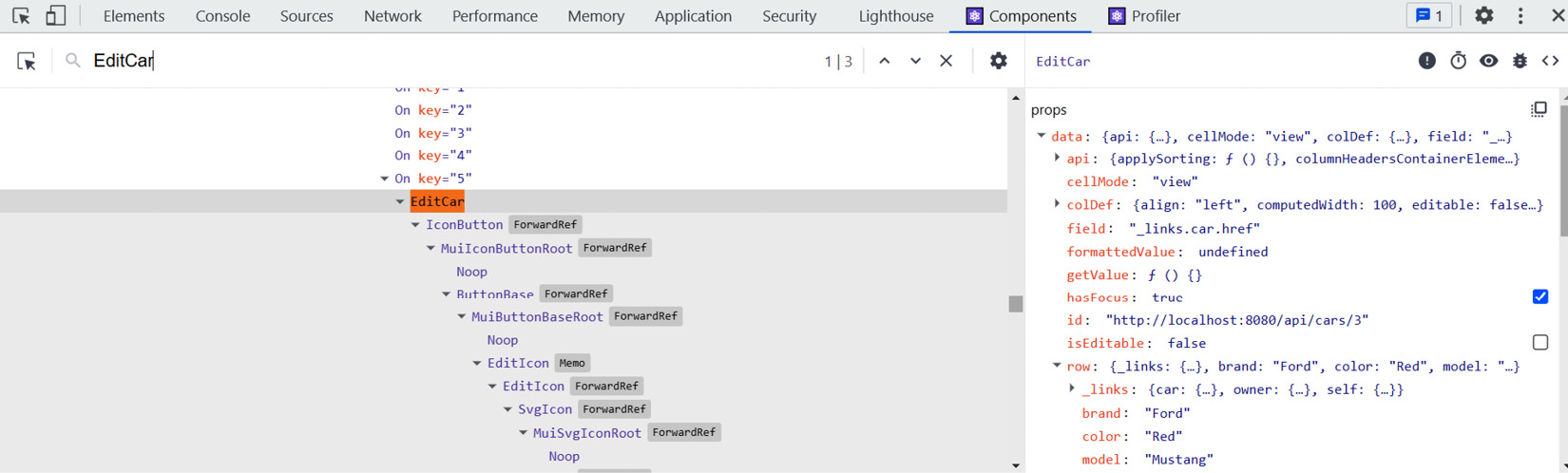
Figure 11.14 – React developer tools
- Next, we will perform the final modifications to the EditCar.js file. We get the car to be edited from the data prop, which we use to populate the form with the existing car values. Change the handleClickOpen function in the EditCar.js file. Now, when the form is opened, the car state is updated with the values from the data prop. The data prop has a row property that contains the car object:
// EditCar.js
// Open the modal form and update the car state
const handleClickOpen = () => {
setCar({
brand: props.data.row.brand,
model: props.data.row.model,
color: props.data.row.color,
year: props.data.row.year,
fuel: props.data.row.fuel,
price: props.data.row.price
})
setOpen(true);
}
- Finally, we will change the handleSave function in the EditCar.js file and call the updateCar function using props. The first argument is the car state that contains the updated car object. The second argument is the id property of the data props, and that is the link to a car:
// EditCar.js
// Update car and close modal form
const handleSave = () => {
props.updateCar(car, props.data.id);
handleClose();
}
- If you press the Edit button in the table, it opens the modal edit form and shows the car from that row. The updated values are saved to the database when you press the Save button:
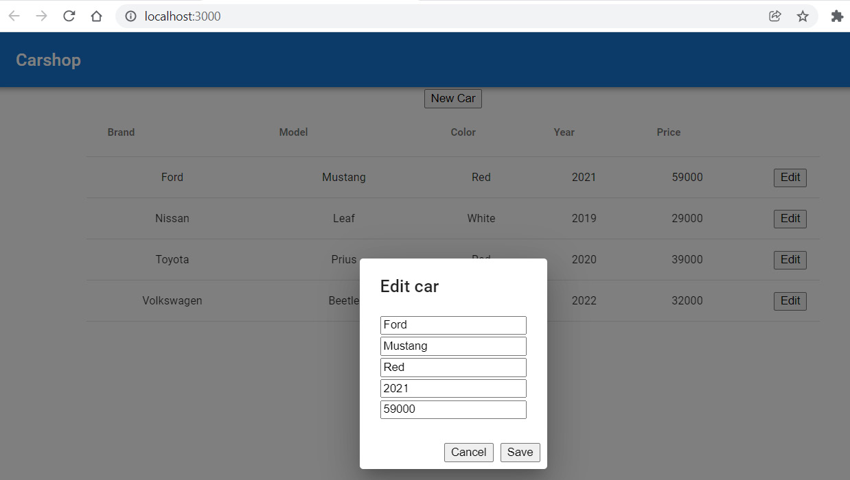
Figure 11.15 – Edit car
Now, we have implemented all CRUD functionalities in relation to our frontend.
Other functionalities
One feature that we will also implement is a comma-separated values (CSV) export of the data. We don't need any extra library for the export because the MUI data grid provides this feature:
- First, we will import the following components to the Carlist.js file:
import { DataGrid, GridToolbarContainer, GridToolbarExport,
gridClasses } from '@mui/x-data-grid';
- Next, we will create the toolbar component that renders the Export button using the MUI GridToolbarContainer and GridToolbarExport components:
// Carlist.js
function CustomToolbar() {
return (
<GridToolbarContainer
className={gridClasses.toolbarContainer}>
<GridToolbarExport />
</GridToolbarContainer>
);
}
- Finally, we have to enable our toolbar that contains the Export button. To enable the toolbar in the MUI data grid, you have to use the components prop and set the value to Toolbar: CustomToolbar:
return(
<React.Fragment>
<AddCar addCar={addCar} />
<div style={{ height: 500, width: '100%' }}>
<DataGrid
rows={cars}
columns={columns}
disableSelectionOnClick={true}
getRowId={row => row._links.self.href}
components={{ Toolbar: CustomToolbar }}
/>
<Snackbar
open={open}
autoHideDuration={2000}
onClose={() => setOpen(false)}
message="Car deleted"
/>
</div>
</React.Fragment>
);
Now, you will see the Export button in the grid. If you press the button and select Download as CSV, the grid data is exported to a CSV file. You can also print your grid using the Export button:
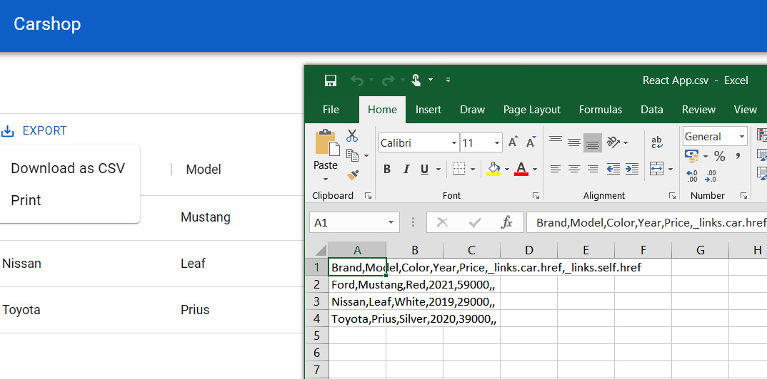
Figure 11.16 – Export CSV
Now, all the functionalities have been implemented. In Chapter 12, Styling the Frontend with React MUI, we will focus on styling the frontend.
Summary
In this chapter, we implemented all the functionalities for our app. We started with fetching the cars from the backend and showing these in the MUI data grid, which provides paging, sorting, and filtering features. Then, we implemented the delete functionality and used the toast component to give feedback to the user.
The add and edit functionalities were implemented using the MUI modal dialog component. Finally, we implemented the ability to export data to a CSV file.
In the next chapter, we are going to style the rest of our frontend using the React MUI component library.
Questions
- How do you fetch and present data using the REST API with React?
- How do you delete data using the REST API with React?
- How do you add data using the REST API with React?
- How do you update data using the REST API with React?
- How do you show toast messages with React?
- How do you export data to a CSV file with React?
Further reading
Packt has other great resources available for learning about React. These are as follows:
- React - The Complete Guide, by Academind GmbH: https://www.packtpub.com/product/react-the-complete-guide-includes-hooks-react-router-and-redux-2021-updated-second-edition-video/9781801812603
- React 17 Design Patterns and Best Practices – Third Edition, by Carlos Santana Roldán: https://www.packtpub.com/product/react-17-design-patterns-and-best-practices-third-edition/978800560444