
Chapter 12: Styling the Frontend with React MUI
This chapter explains how to use MUI components in our frontend. We will use the Button component to show the styled buttons. We will also use MUI icons and the IconButton component. The modal form input fields are replaced by TextField components.
In this chapter, we will cover the following topics:
- Using the MUI Button component in our frontend
- Using the MUI Icon and IconButton components in our frontend
- Using the MUI TextField component in our frontend
Technical requirements
The Spring Boot application that we created in Chapter 5, Securing and Testing Your Backend, is required, together with the modification from Chapter 10, Setting Up the Frontend for Our Spring Boot RESTful Web Service (the unsecured backend).
We also need the React app that we used in Chapter 11, Adding CRUD Functionalities.
The following code samples available at the GitHub link will also be required: https://github.com/PacktPublishing/Full-Stack-Development-with-Spring-Boot-and-React/tree/main/Chapter12.
Check out the following video to see the Code in Action: https://bit.ly/3x04wnw
Using the Button component
Execute the following steps to implement the Button component:
- Let's first change all the buttons to use the MUI Button component. Import Button to the AddCar.js file:
// AddCar.js
import Button from '@mui/material/Button';
- Change the buttons to use the Button component. In the list page, we are using the contained button (variant="contained") and in the modal form, we use the text buttons (default).
The following code shows the AddCar component's return statement with the changes:
// AddCar.js
return(
<div>
<Button variant="contained" onClick={handleClickOpen}>
New Car
</Button>
<Dialog open={open} onClose={handleClose}>
<DialogTitle>New car</DialogTitle>
<DialogContent>
<input placeholder="Brand" name="brand"
value={car.brand}
onChange={handleChange}/><br/>
<input placeholder="Model" name="model"
value={car.model}
onChange={handleChange}/><br/>
<input placeholder="Color" name="color"
value={car.color}
onChange={handleChange}/><br/>
<input placeholder="Year" name="year"
value={car.year} onChange={handleChange}
/><br/>
<input placeholder="Price" name="price"
value={car.price} onChange=
{handleChange}/><br/>
</DialogContent>
<DialogActions>
<Button onClick={handleClose}>Cancel
</Button>
<Button onClick={handleSave}>Save</Button>
</DialogActions>
</Dialog>
</div>
);
Now, the NEW CAR button is also rendered using the MUI Button component, but the layout is not looking good because the button is touching the toolbar.
- We will add some margins to the button by using the MUI Stack layout component. Import the MUI Stack component to the Carlist.js file:
import Stack from '@mui/material/Stack';
- Then, wrap the AddCar component inside the Stack component and add top and bottom margins using the mt and mb props:
// Carlist.js
<Stack mt={2} mb={2}>
<AddCar addCar={addCar} />
</Stack>
Now, the NEW CAR button should look as shown in the following screenshot:
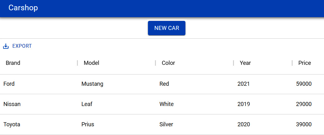
Figure 12.1 – The Carlist buttons
The modal form buttons should look like the following:
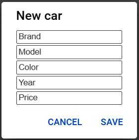
Figure 12.2 – The AddCar buttons
We also need to change the buttons in the EditCar component. The button that opens the modal form is the Edit button, which is shown in the table, and that will be changed later using icons.
Let's change CANCEL and SAVE buttons as we did with the new car form:
- Import the Button component to the EditCar.js file:
// EditCar.js
import Button from '@mui/material/Button';
- Then, change the SAVE and CANCEL buttons to use the MUI Button component:
return(
<div>
<button onClick={handleClickOpen}>Edit</button>
<Dialog open={open} onClose={handleClose}>
<DialogTitle>Edit car</DialogTitle>
<DialogContent>
<input placeholder="Brand" name="brand"
value={car.brand}
onChange={handleChange}/><br/>
<input placeholder="Model" name="model"
value={car.model} onChange=
{handleChange}/><br/>
<input placeholder="Color" name="color"
value={car.color} onChange=
{handleChange}/><br/>
<input placeholder="Year" name="year"
value={car.year} onChange=
{handleChange}/><br/>
<input placeholder="Price" name="price"
value={car.price} onChange=
{handleChange}/><br/>
</DialogContent>
<DialogActions>
<Button onClick={handleClose}>Cancel
</Button>
<Button onClick={handleSave}>Save</Button>
</DialogActions>
</Dialog>
</div>
);
Now, the buttons in the edit form are also implemented using the MUI Button component. Next, we will use the IconButton component for the Edit and DELETE buttons in the grid.
Using icon components
MUI provides prebuilt SVG icons that we have to install by using the following command in the terminal:
npm install @mui/icons-material
Let's first implement the DELETE button in the grid. The MUI IconButton component can be used to render icon buttons. The @mui/icons-material package that we just installed contains lots of icons that can be used with MUI.
You can find the list of icons available from the MUI documentation. We need an icon for our DELETE button; therefore, we will use an icon called DeleteIcon:
- Open the Carlist.js file and add the following imports:
// Carlist.js
import IconButton from '@mui/material/IconButton';
import DeleteIcon from '@mui/icons-material/Delete';
- Next, we will render the IconButton component in our grid. We will modify the DELETE button in the code where we define the grid columns. We change the button element to the IconButton component and render DeleteIcon inside the IconButton component. To get the red delete icon, we can use the color prop of DeleteIcon:
// Carlist.js
const columns = [
{field: 'brand', headerName: 'Brand', width: 200},
{field: 'model', headerName: 'Model', width: 200},
{field: 'color', headerName: 'Color', width: 200},
{field: 'year', headerName: 'Year', width: 150},
{field: 'price', headerName: 'Price', width: 150},
{
field: '_links.car.href',
headerName: '',
sortable: false,
filterable: false,
renderCell: row =>
<EditCar
data={row}
updateCar={updateCar} />
},
{
field: '_links.self.href',
headerName: '',
sortable: false,
filterable: false,
renderCell: row =>
<IconButton onClick={() => onDelClick
(row.id)}>
<DeleteIcon color="error" />
</IconButton>
}
];
Now, the DELETE button in the grid should look like the following screenshot:
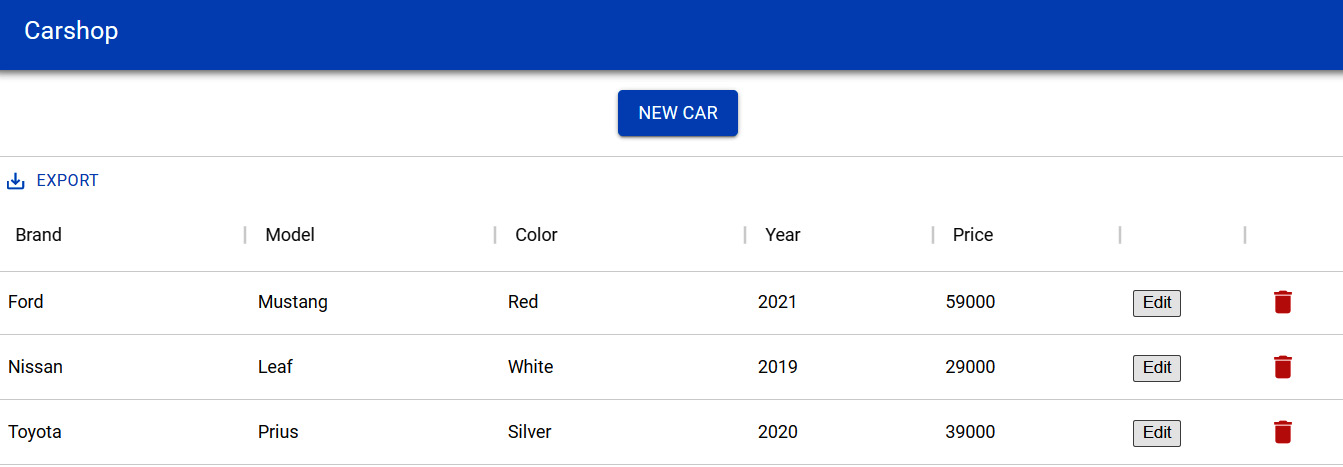
Figure 12.3 – The Delete icon button
Next, we will implement the Edit button using the IconButton component.
- Open the EditCar.js file and import the IconButton component and the EditIcon icon:
// EditCar.js
import IconButton from '@mui/material/IconButton';
import EditIcon from '@mui/icons-material/Edit';
- Then, render IconButton in the return statement. The icon color is the MUI primary color, which is blue:
// EditCar.js return
<IconButton onClick={handleClickOpen}>
<EditIcon color="primary" />
</IconButton>
Finally, both buttons are rendered as icons, as shown in the following screenshot:
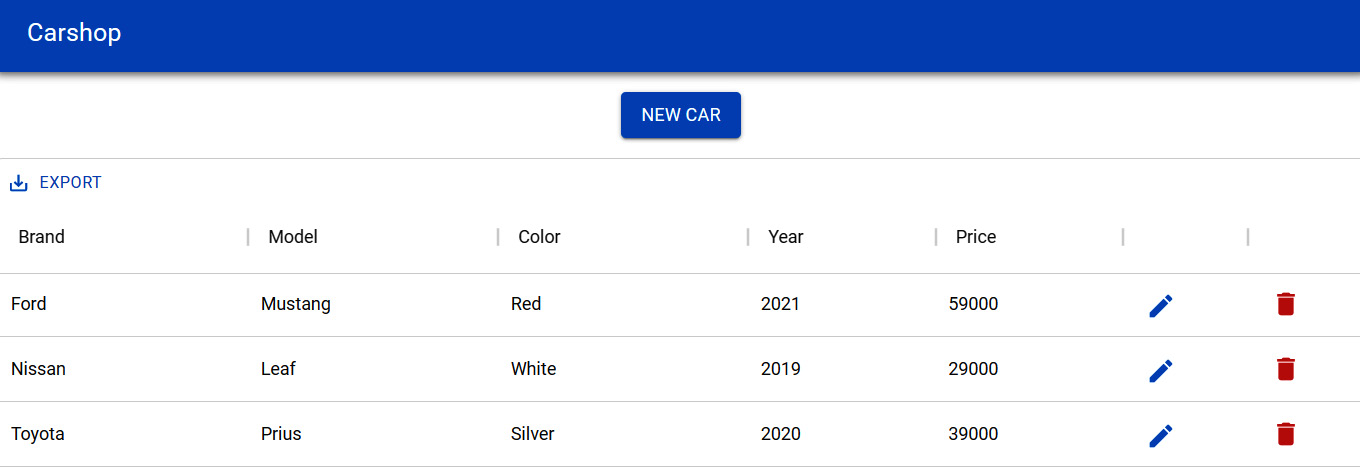
Figure 12.4 – Icon buttons
Next, we will implement text fields using the MUI TextField component.
Using the TextField components
In this section, we'll change the text inputs in the modal forms using the MUI TextField and Stack components:
- Add the following import statement to the AddCar.js and EditCar.js files:
import TextField from '@mui/material/TextField';
import Stack from '@mui/material/Stack';
- Then, change the input elements to the TextField components in the add and edit forms. We are using the label prop to set the labels of the TextField components. The first TextField component contains the autoFocus prop, and the input will be focused on this field. There are three different variants available, and we are using the standard one.
The text fields are wrapped inside the Stack component to get spacing between the components and to set the top margin:
// AddCar.js, do the same modifications to the EditCar.js file
return(
<div>
<Button variant="contained"
onClick={handleClickOpen}>New Car</Button>
<Dialog open={open} onClose={handleClose}>
<DialogTitle>New car</DialogTitle>
<DialogContent>
<Stack spacing={2} mt={1}>
<TextField label="Brand" name="brand"
autoFocus
variant="standard" value={car.brand}
onChange={handleChange}/>
<TextField label="Model" name="model"
variant="standard" value={car.model}
onChange={handleChange}/>
<TextField label="Color" name="color"
variant="standard" value={car.color}
onChange={handleChange}/>
<TextField label="Year" name="year"
variant="standard" value={car.year}
onChange={handleChange}/>
<TextField label="Price" name="price"
variant="standard" value={car.price}
onChange={handleChange}/>
</Stack>
</DialogContent>
<DialogActions>
<Button onClick={handleClose}>Cancel
</Button>
<Button onClick={handleSave}>Save</Button>
</DialogActions>
</Dialog>
</div>
);
After the modifications, the modal form should look like the following:
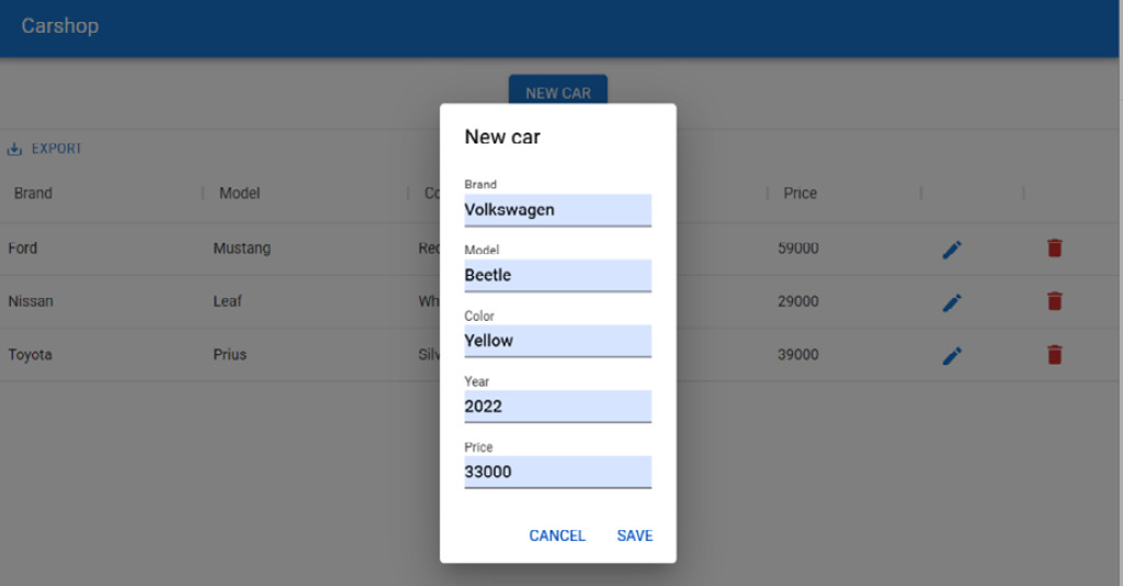
Figure 12.5 – Text fields
Now, we have completed the styling of our frontend using MUI components.
Summary
In this chapter, we finalized our frontend using MUI, which is the React component library that implements Google's Material Design. We replaced the buttons with the MUI Button and IconButton components. Our modal form got a new look by using the MUI TextField component. After these modifications, our frontend looks more professional and uniform.
In the next chapter, we will focus on frontend testing.
Questions
- What is MUI?
- How should you use different Material-UI components?
- How do you use MUI icons?
Further reading
Packt has other great resources available for learning about React. These are as follows:
- React – The Complete Guide by Academind GmbH: https://www.packtpub.com/product/react-the-complete-guide-includes-hooks-react-router-and-redux-2021-updated-second-edition-video/9781801812603
- React 17 Design Patterns and Best Practices – Third Edition by Carlos Santana Roldán: https://www.packtpub.com/product/react-17-design-patterns-and-best-practices-third-edition/978800560444