Chapter 7: Improving and Scaling Your Forecast Strategy
To get the most out of Amazon Forecast, you can partner with your favorite data engineer or data scientist to help you improve your predictor accuracy and go further in the results postprocessing. This chapter will point you in the right direction to monitor your models and compare the predictions to real-life data; this is crucial to detect any drift in performance that would invite you to trigger retraining. Last but not least, you will also use a sample from the AWS Solutions Library to automate all your predictor training, forecast generation, and dashboard visualizations.
In this chapter, we're going to cover the following main topics:
- Deep diving into forecasting model metrics
- Understanding your model accuracy
- Model monitoring and drift detection
- Serverless architecture orchestration
Technical requirements
In this chapter, we will be tackling more advanced topics and as such, you will need need some hands-on experience in a language such as Python to follow along in more detail. You will also need broader skills in several AWS cloud services that are beyond the scope of this book (such as AWS CloudFormation or Amazon SageMaker).
We highly recommend that you read this chapter while connected to your own AWS account and open the different service consoles to run the different actions on your end.
To create an AWS account and log into the Amazon Forecast console, you can refer to the Technical requirements section of Chapter 2, An Overview of Amazon Forecast.
The content in this chapter assumes that you have a predictor already trained; if you don't, we recommend that you follow the detailed process presented in Chapter 4, Training a Predictor with AutoML.
This chapter also assumes you have already generated a forecast from a trained predictor; if you haven't already, we recommend that you follow the detailed process presented in Chapter 6, Generating New Forecasts.
To follow along with the last section of this chapter (Serverless architecture orchestration), you will also need to download the following archive and unzip it:
Deep diving into forecasting model metrics
When training a forecasting model, Amazon Forecast will use different machine learning metrics to measure how good a given model and parameters are at predicting future values of a time series. In this section, we are going to detail what these metrics are, why they are important, and how Amazon Forecast uses them.
In Chapter 4, Training a Predictor with AutoML, you trained your first predictor and obtained the following results:
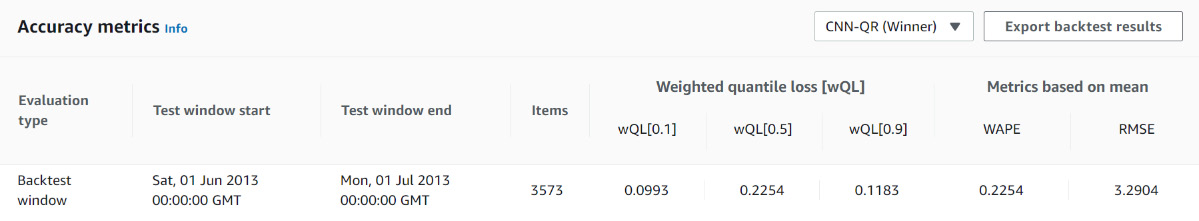
Figure 7.1 – Results page: Accuracy metrics
Using the dropdown on the top right of this section, you can select the algorithm for which you want to see the results. The results you obtained from your first predictor should be similar to the following ones:
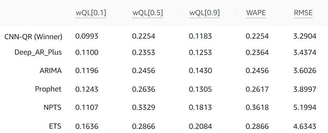
Figure 7.2 – Algorithm metrics comparison
At the top of this table, you can see several metric names, such as wQL[0.1], wQL[0.5], wQL[0.9], WAPE, and RMSE. How are these metrics computed? How do you interpret them? How do you know whether a value is a good one? Let's dive deeper into each of these metrics.
Weighted absolute percentage error (WAPE)
This accuracy metric is a method that computes the error made by the forecasting algorithm with regard to the actual values (the real observations). As this metric is averaged over time and over different items (household items in our case), this metric doesn't differentiate between these items. In other words, the WAPE does not assume any preference between which point in time or item the model predicted better. The WAPE is always a positive number and the smaller it is, the better the model.
The formula to derive this metric over a given backtesting window is as follows:

Here, we have the following:
 is the actual value observed for a given item_id at a point in time, t (with t ranging over the time range from the backtest period and i ranging over all items).
 is the mean forecast predicted for a given item_id at a point in time, t.
Let's have a look at the following plot, where we have drawn the forecast and the observations for the energy consumption of a given household from our dataset:
Figure 7.3 – WAPE metric
In the preceding plot, the vertical dotted lines illustrate the difference between the actual values and the forecasted values for a given household. To compute the WAPE metric, you can follow the steps listed here:
- Take the length of every dotted line in this plot (each line length is the absolute value of the difference between the actual and forecasted values).
- Sum all these lengths together and sum across all item_id in the dataset.
- Divide this number by the sum of the observed values for every item_id over this backtest window.
This will give you an absolute value measured in percentage. For instance, a value of 10.0 could be read as on average, the forecasted values are ±10% away from the observed values. Reading this, you might notice one of the disadvantages of this metric, which is that with the WAPE being a percentage, it can be overly influenced by large percentage errors when forecasting small numbers. In addition, this metric is symmetrical: it does not penalize under-forecasting or over-forecasting more.
Note that the absolute error (the denominator in the previous formula) is normalized by the sum of all the values of all your time series. If you're a retailer and deal with the total demand of multiple products, this means that this metric puts more emphasis on the products that are sold frequently. From a business perspective, it makes sense to have a more accurate forecast for your best sellers. In an energy consumption use case (such as the one we have been using), this means that households with significantly higher consumption will have more impact on this metric. Although this makes sense to ensure you deliver the right amount of electricity through your grid, this may not be useful if you want to deliver personalized recommendations to each household.
Mean absolute percentage error (MAPE)
Like the WAPE, this metric computes the error made by the forecasting algorithm with regard to the real observations. The formula to derive this metric over a given backtesting window is as follows:

Here, we have the following:
 is the actual value observed for a given item_id at a point in time, t (with t ranging over the time range from the backtest period and i ranging over all items).
 is the mean forecast predicted for a given item_id at a point in time, t.
 is the number of data points in the time series associated with a given item_id.
As the formula hints, this metric is highly influenced by outliers: the MAPE is useful when your time series differ significantly over time. Compared to the WAPE, the MAPE is also unnormalized, making it useful when you want to consider time series with large values and others with small values equally.
Mean absolute scaled error (MASE)
When your dataset is seasonal, the cyclical property of your time series may be better captured by this metric, which considers the seasonality by integrating it into a scaling factor. The formula to derive this metric over a given backtesting window for a given time series is the following:
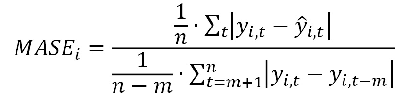
Here, we have the following:
 is the actual value observed for a given item_id at a point in time, t (with t ranging over the time range from the backtest period and i ranging over all items).
 is the mean forecast predicted for a given item_id at a point in time, t.
 is the number of data points in the time series associated with a given item_id.
 is the seasonality value: when
  is equal to 1, the denominator of this formula is actually the mean absolute error of the naïve forecast method (which takes a forecast equal to the previous timestep). Amazon Forecast sets this value,
  , depending on the forecast frequency selected.
When your time series have a significant change of behavior over different seasons, using this metric as the one to optimize for can be beneficial. This metric is scale-invariant, making it easier to compare different models for a given item_id time series or compare forecast accuracy between different time series.
Root mean square error (RMSE)
Like the WAPE, this accuracy metric is also a method that computes the deviation made by a predictor with regard to the actual values (the real observations). In the case of the RMSE, we average a squared error over time and over different items (the household in our case). This metric doesn't differentiate between these, meaning the RMSE does not assume any preference between which point or item the model predicted better. It is always a positive number and the smaller it is, the better the model.
The formula to derive this metric over a given backtesting window is as follows:

Here, we have the following:
 is the actual value observed for a given item_id at a point in time, t (with t ranging over the time range from the backtest period and i ranging over all items).
 is the mean forecast predicted for a given item_id at a point in time, t.
 is the number of data points in a given backtest window (n being the number of items and T the number of time steps).
As you can see in the preceding formula, the RMSE squares the errors (also called the residuals), which gives more importance to large errors when computing this metric. A few wrong predictions can have a negative impact on the RMSE. This metric is very useful in use cases where you do not have the luxury of getting a few predictions wrong.
Weighted quantile loss (wQL)
The WAPE and RMSE are computed using the mean forecast. wQL is a metric that measures the accuracy of a forecasting model at a given quantile. In the Amazon Forecast console, you will, for instance, see wQL[0.1] as a label for the quantile loss computed for the forecast type 0.1.
The formula to derive this metric over a given backtesting window and a given quantile, ![]() , is as follows:
, is as follows:

Here, we have the following:
 is the actual value observed for a given item_id at a point in time, t (with t ranging over the time range from the backtest period and i ranging over all items).
 is the
  quantile predicted for a given item_id at a point in time, t.
 is a quantile that can take one of the following values: 0.01, 0.02…, 0.98, or 0.99.
On the numerator of the previous formula, you can see the following:
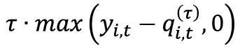 is strictly positive when the predictions are below the actual observations. This term penalizes under-forecasting situations.
- On the other hand,
 is strictly positive when the predictions are above the actual observations. This term penalizes over-forecasting situations.
Let's take the example of wQL[0.80]. Based on the preceding formula, this metric assigns the following:
- A larger penalty weight to under forecasting:

- A smaller penalty weight to over forecasting:
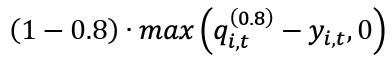
Very often, in retail, being understocked for a given product (with the risk of missed revenue because of an unavailable product) has a higher cost than being overstocked (having a larger inventory). Using wQL[0.8] to assess the quality of a forecast may be more informative to make supply-related decisions for these products.
On the other hand, a retailer may have products that are easy for consumers to substitute. To reduce excess inventory, the retailer may decide to understock these products because the occasional lost sale is overweighed by the inventory cost reduction. In this case, using wQL[0.1] to assess the quality of the forecast for these products might be more useful.
Now that you have a good understanding of which metrics Amazon Forecast computes, let's see how you can use this knowledge to analyze your model accuracy and try and improve it.
Understanding your model accuracy
Some items might be more important than others in a dataset. In retail forecasting, 20% of the sales often accounts for 80% of the revenue, so you might want to ensure you have a good forecast accuracy for your top-moving items (as the others might have a very small share of the total sales most of the time). In every use case, optimizing accuracy for your critical items is important: if your dataset includes several segments of items, properly identifying them will allow you to adjust your forecast strategy.
In this section, we are going to dive deeper into the forecast results of the first predictor you trained in Chapter 4, Training a Predictor with AutoML. In Chapter 6, Generating New Forecasts, I concatenated all the forecast files associated with the AutoML model trained in Chapter 4, Training a Predictor with AutoML. Click on the following link to download my Excel file and follow along with my analysis:
In the following steps, you are going to perform a detailed accuracy analysis to understand where your model can be improved. As an exercise, feel free to reproduce these steps either directly from this Excel spreadsheet or in a Jupyter notebook if you're comfortable writing Python code to process data:
- Let's compute the WAPE metric for each time series and plot them by decreasing value. We can observe that a few items (less than 20) have a WAPE greater than 5%.
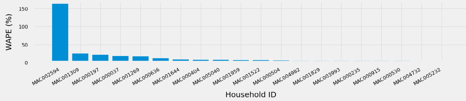
Figure 7.4 – Household time series with a high WAPE
- As they are very few, you can then analyze each of these to understand whether this comes from a specific segment of customers. For instance, you could have a look at one of the metadata fields (the transport_work_from_home field one, for instance) and observe how this field is distributed throughout the whole dataset and compare this to the distribution of this field for items that have a high WAPE.
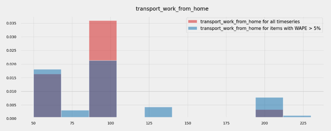
Figure 7.5 – transport_work_from_home variable overlaps with the MAPE
Both distributions overlap significantly, so this field (alone) does not help distinguish between time series with a good WAPE and others with a high WAPE. Diving deeper into this approach goes beyond the scope of this book, but you could apply traditional clustering techniques to try and identify potential conditions that make it harder to forecast energy consumption in this population.
- Similarly, computing and plotting the correlation of the fields present in your item metadata dataset with an individual WAPE doesn't show any strong linear correlation.
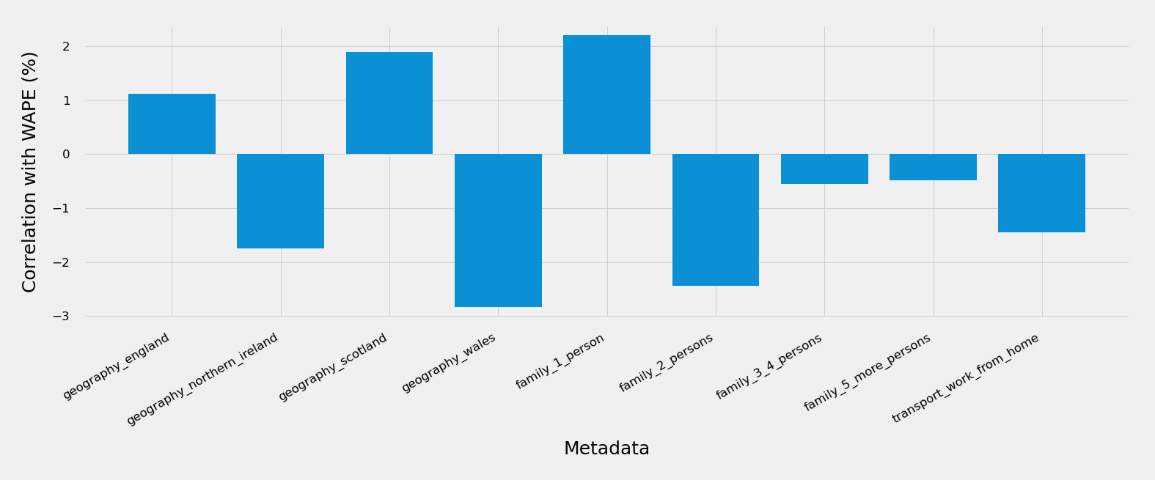
Figure 7.6 – Item metadata correlation with the WAPE
In situations where strong correlations are detected, you might decide to segment these populations and build several predictors that are best suited for each segment.
- You could then plot the actual values of a few selected signals and compare the values a signal took during training with the actual values taken during the forecast window we used for testing. Here is a plot of the energy consumption for household MAC000636:
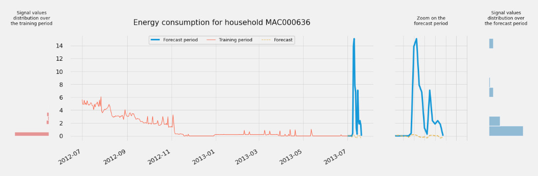
Figure 7.7 – Household time series with a high WAPE
In this figure, you can uncover one of the key reasons why the forecast (the hardly visible dotted line on the bottom right, also seen in the zoomed area) is far away from the actual values (the thick line making a high peak on the right). This is probably because there is significant behavior drift between the data seen by the predictor at training time (the thin line on the left) and what you can witness over the forecast window. This is further highlighted by the histograms exposing the distribution of the time series values over the training period (on the left) and the forecast period (on the far right).
As you can see, drift in your time series data can have severe consequences on the accuracy of your model for some of your time series and this can have a critical impact on the trust your end users will develop for the predictions of your forecasts. In the next section, we will discuss how this can be tackled from an operational perspective.
Model monitoring and drift detection
As was made clear in the previous section, in addition to error analysis, you should also make sure to monitor any potential shifts in your data. To do this, you could follow this process:
- Build and store a dataset with the training data of all the time series that you want to use to build a predictor.
- Compute the statistical characteristics of your dataset at a global level (for example, average, standard deviation, or histograms of the distribution of values).
- Compute the statistical characteristics of your dataset at a local level (for each time series).
- Train your predictors with these initial datasets and save the performance metrics (wQL, MAPE, and RMSE).
- Generate a new forecast based on this predictor; you will only get the predictions here and have no real data to compare them with yet.
- When new data comes in, compute the same statistical characteristics and compare them with the original values used at training time.
- Now that you have new data, compute the metrics to measure the performance of the previous forecast and compare them with these actual results.
- You can display these statistics next to the predictions for your analysts to make the appropriate decisions. This will help them better trust the results generated by Amazon Forecast.
Once you have this process set up, you will be able to organize regular reviews to analyze any shifts in the data or any drift in the performance of your forecasts to decide when is a good time to amend your training datasets and retrain a fresh predictor.
Serverless architecture orchestration
Until now, you have been relying heavily on the AWS console to perform all your actions, such as training predictors, generating forecasts, and querying or visualizing forecast results. In this section, you are going to use one of the solutions from the AWS Solutions Library.
The AWS Solutions Library contains a collection of cloud-based architecture to tackle many technical and business problems. These solutions are vetted by AWS and you can use these constructs to assemble your own applications.
The solution you are going to implement is called Improving Forecast Accuracy with Machine Learning and can be found by following this link:
https://aws.amazon.com/solutions/implementations/improving-forecast-accuracy-with-machine-learning/
After a high-level overview of the components that will be deployed in your account, you are going to use this solution to build the same predictor that you built in Chapter 5, Customizing Your Predictor Training.
Solutions overview
When you deploy the Improving Forecast Accuracy with Machine Learning solution, the following serverless environment is deployed in the AWS cloud:
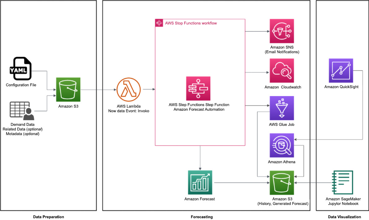
Figure 7.8 – Improving Forecast Accuracy with Machine Learning solution components overview
As you can see in the previous diagram, this solution has three main components:
- A Data Preparation component
- A Forecasting component
- And a Data Visualization component
Let's dive into each of these components.
Data preparation component
The data preparation part assumes you already have your dataset prepared in the format expected by Amazon Forecast. For instance, you must already have a target time series dataset. Optionally, you can have a related time series dataset and a metadata dataset.
To follow along with this section, you can download the following archive directly from this location and unzip it:
This archive contains the following:
- One file with a .ipynb extension: this is a Jupyter notebook that you will use for visualization later in this chapter.
- One YAML file that you will use to configure the solution.
- Three CSV files containing the target time series data, the related time series data, and the item metadata.
The solution needs a forecast configuration file in YAML format. YAML is often used for configuration files and is similar to JSON but less verbose and more readable when the nesting levels are not too deep.
Amazon Simple Storage Service (Amazon S3) is used to store the configuration file and your datasets.
Forecasting component
The forecasting part of the solution is mainly built around the following:
- AWS Lambda: Serverless Lambda functions are used to build, train, and deploy your machine learning models with Amazon Forecast. Lambda functions are just pieces of code that you can run without having to manage an underlying infrastructure (the service is called serverless).
- AWS Step Functions uses a state machine to orchestrate all the Lambda functions together. In the following diagram, you can see the different steps this state machine will go through when running:
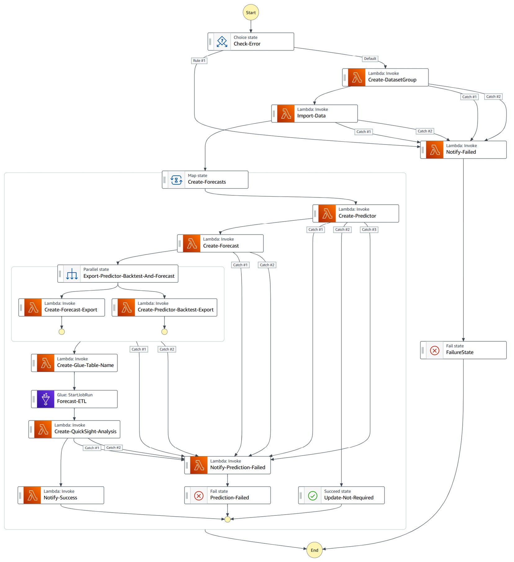
Figure 7.9 – Forecast state machine overview
- Amazon Forecast is the key machine learning service used to train your predictors and generate new forecasts.
- Amazon Simple Notification Service (Amazon SNS): Amazon SNS is used to notify you of the results of the step functions by email.
In addition to the preceding components, the forecasting part of the solutions also uses the following services under the hood:
- Amazon CloudWatch: This service is used to log every action performed by the solution. This is especially useful to understand what's happening when your workflow fails.
- AWS Glue: This solution uses an AWS Glue job to build an aggregated view of your forecasts, including raw historical data, backtesting exports, and forecast results.
- Amazon Athena: This service allows you to query Amazon S3 with standard SQL queries. In this solution, Amazon Athena will be used to query the aggregated views built by the previous AWS Glue job.
- Amazon S3: This is used to store the generated forecasts.
Data visualization component
The data visualization components deployed by the solutions allow you to explore your forecast using either of the following:
- Amazon SageMaker if you're a data scientist that is comfortable with manipulating your data with Python
- Amazon QuickSight if you're a data analyst that is more comfortable with using a business intelligence tool to build dashboards from the analysis generated by the solution on a per-forecast basis
Now that you're familiar with the different components used by this solution, you are going to deploy it in your AWS account.
Solutions deployment
To deploy this solution in your AWS account, you can follow the steps given here:
- Navigate to the solution home page at https://aws.amazon.com/solutions/implementations/improving-forecast-accuracy-with-machine-learning/ and scroll down to the middle of the page to click on the Launch in the AWS Console button.
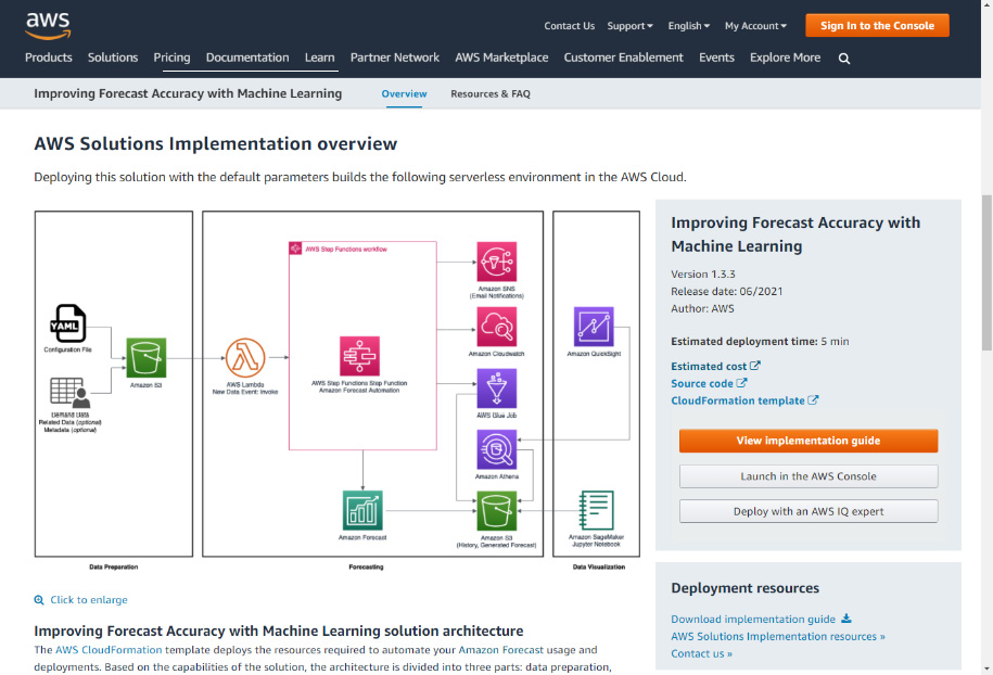
Figure 7.10 – AWS Solutions home page
- You will be brought to the CloudFormation service home page. If you are not logged into your account, you will have to sign in before you're redirected to CloudFormation.
- CloudFormation is a service used to deploy any AWS service with a template written in either JSON or YAML format. This allows you to configure services with code instead of building everything by clicking through multiple service consoles. Click on the Next button on the bottom right.
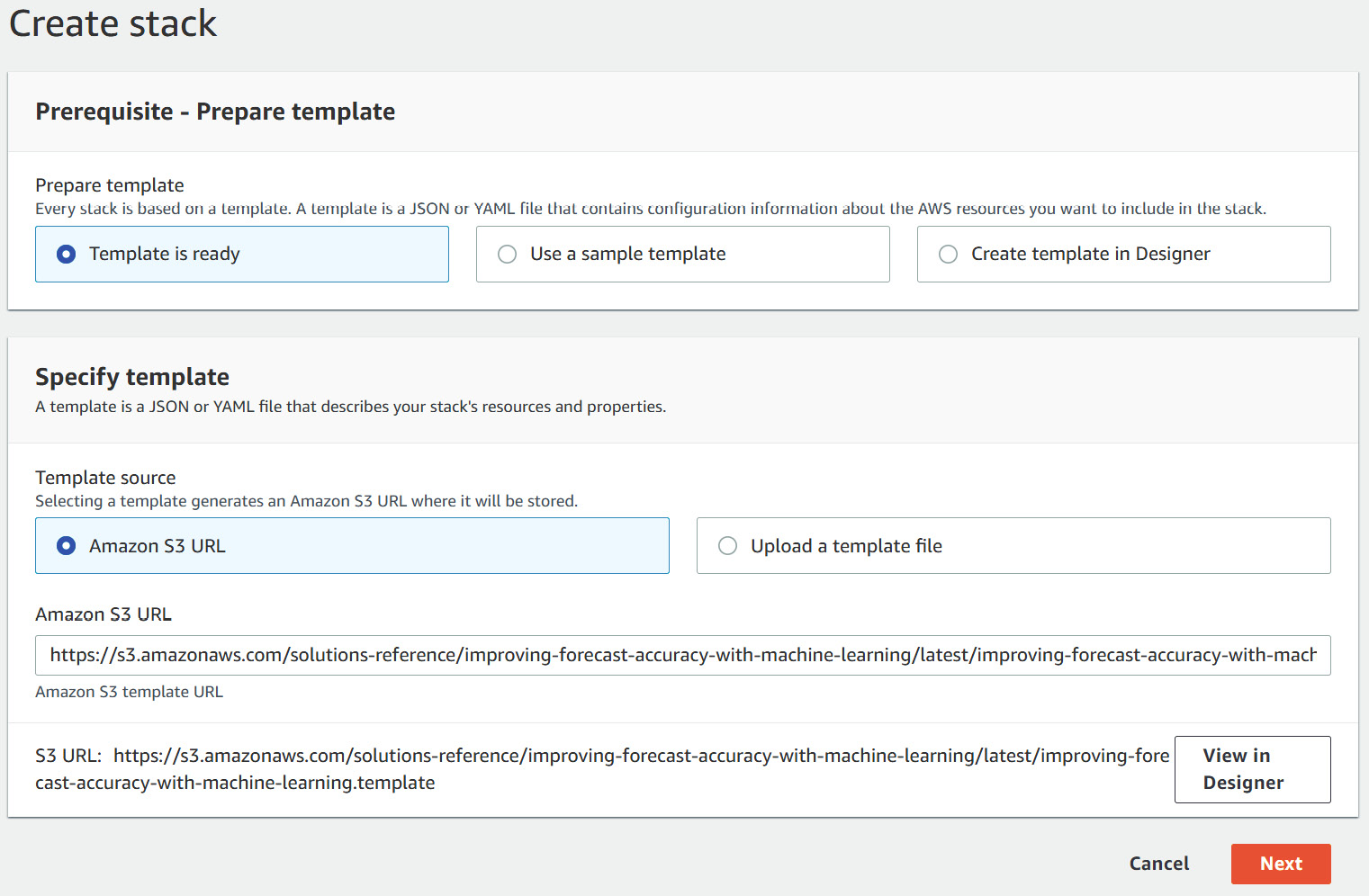
Figure 7.11 – Creating the CloudFormation stack
- On the stack details page, enter a stack name. I chose energy-consumption-forecast-stack for mine.
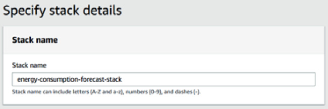
Figure 7.12 – CloudFormation stack name
- In the stack parameters, you will fill in your email address in Email, leave the QuickSight visualization option empty, and select Yes to deploy a Jupyter notebook. Leave all the other options as is and click Next.
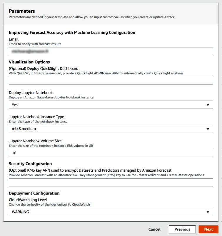
Figure 7.13 – CloudFormation parameters
- On the next screen, you will have the opportunity to configure advanced options. You can leave all these values as their defaults, scroll down the screen, and click Next again.
- On the last screen, you can review all the options and parameters selected and scroll down to the very bottom. Click on both the check-boxes and click on Create stack.
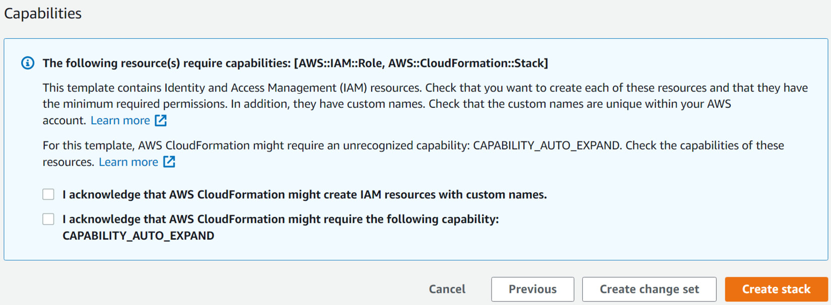
Figure 7.14 – Creating the CloudFormation stack
- This will bring you to a CloudFormation stack creation screen where you can see your stack deployment in progress.
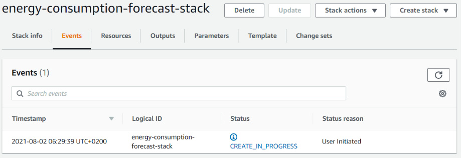
Figure 7.15 – Stack creation started
- At the end of the process, you can navigate to the Outputs tab of the template deployment. Take note of the ForecastBucketName value under this tab.
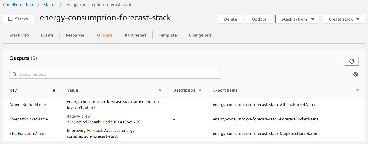
Figure 7.16 – CloudFormation stack outputs
- Once you're through the CloudFormation stack creation, you will also receive an email asking you to confirm your subscription to a notification topic. This SNS topic will be used to send you notifications about the forecasting process. Click on the Confirm subscription link in this email.
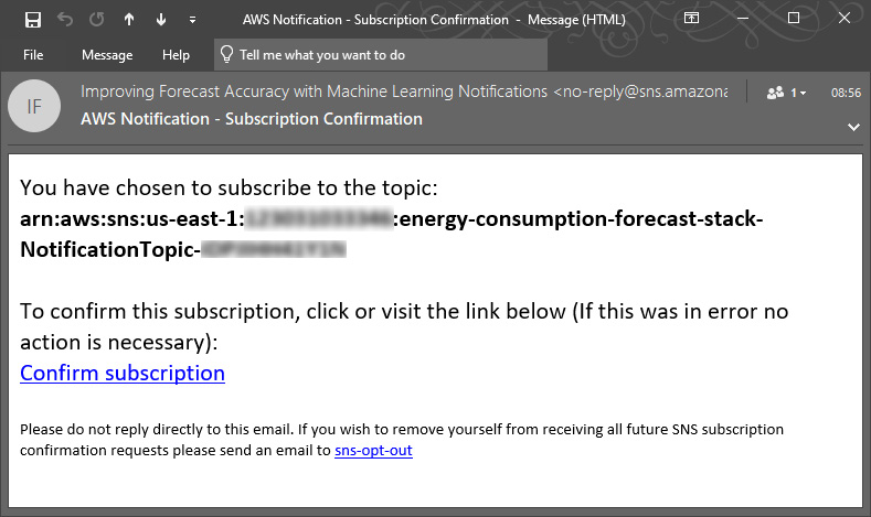
Figure 7.17 – Notification subscription confirmation
Your solution is now deployed. It's time to configure it to match our energy consumption prediction use case.
Configuring the solution
The Improving Forecast Accuracy with Machine Learning solution is configured with a YAML file that you will need to upload to the S3 bucket you took note of earlier (Step 9 of the Solutions deployment section). The file you will use will contain an introduction section configured as follows:
Household_energy_consumption:
DatasetGroup:
Domain: CUSTOM
You then configure the different datasets to be used. Here is the section for the target time series dataset:
Datasets:
- Domain: CUSTOM
DatasetType: TARGET_TIME_SERIES
DataFrequency: D
TimestampFormat: yyyy-MM-dd
Schema:
Attributes:
- AttributeName: item_id
AttributeType: string
Next, you will describe how the predictor will be trained:
Predictor:
MaxAge: 604800
PerformAutoML: False
ForecastHorizon: 30
AlgorithmArn: arn:aws:forecast:::algorithm/CNN-QR
FeaturizationConfig:
ForecastFrequency: D
TrainingParameters:
epochs: "100"
context_length: "240"
use_item_metadata: "ALL"
use_related_data: "FORWARD_LOOKING"
Last but not least, you will define which forecast types you are interested in:
Forecast:
ForecastTypes:
- "0.10"
- "0.50"
- "0.90"
You will find a copy of the complete YAML file in the archive downloaded earlier.
Navigate to the Amazon S3 bucket you took note of earlier and upload this YAML file to this bucket. Also, click on Create folder and create a folder named train. Your S3 bucket root looks like the following (a folder named glue was created during the initial deployment and should already be present):
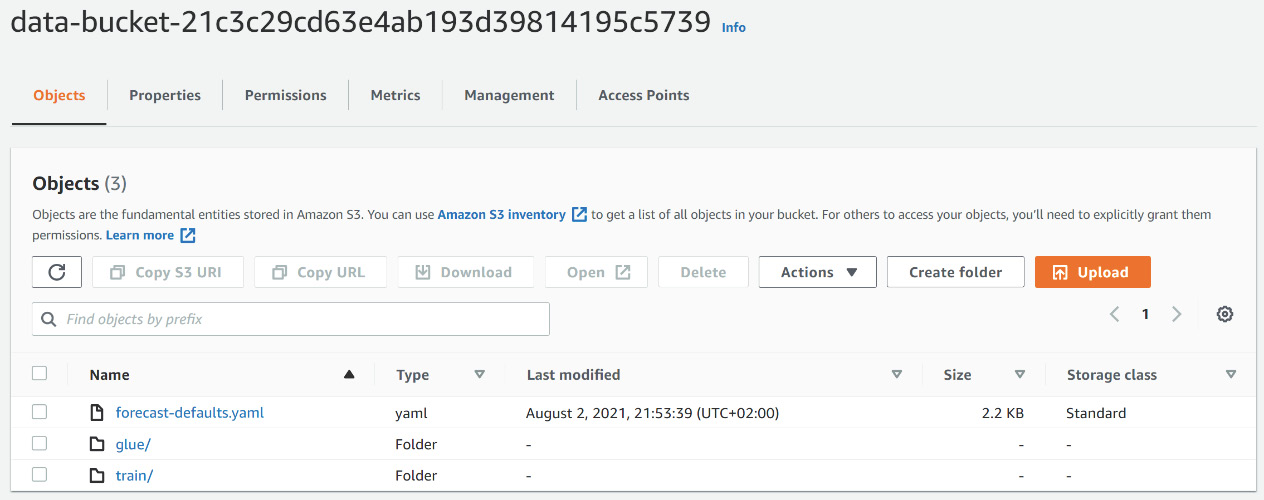
Figure 7.18 – S3 bucket initial configuration
Your solution is now configured and ready to be used!
Using the solution
After deploying the Improving Forecast Accuracy with Machine Learning solution, you are now ready to use it. In this section, you will learn how to trigger and monitor the main workflow run by the solution and how to visualize the results.
Monitoring the workflow status
Navigate to the train directory of your S3 bucket and upload the three CSV files you extracted in the Data preparation component section.
The solution is automatically triggered; if you want to know how your process is progressing, you can use the AWS Step Functions console. To visualize this progress, you can follow these steps:
- Log into your AWS console and search for Step Functions in the search bar at the top.
- Click on AWS Step Functions to go to the service home page. On this page, click on the State machines link at the top of the left menu bar.
Figure 7.19 – AWS Step Functions home page
- You will land on a page listing all the workflows visible from your AWS account. If this is your first time using the service, your list will only contain the state machine deployed by the solution.
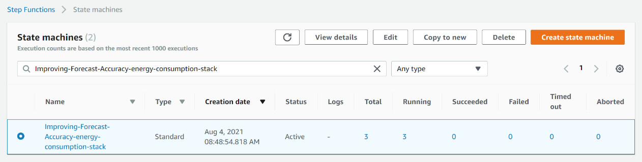
Figure 7.20 – Step Functions state machine list
- Click on the Improving-Forecast-Accuracy-energy-consumption -stack link to visualize all the executions of this workflow. You should see three ongoing executions, one for each file uploaded. Click on one with a Running status.
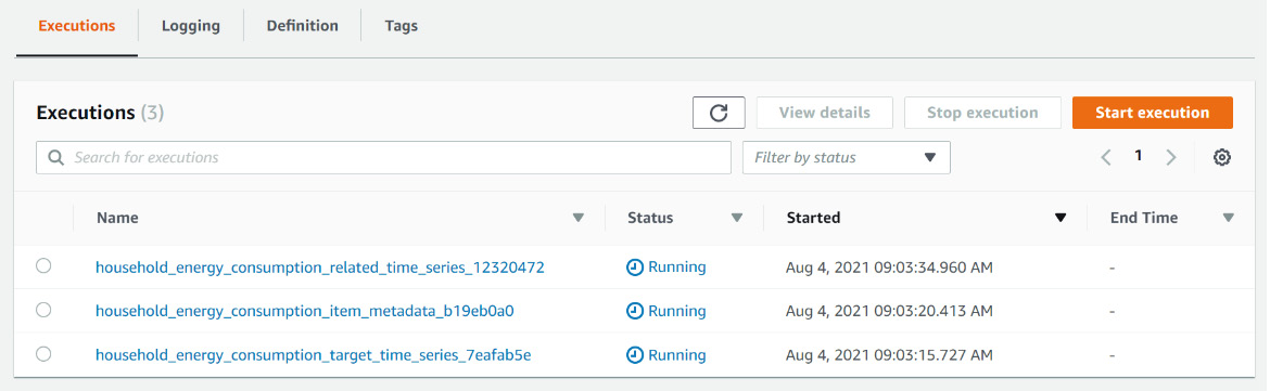
Figure 7.21 – State machine executions list
- You will see the workflow status with the current step (Import-Data) and the past successful ones (Check-Error and Create-DatasetGroup) highlighted.
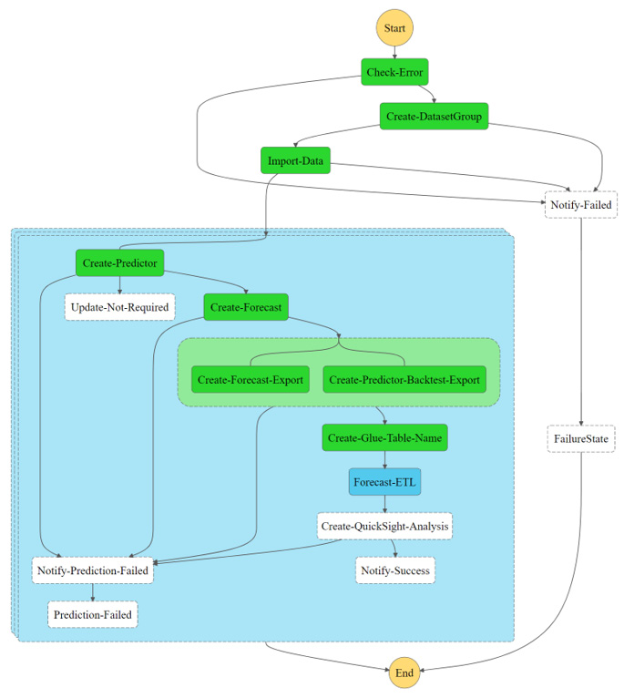
Figure 7.22 – Graph inspector for the current workflow execution
This graph is updated live and is useful for debugging any issues happening in the process. Once you're familiar with the solution, you usually don't need to open the Step Functions console anymore.
Visualizing the results
Once all the workflows are run successfully, you will receive a notification by email and you can then visualize your predictor results. Follow these steps to this effect:
- Log into your AWS console and search for SageMaker in the search bar at the top.
- Click on Amazon SageMaker to go to the service home page. On this page, click on the Notebook instances link in the left menu bar.
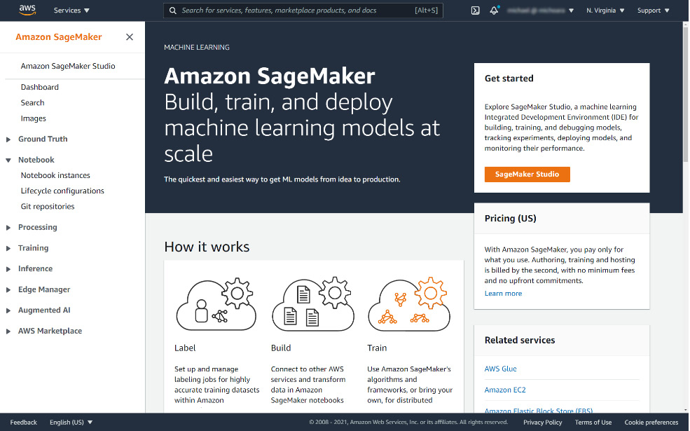
Figure 7.23 – Amazon SageMaker home page
- You will land on a page listing all the notebook instances visible from your AWS account. If this is your first time using the service, your list will only contain the notebook instance deployed by the solution.
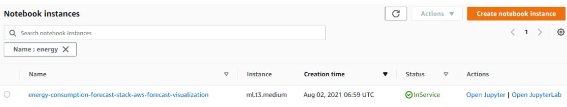
Figure 7.24 – Amazon SageMaker notebook instances list
- Click on the Open JupyterLab link to access your instance; you will be redirected to the JupyterLab environment. On the left, you have a directory structure. Drag and drop the .ipynb file you downloaded earlier at the beginning of this section to this directory structure area. Then, double-click on the EnergyConsumptionVisualization.ipynb notebook name to open it in the main interface on the right.
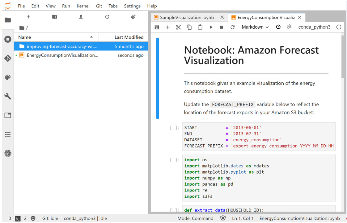
Figure 7.25 – Using a Jupyter notebook for visualization purposes
- Jupyter notebooks are structured in successive cells. Update the first cell so that your code matches the name of your dataset group and the location of the forecast exports:
START = '2013-06-01'
END = '2013-07-31'
DATASET = 'household_energy_consumption'
FORECAST_PREFIX = 'export_energy_consumption_XXXX'
- From the top menu bar, select Run and then Run all cells to run the whole notebook.
- Scroll down to the bottom of the notebook to visualize some of the results. For instance, here are the results for the MAC001259 household:
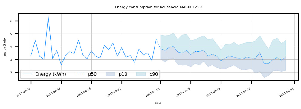
Figure 7.26 – Visualizing energy consumption for a household
Cleanup
Once you are done experimenting with this solution, you can delete all the resources created to prevent any extra costs from being incurred. Follow these steps to clean your account of the solution resources:
- Log into your AWS console and search for CloudFormation in the search bar at the top.
- Click on AWS CloudFormation to go to the service home page. Click on Stacks in the left menu bar to see the list of CloudFormation stacks deployed in your account.
Figure 7.27 – AWS CloudFormation service home page
- In the search bar at the top of the Stacks table, you can enter energy-consumption if you don't find your stack right away.
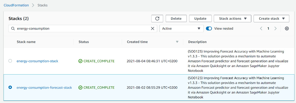
Figure 7.28 – AWS CloudFormation stacks list
- Select energy-consumption-forecast-stack and click on the Delete button at the top.
The deletion process starts and after a few minutes, your account is cleaned up. The Amazon S3 bucket created by this solution will be emptied and deleted by this process. However, if you created other buckets and uploaded other files during your experimentation, you will have to navigate to the Amazon S3 console and delete these resources manually.
Summary
In this chapter, you dived deeper into the forecast accuracy metrics and learned how you can perform some analysis to better understand the performance of your predictors. In particular, you uncovered the impact any behavior changes in your datasets (data drift) can have on the accuracy of a forecasting exercise. You also learned how you can move away from using the console to integrate Amazon Forecast results into your business operations thanks to a serverless solution vetted by AWS and actively maintained.
Congratulations! This chapter concludes the part dedicated to forecasting with Amazon Forecast. In the next chapter, you will start your journey into time series anomaly detection!