Chapter 1: An Overview of Time Series Analysis
Time series analysis is a technical domain with a very large choice of techniques that need to be carefully selected depending on the business problem you want to solve and the nature of your time series. In this chapter, we will discover the different families of time series and expose unique challenges you may encounter when dealing with this type of data.
By the end of this chapter, you will understand how to recognize what type of time series data you have and select the best approaches to perform your time series analysis (depending on the insights you want to uncover), and you will understand the use cases that Amazon Forecast, Amazon Lookout for Equipment, and Amazon Lookout for Metrics can help you solve, and which ones they are not suitable for.
You will also have a sound toolbox of time series techniques, Amazon Web Services (AWS) services, and open source Python packages that you can leverage in addition to the three managed services described in detail in this book. Data scientists will also find these tools to be great additions to their time series exploratory data analysis (EDA) toolbox.
In this chapter, we are going to cover the following main topics:
- What is a time series dataset?
- Recognizing the different families of time series
- Adding context to time series data
- Learning about common time series challenges
- Selecting an analysis approach
- Typical time series use cases
Technical requirements
No hands-on experience in a language such as Python or R is necessary to follow along with the content of this chapter. However, for the more technology-savvy readers, we will address some technical considerations (such as visualization, transformation, and preprocessing) and the packages you can leverage in the Python language to address these. In addition, you can also open the Jupyter notebook you will find in the following GitHub repository to follow along and experiment by yourself: https://github.com/PacktPublishing/Time-series-Analysis-on-AWS/blob/main/Chapter01/chapter1-time-series-analysis-overview.ipynb.
Although following along this chapter with the aforementioned notebook provided is optional, this will help you build your intuition about what insights the time series techniques described in this introductory chapter can deliver.
What is a time series dataset?
From a mathematical point of view, a time series is a discrete sequence of data points that are listed chronologically. Let's take each of the highlighted terms of this definition, as follows:
- Sequence: A time series is a sequence of data points. Each data point can take a single value (usually a binary, an integer, or a real value).
- Discrete: Although the phenomena measured by a system can be continuous (the outside temperature is a continuous variable as time can, of course, range over the entire real number line), time series data is generated by systems that capture data points at a certain interval (a temperature sensor can, for instance, take a new temperature reading every 5 minutes). The measurement interval is usually regular (the data points will be equally spaced in time), but more often than not, they are irregular.
- Chronologically: The sequence of data points is naturally time-ordered. If you were to perform an analysis of your time series data, you will generally observe that data points that are close together in time will be more closely related than observations that are further apart. This natural ordering means that any time series model usually tries to learn from past values of a given sequence rather than from future values (this is obvious when you try to forecast future values of a time series sequence but is still very important for other use cases).
Machine learning (ML) and artificial intelligence (AI) have largely been successful at leveraging new technologies including dedicated processing units (such as graphics processing units, or GPUs), fast network channels, and immense storage capacities. Paradigm shifts such as cloud computing have played a big role in democratizing access to such technologies, allowing tremendous leaps in novel architectures that are immediately leveraged in production workloads.
In this landscape, time series appear to have benefited a lot less from these advances: what makes time series data so specific? We might consider a time series dataset to be a mere tabular dataset that would be time-indexed: this would be a big mistake. Introducing time as a variable in your dataset means that you are now dealing with the notion of temporality: patterns can now emerge based on the timestamp of each row of your dataset. Let's now have a look at the different families of time series you may encounter.
Recognizing the different families of time series
In this section, you will become familiar with the different families of time series. For any ML practitioner, it is obvious that a single image should not be processed like a video stream and that detecting an anomaly on an image requires a high enough resolution to capture the said anomaly. Multiple images from a certain subject (for example, pictures of a cauliflower) would not be very useful to teach an ML system anything about the visual characteristics of a pumpkin—or an aircraft, for that matter. As eyesight is one of our human senses, this may be obvious. However, we will see in this section and the following one (dedicated to challenges specific to time series) that the same kinds of differences apply to different time series.
There are four different families involved in time series data, which are outlined here:
- Univariate time series data
- Continuous multivariate data
- Event-based multivariate data
- Multiple time series data
Univariate time series data
A univariate time series is a sequence of single time-dependent values.
Such a series could be the energy output in kilowatt-hour (kWh) of a power plant, the closing price of a single stock market action, or the daily average temperature measured in Paris, France.
The following screenshot shows an excerpt of the energy consumption of a household:

Figure 1.1 – First rows and line plot of a univariate time series capturing the energy consumption of a household
A univariate time series can be discrete: for instance, you may be limited to the single daily value of stock market closing prices. In this situation, if you wanted to have a higher resolution (say, hourly data), you would end up with the same value duplicated 24 times per day.
Temperature seems to be closer to a continuous variable, for that matter: you can get a reading as frequently as you would wish, and you can expect some level of variation whenever you have a data point. You are, however, limited to the frequency at which the temperature sensor takes its reading (every 5 minutes for a home meteorological station or every hour in main meteorological stations). For practical purposes, most time series are indeed discrete, hence the definition called out earlier in this chapter.
The three services described in this book (Amazon Forecast, Amazon Lookout for Equipment, and Amazon Lookout for Metrics) can deal with univariate data to perform with various use cases.
Continuous multivariate data
A multivariate time series dataset is a sequence of many-valued vector values emitted at the same time. In this type of dataset, each variable can be considered individually or in the context shaped by the other variables as a whole. This happens when complex relationships govern the way these variables evolve with time (think about several engineering variables linked through physics-based equations).
An industrial asset such as an arc furnace (used in steel manufacturing) is running 24/7 and emits time series data captured by sensors during its entire lifetime. Understanding these continuous time series is critical to prevent any risk of unplanned downtime by performing the appropriate maintenance activities (a domain widely known under the umbrella term of predictive maintenance). Operators of such assets have to deal with sometimes thousands of time series generated at a high frequency (it is not uncommon to collect data with a 10-millisecond sampling rate), and each sensor is measuring a physical grandeur. The key reason why each time series should not be considered individually is that each of these physical grandeurs is usually linked to all the others by more or less complex physical equations.
Take the example of a centrifugal pump: such a pump transforms rotational energy provided by a motor into the displacement of a fluid. While going through such a pump, the fluid gains both additional speed and pressure. According to Euler's pump equation, the head pressure created by the impeller of the centrifugal pump is derived using the following expression:

In the preceding expression, the following applies:
- H is the head pressure.
- u denotes the peripheral circumferential velocity vector.
- w denotes the relative velocity vector.
- c denotes the absolute velocity vector.
- Subscript 1 denotes the input variable (also called inlet for such a pump). For instance, w1 is the inlet relative velocity.
- Subscript 2 denotes output variables (also called peripheral variables when dealing with this kind of asset). For instance, w2 is the peripheral relative velocity.
- g is the gravitational acceleration and is a constant value depending on the latitude where the pump is located.
A multivariate time series dataset describing this centrifugal pump could include u1, u2, w1, w2, c1, c2, and H. All these variables are obviously linked together by the law of physics that governs this particular asset and cannot be considered individually as univariate time series.
If you know when this particular pump is in good shape, has had a maintenance operation, or is running through an abnormal event, you can also have an additional column in your time series capturing this state: your multivariate time series can then be seen as a related dataset that might be useful to try and predict the condition of your pump. You will find more details and examples about labels and related time series data in the Adding context to time series data section.
Amazon Lookout for Equipment, one of the three services described in this book, is able to perform anomaly detection on this type of multivariate dataset.
Event-based multivariate data
There are situations where data is continuously recorded across several operating modes: an aircraft going through different sequences of maneuvers from the pilot, a production line producing successive batches of different products, or rotating equipment (such as a motor or a fan) operating at different speeds depending on the need.
A multivariate time series dataset can be collected across multiple episodes or events, as follows:
- Each aircraft flight can log a time series dataset from hundreds of sensors and can be matched to a certain sequence of actions executed by the aircraft pilot. Of course, a given aircraft will go through several overlapping maintenance cycles, each flight is different, and the aircraft components themselves go through a natural aging process that can generate additional stress and behavior changes due to the fatigue of going through hundreds of successive flights.
- A beauty-care plant produces multiple distinct products on the same production line (multiple types and brands of shampoos and shower gels), separated by a clean, in-place process to ensure there is no contamination of a given product by a previous one. Each batch is associated with a different recipe, with different raw materials and different physical characteristics. Although the equipment and process time series are recorded continuously and can be seen as a single-flow variable indexed by time, they can be segmented by the batch they are associated with.
In some cases, a multivariate dataset must be associated with additional context to understand which operating mode a given segment of a time series can be associated with. If the number of situations to consider is reasonably low, a service such as Amazon Lookout for Equipment can be used to perform anomaly detection on this type of dataset.
Multiple time series data
You might also encounter situations where you have multiple time series data that does not form a multivariate time series dataset. These are situations where you have multiple independent signals that can each be seen as a single univariate time series. Although full independence might be debatable depending on your situation, there are no additional insights to be gained by considering potential relationships between the different univariate series.
Here are some examples of such a situation:
- Closing price for multiple stock market actions: For any given company, the trading stock can be influenced by both exogenous factors (for example, a worldwide pandemic pushing entire countries into shelter-in-place situations) and endogenous decisions (board of directors' decisions; a strategic move from leadership; major innovation delivered by a research and development (R&D) team). Each stock price is not necessarily impacted by other companies' stock prices (competitors, partners, organizations operating on the same market).
- Sold items for multiple products on an online retail store: Although some products might be related (more summer clothes when temperatures are rising again in spring), they do not have an influence on each other and they happen to sport similar behavior.
Multiple time series are hard to analyze and process as true multivariate time series data as the mechanics that trigger seemingly linked behaviors are most of the time coming from external factors (summer approaching and having a similar effect on many summer-related items). Modern neural networks are, however, able to train global models on all items at once: this allows them to uncover relationships and context that are not provided in the dataset to reach a higher level of accuracy than traditional statistical models that are local (univariate-focused) by nature.
We will see later on that Amazon Forecast (for forecasting with local and global models) and Amazon Lookout for Metrics (for anomaly detection on univariate business metrics) are good examples of services provided by Amazon that can deal with this type of dataset.
Adding context to time series data
Simply speaking, there are three main ways an ML model can learn something new, as outlined here:
- Supervised learning (SL): Models are trained using input data and labels (or targets). The labels are provided as an instructor would provide directions to a student learning a new move. Training a model to approximate the relationship between input data and labels is a supervised approach.
- Unsupervised learning (UL): This approach is used when using ML to uncover and extract underlying relationships that may exist in a given dataset. In this case, we only operate on the input data and do not need to provide any labels or output data. We can, however, use labels to assess how good a given unsupervised model is at capturing reality.
- Reinforcement learning (RL): To train a model with RL, we build an environment that is able to send feedback to an agent. We then let the agent operate within this environment (using a set of actions) and react based on the feedback provided by the environment in response to each action. We do not have a fixed training dataset anymore, but an environment that sends an input sample (feedback) in reaction to an action from the agent.
Whether you are dealing with univariate, multiple, or multivariate time series datasets, you might need to provide extra context: location, unique identification (ID) number of a batch, components from the recipes used for a given batch, sequence of actions performed by a pilot during an aircraft flight test, and so on. The same sequence of values for univariate and multivariate time series could lead to a different interpretation in different contexts (for example, are we cruising or taking off; are we producing a batch of shampoo or shower gel?).
All this additional context can be provided in the form of labels, related time series, or metadata that will be used differently depending on the type of ML you leverage. Let's have a look at what these pieces of context can look like.
Labels
Labels can be used in SL settings where ML models are trained using input data (our time series dataset) and output data (the labels). In a supervised approach, training a model is the process of learning an approximation between the input data and the labels. Let's review a few examples of labels you can encounter along with your time series datasets, as follows:
- The National Aeronautics and Space Administration (NASA) has provided the community with a very widely used benchmark dataset that contains the remaining useful lifetime of a turbofan measured in cycles: each engine (identified by unit_number in the following table) has its health measured with multiple sensors, and readings are provided after each flight (or cycle). The multivariate dataset recorded for each engine can be labeled with the remaining useful lifetime (rul) known or estimated at the end of each cycle (this is the last column in the following table). Here, each individual timestamp is characterized by a label (the remaining lifetime measured in a cycle):

Figure 1.2 – NASA turbofan remaining useful lifetime
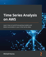
- The ECG200 dataset is another widely used time series dataset as a benchmark for time series classification. The electrical activity recorded during human heartbeats can be labeled as Normal or Ischemia (myocardial infarction), as illustrated in the following screenshot. Each time series as a whole is characterized by a label:
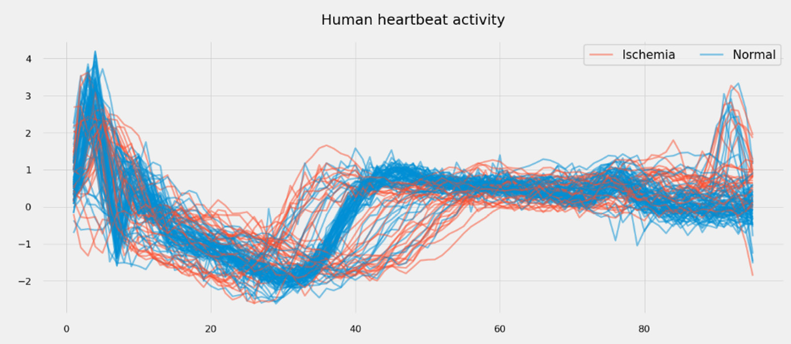
Figure 1.3 – Heartbeat activity for 100 patients (ECG200 dataset)
- Kaggle also offers a few time series datasets of interest. One of them contains sensor data from a water pump with known time ranges where the pump is broken and when it is being repaired. In the following case, labels are available as time ranges:

Figure 1.4 – Water pump sensor data showcasing healthy and broken time ranges
As you can see, labels can be used to characterize individual timestamps of a time series, portions of a time series, or even whole time series.
Related time series
Related time series are additional variables that evolve in parallel to the time series that is the target of your analysis. Let's have a look at a few examples, as follows:
- In the case of a manufacturing plant producing different batches of product, a critical signal to have is the unique batch ID that can be matched with the starting and ending timestamps of the time series data.
- The electricity consumption of multiple households from London can be matched with several pieces of weather data (temperature, wind speed, rainfall), as illustrated in the following screenshot:

Figure 1.5 – London household energy consumption versus outside temperature in the same period
- In the water pump dataset, the different sensors' data could be considered as related time series data for the pump health variable, which can either take a value of 0 (healthy pump) or 1 (broken pump).
Metadata
When your dataset is multivariate or includes multiple time series, each of these can be associated with parameters that do not depend on time. Let's have a look at this in more detail here:
- In the example of a manufacturing plant mentioned before, each batch of products could be different, and the metadata associated with each batch ID could be the recipe used to manufacture this very batch.
- For London household energy consumption, each time series is associated with a household that could be further associated with its house size, the number of people, its type (house or flat), the construction time, the address, and so on. The following screenshot lists some of the metadata associated with a few households from this dataset: we can see, for instance, that 27 households fall into the ACORN-A category that has a house with 2 beds:

Figure 1.6 – London household metadata excerpt
Now you have understood how time series can be further described with additional context such as labels, related time series, and metadata, let's now dive into common challenges you can encounter when analyzing time series data.
Learning about common time series challenges
Time series data is a very compact way to encode multi-scale behaviors of the measured phenomenon: this is the key reason why fundamentally unique approaches are necessary compared to tabular datasets, acoustic data, images, or videos. Multivariate datasets add another layer of complexity due to the underlying implicit relationships that can exist between multiple signals.
This section will highlight key challenges that ML practitioners must learn to tackle to successfully uncover insights hidden in time series data.
These challenges can include the following:
- Technical challenges
- Visualization challenges
- Behavioral challenges
- Missing insights and context
Technical challenges
In addition to time series data, contextual information can also be stored as separate files (or tables from a database): this includes labels, related time series, or metadata about the items being measured. Related time series will have the same considerations as your main time series dataset, whereas labels and metadata will usually be stored as a single file or a database table. We will not focus on these items as they do not pose any challenges different from any usual tabular dataset.
Time series file structure
When you discover a new time series dataset, the first thing you have to do before you can apply your favorite ML approach is to understand the type of processing you need to apply to it. This dataset can actually come in several files that you will have to assemble to get a complete overview, structured in one of the following ways:
- By time ranges: With one file for each month and every sensor included in each file. In the following screenshot, the first file will cover the range in green (April 2018) and contains all the data for every sensor (from sensor_00 to sensor_09), the second file will cover the range in red (May 2018), and the third file will cover the range in purple (June 2018):

Figure 1.7 – File structure by time range (example: one file per month)
- By variable: With one file per sensor for the complete time range, as illustrated in the following screenshot:

Figure 1.8 – File structure by variable (for example, one sensor per file)

Figure 1.9 – File structure by variable and by time range (for example, one file for each month and each sensor)
When you deal with multiple time series (either independent or multivariate), you might want to assemble them in a single table (or DataFrame if you are a Python pandas practitioner). When each time series is stored in a distinct file, you may suffer from misaligned timestamps, as in the following case:
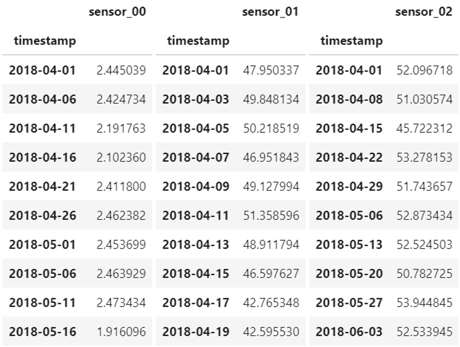
Figure 1.10 – Multivariate time series with misaligned timestamps
There are three approaches you can take, and this will depend on the actual processing and learning process you will set up further down the road. You could do one of the following:
- Leave each time series in its own file with its own timestamps. This leaves your dataset untouched but will force you to consider a more flexible data structure when you want to feed it into an ML system.
- Resample every time series to a common sampling rate and concatenate the different files by inserting each time series as a column in your table. This will be easier to manipulate and process but you won't be dealing with your raw data anymore. In addition, if your contextual data also provides timestamps (to separate each batch of a manufactured product, for instance), you will have to take them into account (one approach could be to slice your data to have time series per batch and resample and assemble your dataset as a second step).
- Merge all the time series and forward fill every missing value created at the merge stage (see all the NaN values in the following screenshot). This process is more compute-intensive, especially when your timestamps are irregular:
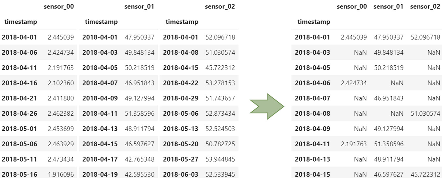
Figure 1.11 – Merging time series with misaligned timestamps
Storage considerations
The format used to store the time series data itself can vary and will have its own benefits or challenges. The following list exposes common formats and the Python libraries that can help tackle them:
- Comma-separated values (CSV): One of the most common and—unfortunately—least efficient formats to deal with when it comes to storing time series data. If you need to read or write time series data multiple times (for instance, during EDA), it is highly recommended to transform your CSV file into another more efficient format. In Python, you can read and write CSV files with pandas (read_csv and to_csv), and NumPy (genfromtxt and savetxt).
- Microsoft Excel (XLSX): In Python, you can read and write Excel files with pandas (read_excel and to_excel) or dedicated libraries such as openpyxl or xlsxwriter. At the time of this writing, Microsoft Excel is limited to 1,048,576 rows (220) in a single file. When your dataset covers several files and you need to combine them for further processing, sticking to Excel can generate errors that are difficult to pinpoint further down the road. As with CSV, it is highly recommended to transform your dataset into another format if you plan to open and write it multiple times during your dataset lifetime.
- Parquet: This is a very efficient column-oriented storage format. The Apache Arrow project hosts several libraries that offer great performance to deal with very large files. Writing a 5 gigabyte (GB) CSV file can take up to 10 minutes, whereas the same data in Parquet will take up around 3.5 GB and be written in 30 seconds. In Python, Parquet files and datasets can be managed by the pyarrow.parquet module.
- Hierarchical Data Format 5 (HDF5): HDF5 is a binary data format dedicated to storing huge amounts of numerical data. With its ability to let you slice multi-terabyte datasets on disk to bring only what you need in memory, this is a great format for data exploration. In Python, you can read and write HDF5 files with pandas (read_hdf and to_hdf) or the h5py library.
- Databases: Your time series might also be stored in general-purpose databases (that you will query using standard Structured Query Language (SQL) languages) or may be purpose-built for time series such as Amazon Timestream or InfluxDB. Column-oriented databases or scalable key-value stores such as Cassandra or Amazon DynamoDB can also be used while taking benefit from anti-patterns useful for storing and querying time series data.
Data quality
As with any other type of data, time series can be plagued by multiple data quality issues. Missing data (or Not-a-Number values) can be filled in with different techniques, including the following:
- Replace missing data points by the mean or median of the whole time series: the fancyimpute (http://github.com/iskandr/fancyimpute) library includes a SimpleFill method that can tackle this task.
- Using a rolling window of a reasonable size before replacing missing data points by the average value: the impyute module (https://impyute.readthedocs.io) includes several methods of interest for time series such as moving_window to perform exactly this.
- Forward fill missing data points by the last known value: This can be a useful technique when the data source uses some compression scheme (an industrial historian system such as OSIsoft PI can enable compression of the sensor data it collects, only recording a data point when the value changes). The pandas library includes functions such as Series.fillna whereby you can decide to backfill, forward fill, or replace a missing value with a constant value.
- You can also interpolate values between two known values: Combined with a resampling to align every timestamp for multivariate situations, this yields a robust and complete dataset. You can use the Series.interpolate method from pandas to achieve this.
For all these situations, we highly recommend plotting and comparing the original and resulting time series to ensure that these techniques do not negatively impact the overall behavior of your time series: imputing data (especially interpolation) can make outliers a lot more difficult to spot, for instance.
Important note
Imputing scattered missing values is not mandatory, depending on the analysis you want to perform—for instance, scattered missing values may not impair your ability to understand a trend or forecast future values of a time series. As a matter of fact, wrongly imputing scattered missing values for forecasting may bias the model if you use a constant value (say, zero) to replace the holes in your time series. If you want to perform some anomaly detection, a missing value may actually be connected to the underlying reason of an anomaly (meaning that the probability of a value being missing is higher when an anomaly is around the corner). Imputing these missing values may hide the very phenomena you want to detect or predict.
Other quality issues can arise regarding timestamps: an easy problem to solve is the supposed monotonic increase. When timestamps are not increasing along with your time series, you can use a function such as pandas.DataFrame.sort_index or pandas.DataFrame.sort_values to reorder your dataset correctly.
Duplicated timestamps can also arise. When they are associated with duplicated values, using pandas.DataFrame.duplicated will help you pinpoint and remove these errors. When the sampling rate is lesser or equal to an hour, you might see duplicate timestamps with different values: this can happen around daylight saving time changes. In some countries, time moves forward by an hour at the start of summer and back again in the middle of the fall—for example, Paris (France) time is usually Central European Time (CET); in summer months, Paris falls into Central European Summer Time (CEST). Unfortunately, this usually means that you have to discard all the duplicated values altogether, except if you are able to replace the timestamps with their equivalents, including the actual time zone they were referring to.
Data quality at scale
In production systems where large volumes of data must be processed at scale, you may have to leverage distribution and parallelization frameworks such as Dask, Vaex, or Ray. Moreover, you may have to move away from Python altogether: in this case, services such as AWS Glue, AWS Glue DataBrew, and Amazon Elastic MapReduce (Amazon EMR) will provide you a managed platform to run your data transformation pipeline with Apache Spark, Flink, or Hive, for instance.
Visualization challenges
Taking a sneak peek at a time series by reading and displaying the first few records of a time series dataset can be useful to make sure the format is the one expected. However, more often than not, you will want to visualize your time series data, which will lead you into an active area of research: how to transform a time series dataset into a relevant visual representation.
Here are some key challenges you will likely encounter:
- Plotting a high number of data points
- Preventing key events from being smoothed out by any resampling
- Plotting several time series in parallel
- Getting visual cues from a massive amount of time series
- Uncovering multiple scales behavior across long time series
- Mapping labels and metadata on time series
Let's have a look at different techniques and approaches you can leverage to tackle these challenges.
Using interactive libraries to plot time series
Raw time series data is usually visualized with line plots: you can easily achieve this in Microsoft Excel or in a Jupyter notebook (thanks to the matplotlib library with Python, for instance). However, bringing long time series in memory to plot them can generate heavy files and images difficult or long to render, even on powerful machines. In addition, the rendered plots might consist of more data points than what your screen can display in terms of pixels. This means that the rendering engine of your favorite visualization library will smooth out your time series. How do you ensure, then, that you do not miss the important characteristics of your signal if they happen to be smoothed out?
On the other hand, you could slice a time series to a more reasonable time range. This may, however, lead you to inappropriate conclusions about the seasonality, the outliers to be processed, or potential missing values to be imputed on certain time ranges outside of your scope of analysis.
This is where interactive visualization comes in. Using such a tool will allow you to load a time series, zoom out to get the big picture, zoom in to focus on certain details, and pan a sliding window to visualize a movie of your time series while keeping full control of the traveling! For Python users, libraries such as plotly (http://plotly.com) or bokeh (http://bokeh.org) are great options.
Plotting several time series in parallel
When you need to plot several time series and understand how they evolve with regard to each other, you have different options depending on the number of signals you want to visualize and display at once. What is the best representation to plot several time series in parallel? Indeed, different time series will likely have different ranges of possible values, and we only have two axes on a line plot.
If you have just a couple of time series, any static or interactive line plot will work. If both time series have a different range of values, you can assign a secondary axis to one of them, as illustrated in the following screenshot:
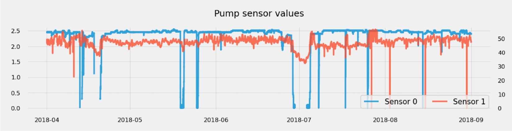
Figure 1.12 – Visualizing a low number of plots
If you have more than two time series and fewer than 10 to 20 that have similar ranges, you can assign a line plot to each of them in the same context. It is not too crowded yet, and this will allow you to detect any level shifts (when all signals go through a sudden significant change). If the range of possible values each time series takes is widely different from one another, a solution is to normalize them by scaling them all to take values comprised between 0.0 and 1.0 (for instance). The scikit-learn library includes methods that are well known by ML practitioners for doing just this (check out the sklearn.preprocessing.Normalizer or the sklearn.preprocessing.StandardScaler methods).
The following screenshot shows a moderate number of plots being visualized:

Figure 1.13 – Visualizing a moderate number of plots
Even though this plot is a bit too crowded to focus on the details of each signal, we can already pinpoint some periods of interest.
Let's now say that you have hundreds of time series. Is it possible to visualize hundreds of time series in parallel to identify shared behaviors across a multivariate dataset? Plotting all of them on a single chart will render it too crowded and definitely unusable. Plotting each signal in its own line plot will occupy a prohibitive real estate and won't allow you to spot time periods when many signals were impacted at once.
This is where strip charts come in. As you can see in the following screenshot, transforming a single-line plot into a strip chart makes the information a lot more compact:

Figure 1.14 – From a line plot to a strip chart
The trick is to bin the values of each time series and to assign a color to each bin. You could decide, for instance, that low values will be red, average values will be orange, and high values will be green. Let's now plot the 52 signals from the previous water pump example over 5 years with a 1-minute resolution. We get the following output:
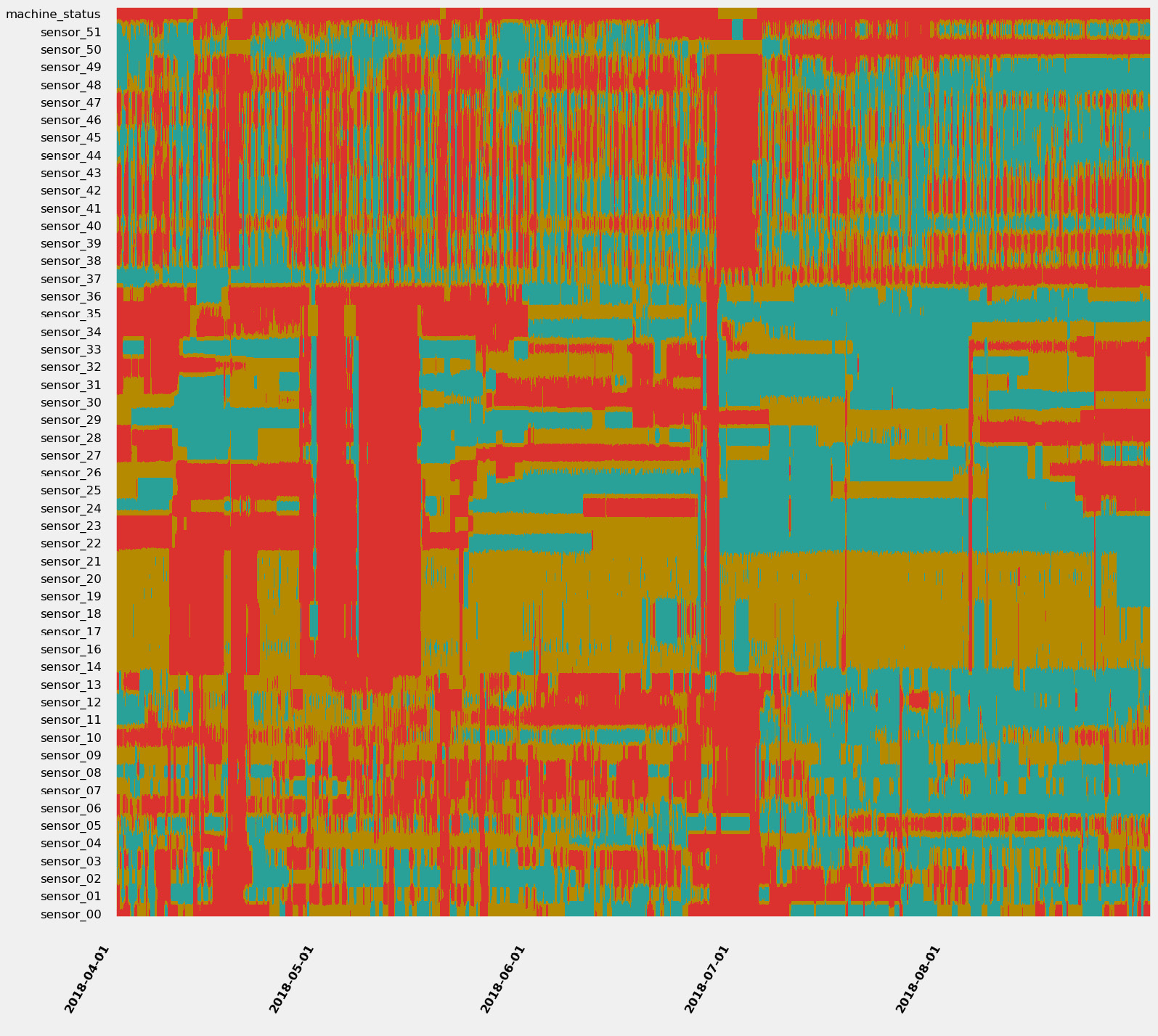
Figure 1.15 – 11.4 million data points at a single glance
Do you see some patterns you would like to investigate? I would definitely isolate the red bands (where many, if not all, signals are evolving in their lowest values) and have a look at what is happening between early May or at the end of June (where many signals seem to be at their lowest). For more details about strip charts and in-depth demonstration, you can refer to the following article: https://towardsdatascience.com/using-strip-charts-to-visualize-dozens-of-time series-at-once-a983baabb54f
Enabling multiscale exploration
If you have very long time series, you might want to find interesting temporal patterns that may be harder to catch than the usual weekly, monthly, or yearly seasonality. Detecting patterns is easier if you can adjust the time scale at which you are looking at your time series and the starting point. A great multiscale visualization is the Pinus view, as outlined in this paper: http://dx.doi.org/10.1109/TVCG.2012.191.
The approach of the author of this paper makes no assumption about either time scale or the starting points. This makes it easier to identify the underlying dynamics of complex systems.
Behavioral challenges
Every time series encodes multiple underlying behaviors in a sequence of measurements. Is there a trend, a seasonality? Is it a chaotic random walk? Does it sport major shifts in successive segments of time? Depending on the use case, we want to uncover and isolate very specific behaviors while discarding others.
In this section, we are going to review what time series stationarity and level shifts are, how to uncover these phenomena, and how to deal with them.
Stationarity
A given time series is said to be stationary if its statistical mean and variance are constant and its covariance is independent of time when we take a segment of the series and shift it over the time axis.
Some use cases require the usage of parametric methods: such a method considers that the underlying process has a structure that can be described using a small number of parameters. For instance, the autoregressive integrated moving average (ARIMA) method (detailed later in Chapter 7, Improving and Scaling Your Forecast Strategy) is a statistical method used to forecast future values of a time series: as with any parametric method, it assumes that the time series is stationary.
How do you identify if your time series is non-stationary? There are several techniques and statistical tests (such as the Dickey-Fuller test). You can also use an autocorrelation plot. Autocorrelation measures the similarity between data points of a given time series as a function of the time lag between them.
You can see an example of some autocorrelation plots here:

Figure 1.16 – Autocorrelation plots (on the left) for different types of signal
Such a plot can be used to do the following:
- Detect seasonality: If the autocorrelation plot has a sinusoidal shape and you can find a period on the plot, this will give you the length of the season. Seasonality is indeed the periodic fluctuation of the values of your time series. This is what can be seen on the second plot in Figure 1.16 and, to a lesser extent, on the first plot (the pump sensor data).
- Assess stationarity: Stationary time series will have an autocorrelation plot that drops quickly to zero (which is the case of the energy consumption time series), while a non-stationary process will see a slow decrease of the same plot (see the daily temperature signal in Figure 1.16).
If you have seasonal time series, an STL procedure (which stands for seasonal-trend decomposition based on Loess) has the ability to split your time series into three underlying components: a seasonal component, a trend component, and the residue (basically, everything else!), as illustrated in the following screenshot:

Figure 1.17 – Seasonal trend decomposition of a time series signal
You can then focus your analysis on the component you are interested in: characterizing the trends, identifying the underlying seasonal characteristics, or performing raw analysis on the residue.
If the time series analysis you want to use requires you to make your signals stationary, you will need to do the following:
- Remove the trend: To stabilize the mean of a time series and eliminate a trend, one technique that can be used is differencing. This simply consists of computing the differences between consecutive data points in the time series. You can also fit a linear regression model on your data and subtract the trend line found from your original data.
- Remove any seasonal effects: Differencing can also be applied to seasonal effects. If your time series has a weekly component, removing the value from 1 week before (lag difference of 1 week) will effectively remove this effect from your time series.
Level shifts
A level shift is an event that triggers a shift in the statistical distribution of a time series at a given point in time. A time series can see its mean, variance, or correlation suddenly shift. This can happen for both univariate and multivariate datasets and can be linked to an underlying change of the behavior measured by the time series. For instance, an industrial asset can have several operating modes: when the machine switches from one operating mode to another, this can trigger a level shift in the data captured by the sensors that are instrumenting the machine.
Level shifts can have a very negative impact on the ability to forecast time series values or to properly detect anomalies in a dataset. This is one of the key reasons why a model's performance starts to drift suddenly at prediction time.
The ruptures Python package offers a comprehensive overview of different change-point-detection algorithms that are useful for spotting and segmenting a time series signal as follows:

Figure 1.18 – Segments detected on the weather temperature with a binary segmentation approach
It is generally not suitable to try to remove level shifts from a dataset: detecting them properly will help you assemble the best training and testing datasets for your use case. They can also be used to label time series datasets.
Missing insights and context
A key challenge with time series data for most use cases is the missing context: we might need some labels to associate a portion of the time series data with underlying operating modes, activities, or the presence of anomalies or not. You can either use a manual or an automated approach to label your data.
Manual labeling
Your first option will be to manually label your time series. You can build a custom labeling template on Amazon SageMaker Ground Truth (https://docs.aws.amazon.com/sagemaker/latest/dg/sms-custom-templates.html) or install an open source package such as the following:
- Label Studio (https://labelstud.io): This open source project hit the 1.0 release in May 2021 and is a general-purpose labeling environment that happens to include time series annotation capabilities. It can natively connect to datasets stored in Amazon S3.
- TRAINSET (https://github.com/geocene/trainset): This is a very lightweight labeling tool exclusively dedicated to time series data.
- Grafana (https://grafana.com/docs/grafana/latest/dashboards/annotations): Grafana comes with a native annotation tool available directly from the graph panel or through their hyper text transfer protocol (HTTP) application programming interface (API).
- Curve (https://github.com/baidu/Curve): Currently archived at the time of writing this book.
Providing reliable labels on time series data generally requires significant effort from subject-matter experts (SMEs) who may not have enough availability to perform this task. Automating your labeling process could then be an option to investigate.
Automated labeling
Your second option is to perform automatic labeling of your datasets. This can be achieved in different ways depending on your use cases. You could do one of the following:
- You can use change-point-detection algorithms to detect different activities, modes, or operating ranges. The ruptures Python package is a great starting point to explore the change-point-detection algorithms.
- You can also leverage unsupervised anomaly scoring algorithms such as scikit-learn Isolation Forest (sklearn.ensemble.IsolationForest), the Random Cut Forest built-in algorithm from Amazon SageMaker (https://docs.aws.amazon.com/sagemaker/latest/dg/randomcutforest.html), or build a custom deep learning (DL) neural network based on an autoencoder architecture.
- You can also transform your time series (see the different analysis approaches in the next section): tabular, symbolic, or imaging techniques will then let you cluster your time series and identify potential labels of interest.
Depending on the dynamics and complexity of your data, automated labeling can actually require additional verification to validate the quality of the generated labels. Automated labeling can be used to kick-start a manual labeling process with prelabelled data to be confirmed by a human operator.
Selecting an analysis approach
By now, we have met the different families of time series-related datasets, and we have listed key potential challenges you may encounter when processing them. In this section, we will describe the different approaches we can take to analyze time series data.
Using raw time series data
Of course, the first and main way to perform time series analysis is to use the raw time sequences themselves, without any drastic transformation. The main benefit of this approach is the limited amount of preprocessing work you have to perform on your time series datasets before starting your actual analysis.
What can we do with these raw time series? We can leverage Amazon SageMaker and leverage the following built-in algorithms:
- Random Cut Forest: This algorithm is a robust cousin from the scikit-learn Isolation Forest algorithm and can compute an anomaly score for each of your data points. It considers each time series as a univariate one and cannot learn any relationship or global behavior from multiple or multivariate time series.
- DeepAR: This probabilistic forecasting algorithm is a great fit if you have hundreds of different time series that you can leverage to predict their future values. Not only does this algorithm provide you with point prediction (several single values over a certain forecast horizon), but it can also predict different quantiles, making it easier to answer questions such as: Given a confidence level of 80% (for instance), what boundary values will my time series take in the near future?
In addition to these built-in algorithms, you can of course bring your favorite packages to Amazon SageMaker to perform various tasks such as forecasting (by bringing in Prophet and NeuralProphet libraries) or change-point detection (with the ruptures Python package, for instance).
The following three AWS services we dedicate a part to in this book also assume that you will provide raw time series datasets as inputs:
- Amazon Forecast: To perform time series forecasting
- Amazon Lookout for Equipment: To deliver anomalous event forewarning usable to improve predictive maintenance practices
- Amazon Lookout for Metrics: To detect anomalies and help in root-cause analysis (RCA)
Other open source packages and AWS services can process transformed time series datasets. Let's now have a look at the different transformations you can apply to your time series.
Summarizing time series into tabular datasets
The first class of transformation you can apply to a time series dataset is to compact it by replacing each time series with some metrics that characterize it. You can do this manually by taking the mean and median of your time series or computing standard deviation. The key objective in this approach is to simplify the analysis of a time series by transforming a series of data points into one or several metrics. Once summarized, your insights can be used to support your EDA or build classification pipelines when new incoming time series sequences are available.
You can perform this summarization manually if you know which features you would like to engineer, or you can leverage Python packages such as the following:
- tsfresh: (http://tsfresh.com)
- hctsa: (https://github.com/benfulcher/hctsa)
- featuretools: (https://www.featuretools.com)
- Cesium: (http://cesium-ml.org)
- FATS: (http://isadoranun.github.io/tsfeat)
These libraries can take multiple time series as input and compute hundreds, if not thousands, of features for each of them. Once you have a traditional tabular dataset, you can apply the usual ML techniques to perform dimension reduction, uncover feature importance, or run classification and clustering techniques.
By using Amazon SageMaker, you can access well-known algorithms that have been adapted to benefit from the scalability offered by the cloud. In some cases, they have been rewritten from scratch to enable linear scalability that makes them practical on huge datasets! Here are some of them:
- Principal Component Analysis (PCA): This algorithm can be used to perform dimensionality reductions on the obtained dataset (https://docs.aws.amazon.com/sagemaker/latest/dg/pca.html).
- K-Means: This is an unsupervised algorithm where each row will correspond to a single time series and each computed attribute will be used to compute a similarity between the time series (https://docs.aws.amazon.com/sagemaker/latest/dg/k-means.html).
- K-Nearest Neighbors (KNN): This is another algorithm that benefits from a scalable implementation. Once your time series has been transformed into a tabular dataset, you can frame your problem either as a classification or a regression problem and leverage KNN (https://docs.aws.amazon.com/sagemaker/latest/dg/k-nearest-neighbors.html).
- XGBoost: This is the Swiss Army knife of many data scientists and is a well-known algorithm to perform supervised classification and regression on tabular datasets (https://docs.aws.amazon.com/sagemaker/latest/dg/xgboost.html).
You can also leverage Amazon SageMaker and bring your custom preprocessing and modeling approaches if the built-in algorithms do not fit your purpose. Interesting approaches could be more generalizable dimension reduction techniques (such as Uniform Manifold Approximation and Projection (UMAP) or t-distributed stochastic neighbor embedding (t-SNE) and other clustering techniques such as Hierarchical Density-Based Spatial Clustering of Applications with Noise (HDBSCAN)). Once you have a tabular dataset, you can also apply and neural network-based approaches for both classification and regression.
Using imaging techniques
A time series can also be transformed into an image: this allows you to leverage the very rich field of computer vision approaches and architectures. You can leverage the pyts Python package to apply the transformation described in this chapter (https://pyts.readthedocs.io) and, more particularly, the pyts.image submodule.
Once your time series is transformed into an image, you can leverage many techniques to learn about it, such as the following:
- Use convolutional neural networks (CNN) architectures to learn valuable features and build such custom models on Amazon SageMaker or use its built-in image classification algorithm.
- Leverage Amazon Rekognition Custom Labels to rapidly build models that can rapidly classify different behaviors that would be highlighted by the image transformation process.
- Use Amazon Lookout for Vision to perform anomaly detection and classify which images are representative of an underlying issue captured in the time series.
Let's now have a look at the different transformations we can apply to our time series and what they can let you capture about their underlying dynamics. We will deep dive into the following:
- Recurrence plots
- Gramian angular fields
- Markov transition fields (MTF)
- Network graphs
Recurrence plots
A recurrence is a time at which a time series returns back to a value it has visited before. A recurrence plot illustrates the collection of pairs of timestamps at which the time series is at the same place—that is, the same value. Each point can take a binary value of 0 or 1. A recurrence plot helps in understanding the dynamics of a time series and such recurrence is closely related to dynamic non-linear systems. An example of recurrence plots being used can be seen here:

Figure 1.19 – Spotting time series dynamics with recurrence plots
A recurrence plot can be extended to multivariate datasets by taking the Hadamard product of each plot (matrix multiplication term by term).
Gramian angular fields
This representation is built upon the Gram matrix of an encoded time series. The detailed process would need you to scale your time series, convert it to polar coordinates (to keep the temporal dependency), and then you would compute the Gram matrix of the different time intervals.
Each cell of a Gram matrix is the pairwise dot-products of every pair of values in the encoded time series. In the following example, these are the different values of the scaled time series T:

In this case, the same time series encoded in polar coordinates will take each value and compute its angular cosine, as follows:

Then, the Gram matrix is computed as follows:

Let's plot the Gramian angular fields of the same three time series as before, as follows:

Figure 1.20 – Capturing period with Gramian angular fields
Compared to the previous representation (the recurrence plot), the Gramian angular fields are less prone to generate white noise for heavily period signals (such as the pump signal below). Moreover, each point takes a real value and is not limited to 0 and 1 (hence the colored pictures instead of the grayscale ones that recurrence plots can produce).
MTF
MTF is a visualization technique to highlight the behavior of time series. To build an MTF, you can use the pyts.image module. Under the hood, this is the transformation that is applied to your time series:
- Discretization of the time series along with the different values it can take.
- Build a Markov transition matrix.
- Compute the transition probabilities from one timestamp to all the others.
- Reorganize the transition probabilities into an MTF.
- Compute an aggregated MTF.
The following screenshot shows the MTF of the same three time series as before:
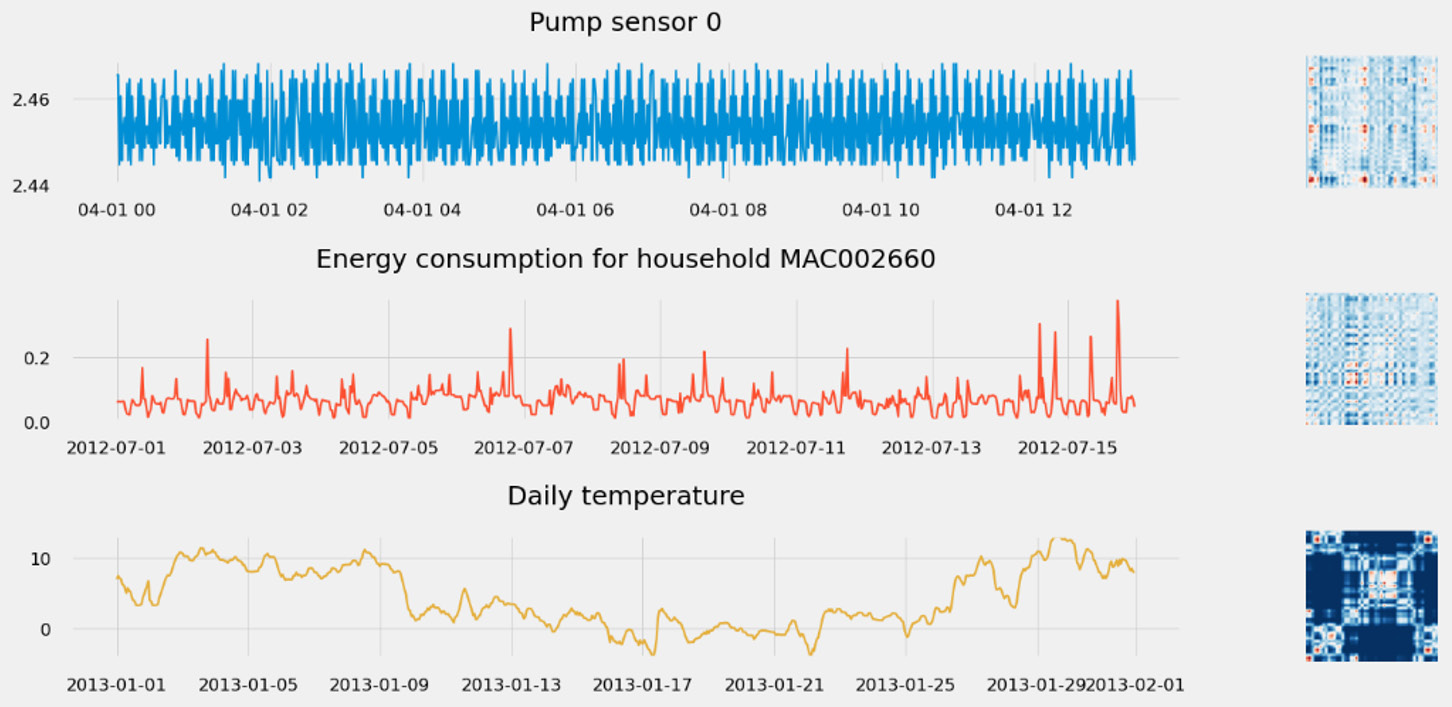
Figure 1.21 – Uncovering time series behavior with MTF
If you're interested in what insights this representation can bring you, feel free to dive deeper into it by walking through this GitHub repository: https://github.com/michaelhoarau/mtf-deep-dive. You can also read about this in detail in the following article: https://towardsdatascience.com/advanced-visualization-techniques-for-time series-analysis-14eeb17ec4b0
Modularity network graphs
From an MTF (see the previous section), we can generate a graph G = (V, E): we have a direct mapping between vertex V and the time index i. From there, there are two possible encodings of interest: flow encoding or modularity encoding. These are described in more detail here:
We map the flow of time to the vertex, using a color gradient from T0 to TN to color each node of the network graph.
We use the MTF weight to color the edges between the vertices.
- Modularity encoding: Modularity is an important pattern in network analysis to identify specific local structures. This is the encoding that I find most useful in time series analysis.
We map the module label (with the community ID) to each vertex with a specific color attached to each community.
We map the size of the vertices to a clustering coefficient.
We map the edge color to the module label of the target vertex.
To build a network graph from the MTF, you can use the tsia Python package. You can check the deep dive available as a Jupyter notebook in this GitHub repository: https://github.com/michaelhoarau/mtf-deep-dive.
A network graph is built from an MTF following this process:
- We compute the MTF for the time series.
- We build a network graph by taking this time series as an entry.
- We compute the partitions and modularity and encode these pieces of information into a network graph representation.
Once again, let's take the three time series previously processed and build their associated network graphs, as follows:

Figure 1.22 – Using network graphs to understand the structure of the time series
There are many features you can engineer once you have a network graph. You can use these features to build a numerical representation of the time series (an embedding). The characteristics you can derive from a network graph include the following:
- Diameter
- Average degree and average weighted degree
- Density
- Average path length
- Average clustering coefficient
- Modularity
- Number of partitions
All these parameters can be derived thanks to the networkx and python-louvain modules.
Symbolic transformations
Time series can also be discretized into sequences of text: this is a symbolic approach as we transform the original real values into symbolic strings. Once your time series are successfully represented into such a sequence of symbols (which can act as an embedding of your sequence), you can leverage many techniques to extract insights from them, including the following:
- You can use embedding for indexing use cases: given the embedding of a query time series, you can measure some distance to the collection of embeddings present in a database and return the closest matching one.
- Symbolic approaches transform real-value sequences of data into discrete data, which opens up the field of possible techniques—for instance, using suffix trees and Markov chains to detect novel or anomalous behavior, making it a relevant technique for anomaly detection use cases.
- Transformers and self-attention have triggered tremendous progress in natural language processing (NLP). As time series and natural languages are sometimes considered close due to their sequential nature, we are seeing a more and more mature implementation of the transformer architecture for time series classification and forecasting.
You can leverage the pyts Python package to apply the transformation described in this chapter (https://pyts.readthedocs.io) and Amazon SageMaker to bring the architecture described previously as custom models. Let's now have a look at the different symbolic transformations we can apply to our time series. In this section, we will deep dive into the following:
- Bag-of-words representations (BOW)
- Bag of symbolic Fourier approximations (BOSS)
- Word extraction for time series classification (WEASEL)
BOW representations (BOW and SAX-VSM)
The BOW approach applies a sliding window over a time series and can transform each subsequence into a word using symbolic aggregate approximation (SAX). SAX reduces a time series into a string of arbitrary lengths. It's a two-step process that starts with a dimensionality reduction via piecewise aggregate approximation (PAA) and then a discretization of the obtained simplified time series into SAX symbols. You can leverage the pyts.bag_of_words.BagOfWords module to build the following representation:

Figure 1.23 – Example of SAX to transform a time series
The BOW approach can be modified to leverage term frequency-inverse document frequency (TF-IDF) statistics. TF-IDF is a statistic that reflects how important a given word is in a corpus. SAX-VSM (SAX in vector space model) uses this statistic to link it to the number of times a symbol appears in a time series. You can leverage the pyts.classification.SAXVSM module to build this representation.
Bag of SFA Symbols (BOSS and BOSS VS)
The BOSS representation uses the structure-based representation of the BOW method but replaces PAA/SAX with a symbolic Fourier approximation (SFA). It is also possible to build upon the BOSS model and combine it with the TF-IDF model. As in the case of SAX-VSM, BOSS VS uses this statistic to link it to the number of times a symbol appears in a time series. You can leverage the pyts.classification.BOSSVS module to build this representation.
Word extraction for time series classification (WEASEL and WEASEL-MUSE)
The WEASEL approach builds upon the same kind of bag-of-pattern models as BOW and BOSS described just before. More precisely, it uses SFA (like the BOSS method). The windowing step is more flexible as it extracts them at multiple lengths (to account for patterns with different lengths) and also considers their local order instead of considering each window independently (by assembling bigrams, successive words, as features).
WEASEL generates richer feature sets than the other methods, which can lead to reduced signal-to-noise and high-loss information. To mitigate this, WEASEL starts by applying Fourier transforms on each window and uses an analysis of variance (ANOVA) f-test and information gain binning to choose the most discriminate Fourier coefficients. At the end of the representation generation pipeline, WEASEL also applies a Chi-Squared test to filter out less relevant words generated by the bag-of-patterns process.
You can leverage the pyts.transformation.WEASEL module to build this representation. Let's build the symbolic representations of the different time series of the heartbeats time series. We will keep the same color code (red for ischemia and blue for normal). The output can be seen here:

Figure 1.24 – WEASEL symbolic representation of heartbeats
The WEASEL representation is suited to univariate time series but can be extended to multivariate ones by using the WEASEL+MUSE algorithm (MUSE stands for Multivariate Unsupervised Symbols and dErivatives). You can leverage the pyts.multivariate.transformation.WEASELMUSE module to build this representation.
This section comes now to an end, and you should now have a hint on how rich time series analysis methodologies can be. With that in mind, we will now see how we can apply this fresh knowledge to solve different time series-based use cases.
Typical time series use cases
Until this point, we have exposed many different considerations about the types, challenges, and analysis approaches you have to deal with when it comes to processing time series data. But what can we do with time series? What kind of insights can we derive from them? Recognizing the purpose of your analysis is a critical step in designing an appropriate approach for your data preparation activities or understanding how the insights derived from your analysis can be used by your end users. For instance, removing outliers from a time series can improve a forecasting analysis but makes any anomaly detection approach a moot point.
Typical use cases where time series datasets play an important—if not the most important role—can be any of these:
- Forecasting
- Anomaly detection
- Event forewarning (anomaly prediction)
- Virtual sensors
- Activity detection (pattern analysis)
- Predictive quality
- Setpoint optimization
In the next three parts of this book, we are going to focus on forecasting (with Amazon Forecast), anomaly detection (with Amazon Lookout for Metrics), and multivariate event forewarning (using Amazon Lookout for Equipment to output detected anomalies that can then be analyzed over time to build anomaly forewarning notifications).
The remainder of this chapter will be dedicated to an overview of what else you can achieve using time series data. Although you can combine the AWS services exposed in this book to achieve part of what is necessary to solve these problems, a good rule of thumb is to consider that it won't be straightforward, and other approaches may yield a faster time to gain insights.
Virtual sensors
Also called soft sensors, this type of model is used to infer the calculation of a physical measurement with an ML model. Some harsh environments may not be suitable to install actual physical sensors. In other cases, there are no reliable physical sensors to measure the physical characteristics you are interested in (or a physical sensor does not exist altogether). Last but not least, sometimes you need a real-time measurement to manage your process but can only get one daily measure.
A virtual sensor uses a multivariate time series (all the other sensors available) to yield current or predicted values for the measurement you cannot get directly, at a useful granularity.
On AWS, you can do the following:
- Build a custom model with the DeepAR built-in algorithm from Amazon SageMaker (https://docs.aws.amazon.com/sagemaker/latest/dg/deepar.html)
- Leverage the DeepAR architecture or the DeepVAR one (a multivariate variant of DeepAR) from the GluonTS library (http://ts.gluon.ai), a library open sourced and maintained by AWS
Activity detection
When you have segments of univariate or multivariate time series, you may want to perform some pattern analysis to derive the exact actions that led to them. This can be useful to perform human activity recognition based on accelerometer data as captured by your phone (sports mobile applications automatically able to tell if you're cycling, walking, or running) or to understand your intent by analyzing brainwave data.
Many DL architectures can tackle this motif discovery task (long short-term memory (LSTM), CNN, or a combination of both): alternative approaches let you transform your time series into tabular data or images to apply clustering and classification techniques. All of these can be built as custom models on Amazon SageMaker or by using some of the built-in scalable algorithms available in this service, such as the following:
- PCA: https://docs.aws.amazon.com/sagemaker/latest/dg/pca.html
- XGBoost
- Image classification
If you choose to transform your time series into images, you can also leverage Amazon Rekognition Custom Labels for classification or Amazon Lookout for Vision to perform anomaly detection.
Once you have an existing database of activities, you can also leverage an indexing approach: in this case, building a symbolic representation of your time series will allow you to use it as an embedding to query similar time series in a database, or even past segments of the same time series if you want to discover potential recurring motifs.
Predictive quality
Imagine that you have a process that ends up with a product or service with a quality that can vary depending on how well the process was executed. This is typically what can happen on a manufacturing production line where equipment sensors, process data, and other tabular characteristics can be measured and matched to the actual quality of the finished goods.
You can then use all these time series to build a predictive model that tries to predict if the current batch of products will achieve the appropriate quality grade or if it will have to be reworked or thrown away as waste.
Recurring neural networks (RNNs) are traditionally what is built to address this use case. Depending on how you shape your available dataset, you might however be able to use either Amazon Forecast (using the predicted quality or grade of the product as the main time series to predict and all the other available data as related time series) or Amazon Lookout for Equipment (by considering bad product quality as anomalies for which you want to get as much forewarning as possible).
Setpoint optimization
In process industries (industries that transform raw materials into finished goods such as shampoo, an aluminum coil, or a piece of furniture), setpoints are the target value of a process variable. Imagine that you need to keep the temperature of a fluid at 50°C; then, your setpoint is 50°C. The actual value measured by the process might be different and the objective of process control systems is to ensure that the process value reaches and stays at the desired setpoint.
In such a situation, you can leverage the time series data of your process to optimize an outcome: for instance, the quantity of waste generated, the energy or water used, or the change to generate a higher grade of product from a quality standpoint (see the previous predictive quality use case for more details). Based on the desired outcome, you can then use an ML approach to recommend setpoints that will ensure you reach your objectives.
Potential approaches to tackle this delicate optimization problem include the following:
- Partial least squares (PLS) and Sparse PLS
- DL-based model predictive control (MPC), which combines neural-network-based controllers and RNNs to replicate the dynamic behavior of an MPC.
- RL with fault-tolerant control through quality learning (Q-learning)
The output expected for such models is the setpoint value for each parameter that controls the process. All these approaches can be built as custom models on Amazon SageMaker (which also provides an RL toolkit and environment in case you want to leverage Q-learning to solve this use case).
Summary
Although every time series looks alike (a tabular dataset indexed by time), choosing the right tools and approaches to frame a time series problem is critical to successfully leverage ML to uncover business insights.
After reading this chapter, you understand how time series can vastly differ from one another and you should have a good command of the families of preprocessing, transformation, and analysis techniques that can help derive insights from time series datasets. You also have an overview of the different AWS services and open source packages you can leverage to help you in your endeavor. After reading this chapter, you can now recognize how rich this domain is and the numerous options you have to process and analyze your time series data.
In the next three parts of this book, we are going to abstract away most of these choices and options by leveraging managed services that will do most of the heavy lifting for you. However, it is key to have a good command of these concepts to develop the right understanding of what is going on under the hood. This will also help you make the right choices whenever you have to tackle a new use case.
We will start with the most popular time series problem we want to solve with time series forecasting, with Amazon Forecast.