
5
Measuring the Process and Solution
We measure to see how far our efforts have progressed. This measurement has multiple dimensions. We examine whether we are achieving Lean flow and delivering work properly. Following that, we deploy the work to see if the changes work in the environment and whether the environment is safe. Finally, we gauge whether the changes created add value and are worthy of continued development.
In this chapter, we will look at the measurements used to answer the questions posed above. We will look at metrics to determine the following:
- Whether we are on track to deliver the solution
- The health of our environments before and after our solution is delivered
- Whether our solution is delivering on hypothesized value
Measuring solution delivery
In Chapter 4, Leveraging Lean Flow to Keep the Work Moving, we looked at practices to establish and maintain Lean flow. We need metrics to evaluate whether we have achieved that Lean flow and whether we can be predictable in our commitments.
Common metrics to evaluate Lean flow are outlined in the following list:
- Cycle time
- WIP
- Throughput
- Blockers or bottlenecks in the process
A useful tool to obtain these metrics is a cumulative flow diagram. We will take a close look at a cumulative flow diagram to find these metrics.
Cycle time
For a value stream, cycle time is the time it takes for a piece of work to be delivered after it has been accepted and goes through the entire development process.
We saw in Chapter 4, Leveraging Lean Flow to Keep the Work Moving, the many factors that can affect cycle time. These factors included too much WIP, large batch sizes, high utilization, and variability.
Another factor that can affect cycle time is if there is waste in the development process. This waste may come in the form of delays or wait times as work gets handed off from one phase to the next.
Regular measurement of cycle time allows us to see how long it takes for a value stream to deliver work. Increases in cycle time can allow us to determine if the root cause is one of the factors mentioned. Once determined, corrective steps can be taken to put cycle time back to its previous length of time.
Lead time
Lead time and cycle time are frequently confused with each other. The big difference between them is the perspective: while lead time is from the customer’s perspective, cycle time is from the perspective of the value stream and is an internal metric.
Lead time is the length of time a customer waits for delivery of an item of work after a request for that work. As shown in the following diagram, lead time is made up of cycle time as well as any wait time for the value stream to accept and start the work.
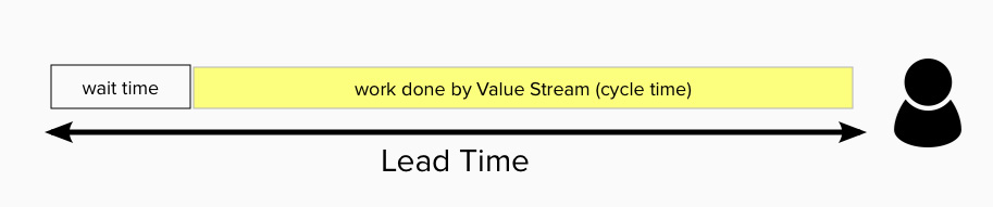
Figure 5.1 – Illustration of cycle time and lead time
From the preceding illustration, we can improve two times to improve the lead time. We could improve the wait time or we could improve the cycle time. Most organizations strive to improve cycle times with the added benefit of improving the lead time.
WIP
By now, we should be familiar with WIP or Work in Progress/Process as the work that a value stream has started but not finished. We have seen the ill effects and consequences of too much WIP.
WIP is visible on the Kanban board shown in the following illustration.
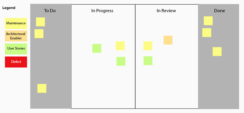
Figure 5.2 – Kanban board with WIP highlighted
In the preceding example, we can count the items and determine our WIP is six.
Throughput
Up to this point, we have looked at metrics that are units, either of time or quantity. Throughput is the only metric we look at that is basically a rate. In other words, how much work is accomplished in a given unit of time.
Throughput is basically the number of units of work completed in a set period of time. Scrum practitioners know of this metric as velocity: the sum total of story points for stories completed in a sprint (a fixed period of time; often two weeks). Other Agile methodologies look at other units of work (stories, features, etc.) delivered per standard unit of time (week, month).
We can see that cycle time has an inverse relationship with throughput for a value stream. The greater the throughput, the shorter the cycle time.
Blockers and bottlenecks
To ensure Lean flow, we need to find and resolve those impediments that are preventing that flow from occurring. These may be temporary or systemic blocks preventing one or more pieces of work from progressing through the process.
Vigilance on these blockers may require daily checks to see if the blockage is still occurring and escalation if resolving the block has not occurred for several days.
Measuring with cumulative flow diagrams
A cumulative flow diagram is an easy way to examine cycle time, lead time, throughput, and WIP. You can also inspect and find bottlenecks in your process.
The cumulative flow diagram is a graph of the history of work that the value stream works through over time. The x axis of the cumulative flow diagram refers to time. The y axis refers to the count of work. Each band in the cumulative flow diagram refers to a step in the workflow that is derived from columns on a Kanban board. An example cumulative flow diagram follows.
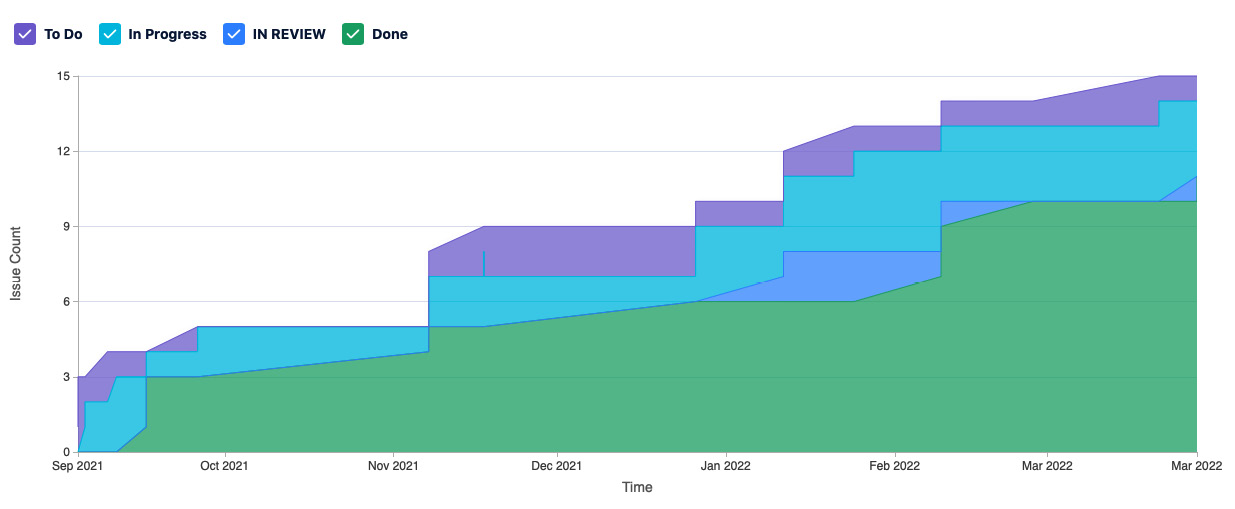
Figure 5.3 – Cumulative flow diagram
In general, we should see the bands move upward and grow from left to right. The entrance and exit lines for a band that represents a process step in the workflow should be roughly parallel in a situation where flow occurs. If the entrance and exit lines grow apart, creating a large growing area, that’s an indicator that a bottleneck exists in that part of the process. We can see such a bottleneck in the following diagram.
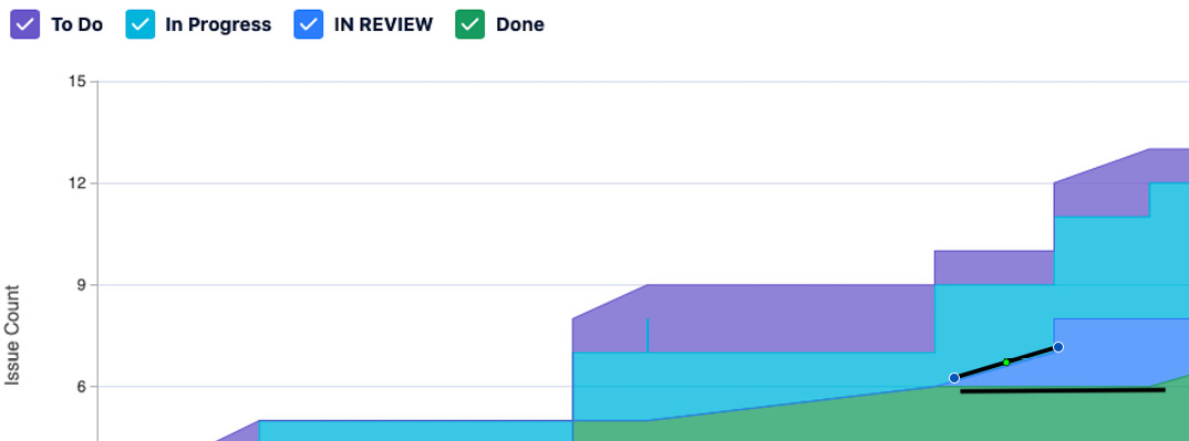
Figure 5.4 – Annotation of bottleneck in cumulative flow diagram
Let’s take a look at how we can use the cumulative flow diagram to measure cycle time, WIP, and throughput.
Measuring WIP with the cumulative flow diagram
To measure the WIP that a value stream has at a given point in time, do the following:
- Start at the point where the boundary between the band corresponding to the Backlog or To Do column and the band corresponding to the first In Progress column resides. In our example, this is the boundary between the To Do band and the In Progress band. We want to look at only the work that has started and, thus, beyond the To Do state.
- Make a note of how many units of work that is.
- Draw a vertical line down through the other bands until you reach the boundary between the band representing the last In Progress column and the band representing the Done column. In our example, we draw the line through the In Progress band and the IN REVIEW band. Make a note of how many units of work that is.
- Subtract the second number from the first number.
The following diagram illustrates the method described.
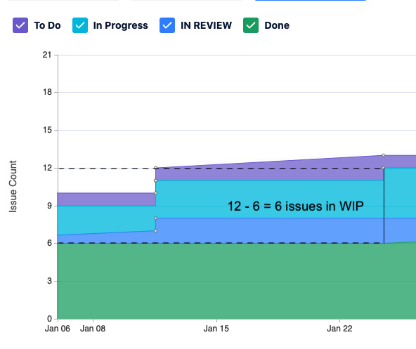
Figure 5.5 – Calculation of WIP
Note that you can use the same method on a smaller scale to find the number of In Progress issues in a single column at a point in time by looking at the two lines that form the band for the column of interest.
Measuring cycle time with the cumulative flow diagram
To measure cycle time, do the following:
- Find and mark a spot when an issue has moved from the band representing the To Do or Backlog column and note its date.
- Draw a horizontal line until you reach the spot where it touches the band representing the Done column. Mark the second date.
- Subtract the first date from the second, and you will get a measure of the cycle time for one issue.
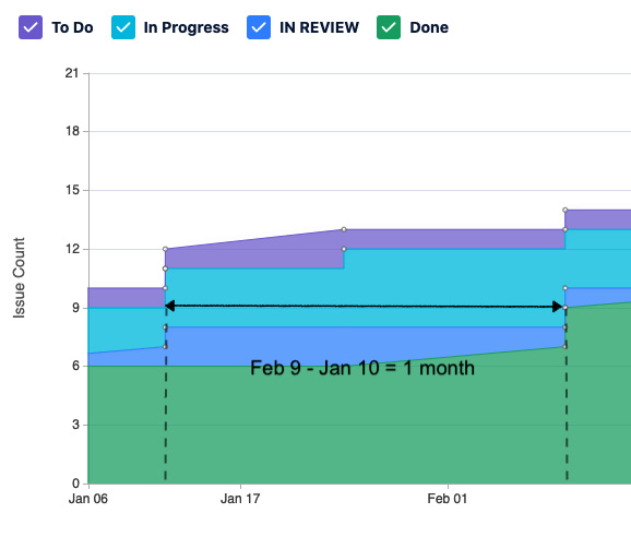
Figure 5.6 – Cycle time calculation
The steps are illustrated in the preceding diagram.
Measuring throughput with the cumulative flow diagram
Throughput on a cumulative flow diagram is done by finding a line and determining its slope:
- Mark one point of the line and make a note of the date and number of issues.
- On a higher point on the line, make a note of the date and number of issues.
- The numerator will be the number of issues on the second point minus the number of issues on the first point.
- The denominator will be the period of time between the two points.
An example of this calculation is shown in the following example.
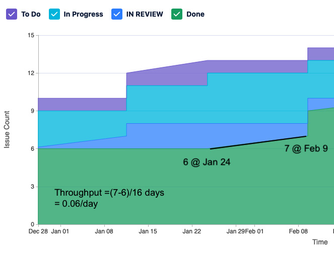
Figure 5.7 – Throughput calculation
Note that areas of no throughput will appear as horizontal lines.
So, for our examples, we have found the following measurements:
- On January 22, our WIP was six issues
- Our cycle time for one issue was one month
- Our throughput for issues moving from IN REVIEW to Done was 0.06/day
Having evaluated the measurements taken to ensure Lean flow and timely delivery of solutions, we need to take a closer look at ensuring that quality is present during deployment and before release. To do this, let’s look at the important measurements to capture from the staging and production environments.
Looking at full stack telemetry
We now turn our attention from the process of developing the product to the product itself. Throughout the development process, we ran testing in our CI/CD pipeline. The passing of those tests is an indication that the product is working as intended. Now, as the product is deployed in multiple environments, we want to ensure proper operation. To do this, we monitor performance in those environments.
Monitoring is the act of measuring our environment. We measure or capture the following three key types of data:
- Logs: Logs are an indication that a notable event has occurred. These events may be classified to determine their severity.
- Traces: Traces show the path inside an application and the messages sent by the application for a given business transaction. Timing information may also be included. The information from traces helps determine the correct function and performance when troubleshooting.
- Metrics: Metrics are indicators of the current state of the system and its components. Periodic measurements are taken to determine good or bad trends over time.
We collect these types of data artifacts through monitoring to answer the following questions about the environment that contains the system and its components:
- Security: Are security vulnerabilities present? Has the system been hacked?
- Performance: Is the system performing properly? Are transactions following the expected paths?
- Reliability: Is the system up and performing well?
To answer these questions, monitoring takes measurements from multiple perspectives. A few of the key perspectives follow:
- Application performance monitoring
- Infrastructure monitoring
- Log management
- Network monitoring
- Observability
Let’s take a closer look at these elements of full stack telemetry.
Application performance monitoring
When looking to see if an application is performing adequately in an environment, there are usually two perspectives that are taken into account:
- How do users perceive the performance of the application? This may be seen as user load or response times.
- How much of our resources (e.g., allocated memory) is the application using? This is typically measured as a change in capacity from a previous state or configuration.
In 2010, Gartner looked at expanding these sets of measures into five dimensions called the APM Conceptual Framework. These dimensions are the following:
- End user experience (e.g., response times)
- Runtime application architecture (e.g., garbage collection events)
- Business transactions
- Middleware components (e.g., database reads and writes)
- Application analytics
Many of the applications that have their performance measured by application performance monitoring are web-based applications with a web browser or mobile app user interface. The reason for this is the easy collection of metrics that span the five dimensions.
Many monitoring tools, especially ones detailed in Chapter 3, Automation for Efficiency and Quality, have features that touch all five of these dimensions.
With the growing popularity of containers and microservices, application performance monitoring has had to look at creating accurate measurements of performance within a container or microservice. Because of this, there is some overlap between application performance monitoring and infrastructure monitoring.
Infrastructure monitoring
Infrastructure monitoring is used to measure the resources of the entire system or environment. This is usually identified in terms of the following utilizations:
- CPU utilization
- Memory (RAM) utilization
- Storage availability
Historically, infrastructure monitoring was important for on-premises equipment, such as bare-metal servers. With the growth of cloud environments, infrastructure monitoring tools need to measure dynamically allocated resources that will be instantaneously created and destroyed depending on need.
Network monitoring
Network monitoring measures the performance of the organization’s network to discover slow performance or outage situations. Generally, network monitoring systems keep track of the following areas:
- Availability of network resources (e.g., connection uptime, connection speed)
- Networking hardware status
- Network interface state
A growing area for network monitoring is ensuring that security in terms of integrity, accessibility, and privacy is maintained. Some network defenses to ensure security include the following:
- Network Access Control (NAC)
- Firewalls
- Antivirus/anti-malware software
- Virtual Private Networks (VPNs)
- Email security
- Application security
- Cloud security
Log management
All the tools that perform monitoring will create logs of all activities and measurements, from critical alerts to informational notices. Log management collects these events as well as performing the following activities:
- Aggregation into a central location
- Storage
- Log rotation and disposal
- Analysis
- Search and reporting
Properly managed logs are needed both during the development process and afterward for several purposes. These include the following:
- Determining whether tests pass
- Troubleshooting application and environment failures
- Evaluating customer feedback
While collecting the logs, traces, and metrics is important, the ability to sift through all that data when something goes wrong is also important. For that, we turn to observability. Let’s discuss what to do with that monitoring information.
Observability
The mountain of data created by collecting logs, traces, and metrics through monitoring now introduces the following new questions:
- When something wrong occurs, can I quickly find the data in the logs, traces, and metrics to understand the root cause and find a solution?
- Can I use the data I’ve collected in logs, traces, and metrics to predict when problems may occur and try to prevent them from occurring?
Observability looks to answer these questions by shifting from collecting the data to understanding the data itself to identify its current state. Doing so moves beyond just monitoring to include the following activities:
- Analysis of logs, traces, and metrics
- Looking for correlation between the logs, traces, metrics, and specific events, such as outages
- Visualization and exploration of data through dashboards
- Alerts and notifications when problems occur
Observability helps enforce a higher level of systems thinking by allowing teams to understand the cause and effect the changes have on the environment. By understanding what causes changes beneficial to the environment, teams can incorporate the correct changes for better outcomes.
Having ensured that the solution is of sufficient quality, we come upon the greater test: does the solution developed provide sufficient value to our customers to the point that they will love it? To evaluate this, we need to take measurements of outcome-based metrics. This is the topic of the next section.
Measuring the value proposition
It’s difficult to apply an objective measurement to a subjective quality such as value. What we can do is measure actions taken by our customer or feedback that our customer has given in terms of survey responses or thoughts during specific events such as reviews.
When looking at the measurements for value, some metrics may be collected too late to allow a value stream to know when to pivot. Examples of this include Profit & Loss (P&L) or Return on Investment (RoI). So, other metrics that can act as leading indicators are needed. The practice of collecting leading indicators to allow pivots or continued development is called innovation accounting by Eric Ries in his book, The Lean Startup.
The Innovation Accounting framework
Ries describes the method of hypothesizing and learning as the Innovation Accounting framework. In this framework, teams work to establish hypotheses of what the customer wants, develop those hypotheses, and then measure and determine further actions. This is done in a three-phase cycle in which the following is done:
- Look at the present situation and establish a baseline hypothesis through a Minimum Viable Product (MVP) or development of just enough of a product or its features to bring to a customer and obtain feedback as validation of the hypothesis.
- Based on metrics, make small adjustments to the MVP.
- If the metrics indicate success, continue the refinement of the MVP. If metrics tell you otherwise, pivot to something new.
In the Innovation Accounting framework, the metrics gathered must be carefully chosen, so they don’t end up being vanity metrics. Vanity metrics tell a good story but provide no meaningful insights. To avoid a metric from falling into the vanity metric category, Ries recommends they have the following three qualities:
- Actionable: Does the metric show clear cause and effect? In other words, could you replicate the results by performing the same actions?
- Accessible: Does everyone on the value stream have access to the same data, and is that data understood by all?
- Auditable: Is there credibility to the report?
Metrics that work with Innovation Accounting will depend on the end product developed by the value stream and customer interaction with the product. We will look at a few of the leading metric collections used to measure value.
Pirate metrics
For many products available and sold to end user customers, such as Software as a Service (SaaS) or web-based products, pirate metrics offer the best guidance on whether development and marketing efforts are bearing fruit.
Pirate metrics were devised by Dave McClure in 2007. They get their name from the acronym formed when we look at the first letter of the five phases (AARRR), which sounds like the noise a pirate makes. These phases are the following:
- Acquisition
- Activation
- Retention
- Referral
- Revenue
Let’s take a close look at each phase.
Acquisition
In this phase, metrics look to determine the number of new visitors to the product. The metrics here are used to capture the effectiveness of the following methods to attract new users.
- Search Engine Optimization (SEO)
- Social media
- Advertising
- Marketing campaigns
Activation
In the activation phase, we look to see how many new users want to become more engaged after first encountering the product or website. Metrics here look at the following user actions as indications that new users are beyond the acquisition phase and into this phase:
- Visiting additional pages after the landing page
- Looking at or playing with additional product features
- Spending more time on the website
- Signing up for the newsletter/email list
- Signing up for a free trial
Results of tests recording user behavior, such as A/B tests, are used to create these types of metrics.
Retention
In this phase, we look to see how long we can keep users after their first encounter. We want to measure whether the following things occur:
- Return visits to the website
- Opening email newsletters
- Repeated use of the product over a given period of time (often the first month)
Often, these metrics measure the effectiveness of marketing emails and campaigns.
Referral
This phase looks to see if the established customer spreads the word to friends or coworkers. The metrics to determine entry into this phase include the following:
- Number of referrals who enter the acquisition phase
- Number of referrals who enter the activation phase
Revenue
Finally, this phase looks at those customers that have reached a higher level and purchased enhanced product features or website content. We look to see which customers do the following:
- Pay the minimum revenue
- Pay enough revenue for marketing efforts to break even throughout all phases
The Google HEART framework
The HEART framework was devised by Kerry Rodden, Hilary Hutchinson, and Xin Fu at Google. It was developed to gauge the effectiveness of User Experience (UX) design for the large-scale web applications offered by Google.
The framework has team members evaluate the following dimensions:
- Happiness: These are typically subjective measures such as user satisfaction, perceived ease of use, and likelihood to recommend.
- Engagement: This tracks how involved the user is with the product and its features.
- Adoption: This tracks the number of new users in a given time period.
- Retention: This tracks how many users in a given time period are still engaged at a later time period.
- Task success: This measures the overall usability of the product or individual feature in question. Can a user accomplish the desired outcome using the product or feature?
For each dimension, the team looks at setting three qualities. These qualities are outlined in the following list:
- Goals or objectives: What is the goal for the product or feature?
- Signals: How do we know that we achieved the goal or objective?
- Metrics: What metrics can we collect to get the signals we want?
Teams will often take the dimensions and qualities and arrange them in a table. An example of this is in the following diagram.
|
Goals |
Signals |
Metrics | |
|
Happiness | |||
|
Engagement | |||
|
Adoption | |||
|
Retention | |||
|
Task success |
Table 5.1 – Google HEART framework
The next metrics framework looks for alignment between customer desires and organization efforts. Let’s look at this framework now.
Fit for Purpose metrics
In Fit for Purpose: How Modern Businesses Find, Satisfy, & Keep Customers, authors David J. Anderson and Alexei Zheglov describe the Fit for Purpose (F4P) framework, a way of aligning customer needs (purpose) with the products and solutions an organization may offer (fit).
Anderson and Zheglov identify four classifications of metrics that organizations typically collect and show where they fit in the framework. The classifications are as follows:
- Fitness criteria
- General health indicators
- Improvement drivers
- Vanity metrics
Let’s look at each category now.
Fitness criteria
Fitness criteria describe the metrics your customer will use to determine whether your product or solution fits their needs or purpose. These fitness criteria will be based on the following dimensions:
- Design
- Implementation
- Service delivery
Customers will evaluate fitness criteria using thresholds. The first is a minimum acceptance level, below which they will decide the product or service does not meet their need. The second threshold is for exceptional service or for situations where the product in all three dimensions exceeds expectations.
Many organizations start with these metrics as fitness criteria until they find out more about the customer or market segment:
- Lead time and its predictability.
- Quality and its predictability.
- Safety, including compliance with necessary laws and standards if in a regulated industry.
- Price. Note that this is often not an independent variable. In other words, the price may be sacrificed for higher expectations of the other fitness criteria.
Customer input into their fitness criteria is often acquired through F4P surveys, which ask customers what three purposes they were seeking, how well the product or service met those purposes, and any other notes.
General health indicators
General health indicators are metrics internal to the organization. They can be used to determine suitability to improve one or more of the dimensions (design, implementation, service journey) that customers use to align an organization’s fit to their purpose. Although these are important metrics and should be collected and analyzed, they are secondary to fitness criteria in determining whether value has been created to the point that customers will select the product.
Examples of general health indicators include cycle time for a value stream, velocity for a Scrum team, and mean time to restore/recover for an operations team.
Improvement drivers
Improvement drivers are metrics used by organizations for the purpose of improvement. They are the measurement that an organization is adopting a specific behavior. There is usually a target associated with them, and when that target is achieved, that metric should be changed to a general health indicator.
An example of an improvement driver could be the number of tests automated. This metric would be there to encourage an emphasis on test automation.
Vanity metrics
We’ve discussed vanity metrics before when talking about Innovation Accounting. Many organizations do collect vanity metrics, and they do provide an emotional boost. But like sugary snacks or junk food with their empty calories, these metrics offer no real insight into whether an organization’s actions are bringing the true value that a customer wants.
An example of this is the total number of website visits that an organization’s website generates. Without diving deeper into details, this is a number that will always go up and doesn’t relate to any efforts the organization is making in marketing or SEO.
Net promoter score
Net promoter score is a common metric used in customer support. This usually takes the form of a single survey question: how likely are you to recommend the product or service to a friend or colleague? This question is accompanied by a range of responses from 1-10. The users then divide the respondents into the following categories based on their response:
- Promoters (9-10)
- Passives (7-8)
- Detractors (1-6)
The score is then calculated by looking at the percentage of promoters and detractors and subtracting the percentage of detractors from the percentage of promoters. This percentage is then expressed as an integer.
We have now completed our exploration of popular metrics frameworks used to measure the value we deliver to our customers. Most of these involve direct contact with the customer and it is beneficial if this contact is made on a frequent basis.
Summary
In this chapter, we looked at the measurements we make during both the development process and afterward. We found that we had to make measurements in three areas to determine whether our value stream was optimized and working toward value.
The first area examined using measurement was the teams and value stream to see if they were working toward optimizing flow. Measurements such as cycle time, lead time, WIP, and throughput were defined and determined using a cumulative flow diagram.
The second area measured the environments where the applications reside. Tools are available to ensure the proper functioning of the application and the environmental resources, such as the infrastructure, including storage and networks.
The third area measured the value provided by the solution. Metric frameworks, such as pirate metrics (AARRR), the Google HEART framework, and F4P metrics, look at the customer actions and thoughts to determine whether the solution developed works with customer expectations to provide value.
In our next chapter, we’ll finish our examination of CALMR by taking a look at Recovery. We will look at the methods value streams will use to mitigate the risk of a failure in production and the methods they use to quickly resolve issues in production if they happen.
Questions
Test your knowledge of the concepts in this chapter by answering these questions.
- Lead time measures wait time and ________________?
- throughput
- blockers
- cycle time
- WIP
- When measuring throughput and cycle time, if cycle time decreases, what happens to throughput?
- Throughput goes up
- Throughput goes down
- Throughput stays the same
- Throughput goes up, then down
- How does WIP present itself on a cumulative flow diagram?
- Horizontal line
- Vertical line
- Upward slope
- Downward slope
- What measurements are taken for infrastructure monitoring (pick 2)?
- Garbage collection rate
- CPU utilization
- Response rate
- Storage availability
- Network availability
- Which type of metric is valued by customers in the Fit for Purpose framework?
- Fitness criteria
- General health indicators
- Improvement drivers
- Vanity metrics
Further reading
- http://www.gartner.com/DisplayDocument?id=1436734&ref=g_sitelink – A Gartner report that describes the APM Conceptual Framework.
- https://500hats.typepad.com/500blogs/2007/09/startup-metrics.html – Blog page of Dave McClure where he describes pirate metrics (AARRR).
- https://research.google/pubs/pub36299/ – Paper submitted by Kerry Rodden, Hilary Hutchinson, and Xin Fu outlining Google’s HEART framework.
- The Lean Startup by Eric Ries – An examination of the Lean Startup Cycle. Part of the cycle includes a discussion of Innovation Accounting and what metrics are truly beneficial and not vanity metrics.
- Fit for Purpose: How Modern Businesses Find, Satisfy, & Keep Customers by David J. Anderson and Alexei Zheglov – An examination of the Fit for Purpose Metrics.