
4
Setting a Strong Baseline Forecast
In the previous chapter, we saw some techniques we can use to understand time series data, do some Exploratory Data Analysis (EDA), and so on. But now, let’s get to the crux of the matter – time series forecasting. The point of understanding the dataset and looking at patterns, seasonality, and so on was to make the job of forecasting that series easier. And with any machine learning exercise, one of the first things we need to establish before going further is a baseline.
A baseline is a simple model that provides reasonable results without requiring a lot of time to come up with them. Many people think of baselines as something that is derived from common sense, such as an average or some rule of thumb. But as a best practice, a baseline can be as sophisticated as we want it to be, so long as it is quickly and easily implemented. Any further progress we want to make will be in terms of the performance of this baseline.
In this chapter, we will look at a few classical techniques that can be used as baselines, and a strong baseline at that. Some may feel that the forecasting techniques we will be discussing in this chapter shouldn’t be baselines, but we are keeping them in here because these techniques have stood the test of time – and for good reason. They are also very mature and can be applied with very little effort, thanks to the awesome open source libraries that implement them. There can be many types of problems/datasets where it is difficult to beat the baseline techniques we will discuss in this chapter, and in those cases, there is no shame in just sticking to one of these baseline techniques.
In this chapter, we will cover the following topics:
- Setting up a test harness
- Generating strong baseline forecasts
- Assessing the forecastability of a time series
Technical requirements
You will need to set up the Anaconda environment following the instructions in the Preface of the book to get a working environment with all the packages and datasets required for the code in this book.
To run the notebooks for this chapter, you need to run the 02-Preprocessing London Smart Meter Dataset.ipynb preprocessing notebook from Chapter02.
The code for this chapter can be found at https://github.com/PacktPublishing/Modern-Time-Series-Forecasting-with-Python-/tree/main/notebooks/Chapter04.
Setting up a test harness
Before we start forecasting and setting up baselines, we need to set up a test harness. In software testing, a test harness is a collection of code and the inputs that have been configured to test a program under various situations. In terms of machine learning, a test harness is a set of code and data that can be used to evaluate algorithms. It is important to set up a test harness so that we can evaluate all future algorithms in a standard and quick way.
The first thing we need is holdout (test) and validation datasets.
Creating holdout (test) and validation datasets
As a standard practice, in machine learning, we set aside two parts of the dataset, name them validation data and test data, and don’t use them at all to train the model. The validation data is used in the modeling process to assess the quality of the model. To select between different model classes, tune the hyperparameters, perform feature selection, and so on, we need a dataset. Test data is like the final test of your chosen model. It tells you how well your model is doing in unseen data. If validation data is like the mid-term exams, the test data is your final exam.
In regular regression or classification, we usually sample a few records at random and set them aside. But while dealing with time series, we need to respect the temporal aspect of the dataset. Therefore, a best practice is to set aside the latest part of the dataset as the test data. Another rule of thumb is to set equal-sized validation and test datasets so that the key modeling decisions we make based on the validation data are as close as possible to the test data. The dataset that we introduced in Chapter 2, Acquiring and Processing Time Series Data (the London Smart Energy dataset), contains the energy consumption readings of households in London from November 2011 to February 2014. So, we are going to put aside January 2014 as the validation data and February 2014 as the test data.
Let’s open 01-Setting up Experiment Harness.ipynb from the chapter04 folder and run it. In the notebook, we must create the train-test split both before and after filling the missing values with SeasonalInterpolation and save them accordingly. Once the notebook finishes running, you will have created the following files in the preprocessed folder with the 2014 data saved separately:
- selected_blocks_train.parquet
- selected_blocks_val.parquet
- selected_blocks_test.parquet
- selected_blocks_train_missing_imputed.parquet
- selected_blocks_val_missing_imputed.parquet
- selected_blocks_test_missing_imputed.parquet
Now that we have a fixed dataset that can be used to fairly evaluate multiple algorithms, we need a way to evaluate the different forecasts.
Choosing an evaluation metric
In machine learning, we have a handful of metrics that can be used to measure continuous outputs, mainly Mean Absolute Error (MAE) and Mean Squared Error (MSE). But in the time series forecasting realm, there are scores of metrics with no real consensus on which ones to use. One of the reasons for this overwhelming number of metrics is that no one metric measures every characteristic of a forecast. Therefore, we have a whole chapter devoted to this topic (Chapter 18, Evaluating Forecasts – Forecast Metrics). For now, we will just review a few metrics, all of which we are going to use to measure the forecasts. We are just going to consider them at face value:
- Mean Absolute Error (MAE): MAE is a very simple metric. It is the average of the unsigned error between the forecast at timestep
 and the observed value at time
  . The formula is as follows:
Here, N is the number of time series, L is the length of time series (in this case, the length of the test period), and f and y are the forecast and observed values, respectively.
- Mean Squared Error (MSE): MSE is the average of the squared error between the forecast
 and observed
  values:
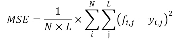
- Mean Absolute Scaled Error (MASE): MASE is slightly more complicated than MSE or MAE but gives us a slightly better measure to overcome the scale-dependent nature of the previous two measures. If we have multiple time series with different average values, MAE and MSE will show higher errors for the high-value time series as opposed to the low-valued time series. MASE overcomes this by scaling the errors based on the in-sample MAE from the naïve forecasting method (which is one of the most basic forecasts possible; we will review it later in this chapter). Intuitively, MASE gives us the measure of how much better our forecast is as compared to the naïve forecast:

- Forecast Bias (FB): This is a metric with slightly different aspects from the other metrics we’ve seen. While the other metrics help assess the correctness of the forecast, irrespective of the direction of the error, forecast bias lets us understand the overall bias in the model. Forecast bias is a metric that helps us understand whether the forecast is continuously over- or under-forecasting. We calculate forecast bias as the difference between the sum of the forecast and the sum of the observed values, expressed as a percentage over the sum of all actuals:

Now, our test harness is ready. We also know how to evaluate and compare forecasts that have been generated from different models on a single, fixed holdout dataset with a set of predetermined metrics. Now, it’s time to start forecasting.
Generating strong baseline forecasts
Time series forecasting has been around since the early 1920s, and through the years, many brilliant people have come up with different models, some statistical and some heuristic-based. I refer to them collectively as classical statistical models or econometrics models, although they are not strictly statistical/econometric.
In this section, we are going to review a few such models that can form really strong baselines when we want to try modern techniques in forecasting. As an exercise, we are going to use an excellent open source library for time series forecasting – darts (https://github.com/unit8co/darts). The 02-Baseline Forecasts using darts.ipynb notebook contains the code for this section so that you can follow along.
Before we start looking at forecasting techniques, let’s quickly understand how to use the darts library to generate the forecasts. We are going to pick one consumer from the dataset and try out all the baseline techniques on the validation dataset one by one.
The first thing we need to do is select the consumer we want using the unique ID for each customer, the LCLid column (from the expanded form of data), and set the timestamp as the index of the DataFrame:
ts_train = train_df.loc[train_df.LCLid=="MAC000193", ["timestamp","energy_consumption"]].set_index("timestamp")
ts_test = val_df.loc[val_df.LCLid=="MAC000193", ["timestamp","energy_consumption"]].set_index("timestamp")
Now that we have a single time series, we need to put it into a data structure that the darts library expects – a TimeSeries data structure, which is native to darts. TimeSeries can be built easily using a few factory methods:
- From a pandas DataFrame using TimeSeries.from_dataframe()
- From a separate array of time index and observed values using TimeSeries.from_times_and_values()
- From a numpy array using TimeSeries.from_values()
- From a pandas series using TimeSeries.from_series()
- From a CSV file using TimeSeries.from_csv()
In our case, since we have the time series as a pandas series, we can just use the from_series() method:
ts_train = TimeSeries.from_series(ts_train)
ts_test = TimeSeries.from_series(ts_test)
Once we have the TimeSeries data structure, we can just initialize the model and call .fit and .predict to get the forecast:
model = <initialize the model>
model.fit(ts_train)
y_pred = model.predict(len(ts_test))
When we call .predict, we have to tell the model how long into the future we have to predict. This is called the horizon of the forecast. In our case, we need to predict our test period, which we can easily do by just taking the length of the ts_test array.
We can also calculate the metrics we discussed earlier in the test harness easily:
mae(actual_series = ts_test, pred_series = y_pred)
mse(actual_series = ts_test, pred_series = y_pred)
# For MASE calculation, the training set is also needed
mase(actual_series = ts_test, pred_series = y_pred, insample=ts_train)
# Forecast Bias is not part of darts, but an own implementation available in src.utils.ts_utils
forecast_bias(actual_series = ts_test, pred_series = y_pred)
For ease of experimentation, we have encapsulated all of this into a handy function, eval_model, in the notebook. This returns the predictions and the calculated metrics in a dictionary.
Now, let’s start looking at a few very simple methods of forecasting.
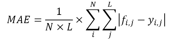
Naïve forecast
A naïve forecast is as simple as you can get. The forecast is just the last/most recent observation in a time series. If the latest observation in a time series is 10, then the forecast for all future timesteps is 10. This can be implemented as follows using the NaiveSeasonal class in darts:
from darts.models import NaiveSeasonal
naive_model = NaiveSeasonal(K=1)
Once we have initialized the model, we can call our helpful eval_model function in the notebook to run and record the forecast and metrics.
Let’s visualize the forecast we just generated:
Figure 4.1 – Naïve forecast
Here, we can see that the forecast is a straight line and completely ignores any pattern in the series. This is by far the simplest way to forecast, hence why it is naïve. Now, let’s look at another simple method.
Moving average forecast
While a naïve forecast memorizes the most recent past, it also memorizes the noise at any timestep. A moving average forecast is another simple method that tries to overcome the pure memorization of the naïve method. Instead of taking the latest observation, it takes the mean of the latest n steps as the forecast. Moving average is not one of the models present in darts, but we have implemented a darts-compatible model in this book’s GitHub repository in the chapter04 folder:
from src.forecasting.baselines import NaiveMovingAverage
#Taking a moving average over 48 timesteps, i.e, one day
naive_model = NaiveMovingAverage(window=48)
Let’s look at the forecast we generated:
Figure 4.2 – Moving average forecast
This forecast is also almost a straight line. Now, let’s look at another simple method, but one that considers seasonality as well.
Seasonal naive forecast
A seasonal naive forecast is a twist on the simple naive method. Whereas in the naive method, we took the last observation (![]() ), in seasonal naïve, we take the
), in seasonal naïve, we take the  observation. So, we look back k steps for each forecast. This enables the algorithm to mimic the last seasonality cycle. For instance, if we set k=48*7, we will be able to mimic the latest seasonal weekly cycle. This method is implemented in darts and we can use it like so:
from darts.models import NaiveSeasonal
naive_model = NaiveSeasonal(K=48*7)
Let’s see what this forecast looks like:
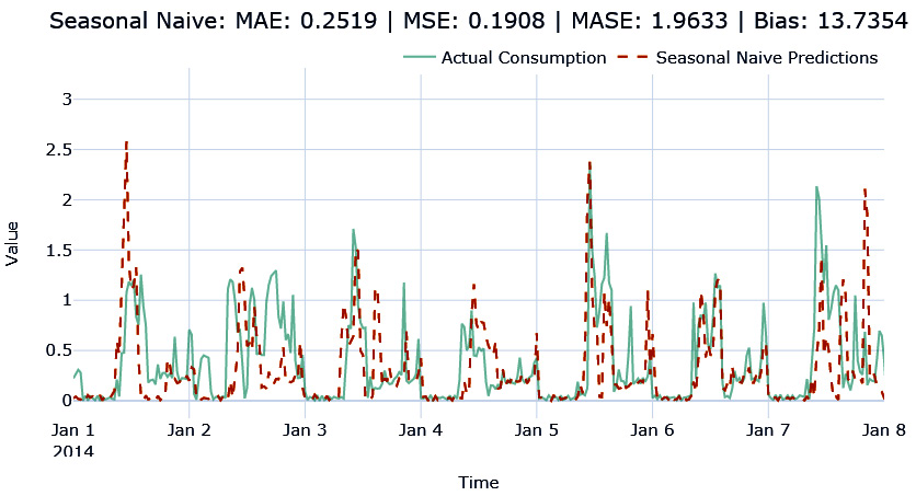
Figure 4.3 – Seasonal naïve forecast
Here, we can see that the forecast is trying to mimic the seasonality pattern. However, it’s not very accurate because it is blindly following the last seasonal cycle.
Now that we’ve looked at a few simple methods, let’s look at a few statistical models.
Exponential smoothing (ETS)
Exponential smoothing (ETS) is one of the most popular methods for generating forecasts. It has been around since the late 1950s and has proved its mettle and stood the test of time. There are a few different variants of ETS – single exponential smoothing, double exponential smoothing, Holt-Winters’ seasonal smoothing, and so on. But all of them have one key idea that has been used in different ways. In the naïve method, we were just using the latest observation, which is like saying only the most recent data point in history matters and no data point before that matters. On the other hand, the moving average method considers the last n observations to be equally important and takes the mean of them.
ETS combines both these intuitions and says that all the history is important, but the recent history is more important. Therefore, the forecast is generated using a weighted average where the weights decrease exponentially as we move farther into the history:

Here, ![]() is the smoothing parameter that lets us decide how fast or slow the weights should decay,
is the smoothing parameter that lets us decide how fast or slow the weights should decay, ![]() is the actuals at timestep t, and
is the actuals at timestep t, and ![]() is the forecast at timestep t.
is the forecast at timestep t.
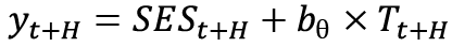
Simple exponential smoothing (SES) is when you simply apply this smoothing procedure to the history. This is more suited for time series that have no trends or seasonality, and the forecast is going to be a flat line. The forecast is generated using the following formula:

Double exponential smoothing (DES) extends the smoothing idea to model trends as well. It has two smoothing equations – one for the level and the other for the trend. Once you have the estimate of the level and trend, you can combine them. This forecast is not necessarily flat because the estimated trend is used to extrapolate it into the future. The forecast is generated according to the following formula:

First, we estimate the level (![]() ) using the Level Equation with the available observations. Then, we estimate the trend using the Trend Equation. Finally, to get the forecast, we combine
) using the Level Equation with the available observations. Then, we estimate the trend using the Trend Equation. Finally, to get the forecast, we combine ![]() and
and ![]() using the Forecast Equation.
using the Forecast Equation.
Researchers have found empirical evidence that this kind of constant extrapolation can result in over-forecasts over the long-term forecast. This is because, in the real world, time series data doesn’t increase at a constant rate forever. Motivated by this, an addition to this has also been introduced that dampens the trend by a factor of ![]() , such that when
, such that when ![]() , there is no damping, and it is identical to double exponential smoothing.
, there is no damping, and it is identical to double exponential smoothing.
Triple exponential smoothing or Holt -Winters (HW) takes this one step forward by including another smoothing term to model the seasonality. This has three parameters (![]() ) for the smoothing and uses a seasonality period (m) as input parameters. You can also choose between additive or multiplicative seasonality. The forecast equations for the additive model are as follows:
) for the smoothing and uses a seasonality period (m) as input parameters. You can also choose between additive or multiplicative seasonality. The forecast equations for the additive model are as follows:

These formulae are also used like in the double exponential case. Instead of estimating level and trend, we estimate level, trend, and seasonality separately.
The family of exponential smoothing methods is not limited to the three that we just discussed. A way to think about the different models is in terms of the trend and seasonal components of these models. The trend can either be no trend, additive, or additive damped. The seasonality can be no seasonality, additive, or multiplicative. Every combination of these parameters is a different technique in the family, as shown in the following table:
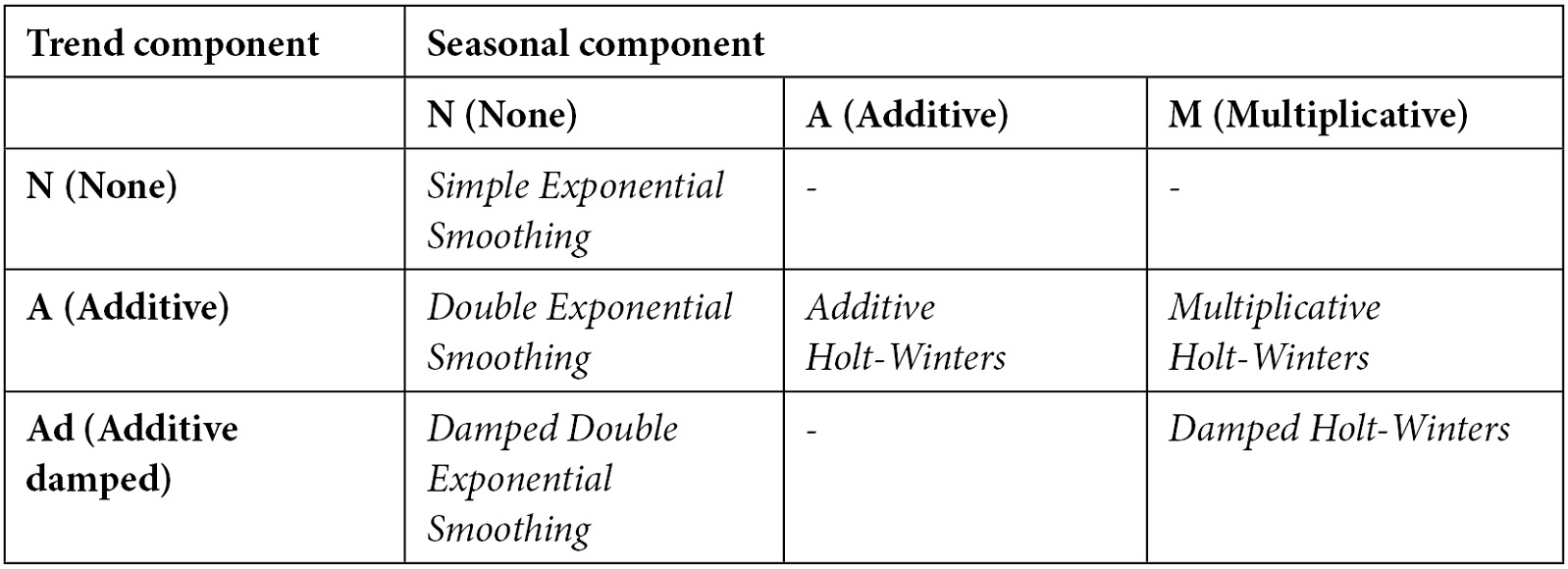
Table 4.1 – Exponential smoothing family
This entire family of methods has been wrapped in a single implementation from statsmodels under statsmodels.tsa.holtwinters.ExponentialSmoothing. The darts library has a wrapper implementation around the statsmodels implementation to make it work in the standardized way we have adopted in this chapter. Let’s see how we can initialize the ETS model in darts:
from darts.models import ExponentialSmoothing
from darts.utils.utils import ModelMode, SeasonalityMode
ets_model = ExponentialSmoothing(trend=ModelMode.ADDITIVE, damped=True, seasonal=SeasonalityMode.ADDITIVE, seasonal_periods=48*7)
The key parameters are trend, damped, seasonal, and seasonal_periods. They help you decide what kind of model you want to fit the data.
Let’s see what the forecast that we generated using ETS looks like:
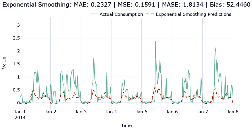
Figure 4.4 – Exponential smoothing forecast
The forecast has captured the seasonality but has failed to capture the peaks. But we can see the improvement in MAE already.
Now, let’s look at one of the most popular forecasting methods out there.
ARIMA
Autoregressive Integrated Moving Average (ARIMA) models are the other class of methods that, like ETS, have stood the test of time and are one of the most popular classical methods of forecasting. The ETS family of methods is modeled around trend and seasonality, while ARIMA relies on autocorrelation (the correlation of ![]() with
with ![]() ,
, ![]() , and so on).
, and so on).
The simplest in the family are the AR(p) models, which use linear regression with p previous timesteps or, in other words, p lags. Mathematically, it can be written as follows:

Here, c is the intercept and ![]() is the noise or error at timestep t.
is the noise or error at timestep t.
The next in the family are MA(q) models, in which instead of past observed values, we use the past q errors in the forecast (which is assumed to be pure white noise) to come up with a forecast:

Here, ![]() is white noise and c is the intercept.
is white noise and c is the intercept.
This is not typically used on its own but in conjunction with AR(p) models, which makes the next one on our list ARMA(p,q) models. ARMA models are defined as 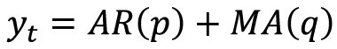 .
.
In all the ARIMA models, there is one underlying assumption – the time series is stationary (we talked about stationarity in Chapter 1, Introducing Time Series, and will elaborate on this in Chapter 6, Feature Engineering for Time Series Forecasting). There are many ways to make the series stationary but taking the difference of successive values is one such technique. This is known as differencing. Sometimes, we need to do differencing once, while other times, we have to perform successive differencing before the time series becomes stationary. The number of times we do the differencing operation is called the order of differencing. The I in ARIMA, and the final piece of the puzzle, stands for Integrated. It defines the order of differencing we need to do before the series becomes stationary and is denoted by d.
So, the complete ARIMA(p,d,q) model says that we do dth order of differencing and then consider the last p terms in an autoregressive manner, and then include the last q moving average terms to come up with the forecast.
The ARIMA models we have discussed so far only handle non-seasonal time series. But using the same concepts we discussed, but on a seasonal cycle, we get Seasonal ARIMA. p, d, and q are slightly tweaked so that they work on the seasonal period, m. To differentiate them from the normal p, d, andq, we call the seasonal values P, D, and Q. For instance, if p meant taking the last p lags, P means taking the last P seasonal lags. If ![]() is
is ![]() ,
, ![]() would be
would be ![]() . Similarly, D means the order of seasonal differencing.
. Similarly, D means the order of seasonal differencing.
Picking the right p, d, and q and P, D, and Q values is not very intuitive, and we will have to resort to statistical tests to find them. However, this becomes a bit impractical when you are forecasting many time series. An automatic way of iterating through the different parameters and finding the best p, d, and q, and P, D, and Q values for the data is called Auto ARIMA. In Python, pmdarima is a library that has implemented this, and the darts library, once again, has a wrapper around it to make our work easy. darts also has a normal ARIMA implementation that is a wrapper around statsmodels.tsa.arima.model.ARIMA.
Practical considerations
Although ARIMA and Auto ARIMA can give you good-performing models in many cases, they can be quite slow when you have long seasonal periods and a long time series. In our case, where we have almost 27k observations in the history, ARIMA becomes very slow and a memory hog. Even when using just the latest 8,000 observations, a single ARIMA fit takes around 6 minutes. Letting go of the seasonal parameters brings down the runtime drastically, but for a seasonal time series such as energy consumption, it doesn’t make sense. Auto ARIMA includes many such fits to identify the best parameters and therefore becomes impractical for long time series datasets. Almost all the implementations in the Python ecosystem suffer from this drawback except for statsforecast (https://github.com/Nixtla/statsforecast). At the time of writing, the new library has just been released, but it shows a lot of promise in having a fast implementation of ARIMA and AutoARIMA.
Let’s see how we can apply ARIMA and AutoARIMA using darts:
#ARIMA model by specifying parameters
arima_model = ARIMA(p=2, d=1, q=1, seasonal_order=(1, 1, 1, 48))
#AutoARIMA model by specifying max limits for parameters and letting the algorithm find the best ones
auto_arima_model = AutoARIMA(max_p=5, max_q=3, m=48, seasonal=True)
For the entire list of parameters for AutoARIMA, head over to the pmdarima documentation at https://alkaline-ml.com/pmdarima/modules/generated/pmdarima.arima.AutoARIMA.html.
Let’s see what the ETS and ARIMA forecasts look like for the households we were experimenting with:
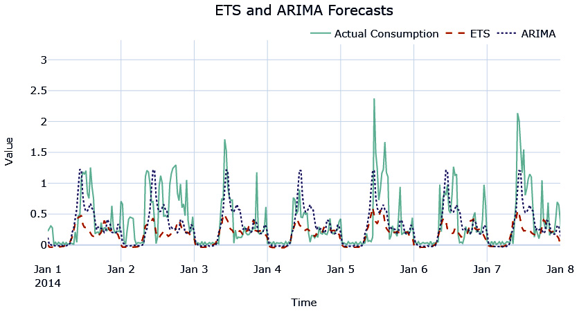
Figure 4.5 – ETS and ARIMA forecasts
The ARIMA forecast has captured the seasonality and the peaks better than ETS and it reflects in a lower MAE score.
Now, let’s look at another method – the Theta Forecast.
Theta Forecast
The Theta Forecast was the top-performing submission in the M3 forecasting competition that was held in 2002. The method relies on a parameter, ![]() , that amplifies or smooths the local curvature of a time series, depending on the value chosen. Using
, that amplifies or smooths the local curvature of a time series, depending on the value chosen. Using ![]() , we smooth or amplify the original time series. These smoothed lines are called theta lines. V. Assimakopoulos and K. Nikolopoulos proposed this method as a decomposition approach to forecasting. Although in theory any number of theta lines can be used, the originally proposed method used two theta lines,
, we smooth or amplify the original time series. These smoothed lines are called theta lines. V. Assimakopoulos and K. Nikolopoulos proposed this method as a decomposition approach to forecasting. Although in theory any number of theta lines can be used, the originally proposed method used two theta lines, ![]() and
and ![]() , and took an average of the forecast of the two theta lines as the final forecast.
, and took an average of the forecast of the two theta lines as the final forecast.
Side note
The M-competitions are forecasting competitions organized by Spyros Makridakis, a leading forecasting researcher. They typically curate a dataset of time series, lay down the metrics with which the forecasts will be evaluated, and open these competitions to researchers all around the world to get the best forecast possible. These competitions are considered to be some of the biggest and most popular time series forecasting competitions in the world. At the time of writing, five such competitions have already been completed and the sixth one has been announced: https://mofc.unic.ac.cy/the-m6-competition/.
In 2002, Rob Hyndman et al. simplified the Theta method and showed that we can use ETS with a drift term to get equivalent results to the original Theta method, which is what is adapted into most of the implementations of the method that exist today. The major steps that are involved in the Theta Forecast (which is implemented in darts) are as follows:
- Check for seasonality and use statsmodels.tsa.seasonal.seasonal_decompose to extract seasonality if the series is seasonal. This step creates a new deseasonalized time series,
 .
. - Use SES on the deseasonalized time series,
 , and retrieve the estimated smoothing parameter,
  .
. - Fit a linear trend on
 and retrieve the estimated coefficient,
  .
.  , where
  is the SET forecast for timesteps t to t+H and
  is an array denoting time, [t, t+1, t+2, … t+H].
 - Reseasonalize if the data was deseasonalized in the beginning.
Let’s see how we can use it practically:
theta_model = Theta(theta=3, seasonality_period=48*7, season_mode=SeasonalityMode.ADDITIVE)
The key parameters here are as follows:
- theta: This functions as a dampening of the trend and is not to be confused with
 in the context of theta lines. The implementation takes
  and
and  as a fixed configuration. The higher the theta value, the higher the dampening of the trend.
 - season_mode and seasonality_period: These parameters are used for the initial seasonal decomposition. If left empty, the implementation automatically tests for seasonality and deseasonalizes the time series automatically. It is recommended to set these parameters with our domain knowledge if we know them.
Let’s visualize the forecast we just generated using the Theta Forecast:
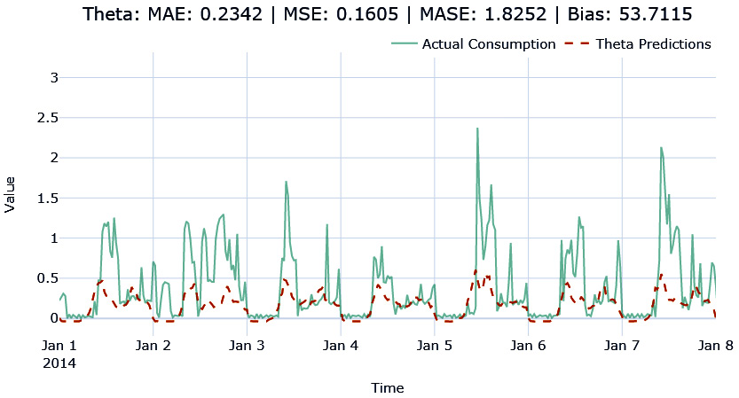
Figure 4.6 – The Theta Forecast
Reference check
The research paper in which V. Assimakopoulos and K. Nikolopoulos proposed the Theta method is cited as reference 1 in the References section, while subsequent simplification by Rob Hyndman is cited as reference 2.
Fast Fourier Transform forecast
We used a Fourier series in Chapter 3, Analyzing and Visualizing Time Series Data, to decompose seasonality. Fourier Transform is a very related concept.
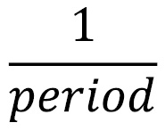
Fourier Transform decomposes a time series, which is in the time domain, to temporal frequencies, which is in the frequency domain. It breaks apart a time series and returns the information about the frequency of all the sine (or cosine) waves that constitute the time series. The period of a sine wave is the time it takes to perform one complete cycle, while the frequency of a sine wave is as follows:
This is the number of complete cycles that can happen upon every unit of time. Therefore, by knowing the frequencies of all the sine waves of a time series, we can reconstruct the time series perfectly, allowing a seamless transition from the frequency domain to the time domain.
The following diagram shows what Fourier Transform strives to do. The time series, which is in the time domain, is split into several frequencies in the frequency domain so that when we add all of those frequencies to the time domain, we get the original time series:
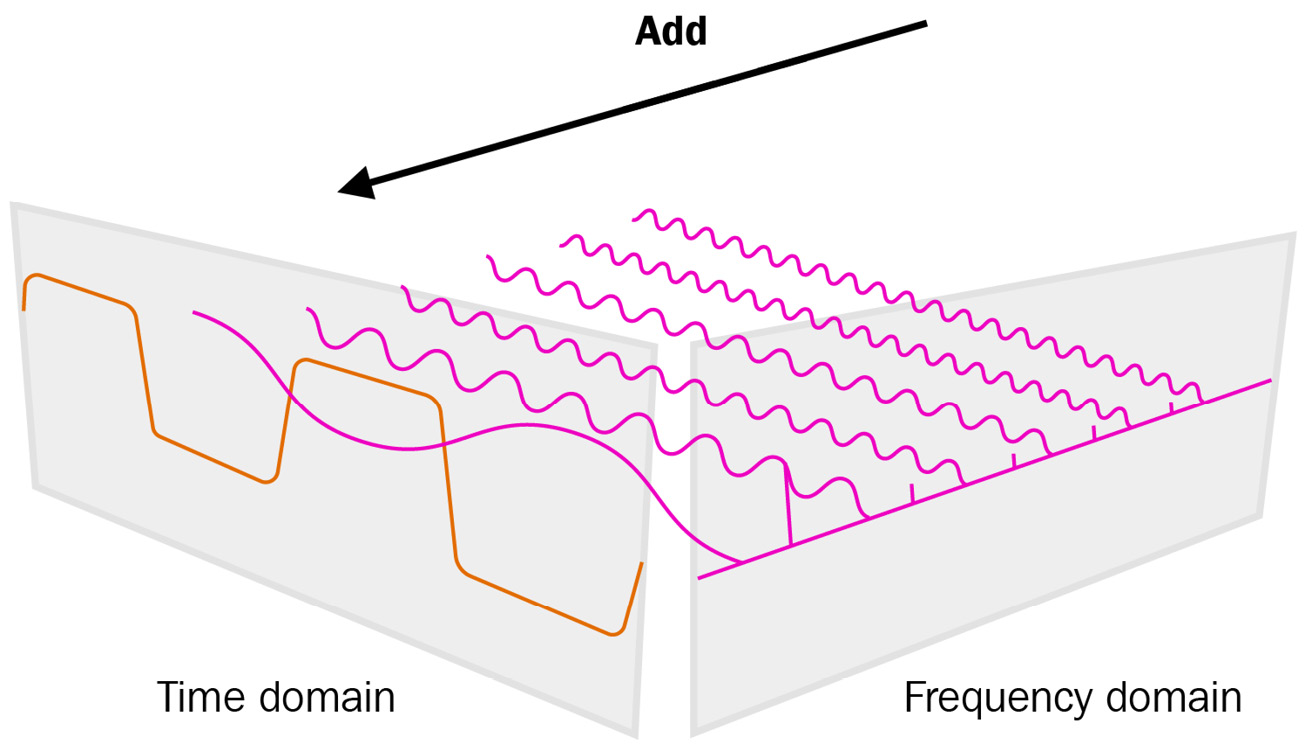
Figure 4.7 – Fourier Transform
The theory is quite beautiful and if you want to know more, go to the Further reading section. But for now, let’s take it at face value and move on.
For sequences that are evenly spaced, Discrete Fourier Transform is applicable, which does away with the integral and makes it into a summation. However, this is also very slow to compute. Fortunately, there is an algorithm called Fast Fourier Transform (FFT) that makes it computationally feasible. Coupled with this, there is an Inverse Fast Fourier Transform (IFFT) to go back to the time domain.
While FFT will let us reconstruct the time series exactly, that is not something we want when we are forecasting. We only want to capture the signal in the time series and exclude the noise. Therefore, we can filter out noise by choosing a few prominent frequencies from FFT and only use this smaller set in IFFT. Since FFT needs the time series to be detrended, we must apply a detrending step before the FFT step and add the trend once we have reconstructed the time series.
This is implemented in darts, and we can use the implementation shown here:
fft_model = FFT(nr_freqs_to_keep=35, trend=”poly”, trend_poly_degree=2)
The nr_freqs_to_keep and trend hyperparameters must be tweaked to get the best forecast possible.
Let’s see what the FFT forecast looks like:
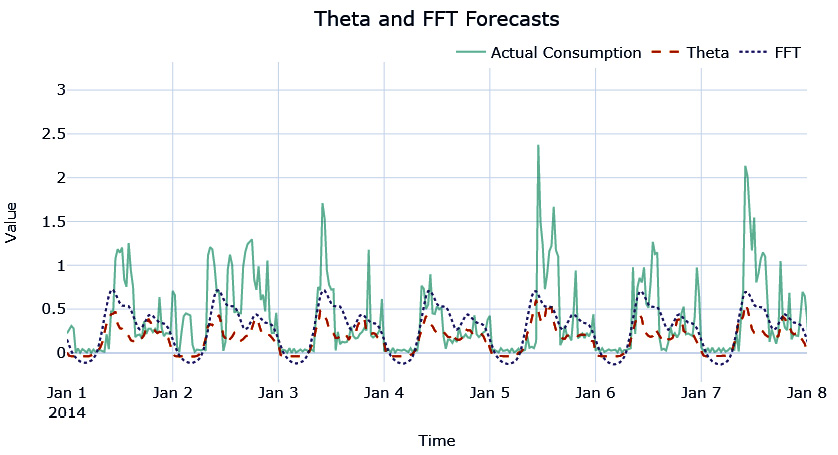
Figure 4.8 – FFT forecast
Again, the seasonality pattern has been replicated, although it is not capturing the peaks in the forecast. Let’s also take a look at how the different metrics that we chose did for each of these forecasts for the household we were experimenting with (from the notebook):
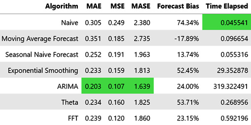
Figure 4.9 – Summary of all the baseline algorithms
Out of all the baseline algorithms we tried, ARIMA is performing the best on both MAE as well as MSE. But if you look at the Time Elapsed column, it stands out. Even after taking only the latest 8,000 observations to train, it took much more time than the other baseline algorithms. The next best from MAE and MSE are Theta, EST, and FFT, out of which Theta and FFT are orders of magnitude faster than EST.
So, we can take these two algorithms as our baseline and run them on all 399 households in the dataset (both validation and test) we’ve chosen (the code for this is available in the 02-Baseline Forecasts using darts.ipynb notebook).
Evaluating the baseline forecasts
Since we have the baseline forecasts generated from Theta as well as FFT, we should also evaluate these forecasts. The aggregate metrics for all the selected households for both these methods are as follows:
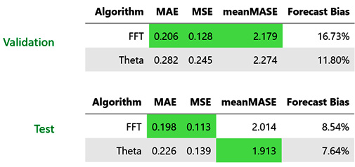
Figure 4.10 – The aggregate metrics of all the selected households (both validation and test)
It looks like FFT is performing much better in all three metrics. We also have these metrics calculated at a household level. Let’s look at the distribution of these metrics in the validation dataset for all the selected households:
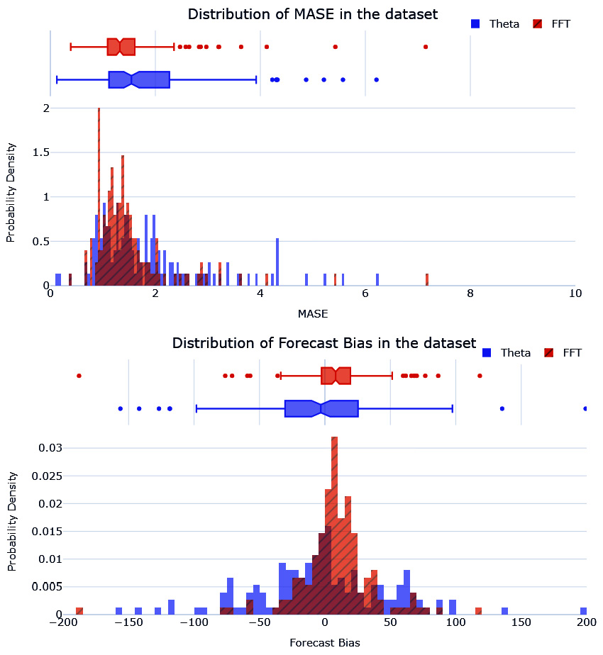
Figure 4.11 – The distribution of MASE and forecast bias of the baseline forecast in the validation dataset
The MASE histogram of FFT seems to have a smaller spread than Theta. FFT also has a lower median MASE than Theta. We can see a similar pattern for forecast bias as well, with the forecast bias of FFT centered around zero and much less spread.
Back in Chapter 1, Introducing Time Series, we saw why every time series is not equally predictable and saw three factors to help us think about the issue – understanding the Data Generating Process (DGP), the amount of data, and adequately repeating the pattern. In most cases, the first two are pretty easy to evaluate, but the third one requires some analysis. Although the performance of baseline methods gives us some idea about how predictable any time series is, they still are model-dependent. So, instead of measuring how well a time series is forecastable, we might be better measuring how well the chosen model can approximate the time series. This is where a few techniques that are more fundamental (relying on the statistical properties of a time series) come in.
Assessing the forecastability of a time series
Although there are many statistical measures that we can use to assess the predictability of a time series, we will just look at a few that are easier to understand and practical when dealing with large time series datasets. The associated notebook (02-Forecastability.ipynb) contains the code to follow along.
Coefficient of Variation (CoV)
The Coefficient of Variation (CoV) relies on the intuition that the more variability that you find in a time series, the harder it is to predict it. And how do we measure variability in a random variable? Standard deviation.
In many real-world time series, the variation we see in the time series is dependent on the scale of the time series. Let’s imagine that there are two retail products, A and B. A has a mean monthly sale of 15, while B has 50. If we look at a few real-world examples like this, we will see that if A and B have the same standard deviation, B, which has a higher mean, is much more forecastable than A. To accommodate this phenomenon and to make sure we bring all the time series in a dataset to a common scale, we can use the CoV:
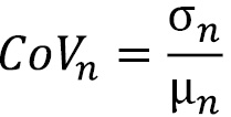
Here, ![]() is the standard deviation and
is the standard deviation and ![]() is the mean of the time series, n.
is the mean of the time series, n.
The CoV is the relative dispersion of data points around the mean, which is much better than looking at the pure standard deviation.
The larger the value for the CoV, the worse the predictability of the time series. There is no hard cutoff, but a value of 0.49 is considered a rule of thumb to separate time series that are relatively easier to forecast from the hard ones. But depending on the general hardness of the dataset, we can tweak this cutoff. Something I have found useful is to plot a histogram of CoV values in a dataset and derive cutoffs based on that.
Even though the CoV is widely used in the industry, it suffers from a few key issues:
- It doesn’t consider seasonality. A sine or cosine wave will have a higher CoV than a horizontal line, but we know both are equally predictable.
- It doesn’t consider the trend. A linear trend will make a series have a higher CoV, but we know it is equally predictable like a horizontal line is.
- It doesn’t handle negative values in the time series. If you have negative values, it makes the mean smaller, thereby inflating the CoV.
To overcome these shortcomings, we propose another derived measure.
Residual variability (RV)
The thought behind residual variability (RV) is to try and measure the same kind of variability that we were trying to capture with the CoV but without the shortcomings. I was brainstorming on ways to avoid the problems of using the CoV, typically the seasonality issue, and was applying the CoV to the residuals after seasonal decomposition. It was then I realized that the residuals would have a few negative values and that the CoV wouldn’t work well. Stefan de Kok, who is a thought leader in demand forecasting and probabilistic forecasting, suggested using the mean of the original actuals, which worked.
To calculate RV, you must perform the following steps:
- Perform seasonal decomposition.
- Calculate the standard deviation of the residuals or the irregular component.
- Divide the standard deviation by the mean of the original observed values (before decomposition).
The key assumption here is that seasonality and trend are components that can be predicted. Therefore, our assessment of the predictability of a time series should only look at the variability of the residuals. But we cannot use CoV on the residuals because the residuals can have negative and positive values, so the mean of the residuals loses the interpretation of the level of the series and tends to zero. When residuals tend to zero, the CoV measure tends to infinity because of the division by mean. Therefore, we use the mean of the original series as the scaling factor.
Let’s see how we can calculate RV for all the time series in our dataset (which are in a compact form):
block_df["rv"] = block_df.progress_apply(lambda x: calc_norm_sd(x['residuals'],x['energy_consumption']), axis=1)
In this section, we looked at two measures that are based on the standard deviation of the time series. Now, let’s look at assessing the forecastability of a time series.
Entropy-based measures
Entropy is a ubiquitous term in science. We see it popping up in Physics, quantum mechanics, social sciences, and information theory. And everywhere, it is used to talk about a measure of chaos or lack of predictability in a system. The entropy we are most interested in now is the one from Information Theory. Information Theory involves quantifying, storing, and communicating digital information.
Claude E. Shannon presented the qualitative and quantitative model of communication as a statistical process in his seminal paper A Mathematical Theory of Communication. While the paper introduced a lot of ideas, some of the concepts that are relevant to us are Information Entropy and the concept of a bit – a fundamental unit of measurement of information.
Reference check
A Mathematical Theory of Communication by Claude E. Shannon is cited as reference 3 in the References section.
The theory in itself is quite a lot to cover, but to summarize the key bits of information, take a look at the following short glossary:
- Information is nothing but a sequence of symbols, which can be transmitted from the receiver to the sender through a medium, which is called a channel. For instance, when we are texting somebody, the sequence of symbols are the letters/words of the language in which we are texting; the channel is the electronic medium.
- Entropy can be thought of as the amount of uncertainty or surprise in a sequence of symbols given some distribution of the symbols.
- A bit, as we mentioned earlier, is a unit of information and is a binary digit. It can either be 0 or 1.
Now, if we were to transfer 1 bit of information, it would reduce the uncertainty of the receiver by 2. To understand this better, let’s consider a coin toss. We toss the coin in the air, and as it is spinning through the air, we don’t know whether it is going to be heads or tails. But we know it is going to be one of these two. When the coin hits the ground and finally comes to rest, we find that it is heads. We can represent whether the coin toss is heads or tails with 1 bit of information (0 for heads and 1 for tails). So, the information that was passed to us when the coin fell reduced the possible outcomes from two to one (heads). This transfer was possible with 1 bit of information.
In Information Theory, the entropy of a discrete random variable is the average level of information, surprise, or uncertainty inherent in the variable’s possible outcomes. In more technical parlance, it is the expected number of bits required for the best possible encoding scheme of the information present in the random variable.
Additional reading
If you want to intuitively understand entropy, cross-entropy, Kullback-Leibler divergence, and so on, head over to the Further reading section. There are a couple of links to blogs (one of which is my own) where we try to lay down the intuition behind these metrics).
Entropy is formally defined as follows:

Here, X is the discrete random variable with possible outcomes, and ![]() . Each of those outcomes has a probability of occurring, which is denoted by and
. Each of those outcomes has a probability of occurring, which is denoted by and ![]() .
.
To develop some intuition around this, we can think that the more spread out a probability distribution is, the more chaos is in the distribution, and thus more entropy. Let’s quickly check this in code:
# Creating an array with a well balanced probability distribution
flat = np.array([0.1,0.2, 0.3,0.2, 0.2])
# Calculating Entropy
print((-np.log2(flat)* flat).sum())
>> 2.2464393446710154
# Creating an array with a peak in probability
sharp = np.array([0.1,0.6, 0.1,0.1, 0.1])
# Calculating Entropy
print((-np.log2(sharp)* sharp).sum())
>> 1.7709505944546688
Here, we can see that the probability distribution that spread its mass has higher entropy.
In the context of a time series, n is the total number of time series observations, and  is the probability for each symbol of the time series alphabet. A sharp distribution means that the time series values are concentrated on a small area and should be easier to predict. On the other hand, a wide or flat distribution means that the time series value can be equally likely across a wider range of values and hence is difficult to predict.
If we have two time series – one containing the result of a coin toss and the other containing the result of a dice throw – the dice throw would have any output between one and six, whereas the coin toss would be either zero or one. The coin toss time series would have lower entropy and be easier to predict than the dice throw time series.
But since time series is typically continuous, and entropy requires a discrete random variable, we can resort to a few strategies to convert the continuous time series into a discrete one. Many strategies, such as quantization or binning, can be applied, which leads to a myriad of complexity measures. Let’s review one such measure that is useful and practical.
Spectral entropy
To calculate the entropy of a time series, we need to discretize the time series. One way to do that is by using FFT and power spectral density (PSD). This discretization of the continuous time series is used to calculate spectral entropy.
We learned what Fourier Transform is earlier in this chapter and used it to generate a baseline forecast. But using FFT, we can also estimate a quantity called power spectral density. This answers the question, How much of the signal is at a particular frequency? There are many ways of estimating power spectral density from a time series, but one of the easiest ways is by using the Welch method, which is a non-parametric method based on Discrete Fourier Transform. This is also implemented as a handy function with the periodogram(x) signature in scipy.
The returned PSD will have a length equal to the number of frequencies estimated, but these are densities and not well-defined probabilities. So, we need to normalize PSD to be between zero and one:

Here, F is the number of frequencies that are part of the returned power spectrum density.
Now that we have the probabilities, we can just plug this into the entropy formula and arrive at the spectral entropy:

When we introduced entropy-based measures, we saw that the more spread out the probability mass of a distribution is, the higher the entropy is. In this context, the more frequencies across which the spectral density is spread, the higher the spectral entropy. So, a higher spectral entropy means the time series is more complex and therefore more difficult to forecast.
Since FFT has an assumption of stationarity, it is recommended that we make the series stationary before using spectral entropy as a metric. We can even apply this metric to a detrended and deseasonalized time series, which we can refer to as residual spectral entropy. This book’s GitHub repository contains an implementation of spectral entropy under src.forecastability.entropy.spectral_entropy. This implementation also has a parameter, transform_stationary, which, if set to True, will detrend the series before we apply spectral entropy. Let’s see how we can calculate spectral entropy for our dataset:
from src.forecastability.entropy import spectral_entropy
block_df["spectral_entropy"] = block_df.energy_consumption.progress_apply(lambda x: spectral_entropy(x, transform_stationary=True))
block_df["residual_spectral_entropy"] = block_df.residuals.progress_apply(spectral_entropy)
There are other entropy-based measures such as approximate entropy and sample entropy, but we will not cover those in this book. They are more computationally intensive and don’t tend to work for time series that contain fewer than 200 values. If you are interested in learning more about these measures, head over to the Further reading section.
Another metric that takes a slightly different path is the Kaboudan metric.
Kaboudan metric
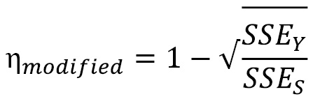
In 1999, Kaboudan defined a metric for time series predictability, calling it the ![]() -metric. The idea behind it is very simple. If we block -shuffle a time series, we are essentially destroying the information in the time series. Block shuffling is the process of dividing the time series into blocks and then shuffling those blocks. So, if we calculate the sum of squared errors (SSE) of a forecast that’s been trained on a time series and then contrast it with the SSE of a forecast trained on a shuffled time series, we can infer the predictability of the time series. The formula to calculate this is as follows:
-metric. The idea behind it is very simple. If we block -shuffle a time series, we are essentially destroying the information in the time series. Block shuffling is the process of dividing the time series into blocks and then shuffling those blocks. So, if we calculate the sum of squared errors (SSE) of a forecast that’s been trained on a time series and then contrast it with the SSE of a forecast trained on a shuffled time series, we can infer the predictability of the time series. The formula to calculate this is as follows:

Here,  is the SSE of the forecast that was generated from the original time series, while
 ![]() is the SSE of the forecast that was generated from the block-shuffled series.
is the SSE of the forecast that was generated from the block-shuffled series.
If the time series contains some predictable signals, ![]() would be lower than
would be lower than  and
and ![]() would approach zero. This is because there was some information or patterns that were broken due to the block shuffling. On the other hand, if a series is just white noise (which is unpredictable by definition) there would be hardly any difference between
would approach zero. This is because there was some information or patterns that were broken due to the block shuffling. On the other hand, if a series is just white noise (which is unpredictable by definition) there would be hardly any difference between ![]() and
and ![]() , and
, and ![]() would approach one.
would approach one.
In 2002, Duan investigated this metric and suggested some modifications in his thesis. One of the problems he identified, especially in long time series, is that the ![]() values are found in a narrow band around 1 and suggested a slight modification to the formula. We call this the modified Kaboudan metric. The measure on the lower side is also clipped to zero. Sometimes, the metric can go below zero because
values are found in a narrow band around 1 and suggested a slight modification to the formula. We call this the modified Kaboudan metric. The measure on the lower side is also clipped to zero. Sometimes, the metric can go below zero because ![]() is lower than
is lower than ![]() , which is because the series is unpredictable and, by pure chance, block shuffling made the SSE lower:
, which is because the series is unpredictable and, by pure chance, block shuffling made the SSE lower:
Reference check
The research paper that proposed the Kaboudan metric is cited as reference 4 in the References section. The subsequent modification that Duan suggested is cited as reference 5.
This modified version, as well as the original, has been implemented in this book’s GitHub repository.
There is no restriction on the forecasting model you use to generate the forecast, which makes it a bit more flexible. Ideally, we can choose one of the classical statistical methods that is fast enough to be applied to the whole dataset. But this also makes the Kaboudan metric dependent on the model, and the limitations of the model are inherent in the metric. The metric measures a combination of how difficult a series is to forecast and how difficult it is for the model to forecast the series.
Again, both metrics are implemented in this book’s GitHub repository. Let’s see how we can use them:
from src.forecastability.kaboudan import kaboudan_metric, modified_kaboudan_metric
model = Theta(theta=3, seasonality_period=48*7, season_mode=SeasonalityMode.ADDITIVE)
block_df["kaboudan_metric"] = [kaboudan_metric(r[0], model=model, block_size=5, backtesting_start=0.5, n_folds=1) for r in tqdm(zip(*block_df[["energy_consumption"]].to_dict("list").values()), total=len(block_df))]
block_df["modified_kaboudan_metric"] = [modified_kaboudan_metric(r[0], model=model, block_size=5, backtesting_start=0.5, n_folds=1) for r in tqdm(zip(*block_df[["energy_consumption"]].to_dict("list").values()), total=len(block_df))]
Although there are many more metrics we can use for this purpose, the metrics we just reviewed for assessing forecastability cover a lot of the popular use cases and should be more than enough to gauge any time series dataset in regards to the difficulty of forecasting it. We can use these metrics to compare onetime series with another time series or to profile a whole set of related time series in a dataset with another dataset for benchmarking purposes.
Additional reading
If you want to delve a little deeper and analyze the behavior of these metrics, how similar they are to each other, and how effective they are in measuring forecastability, go to the end of the 03-Forecastability.ipynb notebook. We compute rank correlations among these metrics to understand how similar these metrics are. We can also find rank correlations with the computed metrics from the best performing baseline method to understand how well these metrics did in estimating the forecastability of a time series. I strongly encourage you to play around with the notebook and understand the differences between the different metrics. Pick a few time series and check how the different metrics give you slightly different interpretations.
Congratulations on generating your baseline forecasts – the first set of forecasts we have generated using this book! Feel free to head over to the notebooks and play around with the parameters of the methods and see how forecasts change. It’ll help you develop an intuition around what the baseline methods are doing. If you are interested in learning more about how to make these baseline methods better, head over to the Further reading section, where we have provided a link to the paper The Wisdom of the Data: Getting the Most Out of Univariate Time Series Forecasting, by F. Petropoulos and E. Spiliotis.
Summary
And with this, we have come to the end of Section 1, Getting Familiar with Time Series. We have come a long way from just understanding what a time series is to generating competitive baseline forecasts. Along the way, we learned how to handle missing values and outliers and how to manipulate time series data using pandas. We used all those skills on a real-world dataset regarding energy consumption. We also looked at ways to visualize and decompose time series. In this chapter, we set up a test harness, learned how to use the darts library to generate a baseline forecast, and looked at a few metrics that can be used to understand the forecastability of a time series. For some of you, this may be a refresher, and we hope this chapter added some value in terms of some subtleties and practical considerations. For the rest of you, we hope you are in a good place, foundationally, to start venturing into modern techniques using machine learning in the next section of the book.
In the next chapter, we will discuss the basics of machine learning and delve into time series forecasting.
References
The following references were provided in this chapter:
- Assimakopoulos, Vassilis and Nikolopoulos, K.. (2000). The theta model: A decomposition approach to forecasting. International Journal of Forecasting. 16. 521-530. https://www.researchgate.net/publication/223049702_The_theta_model_A_decomposition_approach_to_forecasting.
- Rob J. Hyndman, Baki Billah. (2003). Unmasking the Theta method. International Journal of Forecasting. 19. 287-290. https://robjhyndman.com/papers/Theta.pdf.
- Shannon, C.E. (1948), A Mathematical Theory of Communication. Bell System Technical Journal, 27: 379-423. https://people.math.harvard.edu/~ctm/home/text/others/shannon/entropy/entropy.pdf.
- Kaboudan, M. (1999). A measure of time series’ predictability using genetic programming applied to stock returns. Journal of Forecasting, 18, 345-357: http://www.aiecon.org/conference/efmaci2004/pdf/GP_Basics_paper.pdf.
- Duan, M. (2002). TIME SERIES PREDICTABILITY: https://citeseerx.ist.psu.edu/viewdoc/download?doi=10.1.1.68.1898&rep=rep1&type=pdf.
Further reading
To learn more about the topics that were covered in this chapter, take a look at the following resources:
- Information Theory and Entropy, by Manu Joseph: https://deep-and-shallow.com/2020/01/09/deep-learning-and-information-theory/.
- Visual Information, by Chris Olah: https://colah.github.io/posts/2015-09-Visual-Information.
- Fourier Transform: https://betterexplained.com/articles/an-interactive-guide-to-the-fourier-transform/.
- Fourier Transform by 3blue1brown – a visual introduction: https://www.youtube.com/watch?v=spUNpyF58BY&vl=en.
- Understanding Fourier Transform by Example, by Richie Vink: https://www.ritchievink.com/blog/2017/04/23/understanding-the-fourier-transform-by-example/.
- Delgado-Bonal A, Marshak A. Approximate Entropy and Sample Entropy: A Comprehensive Tutorial. Entropy. 2019; 21(6):541: https://www.mdpi.com/1099-4300/21/6/541.
- Yentes, J.M., Hunt, N., Schmid, K.K. et al. The Appropriate Use of Approximate Entropy and Sample Entropy with Short Data Sets. Ann Biomed Eng 41, 349–365 (2013): https://doi.org/10.1007/s10439-012-0668-3
- Ponce-Flores M, Frausto-Solís J, Santamaría-Bonfil G, Pérez-Ortega J, González-Barbosa JJ. Time Series Complexities and Their Relationship to Forecasting Performance. Entropy. 2020; 22(1):89. https://www.mdpi.com/1099-4300/22/1/89
- Petropoulos F, Spiliotis E. The Wisdom of the Data: Getting the Most Out of Univariate Time Series Forecasting. Forecasting. 2021; 3(3):478-497. https://doi.org/10.3390/forecast3030029