
3
Analyzing and Visualizing Time Series Data
In the previous chapter, we learned where to obtain time series datasets, as well as how to manipulate time series data using pandas, handle missing values, and so on. Now that we have the processed time series data, it’s time to understand the dataset, which data scientists call Exploratory Data Analysis (EDA). It is a process by which the data scientist analyzes the data by looking at aggregate statistics, feature distributions, visualizations, and so on to try and uncover patterns in the data that they can leverage in modeling. In this chapter, we will look at a couple of ways to analyze a time series dataset, a few specific techniques that are tailor-made for time series, and review some of the visualization techniques for time series data.
In this chapter, we will cover the following topics:
- Components of a time series
- Visualizing time series data
- Decomposing a time series
- Detecting and treating outliers
Technical requirements
You will need to set up the Anaconda environment following the instructions in the Preface of the book to get a working environment with all the packages and datasets required for the code in this book.
You will need to run 02 - Preprocessing London Smart Meter Dataset.ipynb notebook from Chapter02 folder.
The code for this chapter can be found at https://github.com/PacktPublishing/Modern-Time-Series-Forecasting-with-Python-/tree/main/notebooks/Chapter03.
Components of a time series
Before we start analyzing and visualizing time series, we need to understand the structure of a time series. Any time series can contain some or all of the following components:
- Trend
- Seasonal
- Cyclical
- Irregular
These components can be mixed in different ways, but two very commonly assumed ways are additive (Y = Trend + Seasonal + Cyclical + Irregular) and multiplicative (Y = Trend * Seasonal * Cyclical * Irregular).
The trend component
The trend is a long-term change in the mean of a time series. It is the smooth and steady movement of a time series in a particular direction. When the time series moves upward, we say there is an upward or increasing trend, while when it moves downward, we say there is a downward or decreasing trend. At the time of writing, if we think about the revenue of Tesla over the years, as shown in the following figure, we can see that it has been increasing consistently for the last few years:

Figure 3.1 – Tesla’s revenue in millions of USD
Looking at the preceding figure, we can say that Tesla’s revenue is having an increasing trend. The trend doesn’t need to be linear; it can also be non-linear.
The seasonal component
When a time series exhibits regular, repetitive, up-and-down fluctuations, we call that seasonality. For instance, retail sales typically shoot up during the holidays, specifically Christmas in western countries. Similarly, electricity consumption peaks during the summer months in the tropics and the winter months in colder countries. In all these examples, you can see a specific up-and-down pattern repeating every year. Another example is sunspots, as shown in the following figure:
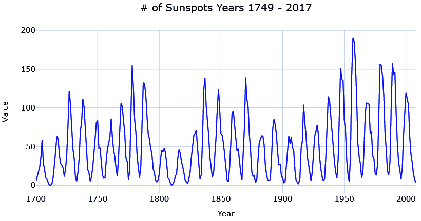
Figure 3.2 – Number of sunspots from 1749 to 2017
As you can see, sunspots peak every 11 years.
The cyclical component
The cyclical component is often confused with seasonality, but it stands apart due to a very subtle difference. Like seasonality, the cyclical component also exhibits a similar up-and-down pattern around the trend line, but instead of repeating the pattern every period, the cyclical component is irregular. A good example of this is economic recession, which happens over a 10-year cycle. However, this doesn’t happen like clockwork; sometimes, it can be fewer or more than every 10 years.
The irregular component
This component is left after removing the trends, seasonality, and cyclicity from a time series. Traditionally, this component is considered unpredictable and is also called the residual or error term. In common classical statistics-based models, the point of any “model” is to capture all the other components to the point that the only part that is not captured is the irregular component. In modern machine learning, we do not consider this component entirely unpredictable. We try to capture this component, or parts of it, by using exogenous variables. For instance, the irregular component of retail sales may be explained as the different promotional activities they run. When we have this additional information, the “unpredictable” component starts to become predictable again. But no matter how many additional variables you add to the model, there will always be some component, which is the true irregular component (or true error), that is left behind.
Now that we know what the different components of a time series are, let’s see how we can visualize them.
Visualizing time series data
In Chapter 2, Acquiring and Processing Time Series Data, we learned how to prepare a data model as a first step toward analyzing a new dataset. If preparing a data model is like approaching someone you like and making that first contact, then EDA is like dating that person. At this point, you have the dataset, and you are trying to get to know them, trying to figure out what makes them tick, what the person likes and dislikes, and so on.
EDA often employs visualization techniques to uncover patterns, spot anomalies, form and test hypotheses, and so on. Spending some time understanding your dataset will help you a lot when you are trying to squeeze out every last bit of performance from the models. You may understand what sort of features you must create, or what kind of modeling techniques should be applied, and so on.
In this chapter, we will cover a few visualization techniques that are well suited for time series datasets.
Notebook alert
To follow along with the complete code for visualizing time series, use the 01-Visualizing Time Series.ipynb notebook in the chapter03 folder.
Line charts
This is the most basic and common visualization that is used for understanding a time series. We just plot the time on the X-axis and the time series value on the Y-axis. Let’s see what it looks like if we plot one of the households from our dataset:

Figure 3.3 – Line plot of household MAC000193
When you have a long time series with high variation, as we have, the line plot can get a bit chaotic. One of the options to get a macroview of the time series in terms of trends and movement is to plot a smoothed version of the time series. Let’s see what a rolling monthly average of the time series look like:
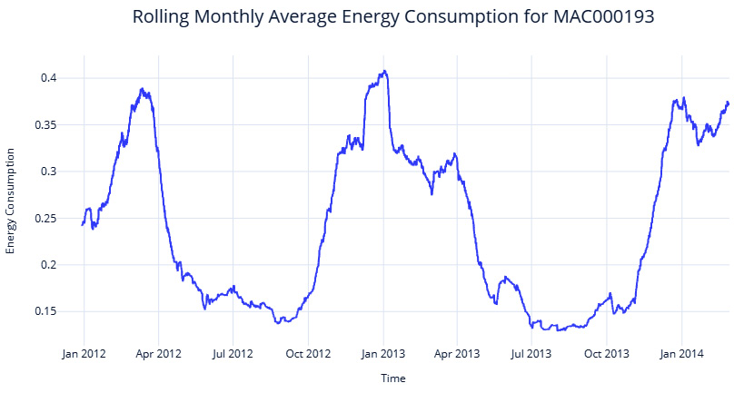
Figure 3.4 – Rolling monthly average energy consumption of household MAC000193
We can see the macro patterns much more clearly now. The seasonality is clear – the series peaks in winter and troughs during summer. And if you think about it critically, it makes sense. This is London we are talking about, and the energy consumption would be higher during the winter because of lower temperatures and subsequent heating system usage. For a household in the tropics, for example, the pattern may be reversed, with the peaks coming in summer when air conditioners come into play.
Another use for the line chart is to visualize two or more time series together and investigate any correlations between them. In our case, let’s try plotting the temperature along with the energy consumption and see if the hypothesis we have about temperature influencing energy consumption holds good:

Figure 3.5 – Temperature and energy consumption (zoomed-in plot at the bottom)
Here, we can see a clear negative correlation in yearly resolution between energy consumption and temperature. Winters show higher energy consumption on a macro scale. We can also see the daily patterns that are loosely correlated with temperature, but maybe because of other factors such as people coming back home after work and so on.
There are a few other visualizations that are more suited to bringing out seasonality in a time series. Let’s take a look.
Seasonal plots
A seasonal plot is very similar to a line plot, but the key difference here is that the X-axis denotes the “seasons”, the Y-axis denotes the time series value, and the different seasonal cycles are represented in different colors or line types. For instance, the yearly seasonality at a monthly resolution can be depicted with months on the X-axis and different years in different colors.
Let’s see what this looks like for our household in question. Here, we have plotted the average monthly energy consumption across multiple years:

Figure 3.6 – Seasonal plot at a monthly resolution
We can instantly see the appeal in this visualization because it lets us visualize the seasonality pattern easily. We can see that the consumption goes down in the summer months and we can also see that it happens consistently across multiple years. In the 2 years that we have data for, we can see that in October, the behavior in 2013 slightly deviated from 2012. Maybe there is something else that can help us explain this difference – what about temperature? We can also plot the seasonal plots with another variable of interest, such as the temperature:
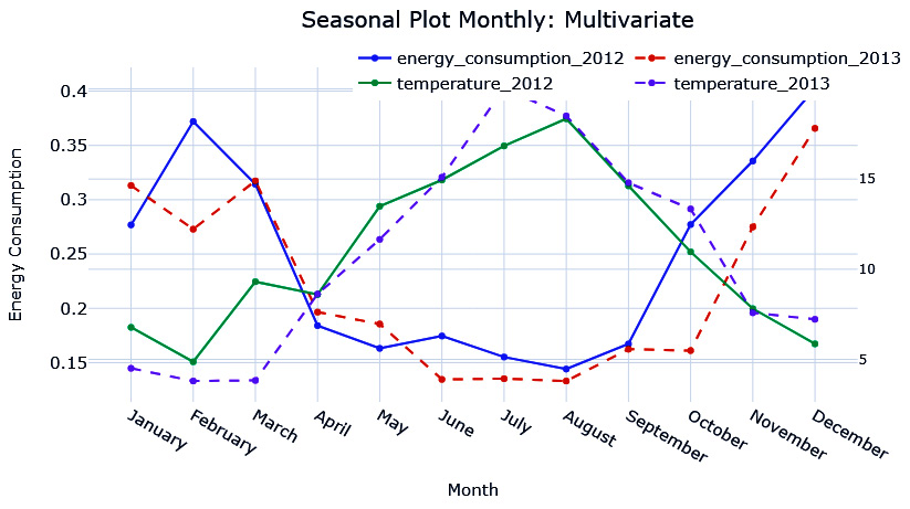
Figure 3.7 – Seasonal plot at a monthly resolution (energy consumption versus temperature)
Notice October? In October 2013, the temperature stayed warmer for 1 month more, hence why the energy consumption pattern was slightly different from last year.
We can plot these kinds of plots at other resolutions as well, such as hourly seasonality. But when there are too many seasonal cycles to be plotted, it increases visual clutter. An alternative to a seasonal plot is a seasonal box plot.
Seasonal box plots
Instead of plotting the different seasonal cycles in different colors or line types, we can represent them as a box plot. This instantly clears up the clutter in the plot. The additional benefit you get from this representation is that it lets us understand the variability across seasonal cycles:
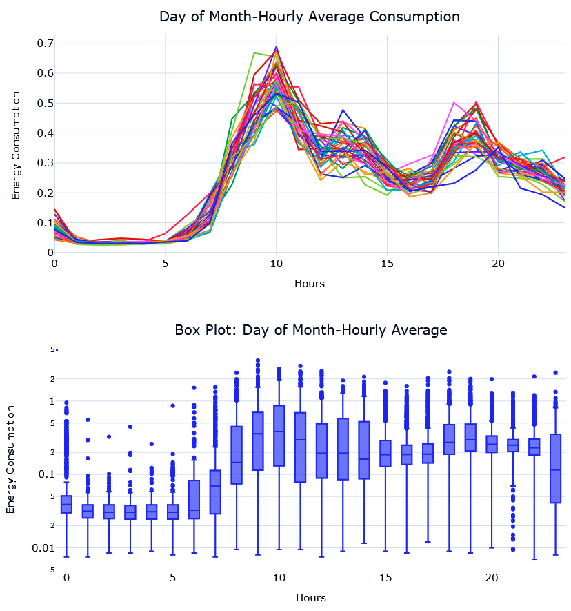
Figure 3.8 – Seasonal plot (top) and seasonal box plot (bottom) at an hourly resolution
Here, we can see that the seasonal plot at this resolution is too cluttered to make out the pattern and the variation across seasonal cycles. However, the seasonal box plot is much more informative. The horizontal line in the box tells us about the median, the box is the interquartile range (IQR), and the points that are marked are the outliers. By looking at the medians, we can see that the peak consumption occurs from 9 A.M. onward. But the variability is also higher from 9 A.M. If you plot separate box plots for each week, for example, you will see that the patterns are slightly different on Sundays (additional visualizations are in the associated notebook).
However, there is another visualization that lets you inspect these patterns along two dimensions.
Calendar heatmaps
Instead of having separate box plots or separate line charts for each week of the day, it would be useful if we could condense that information into a single plot. This is where calendar heatmaps come in. A calendar heatmap uses colored cells in a rectangular block to represent the information. Along the two sides of the rectangle, we can find two separate granularities of time, such as month and year. In each intersection, the cell is colored relative to the value of the time series at that intersection.
Let’s look at the hourly average energy consumption across the different weekdays in a calendar heatmap:

Figure 3.9 – A calendar heatmap for energy consumption
From the color scale on the right, we know that lighter colors mean higher values. We can see how Monday to Saturday have similar peaks – that is, once in the morning and once in the evening. However, Sunday has a slightly different pattern, with higher consumption throughout the day.
So far, we’ve reviewed a lot of visualizations that can bring out seasonality. Now, let’s look at a visualization for inspecting autocorrelation.
Autocorrelation plot
If correlation indicates the strength and direction of the linear relationship between two variables, autocorrelation is the correlation between the values of a time series in successive periods. Most time series have a heavy dependence on the value in the previous period, and this is a critical component in a lot of the forecasting models we will be seeing as well. Something such as ARIMA (which we will briefly look at in Chapter 4, Setting a Strong Baseline Forecast) is built on autocorrelation. So, it’s always helpful to just visualize and understand how strong the dependence on previous time steps is.
This is where autocorrelation plots come in handy. In such plots, we have the different lags (t-1, t-2, t-3, and so on) on the X-axis and the correlations between t and the different lags on the Y-axis. In addition to autocorrelation, we can also look at partial autocorrelation, which is very similar to autocorrelation but with one key difference: partial autocorrelation removes any indirect correlation that may be present before presenting the correlations. Let’s look at an example to understand this. If t is the current time step, let’s assume t-1 is highly correlated to t. So, by extending this logic, t-2 will be highly correlated with t-1 and because of this correlation, the autocorrelation between t and t-2 would be high. However, partial autocorrelation corrects this and extracts the correlation, which can be purely attributed to t-2 and t.
One thing we need to keep in mind is that the autocorrelation and partial autocorrelation analysis works best if the time series is stationary (we will talk about stationarity in detail in Chapter 6, Feature Engineering for Time Series Forecasting).
Best practice
There are many ways of making a series stationary, but a quick and dirty way is to use seasonal decomposition and just pick the residuals. It should be devoid of trends and seasonality, which are the major drivers of non-stationarity in a time series. But as we will see later in this book, this is not a foolproof method of making a series stationary in the truest sense.
Now, let’s see what these plots look like for our household from the dataset (after making it stationary):
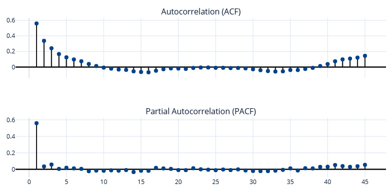
Figure 3.10 – Autocorrelation and partial autocorrelation plots
Here, we can see that the first lag (t-1) has the most influence and that its influence quickly drops down to close to zero in the partial autocorrelation plot. This means that the energy consumption of a day is highly correlated with the energy consumption the day before.
With that, we’ve looked at the different components of a time series and learned how to visualize a few of them. Now, let’s see how we can decompose a time series into its components.
Decomposing a time series
Seasonal decomposition is the process by which we deconstruct a time series into its components – typically, trend, seasonality, and residuals. The general approach for decomposing a time series is as follows:
- Detrending: Here, we estimate the trend component (which is the smooth change in the time series) and remove it from the time series, giving us a detrended time series.
- Deseasonalizing: Here, we estimate the seasonality component from the detrended time series. After removing the seasonal component, what is left is the residual.
Let’s discuss them in detail.
Detrending
Detrending can be done in a few different ways. Two popular ways of doing it are by using moving averages and locally estimated scatterplot smoothing (LOESS) regression.
Moving averages
One of the easiest ways of estimating trends is by using a moving average along the time series. It can be seen as a window that is moved along the time series in steps, and at each step, the average of all the values in the window is recorded. This moving average is a smoothed-out time series and helps us estimate the slow change in time series, which is the trend. The downside is that the technique is quite noisy. Even after smoothing out a time series using this technique, the extracted trend will not be smooth; it will be noisy. The noise should ideally reside with the residuals and not the trend (see the trend line shown in Figure 3.11).
LOESS
The LOESS algorithm, which is also called locally weighted polynomial regression, was developed by Bill Cleveland through the 70s to the 90s. It is a non-parametric method that is used to fit a smooth curve onto a noisy signal. We use an ordinal variable that moves between the time series as the independent variable and the time series signal as the dependent variable. For each value in the ordinal variable, the algorithm uses a fraction of the closest points and estimates a smoothed trend using only those points in a weighted regression. The weights in the weighted regression are the closest points to the point in question. This is given the highest weight and it decays as we move farther away from it. This gives us a very effective tool for modeling the smooth changes in the time series (trend).
Deseasonalizing
The seasonality component can also be estimated in a few different ways. The two most popular ways of doing this are by using period-adjusted averages or a Fourier series.
Period adjusted averages
This is a pretty simple technique wherein we calculate a seasonality index for each period in the expected cycle by taking the average values of all such periods over all the cycles. To make that clear, let’s look at a monthly time series where we expect an annual seasonality in this time series. So, the up-and-down pattern would complete a full cycle in 12 months, or the seasonality period is 12. In other words, every 12 points in the time series have similar seasonal components. So, we take the average of all January values as the period-adjusted average for January. In the same way, we calculate the period average for all 12 months. At the end of the exercise, we have 12 period averages, and we can also calculate an average period average. Now, we can make these period averages into an index by either subtracting the average of all period averages from each of the period averages (for additive) or dividing the average of all period averages from each of the period averages (multiplicative).
Fourier series
In the late 1700s, Joseph Fourier, a mathematician and physicist, while studying heat flow, realized something profound – any periodic function can be broken down into a simple series of sine and cosine waves. Let’s dwell on that for a minute. Any periodic function, no matter the shape, curve, or absence of it, or how wildly it oscillates around the axis, can be broken down into a series of sine and cosine waves.
Additional information
For the more mathematically inclined, the original theory proposes to decompose any periodic function into an integral of exponentials. Using Euler’s identity,  , we can consider them as a summation of sine and cosine waves. The Further reading section contains a few resources if you want to delve deeper and explore related concepts, such as the Fourier transform.
It is this property that we use to extract seasonality from a time series because seasonality is a periodic function, and any periodic function can be approximated by a combination of sine and cosine waves. The sine-cosine form of a Fourier series is as follows:

Here, ![]() is the N-term approximation of the signal, S. Theoretically, when N is infinite, the resulting approximation is equal to the original signal. P is the maximum length of the cycle.
is the N-term approximation of the signal, S. Theoretically, when N is infinite, the resulting approximation is equal to the original signal. P is the maximum length of the cycle.
We can use this Fourier series, or a few terms from the Fourier series, to model our seasonality. In our application, P is the maximum length of the cycle we are trying to model. For instance, for a yearly seasonality for monthly data, the maximum length of the cycle (P) is 12. x would be an ordinal variable that increases from 1 to P. In this example, x would be 1, 2, 3, … 12. Now, with these terms, all that is left to do is find ![]() and
and ![]() , which we can do by regressing on the signal.
, which we can do by regressing on the signal.
We’ve seen that with the right combination of Fourier terms, we can replicate any signal. But the question is, should we? What we want to learn from data is a generalized seasonality profile that does well with unseen data as well. So, we use N as a hyperparameter to extract as complex a signal as we want from the data.
This is a good time to brush up on your trigonometry and remember what sine and cosine waves look like. The first Fourier term (n=1) is your age-old sine and cosine waves, which complete one full cycle in the maximum cycle length (P). As we increase n, we get sine and cosine waves that have multiple cycles in the maximum cycle length (P). This can be seen in the following figure:

Figure 3.11 – Cosine Fourier terms (n=1, 2, 3)
The sine and cosine waves are complementary to each other, as shown in the following figure:
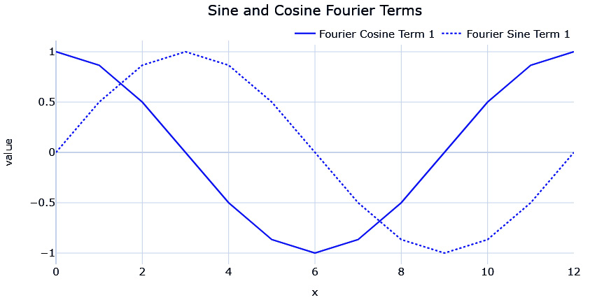
Figure 3.12 – Sine and cosine Fourier terms (n=1)
Now, let’s see how we can use this in practice.
Implementations
Notebook alert
To follow along with the complete code for decomposing time series, use the 02-Decomposing Time Series.ipynb notebook in the chapter03 folder.
There are four implementations that we will cover here in the following subsections.
seasonal_decompose from statsmodel
statsmodels.tsa.seasonal has a function called seasonal_decompose. This is an implementation that uses moving averages for the trend component and period-adjusted averages for the seasonal component. It supports both additive and multiplicative modes of decomposition. However, it doesn’t tolerate missing values. Let’s see how we can use it:
#Does not support missing values, so using imputed ts instead
res = seasonal_decompose(ts, period=7*48, model="additive", extrapolate_trend="freq")
A few key parameters to keep in mind are as follows:
- period is the seasonal period you expect the pattern to repeat.
- model takes additive or multiplicative as arguments to determine the type of decomposition.
- filt takes in an array that is used as the weights in the moving average (convolution, to be specific). It can also be used to define the window over which we need our moving average. We can increase it to smooth out the trend component to some extent.
- extrapolate_trend is a parameter that we can use to extend the trend component to both sides to avoid the missing values that are generated when applying the moving average filter.
- two_sided is a parameter that lets us define how the moving averages are calculated. If True, which it is by default, the moving average is calculated using the past as well as future values because the window for the moving average is centered. If False, it only uses past values to calculate the moving average.
Let’s see how well we have been able to decompose one of the time series in our datasets. We used period=7*48 to capture a weekday-hourly profile and filt=np.repeat(1/(30*48), 30*48) to make the moving average over 30 days with uniform weights:

Figure 3.13 – Seasonal decomposition using statsmodels
We can’t see the seasonal pattern because it’s too small in the grand scale of the plot. The associated notebook has zoomed-in plots to help you understand the seasonal pattern. Even with a large window (for example, 20 days) of smoothing, the trend still has some noise in it. We may be able to reduce this a bit more by increasing the window, but there is a better alternative, as we will see now.
Seasonality and trend decomposition using LOESS (STL)
As we saw earlier, LOESS is much more suited for trend estimation. Seasonality and trend decomposition using LOESS (STL) is an implementation that uses LOESS for trend estimation and period averages for seasonality. Although statsmodels has an implementation, we have reimplemented it for better performance and flexibility. This implementation can be found in this book’s GitHub repository under src.decomposition.seasonal.py. It expects a pandas DataFrame or series with a datetime index as an input. Let’s see how we can use this:
stl = STL(seasonality_period=7*48, model = "additive")
res_new = stl.fit(ts_df.energy_consumption)
The key parameters here are as follows:
- seasonality_period is the seasonal period you expect the pattern to repeat.
- model takes additive or multiplicative as arguments to determine the type of decomposition.
- lo_frac is the fraction of the data that will be used to fit the LOESS regression.
- lo_delta is the fractional distance within which we use a linear interpolation instead of weighted regression. Using a non-zero lo_delta significantly decreases computation time.
Let’s see what this decomposition looks like. Here, we used seasonality_period=7*48 to capture a weekday-hourly profile:
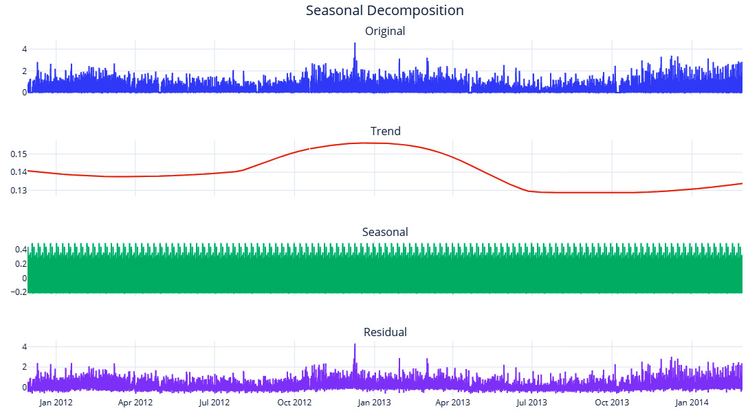
Figure 3.14 – STL decomposition
Let’s also look at the decomposition for just 1 month to see the extracted seasonality patterns clearer:
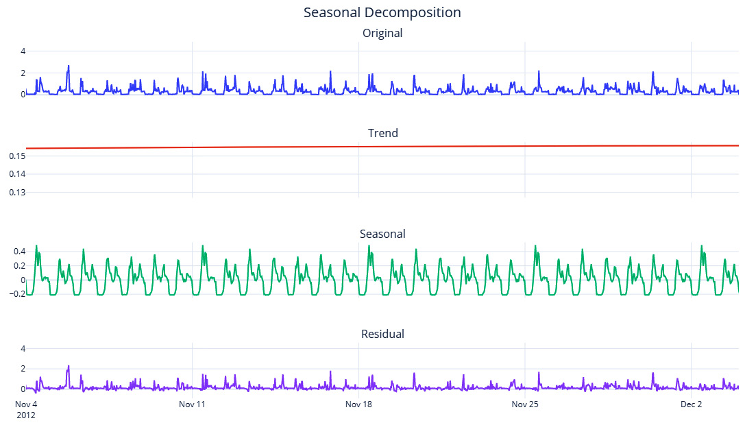
Figure 3.15 – STL decomposition (zoomed-in for a month)
The trend is smooth enough now and seasonality has also been captured. Here, we can clearly see the hourly peaks and valleys and the higher peaks on weekends. But since we are relying on averages to derive the seasonality, it is also highly influenced by outliers. A few very high or very low values in the time series will skew your seasonality profile that’s been derived from period averages. Another disadvantage of this technique is that the “goodness” of the seasonality that’s been extracted suffers when the difference between the resolution of the data and the expected seasonality cycle is greater. For instance, when extracting a yearly seasonality on daily or sub-daily data, this would make the extracted seasonality very noisy. This technique will also not work if you have less than two cycles of the expected seasonality – for instance, if we want to extract a yearly seasonality, but we have less than 2 years of data.
Fourier decomposition
We can find the Python implementation for decomposing a time series using Fourier terms in src.decomposition.seasonal.py. It uses LOESS for trend detection and Fourier terms for seasonality extraction. There are two ways we can use it. First, we can specify seasonality_period as one of the pandas datetime properties (such as hour, week_of_day, and so on):
stl = FourierDecomposition(seasonality_period="hour", model = "additive", n_fourier_terms=5)
res_new = stl.fit(pd.Series(ts.squeeze(), index=ts_df.index))
Alternatively, we can create any custom seasonality array that’s the same length as the time series that has an ordinal representation of the seasonality. If it is an annual seasonality of daily data, the array would have a minimum value of 1 and a maximum value of 365 as it increases by one every day of the year:
#Making a custom seasonality term
ts_df["dayofweek"] = ts_df.index.dayofweek
ts_df["hour"] = ts_df.index.hour
#Creating a sorted unique combination df
map_df = ts_df[["dayofweek","hour"]].drop_duplicates().sort_values(["dayofweek", "hour"])
# Assigning an ordinal variable to capture the order
map_df["map"] = np.arange(1, len(map_df)+1)
# mapping the ordinal mapping back to the original df and getting the seasonality array
seasonality = ts_df.merge(map_df, on=["dayofweek","hour"], how='left', validate="many_to_one")['map']
stl = FourierDecomposition(model = "additive", n_fourier_terms=50)
res_new = stl.fit(pd.Series(ts, index=ts_df.index), seasonality=seasonality)
The key parameters that are involved in this process are as follows:
- seasonality_period is the seasonality to be extracted from the datetime index. pandas datetime properties such as week_of_day, month, and so on can be used to specify the most prominent seasonality. If left set to None, you need to provide the seasonality array while calling fit.
- model takes additive or multiplicative as arguments to determine the type of decomposition.
- n_fourier_terms determines the number of Fourier terms to be used to extract the seasonality. The more we increase this parameter, the more complex the seasonality that is extracted from the data.
- lo_frac is the fraction of the data that will be used to fit the LOESS regression.
- lo_delta is the fractional distance within which we use linear interpolation instead of weighted regression. Using a non-zero lo_delta significantly decreases computation time.
Let’s see the zoomed-in plot for the decomposition using FourierDecomposition:

Figure 3.16 – Decomposition using Fourier terms (zoomed-in for a month)
The trend is going to be the same as the STL one because we are using LOESS here as well. The seasonality profile may be slightly different and robust to outliers because we are doing regularized regression using the Fourier terms on the signal. Another advantage is that we have decoupled the resolution of the data and the expected seasonality. Now, extracting a yearly seasonality on sub-daily data is not as challenging as with period averages.
So far, we have only seen techniques that extract one seasonality per series; mostly, we extract the major seasonality. So, what do we do when we have multiple seasonal patterns?
Multiple seasonality decomposition using LOESS (MSTL)
Time series with high-frequency data (such as daily, hourly, or minutely data) are prone to exhibit multiple seasonal patterns. For instance, there may be an hourly seasonality pattern, a weekly seasonality pattern, and a yearly seasonality pattern. But if we extract only the dominant pattern and leave the rest to residuals, we are not doing justice to the decomposition. Kasun Bandara et al. proposed an extension of STL decomposition for multiple seasonality, known as multiple seasonal-trend decomposition using LOESS (MSTL), and a corresponding implementation is present in the R ecosystem. A very similar implementation in Python can be found in src.decomposition.seasonal.py. In addition to MSTL, the implementation extracts multiple seasonality using Fourier terms.
Reference check
The research paper by Kasun Bandara et al. is cited in the References section as reference 1.
Let’s look at an example of how we can use this:
stl = MultiSeasonalDecomposition(seasonal_model="fourier",seasonality_periods=["day_of_year", "day_of_week", "hour"], model = "additive", n_fourier_terms=10)
res_new = stl.fit(pd.Series(ts, index=ts_df.index))
The key parameters here are as follows:
- seasonality_periods is the list of expected seasonalities. For STL, it is a list of seasonal periods, while for FourierDecomposition, it is a list of strings that denotes pandas datetime properties.
- seasonality_model takes fourier or averages as arguments to determine the type of seasonality decomposition.
- model takes additive or multiplicative as arguments to determine the type of decomposition.
- n_fourier_terms determines the number of Fourier terms to be used to extract the seasonality. As we increase this parameter, the more complex the seasonality that is extracted from the data.
- lo_frac is the fraction of the data that will be used to fit the LOESS regression.
- lo_delta is the fractional distance within which we use linear interpolation instead of weighted regression. Using a non-zero lo_delta significantly decreases computation time.
Let’s see what the decomposition looks like when using Fourier decomposition:
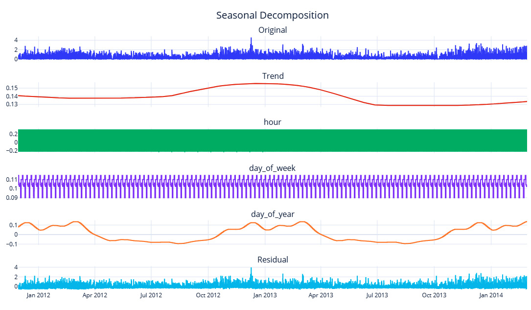
Figure 3.17 – Multiple seasonality decomposition using Fourier terms
Here, we can see that the day_of_week seasonality has been extracted. To see the day_of_week and hour seasonal components, we need to zoom in a bit:

Figure 3.18 – Multiple seasonality decomposition using Fourier terms (zoomed-in for a month)
Here, we can observe that the hour seasonality has been extracted well and that it has also isolated the day_of_week seasonal component, which peaks on weekends. The discrete step nature of the day_of_week seasonal component is because the frequency of the data is half-hourly, and for 48 data points, day_of_week will be the same.
We have summarized the four techniques we’ve covered in the following table:
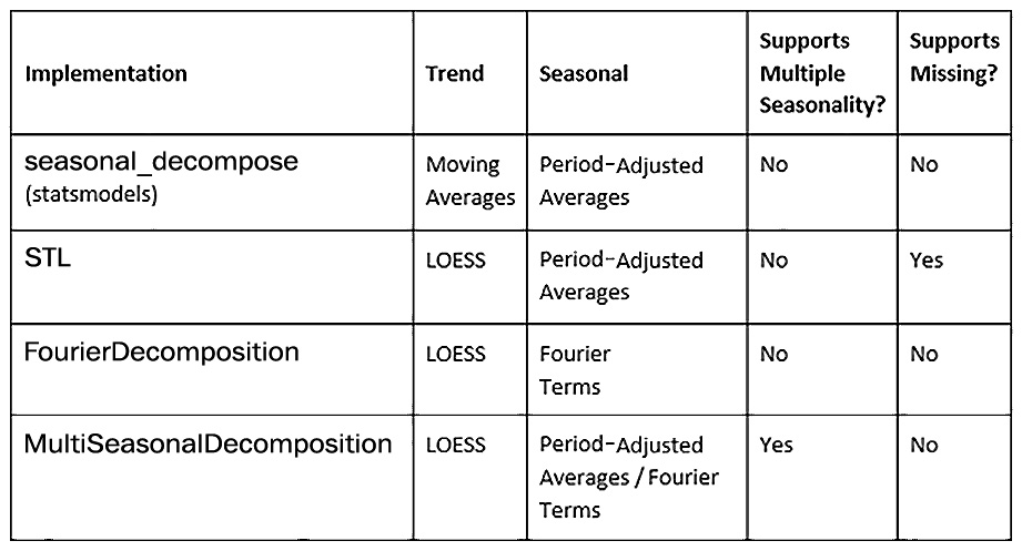
Table 3.1 – Different seasonal decomposition techniques
Now, let’s understand and analyze a time series dataset.
Detecting and treating outliers
An outlier, as its name suggests, is an observation that lies at an abnormal distance from the rest of the observations. If we are looking at a data generating process (DGP) as a stochastic process that generates the time series, the outliers are the points that have the least probability of being generated from the DGP. This can be for many reasons, including faulty measurement equipment, incorrect data entry, and black-swan events, to name a few. Being able to detect such outliers and treat them may help your forecasting model understand the data better.
Outlier/anomaly detection is a specialized field itself in time series, but in this book, we are going to restrict ourselves to simpler techniques of identifying and treating outliers. This is because our main aim is not to detect outliers, but to clean the data for our forecasting models to perform better. If you want to learn more about anomaly detection, head over to the Further reading section for a few resources to get started.
Now, let’s look at a few techniques for identifying outliers.
Notebook alert
To follow along with the complete code for detecting outliers, use the 03-Outlier Detection.ipynb notebook in the chapter03 folder.
Standard deviation
This is a rule of thumb that almost everyone who has worked with data for some time would have heard of – if ![]() is the mean of the time series and
is the mean of the time series and ![]() is the standard deviation, then anything that falls beyond
is the standard deviation, then anything that falls beyond ![]() is an outlier. The underlying theory is deeply rooted in statistics. If we assume that the values of the time series follow a normal distribution (which is a symmetrical distribution with very desirable properties), using probability theory, we can derive that 68% of the area under the normal distribution lies within one standard deviation on either side of the mean, about 95% of the area within two standard deviations, and about 99% of the area within three standard deviations. So, when we make the bounds as three standard deviations (by using the rule of thumb), what we are saying is that if any observation whose probability of belonging to the probability distribution is less than 1%, then they are an outlier. Moving slightly to more practical issues, this cutoff of three standard deviations is in no way sacrosanct. We need to try out different values of this multiple and determine the right multiple by subjectively evaluating the results we get. The higher the multiple is, the fewer outliers there will be.
is an outlier. The underlying theory is deeply rooted in statistics. If we assume that the values of the time series follow a normal distribution (which is a symmetrical distribution with very desirable properties), using probability theory, we can derive that 68% of the area under the normal distribution lies within one standard deviation on either side of the mean, about 95% of the area within two standard deviations, and about 99% of the area within three standard deviations. So, when we make the bounds as three standard deviations (by using the rule of thumb), what we are saying is that if any observation whose probability of belonging to the probability distribution is less than 1%, then they are an outlier. Moving slightly to more practical issues, this cutoff of three standard deviations is in no way sacrosanct. We need to try out different values of this multiple and determine the right multiple by subjectively evaluating the results we get. The higher the multiple is, the fewer outliers there will be.
For highly seasonal data, the naïve way of applying the rule to the raw time series will not work well. In such cases, we must deseasonalize the data using any of the techniques we discussed earlier and then apply the outliers to the residuals. If we don’t do that, we may flag a seasonal peak as an outlier, which is not what we want.
Another key assumption here is the normal distribution. However, in reality, a lot of the time series we come across may not be normal and hence the rule will lose its theoretical guarantees fast.
Interquartile range (IQR)
Another very similar technique is using the IQR instead of the standard deviation to define the bounds beyond which we mark the observations as outliers. IQR is the difference between the 3rd quartile (or the 75th percentile or 0.75 quantile) and the 1st quartile (or the 25th percentile or 0.25 quantile). The upper and lower bounds are defined as follows:
- Upper bound = Q3 + n x IQR
- Lower bound = Q1 - n x IQR
Here, IQR = Q3-Q2, and n is the multiple of IQRs that determines the width of the acceptable area.
For datasets where we observe high occurrences of outliers and wild variations, this is slightly more robust than the standard deviation. This is because the standard deviation and the mean are highly influenced by individual points in the dataset. If 2 ![]() was the rule of thumb in the earlier method, here, it is 1.5 times the IQR. This also ties back to the same normal distribution assumption, and 1.5 times the IQR is equivalent to ~3
was the rule of thumb in the earlier method, here, it is 1.5 times the IQR. This also ties back to the same normal distribution assumption, and 1.5 times the IQR is equivalent to ~3 ![]() (2.7
(2.7 ![]() to be exact). The point about deseasonalizing before applying the rule applies here as well. It applies to all the techniques we will see here.
to be exact). The point about deseasonalizing before applying the rule applies here as well. It applies to all the techniques we will see here.
Isolation Forest
Isolation Forest is an unsupervised anomaly detection algorithm based on decision trees. A typical anomaly detection algorithm models the normal points and profiles outliers as any points that do not fit the normal. But Isolation Forest takes a different path and models the outliers directly. It does this by creating a forest of decision trees by randomly splitting the feature space. This technique works on the assumption that the outlier points fall in the outer periphery and are easier to fall into a leaf node of a tree. Therefore, you can find the outliers in short branches, whereas normal points, which are closer together, will require longer branches. The “anomaly score” of any point is determined by the depth of the tree to be traversed before reaching that particular point. scikit-learn has an implementation of the algorithm under sklearn.ensemble.IsolationForest. Apart from the standard parameters for decision trees, the key parameter here is contamination. It is set to auto by default but can be set to any value between 0 and 0.5. This parameter specifies what percentage of the dataset you expect to be anomalous. But one thing we have to keep in mind is that IsolationForest does not consider time at all and just highlights values that fall outside the norm.
Extreme studentized deviate (ESD) and seasonal ESD (S-ESD)
This statistics-based technique is more sophisticated than the basic ![]() technique, but still uses the same assumption of normality. It is based on another statistical test, called Grubbs's Test, which is used to find a single outlier in a normally distributed dataset. ESD iteratively uses Grubbs's test by identifying and removing an outlier at each step. It also adjusts the critical value based on the number of points left. For a more detailed understanding of the test, go to the Further reading section, where we have provided a couple of resources about ESD and S-ESD. In 2017, Hochenbaum et al. from Twitter Research proposed to use the generalized ESD with deseasonalization as a method of detecting outliers for time series.
technique, but still uses the same assumption of normality. It is based on another statistical test, called Grubbs's Test, which is used to find a single outlier in a normally distributed dataset. ESD iteratively uses Grubbs's test by identifying and removing an outlier at each step. It also adjusts the critical value based on the number of points left. For a more detailed understanding of the test, go to the Further reading section, where we have provided a couple of resources about ESD and S-ESD. In 2017, Hochenbaum et al. from Twitter Research proposed to use the generalized ESD with deseasonalization as a method of detecting outliers for time series.
We have adapted an existing implementation of the algorithm for our use case, and it is available in this book’s GitHub repository. While all the other methods leave it to the user to determine the right level of outliers by tweaking a few parameters, S-ESD only takes in an upper bound on the number of expected outliers and then identifies the outliers independently. For instance, we set the upper bound to 800 and the algorithm identified ~400 outliers in the data we are working with.
Reference check
The research paper by Hochenbaum et al. is cited in the References section as reference 2.
Let’s see how the outliers were detected using all the techniques we have reviewed:
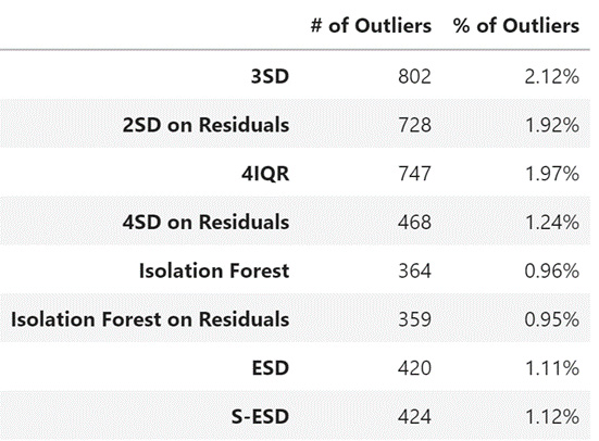
Figure 3.19 – Outliers detected using different techniques
Now that we’ve learned how to detect outliers, let’s talk about how we can treat them and clean the dataset.
Treating outliers
The first question that we must answer is whether or not we should correct the outliers we have identified. The statistical tests that identify outliers automatically should go through another level of human verification. If we blindly “treat” outliers, we might be chopping off a valuable pattern that will help us forecast the time series. If you are only forecasting a handful of time series, then it still makes sense to look at the outliers and anchor them to reality by looking at the causes for such outliers.
But when you have thousands of time series, a human can’t inspect all the outliers, so we will have to resort to automated techniques. A common practice is to replace an outlier with a heuristic such as the maximum, minimum, 75th percentile, and so on. A better method is to consider the outliers as missing data and use any of the techniques we discussed earlier to impute the outliers.
One thing we must keep in mind is that outlier correction is not a necessary step in forecasting, especially when using modern methods such as machine learning or deep learning. Whether we do outlier correction or not is something we have to experiment with and figure out.
Well done! This was a pretty busy chapter, with a lot of concepts and code, so congratulations on finishing it. Feel free to head back and revise a few topics as needed.
Summary
In this chapter, we learned about the key components of a time series and familiarized ourselves with terms such as trend, seasonality, and so on. We also reviewed a few time series-specific visualization techniques that will come in handy during EDA. Then, we learned about techniques that let you decompose a time series into its components and saw techniques for detecting outliers in the data. Finally, we learned how to treat the identified outliers. Now, you are all set to start forecasting the time series, which we will start in the next chapter.
References
The following are the references for this chapter:
- Kasun Bandara and Rob J Hyndman and Christoph Bergmeir. (2021). MSTL: A Seasonal-Trend Decomposition Algorithm for Time Series with Multiple Seasonal Patterns. arXiv:2107.13462 [stat.AP]. https://arxiv.org/abs/2107.13462.
- Hochenbaum, J., Vallis, O., & Kejariwal, A. (2017). Automatic Anomaly Detection in the Cloud Via Statistical Learning. ArXiv, abs/1704.07706. https://arxiv.org/abs/1704.07706.
Further reading
To learn more about the topics that were covered in this chapter, take a look at the following resources:
- Fourier Series: https://www.setzeus.com/public-blog-post/the-fourier-series.
- Fourier Series from Khan Academy: https://www.youtube.com/watch?v=UKHBWzoOKsY.
- Fourier Transform - https://betterexplained.com/articles/an-interactive-guide-to-the-fourier-transform/.
- Ane Blázquez-García, Angel Conde, Usue Mori, and Jose A. Lozano. (2021). A Review on Outlier/Anomaly Detection in Time Series Data. arXiv:2002.04236. https://arxiv.org/abs/2002.04236.
- Braei, M., & Wagner, S. (2020). Anomaly Detection in Univariate Time-series: A Survey on the State-of-the-Art. ArXiv, abs/2004.00433. https://arxiv.org/abs/2004.00433.
- Generalized ESD Test for Outliers: https://www.itl.nist.gov/div898/handbook/eda/section3/eda35h3.htm.