
Media
“The medium is the message.”
Marshall McLuhan, philosopher, educator, and media guru
Although McLuhan may have been referring to the medium of broadcasting, this statement resonates with the artist as well. The medium chosen to communicate the illustration will also communicate your vision and style.
It is a fantastic feeling to know the basics of a medium and how to control and manipulate it. Having the command of several media will further your proficiency and give you options to change the look of your work. Eventually, using various media will become second nature to you.
Being prolific is a necessity to succeed as an illustrator in the contemporary market. Nothing lasts forever, especially in a market driven by fashion and trends, where last season’s “Ins” are on this season’s “Out” list. The ability to adapt and change in a capricious climate is as important as developing a unique style. Change is essential; one method of nurturing change and reinventing and rejuvenating your work is to explore a different medium.
Encourage yourself to invent ways to look anew at your work and develop practices that force you to create the work in a method foreign to that with which you are familiar. That is important. If you are adept at drawing, start painting; if you always begin your illustration with the foreground, begin with the background. Change your palette; choose the complements of the colors you ordinarily use. Acknowledging your pattern of working and then changing your pattern will positively influence your work.
The same holds true for exploring media and finding new ways to incorporate them into your work; combine media, change papers, canvas, or surfaces to work upon, invent or create surfaces, draw and paint with balsa wood, sponges, or found items—above all, explore.
In this chapter we will explore wet media, including brush and ink, gouache, watercolors, dyes, and dry media, including charcoal, graphite, pastel, and collage. Finally, we will look at media that defy these categories and discuss Adobe Photoshop and Adobe Illustrator. A recurring theme throughout this chapter will be the idea of experimentation and practice. Try using any of the exercises given in this book to practice using the different media.

Brush and ink on hot pressed paper.
Brush and ink on cold pressed paper.

Sumi brush and ink on soft pressed paper.

Brush and ink on ink-wash background.
Brush and ink is a natural combination capable of producing a variety of effects. Traditionally, brush and ink is associated with the art of sumi-e painting, a Japanese technique using a bamboo brush with natural hair (a sumi brush) and black ink to create quick line paintings with the addition of a gray tone mixed by adding water to the black ink. Selectivity guides the eye, allowing the artist to use an economy of line and tone to create the image.
There are many kinds of brushes, inks, and papers available. Other brushes, which are discussed in the watercolor and dyes section (see pp. 144–145), can be used as well to elicit different effects. Inks are not limited to black; they come in different colors that can be mixed and diluted with water to create an infinite range of transparent color washes to accentuate the economy of line. The type of paper you use will affect the outcome of the illustration. The ideal paper for this wet medium should be absorbent to soak up the medium and not have it rest on the surface. A cold pressed paper (textured) is preferable to one off a hot press (smooth), as a textured paper will hold the ink better. Think of ironing a shirt and how heat smoothes the creases and wrinkles; the idea is the same behind the press of paper. The weight of the paper is another factor; the heavier the weight, the thicker and more absorbent the paper.
Brush and ink is a dynamic and elegant medium that is as versatile as its user. It is immediate and spontaneous.
The use of a brush with a wet medium depends on confident draftsmanship and a fearlessness to trust your eye. The beauty of brush and ink is its spontaneity. The sweep of a brush stroke will create a definite mark; it is important to explore all of the possibilities of using the brush and its capabilities so it becomes an extension of your eye and vision.
Attempt to develop a rhythmic sense of pressure when using the brush. The versatility of the brush stroke depends not only on the type of brush and the saturation of ink, but on how much pressure is applied when making a stroke. Practice a series of strokes beginning at the top of the page and moving toward the bottom. Acquaint yourself with the brush by repeating the painting strokes in one direction on the paper, attempting to make straight lines with no variation of line. Then attempt to create a variety of line by using pressure by painting a line that is narrow at the beginning point and wider at the end point. Follow through with an exercise that reverses this formula.
Experiment with different brushes and the myriad of textures and line those brushes may create. Begin with a large flat brush to map in the visual and move to a medium brush to restate the visual, concluding with a fine brush to place the detail. Allow the brush to become dry and paint a stroke. Try a wet brush, dry brush, wide brush, thin brush, blunt, sumi, and two brushes at once. Allow accidents to occur and become part of the piece. You can experiment with different inks and textured papers, too.
Be fearless. This medium is not for the delicate or faint of heart. It is a strong medium and needs to be handled as such. Before using the brush, look and think about where you want your line to be placed. Then, without hesitation, dip the brush in the ink and follow through.
Advantages
Bold and dynamic medium
With confidence, its user can create emotion, energy, and flair with one sweep of the brush
Can mimic texture by using different brushes and techniques
This medium is capricious and will differ dramatically in results
Disadvantages
It is an unforgiving medium, especially if using waterproof ink
This medium is capricious and will differ dramatically in results
Graphite, usually contained within a pencil or available as a stick, has a wide range of values from dark to light gray. Softer forms, which are classified as “B,” produce darker values, while harder forms, classified as “H,” produce lighter values.
Graphite allows for a great sense of depth in your work; the various tones can be layered one on top of the other and it easily adheres to a surface. Graphite is fantastic for line and mark-making, creating textures and fine details.
Explore graphite and its versatility by drawing with pencils and sticks. Use the sharpened point to make lines and the broad side of the stick to create blocks of value. Combine the two techniques and invent new ways to work the graphite. It is very important to discover how the graphite relates to different surfaces and interacts with other media. Since graphite is limited to a gray palette, you will need to explore different methods and techniques to reinvent the medium. You could, for example, invest time in finding out how it might react to a smooth surface, such as vellum, versus a coarse one, such as a gessoed board. You could also see how it might work when combined with a wet medium such as ink or gouache. Take the time to start exploring.
Advantages
Immediate results
Versatile
Can be used in a linear fashion or can be layered to create depth and photorealism
Works on all paper surfaces
Pencils are user-friendly, can be sharpened, shaved, or blunted to create different effects
Adheres to the surface of paper
Disadvantages
Limited to gray scale
Has a metallic shine that reflects light
Can leave a shine when applied too heavily or layered onto other media
Adheres to the surface of paper
Note:
Graphite can leave a residue or particles that may smear over the pristine area of a drawing. Placing a sheet of tracing paper or vellum over the initial drawing and resting your hand on this will keep it smooth. To accentuate the smears and incorporate them into the drawing, use a foam applicator or a small wet sponge or paper towel.
Note:
You can also grind graphite into dust and use this as a medium, or to create a specific effect.
Charcoal, in contrast to graphite, comes in one value—black. But that black is unlike any other black seen in other media. It is a rich, velvety black that saturates the paper and smears and smudges easily, leaving a powdered trail of residue depending on the softness or hardness of the charcoal. It comes in a variety of grades from soft to hard, and is available in many forms from a thick stick to a fine powder. It can also be used with wet media to achieve different effects. The blackness can be tempered with tools and techniques to create a wide range of values from light to dark.
Charcoal is a rite of passage for most artists; it can be used to communicate energy and for rapid sketching. As you are reading this book, you are probably already familiar with charcoal and its properties. Love it or leave it, charcoal, for all its simplicity, is and always will be synonymous with figure drawing, and has a history of use for work that is fashion-oriented.
Practice line quality exercises with soft and hard charcoal. You can also try smearing it to create the visual or the ghost of the visual and then use hard charcoal to draw and restate the visual. Alternatively, fill an area of the paper with a medium-gray tone of the charcoal and use an eraser to lift off the excess to communicate a visual. Wet it, smear it, rub it, and use it with different papers. See what texture and effects you can create with the charcoal alone.
Advantages
Immediate
Versatile
Works on most paper surfaces, but is best used when paper has some tooth or texture to grab the charcoal
Can create unlimited textures and effects
Can be used on top of an underpainting of gouache, acrylic, or watercolor to build up the substance of the artwork
Works just as well creating line as solid areas of value
It is a forgiving medium and can usually be erased and reapplied
Can be combined with wet media to paint or create gray washes
Smears easily
Disadvantages
Powder-based and may need a fixative to prevent smudging
Will not adhere to smooth, polished surfaces
Dust and residue can affect cleanliness of the project
Smears easily


Graphite soft/hard on vellum paper.
Pastel soft/hard on toned Canson paper.

Hard charcoal on all-purpose paper.

Soft charcoal on all-purpose paper.
Pastels are a combination of powdered pigment and a binder. They are available in an infinite variety of hues. They come in the form of sticks or pencils and can have properties from soft to hard. The ratio of binders to the pigment affects the intensity of the color saturation. Soft pastels have the highest concentration of pigment; they are brilliant in intensity compared with hard pastels, which, due to the higher ratio of binder, are duller in color. Soft pastels blend easily, crumble, and need a deep textured surface to adhere to, whereas hard pastels and pencils are more compatible with various surfaces. They can also be built up in layers to create different thicknesses. In contrast to these dry pastels, oil pastels are also available. Oil pastels are bound with the addition of oil and create a rich texture and thickness on most surfaces of paper or canvas.
Pastel can create magic. It is impossible to imagine Degas, Lautrec, or even Monet’s Impressionistic artworks without acknowledging the resourcefulness and effect of pastel. Pastel is by nature a medium that can use color to paint as easily to draw. The broad side of the pastel can evoke in one wide stroke the shape of a coat or the turn of a head, while the edge of the pastel can be sharpened with a knife or razor and used to exact the fine detailing of a drawing. Such strokes can be loosely blended and cover a wide area to mimic shadow on the figure or tightly controlled to mimic smoky eye shadow.
In contrast to most methods of applying layers of value—from light to dark—pastel should be layered beginning with media or darks and working toward a layering of lights. A brilliance and intensity in the color can best be achieved with the direct application of the pastel. Blending, although an option, should be used sparingly so as not to overwork the media.
Pastel works well on toned paper. It can also be used over an underpainting to create depth, tone, value, mood, or light. It is a gracious and accommodating medium and seems a natural companion to most dry and wet media. Most dry pastels can also be combined with water to create a colored wash.
Experiment with the pastel by creating a drawing with single, bold strokes, cross-hatching, or solid shapes of color. Play with the pastel to create different textures and effects. Do a loose drawing using five colors only and, once complete, smear the drawing and restate another drawing on top of the smeared one.
You can also try creating an underpainting of three colored pastels in a shaped box on white paper. Once complete, use a brush or wet rag to blend the colors to create a colored ground. Using this colored ground as the medium value, add darks and lights to finish a drawing or a self-portrait.
Finally, do a self-portrait beginning with a dark pastel and then adding light pastels to complete the drawing. Use various papers of different textures to exact different results and don’t hesitate to mix the pastel with brush and water.
Advantages
Available in vibrant colors
Versatile
Can be applied in many forms and techniques
Easily applied and layered
Can easily go from transparent to opaque in application
Can be used in a linear way as well as in broad strokes to create mass and tone
Can be combined with wet media to create color washes
Blends to create shadows, layers of color, and textures
Light colors can be applied over dark areas to great effect to create shine or light
Compatible with most media
Breaks easily
Powder-based and can smear easily
Disadvantages
Overworking pastels may muddy the visual
Dependent on paper with tooth and textured, prepared surfaces
Does not adhere to smooth, polished surfaces
Requires the addition of fixative that will dull the colors
Breaks easily
Powder-based and can smear easily


Collage offers limitless possibilities: it can be cut, folded, ripped, overlapped, painted, drawn, or sewn over. An illustrator can include a myriad of images, text, and found objects—anything and everything that is visual can be a part of a collage.
Creating work in a collage format allows for unlimited possibilities. In its basic form, collage involves the overlapping and layering on of various flat elements to form a finished visual. The combination of these elements in a compositional format creates a visual narrative. Paper, fabric, newspaper, pages torn from magazines, drawings, and photos, as well as other two-dimensional materials, can all be combined to create the desired effect.
Collage has its genesis in paper, but the advent of digital programs such as Photoshop and Illustrator has nurtured the use of collage for illustration; now there is no limit to what the artist can scan in to create a collage.
Collage is inventive and always a great format in which to reinvent your work. It is dependent on the eye and a graphic sensibility. It forces selectivity due to the laborious nature of cutting the paper to communicate the visual.
Your knowledge of shapes will give you a command over collage. The success of collage depends on composition and a sense of positive and negative shapes. Creating an illustration by collaging cut paper is a good place to begin. If you have the luxury of a model, or a photo, available, then grab four or five sheets of colored paper or pages torn from a magazine, and a craft knife, or scissors if you are handy and patient. Begin as if you were drawing the figure with a pencil and start cutting out the shape of the figure with your tools. Using the balancing-act method and incorporating opposition and positive and negative shapes, do several poses and versions. Use any of the principles of composition discussed in Chapter 5 and lay your cut pieces of paper down to create an illustration. Move the compositional elements around until you have a dynamic visual, and use a glue stick to secure the elements in place. Play with the negative as well as the positive shapes. Allow chance and accidents to occur and use those as the catalyst for a new illustration. Keep an open mind: collage is only as limited as your imagination.
Advantages
Creates an immediate visual
Artist can maneuver the compositional elements around to create various options for the finished illustration
Easy to add or eliminate elements to effect a dynamic visual
Paper can rip easily
Disadvantages
Can be tedious depending on the intricacy of the cut paper or elements included
More accommodating to shape than to linear elements
Small pieces can tear or get lost in the mix
Glue stick can be messy
Paper can rip easily


Gouache is the medium of choice for most illustrators. It is versatile, can be opaque or transparent, and can be applied with a range of brushes from thin to thick on a variety of surfaces.
Gouache is a wet medium that comes in tubes. It can be used as a thick and opaque paint or, when watered down, as a light-to-transparent medium to create a watercolor effect. It is usually applied with brushes, but can be used in conjunction with an airbrush or filled pens. It can be used to cover a large area quickly or to add fine detail, and dries to a matte finish. Its ability to be both opaque and transparent and to dry quickly means it is the preferred medium for most illustrators and designers who need a quick and forgiving material that is easy to correct in order to meet deadlines.
Gouache can be applied flat with colors that can be mixed and applied heavily without any streaks or discoloration. Gouache can also be applied thickly with brush strokes that move the paint to create texture.
It is very important to do a test area when using wet media to see how the color differs when dry. The matte surface allows for the artist to combine a variety of dry media with the gouache. Gouache works on most paper surfaces, but is best used on heavier-weight paper to allow a build-up of the gouache without buckling the paper, and with a bit of grip or tooth to allow the paint to adhere to the surface. It is quick, easy to use, and provides great visual results. Its versatility and ability to dry quickly with a velvet-like finish that reproduces well is ideal for most illustrations.
Advantages
Easy to apply and correct
Easy to achieve various textures and results
Dries to a matte finish allowing the addition of other media Reproduces well
Gouache that has dried can be rehydrated with water and reused
Quick-drying
Water-soluble
Disadvantages
Colors may appear a shade lighter when dry
If applied too heavily it may crack
May dry out in tubes
Quick-drying
Water-soluble


Watercolors and dyes can create a variety of effects to great purpose. Whether used on hot pressed or cold pressed paper, or anything in between, the wonderfully capricious nature of this medium guarantees that no two results will ever be alike.
Watercolors and dyes come in a variety of colors and brands. Watercolor is used as a wet medium and is available either as a thick liquid in tubes, similar to gouache, or as a dry cake of color. Both of these varieties are combined with water. Dyes are similar to ink and come packaged as a wet medium in bottles or jars. The concentrated colors of liquid dyes combine easily with water to make washes of transparent color. The colors of the dyes are vivid and brilliant when applied directly and, like pastels, when applied sparingly can saturate and embellish a piece of paper.
Watercolor brushes, which can also be used with inks and dyes, run the gamut from synthetic to sable, from long to short, and come in many shapes and sizes from the classic round and flat brush to a fan, mop, wash, or angular brush. The scale or size of these brushes varies according to the shape of the brush. They also come in a variety of widths and lengths of hair.
The other component to consider when using watercolors and dyes is the paper. There are many factors involved in the creation and character of paper but, generally, watercolor paper comes in three varieties: hot pressed, cold pressed, and rough. The weight of the paper will affect the properties of these three varieties, and the application of the media on various weights will elicit different results. Hot pressed paper, as we have seen (see p. 135), is smooth, having little grain on the surface. Cold pressed paper has some texture and tooth, which will vary according to the process, while rough is the most absorbent of the three, with a pebble-like surface.
Watercolor is a wonderful medium that is strongly associated with the art of fashion illustration. Layers and washes of color have been used to great effect by artists since the inception of fashion art to convey the essence and sensibility of fashion. The nature of watercolor and dyes allows the artist to create various tones and textures by using washes of color, the layering of transparent color, and painting wet on wet, all with a backdrop of spontaneity, accident, and chance.
Watercolor is used with brushes, and this process lends itself to a fluidity and lightness that can capture the ethereal mystique of fashion illustration. Whereas illustrations created with brush and ink are usually dependent on one tone of black ink, the use of colored dyes and watercolors provides more options to create numerous textures and effects. Incorporating the white of the paper or a negative shape into the illustration will accentuate the color and brilliance of the medium. Whether you use a dry brush or paint wet on wet, or combine your work with Photoshop or Illustrator, these media work well with any dry medium. They can also form a transparent underpainting or color ground that would complement the use of gouache or acrylic. The possibilities are unlimited and usually stunning in effect.
Watercolors and dyes work well when applied lightly and incorporate light and air into the work. Familiarize yourself with the medium by experimenting with different techniques of applying it wet on wet, or dry brush on a wet area, mapping in large areas of color and adding details. Find a simple black and white photo from a newspaper or magazine that has a sharp composition of lights and darks. Position the photo upside down and choose one color of dye or watercolor. Analyze the photo in terms of the dark, medium, and light values. Dilute the color selected to create a monochromatic painting using the deepest saturation of the color for the darkest value and the diluted color for the medium value. The lightest value will be the white of your paper.
Once you feel comfortable using the media, substitute three different colors for the values and continue another painting using three colors to represent the light, medium, and dark values. Begin painting in the shape of the lightest value with the assigned color, then layer in the medium and then the darkest values.
Advantages
Easy to clean
Pan colors travel well and are suited for location painting
Can create many different tones and textures
Tubes of watercolor mix and dissolve easily
Able to stain paper
Unpredictable
Disadvantages
Needs time to dry
Dry watercolor cakes can be laborious to work into a wet medium
Tube watercolor can dry out
Able to stain paper
Unpredictable


Photoshop and Illustrator provide infinite options for manipulating and editing work. Photoshop will create a more nuanced effect compared to Illustrator’s vector-based technology, which is best used for graphics.
The choice is yours, but what a choice. Two media that defy any categorization of being dry or wet are Adobe Photoshop and Adobe Illustrator. Within two decades, these digital programs have redefined the nature and direction of illustration as well as many other disciplines in art.
Aside from a command of traditional media, illustrators now also need a thorough knowledge of Photoshop and/or Illustrator and use them in their artwork. Solo, or in combination, these digital programs are as essential as charcoal or a brush loaded with ink.
However they are used, the various tools and options in the programs have no limit in their capacity to affect the look and finish of the illustration. Either program has the ability to create original work or enhance traditional work at any stage, from rough sketches to a finished piece.
Most illustrators are devoted fans of Photoshop, which is a bitmap program that uses a pixel-oriented system to modify and edit or enhance an image, while others rely more on Illustrator for its vector-based graphic abilities. Whatever the choice, the majority of artists seem to concur that both programs are essential to each other and work best when combined.
These programs have taken a solid foothold in the world of illustration and have revolutionized the techniques, processes, and the future of illustration. We will examine their impact in more detail in Chapter 7.
Advantages
Options, options, and more options
Digital artwork
Disadvantages
Options, options, and more options
Digital artwork …

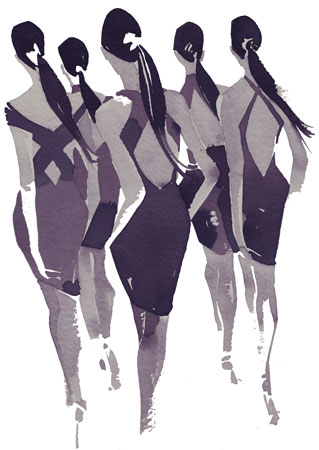
Graphite, ink, and Photoshop.

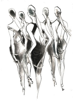
Ink, gouache, Illustrator, and Photoshop.

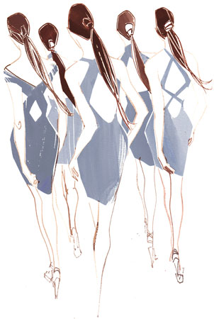
Gouache, ink, and paste.

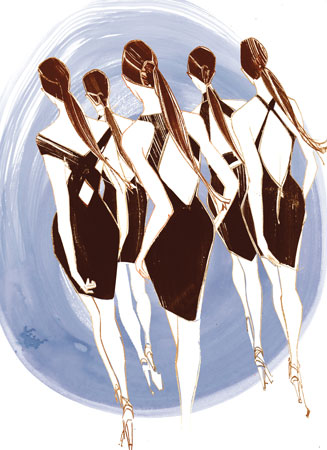
Gouache, ink, and Photoshop.
Proficiency is important in maintaining a competitive edge in an ever-changing market. Knowledge is power and the better your ability and skill in using the media discussed in this chapter, the better your options will be to create a style that is unique to your vision.
Each medium has a particular characteristic and nuance, but combining them with different methods and techniques will reinvent the medium and your work. Exploration should be the driving force of discovering methods that resonate with your personal style.
Try combining two or more of the media in different exercises in the book. Experiment to combine media, tools, and surfaces to extract a unique illustration. Use a large mop brush, loaded with ink, dyes, or gouache, in conjunction with a detailed brush or graphite pencil; blend pastel with collage; draw with a brush and paint with a tree branch; play with different surfaces to discover how the medium translates and reacts to those surfaces. Seek out other media to use, such as crayons, oil sticks, markers, conté, and sponges, or collage with found items, such as string, wire, or fabric. Incorporate the tools of Photoshop and Illustrator into the process to enhance and stylize the illustration.
Most of all, keep an open mind; don’t censure your accidents or mistakes, for one artist’s frustration is another’s success.
Advantages
Limitless
Disadvantages
None
Note:
Mix it up! Do several pieces in different media and then collage them together, or take the best elements and incorporate them in one piece.