4
VISUAL STRUCTURES
Objects, images, and texts are given structure, and hence meaning, through the way in which they are visually composed. This is the case whether we are talking about individual things such as the design of products, furniture, and industrial machinery (objects); the organization of paintings, drawings, photographs, diagrams, doodles, cartoons, posters, graphic images, and emblems (images); or layouts in newspapers, novels, books of poetry, film scripts, and textbooks (texts). It also applies to collections of things (e.g., boxes of coins, scrapbooks full of photographs, and collected works of certain authors) and things that are in sequence (e.g., ornaments in a series, successions of images in films, and runs of pages in particular textbooks).
Visual compositions have two dimensions: space and time. These two dimensions, in turn, have the two elements of placement (where something is located or is represented as being located) and presence (what something is, or is represented as being, along with how it is rendered).
Placement is about such things as perceived location (near/far), positioning (top/bottom or right/left), situation (center/margin), arrangement (organized/disorganized), proximity (togetherness/apartness), balance (symmetry/asymmetry), perceived viewpoint (above/on the level/ below), and orientation (front/back/side). For instance, orientation is often important in the three-dimensional design of packaging of food products. In such cases, the brand name and an image of the product will tend to be placed on the front of the box, while the ingredients will be placed on the back or the side. The forms of placement tell us what is most important to the producer in terms of communication. With placement in two-dimensional works such as paintings, however, other elements of composition loom large. For example, in painting we may find a visual feature at the top of the picture that tends to idealize it, along with something placed at the bottom that is apt to appear more down-to-earth and realistic. That is why God needs to be placed above humans in a work of art, and humans need to be placed below God. (In a similar way, placing something in the foreground and the middle of a picture can give it importance in a way that placing it in the background or at the margins could not. An instance of this phenomenon is the self-portrait, in which the sitter tends to dominate his or her surroundings.) Certain texts may also be composed in certain ways to draw out key features that we wish to emphasize. Footnotes are an example; they appear at the bottom of a text because they tend to be less important than the writings that are placed above them.
Presence, in contrast, is created by the way in which the different elements in a visual composition draw attention to, or away from, themselves. Presence is created by such things as: number (many/few), size (large/small), color (hue/saturation/brightness), contrast (high/low), detail (fine/coarse), tone (light/dark), shape (regular/ irregular), texture (rough/smooth), movement (static/ dynamic), arrangement (organized/disorganized), transparency (clear/unclear), and demandingness (simple/complex). These elements, depending on the context in which they are used, will help to draw attention to, or away from, different parts of the composition by providing us with different kinds of emphasis. Thus, objects that are (say) big, red, and round may create more of a presence than a few objects that are small, brown, and square; images that are bright and dynamic may create more of an initial impression than those that are dull and static; and texts that employ clear and simple written forms may have a greater immediate appeal than those that are unclear and complex.
Time, or the temporal aspect of composition, has, in common with the spatial dimension, two factors: placement and presence. Temporal placing is about whether some feature is placed before or after another in a sequence. We find the notions of “before” and “after” in such things as cartoons, chronological diagrams, recipe cards, paintings of changing moments, books on dieting, and well-plotted novels or films. Consider dieting.
In order to show weight loss, books on dieting will place a “before” image of someone who wants to lose weight on the left side of a page along with an “after” image of them having successfully lost weight on the right side of a page (at least, if you are reading a book designed for an audience in the Western world).
Temporal presence, on the other hand, is about whether something is shown as situated in the past, present, or future. For example, history of art lectures can reveal the attitudes of past cultures; books on contemporary design can tell us about the stylistic tendencies of the present; and exhibitions about technological innovations can help us to speculate on the future. Such things as lectures, books, and exhibitions help to give objects, images, and texts the qualities of pastness, presentness, or futureness in the way that they are shown. In addition, the qualities of fastness and slowness, where evident, can count as forms of temporal presence. The pace of time can be indicated by such things as the patina of an object, by blurring in a photograph, or by the crystallization of a transient moment in a painting.
The key concepts to be discussed in this chapter will tend to focus on two-dimensional visual structures and will therefore take the form of questions and answers concerning such things as: viewer and image, ideal and real, given and new, center and margin, foreground and background, proximity and presence, before and after, past, present, and future, and fast and slow.
VIEWER AND IMAGE
WHAT DOES THIS IMAGE REPRESENT?
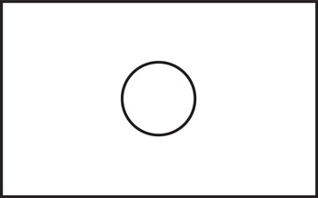
Assuming that this is a highly simplified picture, there are various possibilities. It could be:
1. A hole in a wall
2. A circle drawn on a wall
3. A circular piece of tube fixed to a wall
Notice that what you actually see does not change in each of these three descriptions. What changes is the way that you interpret what you see. In the first instance, we see through a wall. In the second instance, we look on to a wall. In the third instance, an object comes out from a wall. What is worthy of note are the changes in the way that we see the image but also the fixed position of the viewer. Here the viewer is assumed to be looking across at the image in each case.
But now imagine that you are not looking at a wall, but at a table. Here are three more interpretations. It could be:
4. A hole in a table
5. A circle drawn on a table
6. A circular piece of tube fixed to a table
Again, the content of the image is the same but the notional position of the viewer has changed through the description given. Now the viewer is looking down instead of across.
Now we imagine we are looking at a ceiling. Here are three further interpretations. It could be:
7. A hole in a ceiling
8. A circle drawn on a ceiling
9. A circular piece of tube fixed to a ceiling
Once more, the content of the image is the same but the notional position of the viewer has changed again. This time the viewer is looking up. (Alternatively, of course, the viewer might be looking down through the hole in the ceiling from above.)
What these nine interpretations demonstrate is that the image and viewer positions can change via new descriptions. It is this constant negotiation and shift between viewer and image, then, that is vital to understanding these sorts of visual structures and our interpretations (and reinterpretations) of them.
IDEAL AND REAL
WHICH PART OF THIS PICTURE IS IDEALIZED?
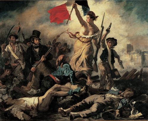
Pictures can be divided in different ways. One way to divide them is to place the idealized elements at the top of the picture and the realistic elements at the bottom. Eugène Delacroix’s The 28th July: Liberty Leading the People (1830) illustrates this point. Liberty, who in this instance is symbolized by the female figure carrying the flag, is placed at the top and center so that attention is drawn to her importance. Below her reside figures that are at once symbolic of the people as a whole, but at the same time somehow more realistic in terms of their depiction. In this way “the people” are shown to be aspiring to the ideal of liberty that is placed literally above them. So, while both Liberty herself and the people below her are idealized, the intention seems to be to make the latter group seem more real, with the ultimate reality of death—which is the consequence of the removal of the ideal of liberty itself—appearing at the very bottom of the image.
The same visual structures are to be found in magazine advertising. In an advert for a certain kind of food we will typically find an idealized image at the top of the page with an indication of the reality of the product being sold at the bottom. For instance, there might be a photograph of a gleaming bunch of succulent looking grapes at the top of the image. Below this we might find that what is being advertised is dried fruit. In such an advert the viewer is reminded of the difference between the ideal (the gleaming fruit) and the corresponding reality (its dried counterpart). But by linking the two it is hoped that the consumer will see how the former might have been condensed into the latter. In other words, the advert, by linking the real with the ideal, indicates the nature of our aspirations to move constantly from what is the case (the real product) to what could be the case (the ideal product).
GIVEN AND NEW
IS IT BEST TO READ THIS IMAGE FROM LEFT TO RIGHT OR RIGHT TO LEFT?
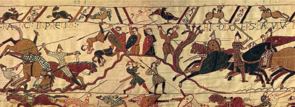
This image, taken from the Bayeux Tapestry, which chronicles the Norman conquest of England by William the Conqueror in 1066, should be read from left to right. But how do we know that? One answer is that the horses, although they are frozen in the picture, appear in the main to be travelling in that direction. So maybe there is a clue in the picture itself. More important than this, though, there is the standard convention that reading the image from left to right is simply correct.
It is easy to think that everyone reads from left to right. Of course, in Western cultures this is true. That is why a Western advert for a washing powder will have a picture of a soiled garment placed on the left and an image of a pristine garment placed on the right. By placing the images in this order the reader knows that the washing powder will help dirty clothes to become clean. However, audiences in the Middle East, who read from right to left, will read the advert in the opposite way. It will seem to them as though the washing powder is taking gleaming white clothes and turning them a dirty grey. Thus the meanings we discern when we employ the convention of reading from left to right are actually specific to a given culture and context.
Whether we read from left to right or from right to left, it seems true to say that the information placed on one side of a composition is usually “given” or assumed, while the information on the other side tends to be “new” or unexpected. So in the advert just imagined, the “given” information is that clothes get dirty (this appears on the left in Western cultures). The new information is that the particular washing powder that is being advertised is good at getting clothes clean (this appears on the right in Western cultures).
CENTER AND MARGIN
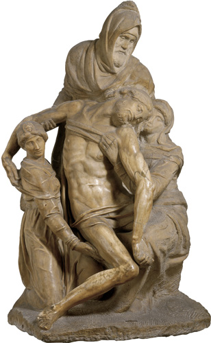
WHY IS CHRIST PLACED IN THE CENTER OF THIS SCULPTURE?
The idea of a center is important to many human activities and to much human thinking. The universe has a center. The world has a center. Countries have centers. Cities have centers. People have centers. Even our nervous system has a center. And objects, images, and pieces of text have centers too.
Centers provide a focus. Centers are important and vital. They act as hubs around which other things are positioned, or else they provide a stable point from which other things might circulate. The center can also be the thing that is seen to prevail over that which surrounds it. With centers, though, come margins. Margins are on the outside. Margins provide limits, edges, borders, and boundaries. Margins, in contrast, can be viewed in some ways as overridden by their centers.
We tend to think of something placed in the center of a composition as having importance and higher status. This is in contrast to those things placed on the margins, which tend to have less importance and lower status. In the Deposition (or Florentine Pietà) by Michelangelo (1550–53), pictured on the previous page, we see the significance of the center and of the relative insignificance of margins. The sculpture includes four figures: Christ, Nicodemus, Mary Magdalene, and an incomplete figure. In the sculpture Michelangelo has clearly placed Christ in the center, surrounding him with the other figures who envelop and support him. So although the other figures are physically close to him, they are still on the margins. In this sculpture, then, the concepts of center and margin, combined with the concepts of in front and behind, act to contrast the idea of permanence and significance (Christ) with transience and relative insignificance (Nicodemus, Mary Magdalene, and the incomplete figure).
What is interesting about this sculpture is that it presupposes a position for the viewer. (In this instance, we view the sculpture as having a front, back, and sides.) And so, as was the case with the images we discussed earlier, we should not try to see the positioning of three-dimensional objects in isolation from the positioning of the person who sees them.
FOREGROUND AND BACKGROUND
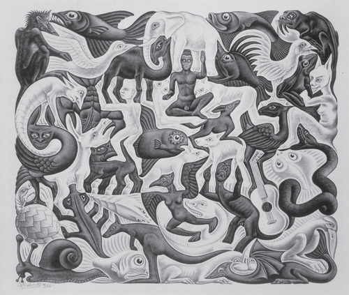
WHAT DO YOU NOTICE ABOUT THE BACKGROUND OF THIS IMAGE?
Human beings have the ability to perceive things in terms of foreground and background. Take objects that are placed on a table. Here we immediately become aware of the objects themselves (which are seen as being in the foreground) rather than the spaces that surround them on the table (which are seen as being in the background). Take music that is being listened to on headphones. Here the melody of the tune is the usual subject of our focus (which is in the foreground) rather than the tracks that make up the rest of the music (which often seem to be in the background). Consider a printed page. In seeing such a page we will tend first to dwell on the text (which is in the foreground) rather than the spaces that surround the text (which may be considered as a mere background).
M.C. Escher, in his picture Mosaic II (1957), demonstrates some of the paradoxes of foreground and background. Curious is his suggestion that what we regard as foreground and as background is in some ways a matter of choice. For in his image our focus can change so that that which is usually seen as the foreground can be viewed as the background, and vice versa. Even though a perceptual switch can occur so that what we see first as foreground can suddenly become regarded as background, we still need to appreciate that this switch does not happen very often (unless it is brought about deliberately, as in Escher’s picture). When you see certain things as being in the foreground, other things tend to form a background and in this way become unseen or go unnoticed.
PROXIMITY AND PRESENCE
CAN YOU IDENTIFY ONE GROUP OF TWO STARS AND ONE GROUP OF THREE STARS?

Often we group things together because of their proximity. Things that are placed near one another tend to be grouped together. On the other hand, things that are placed apart from one another we tend to think of as separate. The fact of proximity might be one reason we might want to group two black stars and a red star together to make up a group of three, and one black star and a red star together to make up a group of two. Placing things in images in a certain way, or presenting objects in a certain way, then, is important if you want to draw attention to them—or divert attention away from them.
The other obvious way of grouping these stars is by color. This, in contrast, is about the presence or aura that they have. To group them in this way means putting the black stars in a group of three and the red stars in a group of two. Presence can be indicated in different ways by such things as size, color, sharpness, tone and texture. Size is usually indicative of importance and authority (e.g., the Statue of Liberty). Color is often essential for creating naturalism or indicating that naturalism is absent (e.g., over-enhancing color can make an image or object seem dreamlike or fake, whereas removing color can make it seem nostalgic). Sharpness—at least as it applies to images and texts— can make something appear more believable, whereas a lack of it can make something appear inauthentic or vague (e.g., a soft-focus photograph might be used to indicate a hazy memory). Contrast in terms of tone can create drama, but without it the impression may be one of drabness or lack of commitment (e.g., notice how spectacular the stark contrast of black-and-white can be in Film Noir). Texture can be tactile and warm, but it may imply imperfection; its absence can be cold and indicate flawlessness (e.g., an engaged drawing of the texture of human skin may give a quite different impression to a detached biological diagram of human skin).
BEFORE AND AFTER
WHY DO THE FIGURES ON THE FAR RIGHT OF THE PICTURE APPEAR MORE THAN ONCE?
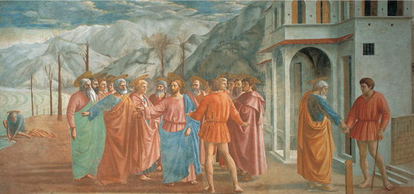
In this painting, Tribute Money (1426–28), Masaccio produces a narrative with three scenes. The composition is curious because the three distinct events are placed next to each other in the picture in such a way that they might not immediately appear to be separate.
The story of the Tribute Money, which is based on an account given in St. Matthew’s Gospel, involves Christ, St. Peter, other apostles, and a tax-collector. In this instance, Christ is seen in the center of the picture with the apostles explaining that he has been asked for his taxes to be paid. Christ then invites St. Peter to perform the task, but at the same time tells him where he can find the money. On the left of the picture we see St. Peter catching a fish and removing a gold coin from its mouth. And on the right we see St. Peter giving the tax-collector the money that is owed.
What is odd about this painting is that the viewer has a sense of the order of the scenes even though they do not conform to the pictorial structure that we might expect. This is because there is a conflict between two demands that we have already discussed in this chapter. The first is that the most important figure should normally be placed roughly in the center of the image, and second is that we tend to read visual images from left to right. What this image demonstrates, then, is that even though we might have a standard way of representing “before and after” sequences visually, we can also deviate from it. What we need to ensure, though, is that when we do deviate from standard conventions those who try to read them appreciate how they have changed. Otherwise, the result of a change in convention can be a drift into incomprehension.
PAST, PRESENT, AND FUTURE
CAN WE IMAGINE THE FUTURE?
Time is important in semiotics because we think of ourselves in relation to its flow and because we are apt to make judgments about it. For example, we can often regard past things as quaint, nostalgic, amusing, charming, or simply archaic, present things as exciting (and sometimes boring), and future things as new, ambitious, avant-garde, or simply frightening. The need to speculate about the past, question the present, and predict the future seems somehow to be built into the chromosomes of human beings.
If we view time as composed of the linear and discrete elements of past, present, and future, then it would seem to follow that we can think of things as being ahead of the times or behind the times. And this is where our thinking about objects, images, and texts starts to become structured and composed by time. For we often talk about a work (say, a product, painting, or book) as being “ahead of the times,” “of its time,” or “behind the times.” But what, more exactly, do we mean when we talk in this way? In what sense can such things really, say, be ahead of the times, as opposed to simply of the times in which they actually exist? And if it is genuinely possible for a work to be futuristic, how long can it stay out in front? How long will it be before other works catch up?
In this image of the future from Fritz Lang’s film Metropolis of 1926, we find a picture of a strangelooking metropolis. This raises some of the questions we have already asked, but in a visual form. Is this image suggestive in allowing us to imagine what might have happened to make such a futuristic city possible? Or does it only serve to confirm the thought that a 1920s’ view of the future will be nothing more than a 1920s’ view of the future?
FAST AND SLOW
CAN WE REPRESENT TIME?
Objects, images, and texts have different forms of temporal flow. This flow can be represented in numerous ways. The flow of an object can be thought about in relation to its life-cycle and in relation to how it is used during that life-cycle (e.g., the walking stick is designed for a life of slowness whereas the motorbike is an emblem of speed and seems intended for a life of haste). The flow of an image may be exemplified by how different movements of time and moments in time can be represented in different media (e.g., a painted image may capture a fleeting smile, or the juxtaposition of multiple images in a film may show the speed of a horse running). The flow of text may be about how it is placed with other texts, how it is spaced, and what sort of graphic and auditory features it has (e.g., slow, long sentences may be evident in a play, whereas quick, short syllables may be evident in a poem).
Slowness can be contemplative, spiritual, sluggish, boring, leisurely, measured, or relaxed. A still-life painting may be motionless and may make the viewer pause for thought. A children’s book can repeat itself constantly and may appear slow and boring to an adult. A poem may be meditative, making us dwell on a single moment in time. Fastness, on the other hand, can be exciting, vital, energetic, inspiring, dangerous, and stirring. A fast car chase in a film may be exciting (e.g., the chase in the Steve McQueen film Bullet). A painting that has been created with a fast-moving brush can appear vital (e.g., the work of Jackson Pollock). A piece of music that is played at speed can be inspiring (e.g., Count Basie’s Shout and Feel It).
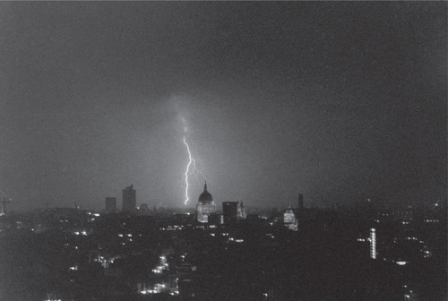
The question as to whether we can represent time may be misleading; that is, if we think of the question as being about how to depict the phenomenon of time. This is because there are so many ways that something that takes up time can be represented, none of which may be “true” to the way we experience time itself. (Indeed, we may wonder whether we do experience time at all.) In photographing a flash of lightning (which takes but a small moment of time) we may find that we have translated the experience and quality of fastness into the experience and quality of slowness. What happens by making such a photograph, then, is that something of the temporal aspects of lightning are lost (but also, at the same time, gained).

