As we mentioned in Chapter 1, the efficiency metric is calculated by subtracting mental load from performance outcomes. We can express this mathematically as E = P − ML. When performance is greater than mental load, the efficiency value is positive. When performance is lower than mental load, the efficiency value is negative. Performance is most often measured by a test taken at the end of the lesson. Sometimes, however, performance is measured by the time required to complete a lesson or a test task. Mental load is most commonly measured by learner ratings of lesson difficulty on a 1 to 7 or 1 to 9 scale.
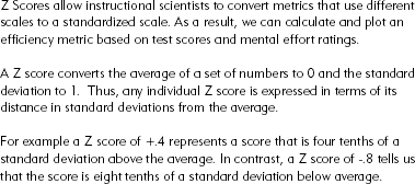
In a typical experiment, learners are randomly assigned to take one of two variations of a lesson. For example, one version uses audio narration to explain a visual, and the comparison version uses the same words presented in text to explain the visual. After studying their assigned version, learners rate the difficulty of the lesson and then take a performance test. Because the test scores and the mental effort ratings use such different numeric values, the data must be converted to a standardized score called a Z-score to make them comparable for purposes of calculating the efficiency values and plotting them on an efficiency graph. Figure A.1 summarizes mathematical details about Z scores.
To visually represent efficiency, instructional scientists use an efficiency graph, shown in Figure A.2, in which the horizontal axis represents the range of mental effort ratings in Z scores and the vertical axis represents the performance outcomes (test scores or time) in Z scores. The origin or point of intersection of the two axes represents the average of all test scores and all ratings, which when converted to Z scores equals 0. Therefore a performance Z score greater than 0 will fall above the axes, and a mental load score greater than 0 will fall to the right of the axes.
The efficiency graphs are shown with a theoretical reference line for which efficiency = 0. Any point falling along this line represents a situation in which the Performance Z score equals the Mental Effort Z score. Since the efficiency is calculated by subtracting mental effort from performance, when they are equal, the result is 0. Note that the line is labeled E = 0.
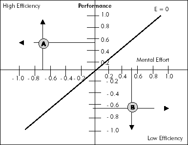
Any lesson that results in high performance (above 0 on the vertical line) and at the same time requires low mental effort (to the left of 0 on the horizontal line) will fall into the upper left quadrant of the graph. This quadrant is called the high efficiency quadrant, since all points that fall within it represent higher than average performance and lower than average mental effort. Lesson Version A in Figure A.2 represents a high efficiency lesson with an average performance value of around +0.5 and an average mental effort value of around −0.7. In contrast, lesson Version B falls into the low efficiency quadrant because it resulted in performance that fell below the average and mental effort that fell above the average.
To calculate the efficiency value of a lesson version, you use the equation:
Based on this equation, the average Z score for mental effort ratings for a lesson is subtracted from the average Z score for performance outcomes for that lesson, and the difference is divided by the square root of 2 (a mathematical operation required for the calculation of distances between points). To see a sample calculation and efficiency graph that uses a small model data set, refer to Figures A.3 and A.4. In this step-by-step example we use three hypothetical data sets from two lesson versions. We convert the raw scores into Z scores, determine the efficiencies for each version, and plot them on the efficiency graph. In the next section we illustrate some efficiency data from an actual experiment plotted on the efficiency graph.
The data below come from an actual experimental comparison of two versions of lessons designed to teach interpretation of a complex electrical table was explained by narration of the same words presented in the text version. After presentation of each lesson, learners rated the difficulty of the lesson and were tested with problems that required them to interpret the table. The data and conclusions from this study are displayed in Figure A.5. Table A.1 shows the Z scores from this data.
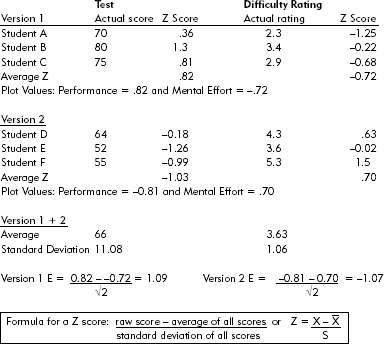
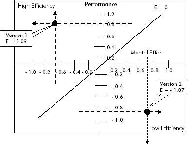
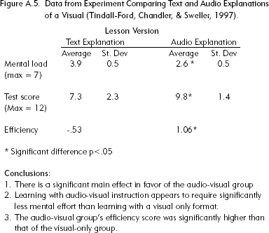
Figure A.5. Data from Experiment Comparing Text and Audio Explanations of a Visual (Tindall-Ford, Chandler, & Sweller, 1997).
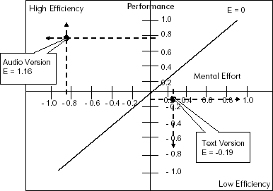
As you can see, for the text version, the test Z scores were below average and mental effort was higher than average. In contrast, for the audio version, test performance was high, while mental effort was low. Figure A.6 shows these values plotted on the efficiency graph. This experiment is a demonstration of the modality effect, which states that a complex visual is understood more efficiently when explanations are presented in audio narration than when explanations are presented in text. (Note that Z and efficiency scores should add to 0. They do not in this example because there were other groups in the study that are not discussed here.)
The guidelines we offer in this book are based on evidence from many controlled research studies. In each chapter we describe several experiments that form the basis for our guidelines. All of the research results we present are based on experimental designs in which learners are randomly assigned to two or more lesson versions. Typically, one lesson version applies cognitive load management instructional methods, and the other version does not. For example, in the previous section we illustrated efficiency data from an experiment in which learning and mental effort were compared between a lesson that explained a complex electrical table with text positioned below the table with another lesson version that explained the same table with the same words presented in audio narration. The data from this experiment are shown in Figure A.5. As you can see, the average test scores are higher among learners who studied the lessons with audio explanations. In addition the standard deviations are smaller. What do these numbers really mean? How much should you rely on results like these?
You may have come across standard deviations before. If so, you may recall that a standard deviation tells us how spread out the scores are. It is an average deviation of each score from the mean in a set of scores. If we give ten students a test, we will end up with ten test scores. We can calculate the mean of those ten test scores. We can then find the difference between each score and the mean score. If we then find the mean of those differences, that will give us the standard deviation. It is the average difference of the ten scores from the mean score. If the standard deviation is close to 0, the scores are all very similar because they are close to the mean score. If the standard deviation is large, the scores are spread out a long way from the mean. In general, more successful lessons result in test score averages that are higher—indicating more learning. If standard deviations are lower, that means greater consistency among the individual learners. That is exactly what you can see in the results shown in Figure A.5. In these data you can see that the mean or average score in the audio explanation group is 9.8 with a standard deviation of 1.4. In contrast, the text explanation group averages 7.3 with a standard deviation of 2.3. The audio group has a higher mean, indicating that they had learned more than the text explanation group, and a lower standard deviation, indicating that more people had scores that were close to the group mean scores.
Because the learners were randomly assigned to each of the lessons, individual differences among participants should be the same in the two experimental groups. Therefore any differences in performance or mental load ratings are due to either chance or to real differences in learning caused by the instructional materials. To rule out chance explanations, researchers submit the data to a statistical test. In the experiment shown in Figure A.5, the statistical tests all showed that there is less than a 5 percent probability that the differences between the two groups could have occurred by chance alone. On this basis, we say that the results are statistically significant.
However, even very small differences in scores can be statistically significant—especially if the experiment includes a large number of participants. Therefore, statistical significance does not necessarily translate into practical significance—especially if production of the "better" version is more expensive or time-consuming. As a result, many recent experiments report an additional statistic called effect size. The effect size tells you how many standard deviations the test group is from the control group. For example, an effect size of .5 means that you could expect any individual score of someone studying the less effective lesson version to increase by half a standard deviation if he or she took the more effective version. For example, suppose Sam had scored 60 points after studying a lesson that did not apply cognitive load guidelines. Let's assume that the more effective lesson had an effect size of .75 and the average standard deviation of both the more and less effective lesson groups was 8. We could expect Sam's score to increase by 8 times .75, or 6 points. As a general guideline, effect sizes less than or equal to .20 are considered small and are of negligible practical importance. Effect sizes around .50 are considered medium and are of moderate practical importance. Finally, effect sizes of .80 or higher are large and are of crucial practical importance (Hojat & Xu, 2004).
Let's return to our sample study comparing a text with an audio explanation of a graphic. We saw that the data had statistical significance. But is there sufficient difference to warrant recommending audio explanations of visuals? To calculate effect size, we divide the difference between the average scores for the two groups by the average standard deviations of both groups as follows:
This means that a learner in the text group that scored 5.0 could expect to score 5.0 + (1.35 times 1.85 = 2.5) or about 7.5 if they studied the audio version. As you can see, the effect size from this experiment falls into the high range and results in a considerable improvement in learning. If we replicated this study and generally obtained high effect sizes like this one, we could recommend the use of audio to explain visuals with a high degree of confidence in its practical payoffs.