A PivotChart is a graphical representation of the values in a PivotTable report. However, a PivotChart goes far beyond a regular chart because a PivotChart comes with many of the same capabilities as a PivotTable. These capabilities include moving fields from one area of the chart to another, hiding items, filtering data via the page field, refreshing the PivotChart to account for changes in the underlying data, and more. You also have access to most of Excel's regular charting capabilities, so PivotCharts are a powerful addition to your data analysis toolkit.
However, PivotCharts are not a perfect solution. Excel has fairly rigid rules for which parts of a PivotTable report correspond to which parts of the PivotChart layout. Moving a field from one part of the PivotChart to another can easily result in a PivotChart layout that is either difficult to understand or that does not make any sense at all.
Similarly, you also face a number of other limitations that control the types of charts you can make and the formatting options you can apply. For example, you cannot configure a PivotChart to use the Stock chart type, which can be a significant problem for some applications. Also, Excel has a tendency to "lose" PivotChart formatting when you make certain changes to the associated PivotTable.
This section outlines these and other PivotChart limitations. Note, however, that most of these limitations are not onerous in most situations, so they should in no way dissuade you from taking advantage of the analytical and visualization power of the PivotChart.
If you have any trouble with the terminology or concepts in this chapter, be sure to refer to the Chapter 1 section "Introducing the PivotChart," for the appropriate background.
One of the main sources of PivotChart confusion is the fact that Excel uses different terminology with PivotCharts and PivotTables. In both, you have a data area that contains the numeric results, and you have a page area that you can use to filter the data. However, it is important to understand how Excel maps the PivotTable's row and column areas to the PivotChart.
In a PivotTable, the row area contains the unique values — the items — that Excel has extracted from a particular field in the source data. The PivotChart equivalent is the category area, which corresponds to the chart's X-axis. That is, each unique value from the source data field has a corresponding category axis value.
In a PivotTable, the column area contains the unique values — the items — that Excel has extracted from a particular field in the source data. The PivotChart equivalent is the series area, which corresponds to the chart's Y-axis. That is, each unique value from the source data field has a corresponding data series.
Excel offers a large number of chart types, and you can change the default PivotChart type to another that more closely suits your needs; see the task "Change the PivotChart Type," later in this chapter. However, there are three chart types that you cannot apply to a PivotChart: Bubble, XY (Scatter), and Stock.
Excel also allows you to format the chart using the controls in the Chart Options dialog box. However, there are a few formatting techniques that Excel disables for PivotCharts. Specifically, you cannot move or change the size of the plot area, chart title, axis titles, and legend.
Perhaps the most serious drawback of using PivotCharts is that Excel removes certain chart customizations when you refresh, rebuild, rotate, filter a PivotTable, or change the PivotTable's layout or view. Specifically, Excel removes any formatting that you have applied to data series and data points, as well as all trendlines and error bars.
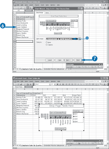
You can create a PivotChart directly from an existing PivotTable. This saves times because you do not have to configure the layout of the PivotChart or any other options.
You have seen elsewhere in this book that the pivot cache that Excel maintains for each PivotTable saves time, memory, and disk space. For example, if you attempt to create a new PivotTable using the same source data as an existing PivotTable, Excel enables you to share the source data between them.
The pivot cache also comes in handy when you want to create a PivotChart. If the layout of an existing PivotTable is the same as what you want for a PivotChart, you can create the PivotChart directly from the PivotTable. Excel uses the pivot cache and the PivotTable layout to create the PivotChart immediately. You can use this method to create a PivotChart using just one or two mouse clicks or keystrokes.
You can create a chart directly from an existing PivotTable using VBA. Select the PivotTable object using the PivotSelect method and then run the Chart object's Add method, as shown in the following example:
Sub CreatePivotChart()
     Dim objPT As PivotTable
     ' Work with the first PivotTable
     Set objPT = ActiveSheet.PivotTables(1)
     ' Select the PivotTable
     objPT.PivotSelect ""
     ' Add the chart
     Charts.Add
End SubNote
This chapter uses the PivotTables.xls spreadsheet, available at www.wiley.com/go/pivottablesvb, or you can create your own sample database.
You can also click Insert→Chart, click the Chart Wizard button (

Excel creates a new chart sheet and displays the PivotChart.
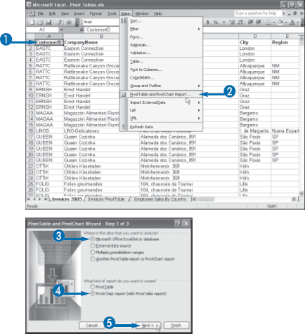
If the data you want to summarize and visualize exists as an Excel range or list, you can use the PivotTable and PivotChart Wizard to build a PivotChart based on your data. The wizard takes you step by step through the process of choosing the type of report you want, specifying the location of your source data, and then choosing the location of the resulting PivotChart.
The PivotTable and PivotChart Wizard has three main steps. In the first step, you choose whether you want a PivotTable or a PivotChart. In this task you learn how to build a PivotChart. To learn how to build a PivotTable, instead, see Chapter 2. The first wizard step also enables you to specify the type of data source you are using. In this task, you learn how to build a PivotChart based on data in an Excel list or range, which is the simplest and most common type of data source. To learn how to build PivotTables from other types of data sources, see Chapters 10 and 11.
In the second step of the PivotTable and PivotChart Wizard, you specify the location of the list or range. If you choose a cell within the list or range in advance, the wizard automatically selects the surrounding list or range. Otherwise, you can click and drag with your mouse to select the data, or type the range address.
Finally, the third step of the wizard enables you to select a location for the PivotTable report that Excel constructs along with your new PivotChart, which Excel automatically places on a new chart sheet.
The first PivotTable and PivotChart Wizard dialog box appears.
The second PivotTable and PivotChart Wizard dialog box appears.
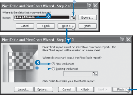
The third PivotTable and PivotChart Wizard dialog box appears.
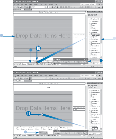
When you click Finish in the third PivotTable and PivotChart Wizard dialog box, Excel creates an empty PivotChart in a new chart sheet. It also creates a PivotTable in a new worksheet or in a location you specify. The empty PivotChart displays four areas with the following labels: Drop Category Fields Here, Drop Series Fields Here, Drop Data Items Here, and Drop Page Fields Here. To complete the PivotTable, you must populate some or all of these areas with one or more fields from your data.
When you add a field to the category, series, or page area, Excel extracts the unique values from the field and displays them in the area. For example, if you add the Salesperson field to the category area, Excel displays the unique salesperson names as categories that run along the X-axis of the chart. Similarly, if you add the Shipper field to the series area, Excel displays the unique shipper names as a separate chart data series. Finally, if you add, say, the Country field to the page area, Excel displays the unique country names in a drop-down list above the PivotChart.
When you add a field to the data area, Excel performs calculations based on the numeric data in the field. The default calculation is sum, so if you add, for example, the Quantity field to the data area, Excel sums the Quantity values. How Excel calculates these sums depends on the fields you have added to the other areas. For example, if you add just the Salesperson field to the row area, Excel displays the sum of the QuantitySale Amount values for each salesperson. You can also use other calculations such as Average and Count; see Chapter 7 to learn how to change the summary calculation.
Excel displays the field's unique values in the PivotChart's category area.
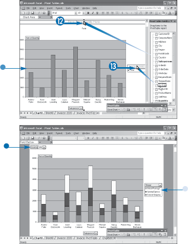
The basic PivotChart is complete.
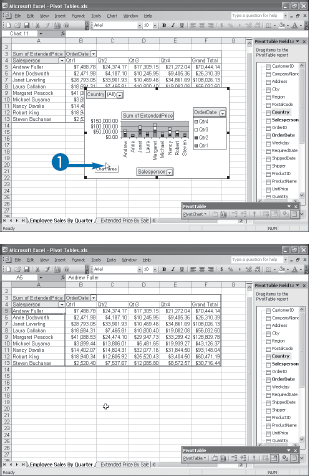
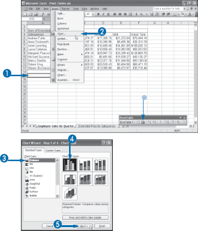
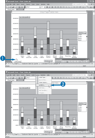
You can create a PivotChart on the same worksheet as its associated PivotTable. This enables you to easily compare the PivotTable and the PivotChart.
Whether you create a PivotChart directly from an existing PivotTable — see the task "Create a PivotChart from a PivotTable" — or use the PivotTable and PivotChart Wizard — see the task "Create a PivotChart from an Excel List," — Excel places the chart on a new chart sheet. This is usually the best solution because it gives you the most room to view and manipulate the PivotChart. However, it is often useful to view the PivotChart together with its associated PivotTable. For example, when you change the PivotTable view, Excel automatically changes the PivotChart view in the same way. Rather than switching from one sheet to another to compare the results, having the PivotChart on the same worksheet enables you to compare the PivotChart and PivotTable immediately.
This task shows you how to create a new PivotChart on the same worksheet as an existing PivotTable. This is called embedding the PivotChart on the worksheet. If you already have a PivotChart, you can move it to the PivotTable's worksheet; see the next task, "Move a PivotChart to Another Sheet."
Note
Make sure the cell you click is not within the PivotTable itself.
The first Chart Wizard dialog box appears.
Note
You cannot use the XY (scatter), Bubble, or Stock chart type with a PivotChart.
The second Chart Wizard dialog box appears.
Excel embeds the PivotChart on the PivotTable's worksheet.
If you have an existing PivotChart that resides in a separate chart sheet, you can move the PivotChart to a worksheet. This reduces the number of sheets in the workbook and, if you move the chart to the PivotTable's worksheet, it makes it easier to compare the PivotChart with its associated PivotTable.
In the task "Create a PivotChart Beside a PivotTable," earlier in this chapter, you learned how to create a new PivotChart on a worksheet instead of in the default location, which is a separate chart sheet. However, there may be situations where this separate chart sheet is not convenient. For example, if you want to compare the PivotChart and its associated PivotTable, that comparison is more difficult if the PivotChart and PivotTable reside in separate sheets. Similarly, you may prefer to place all your PivotCharts on a single sheet so that you can compare them or so that they are easy to find. Finally, if you plan on creating a number of PivotCharts, you might not want to clutter your workbook with separate chart sheets.
The solution in all these cases is to move your PivotChart or PivotCharts to the sheet you prefer. This task shows you how to move a PivotChart to a new location.
You can also right-click the chart area or plot area and then click Location.
The Chart Location dialog box appears.
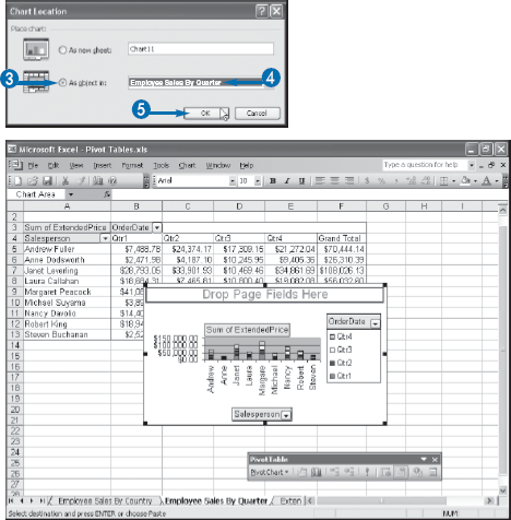
Excel moves the PivotChart to the location you specified.
Extra
The steps you learned in this task apply both to PivotCharts embedded in separate chart sheets and to PivotChart objects floating on worksheets. For the latter, however, there is a second technique you can use. First, click the PivotChart object to select it. Then click Edit→Cut, click the Cut button (
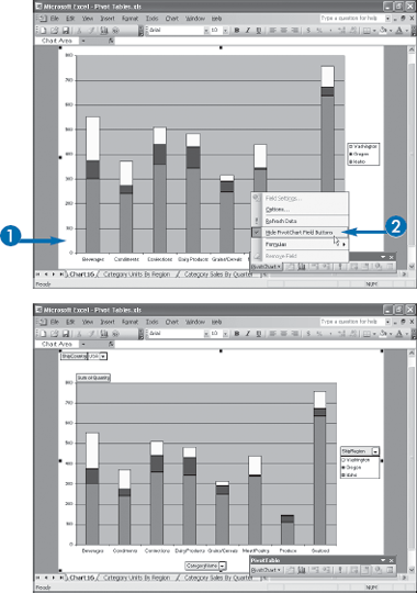
You can toggle off and on the buttons that Excel displays for each field you have added to a PivotChart. Hiding the field buttons is useful if you need more room to display the PivotChart results or if you do not want others to change the PivotChart layout.
When you add a field to the PivotChart's category, series, data, or page area, Excel displays a button for the field. In the category and series areas, you can use the field button to display a list of items in the field, and you can then hide or display the items you want to include in the PivotChart. In the page area, the field button is a drop-down list that enables you to filter the PivotChart data based on the selected page field item. For all four PivotChart areas, you can also use the field buttons to change the layout of the PivotChart by moving a field from one area to another.
However, there may be times when you do not want to include the field buttons in the PivotChart view. For example, the field buttons take up a significant amount of room within the chart area. If the entire chart does not fit onscreen, or if you want to increase the size of the PivotChart to fit the screen, hiding the field buttons can give you extra room. Alternatively, you may prefer not to allow other users to manipulate the PivotChart layout: moving fields, hiding items, or filtering the data. You can prevent this by hiding the field buttons.
Excel displays a check mark beside the Hide PivotChart Field Buttons command.
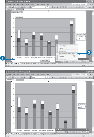
Excel hides the field buttons.
You can modify your PivotChart to use a chart type that is more suitable for displaying the report data.
When you create a PivotChart, by default, Excel uses a stacked column chart. If you do not include a series field in the PivotChart, Excel displays the report using regular columns, which is useful for comparing the values across the category field's items. If you include a series field in the PivotChart, Excel displays the report using stacked columns, where each category shows several different-colored columns stacked on top of each other, one for each item in the series field. This is useful for comparing the contribution each series item has on the category totals.
Although this default chart type is fine for many applications, it is not always the best choice. For example, if you do not have a series field and you want to see the relative contribution of each category item to the total, a pie chart would be a better choice. If you are more interested in showing how the results trend over time, then a line chart is usually the ideal type.
Whatever your needs, Excel enables you to change the default PivotChart type to any of the following types: Column, Bar, Line, Pie, Area, Doughnut, Radar, Surface, Cylinder, Cone, or Pyramid. Remember that Excel does not allow you to use the following chart types with a PivotChart: XY (Scatter), Bubble, or Stock.
The Chart Type dialog box appears.
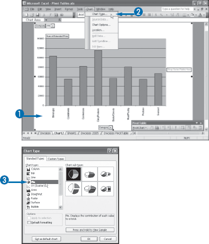
Excel displays the available chart sub-types.
Excel redisplays the PivotChart with the new chart type.
Extra
Depending on the chart type you choose, it is often useful to augment the chart with the actual values from the report. For example, with a pie chart, you can add to each slice the value as well as the percentage the value represents of the grand total. In most cases you can also add the series name and the category name.
To add these data labels to your PivotChart, click the chart and then click Chart→Chart Options. In the Chart Options dialog box, click the Data Labels tab, and then activate the Value check box (
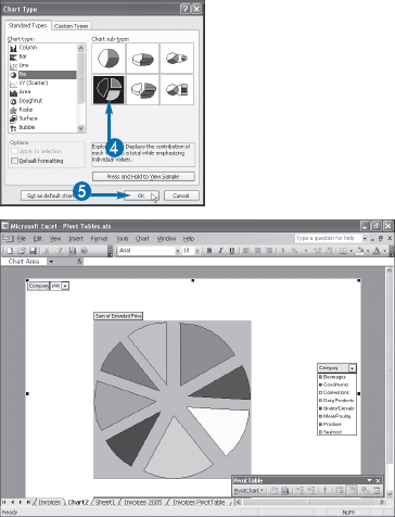
If there is a particular chart type that you would prefer to use for all your future PivotCharts, you can set that chart type as the default. Follow Steps 1 to 4 in this task to open the Chart Type dialog box and choose your chart type and sub-type. Then click the "Set as default chart" button. When Excel asks you to confirm that you want to use this chart type as the default, click Yes. Click OK to close the Chart Type dialog box.
You can customize the PivotChart to display the data series in a different order.
When you create a PivotChart and include a series field, Excel displays the data series based on the order of the field's items as they appear in the PivotTable. That is, as you move left to right through the items in the PivotTable's category field, the data series moves bottom to top in the PivotChart's series field. This default series order is fine in most applications, but you may prefer to change the order. In the default stacked column chart, for example, you may prefer to reverse the data series so that they appear from top to bottom.
In other cases, you may prefer to display the data series in some custom order. For example, you may want to rearrange employee names so that those who have the same supervisor or who work in the same division appear together. It is possible to sort the data series items, but Excel also gives you the option of rearranging the series order by hand, as described in this task. See the tip on the next page for more about sorting data series items.
The Format Data Series dialog box appears.
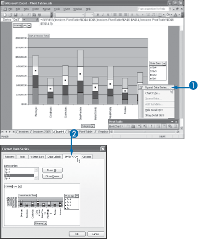
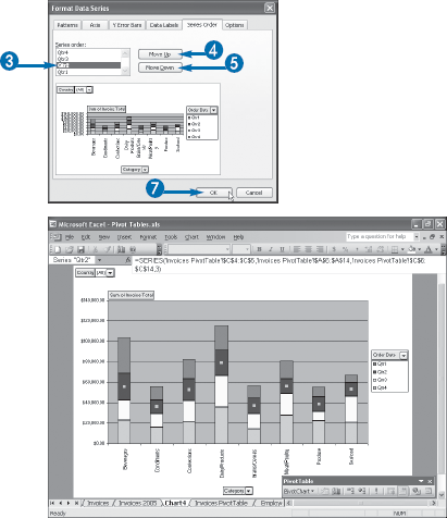
Excel redisplays the PivotChart using the new series order.
Extra
Besides changing the series order by moving data series by hand, Excel also enables you to sort the PivotChart's data using the AutoSort feature. To learn more about this feature, see the task "Sort PivotTable Data with AutoSort" in Chapter 4.
Click the data series field button and then click PivotChart→Field Settings to display the PivotTable Field dialog box. Click Advanced to display the PivotTable Field Advanced Options dialog box. Select Ascending (
Note, as well, that you can apply the same technique to the items in the category field and the page field.
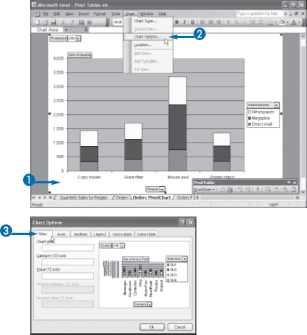
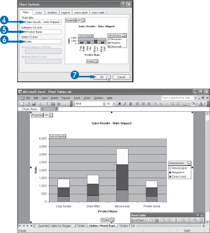
You can add one or more titles to your PivotChart to make the report easier to understand.
By default, Excel does not add any titles to your PivotChart. This is not a concern for most PivotCharts because the field names and item labels often provide enough context to understand the report. However, the data you are using may have cryptic field names or it may have coded item names, so the default PivotChart may be difficult to decipher. In that case, you can add titles to the PivotChart that make the report more comprehensible.
Excel offers three PivotChart titles: an overall chart title that sits above the chart's plot area; a title for the category (X) axis that sits between the category items and the category field button; and a title for the value (Y) axis that sits to the left of the value axis labels. You can add one or more of these titles to your PivotChart. And although Excel does not allow you to move these titles to a different location, you can adjust the font, border, background, and text alignment.
The downside to adding PivotChart titles is that each one takes up some space within the chart area, which means there is less space to display the PivotChart itself. This is not usually a problem with a simple PivotChart, but if you have a complex chart — particularly if you have a large number of category items — then you may prefer not to display titles at all, or you may prefer to display only one or two.
You can change the placement of the PivotChart legend to give the chart more room or to better display the data series within the legend.
The PivotChart legend appears below the series field button and it displays the series field items along with a colored box that tells you which series belongs to which item. By default, Excel displays the legend to the right of the plot area. This is usually the best position because it does not interfere with other chart elements such as titles — see the previous task, "Add PivotChart Titles" — or the value (Y) axis labels.
However, displaying the legend on the right does mean that it takes up space that would otherwise be used by your PivotChart. If you have a number of category items in your PivotChart report, you may prefer to display the legend above or below the plot area to give the PivotChart more horizontal room.
Excel enables you to move the legend to one of five positions with respect to the chart area: right, left, bottom, top, and upper right corner. Bear in mind that Excel always displays the series field button with the legend, so if you move the legend you also move the field button.
The Chart Options dialog box appears.
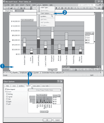
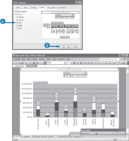
Excel displays the legend in the new position.
Extra
In some cases, you might prefer to not display the legend at all. For example, if your PivotChart does not have a series field, Excel still displays a legend for the default "series" named Total. This is not particularly useful, so you can gain some extra chart space by hiding the legend. To do this, follow Steps 1 to 3 to display the Legend tab. Deselect "Show legend" (
To format the legend, right-click the legend and then click Format Legend; you can also double-click the legend. In the Format Legend dialog box, use the Patterns tab to apply a border or shadow effect, as well as a background color or fill effect. Use the Font tab to specify the typeface, style, size, color, and effects for the title text. Note, too, that you can also format a legend by clicking it and then clicking the buttons in Excel's Formatting toolbar.
You can also change the font of individual legend entries. Click the legend to select it, and then click the legend entry you want to work with. Right-click the entry, click Format Legend Entry, and then, in the dialog box that appears, use the Font tab to set the entry font.
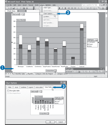
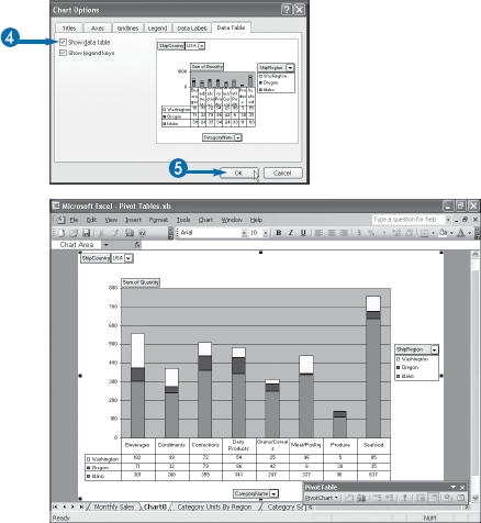
To augment your PivotChart and make the chart report easier to understand and analyze, you can display a data table that provides the values underlying each category and data series.
The point of a PivotChart is to combine the visualization effects of an Excel chart with the pivoting and filtering capabilities of a PivotTable. The visualization part helps your data analysis because it enables you to make at-a-glance comparisons between series and categories, and it enables you to view data points relative to other parts of the report.
However, while visualizing the data is often useful, it lacks a certain precision because you do not see the underlying data. Excel offers several ways to overcome this including creating the PivotChart on the same worksheet as the PivotTable, see the task "Create a PivotChart Beside a PivotTable;" moving a chart to the PivotTable worksheet, see the task "Move a PivotChart to Another Sheet;" and displaying data labels, see the tip in the task "Change the PivotChart Type," all earlier in this chapter.
Yet another method is to display a data table along with the PivotChart. A PivotChart data table is a table that displays the chart's categories as columns and its data series as rows, with the cells filled with the actual data values. Because these values appear directly below the chart, the data table gives you an easy way to combine a visual report with the specifics of the underlying data.
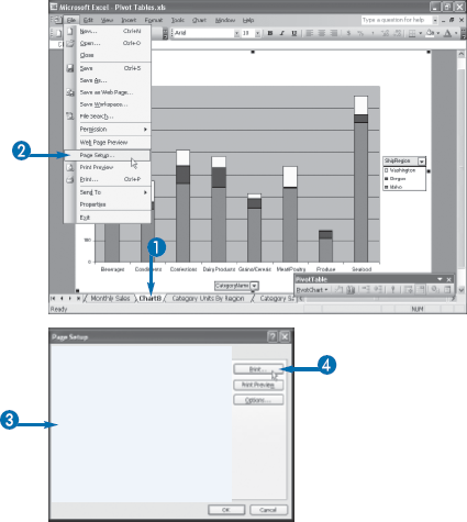
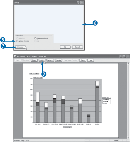
You can print your PivotChart if you require a hard copy for mailing, faxing, or filing, if you want to document changes, or if you want to compare PivotCharts.
Like a PivotTable, a PivotChart is most useful in electronic form where you can format it, change the layout, and perform the other manipulations that you have learned about in this chapter to enhance your analysis of the data.
However, after you have completed the PivotChart, you might want to preserve a hard copy by printing out the PivotChart report. You can use the printout to send a copy to another person, store the report in a file, or provide a backup if you lose the original electronic report or if the original report is no longer available.
Printing the PivotChart is also useful for documenting intermediate steps in the data analysis. If your analysis consists of four or five changes to the PivotChart, you could get a printout at each stage to document what you have done.
Printouts are also useful for comparing PivotChart results side by side. For example, you could construct the PivotChart using one layout and then print it out. You could then change the PivotChart layout and get a second printout. With the two printouts beside each other, you can then quickly scan the reports to compare them.
If the PivotChart you want to print is embedded on a worksheet, click the chart object.
The Page Setup dialog box appears.
The Print dialog box appears.
If the PivotChart you want to print is embedded on a worksheet, select Selected Chart, instead.
The Preview window appears.
Excel prints the PivotChart.
Extra
Excel gives you several options for controlling the size of the PivotChart printout. To see these options, follow Steps 1 and 2 to display the Page Setup dialog box, and then click the Chart tab. The options appear in the Printed chart size group.
If you have a small PivotChart and you want the maximum print size to make the chart easier to read, select the "Use full page" option (
If you have a large PivotChart that does not print on a single page, select the "Scale to fit page" option (
If you would rather set the size of the PivotChart printout by hand, select the Custom option, instead (
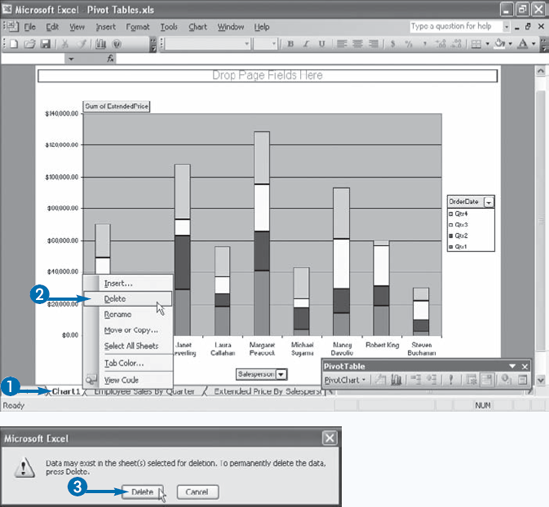
PivotCharts are useful data analysis tools, and now that you are becoming comfortable with them, you may find that you use them quite often. This gives you tremendous insight into your data, but that insight comes at a cost: PivotCharts are very resource-intensive, so creating many PivotChart reports can lead to large workbook file sizes and less memory available for other programs. You can reduce the impact that a large number of open PivotCharts have on your system by deleting those reports that you no longer need.
Even if you create just a few PivotCharts, you may find that you need them only temporarily. For example, you may just want to build a quick-and-dirty report to check a few numbers. Similarly, your source data may be preliminary, so you might want to create a temporary PivotChart for now, holding off on a more permanent version until your source data is complete. Finally, you might build a PivotChart report to send to other people. When that is done, you might no longer need the reports yourself. For all these scenarios, you need to know how to delete a PivotChart report, and this task shows you how it is done.