The PivotTables and PivotCharts that you learn about in this book are part of the larger category of data analysis. You can get the most out of these tools if you have a broader understanding of what data analysis is, what its benefits are, and what other tools are available to you.
Data analysis is the application of tools and techniques to organize, study, reach conclusions about, and sometimes also make predictions about, a specific collection of information. A sales manager might use data analysis to study the sales history of a product, determine the overall trend, and produce a forecast of future sales. A scientist might use data analysis to study experimental findings and determine the statistical significance of the results. A family might use data analysis to find the maximum mortgage they can afford or how much they must put aside each month to finance their retirement or their kids' education.
The point of data analysis is to understand information on some deeper, more meaningful level. By definition, raw data is a mere collection of facts that by themselves tell you little or nothing of any importance. To gain some understanding of the data, you must manipulate it in some meaningful way. This could be something as simple as taking the sum or average of a column of numbers, or as complex as a full-scale regression analysis to determine the underlying trend of a range of values. Both are examples of data analysis, and Excel offers a number of tools — from the straightforward to the sophisticated — to meet even the most demanding needs.
The "data" part of data analysis is a collection of numbers, dates, and text that represents the raw information you have to work with. In Excel, this data resides inside a worksheet and you get it there in one of two ways: you enter it by hand or you import it from an external source. You can then either leave the data as a regular range, or you can convert it into a list for easier data manipulation.
In many data analysis situations, the required data must be entered into the worksheet manually. For example, if you want to determine a potential monthly mortgage payment, you must first enter values such as the current interest rate, the principal, and the term. Manual data entry is suitable for small projects only, because entering hundreds or even thousands of values is time-consuming and can lead to errors.
After you have your data in the worksheet, you can leave it as a regular range and still apply many data analysis techniques to the data. However, if you convert the range into a list, Excel treats the data as a simple flat-file database and enables you to apply a number of database-specific analysis techniques to the list. In Chapter 2, see the task "Create a List for a PivotTable Report."
Most data analysis projects involve large amounts of data, and the fastest and most accurate way to get that data onto a worksheet is to import it from a non-Excel data source. In the simplest scenario, you can copy the data — from a text file, a Word table, or an Access datasheet — and then paste it into a worksheet. However, most business and scientific data is stored in large databases, and Excel offers tools to import the data you need into your worksheet. See Appendixes B and C for more about these tools.
In many cases, you perform data analysis on worksheet values by organizing those values into a data model, a collection of cells designed as a worksheet version of some real-world concept or scenario. The model includes not only the raw data, but also one or more cells that represent some analysis of the data. For example, a mortgage amortization model would have the mortgage data — interest rate, principal, and term — and also cells that calculate the payment, principal, and interest over the term. For such calculations, you use formulas and Excel's built-in functions, as described in Appendix A, "Building Formulas for PivotTables."
A formula is a set of symbols and values that perform some kind of calculation and produce a result. All Excel formulas have the same general structure: an equals sign (=) followed by one or more operands — which can be a value, a cell reference, a range, a range name, or a function name — separated by one or more operators — the symbols that combine the operands in some way, such as the plus sign (+) and the multiplication sign (*). For example, the formula =A1+A2 adds the values in cells A1 and A2.
A function is a predefined formula that is built into Excel. Each function takes one or more inputs — called arguments, such as numbers or cell references — and then returns a result. Excel offers hundreds of functions and you can use them to compute averages, determine the future value of an investment, compare values, and much more.
One of the most common data analysis techniques is what-if analysis, where you set up worksheet models to analyze hypothetical situations. The what-if part comes from the fact that these situations usually come in the form of a question: "What happens to the monthly payment if the interest rate goes up by 2 percent?" "What will the sales be if we increase the advertising budget by 10 percent?" Excel offers four what-if analysis tools: data tables, Goal Seek, Solver, and scenarios.
A data table is a range of cells where one column consists of a series of values, called input cells. You can then apply each of those inputs to a single formula, and Excel displays the results for each case. For example, you could use a data table to apply a series of interest rate values to a formula that calculates the monthly payment for a loan or mortgage.
You use Excel's Goal Seek tool when you want to manipulate one formula component — called the changing cell — in such a way that the formula produces a specific result. For example, in a break-even analysis, you determine the number of units of a product that you must sell for the profit to be 0. Given a formula that calculates profit, you could use Goal Seek to determine the break-even point.
You use Excel's Solver tool when you want to manipulate multiple formula components — called the changing cells — in such a way that the formula produces the optimal result. For example, you can use Solver to tackle the so-called transportation problem, where the goal is to minimize the cost of shipping goods from several product plants to various warehouses around the country.
A scenario is a collection of input values that you plug into formulas within a model to produce a result. The idea is that you make up scenarios for various situations — for example, best-case, worst-case, and so on — and Excel's Scenario Manager saves each one. Later you can apply any of the saved scenarios, and Excel automatically applies all the input values to the model.
Lists and external databases can contain hundreds or even thousands of records. Analyzing that much data can be a nightmare without the right kinds of tools. To help you, Excel offers a powerful data analysis tool called a PivotTable. This tool enables you to summarize hundreds of records in a concise tabular format. You can then manipulate the layout — or pivot — of the table to see different views of your data.
This book teaches you everything you need to know (and, indeed, just about everything there is to know) about PivotTables. You learn how to create them, edit them, pivot them, format them, calculate with them, and much more. You can get more out of the rest of the book if you take a few minutes now to get acquainted with some PivotTable background and basics.
To understand pivot tables, you need to see how they fit in with Excel's other database-analysis features. Database analysis has three levels of complexity: lookup and retrieval, criteria and list functions, and multiple variables. As you move from one level to another, the need for PivotTables becomes apparent.
The simplest level of database analysis involves the basic lookup and retrieval of information. For example, if you have a database that lists the company sales reps and their territory sales, you could use a data form (or even Excel Find feature) to search for a specific rep and to look up the sales in that rep's territory.
The next level of database analysis complexity involves more sophisticated lookup and retrieval systems in which you apply criteria to work with a subset of the data. You can then use this subset to apply subtotals and Excel's list functions (such as the DSUM() function, which sums those list cells that meet some specified criteria). For example, suppose that each sales territory is part of a larger region, and you want to know the total sales in the eastern region. You could either subtotal by region or set up your criteria to match all territories in the eastern region and use DSUM() to get the total. To get more specific information, such as total eastern region sales in the second quarter, you just add the appropriate conditions to your criteria.
The next level of database analysis applies a single question to multiple variables. For example, if the company in the preceding example has four regions, you might want to see separate totals for each region broken down by quarter. One solution would be to set up four different criteria and four different DSUM() functions. But what if there were a dozen regions? Or a hundred? Ideally, you need some way of summarizing the database information into a sales table that has a row for each region and a column for each quarter. This is exactly what PivotTables do and, as you see with Excel's PivotTable Wizard in the Chapter 2 task "Build a Basic PivotTable from an Excel List," you can create your own PivotTables with just a few mouse clicks.
PivotTables help you analyze large amounts of data by performing three different operations: grouping the data into categories, summarizing the data using calculations, and filtering the data to show just the records you want to work with.
A PivotTable is a powerful data analysis tool in part because it automatically groups large amounts of data into smaller, more manageable categories. For example, suppose you have a data source with a Region field where each cell contains one of four values: East, West, North, and South. The original data may contain thousands of records, but if you build your PivotTable using the Region field, the resulting table will have just four rows — one each for the four unique Region values in your data.
You can also create your own grouping after you have built your PivotTable. For example, if your data has a Country field, you could build the PivotTable to group together all the records that have the same Country value. When you have done that, you can further group the unique Country values into continents: North America, South America, Europe, and so on. See Chapter 4 to learn how to group PivotTable values.
In conjunction with grouping data according to the unique values in one or more fields, Excel also displays summary calculations for each group. The default calculation is Sum, which means for each group, Excel totals all the values in some specified field. For example, if your data has a Region field and a Sales field, a PivotTable could group the unique Region values and, for each one, display the total Sales. Excel has other summary calculations, including Count, Average, Maximum, Minimum, and Standard Deviation.
Even more powerful, a PivotTable can display summaries for one grouping broken down by another. For example, suppose your sales data also has a Product field. You could set up a PivotTable to show the total Sales for each Product, broken down by Region.
A PivotTable also enables you to view just a subset of the data. For example, by default the PivotTable's groupings show all the unique values in the field. However, you can manipulate each grouping to hide those that you do not want to view; see the task "Hide Items in a Row or Column Field," in Chapter 4. Each PivotTable also comes with a page area — see the section "Explore PivotTable Features," later in this chapter — that enables you to apply a filter to the entire PivotTable. For example, suppose your sales data also includes a Customer field. By placing this field in the PivotTable's page area, you can filter the PivotTable report to show just the results for a single Customer.
PivotTables come with certain limitations and restrictions that you need to be familiar with. See the section "Explore PivotTable Features," later in this chapter, for explanations of the PivotTable terminology used here:
The maximum number of column fields is 256. (Note that there is no maximum number of row fields.)
The maximum number of page fields is 256.
The maximum number of items that can appear in a row field is 32,500. (If you are using a version of Excel prior to 2003, the maximum number is 8,000.)
The maximum number of items that can appear in a column field is 32,500. (If you are using a version of Excel prior to 2003, the maximum number is 8,000.)
The maximum number of items that can appear in a page field is 32,500. (If you are using a version of Excel prior to 2003, the maximum number is 8,000.)
The size and number of PivotTables are limited by how much available memory your system has.
If Excel comes with so many powerful data analysis tools and features, why do you need to learn how to build and work with PivotTables? The short answer is that PivotTables are a useful weapon to add to your data analysis arsenal. The long answer is that PivotTables are worth learning because they come with not just one or two, but a long list of benefits.
PivotTables are easy to build and maintain; PivotTables perform large and complex calculations amazingly fast; PivotTables are quickly and easily updated to account for new data; PivotTables are dynamic, so components can be easily moved, filtered, and added to; PivotTables are fully customizable so you can build each report the way you want; and, finally, PivotTables can use most of the formatting options that you can apply to regular Excel ranges and cells.
These days, we all have far too much to do and far too little time in which to do it. Computers are supposed to help us with this problem by reducing the amount of time we spend on routine tasks, such as adding up rows of numbers. Some computer features have the opposite effect — e-mail, for example, takes up increasing amounts of our time — but PivotTables are not one of them. The chore PivotTables are designed to replace — cross-tabulating massive amounts of data — is inherently time-consuming. But PivotTables, by virtue of being easy to use, lightning fast, and readily updated, reduce that time to a mere fraction of what it was, resulting in true time savings.
Perhaps the most important benefit of PivotTables is that they do not come with a daunting learning curve. After you understand the basic features, you can use the PivotTable Wizard to build a simple PivotTable report with as little as nine mouse clicks; see the section "Explore PivotTable Features," later in this chapter. Even the most complex PivotTables are not much harder to build because the Wizard takes you through everything step by step — in Chapter 2, see the task "Build a Basic PivotTable from an Excel List".
The average PivotTable must do quite a bit of work when it generates its report: it must analyze hundreds or even thousands of records, each of which may have a dozen or more fields, extract the unique values from one or more fields, calculate the data summary for each unique item, and then lay everything out on the worksheet. Amazingly, for all but the largest data sources, this entire process usually only takes a second or two.
PivotTables are often used in situations where the original data changes. When that happens, the PivotTable can become out-of-date. However, each PivotTable "remembers" the original data upon which the report was based. This means that when a PivotTable is out-of-date, you do not need to re-create the report from scratch. Instead, you can run the Refresh Data command which instantly updates the PivotTable with the latest data. You can even set up your PivotTable to refresh its data automatically. For the details on refreshing PivotTables, see the task in Chapter 3 titled "Refresh PivotTable Data."
One of the traits that makes a PivotTable a powerful data analysis tool is its flexibility. For example, when you create a PivotTable, the resulting report is not set in stone. Instead, you can move components from one part of the PivotTable to another, filter the results, add and remove data, and more. Another aspect of the flexibility of PivotTables is their versatility, which means that you can create them from more than just Excel ranges and lists.
Every PivotTable is a dynamic creation that you can reconfigure to produce the kind of report you need. Specifically, most of the fields that you add to the PivotTable you can also move from one part of the report to another. This is called pivoting the data, and it causes Excel to reconfigure the PivotTable and recalculate the results. Excel produces the updated PivotTable immediately, so you can use this feature as needed, making PivotTables even more powerful and useful. In Chapter 4, see the task "Move a Field to a Different Area" to learn how to pivot data.
You can easily and quickly manipulate your PivotTable layout to get the results you are looking for. For example, you can always add new fields to any part of the PivotTable, usually with just a few mouse clicks, and you can easily remove any fields that you no longer need. Also, as you learned in the previous section, you can group and filter the PivotTable results to work with just the data you need.
If you could create PivotTables only from an Excel range or list, then they would still be enormously useful. However, Excel has made PivotTables versatile enough to handle many other types of data. You can create them from Access tables, Word tables, text files, Web pages, XML data, and from tables in powerful database systems such as SQL Server and Online Analytical Processing (OLAP) servers. See Chapter 10 to build advanced PivotTables, and Chapter 11 to build a PivotTable from an OLAP Cube.
Although many of the PivotTables that you create will be for your own use, you will also likely find that you set up PivotTables for other people to view, either on-screen, on paper, or even on the Web; see the task in Chapter 3 titled "Publish a PivotTable to a Web Page." In these more public situations, you will usually want to set up your PivotTable so that it looks its best. To that end, Excel has given PivotTables a number of features that enable you to customize and format them as needed.
Each PivotTable comes with a number of options that you can use to customize both the report as a whole and individual PivotTable components. For example, you can hide items, sort the data, and customize the report printout. You can also customize the calculations used in the report, either by changing to one of Excel's built-in calculations, or by defining custom calculations. For more about custom calculations, see Chapter 8.
After you have the PivotTable result you want, you can spend time dressing up the report to make the data easier on the eyes. Fortunately, most of the cells in a PivotTable act as regular Excel cells. This means you can format them in the same way by changing the font, applying colors and borders, using numeric and date formats, and much more. See Chapter 5 to customize your PivotTable fields.
One of the keys to using Excel's data analysis tools is knowing which tool to use under which circumstances. If you want to glean one or two facts about your data, then a formula or two is often all you need. For more elaborate needs, especially ones where you need to build a worksheet version of some real-world concept, a data model is required. If you want to "interrogate" your data by plugging various values into a formula and comparing the results, a data table is best. If you are looking for a particular or optimal result, use Goal Seek for simple models or Solver for more complex models.
PivotTables, too, are best used only in certain scenarios. The situations where a PivotTable is your best data analysis tool — or, at least, a worthwhile one to consider — fall into three categories: the structure of the underlying data; the analysis you require; and your (or your manager's) reporting needs.
More than any other factor, the structure of your data determines whether a PivotTable is a good data analysis choice. Certain types of data simply cannot be analyzed in a PivotTable, while other data sets would produce largely useless results. In general, the best data structure for PivotTables is one where the data exists in a tabular format with consistent and repeated data, such as those found in databases of transactions. For more detailed information on setting up your data for a PivotTable report, see the section in Chapter 2 titled "Prepare Your Worksheet Data."
Your data is a good candidate for a PivotTable analysis if it exists in tabular format. This means that the data is arranged in a row-and-column structure, with the same number of columns used in each row. If your data is scattered around the worksheet and cannot be rearranged into tabular format, you cannot build a PivotTable from it.
You should consider a PivotTable analysis if your tabular data also has consistent and repeated values. Consistent values means that each column contains the same type of data in the same format. For example, one column contains only customer names, another contains only order dates, and a third contains only invoice amounts. Repeated values means that at least one column contains only a limited number of values that repeat throughout the records. For example, a Region column may contain just four values — such as East, West, North, and South — that are repeated over hundreds or thousands of records.
The perfect type of data to benefit from a PivotTable analysis is transactional data that records frequent, consistent exchanges of information. Common examples of transactional data include customer orders, accounts receivable, experiment results, inventory totals, product sales, survey answers, and production schedules. This transactional data creates the same data structure for each record, has consistent data, and has repeated values in at least one field, all of which make this kind of data ideal for a PivotTable approach.
When deciding whether to build a PivotTable from your data, think about the type of analysis you require. What is your goal? What do you need to know? What secret do you suspect is hidden within all that data? Generally, building a PivotTable is a good idea if you are seeking one or more of the following as part of your analysis of the data: a list of unique values in a field; a summary of a large amount of data; relationships between two or more fields; and the trend of the data over time.
When faced with a huge amount of data, you may find that one of the first things you want from that data is a list of the unique values in some field. For example, in a database of thousands of orders, you may simply want to know which customers placed orders. The PivotTable is your best choice here because extracting a list of the unique values that occur in a field is one of the things that PivotTables do best.
Analyzing data often means summarizing it in some way: totaling it, counting it, finding the average or maximum value, and so on. Excel has worksheet functions, subtotals, and other tools for this kind of analysis, but none of them are suitable for summarizing large amounts of data, particularly if you want to view the results in a compact report. To do that, you must build a PivotTable.
One of the biggest problems you face when confronted with a large data set is determining the relationships that exist between one field and another. Which customers are buying which products? How do product defects vary by manufacturing plant? PivotTables are ideal for this kind of analysis because they can break down the values in one field with respect to another. For example, you can display the total sales generated by each of your salespeople, and then break that down by customer, country, product, category, and so on.
If your data includes a field with date or time values, you may be interested to see how a particular field varies over time. This trend analysis can be extremely useful, and Excel has several powerful tools to help you see the trend. However, a PivotTable is an excellent choice if you want to summarize one field and break it down according to the date or time values. How do sales vary throughout the year? How do manufacturing defects vary throughout the day or week?
The final aspect to consider when deciding whether to analyze your data with a PivotTable is to determine what your reporting needs are. In other words, what do you want to end up with? Choose the PivotTable route if you want to end up with a report that is flexible and can easily handle frequent changes.
Build a PivotTable to analyze your data if you want the flexibility to change the report quickly and easily. If you need to switch the layout — for example, to switch from a vertical layout to a horizontal one — you can pivot any field with a click and drag of the mouse. If you need to view subsets of the results, you can filter the report based on the values in a particular field.
Choose a PivotTable if you think your underlying data will change frequently. You can easily update the PivotTable to use the latest data, so your report is always accurate and up to date. It is also easy to change the structure of the PivotTable — by adding a new field that has been inserted into the data — so you can always incorporate new data.
You can get up to speed with PivotTables very quickly after you learn a few key concepts. You need to understand the features that make up a typical PivotTable, particularly the four areas — row, column, data, and page — to which you add fields from your data.
You also need to understand some important PivotTable terminology that you will encounter throughout this book, including terms such as source data, pivot cache, and summary calculation.
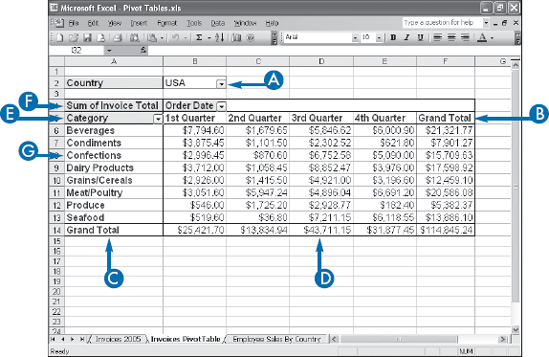
Displays a drop-down list that contains the unique values from a field. When you select a value from the list, Excel filters the PivotTable results to include only the records that match the selected value.
Displays horizontally the unique values from a field in your data.
Displays vertically the unique values from a field in your data.
Displays the results of the calculation that Excel applied to a numeric field in your data.
Identifies the field contained in the area. You also use the field button to move a field from one area to another.
The unique values for the field added to the particular area.
Specifies both the calculation (such as Sum) and the field (such as Invoice Total) used in the data area.
PivotTables come with their own terminology, much of which may be unfamiliar to you, even if you have extensive experience with Excel. To learn PivotTables faster, you should understand not only the terms on the previous page, but also the words and phrases that appear in this glossary.
The original data from which you built your PivotTable. The source data can be an Excel range or list, an Access table, a Word table, a text file, a Web page, an XML file, SQL Server data, or OLAP server data, among others.
Source data that comes from a non-Excel file or database. You can use Microsoft Query to import external data into your Excel worksheet; see Appendix B. Or you can use Excel's other data import tools; see Appendix C.
When you have multiple fields in the row or column area — see the task in Chapter 3 titled "Add Multiple Fields to the Row or Column Area" — Excel places the fields either beside each other, in the row area, or one on top of the other, in the column area. In either case, the field that is closest to the data area is called the inner field, and the field that is furthest from the data area is called the outer field.
A region of the PivotTable onto which you can drop a field from the source data or from another area of the PivotTable. Excel displays each drop area with a blue border.
The non-data area elements of the PivotTable. The labels include the field buttons, field items, and page area drop-down list.
The mathematical operation that Excel applies to the values in a numeric field to yield the summary that appears in the data area. Excel offers 11 built-in summary calculations: Sum, Count, Average, Maximum, Minimum, Product, Count Numbers, Standard Deviation (sample), Standard Deviation (population), Variance (sample), and Variance (population); see Chapter 7. You can also create custom calculations; see Chapter 8.
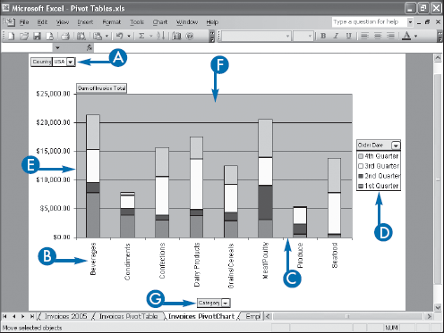
When you begin the process of building a PivotTable, Excel actually gives you a choice between building a PivotTable or a PivotChart. In basic terms, a PivotChart is to a PivotTable what a regular chart is to a range. That is, the former is a graphical representation of the latter. So the PivotChart enables you to visualize the PivotTable results by displaying the data area values in chart form.
However, it is also possible to say that a PivotChart is to a regular chart what a PivotTable is to a regular range. In other words, the PivotChart goes far beyond the capabilities of a simple chart because the PivotChart comes with most of the same features that make PivotTables so powerful: you can filter the results to see just the data you need, and you can pivot fields from one area of the PivotChart to another to get the layout you want. See Chapter 9 to learn how to create and work with PivotCharts.
As you might expect, PivotCharts have a number of elements in common with PivotTables, but there are also some key differences. The following items explain these differences and introduce you to some important PivotChart concepts.
Like a PivotTable, a PivotChart automatically groups large amounts of data into smaller, more manageable groups. For example, if you have data with a Category field containing values such as Beverages, Condiments, Confections, and so on, if you build your PivotChart using the Category field, the resulting chart will display one chart category (X-axis value) for each unique Category field value. This is the equivalent of a row field in a PivotTable.
Also, as with a PivotTable, you can break down your data in terms of a second field. For example, your data may have an Order Date field. If you add that field to the PivotChart, Excel creates one data series for each unique value in that field. This is the equivalent of a Column field in a PivotTable.
You can't have a PivotTable without a data field, and the same is true with a PivotChart. When you add a numeric field for the summary calculation, Excel displays the results as chart values (Y-axis). This is the equivalent of a data field in a PivotTable.
Like a PivotTable, you can use the unique values in another field to filter the results that appear in the PivotChart. For example, if your source data has a Country field, you could add it to the PivotChart and use it to filter the chart results to show just those from a specific country. This is the equivalent of a page field in a PivotTable.
Perhaps the biggest difference between a PivotChart and a regular chart is that each PivotChart is a dynamic object that you can reconfigure as needed, just like a PivotTable. You can pivot fields from one area of the chart to another; you can add fields to different chart areas; and you can place multiple fields in any chart area.
PivotCharts have advantages and disadvantages, and understanding their strengths and weaknesses will help you decide when and if you should use them. On the positive side, a PivotChart is a powerful data analysis tool because it combines the strengths of Excel's charting capabilities — including most of the options available with regular charts — with the features of a PivotTable. Also, creating a basic PivotChart is just as easy as creating a PivotTable. In fact, if you already have a PivotTable, you can create the equivalent PivotChart with just a couple mouse clicks.
On the negative side, PivotCharts share the same caveats that come with regular charts, particularly the fact that if you do not choose the proper chart type or layout, your data will not be easily understood. Moreover, a PivotChart can quickly become extremely confusing when you have multiple category fields or data series fields. Finally, PivotCharts have inherent limitations that restrict the options and formatting you can apply. See the section in Chapter 9 titled "Understanding PivotChart Limitations."
PivotCharts carry over some of the same terminology that you saw earlier for PivotTables, including the concepts of the page area, data area, and field button. However, PivotCharts also use a number of unique terms such as category axis and series axis that you need to understand to get the most out of PivotCharts.
Displays a drop-down list with unique values from a field that you use to filter the PivotChart data.
The unique values from a field that define the chart's categories.
The chart axis (X-axis) that displays the category items.
The unique values from a field that define the chart's data series. The item names appear in the chart legend.
The chart axis (Y-axis) that displays the values of the data series items.
Displays the charted results of the calculation that Excel applied to a numeric field in your data.
Identifies the field contained in the area. You also use the field button to move a field from one area to another.