


Analytics
This chapter can help you learn about the relevance of analytics in the IBM API Management solution. We will begin with an overview of analytics and its importance in an API Management solution.
This chapter addresses the use of analytics in IBM API Management for real-time operational insight and business control. The chapter also covers product-level details about available Analytics dashboards for API usage, monitoring, and tracking activities.
This chapter contains the following topics:
10.1 Introduction to analytics
The confluence of mobile, cloud, and social media has led to massive amounts of data being generated and consumed by systems and devices. The variety of data sources and unstructured format has transformed how data is now harnessed for drawing insight. In the past, data existed in silos or buried deep within the enterprise in proprietary formats, making it a painstaking and lengthy process to draw out intelligence.
Advances in computer software, such as big data, and hardware technologies have now made possible the collecting and processing of large volumes of data. These technological improvements have paved the way for the emergence of the field of analytics.
The direct application of statistics and operations research in computer programming has formalized the creation of an analytics discipline. Analytics has dramatically improved communication and decision-making insight by quantifying performance and presenting it in a user-friendly visualized format.
Analytics has also come to the forefront in recognition that it tangibly empowers organizations to drive innovation while reducing cost. Although, a more profound impact has been through the democratization of IT, with more companies and product vendors enabling analytics for broader external consumption. For instance, consider financial dashboards that aggregate financial transactions from multiple sources, as exemplified by Mint.com. These contextual dashboards are now becoming common in industries and solutions that cater to user consumers.
The cloud computing service models can be considered as one of the dominant catalysts in promoting analytics for user consumption. For example, the usage and metering of consumed cloud resources is one common use of an analytics dashboard. The usage view is typically associated with the consumer (developer) of the services. The metering view is associated with the provider (API manager) of the services, responsible for billing the customer. It is natural that an API Management solution, which functions like a software-as-a-service (SaaS) model, embraces the same attributes as those instituted under cloud computing.
Although the use of analytics in API Management is essential to provide metering and monitoring capabilities, offering business level insights has become an equally critical component. A general agreement is that APIs should be treated like a product: exposing the enterprise’s valued assets into the public domain. So the logical assumption is that a business arm of the enterprise, such as marketing, might become a key stakeholder of the offering. This audience would be keenly focussed on business level KPIs to measure and suggest corrective actions in pursuit of market and profitability goals.
With an understanding of these key drivers, the management of APIs in the IBM API Management solution have been designed from the ground up to cater to both a technical and a business audience. Analytics dashboards provide a 360 degree view to all parties that are part of the value and supply chain.
The IBM API Management product includes nine perspectives that are contextually oriented toward roles (personas) of users. In the following sections, descriptions of these dashboards are aligned to their relevant user roles:
•API product manager
•IT operations
•API developer (publisher)
•Application developer (consumer)
Descriptions of these roles are in 2.5, “Introducing the use case scenario and user roles” on page 33.
|
Roles: For the purposes of illustrating the various analytics perspectives, these roles have been restrictively defined. In practice, however, these roles are likely to be combined, or perhaps even further segmented. For instance, an API product manager might assume both business and technical functions, or an operations specialist and developer might share responsibilities under a DevOps designation.
|
10.2 API product manager
The API product manager represents the business stakeholder of an API Management solution. This user can be given access and authority over a single tenant or multiple tenants. The decision criteria is worth mentioning because the Analytics dashboard is available only per tenant. The Analytics views capture data only for transactions and activities occurring within the tenant in use.
There are multiple metrics available for an API product manager. The dashboard page within API Manager shows the usage distribution of top five APIs by developers or applications. The API Statistics page shows the number of calls per API and response time statistics within a time interval. The Search & Analyze page enables users execute search queries on API calls and perform deep API analysis.
|
Note: All analytics metrics displays are subject to the analytics data retention period specified in the Environment Console.
|
10.2.1 Top five APIs
The Dashboard page displays the usage distribution for the top five APIs, developers, and applications. The page can be accessed by logging into the tenant’s API Manager portal. After logging in, expand the top level drop-down in the main navigation and click Dashboard under the Manage section to display the page, as shown in Figure 10-1.

Figure 10-1 API Manager Analytics Dashboard
A user can select the following time intervals to present data within that period:
•7 days
•1 month
•3 months
|
Note: The time periods are displayed based on settings in the Analytics Data Period policy. For example, if the policy is set to 30 days (or 1 month), then the 3 months selection is not shown.
|
The Dashboard page shows much information; it is too large to show the entire dashboard in one figure. Here, the Dashboard is divided into three sections:
•Top section is shown in Figure 10-2 on page 221.
•Middle section is shown in Figure 10-3 on page 222.
•Bottom section is shown in Figure 10-4 on page 222.
The graphs within these sections might look similar because not much sample data is shown here. However, when you work with real data from a production environment, the graphs will vary.
The first graph (Figure 10-2) plots calls for each API: the days on the X-axis against the number of calls on the Y-axis. Below the graph on the left side is a legend of the top five API names and total number of calls for each API. Clicking the View calls hyperlink opens the Search & Analyze page for a more detailed analysis.
On the right side, below the graph, is a pie chart that shows the distribution of clients invoking the selected API. Clicking the percentage hyperlink in the pie chart displays a further analysis of the client types.
If the client is listed as Mobile in the top-level chart, clicking the percentage hyperlink displays a distribution overlay of types of Mobile clients, such as IOS, Android, or Windows Mobile.
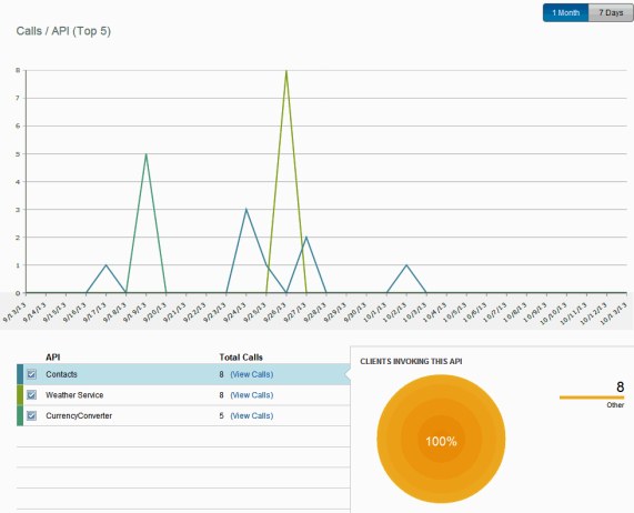
Figure 10-2 API Manager Analytics Dashboard: Calls/API (Top 5)
The middle section of the Dashboard page (Figure 10-3) displays the top five API calls initiated by application users. A legend on the right side of this graph lists the developers and total number of API calls that were originated by them.
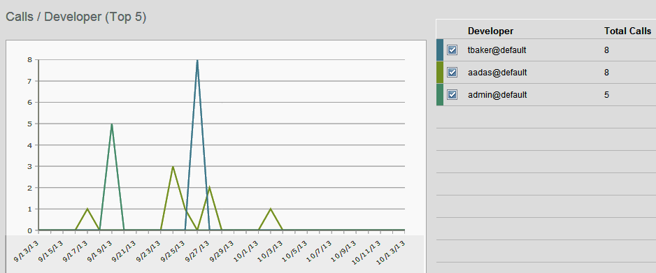
Figure 10-3 API Manager Analytics Dashboard: Calls/Developer (Top 5)
Finally, the bottom section of the Dashboard page (Figure 10-4) displays the top five API calls made by an application. A legend on the right side of the graph lists the application name and associated number of total calls.
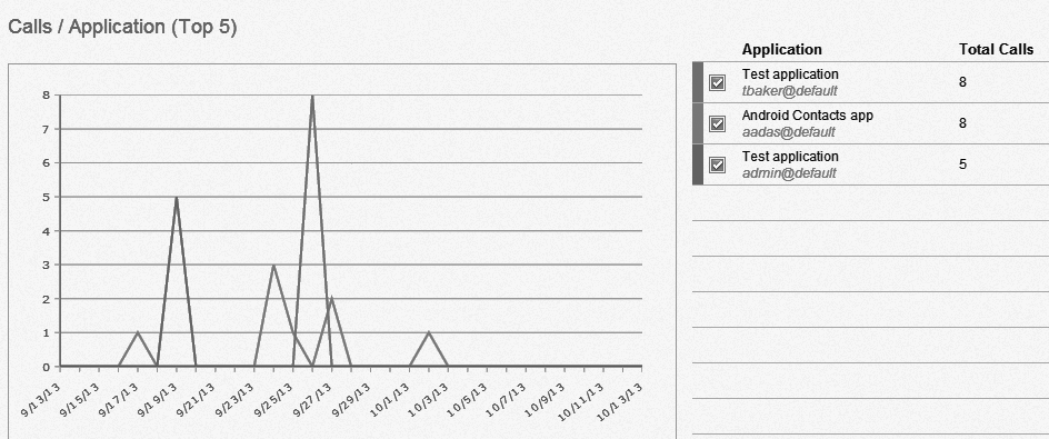
Figure 10-4 API Manager Analytics Dashboard: Calls/Application (Top 5)
In each legend in each section, you can also select which API, developers, or applications should be rendered in the graphs for more concise reporting.
All graphs generated on this page display calls, or response times within the chosen interval.
10.2.2 API calls and response time statistics
The API Statistics page displays the number of calls per API and response time statistics, within a calendar month interval. The page can be accessed by logging in to the tenant’s API Manager portal. After logging in, expand the top level drop-down list in the main navigation and click API Statistics under the Manage section to display the page (Figure 10-5).
A drop-down icon is available for each API listed. Click the icon to view detailed statistics for that API. The columns represent the following information:
•Resource: Request methods such as GET, POST, DELETE, and PUT, with their associated URI
•Calls this month: Aggregate number of API calls made in the current month
•Response time: Measured in milliseconds; displayed as minimum, average, and maximum
|
Response time: This is based on the amount of time that the IBM API Management platform processes the request, from the time the request arrives from the client, to the time a response is returned to the client. It does not include the time spent for the request from the client to the platform, nor the time for the response from the platform to the client.
|
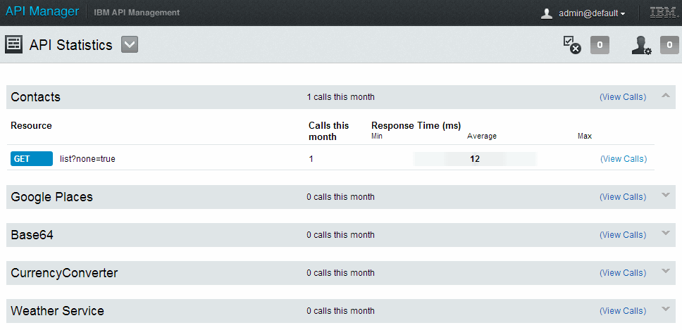
Figure 10-5 API Statistics
Each API listing also includes an individual link (View Calls) under each resource to navigate the user to a Search & Analyze page, where more advanced API analysis can be performed.
10.2.3 Search and deep analysis on API calls
The Search & Analyze page provides the ability to perform deep API analysis and also execute search queries on API calls. The search functionality also comes with the added convenience of saving and sharing the generated results. The page can be accessed by logging into the tenant’s API Manager portal.
Analyze
After logging in, expand the top level drop-down in the main navigation. Click Search & Analyze under the Manage section to display the page (Figure 10-6 on page 225). A scatter graph for Response Time (ms) is selected, displaying the distribution of response times per day across the selected time interval.
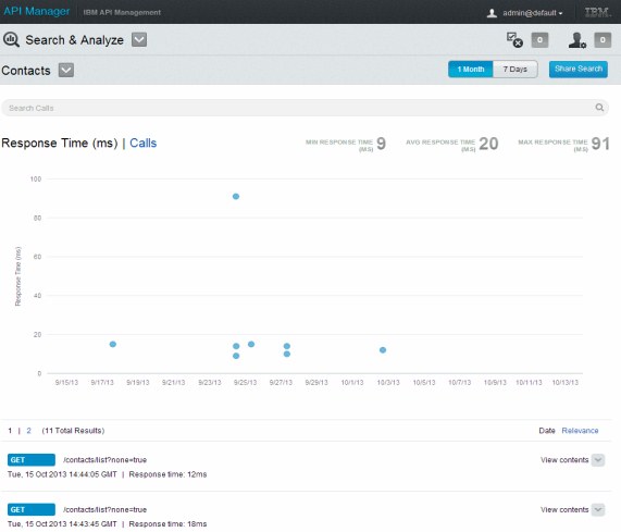
Figure 10-6 Search & Analyze: Response Time (ms)
The individual calls by application are listed beneath the graph in date-order with their respective response times (ms). The order of the list can be changed to Relevance by clicking the link. The colors of the dots in the scatter graph indicate which HTTP method the call used.
The page displays the calls or response times within the selected interval: 7 days, 1 month, or 3 months.
Click the Calls hyperlink to change the view from the Response Time (ms) graph to a bar chart.
The bar chart (Figure 10-7), which is the default, indicates the total number of API calls per day across the selected time interval.
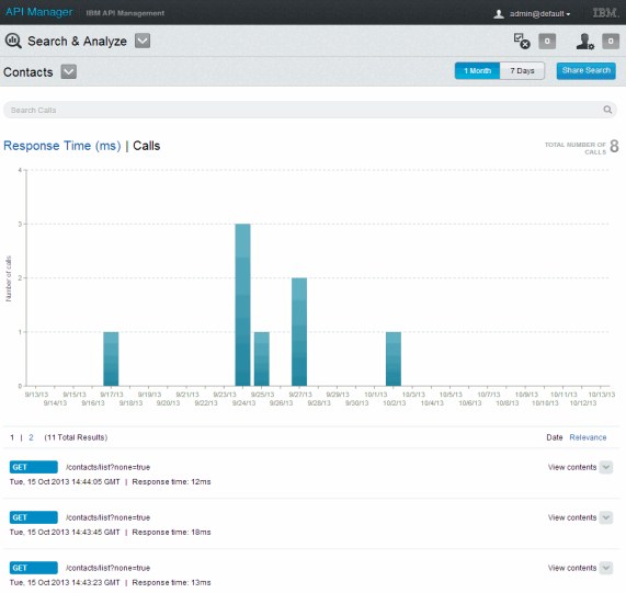
Figure 10-7 Search & Analyze: Calls
Each individual API call has a drop-down icon (View contents link) associated with the call. Click this View contents link.
Further technical details are displayed (Figure 10-8). The key sections of this view are as follows:
•Request Body: HTTP Request body, in either XML, or JSON format
•Response Body: HTTP Response body, in either XML, or JSON format
•Request Headers: HTTP request headers
•Response Headers: HTTP response headers
•Returned Response: HTTP response code
Click Hide contents to collapse the view.
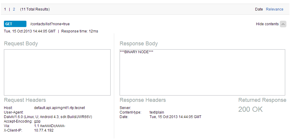
Figure 10-8 Search & Analyze: Show contents
A high-level description of all the defined APIs can also be viewed by clicking the All APIs drop-down icon, as shown in Figure 10-9.
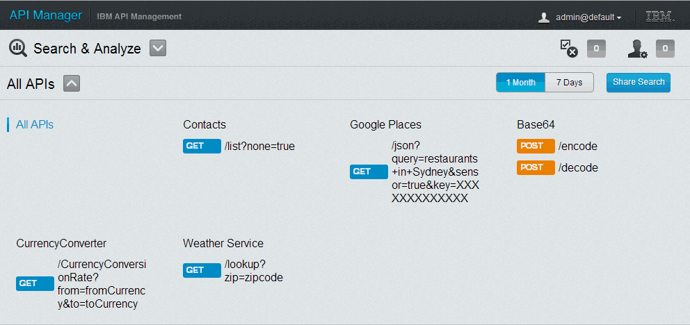
Figure 10-9 Search & Analyze: All APIs
Search
The search function is available at the top of the Search & Analyze page. The gray bar labeled Search Calls represents the area for entering queries. Click in this area to see a list of Example queries, below the bar. Select a query by clicking one of the samples, as shown in Figure 10-10.

Figure 10-10 Search & Analyze: Search Calls example queries
If the query you want to view is not listed, you can compose a new query in the bar, as shown in Example 10-1, and press Enter to run the query. The results of the search are displayed below the graph.
Example 10-1 Search call example query
last_name:<lastname> AND NOT first_name:<firstname> AND username:<username>
If no query is specified in the Search Calls, the total number is displayed. If an incorrect query or keyword is entered, no results are displayed.
|
Restriction: The following words are not allowed in a query:
a, an, and, are, as, at, be, but, by, for, if, in, into, is, it, no, not, of, on, or, such, that, the, their, then, there, these, they, this, to, was, will, with
Also, proximity searches are not supported.
|
To share the search, click Share Search (Figure 10-11). A URL is listed. This URL can be shared with others to access the queried results.

Figure 10-11 Search & Analyze: Share Search
The page can also be bookmarked in the browser for future retrieval.
10.3 IT operations
IT operations is responsible for operating the IBM API Management environment. This role can also involve undertaking the system administration tasks. In this section, we only focus on the monitoring aspects of the role.
The Environment Console portal provides the primary interface to manage and monitor the platform and its usage. The portal includes operations analytics that display real-time health metrics for each node. It also displays activities generated through user actions, environment tasks and system alerts.
10.3.1 Monitor health of the environment
The Monitor Environment page displays the health metrics for each node deployed. The Gateway and Assembly nodes display a wider set of metrics reflecting some of the more complex tasks these nodes typically perform. To access the page, log in to the Environment Console portal, expand the top level drop-down list in the main navigation, and click Monitor Environment. The page opens (Figure 10-12 on page 231).

Figure 10-12 Monitor Environment
The Monitor Environment page contains two panels:
•Node Status and Health panel
This panel, at the left side of the page, shows a summary grid for all the deployed nodes.
Node status reflects the ability of the Management tier to access the management API of the node. Node health indicates whether any of the node metrics have exceeded the threshold in the past 24 hours. The columns indicate node type, host name, status, and health. Additional information (such as firmware, model and serial number) is displayed in a pop-up window by hovering over an entry in the list.
•Node Metrics panel
This panel, at the right side of the page, displays the graphs associated with the selected node in the list.
In the Node Metrics panel, the operations specialist can select a time period for which to display information. The following options can be selected:
– 1 Day
– 1 Week
– 1 Month
– 3 Months
|
Time periods in the Node Metrics panel:
•The default time period is 1 Day.
•1 month = 30 days; 3 months = 90 days.
•The time periods are displayed based on settings in the Analytics Data Period policy. For example, if the policy is set to 30 days (or 1 month), then the 3 Months selection is not shown.
•To improve visibility of the graphs, click the icon next to the Node Metrics label to increase the display scale.
•Each graph includes a gray dotted line indicating the maximum node-wide capacity threshold.
|
Management node
When the selected node is a Management node type, a single graph is displayed, as shown in Figure 10-13, with three available metric choices:
•CPU (%): Average across node CPUs
•Memory (%):- Memory usage of node
•Disk (%): Disk usage of node
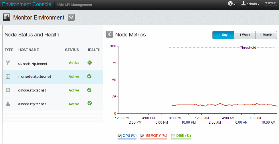
Figure 10-13 Monitor Environment: Management Node metrics
Analytics node
When the selected node is an Analytics node type, a single graph is displayed, as shown in Figure 10-14, with three available metric choices:
•CPU (%): Average across node CPUs
•Memory (%): Memory usage of node
•Disk (%): Disk usage of node

Figure 10-14 Monitor Environment: Analytics node metrics
Gateway node
When the selected node is a Gateway node type, four graphs are displayed highlighting different health characteristics.
|
Note: Statistics must be enabled on the DataPower node or appliance to see all the metrics. See the WebSphere DataPower Information Center for instructions to enable statistics.
|
Node Metrics
The first graph (Figure 10-15) shows the appliance’s (virtual or hardware) Node Metrics across the selected time interval. The graph features five selectable metrics:
•CPU (%): CPU usage over the past 10 minutes
•Memory (%): Percentage of node memory in usage (by API Management and other users)
•Load (%): A measurement of the node’s ability to accept additional work based on the various components of system load
•Disk (%): Percentage of the disk used
•Domain Memory (%): Memory as a percentage of the total available on the node
Figure 10-15 Monitor Environment: Gateway node metrics
Throughput
The second graph (Figure 10-16) shows throughput (including all traffic that passes through the node), in kilobytes per second (KB/s) across the selected time interval. The graph features two selectable metrics:
•Receive Throughput (KB/s)
This is the aggregated throughput of all ingress traffic. It might be either client requests or back-end responses.
•Transmit Throughput (KB/s)
This is the aggregated throughput of all regress traffic. This might be either client responses or back-end requests.
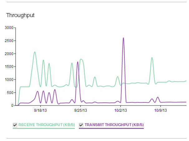
Figure 10-16 Monitor Environment: Gateway Throughput
Transaction Rate
The third graph, Transaction Rate (specific to the API Management domain and includes both internal and API traffic), is measured as completed requests per second across the selected time interval, as shown in Figure 10-17.
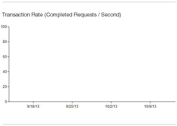
Figure 10-17 Monitor Environment: Gateway Transaction Rate
Mean Transaction Times
The fourth graph (Figure 10-18) shows mean transaction times (specific to the API Management domain and includes both internal and API traffic), in milliseconds (ms) across the selected time interval.
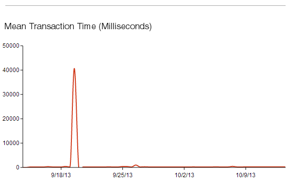
Figure 10-18 Monitor Environment: Gateway Mean Transaction Time
Assembly node
When the selected node is an Assembly node type, four graphs are displayed highlighting various health characteristics.
Node Metrics
The first graph (Figure 10-19) shows appliance (virtual, or hardware) node metrics across the selected time interval. The graph features four selectable metrics:
•CPU (%): Aggregated CPU utilized by node
•Memory (%): Aggregated Memory utilized by node
•Disk (%): Aggregated disk storage utilized by node
•WIP Disk (%): Disk utilization for all work in progress on node

Figure 10-19 Monitor Environment: Assembly node metrics
Memory Usage per JVM Process
The second graph (Figure 10-20) shows memory usage per JVM process, across the selected time interval. The graph features three selectable metrics:
•Runtime Memory (%)
•DB Memory (%)
•WMC Memory (%)
|
Note: All three metrics are percentages of Java heap usage for the runtime (assembly capability), database, and management components.
|
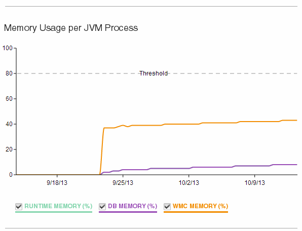
Figure 10-20 Monitor Environment: Assembly Memory Usage per JVM process
Garbage Collection (GC) Activity per JVM Process
The third graph (Figure 10-21) shows garbage collection (GC) activity per JVM process across the selected time interval. The graph features three selectable metrics:
•Runtime GC Activity (%)
•DB GC Activity (%)
•WMC GC Activity (%)
|
Note: Garbage collection is a process that returns memory, held by completed jobs (or assemblies) and variable data, back to a pool of memory that can be used by all orchestration jobs. This garbage collection process ensures that the Assembly node has a constant supply of free memory to be used by new orchestration jobs.
The Assembly node (Cast Iron) considers 5 full Garbage Collection (GC) cycles per minute to be 100%, so going over 100% is possible.
|

Figure 10-21 Monitor Environment: Assembly GC Activity per JVM Process
Number of Jobs On This Node
The fourth graph (Figure 10-22) shows the number of jobs on this node across the selected time interval. The graph has two selectable metrics:
•Running Jobs (Total)
•Waiting Jobs (Total)
|
Note: These are instantaneous measurements. Unless workload is sustained, you might not see individual jobs displayed.
|
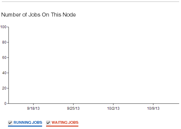
Figure 10-22 Monitor Environment: Assembly Number of Jobs On This Node
10.3.2 View information about activities
The View Activities page displays all events and alerts generated by the platform, including actions performed by users. This information is vital for conducting audits and problem determination.
To access the page, log in to the Environment Console portal, expand the top level drop-down in the main navigation, and click View Activities. By default, the Alerts view is selected.
The button for each view displays a number, indicating the total number of entries available for viewing. The system can track a maximum of the last 1000 entries.
Alerts
The Alerts view (Figure 10-23 on page 244) is responsible for notifying the user of critical environment-related failures that require attention. These alerts consist of both platform and transaction failures.
|
Note: Alerts are subject to a limit of the last 1000 entries. These entries are captured at an Error level, or above.
|
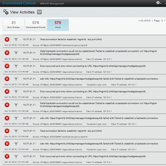
Figure 10-23 View Activities: Alerts
User Actions
The User Actions view (Figure 10-24 on page 245) captures information resulting from administrative actions taken by the user, or system. This information can be useful for conducting audits or for problem determination.
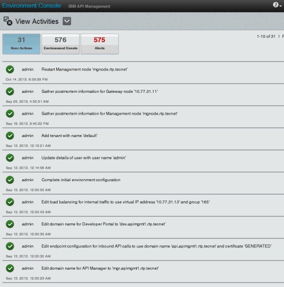
Figure 10-24 View Activities: User Actions
To access the page, log in to the Environment Console portal, expand the top level drop-down in the main navigation, click View Activities, and then click User Actions to display the view.
The User Actions view also includes a Details drop-down icon. Clicking the icon displays more details regarding the entry.
Environment Events
The Environment Events view (Figure 10-25) shows entries concerning all events occurring at the platform level. These events contain information that can be used for both informational and troubleshooting purposes.

Figure 10-25 View Activities: Environment Events
To access the page, log in to the Environment Console portal, expand the top level drop-down in the main navigation, click View Activities, and then click Environment Events to display the view.
|
Note: Environment Events are subject to a limit of the last 1000 entries. These entries are captured at a Warning level, or above.
|
10.4 API developer (publisher)
The API developer serves the role of creating and publishing APIs for internal or external application developers to consume. After the APIs are published, the API developer can monitor activities associated with APIs running on the assigned tenant.
The Activities Feed page displays all activities and alerts generated through API access and invocations. This information is useful for determining API improvements through code or documentation and can also be helpful in problem determination.
To access the page, log in to the API Manager portal, expand the top level drop-down in the main navigation, and click Activities Feed. By default, the Audit Activity view is selected.
|
Note: The button for each view displays a number, indicating the total number of entries available for viewing. The system can track a maximum of the last 1000 entries.
|
10.4.1 Audit Activity
The Audit Activity view provides an audit trail of all configurations completed by the API developer. A sample illustration is provided in Figure 10-26 on page 248.
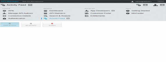
Figure 10-26 Activities Feed: Audit Activity view
10.4.2 API Activity
The view associated with selecting the API Activity button shows whether the activity successfully completed. This view captures the job identifier, a description of the resource activity, and the date and time the activity occurred. A sample illustration is provided in Figure 10-27.

Figure 10-27 Activities Feed: API Activity
Click the Details icon to further investigate the selected entry. An expanded view opens below the API resource activity with additional details.
Clicking each of the generated radio buttons will continue to expand the level of detail that is revealed about the resource.
For example, if the activity failed, the developer can continue to track the flow of data in the resource activity until the problem is identified. The developer can then edit the resource to correct the definition and test to ensure that the API resource is working as designed.
10.4.3 Alerts
Clicking the Alerts button shows a view for notifications of issues. For example, an assembly might be failing because of a connectivity issue of a secure connector.
A sample illustration is provided in Figure 10-28.
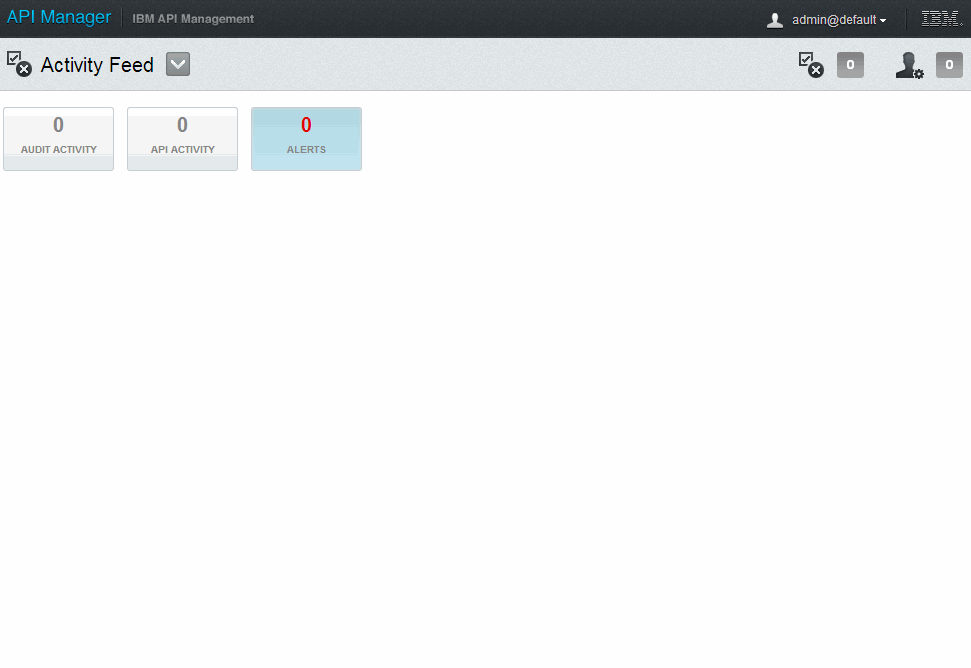
Figure 10-28 Activities Feed: Alerts
10.5 Application developer (consumer)
The application developer serves the role as a consumer of APIs, hosted by the provider. As a consumer of APIs, the application developer can view usage analytics in the IBM API Management product.
The Analytics dashboard provides a comprehensive view of API usage application invocations by application users. With this feature, the application developer can derive key insights. The popularity and adoption of an application can be assessed by viewing the calls per application, distribution of clients invoking the APIs, and call volume per API. This information can be used as a feedback mechanism in multiple ways:
•Improve market adoption and penetration.
For example, if there are greater number of Android users, then an application owner might want to first target new revisions, or applications on an Android device.
•Adjust payment levels.
For example, if the developer is paying too much for calls that are not used, or expects a surge, the developer might want to request lowering or increasing the entitlement levels in line with the pricing model of the provider that it is most cost effective for the developer.
10.5.1 Dashboard
The Dashboard page displays the usage distribution for the top five APIs with most calls, client type distribution, and top five applications with the most calls. To access the page, log in to the tenant’s Developer Portal, click the Manage section and then click the Dashboard tab to display the page shown in Figure 10-29.

Figure 10-29 Developer Portal: Manage dashboard
The Dashboard page displays the usage statistics made for the selected interval. Three choices for time period selection are provided:
•1 Year
•1 Month
•7 Days
Two graphs are displayed with different perspectives.
The first graph (Figure 10-30) features a time series that depicts the top five applications that have generated the most calls.
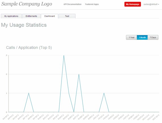
Figure 10-30 Developer portal dashboard: Calls/Application (Top 5)
A summary grid is provided below the graph highlighting the application name and associated number of calls, as illustrated in Figure 10-31. It is possible to select, or deselect the application to modify the graph view.
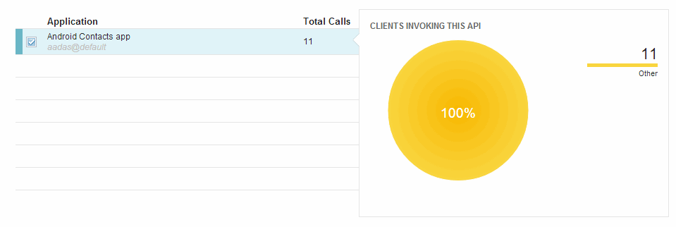
Figure 10-31 Developer portal dashboard: Calls/Application (Top 5) summary grid
Next to the summary grid, a pie-chart shows distribution of the types of client devices. The distribution is associated with the selected application in the summary grid.
The second graph (Figure 10-32) shows a time series that depicts the top five APIs that have generated the most calls.
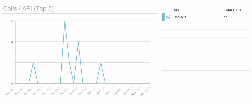
Figure 10-32 Developer portal: Calls/API (Top 5)
Next to the graph, a summary grid highlights each API and its associated number of calls. It is possible to select, or de-select the API to modify the graph view.
..................Content has been hidden....................
You can't read the all page of ebook, please click here login for view all page.