Chapter 5. Creating Layouts
The last chapter introduced a lot of concepts, but you only had a chance to shuffle one layout around a bit. Now it’s time to put everything you’ve learned to use. Your People database has a great detail layout, but what else could it use? For starters, a neatly arranged list of people would be nice. And how about a way to print mailing labels? You probably have some ideas about what you’d like your database to do, and FileMaker itself has some ideas of its own to help you along.
In this chapter, you’ll learn the two main ways of designing and implementing your own layouts in FileMaker. You can create a unique new layout from scratch, say if you like to print all your worldly information on index cards (you know who you are). Or if your needs are more down-to-earth, you can let an assistant save you some time. Just answer a few questions, and the assistant plugs your answers into standard forms like mailing labels. You’ll also learn about special FileMaker layouts called reports, which sort, filter, or summarize your data before presenting it.
The Lowdown on Layouts
Although you can create an infinite variety of layouts in FileMaker, they all boil down to a few basic types. You get a chance to try each of them as you proceed through this chapter. Here’s a brief overview of each.
Standard Form
The “Standard form” choice creates a layout just like the one FileMaker creates automatically when you start your database—a simple detail layout (see Section 3.2).
This time, though, you get to decide which fields to include. You also have some control over the fonts and colors. FileMaker calls these design controls “themes.”
Columnar List/Report
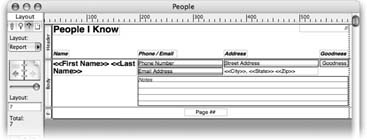
If you want to show lots of records on the screen or page at one time, choose "Columnar list/report” instead. You still get to pick which fields to include and what theme to use, but FileMaker sets up the new layout as a list of records with one column per field, as shown in Figure 5-1.
Table View
When you select “Table view,” FileMaker creates a layout much like “Standard form,” but the layout is set to table view automatically. Actually, the pros (yourself included) know that you can choose View → View as Table in Browse mode to see any layout in table view (Section 2.1.2), so you rarely need to create a separate layout of this type. But if you’re new to this whole database thing and want a layout that looks and acts like the spreadsheets you’re accustomed to, the Table view layout is your fastest way there.
Labels or Vertical Labels
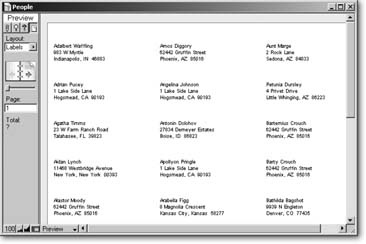
If you ever need to print a sheet of peel-and-stick labels from your database—to make nametags for every attendee to your conference, or address labels for all those follow-up letters—the Labels layout type is your best friend (it’s shown in Figure 5-2). FileMaker is smart enough to know how to set up a layout for any of the standard Avery label types. You just pick your type, and FileMaker does all the work. If you’re not using Avery labels, you can plug in your own measurements.
Note
The “Vertical labels” type only applies to people with Asian language text in their database. This type rotates this kind of text to create vertical text labels.
Envelope
If you’d rather print right on the envelope than stick a label on it, use the Envelope type. FileMaker creates a layout specially designed to print on a Number 10 size envelope (Figure 5-3).
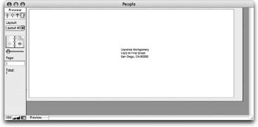
Since every printer handles envelopes a little differently, the layout needs a little adjusting to print perfectly, though. Luckily, it’s almost always a cinch to put things right. You can usually just delete the header part from the layout. On more persnickety printers, you may have to leave the header in place, and adjust its height. Getting things lined up always involves a few test prints, but once you’ve got it working, you never have to fuss with it again.
Blank Layout
The last type, called Blank layout, is both the simplest and the most flexible. You get a layout with a small header and footer, and a big body. It has nothing on it at all. If you like setting things up by hand, or your layout doesn’t rightly match any of the types above, drawing a blank may be your best choice.
Creating a Layout from Scratch
FileMaker’s built-in layout types are nice for quick-and-dirty work, but if you want your database to look great and work exactly the way you say, you may need to do some heavy customization. In fact, you often find it easier to start with a blank layout and add exactly what you need than to try and slice’n'dice a standard form into the avant-garde arrangement you have in mind.
Adding a New Layout
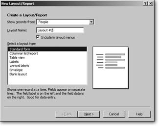
However they may end up, all new layouts start the same way. Open a database, switch to Layout mode, choose Layout → New Layout/Report. You see the window shown in Figure 5-4—the New Layout/Report dialog box.
Note
As its name suggests, you’ll see this dialog box again when you learn how to create reports, on Section 5.3.2.
In this box, you tell FileMaker a few basic facts about the new layout you have in mind. (You can always tweak these settings later.) From top to bottom, here’s how it works:
Show records from. For now, you can just ignore this pop-up menu. (It lets you choose a table, but you have only one table so far.)
Layout Name. Enter a name for your layout here. You can use any name you want, but you have to keep it to 100 characters or less.
Include in Layout menu. Use this checkbox to tell FileMaker whether or not it shows up in the status area’s Layout pop-up menu. Most new developers turn on this option for every layout, to make sure they can always find their work. As your databases get more advanced, you might have special layouts that you want people to access only under certain circumstances. When you get that fancy, you can turn this checkbox off so folks can’t switch to the layout any time they want.
Note
Every layout shows in the Layout pop-up menu when you’re in Layout mode. This checkbox controls what shows up when you’re in other modes.
Right now, the most important decision you make in this window is the choice of items in the “Select a layout type” list. FileMaker asks you questions specific to the type of layout you ask for, and then creates the layout based on your answer. When you select a layout type, FileMaker shows a little graphic mock-up of what this kind of layout looks like, just to the right of the list.
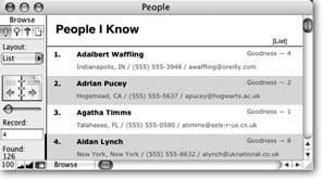
To get a feel for how it works, you’re going to create a layout in the People database like the one shown in Figure 5-5. Because this layout doesn’t match any of the canned layout types in the New Layout/Report window, you’ll start with a blank layout and build everything by hand. The goal is to see several people at once, so you’ll tailor it with list view in mind.
First, create the layout:
Open the People database (see Section 3.4.5 for download instructions). In Layout mode, choose Layout → New Layout/Report.
In the Layout Name box, type a fitting name, like List. Then, from the “Select a layout type” list, choose “Blank layout.”
The Next button changes to Finish, since you don’t have any more choices for a blank layout.
Click Finish.
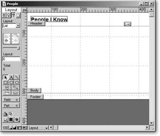
FileMaker returns you to your database, and shows you the new blank layout.
Set up the Header
This layout needs a header almost exactly like the one on the People layout. Unfortunately, you can’t copy and paste the header part (Section 4.3.1) itself, but you can copy everything on the header, and paste it on this new layout.
Before you do, you need to make this header the same size as the other so everything fits properly. As with many things in FileMaker, you have at least two good ways to perform this task. Which you use depends entirely on your personal taste.
Matching part sizes with the Object Size palette
If you’re a numbers person, this method is for you. Using the Object Size palette, you can resize or reposition any layout object with pixel-perfect precision. To learn how to tackle it, you first check the exact size of the header part on the People layout, then adjust the new header so its size matches.
Switch to the People layout.
You can switch using the Layout pop-up menu, or simply by clicking the left-hand page on the Book icon. When you do, you immediately see the People layout.
If the Object Size palette isn’t showing, choose View → Object Size.
You can have a hard time spotting the palette, since it’s so small. You know it’s there if you see a checkmark next to Object Size in the View menu.
Make sure the palette is measuring in pixel units.
You should see “px” by each number in the palette. If you don’t, click the unit you do see repeatedly until “px” shows.
Click the Header part tag to select the part.
The Object Size palette updates to show measurements for the header part. The last field—with a double arrow pointing up and down—is the height. Jot down the height number you see there.
Switch to the new List layout, then select the header by clicking its tag.
Type the number you got in step 5 into the height field on the Object Size palette, and then press Enter.
The part doesn’t move while you type; you have to press Enter to see your change take effect. When you do, the header part resizes, and now perfectly matches the header on the People layout.
If you prefer less typing and more mousing, you can use the T-Squares instead.
Matching part sizes with the T-Squares
In the last chapter, you learned about the T-Squares (Section 4.4.2.5). These handy liner-uppers don’t just help you keep objects on the layout straight. They can also help you make sure parts and objects are in the same place on different layouts. Start on the People layout, and then follow these steps:
If the T-Squares aren’t showing, choose View → T-Squares.
The T-Square lines appear.
Position the horizontal T-Square between the header and body.
The T-Squares float above everything else on a layout, so it covers the dotted part boundary line perfectly. If you add a black line between your header and body, you may not see the boundary. Just put the T-Square over your line instead.
Switch to the new list layout, and drag the header part tag into the right place, using the T-Square as a guide.
Since T-Squares stay in the same spot as you switch layouts, you can rest assured your new header is just the right size.
Now that the header is the right size, you can fill it with the necessary objects. You could drag objects into the header manually, just as you did in the last chapter when you built the People layout. But you’ve already done that work once. Why not take advantage of it here as well? You can easily reuse these items: Copy and paste them from the People layout. You use copy and paste a lot when you design layouts.
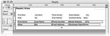
Switch back to the People layout. Select the graphic, “People I Know” text, and “[Detail]” text.
You can Shift-click or use the rubber band. If you have a horizontal line on your layout, select it too.
Choose Edit → Copy.
Nothing changes on the screen, but FileMaker copies the objects to your operating system’s clipboard.
Switch back to the list layout, then choose Edit → Paste.
The objects appear on the new layout, probably in the wrong place.
Drag the objects (as a group) into their proper place in the header.
Since they’re all selected, if you drag one object, the others follow.
Adding the finishing touches
Your header part is nearly complete. To finish it, give it a colored fill (Section 4.4.4.4). Finally, since you’re not making a detail layout, it probably shouldn’t say “[Detail]” in the header. Change that text object to say “[List]” instead, so it matches the name of the layout. Figure 5-6 shows how your layout should look now.
Set up the Body
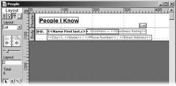
Now that the header is in place, it’s time to work on the body—and learn a few new tricks. You add the first and last name fields to the layout, and make them flow nicely together. You’ll also tell FileMaker to show the record number next to each person’s name.
Making data flow with merge fields
Knowing what you know now, if you set out to build this layout yourself, you’d probably jump right for the field tool and start dragging new field on the layout. But look closely at Figure 5-7 first.
When you put a field on a layout, you’re putting it exactly where you want it. No matter what record you’re on when you look at the layout, that field value is in the same spot. Usually, that’s where you want it to be, but sometimes—like in the new list layout—you want something a little more flexible. You want the Last Name field to start where the first name ends. Since some first names are longer than others, this spot changes from record to record.
In FileMaker, you solve this problem using merge fields. These work a lot like a mail merge in a word processing program. You create an ordinary text object on your layout (not a field object), and then tell FileMaker to merge different field values into the text. For example, to put the first and last names together on your new layout, you create a text object like this:
<<First Name>> <<Last Name>>
Merge fields always show up in Layout mode with angle brackets around their names, just like <<this>>. When you look at this text object in Browse mode, though, you see the value of the First Name field, then a space, then the Last Name field. Since all these values show up in a single text object, FileMaker sorts out the exact positions for you.
Merge fields have a downside, though: They’re for display only. You need a real field if you want your users to be able to get into a field and change its contents. Your database already has a layout with real fields just for editing data (the details layout), so in this case, merge fields are just what the doctor ordered.
Putting merge fields into a text object is easy:
In the status area, click the text tool.
FileMaker activates the text tool; it changes your mouse arrow to an I-beam, and darkens the text tool button. Now set up the font for the text object you’re about to create.
Using the Font, Size, and Style menus (in the Format menu) choose Verdana, 11 Point, and Bold. Then click somewhere in the body part.
A new editable text box appears, ready for you to type.
Choose Insert → Merge Field.
The Specify Field dialog box appears, listing every field in your database.
Select the First Name field, and then click OK.
FileMaker types <<First Name>> into the text object for you.
Type a single space.
Since you don’t want the first and last name right next to each other, you’ve just added a space.
Choose Insert → Merge Field again. When the Specify Field dialog box returns, select the Last Name field, and then click OK.
FileMaker adds the Last Name merge field to the text object.
You now have a text object that shows the first and last names with a single space between them (you can switch to Browse mode and try it out if you want). You just need to put it into place.
The address, phone, and email information should also be in a merge field (study Figure 5-7 to see why—they all flow together in a nicely formatted line). In this case you want Verdana, 9-Point, Plain. You can also select a gray color (or any color you like) from the Format → Text Color menu. Repeat the steps above to build a text object like this:
<<City>>, <<State>> / <<Phone Number>> / <<Email Address>>
Tip
You can mix and match merge fields and normal text to your heart’s content. When you were setting up the first and last name, you added a space between the merge fields. This time you add even more. After you add the City merge field, type a comma, and a space. After the State and Phone Number merge fields, type space-slash-space.
Using symbols to show important info
Merge fields aren’t the only things FileMaker can squeeze into a text object on the fly. You can also insert a handful of special symbols—stand-in characters that you can replace with useful information when you view your database in Browse or Preview mode. For instance, notice in Figure 5-7, how each record in the list is numbered. You can accomplish this effect with the record number symbol.
Tip
FileMaker offers a host of other symbols besides the record number symbol. See the box on Section 5.2.3.3 for full detail.
Since you’re creating a list layout, it would be nice to show record numbers. That way you can easily see where you are in the list at any time, even if you’ve scrolled down from the top. You use the record number symbol to make it happen.
Select the first and last name text object you just created.
If you just make a new text object with the text tool, you have to set the font, size, style, and possibly color. Instead, you can take a text object that already has all the attributes you want and use it as a starting point.
Choose Edit → Duplicate.
A copy of the first and last name object appears.
In the status area, click the text tool. Click anywhere in the new text object you’re about to edit.
FileMaker outlines the text object and adds a flashing insertion point. Now select all the text in the object.
Choose Edit → Select All, and then press Delete or Backspace.
The selected text disappears, leaving an empty text box.
Choose Insert → Record Number Symbol.
Type a period, then press Enter.
If you want a period after the record number symbol, you have to type it yourself. Pressing Enter tells FileMaker you’re done editing the text object.
You now have a text object that contains “@@.” But if you peek at it in Browse mode, you see that FileMaker actually puts the current record number in its place.
FileMaker includes symbols for several special values you might want to show on a layout. You insert these symbols on the layout because you don’t know in advance what they’re going to be, such as the current date or record number. Then, when you switch to Browse mode (or Preview mode), FileMaker replaces the symbol with the up-to-the-moment correct value. You can read about the record number symbol on Section 5.2.3.2. Here are the others:
The date symbol (//) is replaced by the current date. People often include this symbol on printed reports so you can easily see when they were generated.
The user name symbol (||) is replaced by the current user’s name. FileMaker takes the user name of whoever’s logged into your computer. (That’s two pipe symbols—Shift-backslash on most keyboards—typed side by side)
The page number symbol (##) is replaced by the page number in Preview mode or when you print. Otherwise, it just shows as a question mark.
The Insert menu has three related options as well, but unlike symbols, these don’t get replaced by anything in Browse or Preview mode. When you use the Insert → Current Date command, for instance, FileMaker simply adds today’s date to the text object in Layout mode. It will show this same date forever in either mode.
You can use the Insert menu to place symbols where you need them, but it’s faster and easier to type them in manually. So once you’ve seen that “##” makes a page number, forget about mousing around and just type the two number signs.

Arranging the objects
Now that you’ve added three new text objects to the body part, you can arrange them on the layout. Using Figure 5-8 as a guide, use the techniques you learned on Section 4.4.9 to move the text objects into a clear, attractive arrangement. Once they’re in place, you just need to add the Goodness Rating field and make a few adjustments to the body part. You’re almost done!
Adding a field
The Goodness Rating is always a single-digit number, so unlike the First Name and Last Name fields, you don’t need a merge field (Section 5.2.3.1) to get its spacing right. You use an ordinary field object instead.
From the status area, drag the Field tool onto the layout.
The Specify Field dialog box appears.
Make sure the “Create field label” checkbox is turned on.
When this option is on, FileMaker automatically adds a text object to serve as a label for your field.
Select the Goodness Rating field, and then click OK.
FileMaker adds the Goodness Rating field to the layout, along with a new text object that says “Goodness Rating.”
Copying formatting with the format painter
Unfortunately, the new field and label aren’t formatted properly. They have the wrong font, size, style, and color. Instead of fixing each object manually as you learned in Chapter 2, you can use the format painter.
This intuitive tool copies all the formatting from one object and applies it to another. Here’s how to use it:
Click the text object that shows City, State, Phone Number and Email Address to select it.
That object has the very formatting you want to copy.
Choose Format → Format Painter.
Your mouse arrow changes to include a tiny paintbrush. The next thing you click with this special cursor takes on the copied format like a fresh coat of paint.
Click the Goodness Rating label.
The label instantly changes to reflect the correct formatting. Also, it’s already selected, so copying its formatting to the Goodness Rating field is a snap.
Choose Format → Format Painter again, and then click the Goodness Rating field.
The field changes to the new formatting too. But it isn’t exactly what you want—you want this field to be bold as well.
Choose Format → Style → Bold.
The label now has just the right formatting.
The format painter is certainly easier than choosing each formatting option individually, but it seems to work for only one object at a time. There are actually a couple of ways to extend Format Painter’s abilities. If the objects you want to format together are close enough, you can rubber band them with Format Painter and they all change together. Just like the regular rubber band, you have to fully enclose each object for the change to take place. But pressing the Ctrl (⌘) key lets you merely touch an object with the rubber band to get the same effect.
But maybe even that method doesn’t work for you, because your objects are all over the place. Wouldn’t it be nice if Format Painter were a button like the other tools? Then you could double-click it to lock it. Well, you’re in luck, because that’s just how it works.
Choose View → Toolbars → Standard.
The Standard toolbar appears at the top of your screen.
Select the object that has the formatting you want to copy
You’ve just copied a text block’s formatting, but you can also use a field, a drawn object, or anything that has formatting.
Double-click the format painter tool—the one that looks like a paintbrush, and then click each object you need to format.
Double-clicking locks the tool, so you can use it over and over. You can even grab some rubber band selections if you want to.
Click the Selection tool to let FileMaker know you’re finished formatting.
All good things must come to an end.
You now just need to make the Goodness Rating field smaller (just wide enough to hold one number) and put it in its place on the right side of the layout. Delete the word “Rating” from the Goodness Rating label, and then add a “-” to the end and position it just to the left of the field. Figure 5-9 shows where you’re at.
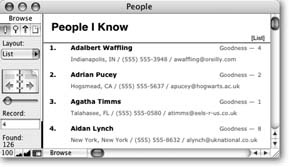
Alternating the body color
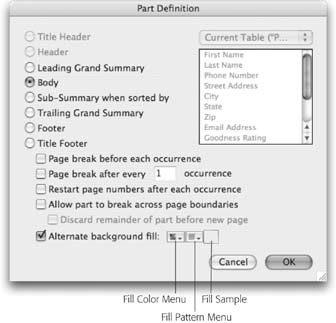
As Figure 5-5 plainly shows, the rows on this list layout are supposed to alternate between gray and white. FileMaker gives you this effect for free; you just have to turn it on. To do that, you pay a visit to the Part Definition dialog box via the Part Setup dialog box.
Choose Layout → Part Setup.
The Part Setup dialog box appears, as described in the box on Section 5.2.4.
In the Part Setup dialog box’s list, select Body, and then click Change.
This window lists every part in your layout. To select a part, just click its name. When you click Change, the Part Definition window opens (Figure 5-10).
Tip
There’s a shortcut to the Part Definition dialog box: On the layout, just double-click the part tag. Turn on the “Alternate background fill” checkbox.
The Fill Color Menu and Fill Pattern Menu buttons, which had been grayed out, become available and ready for you to make a choice.
From the Fill Color Menu, choose a color to use for your alternate row color.
The Fill Sample changes to show your selection. Choose a color that’s not too dark, or you’ll have trouble seeing the beautiful layout you’ve created.
Click OK, and then Done.
Nothing changes in Layout mode, but if you switch to Browse mode, you see the new effect.
When you use the “Alternate background fill” option, the settings you make in the Part Definition window apply to the even numbered records. You can still control the fill for odd numbered records by adjusting the body part fill right on the layout, just like you did with the header part. In this example, you tell FileMaker to color the even rows gray, and leave the odd rows white. You can use this feature any time you want to make it easier to see where one record ends and another begins, in a list.
Now all you need to do is resize the body part so it just fits its contents, using any of the methods described earlier in this chapter. When you’ve done that, your layout design is nearly finished.
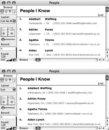
Setting Layout View
Switch to Browse mode to admire your handiwork. If you’re seeing only one record at a time, switch to list view (choose View → View as List). When you choose the blank layout template, you get complete freedom to make the layout look just the way you want. But one tradeoff is that you have to remember to tell the layout which view it’s supposed to be in.
When you choose Layout → Part Setup, FileMaker shows you Part Setup Dialog Box. This often-ignored box isn’t just a slower way to get to the Part Definition window, though. From this one screen, you can create new parts and edit, delete, and rearrange existing parts. But, as you’ll read on Section 6.9.3, you can do most of this work more easily without this window, so you won’t use it very often.
To add a new part, click Create. You’re presented with the Part Definition dialog box, where you can decide what kind of part to create, and set various options. You can do the same thing by dragging the part tool from the status area or choosing Insert → Part.
To see the part definition for an existing part, select it and click Change. This maneuver too has a shortcut: Just double-click any part tag in Layout mode.
To delete a part, select it and click Delete. If the part contains any objects on the layout, FileMaker asks you if you’re sure, because when you delete a part, you delete everything on it as well. You’ve already deleted parts without using this window, though, by selecting the part and choosing Edit → Clear. But if you hate menus, you can also just press Delete.
You can also rearrange parts using the same technique you use to order fields in the Define Database window. Just drag the arrow icon next to a part name. But some parts (most parts, in fact) have a padlock symbol instead of an arrow icon. This symbol tells you the part is locked in place and you can’t move it. The reason is simple: It doesn’t make sense to move most parts. For example, the header is always below the title header and above everything else. You really only need to rearrange parts when creating subsummary reports, which the next chapter covers.

Since FileMaker always starts out showing form view, that’s what you see until you tell the layout something different.
Still in the People database, switch to Layout mode, then choose Layouts → Layout Setup.
Remember, Layout mode is the only place you can make changes to a layout. The Layout Setup box is where you work this particular piece of magic.
On the Views tab, turn off Form View and Table View.
You’ve just told FileMaker to make these two menu choices off-limits in Browse and Find modes. After all, they don’t make much sense in a layout that’s designed specifically to work as a list.
Click OK to dismiss the dialog box.
Honestly, you have to tell some programs everything.
Now, when you switch to Browse mode and look at the View menu, View as Form and View as Table are grayed out. FileMaker won’t accidentally switch your list to a useless view of the data.
Creating Layouts for Reports
You’ve now knocked out two good layouts—a detail layout (Chapter 4) and a list layout (this chapter). Layouts like these meet many typical database needs: You’ve got your detail layout for finding and viewing individual records, and your list layout for rapidly scanning many records at once. You also want to do reporting, an equally important task in a typical database. A report’s no different from any other layout as far as FileMaker is concerned. But report layouts are designed from the ground up to be printed. Almost no database gets by without some kind of a report layout, and most important databases have several, from straightforward lists to powerful snapshots of your data’s important statistics, like sales by region or inventory by product category.
The People database needs a reporting layout, too. In this chapter you’ll create a report layout for a simple purpose: printing a list of people. You can then file the printed list as a hard copy backup, take it with you on a trip, or mail it to an associate. But FileMaker’s reporting powers go far beyond simple lists. The next chapter will introduce FileMaker’s powerful data summarization and reporting capabilities.
Visualize the Result Preview Mode
First, you need a rough idea of how your layout should look. This step is especially important when you create a report, since the physical constraints of a piece of paper often dictate the working space you have. When you create a detail layout, you’re free to make it large or small, tall or short, narrow or wide—whatever meets the needs of your data. Not so if you want to print your layout.
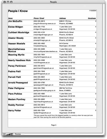
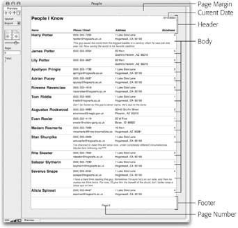
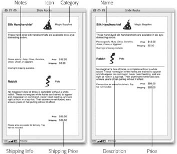
In the spirit of visualization, how about a picture? From the Preview illustration in Figure 5-11, you can get a pretty good idea of how this layout is going to come together. It has a header, body, and footer. The header includes a title, the date, and some column labels, and the footer has just a page number (these parts print on the top and bottom of each page). The body is the most important part: It has all the fields that show your information.
You can see the report in Layout mode in Figure 5-12. To see your layout in Preview Mode, choose View → Preview Mode.
Creating a Report Layout with an Assistant
In the example in the previous section, you started with FileMaker’s blank layout. Since blank layouts are always just blank, there were no more choices to make. This time, FileMaker does a lot more work for you. Before it does, it asks you a handful of questions. Your job is to answer the questions, click Next, answer some more, and so on. When FileMaker has all the information it needs, it changes the Next button to a Finish button. FileMaker then creates the layout according to your specifications. Here’s how to proceed:
In the People database, switch to Layout mode and choose Layout → New Layout/Report. Name the new layout Report.
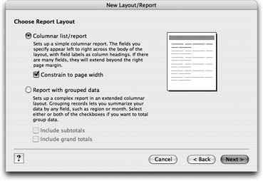
You’ve been through these steps before (Section 5.1.6). Next, select a layout type (Figure 5-13), so FileMaker knows which choices to offer you in the upcoming steps. Different layout types, different options.
Figure 5-13. This is the first round of choices when creating a “Columnar list/report” layout. Here, you decide whether or not you want “grouped data” (you don’t—more on that in Chapter 6). You also need to decide if you want FileMaker to make sure your layout fits the width of a piece of paper. As you make selections, the picture in the top-right corner shows a rough representation of what your choices do.Select the “Columnar/list report” radio button. While you’re at it, turn on the “Constrain to page width” checkbox.
The picture in the top-right corner of the window changes to show that the layout won’t extend past the width of a page.
Click Next.
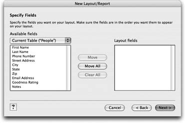
Now you see the window shown in Figure 5-14, where you tell FileMaker what fields to add to the layout.
Click Move All.
Every field in the “Available fields” list moves to the "Layout fields” list. Click Next.
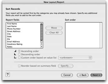
As shown in Figure 5-15, add the Last Name field to the “Sort order” list.
In the “Report fields” list, click Last Name, and then click Move.
In the same way, add the First Name field to the “Sort order” list.
The “Sort order” list now shows the Last Name field, then the First Name field. This arrangement tells FileMaker to sort first by Last Name, then by First Name. Click Next.
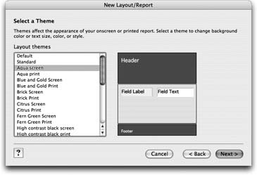
From the "Layout themes” list shown in Figure 5-16, select Standard.
The picture changes to show a simple white background with black text. Click Next.
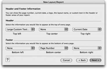
Figure 5-16. Here’s your chance to select a theme. As you make selections from the “Layout themes” list, the picture changes to show how the theme will look. Click all you want—it’s pretty much guaranteed that none of them will match your business collateral. When you’re done browsing, pick Standard for the example on these pages.From the “Top left” pop-up menu (Figure 5-17), choose Large Custom Text. When the Custom Text dialog box appears, type People I Know, and then click OK.
The “Top left” pop-up menu now shows that you’ve selected Large Custom Text.
From the “Top right” pop-up menu, choose Current Date. Then, from the “Bottom center” pop-up menu, choose Page Number.
The pop-up menus’ content changes to reflect your choices. Click Next.
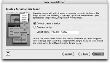
On the next screen, turn on the “Create a script” radio button. Then, in the “Script name” box, type Report.
As explained in Figure 5-18, you’ve just told FileMaker to add an item with this name to the Script menu. You can choose this menu command to run the report. Click Next.
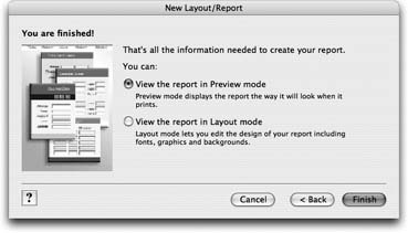
In the assistant’s final screen (Figure 5-19), turn on “View the report in Layout mode.”
This tells FileMaker to deposit you in Layout mode after it finishes creating the report. Click Finish.
Phew! You’re finished at last. Your new report layout should look something like Figure 5-20.
Print Margins
Before you begin arranging things on the layout, you need a feel for the amount of available space. Normally when you print from FileMaker, the page margins are set to the minimum size allowed by your printer. This arrangement provides the most usable space possible, but at a cost: The margins—and the printable area—change as you switch printers. For a report that you intend to print often, you don’t want to deal with that kind of inconsistency.
Luckily, you can override this behavior and set explicit margins. Before you do, though, you need to make sure FileMaker is using units that make sense for page margins. Follow these steps to set the units and the margins:
Choose Layouts → Set Rulers.
The Set Rulers window appears (Section 4.4.2.3).
From the Units pop-up menu, choose Inches, then click OK.
You’re back on your new layout, where you’ve just told FileMaker to use inches for just about everything.
Choose Layouts → Layout Setup, and then click the Printing tab.
The printing options associated with this layout appear, as shown in Figure 5-21. (This Layout Setup window is the same one you saw on Section 4.4.2.15. This time, you’ll explore a little more deeply.)
Figure 5-21. These settings affect the way the current layout prints. For example, you can create a layout that prints in multiple columns (imagine printing sticky labels). You’ll learn more about that in the next chapter. For now, draw your attention to the “Use fixed page margins” checkbox, which you need to turn on if you want this layout to have hardcoded (and consistent) page margins.Turn on the “Use fixed page margins” checkbox.
The Top, Bottom, Left, and Right text boxes start out grayed out. As soon as you turn on this checkbox, you can type into them.
Note
The numbers you see in these boxes (before you type anything into them, that is) are the margins associated with the printer you’re hooked up to. That’s why they probably look different from what you see in Figure 5-21.
In each of the Top, Bottom, Left, and Right text boxes, type .5.
Don’t forget to type the decimal point. Your goal is to set the margin on all sides to half an inch.
Click OK.
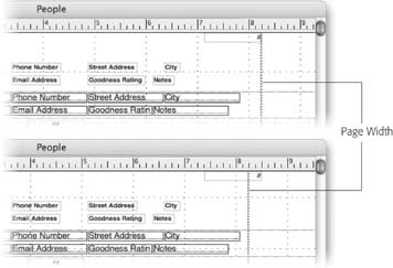
The Layout Setup dialog box disappears and you’re looking at your layout again. If you have sharp eyes, you notice the page width has shrunk a bit, as shown in Figure 5-22.

Tip
If you like working in pixels and don’t want the bother of switching units, take heart. You can probably do the math in your head even faster. Remember, there are 72 pixels per inch: A one-inch margin would be 72 pixels and a half-inch margin would be 36. (If you like centimeters, figure there are 28 pixels per centimeter.)
Improving the Report Layout
Now that you’ve specified your page size, you can begin to lay out the report. FileMaker already created header, body, and footer parts. It already set the layout to list view. And it already added a title, date stamp, page number, column labels, and fields in the proper parts. As usual, it just isn’t very pretty. (Remember, Figure 5-30 on Section 5.3.5.5 shows how the finished product will look.)
Tidy up the header
Your first job is to clean up the header part. As shown in Figure 5-23 for guidance, your tasks involve mostly text formatting and dragging things around.
Rearrange the body
In Figure 5-23, you can also see before and after shots of the report’s body. Again, you know everything you need to rearrange things. You want to replace the First Name and Last Name fields with larger merge fields (Section 5.2.3.1), rearrange the rest of the fields, and give them new font, size, and style formatting. This time, though, there are a few extra steps.
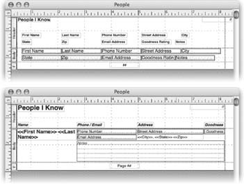
First, you can delete the First Name, Last Name, City, State, and Zip fields. In their place, add two new text objects. One—formatted as 14-point bold text—should hold merge fields for the First Name and Last Name fields, with a space between them. In the second, add City, and comma and space, State, another space, and Zip. Finally, change the font on the remaining fields to 10-point and italicize the notes field.
Once you’ve made these changes, you can rearrange the fields and objects using Figure 5-30 as a guide. (Don’t worry about matching the example exactly. Periodically inspect your work in Browse mode and adjust the arrangement until it pleases your eye. Use your individual sense of style!)
With the fields in place, you have just one finishing touch to add to the body. It’s hard to see in Figure 5-30, but there’s a hairline-width line along the bottom edge. You can save some effort by duplicating the horizontal line you added to the header. Select the line and choose Edit → Duplicate. A new line appears just below the first. Move it into position, and use the Line Thickness tool to make it a hairline.
Tweak the footer
Next up is the footer part. It’s already almost perfect. But it would be nice if the report showed "Section 1.1" on the bottom of the third page, instead of the mysterious “3.” Use the text tool to edit the page number text object (“##”), typing Page and a space before the page number symbol.
Sliding Layout Objects
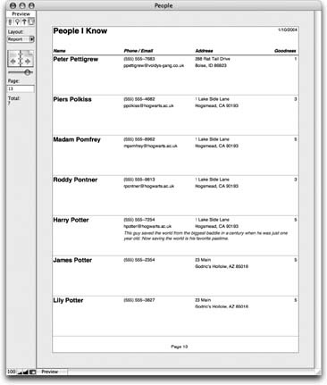
Your layout is essentially finished; time to take a look. Choose Scripts → Report to run the script you told FileMaker to create for your report on Section 5.3.2. As Figure 5-24 confirms, this report has one minor problem: It’s not very paper-efficient. All that blank space beneath most items is the notes field, which may have lots of information, but usually doesn’t. Wouldn’t it be cool if you could tell FileMaker to slide the next record up if the notes field didn’t need all that space? The engineers at FileMaker thought so too, and added a feature called sliding.
When to use sliding
Since the data in a field changes from record to record, the amount of space it takes up often changes too. Usually this behavior doesn’t cause a problem. After all, you might want that empty space because you’re printing onto a preprinted form, and everything needs to go in just the right spot on the page, or maybe your report design counts on consistent field sizes so things line up properly. But sometimes you can’t get the effect you want without adjusting the layout based on the amount of data—usually when you’re trying to tighten things up on the printed page to avoid wasted paper or excessive spacing around data.
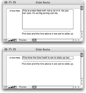
Sliding does three things to help in this situation. First, it lets fields shrink to just the right size for their data. After a field has shrunk, any object on the layout can slide up or to the left to fill the space left behind.
Finally, whole layout parts can shrink vertically to compensate for their shrinking contents. It’s an idea that’s much easier to see than to explain, so turn your attention to Figure 5-25.
Choosing the objects to slide
Object sliding in FileMaker is notoriously hard to figure out. It’s a bit like that board game “Go.” The rules take a minute to learn, but a lifetime to master. Here goes:
Sliding exists for only one reason: to compensate for changing field data. Therefore, unless you set at least one field to shrink, nothing on the layout moves. Unfortunately, you can’t explicitly set a field to shrink. Instead, you set it to slide—and FileMaker makes sure it shrinks too. This seemingly simple principle is guaranteed to confuse you at least 36 times in the near future. You’ve been warned. Figure 5-26 shows how this field shrinking business works.
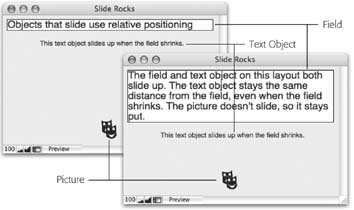
Once you’ve figured out which fields should shrink to fit their contents, you need to decide which objects should slide. What does that mean exactly? Normally, when you add an object to a layout, you specify exactly where it goes. But when the object is set to slide, its position is no longer fixed at an exact spot on the layout.
Instead, it moves up (or to the left) if other objects above it (or to the left of it) move or shrink. Figure 5-27 illustrates this concept.
Setting sliding options
Once you have a general idea of which elements need to slide (and which fields must shrink accordingly), you can start telling FileMaker.
The general process works like this:
Select one or more objects on the layout.
FileMaker puts handles on the corners of each selected object.
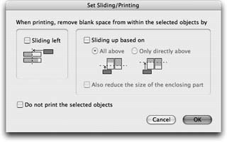
Choose Format → Sliding/Printing.
The Sliding/Printing window appears. (It’s shown in Figure 5-28.)
Make your selections.
Right now you’re just getting comfortable, so feel free to choose whatever you want. For example, choose Sliding Left to make your selected objects slide to the left to get rid of excess space. Each option will be explained in the next section. Click OK when you’re done to return to your layout.
Click OK.
FileMaker returns you to your layout.
Since sliding affects the way your layout looks only in Preview mode and when printing, your layout won’t look any different after you’ve made these changes. You can choose View → Show → Sliding Objects to identify the objects that will slide. With this option turned on, FileMaker draws tiny arrows on each sliding object, showing the direction it will slide.
Tip
Since setting sliding options requires a trip to a special window—and all those clicks—it can be tedious. If you have more than one object that will get the exact same settings, save yourself trouble by selecting them all first. If you plan ahead, you can usually set up even a complex sliding arrangement in just a few batches.
Now that you’ve seen the Sliding/Printing window, it’s time to learn how to make sense of all those options.
The Sliding/Printing dialog box
The Sliding/Printing dialog box has several options to control just how the selected objects slide (and shrink if appropriate). In general, an object can slide left, up, or both.
If you want something to just slide left, you’re in luck. Simply turn on the “Sliding left” checkbox and you’re done. When you print or preview the layout, the objects slide to the left when field data isn’t long enough to fill the full width of the field.
Objects that slide up, on the other hand, need a little more thought. To start, turn on the “Sliding up based on” checkbox.
When you turn this checkbox on, you make three more options available.
The “All above” and “Only directly above” radio buttons are hard to explain in words. Luckily, FileMaker gives you a picture to help you understand what they mean.
What if I have a field that should shrink but not slide? How do I do that?
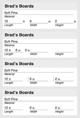
Would you believe, “You can’t?” Sadly, it’s almost entirely true. This series of images shows the problem, and one workaround. Imagine you use FileMaker to keep track of the kinds of boards you sell. You record the material and the length, width, and height of the board. Sometimes you print this layout, and the first picture shows the result. It’s not bad, but you decide you want the “ft” and “in” unit labels to slide left so they’re closer to the numbers.
You remind yourself that the fields need to shrink for the sliding to work, and that shrink means slide. So you set the Length, Width, and Height fields, the “ft” text object, and the two “in” text objects all to slide left. The second image shows the result—not exactly what you had in mind.
What happened? Since the fields are set to slide, they did—right into one another. What you really want is for the fields to shrink but not slide. Alas, FileMaker has no such setting.
If you really want this to work, you have to get creative. The fields don’t slide left if there’s something in the way. Instead, they maintain their position relative to whatever is to their left. As shown in the third picture, you can put simple vertical lines next to the Width and Height fields. Since they’re not set to slide, these lines act as little roadblocks for the slippery fields. To complete the effect, set the line thickness of the little lines to None. They disappear from the layout completely, but since they still exist, they still stop the sliding.
This workaround isn’t perfect. It leaves invisible objects on your layout, which is always a recipe for trouble down the road (“Where is that line?!” or “What is this thing?”). But if you must have shrinking without sliding, a trick like this is all you’ve got.
Remember an object that slides up stays the same distance from the object above it. But which object? See Figure 5-29.
Finally, if you turn on “Also reduce the size of the enclosing part,” the part the object is on shrinks to fit its contents. This setting is a little misleading, though. For example, imagine you have two sliding objects on the body part. One of these is set to reduce the body part, while the other isn’t. How can the body both reduce and not reduce at the same time?
In truth, the “Also reduce the size of the enclosing part” setting only matters for the lowest object on the part. If that object wants the part to reduce, it will. If it doesn’t, the part won’t. Anything you set on any other object doesn’t matter. The lesson: If you’re trying to get your part to reduce, focus your attention on the bottom- most object on your layout.
Using sliding on the report layout
The report layout you’ve been working on provides a dramatic example of how sliding can both save space and produce a more attractive printout. You might have lengthy notes about some of the people you know, and no comment about others. Here are the specific steps for shrinking the notes field to avoid wasting space.
Select the notes field and the hairline below it.
Both objects have selection handles, and the Format → Sliding/Printing command is no longer grayed out.
Choose Format → Sliding/Printing.
The now-familiar Sliding/Printing window appears.
Turn on “Sliding up based on” and select “All above.”
You want the notes field to shrink vertically, and the line to slide up next to it, so up makes sense.
In this case, you’re interested in sliding things up, so turn on the “Sliding up based on” checkbox. With this option selected, the notes field shrinks vertically to hold just its contents. The hairline also slides up, maintaining its distance from the notes field as it shrinks.
If you stop here, you won’t quite have your problem solved. Even though the hairline slides up as much as possible, the body part itself doesn’t shrink, and your report still wastes paper. To solve this problem, turn on “Also reduce the size of the enclosing part.” When you’re done, click OK.
If you view your report now (Scripts → Report), things should look much better. Figure 5-30 agrees.
Tip
If you need to rearrange the order of your layouts, choose Layouts → Set Layout Order. Like other elements lists in FileMaker, drag the double-arrow to reorder the list. You can also use the checkbox column to change which layouts display in the layout pop-up menu.