
Chapter 6. Advanced Layouts and Reports
Believe it or not, Layout mode has even more tricks up its sleeve. In the last couple of chapters, you’ve learned how to use the basic layout tools to position fields, create text labels, add graphics, and more. You’ve experienced stress-free layout creation with the layout assistant and seen reports in action. You even know how to design full-fledged layouts from the ground up.
Now, you’re ready to learn the more advanced layout concepts: controlling how fields look and act, and adding buttons to perform customized tasks. You’ll also learn how to develop massively powerful reports by using summary and sub-summary parts to add groups, subtotals, and grand totals.
Setting up Field Controls
You flirted a bit with the Field/Control Setup dialog box in Chapter 4, when turning the Goodness Rating field into a pop-up menu (Section 3.4). Fields can be more than pop-up menus, though. The six main field styles are Edit Box, Drop-down List, Pop-up Menu, Checkbox Set, Radio Button Set, and Drop-down Calendar.
Each style (except Edit Box and Drop-down Calendar) lets you associate a value list with the field. Value lists limit the information you enter to a few, frequently used terms, numbers, dates or times. Using a value list, you can then easily enter a value from the value list into the field. You tell FileMaker how you want these choices presented, by selecting one of the field control styles.
Using a value list–based field control helps in two ways. First, you can more easily enter data into your database. If folks need to put a part number into a field, for example, they can just pick it from a list and avoid typing it exactly. Just as important, fields formatted this way help ensure consistency.
As your database grows, one of the toughest challenges you face is inconsistent data. For example, suppose you have two people entering addresses in your database. Cheryl is a fussbudget, and she always spells things out. Frank, on the other hand, is…ahem…keystroke efficient. He likes to abbreviate wherever possible. If all your customers are in central Arizona, you might wind up with some people in Phoenix and others in PHX; some in Tucson and others in Tcsn. Even worse, Frank, like most of his kind, can’t even keep his own abbreviations consistent. He’s got customers in Chnd, Chndlr, Chand, and (on a particularly bad day) Ch.
Even horrendous abbreviations may not cause a big problem to the human eye. After all, you can probably figure out where the person lives just by reading the City field. But what happens when you need to use FileMaker’s find tools to find all the Chandler, AZ customers in your database? Searching for “Chandler” won’t turn them all up. Instead, you have to try to think of all the different ways it could be abbreviated and search for each one. If you use a field formatted with a value list, however, you can make sure that everybody enters data the same way every time.
A value list has two parts. First, you decide which items appear in your value list. In this part, you’re limiting the scope of the data your users can enter in a field. Creating value lists isn’t technically a part of field control–you can define them at any time, using the Define → Value List dialog box (just like the one you first saw on Section 3.4). But often, you create new value lists as you format a field with controls, so you’ll learn how to define value lists first.
Once you’ve got your value list defined, you jump right back into Layout mode, and tell your field how to display the new value list—as a drop-down menu, a pop-up list, a Checkbox Set, or radio buttons. Here’s the low-down on defining value lists.
Tip
If you don’t need to create value lists, or if you want to provide a calendar for entering dates into a field, you can skip the next section. Go straight to Section 6.2 and start setting up the field.
Creating Value Lists
Back in Chapter 3, you saw how to use a value list to validate information entered in a field. On Section 3.4, for example, you created a simple value list to make sure folks can type values of only zero through five in the Goodness Rating field. Preventing database users from entering inappropriate information is all well and good, but why not be even more helpful? You use the true power of value lists when you make it easier for them to enter the correct information in the first place.
In this example, you can use a value list to translate those numbers into words anybody can understand without a legend. So, you define a new field—called Goodness Description, say—where you specify that a rating of five means “Angelic.” While you’re dedicated enough to type the full word out faithfully every single time, your teenaged son, who’s helping out around the office after school, types Angel when he feels energetic and slips into Ang towards quitting time.
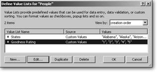
You don’t have to adjust your son’s Goodness Rating downward. Open your People database and make a value list. Then your son can just click a pop-up menu instead of doing all that exhausting typing. The Define Value List dialog box is shown in Figure 6-1.
Open your People database.
If you haven’t been following along page-by-page, you can download a file with the fields listed in these steps from the Missing Manual Web site (Section 3.4.5). (If you prefer to keep working in the file you created in Chapter 2, define a new text field called Goodness Description.)
Choose File → Define → Value Lists
The Define Value Lists dialog box appears. Notice that FileMaker’s considerate enough to tell you the name of the file you’re working in.
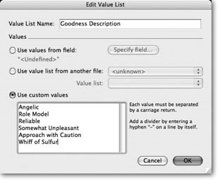
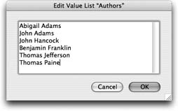
In the Define Value Lists dialog box, click New. Then, when the Edit Value List dialog box opens (Figure 6-2), give your new Value List a name.
Since you already know that you’re using this value list for the Goodness Description field, it’s helpful to name it something that helps you remember that. You might just call it Goodness Description, but you can name it pretty much whatever you want.
In “Use Custom Values” box, type the values you want to appear in your list.
Be sure to separate each item in your list with a line break (press Return at the end of each line). For your goodness scale, you might type: Angelic, Role Model, Reliable, Somewhat Unpleasant, Approach With Caution, and Whiff of Sulfur.
If you want a menu divider in your list (between Reliable and Somewhat Unpleasant, perhaps), type a hyphen and press Return between those two values.
Click OK, and then OK again to close both dialog boxes.
You’re back in your database.
See Section 6.2 for details on attaching your new value list to the Goodness Description field.
Note
You can also define a value list right there in layout mode. Select a field, then choose Format → Field/Control → Setup. Select Drop-down list, Pop-Up Menu, Checkbox Set, or Radio button set from the “Display as:” pop-up menu. You’ll see the Define Value Lists dialog box and from there, you repeat steps 3–5 above.
Values from a field
The "Use values from field” radio button tells FileMaker you want your value list to automatically include data that’s already in your database. It might sound strange, but this technique is pretty common. By the time you figure out that your assistant isn’t following the data entry rules you’ve set down, there’s already lots of data in your file. Put it to use by selecting the field’s data for use in a value list.
When you want to use values from a field, simply click that option, and the Specify Fields for Value List dialog box appears (Figure 6-3).
Note
If you’ve already specified the field for this value list, and you want to change it later, return to the Edit Value List dialog box and click Specify.
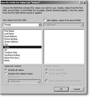
In the simplest case, just pick one field from the “Use values from first field” list. The value list goes and checks your old friend, the field’s index, and then displays every value it finds in that field across all records. For example, if you choose the City field, the value list includes every city in your database.
Adding a second value field
Back on Section 6.1.1, you created a value list for Goodness Description, and it’s helped your son with his data consistency, but you really prefer the numbering system. You can use the values in the Goodness Description field to remind your son that five is the highest goodness rating and zero is no goodness at all, and still get the number you want entered in the Goodness Rating field. The secret lies in the “Also display values from second field” option:
In the People database, choose File → Define → Value Lists. In the Define Value Lists dialog box, click New, and then name the new value list Goodness Ratings .
A descriptive name like this helps you remember what kind of information the list holds.
Click “Use values from field.”
The Specify Fields for Value List dialog box pops up (Figure 6-4). You can see the name you just gave your value list in the box’s title, which is really helpful if you get called away from your database in the middle of your creative work.
Figure 6-4. A value list with two fields shows both field values side by side. Only the first value is actually part of the list: If you select “0 Whiff of Sulfur,” only 0 goes in the field. The “Whiff of Sulfur” description just reminds you that the character you’re rating has no character. (You learned how to make value lists appear in pop-up menus on Section 4.4.7.2.)From the “Use values from field” pop-up menu, choose People. Then, in the field list, select Goodness Rating.
Your new value list includes every item in the field’s index. That is, the value list contains one instance of every value that you’ve entered in the Goodness Rating field. FileMaker sorts the list by the Goodness Rating field—unless you tell it otherwise. If you’d rather sort the list by Goodness Description, just turn on the “Sort by second field” radio button. The list works the same way, but FileMaker sorts it alphabetically by Goodness Description instead. See Section 3.3.4.2 for details on field indexes.
Turn on “Also display values from second field.” Then, in the field list (at right), select Goodness Description.
You’ve just told FileMaker to show your Goodness Descriptions in the value list.
Click OK, then OK again, and then OK a third time to dismiss all the dialog boxes.
You’re now back in your database.
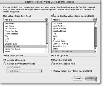
Sometimes you need to keep track of numerical data—like the Goodness Rating— but you think people using your database would find it confusing to see all those numbers cluttering up the value list. Solution: Hide the numbers. In the Specify Field for Value List dialog box (Figure 6-4), turn on “Show values only from the second field.” This option suppresses the Goodness Rating number, letting only the Goodness Description show. But behind the scenes, FileMaker still puts the Goodness Rating number in the Goodness Rating field.
Note
Showing values only from the second field is most useful in conjunction with a Pop-up Menu (Section 6.2.4), which always lets you see the contents of the second field. A Drop-down List, by contrast, displays the contents of the first field until you click it. Only then does it show the values of the second field like it’s supposed to.
Value list from another file
If you have another database that already defines just the right value list, you don’t have to recreate it here. For example, your People database can use a Zip code list containing all the Zip codes in your state from a different database. Instead of copying all that data into your People file, you can create a value list that simply goes and looks up the information in the other database—refers to it, in other words. If you later change the original value list (when the post office changes Zip codes, say), People reflects that change as well.
To define this kind of value list, you have to hook two databases together using a file reference. A file reference doesn’t require anything fancy, like a relationship (something you’ll learn much more about in Chapter 8). Instead, the file reference just remembers where the other file is. When you click a field that uses a value list from another file, FileMaker can just hop over to the other file and grab what it needs without bugging you to find where that other file is stored. Here’s how to reuse a list of information from another database:
In the Edit Value List dialog box, turn on “Use value list from another file.”
Now you can choose from a pop-up menu to the right of this radio button. (Right now the menu probably includes only two choices: Add File Reference and Define File References. If you’ve already added file references [Section 8.5.1], each database you’ve connected to also shows up in this menu. If the database you want is already listed, choose it and skip the next two steps.)
From the top pop-up menu, choose Add File Reference. When the Open File dialog box appears, select another database file, and then click Open.
The selected database’s name appears in the pop-up menu, and the second pop-up menu lists every value list in that database.
Select a value list from the second pop-up menu, and then click OK to seal the deal.
FileMaker creates a reference to the value list you specified.
Editing Value Lists
If your short list of approved part numbers changes, you need a way to edit your custom value list to reflect the new company policy. Choose Define → Value Lists, select the value list you need to change, and then click Edit.
When you’re through editing a value list, just click OK. If you decide you don’t want to change it after all, click Cancel instead. Either way, you wind up back in the Define Value Lists window. Just like Define Fields, if you instead click Cancel, everything you’ve changed is tossed out. The value lists go back to the way they were before you opened Define Value Lists. FileMaker asks you if you’re sure first, since the Cancel button is precariously close to the OK button.
In addition to the New and Edit buttons, this Define Value Lists dialog box has a Duplicate button. It does just what you’d expect: creates a new value list that’s an exact copy of one you already have. You can live a long, healthy life without ever using this button, because once you create a value list in FileMaker, you can use the same list over and over in a multitude of fields and databases. (But isn’t it nice to know you have the option?)
The Delete button deletes the selected value list, after an appropriate warning. As usual, you can hold down the Shift (Option) key as you press Delete to skip the warning.
Value lists play a part in so many database activities, it’s a wonder they didn’t call it ValueListMaker Pro. The Sort dialog box is another place Value lists show up. Suppose you have a database of clothing products, each with a size: Small, Medium, Large, X-Large. (If you want to follow along, you can find just such a database on the Missing Manuals Web site; see Section 3.4.5.) If you sort these records by size, they show up in alphabetical order:
| Large |
| Medium |
| Small |
| X-Large |
Chances are, that’s not what you want—you want them in order from smallest to largest, or largest to smallest. To arrange that, simply define a value list with custom values: each size in the proper order.
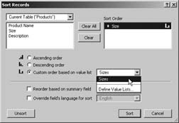
You can then tell FileMaker to sort the record by size, but to use the order of this value list instead of alphabetical order:
Choose Records → Sort Records. You see the Sort Records dialog box.
Clear any existing fields from the Sort Order list and add the Size field. Remember you can quickly add items to the list by double-clicking them.
From the Sort Order list, select Size. The radio buttons below the list are now clickable.
Choose the “Custom order based on value list” radio button. This option informs FileMaker to order the sizes according to a value list.
Select the Sizes value list from the pop-up menu. Here’s where you pick which value list to use.
Click Move. The Size field moves to the Sort Order list. The little bar chart icon beside this field matches the “Custom order based on value list” icon.
Click Sort. FileMaker sorts the records according to size. This time, the records are in a good logical order
Adding Field Controls to Layouts
Plain old edit boxes are as popular as they are flexible. They’re the kind of field that FileMaker automatically creates when you start a new database or use the field tool to drag a field onto a layout. Maybe a little too flexible: Just about anyone using your database can type just about anything into an edit box. If you’re trying to collect specific bits of information, though, you could apply some validation (Section 3.3.1.8). Or for even more, well…control over what your database’s users put in a field choose Format → Field/Control → Setup. In that dialog box, you find drop-down menus, pop-up lists, checkboxes, radio buttons, and pop-up calendars—just like the ones the pros use in databases and Web sites worldwide.
Figure 6-5 shows the Field/Control Setup dialog box, including the list of available formatting options.
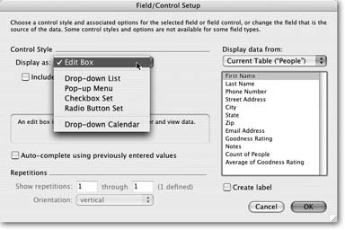
Edit Box
Most of the fields you’ve used so far have been Edit Boxes. These are the click and type variety that normal people call a text box. Distinctive as always, FileMaker has its own moniker.
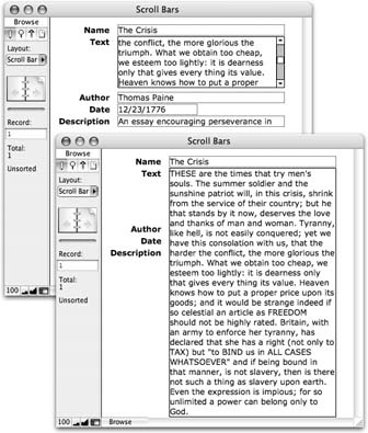
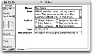
When you select the Edit Box format, you have the choice of turning on the “Include vertical scroll bar” checkbox. You saw this option when you added a scroll bar to the Notes field on Section 4.4.8. If you anticipate that a field will hold lots of information, a scroll bar can be a good idea, as Figure 6-6 shows.
Drop-Down List
This field type looks just like an Edit Box. But when you click into the field, a list of available choices appears just below it (Figure 6-7).
The items in the list come from a value list (Section 3.4). When you pick the Drop-down List type, you get a “Display values from” pop-up menu. From this menu, choose the value list to use. You can also choose Define Value Lists to create a new one.
Tip
If you don’t apply borders to a Drop-down List, the show/hide arrow only appears when the field is active. Add field borders (Section 4.4.8) to make the arrow a better visual cue.
Drop-down Lists look just like Edit Boxes until you click them or tab into the field. Then the list drops down for your data entry pleasure. But it could get annoying to have lists flashing at you just because you happen to be tabbing through the data in a record, so FileMaker lets you stop the list waving by choosing “Include arrow to show and hide list.” Now the list is a little more polite. When the field is active, the list doesn’t drop down until you click the arrow. If you make a choice from the list, the list disappears. Or, if you don’t want to enter anything into the field after all, just click the arrow and the list goes back home.
Finally, turn on “Include ‘Edit…' item to allow editing of value list” if you want your users to be able to easily modify the list of choices. When folks choose “Edit…” (always the last item in the list), the window in Figure 6-8 shows up so they can modify the value list.
Pop-up Menu
When you format a field as a Pop-up Menu, the look changes significantly, as shown in Figure 6-9. Rather than type into the field, your users must click the menu and make a choice.
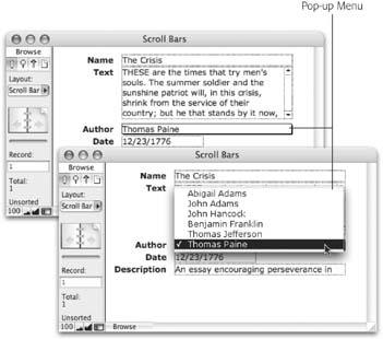
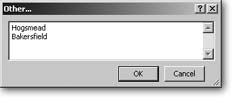
Like Drop-down Lists, Pop-up Menus let mere mortals edit value lists, plus they up the ante by including an Other item. When your users pick “Other…” from the menu, they see the window in Figure 6-10. Entering a value in this window puts it in the field but doesn’t add it to the value list. Turn on “Include ‘Other…' item to allow entry of other values” to grant this power to the masses. (See the box on Section 6.2.4 for advice on the ramifications of letting your users to edit or bypass your carefully crafted value lists.)
Checkbox Set
Figure 6-11 shows a field formatted as a Checkbox Set. With this format, database users can simply click each item to turn it on or off. As they do, the data in the field changes to reflect the checked items.
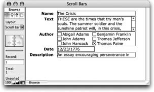
Checkbox sets can include the Other item, just like a Drop-down List (Section 6.2.1). If someone enters a value that isn’t in the value list, FileMaker just turns on the Other checkbox to indicate the field has something more in it.
Radio Button Set
A Radio Button Set (Figure 6-12) works much like a Checkbox Set. The only distinction is that your users can turn on only one item. If they try to turn another item on, FileMaker turns off items as necessary.
Warning
Some users know they can shift-click to select multiple items in a radio button set. See Section 10.3.3.4 to learn how calculations can control these users’ urge to get around the system.
Just as with Drop-down Lists and Checkbox Sets, you can add an Other or Edit item to the Radio Button Set. (See the box on Section 6.2.4 for more detail.)
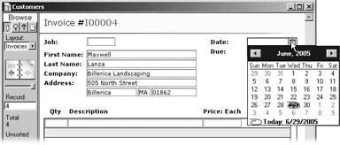
Drop-down Calendar
In FileMaker, you can easily read date fields, and easily set them up. But actually typing dates into them is notoriously tricky. If you don’t get just the right combination of numbers and separators, FileMaker gets all huffy and tells you the value you’ve just typed isn’t valid. And if somebody swipes your desk calendar, how are you supposed to know what numbers to type in the first place? FileMaker Pro 8 can handle both these problems. It lets you give your date fields a nifty drop-down calendar where anyone can simply point and click to enter a date.
When you first format a field with a drop-down calendar, FileMaker doesn’t give you any visual feedback letting you know a calendar’s lurking there, waiting to drop down when you tab into the field. If you want to provide a visual clue, select “Include icon to show and hide calendar.” Then you see a teeny, tiny calendar at the right side of your field (see Figure 6-13). Tiny as it is, the calendar icon still takes up some room, so you might have to make the field a little wider to display the entire date plus the new icon.
Tip
Like the show/hide arrow on Drop-down Lists, the calendar icon shows up in an inactive field only if the field has a border. If you’re a minimalist on the field border issue, you can format your field with only a right border to force the icon to appear.
The calendar itself is a little dynamo. To enter a date, click the Month Year display at the top and you see a pop-up menu that lets you jump to a specific month in the current calendar year.
Right-click anywhere on the calendar (⌘-click on the Mac), and the pop-up menu changes to read “Go to today.” The calendar closes and plunks the current date into the field.
You can also change the month with the right and left arrows at either side. The left arrow icon moves you backward in time (careful, don’t touch anything or you could change the course of human history!) and the right one moves you forward. The up and down arrow icons change the display of years. Finally, you can move the highlighted date with your keyboard’s arrow keys. Tap the down arrow key a few times and you see how fast time flies.
But if you get carried away playing the controls (is my birthday on a Friday in 2015?), the calendar’s footer always displays the current date. Just click that display to enter the current date, then drop the calendar down again. It reorients to today’s date.
Auto-Complete
Auto-complete is a strong ally both for database designers who care about data consistency and for data entry folk who hate to type. Unlike the other Field/Control field styles, you can apply this little beauty to a regular Edit Box. Once you’ve turned on the option to "Auto-complete using previously entered values,” the field gets ESP and tries to figure out what you want to enter. Where do these super-human powers come from? From that old friend, the field’s index (Section 3.3.4.2).
But Auto-complete behaves a little differently on Edit Boxes than it does on Drop-down Lists.
The differences are discussed in the following sections.
Auto-Complete in Edit Boxes
When you start typing into an Edit Box formatted with the Auto-complete option, FileMaker scans the field’s index and drops down a list of matching entries. If you type T, for example, you see a list of entries that begin with the letter T. If you type R next, the list shortens to only words beginning with “TR.” Once the list is short enough for you to find what you want, just click the list item to select it.
The Auto-complete list behaves just like a regular Drop-down List, so if you prefer you can highlight items with arrow keys and then press Enter.
Auto-Complete in Drop-down Lists
When you want to use Auto-complete in conjunction with a Drop-down List, you’ll also need to specify a value list from which Auto-complete will draw its suggested entries.
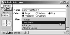
Strange as it sounds, Pop-up Menus and radio buttons both allow multiple selections, just like Checkbox Sets. Just hold down the Shift key while you select an item, and FileMaker dutifully turns it on without turning off the item that’s already selected. Handy though it may be, however, chances are you don’t want anyone to use this trick and choose more than one value—otherwise you use check-boxes to make it obvious that multiple choices are desirable.
Unfortunately, there’s no direct way to turn this feature off. If you want to prevent your users from picking too many items, you have to get creative. Here’s one way of doing so:
Chapter 3 introduced you to Auto-Enter calculations (Section 3.3.1.5). They let you automatically change the value in a field, based on a calculation. You’ll learn all about calculations in Part 4, so for now you just have to have some blind faith.
Here’s how to limit your fields to a single value:
In the Define Database window, select the field you want to fix and click Options. The Field Options dialog box appears. If it isn’t already selected, click the Auto-Enter tab.
Turn on the “Calculated value” checkbox. The Specify Calculation dialog box appears.
In the big free-entry box on the bottom half of the window, type LeftValues ( My Field ; 1 ). But instead of My Field, type the name of the field you’re fixing. Otherwise, be sure you type this exact calculation. This calculation tells FileMaker you want to keep only the left-most—or first—value in the field.
Click OK. You’re now back in the Field Options dialog box.
Turn off “Do not replace existing value (if any)” and click OK.
You’re back in your database.
Now if you try to Shift-click a second item, FileMaker immediately throws it out. In practice, it looks like it simply doesn’t let you Shift-click.
Use an existing value list or define a specific list just for Auto-complete. Just as with regular field entry, you can use a value list from:
The field you’re formatting with Auto-complete
Another field in the same table.
A field in a different table with the same file
A field in another file
A custom list
Remember, value lists based on fields depend on the field’s index, but custom lists don’t.
When you click into an Auto-complete Drop-down List that’s formatted with a show/hide arrow, the list doesn’t appear until you click the arrow or pres the Esc key. If you want the list to display as soon as the field is entered, then don’t select the “Include arrow to show and hide list” option.
Repetitions
On Section 3.3.4.2, you learned about repeating fields, which let you put several values in one field, with a separate Edit Box for each value. Remember, when you put a repeating field on a layout, you get to decide how many times it shows up. Even if a field has 200 repetitions, you don’t have to show them all on the layout. You can elect to show just the first ten. Or just the last ten. Or numbers 37 through 118.
To control how repeating fields display, you use the same Field Format dialog box shown in Figure 6-5. This time, focus your attention at the bottom of this dialog box under Repetitions. Just enter the first repetition you want in the “Show repetitions” box, and the last one in the “through” box. You can’t show noncontiguous repetitions here—you have to pick a range with one beginning and one end. But try this technique instead. Put multiple copies of the field on the layout, but specify that each copy displays a different range of repeats. You’ll get much the same effect.
Note
If the “Show repetitions” and “through” options are grayed out, it probably means you didn’t have a repeating field selected when you chose the Format → Field Format command.
Once you’ve figured out which repetitions to show, you get to pick an orientation. Your choices are Horizontal and Vertical, and Figure 6-14 makes sense of them.
Display Data From
So far, you haven’t explored the right side of the Field/Control Setup dialog box, where there lives an incredibly powerful feature—the “Display data from” option. With this powerful tool, you can make one field display the contents of…another field. But why? While you ponder that Zen-like paradox, read the following example.
Say your layout has a series of similar fields—Email, Mail, and Phone—each of which indicates whether or not you have permission to contact a customer using that method. You format the Email field with a nice pop-up control and a value list with the custom values of Yes and No. You shorten it to just the right width and apply beautiful font formatting. Now, select Mail and Phone in turn and give them the same controls and text formatting. But that would take forever—twice!
Instead, do the following: Delete the Mail and Phone fields, then copy the Email field, and paste it where the Mail field used to be. Next, use the Field/Control Setup dialog box to tell the duplicated Email field to display data from Mail instead. Paste again, change this copy to display data from the Phone field, and with a few quick clicks, you’re done. You’ve just borrowed the formatting from one field to display the information from another. The moral of the story: Use “Display data from” to avoid doing work you’ve already done.
Field Behavior
The Field/Control Setup dialog box controls how a field looks and works. FileMaker has another dialog box, called the Field Behavior dialog box, that also influences how a field works, but in a different way. This time, you get to decide when (if ever) a person should be allowed to click the field, and how it handles certain special keystrokes. The Format → Field Behavior command shows this dialog box, and so does Figure 6-15.
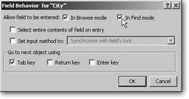
Field Entry
Sometimes you want to show a field value, but you don’t want any one changing it. If that’s your fancy, select the field in Layout mode and choose Format → Field Behavior. Then simply turn off the “In Browse mode” checkbox (next to “Allow field to be entered”;).
Just because you don’t want this field being modified on this layout doesn’t mean you don’t want to use it in a find request. If you leave “In Find mode” turned on, your users can still type into the field in Find mode. If you don’t want that either, turn off “In Find mode.” If you want to let people modify a field but not search in it, then turn on “In Browse mode” and turn off “In Find mode.” For example, turn off Find if the field isn’t indexed (Section 3.3.4.2) and you don’t want people stuck with slow finds.
Select Entire Contents of Field on Entry
If a field is formatted as an Edit Box or pop-up list, folks can click it to type a value. Normally, when they first click the field, a flashing insertion point marks the spot they clicked. If you prefer, you can instead have the field start out with all its content selected. For example, if the First Name field contains “Stacey,” a single click on the “c” selects the entire name. To get this behavior, turn on “Select entire contents of field on entry.”
Input Method
Unless you work for the UN, you probably never use the “Set input method” setting, but for the sake of completeness here’s what it does:
In some languages, entering text isn’t as simple as in English. For example, Japanese has many more characters than fit comfortably on a keyboard. To get the job done, a Japanese typist must use an input method—the set of rules and software interfaces used to get text into the computer. Unfortunately there isn’t just one method, and FileMaker lets you pick which one you want. Normally, the “Synchronize with field’s font” option is selected. This option just means FileMaker automatically picks the input method based on the font you’ve selected. If you want to override this behavior and specify a hard-coded input method, turn on this checkbox and, from the pop-up menu, choose the input method.
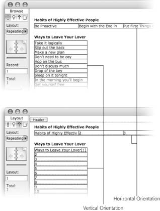
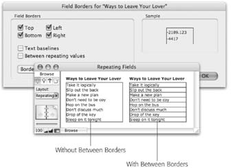
While you’ve got repeating fields on the brain, there’s one more formatting choice worth talking about. You can put a border Section 4.4.8.1 around a repeating field just like any other field. But this border goes around the entire set of fields, not each individual repetition. You wind up with what looks like one big field, and it can be a surprise when you click it and discover those repetitions. Wouldn’t it be nicer if you could format those repeating fields to look like a nice clear table, as shown here?
Nicer, yes. And possible too. Just select the repeating field in Layout mode and visit the Format → Field Borders window. If you look at this dialog box with a repeating field selected, you have one additional option: “Between repeating values.” When this checkbox is turned on, you get your borderline between each repetition, as well as around the whole thing. You can even apply different color, pattern, and thickness to these lines if you want. For example, you can put a dark black border around the whole thing, and a paler gray line between each repetition if that suits you.
Go To Next Field Using
Way back in Chapter 1 you learned to use the Tab key to move from field to field (Section 1.5.3). It turns out you can actually change this behavior too: You can designate the Tab key, Return key, or Enter key to jump to the next field. You can select any combination of these three keys, including none of them.
Note
When one of these keys isn’t assigned to go to the next field, its more normal behavior takes over: the Tab key inserts a tab into the field; the Return key inserts a new line into the field; and the Enter key exits the record.
You might want to change these settings for two reasons. First, if you have a field that often needs tabs typed into it (like a field that holds an ingredient list—quantity [Tab] unit [Tab] ingredient [Return]…), it can be annoying to have to press Ctrl+Tab (Option-Tab) all the time. You can turn off “Tab key” in the Field Behavior dialog box and make typing tabs easier. Since field behaviors are set for each field, you can give the Ingredients field this behavior, and keep the normal tabbing behavior for all the other fields on the layout.
The second reason comes down to the fact that humans are funny creatures. People are smart enough to put a man on the moon, but for some reason they hate to learn new ways to work. If you’re creating a database for people whose old computer system used, for example, the Enter key to move between fields, you might decide to make FileMaker mimic that behavior to give their brains a break.
Tab Order
Whichever key you use to move among fields on the layout (as discussed in the previous section), it normally moves from the top left to the bottom right. Figure 6-16 shows the order fields go in as someone presses Tab (called the tab order).
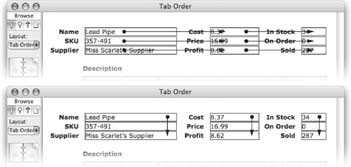
If the order FileMaker gives you isn’t ideal for your layout, you can customize it. Your detail layout in the People database, for example, could benefit from a custom tab order. As it stands, the first time your users press Tab, they go to the First Name field, which is fine. But the next hit on Tab takes them to the Goodness Rating pop-up menu, while most people would expect the Last Name field to come next. To fix this annoying snafu, first choose Layouts → Set Tab Order. A few things happen onscreen, as shown in Figure 6-17.
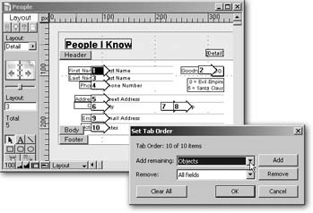
The Set Tab Order window appears in the bottom-right corner of the screen (you can see it in Figure 6-17 as well). Here you have several options for changing the tab order to suit your needs, along with which of the objects on your layout you can include.
Since FileMaker automatically assigns a tab order to your layout, it assumes you simply want to modify what’s already there—every arrow already has a number. If you click the Clear All button, all the arrows lose their numbers and you can start numbering from scratch.
Since the Goodness Rating field is a pop-up menu, and thus doesn’t respond well to keyboard input, you probably ought to edit the tab order so it gets skipped when tabbing. The number inside each arrow is editable—just click the number to select it, and then type a new number. If you don’t want the field in the tab order at all, remove the number from its arrow.
Click the arrow pointing to the Goodness Rating field and delete the number.
The arrow pointing to Goodness Rating is empty.
Also, your numbered arrows now skip 2—they go from First Name (1) to Last Name (3). Fear not. FileMaker’s smart enough to figure out what you mean.
Click OK in the Set Tab Order window.
If you switch to Browse mode and try out your tab order, you see that you can now tab right from First Name to Last Name.
Note
To unlock the secrets of how the Set Tab Order dialog box can help you automate your database, see Section 6.7.5. There you’ll learn how to add buttons to a layout’s tab order.
As long as you never choose the Set Tab Order command on a particular layout, FileMaker automatically manages the tab order for you. For example, if you add a Middle Name field to the layout, and place it between the first and last name fields, it automatically goes into the right spot in the tab order. If you switch the positions of the first and last name fields, Last Name becomes the first field in the tab order, and First Name comes next.
The first time you click the Tab Order window’s OK button, though, FileMaker assumes you want full responsibility. If you add a new field to the layout, it just gets stuck to the end of the tab order, no matter where you put that field on the layout. If you move fields around so that the tab order makes absolutely no sense, FileMaker doesn’t care. It keeps the tab order exactly as you had specified, even if it means the Tab key jumps you randomly around the layout.
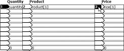
Each repetition of a repeating field is treated as a separate entity as far as tab order is concerned. It’s perfectly legal to have the last repetition come right after the first if you’re into aggravating your users. But it can be a real drag to have to click each and every one of those repetitions when you set the tab order. FileMaker has a nice feature to save you the trouble.
When you click the first repetition of a repeating field (while setting tab orders), FileMaker gives it a number–and the arrow begins to flash. If you click this flashing arrow again, FileMaker numbers that field’s additional repetitions for you, in the logical order.
But the magic doesn’t stop there: Suppose you have a series of repeating fields, as shown here. The standard tab order would go down each column before moving to the next one, but you’d prefer to tab across the rows first. For example, if you’re sitting in the first Quantity field, you want to tab into the Product field, then the Price field. Then once you’ve completed a row, you want the next tab to take you to the next one.
FileMaker can automatically do this kind of numbering for you too. When setting the tab order, click the first Quantity field. It gets a number and begins to flash. Now click the first Product field, and then the first Price field, as pictured here. You notice that the arrow by the Quantity field continues to flash. Once you’ve done these three clicks, click the flashing arrow again. FileMaker now numbers all your repetitions properly.
In general, you click each repeating field in the order you want them tabbed to. When you’re done, click the first one again to let FileMaker know. FileMaker fills out each row of repetitions matching this order.
(Of course you probably never actually build a database like this one. If you want to track line items on an order, read Part 3 of this book first.)
Print-Related Layout Options
Your layout needs are often different when viewing data onscreen versus on a printed page. For instance, you might want text blocks, fields or other objects to show onscreen, but to disappear completely when printed. Also, when printing, you’re often concerned about wasted paper, but few people worry about using too much scrolling window. FileMaker gives you a handful of layout options to control how things print.
Non-Printing Objects
Sometimes you have something on a layout that you don’t want to print, such as a layout that’s designed to print over the top of preprinted invoice forms. When you view this layout in Browse mode, you want the appropriate boxes to show so your users know where to type. But when you print, you want only the field data.
You can tell FileMaker not to print any layout objects. First select the object (or objects). Then choose Format → Sliding/Printing. This brings up the Set Sliding/ Printing dialog box, which you learned about in the last chapter (Section 5.3.5.4). What you didn’t learn about is the “Do not print selected objects” checkbox at the bottom of this window. Turn this checkbox on and the selected objects show in Browse, Layout, and Find modes, but not in Preview mode and not when printed.
Columns
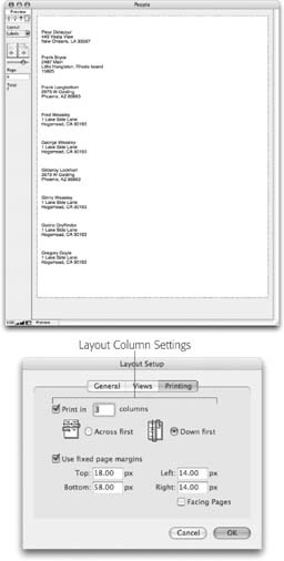
Occasionally your printed page needs to spread records across several columns. For example, when you print on address label sheets, the sheets you buy usually have two or three columns of labels on one page. Even when printing a list or detail layout, if your data’s narrow, you can save paper by printing two records side by side. How do you tell FileMaker what to do in special cases like this? Figure 6-19 illustrates the problem.
When you turn on column printing for a layout, FileMaker does some pretty crazy stuff to your layout in Layout mode, as Figure 6-19 shows.
The column setting has no effect on your layout in Browse or Find modes. But if you print or switch to Preview mode, you can see the effect. Instead of repeating the body part just vertically, FileMaker tiles the body part both horizontally and vertically so that it fills the page.
Every column has to be the same width (this makes sense because every column contains the same kind of information). FileMaker automatically sets the column width so that the columns perfectly divide the page. But it bases its assumptions about the size of the page on the settings in the Print Setup (Windows) or Page Setup (Mac OS X) dialog box at the time you turn on columns. If you later switch to a different paper size or orientation, you probably want to resize the columns. To do so, just drag the first (left-most) dashed line on the layout. When you finish, FileMaker makes every column the same width as the first one.
Lastly, FileMaker gives you two choices for the way it arranges records in the columns. Choose “Across first” in the Layout Setup dialog box if you want the second record to be at the top of the second column. Choose “Down first” if it should be the second item in the first column. The flow arrows on the icons in the Layout Setup dialog box (Figure 6-18) show how the data flows onto the printout.
Format the Number/Date/Time/Graphic
All this talk about how fields look and work is well and good, but what if you want to change how the data inside them looks? A price and a weight both go in a Number field, but they are different types of values and should look different. FileMaker provides a series of formatting options for the data inside fields, giving you loads of control over how numbers, dates, times, and pictures look.
FileMaker has a special formatting dialog box for each kind of data a field can hold: Text, Number, Date, Time, and Container. (Timestamps are just a date and a time together, so you can format both parts separately.) You’ve already seen one of these dialog boxes—Text Format—in Chapter 4 (Section 4.4.6.3). It’s the thing you see when, in Layout mode, you choose Format → Text.
Below this menu command, you find four others, each of which accesses a dialog box specific to the type of information in your field.
Number Formatting
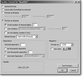
Select a number field and choose Format → Number to control how the number inside the field is displayed. The Number Format dialog box has a lot of options, as you can see in Figure 6-20. You can use most of these in any combination, so the possibilities are vast.
Note
As with most layout settings, if you choose this command without selecting a field, FileMaker lets you edit the default formats. In other words, the settings you pick apply to every number field you create on the layout thereafter.
General Format
If you don’t tell it otherwise, FileMaker assigns the General Format to any new number fields you create. Usually, this format means, “show numbers the same way someone types them.” But if your number has too many digits (either a very large number, or a number with lots of decimal places), FileMaker rounds the number or uses scientific notation to shorten it.
Leave data formatted as entered
If you don’t want the automatic rounding and scientific notation you get with General Format, choose “Leave data formatted as entered” instead. FileMaker leaves your numbers alone, so they appear exactly as typed.
Format as Boolean
Sometimes you use a number field simply as a Boolean value. For instance, pretend you have a field that flags customers who get holiday cards. You could use a number field for this one, with a 1 in it if you want to send a card, and a 0 if you don’t. But someone looking at the layout later might mistake all those 1’s and 0’s for so much computer gibberish (even if that someone is yourself).
For this reason alone, the Number Format dialog box has a choice called Format as Boolean. With this setting, a number field shows one of two text values. The first (“Show non-zero as”) shows if the number field has any non-zero value. The second (“Show zero as”) shows only when the field has a zero in it.
Format as decimal
The most flexible setting is called “Format as decimal.” When you choose this option, you activate a host of new settings.
Fixed number of digits. Turn on “Fixed number of decimal digits” if you want to force every number to have the same number of decimal places. FileMaker also lets you say how many decimal places you want. If the number in the field doesn’t have a decimal part, FileMaker just fills in zeros after the decimal point.
Notation and symbols. The “Use notation” checkbox lets you add currency symbols, units, or other labels to your numbers:
Choose Percent to turn the number into a percent value. FileMaker automatically multiplies the number by 100 and puts a percent sign after it. That way, your users can enter .1 for 10 percent, and you can later have your database multiply the percent value by another number. If the field held the value 10% instead, you wouldn’t be able to use that number to do any math.
Choose one of the Currency options to format the number as a monetary value. When you do, you can supply an appropriate currency symbol as well. The four currency options in the pop-up menu have to do with where the symbol is placed, as explained in Figure 6-21.
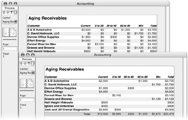
Do not display number if zero. Suppose you have a report with lots of numbers, where many of those numbers are zero. If you don’t enter anything in a number field, FileMaker displays a value of zero—what else? But not every record needs every field filled in. In fact, it’s quite common to have a lot of empty fields in financial databases, resulting in a teeming mass of meaningless zeros. So turn on the “Do not display number if zero” option, to make the zeros go away. Figure 6-22 shows a classic aging receivables report with and without zeros.
The currency symbol is, in a sense, just an expression of units. It isn’t at all uncommon to want to put other unit labels on your numbers too. But FileMaker doesn’t have an option for this variation. It seems hopelessly in love with currency.
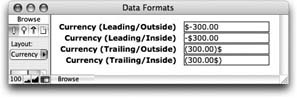
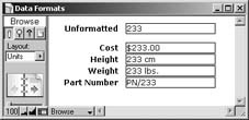
But don’t let the word currency in the “Use notation” popup menu get you down. Since you can type anything you want for the currency symbol, you’re welcome to use one of the currency options for any other kind of unit too. In this picture, the Cost field is formatted with normal currency settings. The Height field uses the Trailing/Outside option with " cm” as the currency symbol, to display a number with centimeter units. Weight uses a similar approach, with a currency symbol of " lbs.” (Note there’s a space before the abbreviations here, so they don’t crash into the field’s actual number.)
The Part Number field shows another creative use of the currency formatting options. This time, “PN/” is inserted before the number value, using the Leading/Outside option. Every one of these fields really has 233 in it, but through number formatting they show very differently.
The currency symbol box accepts only up to five characters –and that includes the leading space if you want one– so it isn’t perfect. But in many cases it gets the job done.
Separators. It’s no surprise to you that numbers use special symbols to separate their parts. For example, you usually see a decimal point between the whole and fractional parts of a number, and a comma after the thousands place. FileMaker uses whatever symbols your operating system dictates for these special purposes, but you’re free to override them if you want. For instance, you can use a space instead of a comma between each third digit.
In the "Decimal separator” box, type the character you want in place of a decimal point. The box accepts only a single character. FileMaker calls the comma between every third digit a “thousands separator” and you can opt to leave them out by turning on “No thousands separator.” Turn on “Use thousands separator” if you want them, and feel free to enter something other than a comma in the associated box.
Formatting negative values. The last thing you get to control with the “Format as decimal” option is the way FileMaker represents negative numbers. In the “Format as” pop-up menu, you can choose any one of six negative number formats:
-1234 puts a negative sign before the number in the usual fashion.
1234- puts the sign on the end instead, if that’s the kind of thing that makes your socks go up and down.
For that oh-so-financial look, choose (1234) instead. It puts negative numbers in parentheses.
<1234> is similar, but it uses angle brackets instead of parentheses.
If you’re an accountant, hold onto your hat. The 1234 CR option will make you feel right at home when crediting those accounts.
The last choice, (1234 with a black triangle before it) puts that funny triangle before negative numbers. No idea what that’s all about. If you know, more power to you.
To draw more attention to a negative number, you can have FileMaker automatically color it. Turn on “Use color” and pick a color by clicking the little icon button to its right.
Formatting a number’s text. At the end of the day, a number is text too, really. It’s made up of numbers and symbols using some font, size, style, and color. As such, you can choose the Format → Text command with a number field selected. If you’re already in the Format Number dialog box and you want to format the text as well, the Text Format button serves as a shortcut to the Text Format dialog box.
Date Formatting
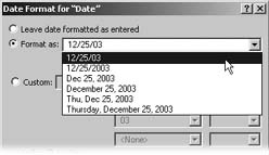
The Date Format dialog box works a lot like its number-oriented brother. This time, though, you tell FileMaker how you want dates to look. This date could be the value in a date field, or the date part of a timestamp field. For example, the date at the top of a letter might look best spelled out, while the due date on a list of 25 invoices might best be served by an abbreviated numbers-only format. Figure 6-23 shows the Date Format dialog box (no surprises here: just choose Format → Date).
Leave data formatted as entered
When you choose “Leave data formatted as entered,” FileMaker shows the date just almost the same way your users type it. If they type a two-digit year, the program changes it to four digits. Otherwise, it leaves the data alone.
Format as
If you choose “Format as” instead, you can pick from six common date formats in its pop-up menu, as shown in Figure 6-24.
Custom
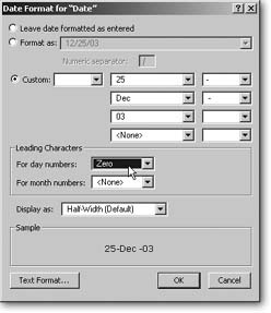
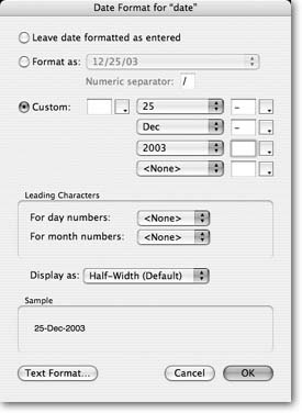
For the ultimate in control, choose Custom. When you do, the mysterious unlabelled boxes, buttons, and pop-up menus to the right become usable. By selecting different parts of a date from the pop-up menus and adding your own text as appropriate to the boxes, you tell FileMaker exactly how you want the date formatted. You would use this option when none of the Format As formats (Figure 6-25) are exactly right. For example, if you’re in the U.S., FileMaker suggests date formats that follow typical U.S. standards (month, then day, then year). But if people in England use your database, you might want to construct a custom format in line with their expectations (day, then month, then year).
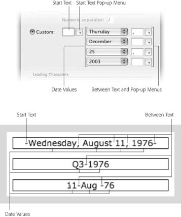
When FileMaker formats a date with the Custom option turned on, it assembles the final date value piece by piece according to your specifications. Whatever you type in the Start Text box comes first, followed by the first date value. FileMaker then adds the text from the top Between Text box. Next comes another date value and more between text. This process continues until the last text box is added to the result. By mixing and matching text and date values, you can make a date look any way you want.
If you don’t want to use one of the date values, choose “<none>” from the relevant pop-up menu. Likewise, to skip a between text value, clear its text box. The pop-up menu buttons to the right of each text box give you a choice of common date-related symbols for easy picking. The have a “<none>” option as well, if you want to quickly clear the associated box.
In addition to “<none>”, the date value pop-up menus all have identical choices, divided into four sections, as shown in Figure 6-26.
As with the “Format as” option, you can use the pop-up menus in the Leading Characters area of this window to tell FileMaker how to handle single-digit month and day numbers. If you want them left alone, choose “<none>.” To insert a leading space, choose Space, and for a leading zero, choose Zero.
Time Formatting
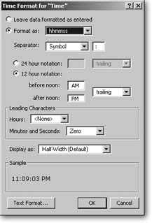
Compared to dates and numbers, formatting time values is a breeze—FileMaker gives you just a few simple choices. Figure 6-27 shows the Time Format dialog box (Format → Time).
Leave data formatted as entered
This time, “Leave data formatted as entered” really means it. The time value shows exactly as you typed it.
Format as
The only other formatting option you get with time values is “Format as” and its related options. From the “Format as” pop-up menu, choose what time information you want to include:
hhmmss tells FileMaker to show hours, minutes, and seconds.
hhmm says you want hours and minutes, but no seconds. If your time value has seconds, FileMaker just ignores them.
mmss limits the display to just minutes and seconds. If the time value has hours, the minutes are increased accordingly. For instance, if your field has 1:13:27 and you format it without hours, you see 73:27—each hour adds 60 minutes.
hh gives you a field that shows just the hours. Any minutes and seconds are left off.
mm tells FileMaker to show the number of minutes. Again, any hours in the time value are counted as 60 minutes, and any seconds are ignored.
ss shows a time as just a number of seconds. Every minute counts as 60 seconds, and every hour as 60 minutes. They’re added up along with the seconds themselves to produce the final number.
Normally time values show a colon between each number. You can change this look if you want by typing something else in the Separator box. To leave out the separator entirely, clear the box. (This method lets you make military style times: 0730.)
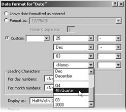
If people all over the world use your database, you quickly discover that date formats can lead to unending confusion. A date like 1/11/05 could mean January 11 or November 1, depending on your persuasion. To avoid all this confusion, consider a date format that strikes a nice balance between efficient display and unambiguous interpretation: 11-Jan-05.
To get this format, select a date field, choose Format → Date, and turn on the Custom option. Then configure it thusly:
In the first pop-up menu, choose the number version of the day. (It’s the number in the first group of options, right below <none>.)
In the top text box, enter a hyphen (-).
In the second pop-up menu, choose the abbreviated month name.
In the next text box, enter another hyphen (-).
In the third pop-up menu, choose the year (you can use either the two or four-digit version).
Clear the contents of the two remaining text boxes and in the last pop-up menu, choose <none>.
Now click OK and switch to Browse mode. Your date field should show this svelte-yet-satisfying format.
Note
As with date formatting (Section 6.6.2.1), the pop-up menu between this box and its label lets you opt for a Japanese time separator instead.
When displaying clock time, FileMaker can use 24-hour or 12-hour notation. In other words, do you want to see 14:23 or 2:23 PM? When you choose “24 hour notation,” you can add some arbitrary text before or after the value (23:00UTC, for instance). When using 12-hour notation, you get to decide what text you want to represent a.m. and p.m. by typing in the “before noon” and “after noon” boxes.
You can choose from the pop-up menu to the right of these labels to put them on either side of the time value.
Like a date value, you get to tell FileMaker how to handle single-digit numbers. Again, you can leave them a single digit, add a leading space, or add a leading zero.
Timestamp Formatting
Although FileMaker has a timestamp field (Section 3.2.6.5), there’s no Timestamp option in the Format menu. Remember that timestamp fields really contain two values: a date and a time. So, you use the Format → Date command to control how the date part of a timestamp looks, and the Format → Time command for the time portion. Like time values, you can also use Format → Number to control decimal places and points in the seconds part.
In order for a timestamp field to show your settings, though, you have to format both the date and time parts. If either is set to “Leave data formatted as entered,” the timestamp field just puts its hands over its ears and hums so it can’t hear you trying to format it. Once you enter both the date and the time formats, the timestamp field straightens up and follows your formatting instructions.
You do not have to set the number format if you don’t want to. If you don’t choose a number format, FileMaker leaves the decimal part of your time values formatted as your users enter them.
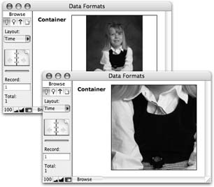
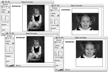
Graphic Formatting
When your users want to put pictures or movies in a container field, they can use the Format → Graphic command to crop, scale, or otherwise control how it looks. If you’d like some control over how much formatting they can do, you can set some limits in the Graphic Format dialog box, as shown in (Figure 6-28).
Note
If someone puts a sound file in your container field (using Insert → File), you have no control over how FileMaker displays it. FileMaker automatically shows the appropriate icon and leaves it at that.
Basically, you’re taking control of what happens when folks use FileMaker’s usual image display commands. For example, when FileMaker shows a big picture in a container field, it normally shrinks it down so the whole thing fits inside the field. Smaller pictures are left at their normal size, and centered in the field. But this command isn’t the only way to work it. Here are all the settings you can bend to your wishes:
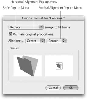
Scale
The Scale pop-up menu lets you decide how FileMaker should handle pictures that aren’t exactly the right size:
Choose Crop if you want FileMaker to crop large pictures, showing only what fits. Figure 6-29 shows how this method works.
Choose Reduce if you want FileMaker to shrink large pictures to fit, but leave small pictures alone. This setting is what you automatically get if you don’t change it yourself.
Choose Enlarge to grow small pictures so they fit the field but are as big as possible. Large pictures get cropped.
Choose Reduce or Enlarge if you want FileMaker to shrink big pictures and grow small ones. This setting ensures that every picture in the field (on each record) is the about the same size.
Alignment
If the picture is small and hasn’t been enlarged, the alignment pop-up menus control where in the field the picture appears. For example, choose Right from the Horizontal Alignment pop-up menu and Top from the Vertical Alignment pop-up menu to nestle the picture in the top-right corner of the field.
If a picture has been reduced or enlarged so that it fills the field, it might still be smaller than the field in one dimension. In this case, the alignment pop-up menus tell FileMaker where to put the picture along this dimension. Figure 6-30 shows this process in action.
Note
When FileMaker reduces or enlarges a picture, it keeps the picture’s aspect ratio the same. In other words, a picture that’s four inches by six inches may not be that size in the container field, but its height is 2/3rds of its width. If you’d rather FileMaker make the picture exactly the size of the container field, even if it means distorting it, turn on “Maintain original proportions.”
Cropping
Finally, when the picture is cropped, the alignment pop-up menus tell FileMaker which part of the picture to show. You can see the same cropped picture with each possible alignment in Figure 6-31.
Adding Buttons
The first FileMaker database you looked at (the Contact Management template on Section 1.2.1) has a pretty slick system for switching between list and detail layouts. Instead of fiddling with the tiny Layout pop-up menu, you can just click tab graphics right on the screen. Each click magically transports you to a different layout. (Of course, at the time you didn’t know it was changing layouts. You didn’t even know what a layout was. But the buttons still made sense to you.)
You can easily duplicate this magic in your own databases. Just use FileMaker’s Button tool, shown in Figure 6-32. But don’t let the tool’s name and appearance mislead you. You’re not limited to the rectangular beveled buttons this tool creates. In fact, you can turn any object on a layout into a button—an imported graphic or even a field. When your users click the mouse button while pointing to such an object, FileMaker highlights it so they know they’re about to perform some kind of action. When they let go, something happens. You get to decide what that something is.
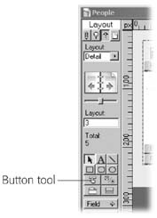
Creating Buttons with the Button Tool
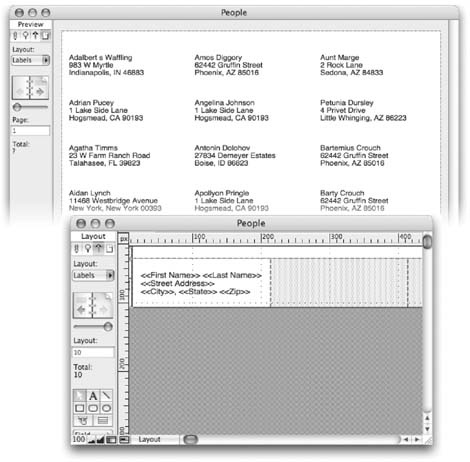
You want to add a Go to List button to the detail layout in your People database, so open the database now and switch to the detail layout.
To add a button, first click the Button tool. Then draw the button on the layout as though you were drawing a rectangle. Figure 6-33 shows you where you might want to put it.
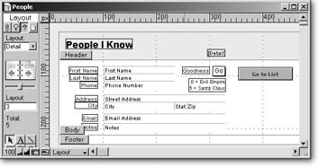
When you release the mouse button, FileMaker immediately pops up the Button Setup dialog box (Figure 6-34).
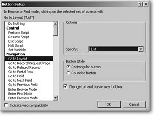
You want this button to switch to a different layout whenever someone clicks it, so find Go to Layout in the action list and select it (it’s right under the boldface Navigation item). When you do, the Options area shows you a pop-up menu labeled Specify. You can pick any layout in your database from this menu. For this button, choose List.
If you’re picky about such things, you can even control whether your button has square corners or slightly rounded corners. Choose the “Rounded button” option for an elegant, classy look. (If you don’t make a choice, square is what you get.)
Something else changes when you select a button command: The “Change to a hand cursor over button” checkbox appears below the Button Style area. By turning this option on, you tell FileMaker to use a special pointing-finger cursor whenever someone mouses over the button. (The icon is similar to the one you usually see when you point to a link in a Web browser—the universal cue that an area is clickable.)
When you’re done making choices, click OK. You can now switch to Browse mode and give your button a try.
Note
Buttons work in Browse mode and Find mode, but not in Preview mode (Section 2.9).
Turning an Existing Layout Object into a Button
Buttons are handy, but they can be redundant. Often, there’s already something on your layout—like a picture or even a field—that would make a perfectly good button. For example, if you’ve got your company’s logo in the top-right corner of the layout, you can make it link to the main page of your Web site. A separate button reading “Go to Home Page” would be unnecessary clutter. (Incidentally, in this case you would use the Open URL button action; see Section 14.9.)
Here’s another common example: Now that you have a button that goes from the detail layout to the list layout (Section 5.3.2), you might want to give folks an easy way to get back where they came from. Rather than add a button to the already full body part on the list layout, why not turn the person’s name into a link of sorts? When you click the name, FileMaker shows you details on that person.
Turning one of a record’s existing fields into a button capitalizes on the fact that FileMaker always selects a record when you click it in list view. And when you switch layouts, it always stays on the same record no matter which layout you use. This time you’ve added a button to the works, but the original behavior is unchanged: Clicking the list switches records, and the button switches layouts.
Here’s how:
If necessary, switch to Layout mode and to the list layout. Then, select the text object that holds the First Name and Last Name merge fields.
This is the object you want to turn into a button. You have to select it before you can work on it.
Choose Format → Button Setup.
The Button Setup dialog box (Figure 6-35) makes its return. This time, though, you’re not making a new button. Instead, you’re turning the selected object into a button.
Choose the Go to Layout button action. When the Options area shows the Specify pop-up menu, choose Detail.
This action tells the button which layout it should go to.
Figure 6-35. Your list layout (in Browse mode) should look something like the top window. When you point to a name, your mouse arrow changes to the little hand icon, and when you click, the name highlights. After the button is released, you see the detail layout for the correct person, as shown in the bottom window.Click OK.
The window disappears and you’re back on your layout. You don’t see a change because you can’t normally see if an object has been turned into a button. If you try the button now, it works fine, but it doesn’t do your users much good if they don’t know it’s there. To make it obvious that the name links to the detail layout, why not make it look like a link.
Using any of FileMaker’s text formatting tools (Section 4.4.6.2), turn the text blue and give it an underline (Format → Text Color and Format → Style → Underline).
Now your list layout looks like the one in Figure 6-35, and it works beautifully.
If you need a bunch of buttons on your layout, you can use the technique outlined on Section 4.4.6.2 on several buttons at once. Just select all the objects that you want to button-ize before you choose the Format → Button command. FileMaker automatically groups the objects and turns the entire group into a button. These objects now act like any other grouped objects: Anything you do to one in Layout mode happens to all of them. If you later ungroup a grouped button, FileMaker warns you and removes the button behavior as well.
Making a Button not a Button
If you have a layout object that’s already a button, and you don’t want it to be a button anymore, you need a way to turn off its button-ness. It’s easy to do but not very intuitive: Select the button and choose Format → Button Setup (or double-click the button). In the Button Action list (Figure 6-35), choose Do Nothing, and then click OK. Now the object isn’t a button anymore.
Tip
Here’s a faster way, even though it’s cheating. Just click a button and choose the Arrange → Ungroup command (or better yet, press Ctrl+Shift+R or Shift-⌘-R). Even if the button isn’t part of a group, FileMaker pops open a message box asking if you want to remove the buttons. Just click OK, and your object is no longer a button.
You can even remove the button action from the “real” buttons you create with the button tool (Section 4.4.4.2). That’s because, in reality, the button tool just creates a specially formatted text object and automatically turns it into a button. If you switch it to Do Nothing, you’re just left with a fancy text object. (You might want to deactivate a button when you’re troubleshooting your database…or for a little April Fool’s Day fun.)
Button Actions
The Specify Button window has dozens of available actions, as you can see at the left side in Figure 6-34. In the previous section, you created buttons for the Go to Layout action, but there are many more. As you scan through these commands, you probably notice that many of them repeat the same functions you find in File-Maker’s menus. That’s not just meaningless redundancy. By giving your databases buttons for lots of everyday commands, you can make FileMaker even easier to use than it already is. Design some icons (perhaps in your corporate colors), attach buttons to them, and you may find that you hardly have to train your colleagues at all, because the buttons and their labels help explain what they need to do to use the database.
Here’s a brief rundown on what some of these actions do.
Note
This section explains the button actions you’re ready to use right now. Many available actions simply won’t make sense to you until you’ve learned more about FileMaker. These buttons mimic the steps you can use when you write scripts to automate FileMaker procedures. (In fact, you can use any button action in a script.) You’ll learn about scripts in detail in Part 5.
Go to Layout
Go to Layout is the action you used for the two buttons you created earlier in this chapter. It transports those who click it to another layout instantly. You get to pick which layout to visit (Section 6.7.2).
Go to Record/Request/Page
The Go to Record/Request/Page action lets you switch to the Next, Previous, First, or Last record in the found set. If you’re in Find mode, it navigates find requests instead. Despite the word “Page” in its name, it doesn’t navigate pages in Preview mode because buttons don’t work in Preview mode. (The reason it has this name is because you can navigate pages with a script in Preview mode. See Chapter 13 for more.)
Go to Field
Use Go to field if you want a button that delivers its clickers into a specific field. You get to pick the field by clicking the Options area’s Specify button. For example, you could create a button that says “Back to Square One” that places the cursor in the first field in the tab order. (If you don’t pick a field, this step goes to no field. In other words, it gets the user out of whatever field she’s in.)
The Options area also has a “Select/perform” checkbox. For text, number, date, time, and timestamp fields, turn on this option if you also want FileMaker to select the contents of the field, so folks can just start typing to replace it. For container fields, this option tells FileMaker to perform the field contents. In other words, play the movie or sound, open the file, and so forth. This way, you could have a button that opens up a file (Section 2.7.5), stored in a container field. For the Go to Field action to work, the target field must be on the layout.
Go to Next Field and Go to Previous Field
The Go to Next Field and Go to Previous Field actions have no options at all. They simulate the Tab and Shift-Tab keystrokes, bouncing to the next or previous field in the tab order.
Enter Browse Mode, Enter Find Mode, and Enter Preview Mode
The last three actions in the Navigation section—Enter Browse Mode, Enter Find Mode, and Enter Preview Mode—do just what you’d expect. Want a Find button on your layout? Assign it the Enter Find Mode action and you’re done.
Note
The Enter Find Mode button has a “Specify find requests” option. You can use this power-user feature to preload the find requests and save your database’s searchers a little time. You’ll learn all about how to do this in Chapter 13.
Editing Actions
FileMaker has seven editing actions, whose names are largely self-explanatory:
The Undo action takes no options at all; it simply runs the normal Edit → Undo menu command. Select All also has no options. It works exactly like the Edit → Select All command.
Cut, Copy, Paste, and Clear all let you optionally specify the field to act on. If you don’t give a field, they act on the field your user is in when he clicks the button. You can also turn on “Select entire contents” for these actions if you want FileMaker to do a Select All before it cuts, copies, pastes, or clears. Again, if you don’t, it works on whatever the user has already selected.
Perform Find/Replace lets you pop up the Find/Replace dialog box. You can click Specify to preload the dialog box with your own choices. And you can turn on “Perform without dialog” if you want it to perform your user’s Find/Replace choices without showing the dialog box at all.
Note
The Editing section also has an action called Set Selection. You’re not ready for this one yet, but it’s covered in Chapter 14.
Field Actions
In the Fields section you find several useful and familiar commands.
Insert Text lets you stick predetermined text into a field. You can tell FileMaker which field to put it in, or leave “Go to target field” unchecked to have it land in the field the user’s currently in. You also get a “Select entire contents” checkbox if you want the inserted text to replace whatever’s in the field. Click the bottom Specify button to tell FileMaker what text to insert.
Several actions mimic the choices in the Insert menu (in Browse mode):
Insert from Index
Insert from Last Visited (Insert → From Last Visited Record)
Insert Current Date
Insert Current Time
Insert Current User Name
Insert Picture
Insert QuickTime
Insert File
For each of these, you can optionally choose the field to use, and whether or not to select everything in the field before inserting.
Finally, the Replace Field Contents action runs the Records → Replace Field Contents command. This time, you get to pick the field to replace into if you want. You can also predetermine what goes in the Replace Field Contents dialog box. If you turn on “Perform without dialog,” your users never even see the dialog box. Instead, the replace just happens. You could use this action, for example, to add a Flag button to your layout. It would automatically flag every record in the found set by putting a Y in the same field on each of those records.
Record Actions
Use the New Record/Request action to make a button create a new record. To duplicate the current record instead, choose Duplicate Record/Request. To delete a record, use Delete Record/Request. This action has one option: “Perform without dialog.” Turn this action on if you want your button to delete the record with no warning message.
Tip
Turn off the warning message only if the people using your database are very experienced (or very trustworthy). The Undo command can’t undo a deletion, so there’s no going back. Yet another reason for a good backup routine.
The Open Record/Request action locks the record without actually entering any fields. Chances are you never need to do this action from a button.
Use Revert Record/Request to mimic the Records → Revert Record menu command. This one has a “Perform without dialog” option as well.
To give folks an obvious Save button, assign it to the Commit Record/Request action. This action is just like clicking out of the record. It’s useful, though. If you have your layout set to show a “Do you want to save…” message whenever someone edits the record, you can add a Save button to the layout, using this command with the “Perform without dialog” option turned on. Whenever anyone clicks the button, FileMaker saves the record straightaway without the annoying dialog box.
Found Set Actions
If you have certain finds that you perform a lot, you can create buttons to run them directly. Use the Perform Find, Constrain Found Set, and Extend Found Set actions to get the job done. Each action lets you specify what find requests you want them to use. See Section 1.6.3.1 for an explanation of how to specify these requests manually.
For now, though, you can easily use them like this: First, perform the find you want the button to do (just go to Find mode, enter your criteria, and click Find). Then add the button to the layout and pick one of the find actions. Turn on “Specify find requests” and FileMaker shows you its complicated Specify Find Requests dialog box. But the box already has the requests you used last, so you can just click OK. Now your button performs the right find.
The last few actions work just like their counterparts in the Records menu:
Modify Last Find
Show All Records
Show Omitted Only
Omit Record
Omit Multiple Records (This action has two options: how many records to omit, and the now-familiar “Perform without dialog.”)
Sort Records (This one also lets you predetermine the desired sort order, and avoid the dialog box if you want.)
Unsort Records
Window Actions
Windows are, after all, where FileMaker displays your information, so it pays to be familiar with the button commands that control them. With these actions, you can adjust an open window so your data fits more comfortably, or even create a new window to navigate in while the form stays intact in the background.
Use New Window to make a button that creates a new window. You can determine its name, size, and position, but it always shows the layout you’re already on, so its usefulness is pretty limited. It’s more typically used in a script.
The Select Window action lets you switch to a different window if you know its name. Click Specify, choose Window Name, and type in the name of the window. (The Current Window option only makes sense when scripting.)
Close Window simply closes the active window. You can also supply the name of another window, and FileMaker closes that window instead.
The Scroll Window action gives the button rudimentary control over the window’s scroll bars. Choose Home to scroll to the very top. If you choose End, a button click scrolls to the very end. Page Up and Page Down work like scroll bar clicks, moving it one screenful up or down.
You can scroll a window while you’re in a field. If you do, the field you’re in may no longer be visible on the screen. The Scroll Window action’s To Selection option tells FileMaker to scroll the window so that the field you’re in is visible.
Use Show/Hide Status Area and Show/Hide Text Ruler to show or hide each embellishment. Your button can explicitly show or hide the item, or you can choose Toggle to have the button switch the setting with each click. The Show/Hide Status Area action also has a Lock checkbox. Turn this checkbox on if you want the Status Area control to become inactive when your button is clicked. With an inactive Status Area control, nobody can show or hide the status area without using your buttons.-
The Set Zoom Level action lets you make your own Zoom buttons as well. This action also has a Lock option if you want to lock out the normal Zoom control. You also get a list of actions that perform menu commands:
Adjust Window lets you Minimize, Maximize, Resize to Fit, Restore (to its last size), or Hide the front most window.
Arrange All Windows gives you the Tile Horizontally, Tile Vertically, Cascade, and Bring All to Front options from the Window menu.
View As has an option for View as Form, View as List, and View as Table. You can also choose Cycle to have one button that cycles through all three views.
Note
The options to lock the status area and zoom controls might seem a little odd for button actions. Why would a person ever click a button to lock herself out of something useful? Actually, you’ll usually use these options as part of a script (Chapter 13). You see them here since button actions and script steps always have the same options.
Print Actions
The Files section has two important actions: Print Setup and Print. These give you control over the File → Print and File → Print Setup or File → Page Setup commands. Optionally, you can preselect the options in each dialog box, and use the “Perform without dialog” checkbox to perform the action with no user intervention. You could, for instance, have buttons that switch to landscape and portrait page layouts, and a third button to directly print the current record.
Open Actions
The Open Menu Item section gives you button access to several common dialog boxes. You can add them to a layout to save people a trip to the menu bar…especially useful if they don’t know where the menu bar is.
Open Preferences
Open File Options
Open Define Database
Open Define Value Lists
Open Find/Replace
Open Help
Tab Panels
Dialog boxes are great examples of packing lots of stuff into a small space. Think about how the Layout Setup dialog box (Figure 6-18) works. When you first open the dialog box, you see a tab called General, which consolidates the most popular tools in one place. Two other tabs (Views and Printing) keep those categories of options out of your way until you need them. The Tab Panel tool and its controls help you use these same concepts to organize lots of objects on a single layout.
Creating a Tab Panel
If you want to add another set of fields to hold the work addresses of the contacts in your People database, you have to make the layout bigger in order to hold your new fields. But there are times when you just can’t stretch a layout any farther. Maybe some of your employees have smaller monitors and you don’t want them to have to scroll to see everything on the layout. Or you may feel you’ve already created a beautiful layout, with perfect proportions, and stretching it just to add a few more fields would ruin the design you worked so hard to create. Whatever the reason, if you don’t want to make a layout bigger, you can organize lots more fields by adding a tab panel (Figure 6-36)
Here’s how to use your existing detail layout (in the People database) to create a new layout using a three-tab panel:
In the People database, go to detail layout and switch to Layout mode. Then choose Layout → Duplicate Layout.
An exact copy of the detail layout appears, which FileMaker names Detail Copy.
Choose Layouts → Layout Setup. Change the layout’s name to Data Entry.
The original detail layout was useful for printing, but this one helps you organize the fields for entering data. As your databases grow more complex, you could end up with dozens of layouts used for all different purposes, so painfully descriptive names like Data Entry make a lot of sense.
On the Data Entry layout, select everything below the Last Name field and drag it over to the right side of your layout.
You’re clearing a space for your new tab control.
Click the Tab Panel tool (it looks like a file folder icon). Then, draw a tab panel like the one in Figure 6-36 .
The Tab Control Setup dialog box appears. Here’s where you tell the panel how many tabs it needs and what to name them.
Figure 6-37. The standard settings for Tabs are left aligned, with rounded corners. But you can have square corners instead if you like them better. Left, center and right justified tabs are just wide enough to enclose the names you give them. But fully justified tabs stretch out and divide the space to fill the width of the entire panel.In the Tab Name field, type Address, and then click the Create button.
In the Tabs list, the Address tab appears. Repeat this step for two more tabs: Contact and Notes.
When you’re done, click OK to close the Tab Control Setup dialog box.
Your new tab panel, complete with three tabs, sits highlighted in place on your layout. Notice that there are four selection handles at each corner, and a dark box around each of the three tabs. Any changes you make to the tab panel now affects all three tabs.
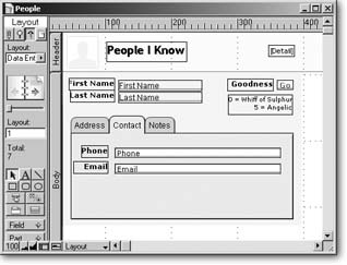
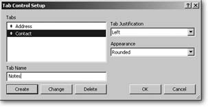
Tip
You can change the tab panels individually if you want to. Click outside the tab panel to deselect it, then click the tab you want to change independently of the others. To reselect the whole panel, use the rubber band technique (Section 4.4.6.2).
Change the tab panels to a lighter gray, using the Fill Color palette.
You can also change the tab panels’ font, font size, style and color if you wish.
Click the Address tab to make it active.
You’re getting ready to move the fields into place on the tab panel.
Select the set of address fields you moved out of the way earlier and drag them onto the Address panel.
Repeat steps 2 and 3 to move the Phone and Email fields to the Contact panel and the Notes field to the Notes panel.
Switch to Browse mode to test your panel.
Click the panels to see how the fields appear and disappear along with their panels.
There’s plenty of room on the Address panel for another set of address fields to hold a separate work address. You can define them now, if you like, and place them on the Address panel. (See Section 3.2 for a step-by-step tutorial on defining new fields.)
All the fields you’ve moved onto the tab panels are now firmly attached to those panels. If you move the panel, all the fields move along with it, so there’s no need for fancy selection techniques. Just drag the panel to your new location, and you’re golden. You can even copy the whole panel and paste it onto another layout. It works just as it did in the original location.
Warning
Tab panels are brand-new in FileMaker 8. Although earlier versions can open .fp8 files, some features, like tab controls, don’t work in those versions. Folks using FileMaker 7 or earlier can’t see your lovely tab panels, for example. Instead, they see a jumble of fields piled on top of one another.
Editing Tab Panels
You can edit a tab panel by double-clicking it to summon the Tab Control Setup dialog box.
Reorder your existing tabs by dragging the little arrow that sits to the left of each tab. All the objects attached to the tab move along with it.
Add a new tab by typing a new name and clicking the Create button. The new tab appears at the end of your list, but you can move it with the arrow. New tabs start out empty, but you can move any fields, buttons, or other objects onto the tab after you click OK.
Change a tab’s name by selecting the tab from the list. Type the new name, then click Change. Objects on the tab are unaffected.
Delete a tab by selecting it from the list, and then clicking Delete. You delete any unlocked objects on the tab at the same time.
As useful as they seem on the surface, tab panels have a few hidden secrets that you can use to your advantage.
If you leave a tab active in Layout mode, that’s the panel that’s always active when you return to that layout. Try it on your People file. In Layout mode, click the Contact tab to make it active. Switch to Browse mode and click the Address tab. Now, if you switch to any other layout, then come back to Data Entry, the Contact tab is always the active one.
Another way to go to a specific tab, without clicking the tab itself, is to make a button with a Go to Field [] action. Make sure the field is on the tab you want to be active. Every time you click the button, the tab that contains the field in your Go To Field [] action comes forward.
You can nest tab panels inside one another for even more space. So long as the new panel sits entirely inside an existing tab, it behaves just like any other object on a panel. It sits there quietly behind the scenes and doesn’t make an appearance until you click its enclosing panel. Then, up the new panel pops, in all its tabbed glory. Download the file People Tab Panels from www.missingmanuals.com/cds/fmakerprotmm/ to see this trick in action.
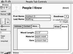
If you make a set of changes and realize you’ve made a mistake, just click the Cancel button. All changes you’ve made to the tab panel since you opened the dialog are swept away, even if you deleted some panels, added some and rearranged the furniture while you were in there. But once you click OK, your changes are written in stone—at least until you revisit the Tab Control Setup dialog box.
Deleting a Tab Panel
If you don’t want a tab panel after all, just select it and choose Edit → Clear or tap Delete. FileMaker warns you that it’s about to delete all unlocked objects on the tab panel as well (Figure 6-38). If that’s the way you want it, click OK. If you need to keep fields or objects on the tab panels, though, click Cancel, then move the keepers off the panel (way to the right of your layout, perhaps) for safekeeping.
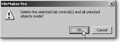
Reports and Summary Fields
A database excels at keeping track of things—itsy bitsy teeny tiny details about hundreds, thousands, even millions of little things. But people aren’t so good at dealing with all that detail (hence the invention of the database). They like to see the big picture. If you want to understand your customer’s music tastes, a report of 200,000 individual CD sales won’t do you much good: The information is in there somewhere, but your feeble mind stands no chance of ferreting it out. But a report that divides that information into 25 music genres, each with sales totals, both in aggregate and by gender, helps you interpret all those reams of data at a glance. In other words, a well-designed report summarizes the data for you. FileMaker’s not only fantastic at showing you information, it also excels at helping you see what it all means.
In Chapter 5, you learned how to create reports that show lists of records, but they don’t include any so-called summary data. They only show the details. To get summary information, you need summary fields.
Summary Fields
In Chapter 3, you learned that a summary field isn’t associated with records like the other field types (Section 3.3). Instead, summary fields gather up and process data from several records. Creating summary fields is much easier than describing what they do, as you can see from the following example.
In the People database, choose File → Define → Database.
You’re about to add a field that counts up the people in your database. This action is one of the commonest ways to summarize database information.
In the Define Database window, choose the Fields tab. Then, in the Field Name box, type Count of People .
A summary field, like any other, has a name. You’re going to use this summary field to count the people in your database.
From the Type pop-up menu, choose Summary, and then click Create.
The Options for Summary Field window appears (Figure 6-39).
Figure 6-39. The Options for Summary Field dialog box appears when you make a new summary field. Unlike the field types you’ve used so far, a summary field has options that must be set for it to be usable, so FileMaker shows you those options right away. This window also shows up if, in the Define Database window, you select a Summary field and click Options.Choose the “Count of” radio button.
A summary field can perform one of seven summary calculations. In this case, you want it to count things.
From the Available Fields list, choose First Name.
A summary field is always based on some other field in the database. For example, this field counts the First Name field. What does that mean? Simple: If a record has something in the First Name field, it gets counted, but if the First Name field is blank, FileMaker skips the entire record. Since every person has a first name, this field counts every record. But beware—if you forget to type somebody’s first name in a new record, that person doesn’t get included in the count.
Click OK.
FileMaker adds the new field to the field list.
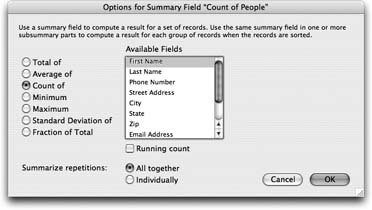
You now have a field that helps you find out how many people are in the database. That piece of information is much more useful than it sounds; you’ll be using it to find out interesting things soon. It would also be nice to be able to summarize the Goodness Rating information. In this case, an average makes sense.
In the Field Name box, type Average of Goodness Rating .
Remember, field names can be about as long as you want.
With Summary selected in the Type pop-up menu, click Create.
The Options for Summary Field dialog box makes its second appearance.
Select the “Average of” radio button.
Since averages only make sense for numbers, FileMaker grays out any non-number fields in the Available Field list. In this example, that leaves only Goodness Rating, which is automatically selected. But if you had date, time or timestamp fields in your file, those would remain available, too, in case you wanted to do some math on them.
Click OK to add the Goodness Rating field, and then OK again to dismiss the Define Database window.
FileMaker returns you to your database window.
If you squeeze these two fields onto the detail layout and have a look in Browse mode, you see something altogether unimpressive: the total number of people in the database (the status area already tells you this information) and their average goodness rating (OK, this number is mildly impressive). If you don’t believe it, have a look at Figure 6-40.
Creating a Summary Report
This section began by talking about how useful it can be to summarize your data. It specifically mentions a report that shows sales by Zip code and genre for a music retailer. When you hear something like that, you’re sure to think that a Summary field should have some kind of a “by what” option. In other words, how do you tell that Total Sales field to summarize by Zip code? You don’t. There’s no such choice in the Options for Summary Field dialog box.
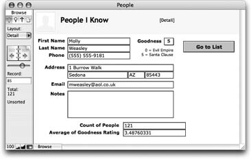
A Summary field is, by nature, abstract. You tell it which field to summarize, and that’s about it. You might have one that counts people, another that totals orders, and a third that shows the standard deviation of the Height field.
The way to tell reports how to summarize your data is to design your layouts to produce the specific groupings you want. For example, you can make that Total Orders field display totals per customer on one layout, per product on another, and per month on a third. This field gives you tremendous flexibility when asking your database questions, without the need to define different fields for the totals on each different report. You can even make a new layout that slices your data a brand-new way without ever revisiting the Define Database window. Once you understand this process, defining summary fields is easy. You usually need just a handful at most.
To help you understand how to tailor a layout to a report’s best advantage, how about adding a new report to the People database that uses the new summary fields? Start by opening the database and switching to Layout mode.
Choose Layouts → New Layout/Report.
The now-familiar New Layout/Report window returns.
In the Layout Name box, type Summary Report, and then, in the “Select a layout type” list, choose Blank Layout.
You’re going to build this layout by hand.
Click Finish.
FileMaker creates its basic blank layout: empty header; empty body; empty footer.
First things first: This layout is a report, and as such it’s going to be printed. A lot. In this case, it makes sense to fix page margins so the printed output looks as nice as possible.
Choose Layouts → Layout Setup. In the dialog box that opens, click the Printing tab.
This panel should look familiar, if you’ve read Section 6.4.
Turn on “Use fixed page margins.”
If you leave this option off, FileMaker automatically prints things as close to the edge of the page as your printer allows. When on, you get to edit the four margin boxes (Top, Bottom, Left, Right).
In each of the boxes for Top, Bottom, Left, and Right, enter 1, and then click OK.
Back in Layout mode, you may notice that the page break lines have moved to reflect the printable area considering the new margins.
Choose File → Print Setup (Windows) or File → Page Setup (Mac OS X) and make sure the paper size is correct and the orientation is set to the normal portrait .
The page break lines may move once again to show the new size and shape of the paper.
Since your layout now has fixed margins, you might want to see them in Layout mode so you have a feel for how things fit on the page. Just choose View → Page Margins.
Note
Showing page margins in Layout mode is not a substitute for Preview mode. FileMaker doesn’t attempt to show the page at the proper size. Instead, the margins in Layout mode help you get a feel for the space around your layout objects on the printed page. For example, without them, you might avoid putting text at the very top of the layout. But the margins remind you that this text will actually sit an inch below the top of the page. You can switch to Preview mode at any time for a more accurate look.
Now it’s time to design the body part.
Add a new field to the layout by dragging the field tool into the body part.
FileMaker instantly asks you which field you want.
Select the First Name field in the Specify Field list, and then click OK.
The First Name field is now on the layout, although it may not be formatted properly. You’re going to format it, and then use it as the basis for the rest of the fields in this layout—a great timesaving trick.
Change the field’s font to Verdana 10 point regular. Make sure the field content aligns to the left (Format → Align Text → Left).
The field now looks something like those in Figure 6-41. Now that the field is properly formatted you can copy it to produce the other needed fields.
While pressing the Alt (Option) key, drag the First Name field to the right a few inches.
When you Alt-drag (or, on the Mac, Option-drag), FileMaker makes a copy of whatever you’re dragging. See Section 4.4.9.4 for more cool dragging tricks.
Double-click the new copy of the First Name field. When the Specify Field window returns, choose the Last Name field from the list, and then click OK.
You now have a First Name field and a Last Name field on the layout.
Repeat steps 4 and 5 six times to add these fields: Phone Number, Email Address, Street Address, City, State, Zip
You now have eight fields on the layout.
Arrange the fields in the body part to match Figure 6-41 .
Figure 6-41. The fields on your new layout should be arranged something like this. You’ll add titles, page numbers, decorations, and so forth shortly. You also need to resize the parts and work your new summary fields in there somewhere.If you stop and view this layout in Browse mode now, it looks sparse, but the data’s there. You may notice, though, that the address portion is “spaced out” in an unpleasant way. You can fix this problem with sliding. (And if you don’t remember what sliding is, see Section 6.9.3.)
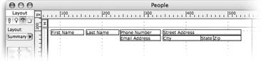
In Layout mode, select these fields: First Name, Last Name, City, State, and Zip.
Remember to press Shift as you click to select more than one item. All these fields need to slide to the left.
Choose Format → Sliding/Printing, turn on “Sliding left,” and then click OK.
Again, sliding only affects Preview mode and printing, so you don’t see any change in Layout mode.
Next, you can add the summary fields to the layout. Since they summarize data, they really don’t belong in the body part, which repeats for every record on every printed page.
Is there any way I can tell which items have sliding turned on?
Yep. Choose View → Show → Sliding Objects. Every object that is set to slide gains a small black arrow pointing in the sliding direction. In this picture, you can see the arrows clearly on several fields, indicating that those fields slide left.
If that way’s not your bag, there’s another way. When you choose Format → Sliding/Printing, the Set Sliding/Printing window first appears with the settings that match the currently selected object. You can therefore find out how an object slides by selecting it and then choosing Format → Sliding/Printing.
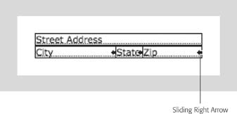
Adding a Summary Part
You need to show them only once—probably after all the data. There’s a part type that does exactly this: Trailing Grand Summary. When you start with a brand-new layout, it has a body, a header, and a footer, but it doesn’t automatically have any summary parts. You have to add them yourself:
Choose Insert → Part. When the Part Definition dialog box appears, select Trailing Grand Summary, and then click OK.
FileMaker adds a trailing grand summary part to your layout, between the body and the footer.
Add the two summary fields to the new part, along with meaningful labels.
Refer back to Section 4.4.4.4 for instructions.
Next up, you need to reduce the size of the body part so it shows a slim row, add a title and any lines you feel would look nice, and add a page number in the footer. You might also use separate title header and header parts so you can put a smaller header on every page after the first. You can see one way to format this report in Figure 6-42.
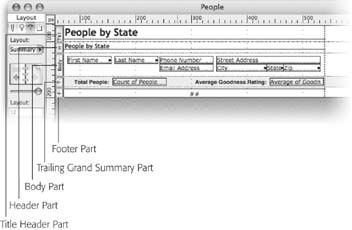
Other Summary Field Types
The Options for Summary Field dialog box has several choices. The first decision you need to make when defining a summary field is which radio button to turn on. Here’s what each choice does:
Total of
Use the "Total of” option to sum (add) number fields. For instance, you can make a summary field that shows total sales by turning on "Total of” and, in your Orders database, selecting the Order Amount field.
When you have this option selected, a “Running total” checkbox appears below the Available Fields list. When you use a summary field on one of those magical layouts (like the one you create on Section 6.9.4.7) that produces grouping—total sales by Zip code, total sales by state, and so on—you normally see just the totals for each group in the report. If you turn on “Running total,” FileMaker changes things slightly. Instead of individual totals for each group, the totals add up from group to group. Figure 6-43 shows just such a report.
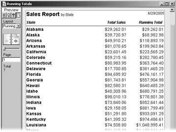
Average of
Obviously, the "Average of” choice calculates the average of the values in a number field. This time, you see a “Weighted average” checkbox. When you turn it on, another field list appears (see Figure 6-44). From this list, you choose the field by which to weight your average.
You would use a weighted average when the things you are averaging have an associated quantity. For example, suppose your database has a record for each product sale. It records which product was sold, how many were sold, and the unit price. If you want a summary field that calculates the average sale price, you probably want to turn on the “Weighted average” checkbox. Imagine you have these sales figures:
You sold three laptop computers for $2,500 each.
You sold 18 more laptops for $2,200 each.
You sold a single laptop for $2,800.
If you use a simple average, FileMaker tells you the average sale price for laptops is $2,500 ($2,500 + $2,800 + $2,200, divided by three). But that’s not exactly right. You sold 18 of those laptops at just $2,200 each, but it only counts once in the calculation. In fact, you really sold 22 laptops in all, at three different price points. To calculate the correct average, you need to take quantities into consideration. In FileMaker, turn on the “Weighted average” checkbox and choose the Quantity field in the “Weighted by” list. Now it reports the correct average: $2,268.18.
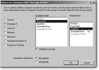
Count of
Choose "Count of” to count items without totaling them. Since this option doesn’t involve actual math, you can pick any field type, not just numbers. FileMaker counts each record in which that field isn’t empty. If it’s empty, it simply doesn’t contribute to the count. Choose a field that is never empty if you want to be sure you count every record. You can use this property to your advantage, though. If you wanted your count to reflect just the records that are flagged, count the Flag field instead. This option gives you a “Running count” checkbox. It works like “Running total” (Section 6.9.4.2), but has an option that running total doesn’t offer.
Say you want to know how many contacts in your People database live in each city. In your counting summary field, choose the “Restart summary for each sorted group” option. A new list of your fields appears, letting you determine how you want the restarted count to behave. Since it’s the city you care about, choose the city field from the list that appears on the right. To see the restarted count in action, sort your list by city (Figure 6-45).
Minimum and Maximum
If you want to know the smallest or the largest value in a group, use Minimum or Maximum. Both are very simple: Just pick the number field you want to look at. No checkboxes, no extra lists. You might use these to see the largest goodness rating in your database, or the price of the least expensive product.
Standard Deviation of
If you’re into statistics, use "Standard Deviation of.” It gives you a field that calculates its namesake for the selected number field. It also has a “by population” checkbox, which is a little oddly named (it probably should be called “of population”). Turn this checkbox on if your records represent the entire population in your particular domain, and FileMaker uses the formula for the standard deviation of a population. Turn it off to calculate the standard deviation of a sample.
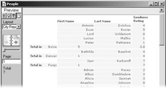
Fraction of Total
Fraction of Total is the most complex summary option. It looks at the total for the group you’re summarizing, as well as the total for the entire database. It then reports what portion of the overall total the group represents, as a decimal number. If all your sales were in California, it would show 1. If California only accounted for 5 percent of your sales, on the other hand, it would say .05.
The “Subtotaled” checkbox that comes along with this option is also a little confusing. When you turn it on, FileMaker lets you pick another field from a list called “When sorted by.” The name of this list serves to inform you that you must sort the record by the selected field for this summary field to work. If you don’t sort the records yourself before you view the report, the field stays empty.
Note
That problem’s not as big as it might seem at first. As you’ll see on Section 6.9.5.1, you have to sort records to do a lot of things with summary fields.
FileMaker looks at the selected field, figures out which records have the same value in them as in the current record, and calculates the fraction based only on the total of those records. Figure 6-46 illustrates this concept.
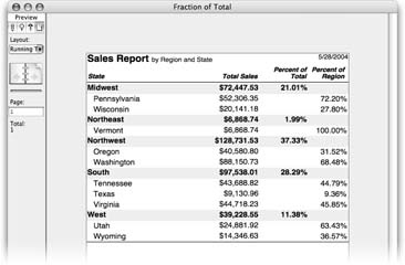
Summarizing repetitions
When you summarize a repeating field (Section 3.3.4.2), you have another choice to make. Do you want one summary value that aggregates every repetition, producing a single value? If so, choose “All together.” If you want a repeating summary value that aggregates each repetition individually instead, choose Individually.
Note
If you have sharp eyes, you notice that the “Summarize repetitions” radio buttons are available all the time, although they don’t do anything unless you’ve selected a repeating field. Don’t waste your time clicking them unless you’re working with a repeating field. Just one of those FileMaker mysteries for the cocktail-party circuit.
Sub-Summary Reporting
The report you just created is nice, but it could be even nicer (imagine that). Wouldn’t it be fantastic to know how many people in your database live in each state? The average goodness rating per state would be pretty telling as well. Since there are 50 possible states and two summaries, you need 100 summary fields, right? Nope: Here’s where summary fields really start to shine. Since your new needs still involve just counting and averaging, you already have all the fields you need.
All you really need to do is sub-summarize your existing data by state. This process just involves adding a new part to your layout; a sub-summary part. You tell this part to use the State field, and any summary fields you put in it automatically operates on the correct subset of records.
Sub-summary parts
A sub-summary part shows summary information about a subset of the records in the found set. When you add a sub-summary part to a report, it acts like a cross between a trailing (or leading) grand summary and a body part. It doesn’t repeat for every record, but it does repeat: It shows once for each group of records.
You can actually put two sub-summary parts associated with the same field on a layout at the same time, as long as one’s set to print above the records and the other below.
You can also put several sub-summary parts on the same layout with each associated with a different field. This way you can create nested sub-groupings, each with their own summarization data. When you create them, you need to be extra careful with the sort order. For sub-summary parts that print above the records, you should sort the fields in the order of the sub-summary parts themselves. If your sub-summary parts are below the records, you should sort first by the field associated with the bottommost part, and then by the next one up, and so on.
If you don’t include a field in the sort order, FileMaker simply excludes the sub-summary part(s) for that field from the report. In this way, you can have a single layout that reports on data with different groupings based only on the sort order.
In the left window shown here, the records are sorted by state. In the right window, though, they’re sorted first by city, then by state. Even though each window shows the same layout, you see very different results.
You can even make a layout with sub-summary parts, but no body part. A layout set up like this just shows group summaries, without individual record details. For example, if you remove the body part from the report you just made, you see the people count and goodness rating for each state in a simple list, but you don’t see individual people.

Sub-summary parts are unique in two ways. First, they only show up in Preview mode. You never see a sub-summary part in Browse or Find modes. Second, they only show up when the data is sorted by the field they’re associated with.
You tell a sub-summary part how to group records by associating it with a single field in your database. The part shows up once for each unique value in that field (you get to decide if it comes before or after the records in its group). But the magic doesn’t stop there. If you put summary fields in a sub-summary part, the fields automatically summarize just the records in the associated group. In other words, you can put the same fields in different parts to see different results.
In the People database, for instance, you could add a sub-summary part to this report based on the State field and set to appear above the summarized records. The result would look something like Figure 6-47.
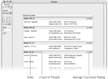
Creating a sub-summary part
Adding sub-summary parts to your layout is a breeze, since you already know how to create summary parts (Section 6.9.3).
In Layout mode, choose Insert → Part. Then, in the Part Definition dialog box, select “Sub-Summary when sorted by.”
Now you can access the list of fields on the right side of this window. This is where you tell FileMaker which field you’ll be summarizing by.
Scroll down to State in the field list and click it.
You’ve just told FileMaker to use the State field to group records.
Click OK.
FileMaker asks if you want to print the part above or below the records it summarizes.
To get the result shown in Figure 6-47, click Print Above.
A new sub-summary part appears between the header and body.
Add the State, Count of People, and Average of Goodness Rating fields to the new part.
You can also decorate this part any way you see fit, using any of the methods described on Section 4.4.5.3.
To see the results of your labors, sort the records by the State field and switch to Preview mode.