
Since early in its life, Flash has proven itself the leader in web animation. In recent years, that dominance has nudged into the realm of online applications as well. For user-facing applications, you need user interface (UI) elements, plain and simple—something to receive input from the person viewing your content or display information in a specific way, such as in a grid or selection box. Sure, you've already seen how button symbols work, and you're aware that input text fields accept hand-typed content. Those make a good start, but they're also nothing more than the tip of the iceberg.
The UI components that ship with Flash CS4 are an improvement over the previous set, which shipped with Flash 8, in a number of ways: size (much smaller), performance (faster and better), and ease of customization.
Note
As a bonus, Flash CS4 even gives you the previous set, known as the v2 components, but those only work with ActionScript 2.0. That's an important point! They're for publishing older movies if you find that necessary. Choosing the Flash document type or changing your publish settings between ActionScript 3.0 and 2.0 automatically updates the Components panel to offer the correct set. You cannot mix and match components designed for different versions of ActionScript. If you were to use ActionScript 1.0, you would lose the UI components altogether!
Here's what we'll cover in this chapter:
Using the Flash CS4 UI components
Using ActionScript 3.0 to control components
Changing component skins
The following files are used in this chapter (located in Chapter11/ExerciseFiles_Ch11/Exercise/):
Button02.flaButton04.flaCheckBox.flaColorPicker.flaComboBox.flaDataGrid.flaLabel.flaList.flaNumericStepper.flaProgressBar.flaOnion.jpgRadioButton.flaScrollPane.flaSlider.flaTextArea.flaTextInput.flaTileList.flaMug01.jpg–Mug08.jpgUILoader.fla
The source files are available online from either of the following sites:
http://www.FoundationFlashCS4.comhttp://www.friendsofED.com/download.html?isbn=9781430210931
Anyone familiar with HTML development knows how easy it is to add a check box, radio button, or other form element into a document. These are usually used in "contact us" pages, online surveys, and other application scenarios. Flash components provide you the same set of "widgets," but you also get a whole lot more, including components not possible in a browser alone. A smidgen of ActionScript is required to wire up components, but for the most part, adding them is a drag-and-drop operation.
Out of the box, the Flash UI components are styled in a modest, attractive manner that comfortably fits a broad range of designs. Of course, Flash being what it is—free from the relative constraints of HTML—you may want to customize their appearance, and you can. Designers and developers familiar with Flash 8 might warn you with a shudder that you're in for a barrel of headaches. Tell the old-timers they can breathe easy. Things have improved considerably in Flash CS4.
We'll start our exploration with the Button component and spend a bit more time with it than the others, simply because once you "get it," you get it. To be sure, certain components are more complex than others, and we certainly won't skimp as we visit each one. But if you're a complete newcomer, you may want to read through the "Button component" section first, and then breeze through the other headings until you find components of interest to you.
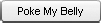
At first glance, the Button component is just another button symbol, but the two shouldn't be confused. As discussed in Chapter 3, button symbols have a specialized timeline, made of Up, Over, Down, and Hit frames. As such, button symbols are very flexible: Over artwork can be made to spill over the button's Up shape, paving the way for quick-and-dirty tooltips and other tricks. Hit artwork can make the button invisible—but still clickable—if it is the only frame with content. In contrast, the Button component has no discernable timeline. It's a self-contained component and is much more conservative (at first glance) than its wild, partying cousin. Figure 11-1 shows an example of the Button component.
Note
Using one or more instances of the Button component in your movie will add 15KB to the SWF if no other components share the load.
What makes the Button component so special? In two words, consistency and toggleability. The first of those, consistency, will be evident in each of the components we visit. If you accept the default skin for every component, you'll get a reliable uniformity among your UI widgets. The second word (OK, toggleability isn't actually a word) means that you get a button that optionally stays pressed after you click it, and releases when you click it a second time. This useful feature is possible without a lick of ActionScript knowledge. Here's how:
Create a new Flash document and open the
Componentspanel (Window
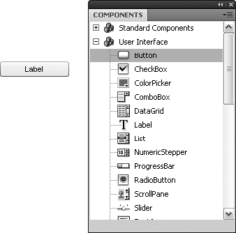
In the
Componentspanel, open theUser Interfacebranch by clicking the+button or double-clicking the wordsUser Interface. The+button becomes a minus, and you'll see the list of available UI components. Drag an instance ofButtonto the stage, as shown in Figure 11-2.Doing this drops a copy of the
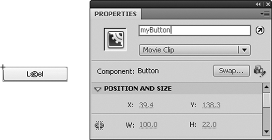
Buttoncomponent and a folder namedComponent Assetsinto your library. You can ignore theComponent Assetsfolder for the time being. Any time you want additional Button instances from this point forward, drag them from your library.To give your button an instance name, click it on the stage, and then type
myButtoninto theInstance Namefield of theProperty inspector, as shown in Figure 11-3.Under normal circumstances, you should make your instance name something more meaningful—say,
btnContactorsubmitForm—but for now,myButtonwill do.If you like, use the
Free Transformtool to change the dimensions of the button. Note that it resizes much like any symbol, but its text label stays the same size.Note
Skewing or rotating the button makes its label disappear because font outlines are not embedded by default. See Chapter 6 for more information about font outlines.
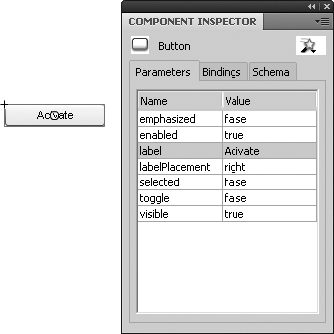
Out of the box, the button's label is the self-descriptive term Label. Let's change that. Open the
Component Inspectorpanel (WindowRename your button's layer from
Layer 1tobutton, and create a new layer. Name the new layerscriptsand lock that layer.Wait a minute! Wasn't this exercise supposed to happen "without a
lickof ActionScript knowledge"? In fact, it does. The configuration of your button—even the toggling part you'll see in step 9—all takes place within theComponent Inspectorpanel. The following code simply demonstrates that the button actually works (for an explanation of what this ActionScript does, see Chapter 4). ActionScript isn't required to get the toggle to do its thing.Click inside frame 1 of the
scriptslayer. Open theActionspanel (WindowmyButton.addEventListener(MouseEvent.CLICK, clickHandler); function clickHandler(evt:MouseEvent):void { trace("By George, I've been clicked!"); }Test your movie (
ControlTo make this button a toggle, return to the
Component Inspectorpanel'sParameterstab and change thetoggleparameter totrue. Test the movie again, if you like, to confirm that the button now stays in when you click it and pops out again when you click it a second time. Compare your work withButton01.flain theCompletefolder for this chapter.
Note
The parameters available in the Parameters tab are also available via ActionScript. They're simply properties of the component's class. For example, instead of using the Component Inspector panel to change the toggle parameter to true, you could have referenced the component's instance name:
myButton.toggle = true;
myButton.addEventListener(MouseEvent.CLICK, clickHandler);
function clickHandler(evt:MouseEvent):void {
  trace("By George, I've been clicked!");
}Note the use of the assignment operator (=), which sets a value, rather than the comparison operator (==), which consults a value. Properties set with ActionScript override parameters set in the Component Inspector panel.
To actually make use of this toggled/untoggled state, you will need to use the BaseButton.selected property of the Button component instance on the stage. Many button-like components, including Button, CheckBox, and RadioButton, inherit from the BaseButton class family tree. This means they support a selected property, just as their ancestor does. The button's instance name lets you access this property easily.
Open the
Button02.flafile in this chapter'sExercisesfolder. This file picks up where we left off in the previous exercise. The only difference is a movieclip containing a PNG image has been added to the library. You're going to make this movieclip draggable, but only when the button is pressed.Create a new layer and name it
mystical dude. Select the new layer and drag an instance of the movieclipdudeto the stage. Give this movieclip the instance nameguru.In the
scriptslayer, select frame 1 and add the following new ActionScript beneath the existing code:guru.addEventListener(MouseEvent.MOUSE_DOWN, dragGuru); function dragGuru(evt:MouseEvent):void { if (myButton.selected == true) { guru.startDrag(); } }; guru.addEventListener(MouseEvent.MOUSE_UP, dropGuru); function dropGuru(evt:MouseEvent):void { guru.stopDrag(); };The key here is the
ifstatement in theMouseEvent.MOUSE_DOWNhandler, which is a custom function nameddragGuru(). Theifevaluates the button'sselectedproperty as described previously. When it's set totrue, dragging commences by way of theMovieClip.startDrag()method, as shown in Figure 11-5; otherwise, dragging is ignored. In theMouseEvent.MOUSE_UPhandler, dragging is stopped.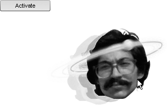
Figure 11.5. Checking the button's selected property allows you to perform actions only when the button is clicked.
Note
To see the full list of events available to the
Buttoncomponent, look up theBaseButtonclass in the ActionScript 3.0 Language and Components Reference. Don't forget to select theShow Inherited Styleshyperlink beneath theEventsheading!For extra credit, let's handle the
MouseEvent.CLICKevent to add a bit of polish. Press the Enter (Return) key a couple times after the existing code and type the following additional ActionScript:myButton.addEventListener(MouseEvent.CLICK, clickHandler); function clickHandler(evt:MouseEvent):void { if (myButton.selected == true) { guru.buttonMode = true; } else { guru.buttonMode = false; } };What's going on? This is nothing more than a third event handler. This one listens for a click, and then triggers a custom function named
clickHandler(). The function uses anifstatement, just as you saw in the previous step, but this time, the evaluation sets theMovieClip.buttonModeproperty of theguruinstance totrueorfalse, depending on the toggled state of the button. When the button is toggled, the mouse cursor turns into a finger pointer as it rolls overguru. When the button is not toggled, the cursor remains in its default state: an arrow.
In the previous code example, the Button component was referenced directly by its instance name in the event handler function. Here's another look, just as a reminder, with the instance name in bold:
function clickHandler(evt:MouseEvent):void {
  if (myButton.selected == true) {
    guru.buttonMode = true;
  } else {
    guru.buttonMode = false;
  }
};
There's another way to get to that button—another way to make that same reference—and it can come in handy when you have numerous instances of a given component on the stage. Why? Because although you could write a separate function to handle events for each component, you might want to consolidate your functions in order to reduce complexity in your code.
First, consider a scenario with three Button components. Their label parameters are set to Apples, Bananas, and Pears in the Component Inspector panel, and their instance names, respectively, are set to btn1, btn2, and btn3 in the Property inspector. If you want to populate a dynamic text field whose instance name is output with the most recently clicked Button's label, you could do it like this:
btn1.addEventListener(MouseEvent.CLICK, clickHandler1);
btn2.addEventListener(MouseEvent.CLICK, clickHandler2);
btn3.addEventListener(MouseEvent.CLICK, clickHandler3);

function clickHandler1(evt:MouseEvent):void {
  output.text = btn1.label;
};
function clickHandler2(evt:MouseEvent):void {
  output.text = btn2.label;
};
function clickHandler3(evt:MouseEvent):void {
output.text = btn3.label;
};So far, nothing new—and ultimately, nothing wrong. The code works, but it could be written in a more compact way. Compare the following abbreviated version:
btn1.addEventListener(MouseEvent.CLICK, clickHandler);
btn2.addEventListener(MouseEvent.CLICK, clickHandler);
btn3.addEventListener(MouseEvent.CLICK, clickHandler);

function clickHandler(evt:MouseEvent):void {
  output.text = evt.target.label;
};
In this case, all three buttons are associated with the same function, clickHandler(), rather than the individualized clickHandler1(), clickHandler2(), and clickHandler3(). So how does the Button referencing work? The individual instance names are no longer part of the picture.
It all hinges on the evt variable between the function's parentheses. That variable, evt, points to an instance of the MouseEvent class—namely, the event triggered (MouseEvent.CLICK) when the user clicks any of the Button components. The click itself is an object. As such, evt features whatever properties and other class members are defined by the MouseEvent class. One of those properties is target (inherited from the Event class), which points to the object that dispatched the event in the first place. Here, the dispatcher is going to be btn1, btn2, or btn3, and the expression evt.target is as good a reference as any of those instance names. Because the expression evt.target points to an instance of the Button class, you can tack label onto the end of it. See the ButtonTarget.fla in this chapter's Complete folder for a working example of the code just discussed.
One final note before we start playing with the look of this component. Unlike normal library assets, UI components add to the weight of your movie whether or not they're used. This is why seasoned Flash developers regard these things in much the same way Dracula regards garlic. The reason for this is that components are set to export for ActionScript. Right-click (Ctrl-click) any component in your library and choose Properties to see for yourself in the Linkage area of the Symbol Properties dialog box.
The first UI component in your movie usually adds the most weight, proportionately speaking, to the SWF. Some components weigh more than others, but all of them rely on a base framework that provides functionality for the whole set. For this reason, your first instance of Button will add 15KB. The second and third instances won't add anything. Your first CheckBox instance, on its own, will add 15KB, and additional CheckBox instances will add nothing. However, if you already have a Button instance in the movie and then add a CheckBox, the combined total of both components is only 16KB.
Note
To remove the weight of these components—in case you change your mind and decide to omit them from your design—delete the component(s) and Component Assets folder from the library.
What you're about to see can be achieved with most of the UI components, not just Button. (Some components have little or no visual element, so there are exceptions.) This is good news, because it means you'll get the basic gist right off the bat.
There are two ways to alter a UI component's appearance:
Skinning, which generally deals with the material substance of the component, such as the shape of the clickable surface of a button or the drag handle of a scrollbar
Styling, which generally deals with text, dressing, and padding
Before Flash CS3, the practice of skinning UI components was an exercise in alchemy. Only the wisest and purest of wizards would trust themselves to toss mysterious ingredients into the frothing cauldron. All of that changed when the components were rewritten for ActionScript 3.0, and the improvement remains intact in Flash CS4. In fact, it couldn't get much easier. Here's how:
Create a new Flash document and drag an instance of the
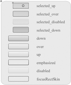
Buttoncomponent to the stage. Double-click the button and you'll see a convenient "buffet table" of the various visual states available to the button, as shown in Figure 11-6.The
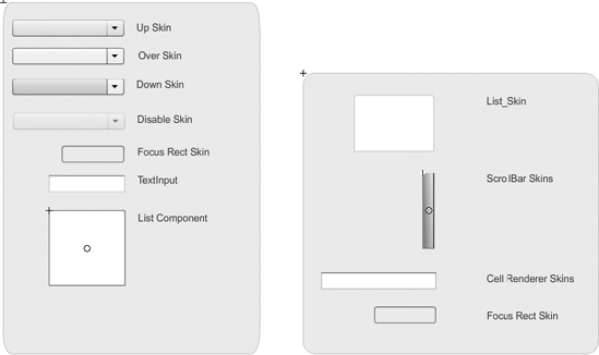
upskin is the button's default appearance. Double-click that, and you'll come to the symbol that represents theupskin for this component, complete with 9-slice scaling, as shown in Figure 11-7. This particular skin happens to be made of three layers.Select an area in one of these layers and change the button's appearance, perhaps like Figure 11-8—but the choice is yours. Make sure that the existing shapes, or any new ones, align to the upper left (0,0) of the symbol's registration point. Adjust the 9-slice guides as necessary. See
Button03.flain this chapter'sCompletefolder for an example with minor changes to theupandoverskins.Select
EditDrag another copy of the
Buttoncomponent from the library to the stage. Test your movie to see that your alteration appears, for both buttons, as the newupskin in the published SWF. Click either button to verify that the remaining skins (for example,down) function as before.


Note
To reskin a component completely, every skin symbol must be edited or replaced.
As you've seen, components are easy enough to customize, even if a complete job takes some effort. You may have noticed an important omission, however, while poking around the skin symbols. Even though the Button component features a text label, none of the skins contains a text field. What if you want a different font in there, or at least a different color? ActionScript to the rescue.
Each component has its own list of styled elements. Many overlap, but you can see the definitive list for each in the class entry for that component. For example, find the Button class entry in the ActionScript 3.0 Language and Components Reference, then browse the Styles heading, as shown in Figure 11-9. Don't forget to click the Show Inherited Styles hyperlink to see the full listing. Remember, the Button class gives you details on the Button component; the SimpleButton class gives you details on button symbols.
Components that include text elements, such as the Button component, support the inherited UIComponent.textFormat style, which lets you make changes to the button's text label. Other button styles include the inherited LabelButton.icon, which lets you specify an optional image for the button in addition to text.

Figure 11.9. UI component styles are listed under the class entry for each component in the documentation.
For this sort of styling, ActionScript allows you to affect the following:
All components in a document
All components of a certain type (for example, all
Buttoncomponents)Individual component instances
Let's see it in action:
Open the
Button04.flafile in the Chapter 11Exercisefolder. You'll see three instances of theButtoncomponent and one of theCheckBoxcomponent, as shown in Figure 11-10. Note that each has its own label.Click once in the first frame of the
scriptslayer. Open theActionspanel and type the following ActionScript into frame 1 of thescriptslayer:import fl.managers.StyleManager; import fl.controls.Button;
var fmt1:TextFormat = new TextFormat();
fmt1.bold = true;
fmt1.color = 0xFF0000;

var fmt2:TextFormat = new TextFormat();
fmt2.bold = false;
fmt2.color = 0x0000FF;

StyleManager.setStyle("textFormat", fmt1);
StyleManager.setComponentStyle(Button, "textFormat", fmt2);
btn2.setStyle("icon", "star");
Test the movie.

You'll notice the following changes:
The check box's label is red and bold.
The buttons' labels are blue and not bold.
The second button contains an icon.
Chapter 6 discusses the TextFormat class in detail, but there are a few twists here that deserve some clarification.
First up are the opening two lines, which use the import statement. We've been sidestepping this one so far because the import statement isn't often necessary in timeline code. In ActionScript 3.0 class files—that is, code written outside Flash altogether—the import statement is not only more prevalent, it's actually required in order let the compiler know which other classes you intend to use. In contrast, Flash takes care of this for you—for the most part—in keyframe scripts. This just happens to be an exception. Without those first two lines, Flash will get confused about what you mean later when you mention StyleManager and Button directly.
Note
These hierarchical class arrangements are called packages. To find the package for other components, so that you can carry the preceding styling knowledge to other scenarios, look up the component's class in the ActionScript 3.0 Language and Components Reference. When you're looking at the component's class entry, you'll see a number of headings immediately beneath the name of the class, including Package, Class, and Inheritance. The Package heading is the one you want. Most components, including Button, belong to the fl.controls package. As an example of the oddball, ScrollPane belongs to the fl.containers package. In keyframe scripts, you only need to import classes outside the flash package, such as fl.managers, fl.controls, fl.containers, and the like.
Two variables, fmt1 and fmt2, are declared and set to instances of the TextFormat class, and each is given its own styling. Here's where it gets interesting. The StyleManager class has two methods you can use to apply styling to components. Both methods are static, which means they're invoked on the class itself, rather than an instance. The first of these, StyleManager.setStyle(), applies formatting to all components. In this case, we're setting the TextFormat style of all components—specifically, all components that have a TextFormat property—to the fmt1 instance of the TextFormat class. We programmed this style to make text red (0xFF0000) and bold, and it is indeed applied to all three buttons and the check box. You can specify any styling you like, and the TextFormat style is common to many components.
"Wait a minute, guys," you may be saying. "Only the check box is red!" This is true. The reason for this is the other method, StyleManager.setComponentStyle(). That one applies styling to all components of a certain type, which explains the fact that it accepts three parameters. Here, we've specified Button, and then set the TextFormat style of all Button instances to fmt2. This overrides the red, bold formatting of fmt1 applied in the previous line. Comment out the second StyleManager line:
StyleManager.setComponentStyle(Button, "textFormat", fmt2);
And now test your movie again to prove it.
A good way to tell which style will take effect is to remember this: the more specific the style—for example, Button components vs. all components—the higher priority it takes. If you holler to everyone in the room (StyleManager.setStyle()), giving instructions to wear green scarves, then everyone will do so. If you holler a second time, telling only the tall people to change their scarves to purple (StyleManager.setComponentStyle()), then only the tall people will comply. The instruction you've given the tall people is more specific—it only applies to people over six feet in height—and because of that, you can rest assured that, given the choice between two sets of instruction, the tall folks will follow the more specific set and wear purple.
This precedence goes a step further: the UIComponent.setStyle() method is invoked directly and specifically on a particular instance of the Button class—in this case, the component whose instance name is btn2. It works just like StyleManager.setStyle() in that it accepts two parameters: the style to change and its new setting. Here, the LabelButton.icon style, which Button inherits, is set to "star", which refers to the linkage class of the star asset in the library. Right-click (Ctrl-click) the star asset and choose Properties to verify this.
And now you've had a quick tour of the lobby and one of the rooms here at the UI Component Hotel. There are other rooms, of course, some more elaborate than others, but the layout for each is basically the same.
You met CheckBox briefly in the "Button component" section, but let's take a closer look. This component is essentially a toggle button with its label on the side. Click the box or its label, and the box gets a check mark, as shown in Figure 11-11. Click again, and the check mark goes away.

The Parameters tab of the Component Inspector panel is fairly light for CheckBox:
label:Sets the text label.labelPlacement:Determines the position of the label (left, right, top, or bottom).selected:Lets you display an instance with the check mark showing by default.
Double-click any CheckBox instance to change the skinning for all. Styling works as described in the "Button component" section.
Note
Using one or more instances of the CheckBox component in your movie will add 15 KB to the SWF if no other components share the load.
Let's take a look at how to interact with check boxes via ActionScript:
Open the
CheckBox.flafile in this chapter'sExercisefolder. Note that eachCheckBoxinstance has its own label and instance name.Open the
Actionspanel and enter the following ActionScript into frame 1 of thescriptslayer:addEventListener(Event.CHANGE, changeHandler); function changeHandler(evt:Event):void { var str:String = ""; if (cb1.selected == true) { str += cb1.label + " "; }if (cb2.selected == true) { str += cb2.label + " "; } if (cb3.selected == true) { str += cb3.label; } output.text = str; }This assigns an event handler to the main timeline, listening for
Event.CHANGEevents. This event handler could have been attached to eachCheckBoxinstance individually, but by doing it this way, the events of all three can be handled at the same time. When any of the threeCheckBoxinstances is changed by clicking, each member of the group is checked in turn—via theCheckBox.selectedproperty—to see if it is selected. If so, the value of its label is added to a string that is ultimately assigned to theTextfield.textproperty of a text field beneath them.Save and test the movie. Click a number of boxes and see how the code adds the associated text.
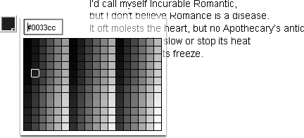
ColorPicker is a fun component, because nothing like it exists in the realm of HTML—at least, not without a swarm of complicated JavaScript! But of course, color pickers are common in applications like Microsoft Word, Adobe Photoshop, and even Flash itself. In a nutshell, the ColorPicker component is a clickable color chip that reveals an assortment of colors when selected, as shown in Figure 11-12. It allows the user to choose one of the presented colors or optionally to type in a hexadecimal value, and then the chosen color is available for use.
Note
Using one or more instances of the ColorPicker component in your movie will add 19KB to the SWF if no other components share the load.
Double-clicking a ColorPicker instance inside the authoring environment makes its skins editable, and styling works the same as it does for the Button component. The palette of colors displayed by this component is also editable, but requires just a bit of ActionScript, as shown in the following example.
Open the
ColorPicker.flafile in this chapter'sExercisefolder and note that the component itself has the instance namecp. The dynamic text field next to it has the instance namepoem.Click into frame 1 of the
scriptslayer and open theActionspanel. You will see the following ActionScript:var fmt:TextFormat = new TextFormat(); cp.addEventListener(Event.CHANGE, changeHandler); function changeHandler(evt:Event):void { fmt.color = cp.selectedColor; poem.setTextFormat(fmt); };Here, a variable,
fmt, is declared and set to an instance of theTextFormatclass. AnEvent.CHANGEevent listener is assigned to theColorPickerinstance,cp. This event listener does two things. First, it sets theTextFormat.colorproperty of thefmtinstance to the selected color of thecpinstance (see Chapter 6 for more information about theTextFormatclass). Second, it applies that format to the text field with the instance namepoem.Let's determine which colors to display. Update the existing ActionScript to look like this (new code in bold):
var fmt:TextFormat = new TextFormat();
cp.colors = new Array(0x6E1E46,0xA12F1C,0xD47565,0x557A40,0x79A11C);cp.selectedColor = cp.colors[0];cp.addEventListener(Event.CHANGE, changeHandler); function changeHandler(evt:Event):void { fmt.color = cp.selectedColor; poem.setTextFormat(fmt); };Specifying your own color palette couldn't be easier. Just provide the desired hexadecimal values—up to 1,024 individual colors—as array elements to the
ColorPicker.colorsproperty of your component instance (note the0xprefix for each color that indicates the hexadecimal format). If you specify your own colors, as shown, the default palette is replaced altogether, and your chosen colors run left to right, wrapping if necessary, as seen for the default colors in Figure 11-12. To see the color chip display color, set theColorPicker.selectedColorproperty. (Here, it's set to the first element in thecolorsarray.)Drag the
ColorPickerinstance to the lower-right corner of the stage.Test the movie to see that the pop-up color palette is smart enough to position itself to the upper left of the color chip.
Note that in the Parameters tab of the Component Inspector panel, the color palette's text field can be hidden by setting the showTextField parameter to false. You'll also see that you can set the component's selectedColor property as a parameter.
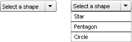
The ComboBox component is very like the <select> element in HTML, except that it doesn't have the <select> element's optional size and multiple attributes. ComboBox gives users the ability to make one selection at a time from a drop-down list, as shown in Figure 11-13. In addition, the component can be made editable, which lets the user manually type in a custom selection.
ComboBox skinning is a little more complicated than Button skinning, but the basic approach is the same. The complexity stems from the fact that the ComboBox combines two other components: List and TextInput (which are described later in this chapter).
Adding a ComboBox instance to your movie puts three components into your library—ComboBox, List, and TextInput—plus the Component Assets folder used by all UI components. Double-clicking a ComboBox instance in the authoring environment opens the first tier of skins (see the left image in Figure 11-14). Double-clicking the List element in this tier opens the skins for the embedded List component (the right image in Figure 11-14).
Note
Using one or more instances of the ComboBox component in your movie will add 35KB to the SWF if no other components, other than the automatically included List and TextInput, share the load.
In turn, the skins for List include a third tier for scrollbars. In spite of this nesting, individual skins are nothing more than symbols, usually with 9-slice guides, such as the up and over skins for the Button component. Styling works the same as it does for the Button component.
Let's experiment with ComboBox:
Open the
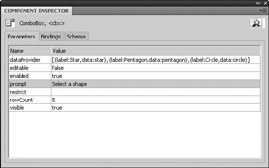
ComboBox.flafile in this chapter'sExercisefolder and select theComboBoxinstance on the stage. Note that in theParameterstab of theComponent Inspectorpanel, some information has already been entered into thedataProviderparameter, as shown in Figure 11-15. This is an array of objects, each of which represents the visible portion of a drop-down choice (label) and the hidden value each label contains (data).Double-click the right column of the
dataProviderrow to open theValuesdialog box, as shown in Figure 11-16.Click the
+button at the top left of theValuesdialog box to create a new entry, which will appear below the existingCircleentry.Double-click the right column of the
labelrow and change the existing stand-in label toSquare. Double-click the right column of thedatarow and enter the valueSquare. Pay attention to the capitalization. ClickOKto close theValuesdialog box.Test your movie to verify that the combo box now includes a
Squarechoice that changes the shape to its right.How does this work? Let's take a look. The
shapessymbol in the library contains a series of shapes drawn every few frames of its own timeline. Frame labels are provided for each shape, and it is these frame labels that are represented by thedatarow in theValuesdialog box.Click into frame 1 of the
scriptslayer to see the ActionScript that pulls this off:cbx.addEventListener(Event.CHANGE, changeHandler); function changeHandler(evt:Event):void { shapes.gotoAndStop(cbx.selectedItem.data); };The
ComboBoxinstance is referenced by its instance name,cbx. AnEvent.CHANGEevent triggers a custom function,changeHandler(), that tells theshapesinstance—a movieclip—to stop at a particular frame label. The frame label is determined by thedataproperty of theComboBoxcomponent's currently selected item. How? This is accomplished by way of theComboBox.selectedItemproperty, which features thelabelanddataparameters supplied in theComponent Inspectorpanel.To populate the
ComboBoxcomponent by way of ActionScript, add the following line before or after the existing code:cbx.addItem({label:"Triangle", data:"triangle"});

This is pretty straightforward! The other parameters in the Parameters tab are just as intuitive:
editable:Determines whether the user can type in a custom selection (if so, check for this value by referencing theComboBox's instance name, and then thetextproperty)prompt:Determines the default text (in this example, the phrase "Select a shape")rowCount:Determines how many selections to show in the drop-down list (if there are 15 selections and the value ofrowCountis5, only five will show, but the rest will be available with a scrollbar).
The DataGrid component is the most complex component in the UI arsenal. Its purpose falls almost entirely in the realm of ubergeek interface programmers, but we're going to give you a cursory look, including a basic sample file. In short, the DataGrid component gives you a spreadsheet-like, sortable display for tabular data, as shown in Figure 11-17.

Note
Using one or more instances of the DataGrid component in your movie will add 40KB to the SWF if no other components share the load.
Open the DataGrid.fla file in this chapter's Exercise folder for a working demonstration. Click into frame 1 of the scripts layer to see the ActionScript. Here's a bird's-eye view of that code:
dg.addColumn("num");
dg.addColumn("eng");
dg.addColumn("ger");
dg.addColumn("fre");
These first lines reference the DataGrid component's instance name, dg, and instruct the component to add four columns. These column names are arbitrary and, here, represent a column for numbers, and then their English, German, and French equivalents.
dg.addItem({num:1, eng:"one", fre:"un", ger:"eins"});
dg.addItem({num:2, eng:"two", fre:"deux", ger:"zwei"});
dg.addItem({num:3, eng:"three", fre:"trois", ger:"drei"});
dg.addItem({num:4, eng:"four", fre:"quatre", ger:"vier"});
dg.addItem({num:5, eng:"five", fre:"cinq", ger:"fünf"});
dg.addItem({num:6, eng:"six", fre:"six", ger:"sechs"});
dg.addItem({num:7, eng:"seven", fre:"sept", ger:"sieben"});
dg.addItem({num:8, eng:"eight", fre:"huit", ger:"acht"});
dg.addItem({num:9, eng:"nine", fre:"neuf", ger:"neun"});
dg.addItem({num:10, eng:"ten", fre:"dix", ger:"zehn"});
You cannot populate the DataGrid from the Parameters tab of the Component Inspector panel, and we're sure you can see why. It's much easier to type in the data in the relatively spacious environs of the Actions panel. Here's how to give each column a name:
dg.getColumnAt(0).headerText = "Numeric";
dg.getColumnAt(1).headerText = "English";
dg.getColumnAt(2).headerText = "German";
dg.getColumnAt(3).headerText = "French";
These lines make the header text a bit more "friendly" to the eye.
Test the movie to see how it all comes together. Click the headers to sort each column. When you sort the Numeric column, you'll see something odd. By default, sorting is alphabetical, which puts the numbers 1 and 10 right next to each other. To fix that for columns that contain numerical data, remove the comment (//) from the final line of ActionScript, so that it looks like this:
dg.getColumnAt(0).sortOptions = Array.NUMERIC;
Note
What about retrieving which cell has been selected? The selectedItem property for the DataGrid component returns the contents of the whole row you click, not just the clicked cell. It is possible to return the selected cell, but it requires something called the CellRenderer class and more Action-Script, and frankly, it rockets way out the atmosphere that makes this book breathable.
Label is something of an oddball in the UI components collection. Unless you're an avid programmer, we're almost certain you'll want to forego Label in favor of a simple dynamic text field (covered in Chapter 6). Why? Practically speaking, from a designer's point of view, Label doesn't really do anything that can't be accomplished with a dynamic text field—and besides, by using a text field, you'll save the 14KB that an instance of label would have brought to the table.
Labels don't really have skins, and double-clicking an instance will tell you as much. Styling works the same as for Button, but again, trust us on this one . . . just use a dynamic text field. If you still want to see a Label component in action, check out Label.fla in the Exercise folder.
The List component is akin to the <select> element in HTML when its optional size and multiple attributes are specified. This component is basically a ComboBox component without the drop-down aspect—it's always dropped down—and it allows multiple selections, as shown in Figure 11-18.
Like ComboBox, the List component has nested skins, so when you double-click an instance in the authoring environment, the skins become available for editing in tiers. Styling is handled the same way as described in the "Button component" section.
Note
Using one or more instances of the List component in your movie will add 29KB to the SWF if no other components share the load.
The Parameters tab in the Component Inspector panel is relatively hefty for the List component, as shown in Figure 11-19. Most of the choices pertain to scrolling (the distance to scroll horizontally and vertically, whether scrolling should be automatic or constant, and so on). The important parameters are allowMultipleSelection and dataProvider.

To populate your user's choices in a given List instance, double-click the right column of the dataProvider row and use the Values dialog box, as described in the "ComboBox component" section. Setting showMultipleSelection to true (the default is false) lets your users hold down Ctrl (Cmd) while they click in order to select more than one of the listed choices (this is like the multiple attribute in HTML).
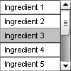
To see how List works, open the List.fla file in this chapter's Exercise folder. Note that the instance name for the List instance is List, which works only because ActionScript is a case-sensitive language—you couldn't call it List, because that's the name of the class that defines this object. In your own work, you'll want to use an instance name that describes the list's use (in this case, that might be the word ingredients). Note that the dynamic text field, next to the List instance, has the instance name output.
Click into frame 1 of the scripts layer and type the following ActionScript:
list.addEventListener(Event.CHANGE, changeHandler);
function changeHandler(evt:Event):void {
  var str:String = "The secret ingredient(s): ";
  for (var i:uint = 0; i < list.selectedItems.length; i++) {
    str += list.selectedItems[i].data;
    if (i < list.selectedItems.length - 1) {
      str += ", ";
    } else {
      str += ".";
    }
  }
  output.text = str;
};
This one may look more complicated than it actually is, so let's break it down. As always, we're using addEventListener() to associate a custom function with an event. In this case, the event is Event.CHANGE, and the function, named changeHandler(), does three things.
First, the variable
strholds the phrase"The secret ingredient(s): ".var str:String = "The secret ingredient(s): ";
Next, a
forloop repeats a particular set of actions. The duration of the loop depends on the number of selected items, based on theArray.lengthproperty of theArray.lengthproperty of theListcomponent. The variableistarts at zero and increments at each "lap" around the loop, so that this line:str += list.selectedItems[i].data;
refers to the first selected item (item 0) on the first lap, and then the second selected item (item 1) on the second lap, and so on. There's a
.datatacked onto the end becauseListitems are made up of two parts:labelanddata, which are—bingo!—the elements that make up thedataProviderparameter described previously. Anifstatement adds a comma between items in the middle and a period after the item at the end.Finally, the
strvariable, which has continuously been updated by this process, is set to theTextfield.textproperty of theoutputinstance.
The net result is that List selections populate a dynamic text field with the ingredients of Kraft Cucumber Ranch dressing.
For extra credit, add the following line after the existing ActionScript:
list.addItem({label:"Ingredient 11", data:"natural flavor"});This shows that it's also possible to populate a List instance programmatically.
NumericStepper is a compact little gadget that lets the user specify a numeric value, either by typing it in or by clicking up and down arrow buttons, as shown in Figure 11-20. You, as a designer, can specify your own desired minimum and maximum values, as well as the size of each increment (count by ones, by twos, by tens, and so on). These values can be set via the Parameters tab of the Component Inspector panel.
NumericStepper's skins can be edited by double-clicking an instance, and styling can be applied as described in the "Button component" section. This component carries with it the TextInput component, so you'll see both in your library if you add NumericStepper to your movie.
Note
Using one or more instances of the NumericStepper component in your movie will add 18KB to the SWF if no other components (other than the automatically included TextInput) share the load.
Let's play with the NumericStepper component:
Open the
NumericStepper.flafile in the Chapter 11Exercisefolder. Note that theNumericStepperinstance has the instance namensand that thethermometermovieclip has the instance namethermometer.Double-click that movieclip to enter its timeline, and you'll see a red rectangle (masked by a green shape) with the instance name
mercury, as shown in Figure 11-21. You're going to set the height of this nested movieclip based on the value of theNumericStepper.Select
EditClick into frame 1 of the
scriptslayer and type the following ActionScript:ns.addEventListener(Event.CHANGE, changeHandler); function changeHandler(evt:Event):void { thermometer.mercury.height = ns.value; };Test your movie. Click the up and down arrow buttons to see the component in action. Close the SWF when you are finished experimenting.
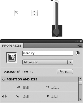
The MovieClip.height property of mercury is set to the value of NumericStepper.value, as referenced in terms of the ns instance. The mercury movieclip is nested inside thermometer, which explains the matching hierarchical reference thermometer.mercury.
Used often for preloading, the ProgressBar component gives you a rising thermometer-style animation to display load progress when loading files of known size, and a barber-pole–style animation to indicate that the user must wait (for example, for files of unknown size to load or for processes to finish). Figure 11-22 shows an example.
This component doesn't have a whole lot to skin, but you can access what's there by double-clicking a ProgressBar instance. Styling works as it does for the Button component, but ProgressBar doesn't even have text, so your styling choices are fairly slim. (Yes, Figure 11-22 shows text, but that's an example of a separate Label component.)
Figure 11.22. The ProgressBar component indicates load progress (top), and also presents a "waiting" animation (bottom).
Note
Using one or more instances of the ProgressBar component in your movie will add 16KB to the SWF if no other components share the load. That means 16KB of non-preloadable content (the preloader itself!), so don't put much else into the frame that contains the ProgressBar component.
Here's an exercise designed to show you how the ProgressBar component works:
Open the
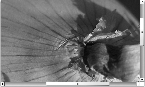
ProgressBar.flafile in this chapter'sExercisefolder. Note that aProgressBarinstance exists in frame 1 with the instance namepb, as well as a text field with the instance nameoutput. In frame 5, you'll find a fairly heavy image of a homegrown onion, snapped years ago by one of the authors. In thescriptslayer, there's aMovieClip.stop()method in frames 1 and 5.Click into frame 1 of the
scriptslayer. Note the existingstop()method. Type the following ActionScript after that method (new code in bold):stop();
root.loaderInfo.addEventListener(Event.COMPLETE,
completeHandler);function completeHandler(evt:Event):void {play();};pb.source = root.loaderInfo;Here, first, the playhead stops at this frame. Next, an
Event.COMPLETEhandler is assigned to theLoaderInfoinstance associated with therootproperty of the main timeline. Say again? Yeah, this one is a bit different from what you've seen.In the same way that the
stop()method is invoked here on the main timeline—appearing, as it does, without an object reference prefix—therootproperty is also being invoked implicitly on the main timeline. (rootis a property of theDisplayObjectclass, which meansMovieClipand other classes have it by inheritance.) Therootproperty refers to the topmost display object in a given display list. In this context, it essentially refers to the display list of the main timeline (everything that's visible—or will be visible—on the main timeline, including that onion photo on frame 5).The main timeline, being a movieclip, features a
LoaderInfoproperty, which points to an instance of theLoaderInfoclass that (as its name suggests) manages loading information for the object at hand. In this case, when the movie itself has completed loading, theEvent.COMPLETEevent is dispatched, and thecompleteHandler()function invokesMovieClip.play()on the main timeline, causing the playhead to resume play until it encounters the secondstop()method on frame 5. It's frame 5 that reveals the onion.Notice that, so far, none of this yet touches the
ProgressBarcomponent. That happens only at this point. Immediately after the event handler, theProgressBar.sourceproperty, by way of thepbinstance, is associated withroot.loaderInforeference. As if by magic, that's all it takes to set the thermometer-style movement in motion.Test the movie. When the SWF launches, select
ViewClose the SWF.
Let's also display a text message indicating a percent loaded. In the
Actionspanel, add a few more lines below the existing code:pb.addEventListener(ProgressEvent.PROGRESS,
progressHandler); function progressHandler (evt:ProgressEvent):void { output.text = Math.floor(pb.percentComplete).toString() + "%"; };
The ProgressBar component features a percentComplete property, which we're using here. The add EventListener() method is invoked against the pb instance, listening for a ProgressEvent.PROGRESS event. The function it performs sets the output text field's text property to a rounded-down string version of the progress percentage, with the percent sign tacked onto the end for good measure.
Radio buttons are gregarious. They belong in groups, and courteously defer to each other as each takes the spotlight. What are we talking about? We're talking about a component identical in functionality to radio buttons in HTML. Groups of RadioButton components are used to let the user make a single selection from a multiple-choice set, as shown in Figure 11-23.
Figure 11.23. The RadioButton component lets the user make a single selection from a multiple-choice set.
Double-clicking a RadioButton instance provides access to its skins, which you can edit as described in the "Button component" section. Styling works the same way.
Note
Using one or more instances of the RadioButton component in your movie will add 16KB to the SWF if no other components share the load.
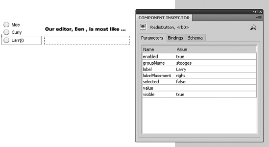
To see RadioButton components in action, open the RadioButton.fla file in this chapter's Exercise file. Because radio buttons work in groups, the Parameters tab of the Component Inspector panel has a "collective consciousness" parameter we haven't seen with other components: groupName. Select each of the three radio buttons in turn and verify that each belongs to the same group, stooges, even though each has its own distinct label: Moe, Curly, and Larry (see Figure 11-24). Note also the empty dynamic text field whose instance name is output. You're about to wire up the radio buttons to that text field.
Click into frame 1 of the scripts layer and type the following very condensed but interesting ActionScript:
rb1.group.addEventListener(Event.CHANGE,changeHandler); function changeHandler(evt:Event):void { output.text = rb1.group.selection.label; };
What makes this interesting? In most of the event-handling samples in this chapter, you've invoked the addEventListener() method on an object that you personally gave an instance name. Here, that might have been rb1, but that's not the focal point in this case. You're not adding an event listener to a particular radio button, but rather to the group to which these buttons belong. The RadioButton class provides a group property, which means that each instance knows to which group it belongs. It's the group that dispatches the Event.CHANGE event, which occurs when any one of these radio buttons is clicked.
It doesn't matter which radio button's group property you use, because all of them point to the same RadioButtonGroup instance. The associated function updates the output text field by sending it the selected button in this group—in particular, that button's label property, which is either Moe, Curly, or Larry.
Note
Note that the Parameters tab gives you the option to supply a value for each radio button. This allows you to say one thing and do another, just as in the List example. The difference is that the List choices were label and data, and here they are label and value, and the data type of value is typed as Object, not String. The text field wants a string, so you would change that line of ActionScript to output.text = rb1.group.selection.value.toString();.
The ScrollPane component lets you have eyes bigger than your stomach. If you want to display a super-large image—so large that you'll need scrollbars—ScrollPane is your component; Figure 11-25 shows it in action.
ScrollPane has nested skins because of its scrollbars, so double-clicking an instance during authoring will open its skin elements in tiers. Styling works the same as described in the "Button component" section, although with no text elements, most of your customization work will probably center around skins.
Note
Using one or more instances of the ScrollPane component in your movie will add 21KB to the SWF if no other components share the load.
In this example, there's no need for ActionScript.
Open the
ScrollPane.flafile in this chapter'sExercisefolder. Select theScrollPaneinstance and click theParameterstab of theComponent Inspectorpanel.In the
Parameterstab, double-click the right column of thesourcerow. TypeOnion.jpg.Test the movie. Pretty slick! The
sourceparameter can be pointed to any file format that Flash can load dynamically, including GIFs, PNGs, and other SWFs.
The Slider component is conceptually the same thing as NumericStepper, except that instead of clicking buttons to advance from one number to the next, the user drags a knob along a slider, as shown in Figure 11-26. You, as designer, are responsible for setting the minimum and maximum values, and this component lets you specify whether sliding is smooth or snaps to increments specified by you.
Slider has no text elements, so styling is fairly light. What's there works as it does for the Button component. Skinning also works as it does for Button: double-click a Slider instance in the authoring environment to change the knob and track skins.
Note
Using one or more instances of the Slider component in your movie will add 17KB to the SWF if no other components share the load.
To see how the Slider component works, open the Slider.fla file in this chapter's Exercise folder. Note that the instance name for the Slider instance is slider, which works only because ActionScript is a case-sensitive language. You couldn't call it slider, because that's the name of the class that defines this object. Also note the instance names circle1 and circle2 on the two circles. You're about to wire up the Slider component to adjust their width and height.
Click into frame 1 of the scripts layer and type the following ActionScript:
slider.addEventListener(Event.CHANGE, changeHandler);
function changeHandler(evt:Event):void {
  circle1.scaleX = slider.value / 100;
  circle2.scaleY = slider.value / 100;
};
When the Event.CHANGE event is dispatched—this happens as the knob moves along the track—the slider's value property is used to update scaling properties of the Circle movieclips. Why divide by 100? In movieclip scaling, 0% is 0 and 100% is 1. Because the Slider instance happens to have its maximum parameter set to 100, the division puts value into the desired range, as shown in Figure 11-27.

Be sure to experiment with the parameters in the Component Inspector panel's Parameters tab. Most of them are intuitive, but liveDragging and snapInterval might not be. The liveDragging parameter tells Slider whether or not to update its value property as the knob moves, as opposed to when it is released. When you set liveDragging to false, the circles will resize only after you reposition the knob and then release it. The snapInterval parameter tells Slider how often to update its value property. To demonstrate, set liveDragging to true, and then change snapInterval to a small number, such as 1. When you drag the knob, you'll see the circles resize smoothly. Change snapInterval to 10 and test again, and the circles resize less smoothly, because you're asking value to count by tens.
You may be surprised to find a direction parameter (its values are horizontal and vertical). Why not just use the Free Transform tool to rotate this slider? Well, try it. We'll wait . . . Kind of weird, right? It doesn't work. Components are a sophisticated phenomenon, even though they look so simple.
Now, what if you want a slanted slider, not horizontal or vertical? Here's a trick: select the Slider instance, convert it to a movieclip (Modify
sliderClip.slider.addEventListener(Event.CHANGE, changeHandler);
function changeHandler(evt:Event):void {
  circle1.scaleX = sliderClip.slider.value / 100;
  circle2.scaleY = sliderClip.slider.value / 100;
};Chapter 6 introduced you to text fields. Consider the TextArea component a text field in a tux. It has an attractive, slightly beveled border, lets you limit how many characters can be typed into it (like input text fields), and is optionally scrollable (see Figure 11-28). This component is akin to the <textarea> element in HTML.
TextArea is skinnable, but the parts are few. You'll see a nested skin for the scrollbars when you double-click an instance in the authoring environment. More likely, you'll want to style its text contents, which works as described in the "Button component" section.
Note
Using one or more instances of the TextArea component in your movie will add 21KB to the SWF if no other components (other than the automatically included UIScrollBar) share the load.
Open the TextArea.fla file in this chapter's Exercise folder to see an example of populating a TextArea instance with text. (We figured it would be cruel to make you type in a lengthy bit of sample text on your own.) Note that the TextArea component can display HTML text, as shown in the sample file, or plain text. Use the component's htmlText or text property accordingly.
Notice that the Parameters tab of the Component Inspector panel shows only a text parameter for supplying text. We can't imagine anyone using that tiny space to enter more than a sentence, so reference that parameter as a property in your ActionScript. Assuming ta is the TextArea component's instance name:
ta.htmlText = "<p>HTML text here, with <b>styling</b>.</p>";
or
ta.text = "Plain text content here.";
The TextInput component is the single-line kid brother of TextArea. For this reason, to trump it up, we'll show it displaying one of the shortest short stories in the world, attributed to Ernest Hemingway (see Figure 11-29).
TextInput is primarily used to collect typed user input, like HTML-based "contact us" forms, and can even be set to display password characters as asterisks (see the displayAsPassword parameter). The component is skinnable—just double-click an instance in the authoring environment—but there's not much to skin. Styling works as described in the "Button component" section.
Note
Using one or more instances of the TextInput component in your movie will add 15KB to the SWF if no other components share the load.
To see the TextInput component in action, open the TextInput.fla file that accompanies this chapter. Note the two TextInput instances, with instance names input (top) and output (bottom). Select each component in turn and look at the Parameters tab of the Component Inspector panel as you do. For the top TextInput instance, the displayAsPassword and editable parameters are set to true. For the bottom one, both of those parameters are set to false. You're about to make the upper component reveal its password to the lower one.
Click into frame 1 of the scripts layer and type the following ActionScript:
input.addEventListener(Event.CHANGE, changeHandler);
function changeHandler(evt:Event):void {
  output.text = input.text;
};
As text is typed into the upper TextInput instance, the Event.CHANGE handler updates the lower instance's text content with that of the upper instance's content. Because of the parameter settings, the text content is hidden above but clearly displayed below.
TileList is not unlike the ScrollPane component. Both load files for display, optionally with scollbars, but TileList displays numerous files—JPGs, SWFs, and so on—in the tiled arrangement shown in Figure 11-30.
Double-click a TileList instance to edit its skins. You'll see a second tier of skins for the scrollbars. Styling may be accomplished as described in the "Button component" section.
Note
Using one or more instances of the TileList component in your movie will add 32KB to the SWF if no other components share the load.

There are quite a few parameters listed in the Parameters tab of the Component Inspector panel for this component, but they're all easy to grasp. For example, there are settings for the width and number of columns, height and number of rows, direction or orientation (horizontal or vertical), and scrolling settings (on, off, and auto, the last of which makes scrollbars show only as necessary). The dataProvider parameter is the most important, because that's where you define the content to show. It works the same as the dataProvider for ComboBox, except that instead of label and data properties, TileList expects label and source.
If you find the Parameters tab a bit confining, you can always use ActionScript to add items to the TileList. To try this, open the TileList.fla file in the Chapter 11 Exercise folder. Note that the TileList instance has the instance name tl, and the dynamic text field below it has the instance name output.
Click into frame 1 of the scripts layer and type the following ActionScript:
tl.addItem({label:"Mug 6", source:"Mug06.jpg"});
tl.addItem({label:"Mug 7", source:"Mug07.jpg"});
tl.addItem({label:"Mug 8", source:"Mug08.jpg"});
tl.addEventListener(Event.CHANGE, changeHandler);
function changeHandler(evt:Event):void {
output.text = tl.selectedItem.label;
};The first three lines use practically the same approach we used for adding an additional item to the ComboBox instance in that section of the chapter. Mugs 1 through 5 are specified in the Component Inspector panel. Here, these three lines of code give us a few more mug shots (heh, mug shots—we love that joke). In the event handler, the changeHandler() function updates the output text fields' text property with the label value of the TileList's selected item.
Note
TileList also supports multiple selections, like the List component. The sample code in the "List component" section provides the same basic mechanism you would use here, except instead of targeting the data property, you'll probably want to target label, as shown in the preceding single-selection sample.
If the Flash CS4 UI components all went to a Halloween party, UILoader would show up as the Invisible Man (see Figure 11-31).

Figure 11.31. Practically speaking, UILoader has no visual elements (and yes, this figure is empty; it tickled us to include it).
So what's the point? Ah, but UILoader is such a selfless, giving component! Its purpose is to load and display content other than itself. This lets you avoid using the Loader class (as described in Chapter 14), just in case the thought of ActionScript makes you feel like you discovered half a worm in your apple. Simply enter a file name into the source parameter of the Component Inspector panel's Parameters tab, and you're set (see Figure 11-32).

Note
Using one or more instances of the UILoader component in your movie will add 15KB to the SWF if no other components share the load.
Here's a UILoader component exercise:
Open the
UILoader.flafile that accompanies this chapter. Double-click theUILoaderinstance, and you'll see message that no skins are available. Since we aren't speaking to this component with ActionScript (yet), it doesn't need an instance name.In the
Parameterstab of theComponent Inspectorpanel, enter the file nameOnion.jpginto the right column of thesourcerow. This references a JPG file in the same folder as your FLA.Test your movie, and you'll see the onion load into its
UILoadercontainer.Change the
maintainAspectRatioparameter tofalseand test again. This time, the onion loads a bit squished. Our personal preference is usually to maintain aspect ratio. ThescaleContentparameter determines whether the loaded content is scaled or cropped in its container.Our friend
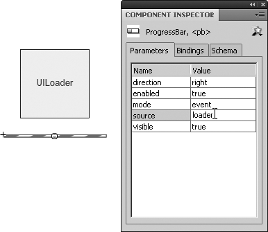
ProgressBaris about to make a cameo appearance. Drag an instance of theProgessBarcomponent to the stage below theUILoaderinstance, and give theUILoaderinstance the instance nameLoader.Select the
ProgressBarinstance, and in theParameterstab, set itssourceparameter toLoader—that's the instance name you just gave theUILoaderinstance (see Figure 11-33). You're associating the two and telling theProgressBarcomponent to check with theUILoadercomponent to divulge how much of the requested file has loaded.Test your movie again.
in the SWF's menu bar, select
ViewClose the SWF.
To wrap up, let's add a teensy bit of ActionScript. (Don't worry, that half a worm we mentioned earlier was just a centipede—half a centipede.) To make sure ActionScript talks to the
ProgressBarinstance, give it an instance name. We're usingpb. Click into frame 1 of thescriptslayer and type the following ActionScript:pb.addEventListener(Event.COMPLETE, completeHandler); function completeHandler(evt:Event):void { removeChild(pb); };Test the movie for the last time. You'll see what this ActionScript does: it makes the progress bar disappear when loading is complete.
If you read any other sections of this chapter, you've probably already been introduced to the UIScrollBar component. This component is a humble but useful member of the team, as it allows other components to have scrollbars. UIScrollBar is skinnable by double-clicking any instance in the authoring environment. Styling doesn't make much sense, but it is possible as described in the "Button component" section.
Note
Using one or more instances of the UIScrollBar component in your movie will add 18KB to the SWF if no other components share the load.
So as to avoid repeating ourselves, we'll direct your attention to the "Your Turn: Scrollable text" section in Chapter 6 to see this component in action.
In this chapter, you've learned the following:
How to use every one of the Flash CS4 UI components
How to write the ActionScript that controls components
How to skin a component
How to manage components in a Flash movie
In the next chapter, we'll show you how to use CSS to format text in a Flash movie. This may seem a bit odd, because the Text tool has a lot of settings in the Property inspector and a whole chapter in this book shows you how to use them. But one of the adages we live by is this: there are six million ways of doing everything in digital media and the best way is the one you pick. When it comes to text, that rule really comes into play, but an even stronger one supersedes it:
Let the software do the work.
Clients are fickle. One day the black Times Roman they asked for is fabulous, and the next day it "just has to be" green Helvetica Narrow. This can be a huge waste of time. You can spend hours opening Flash files and physically making the change, or pawing through ActionScript looking for code that formats text. Is there an easier way? You betcha. CSS to the rescue. Flash gives you the ability to put your styling into a CSS document. This means it's all in one place, and when the client wants the green Helvetica Narrow changed to orange Franklin Book, you can grumble to the client about the hours it is going to take to make the change, and then open the style sheet and spend 5 minutes, not hours, carrying it out.
It isn't as dry as it sounds, because you can do some pretty interesting things with CSS-formatted text in Flash CS4. What are they? Turn the page to find out.