
Chapter 26
Visualization
Tamara Munzner
A major application area of computer graphics is visualization, where computergenerated images are used to help people understand both spatial and nonspatial data. Visualization is used when the goal is to augment human capabilities in situations where the problem is not sufficiently well defined for a computer to handle algorithmically. If a totally automatic solution can completely replace human judgment, then visualization is not typically required. Visualization can be used to generate new hypotheses when exploring a completely unfamiliar dataset, to confirm existing hypotheses in a partially understood dataset, or to present information about a known dataset to another audience.
Visualization allows people to offload cognition to the perceptual system, using carefully designed images as a form of external memory. The human visual system is a very high-bandwidth channel to the brain, with a significant amount of processing occurring in parallel and at the pre-conscious level. We can thus use external images as a substitute for keeping track of things inside our own heads. For an example, let us consider the task of understanding the relationships between a subset of the topics in the splendid book G oödel, Escher, Bach: The Eternal Golden Braid (Hofstadter, 1979); see Figure 26.1.

When we see the dataset as a text list, at the low level we must read words and compare them to memories of previously read words. It is hard to keep track of just these dozen topics using cognition and memory alone, let alone the hundreds of topics in the full book. The higher-level problem of identifying neighborhoods, for instance finding all the topics two hops away from the target topic Paradoxes, is very difficult.
Figure 26.2 shows an external visual representation of the same dataset as a node-link graph, where each topic is a node and the linkage between two topics is shown directly with a line. Following the lines by moving our eyes around the image is a fast low-level operation with minimal cognitive load, so higherlevel neighborhood finding becomes possible. The placement of the nodes and the routing of the links between them was created automatically by the dot graph drawing program (Gansner, Koutsofois, North, & Vo, 1993).

Substituting perception for cognition and memory allows us to understand relationships between book topics quickly.
We call the mapping of dataset attributes to a visual representation a visual encoding. One of the central problems in visualization is choosing appropriate encodings from the enormous space of possible visual representations, taking into account the characteristics of the human perceptual system, the dataset in question, and the task at hand.
26.1 Background
26.1.1 History
People have a long history of conveying meaning through static images, dating back to the oldest known cave paintings from over thirty thousand years ago. We continue to visually communicate today in ways ranging from rough sketches on the back of a napkin to the slick graphic design of advertisements. For thousands of years, cartographers have studied the problem of making maps that represent some aspect of the world around us. The first visual representations of abstract, nonspatial datasets were created in the 18th century by William Playfair (Friendly, 2008).
Although we have had the power to create moving images for over one hundred and fifty years, creating dynamic images interactively is a more recent development only made possible by the widespread availability of fast computer graphics hardware and algorithms in the past few decades. Static visualizations of tiny datasets can be created by hand, but computer graphics enables interactive visualization of large datasets.
26.1.2 Resource Limitations
When designing a visualization system, we must consider three different kinds of limitations: computational capacity, human perceptual and cognitive capacity, and display capacity.
As with any application of computer graphics, computer time and memory are limited resources and we often have hard constraints. If the visualization system needs to deliver interactive response, then it must use algorithms that can run in a fraction of a second rather than minutes or hours.
On the human side, memory and attention must be considered as finite resources. Human memory is notoriously limited, both for long-term recall and for shorter-term working memory. Later in this chapter, we discuss some of the power and limitations of the low-level visual attention mechanisms that carry out massively parallel processing of the visual field. We store surprisingly little information internally in visual working memory, leaving us vulnerable to change blindness, the phenomenon where even very large changes are not noticed if we are attending to something else in our view (Simons, 2000). Moreover, vigilance is also a highly limited resource; our ability to perform visual search tasks degrades quickly, with far worse results after several hours than in the first few minutes (Ware, 2000).
Display capacity is a third kind of limitation to consider. Visualization designers often “run out of pixels,” where the resolution of the screen is not large enough to show all desired information simultaneously. The information density of a particular frame is a measure of the amount of information encoded versus the amount of unused space. There is a tradeoff between the benefits of showing as much as possible at once, to minimize the need for navigation and exploration, and the costs of showing too much at once, where the user is overwhelmed by visual clutter.
26.2 Data Types
Many aspects of a visualization design are driven by the type of the data that we need to look at. For example, is it a table of numbers, or a set of relations between items, or inherently spatial data such as a location on the Earth’s surface or a collection of documents?
We start by considering a table of data. We call the rows items of data and the columns are dimensions, also known as attributes. For example, the rows might represent people, and the columns might be names, age, height, shirt size, and favorite fruit.
We distinguish between three types of dimensions: quantitative, ordered, and categorical. Quantitative data, such as age or height, is numerical and we can do arithmetic on it. For example, the quantity of 68 inches minus 42 inches is 26 inches. With ordered data, such as shirt size, we cannot do full-fledged arithmetic, but there is a well-defined ordering. For example, large minus medium is not a meaningful concept, but we know that medium falls between small and large. Categorical data, such as favorite fruit or names, does not have an implicit ordering. We can only distinguish whether two things are the same (apples) or different (apples vs. bananas).
Relational data, or graphs, are another data type where nodes are connected by links. One specific kind of graph is a tree, which is typically used for hierarchical data. Both nodes and edges can have associated attributes. The word graph is unfortunately overloaded in visualization. The node-link graphs we discuss here, following the terminology of graph drawing and graph theory, could also be called networks. In the field of statistical graphics, graph is often used for chart, as in the line charts for time-series data shown in Figure 26.10.
Some data is inherently spatial, such as geographic location or a field of measurements at positions in three-dimensional space as in the MRI or CT scans used by doctors to see the internal structure of a person’s body. The information associated with each point in space may be an unordered set of scalar quantities, or indexed vectors, or tensors. In contrast, nonspatial data can be visually encoded using spatial position, but that encoding is chosen by the designer rather than given implicitly in the semantics of the dataset itself. This choice is one of the most central and difficult problems of visualization design.
26.2.1 Dimension and Item Count
The number of data dimensions that need to be visually encoded is one of the most fundamental aspects of the visualization design problem. Techniques that work for a low-dimensional dataset with a few columns will often fail for very high-dimensional datasets with dozens or hundreds of columns. A data dimension may have hierarchical structure, for example with a time series dataset where there are interesting patterns at multiple temporal scales.
The number of data items is also important: a visualization that performs well for a few hundred items often does not scale to millions of items. In some cases the difficulty is purely algorithmic, where a computation would take too long; in others it is an even deeper perceptual problem that even an instantaneous algorithm could not solve, where visual clutter makes the representation unusable by a person. The range of possible values within a dimension may also be relevant.
26.2.2 Data Transformation and Derived Dimensions
Data is often transformed from one type to another as part of a visualization pipeline for solving the domain problem. For example, an original data dimension might be made up of quantitative data: floating point numbers that represent temperature. For some tasks, like finding anomalies in local weather patterns, the raw data might be used directly. For another task, like deciding whether water is an appropriate temperature for a shower, the data might be transformed into an ordered dimension: hot, warm, or cold. In this transformation, most of the detail is aggregated away. In a third example, when making toast, an even more lossy transformation into a categorical dimension might suffice: burned or not burned.
The principle of transforming data into derived dimensions, rather than simply visually encoding the data in its original form, is a powerful idea. In Figure 26.10, the original data was an ordered collection of time-series curves. The transformation was to cluster the data, reducing the amount of information to visually encode to a few highly meaningful curves.
26.3 Human-Centered Design Process
The visualization design process can be split into a cascading set of layers, as shown in Figure 26.3. These layers all depend on each other; the output of the level above is input into the level below.

26.3.1 Task Characterization
A given dataset has many possible visual encodings. Choosing which visual encoding to use can be guided by the specific needs of some intended user. Different questions, or tasks, require very different visual encodings. For example, consider the domain of software engineering. The task of understanding the coverage of a test suite is well supported by the Tarantula interface shown in Figure 26.11. However, the task of understanding the modular decomposition of the software while refactoring the code might be better served by showing its hierarchical structure more directly as a node-link graph.
Understanding the requirements of some target audience is a tricky problem. In a human-centered design approach, the visualization designer works with a group of target users over time (C. Lewis & Rieman, 1993). In most cases, users know they need to somehow view their data but cannot directly articulate their needs as clear-cut tasks in terms of operations on data types. The iterative design process includes gathering information from the target users about their problems through interviews and observation of them at work, creating prototypes, and observing how users interact with those prototypes to see how well the proposed solution actually works. The software engineering methodology of requirements analysis can also be useful (Kovitz, 1999).
26.3.2 Abstraction
After the specific domain problem has been identified in the first layer, the next layer requires abstracting it into a more generic representation as operations on the data types discussed in the previous section. Problems from very different domains can map to the same visualization abstraction. These generic operations include sorting, filtering, characterizing trends and distributions, finding anomalies and outliers, and finding correlation (Amar, Eagan, & Stasko, 2005). They also include operations that are specific to a particular data type, for example following a path for relational data in the form of graphs or trees.
This abstraction step often involves data transformations from the original raw data into derived dimensions. These derived dimensions are often of a different type than the original data: a graph may be converted into a tree, tabular data may be converted into a graph by using a threshold to decide whether a link should exist based on the field values, and so on.
26.3.3 Technique and Algorithm Design
Once an abstraction has been chosen, the next layer is to design appropriate visual encoding and interaction techniques. Section 26.4 covers the principles of visual encoding, and we discuss interaction principles in Sections 26.5. We present techniques that take these principles into account in Sections 26.6 and 26.7.
A detailed discussion of visualization algorithms is unfortunately beyond the scope of this chapter.
26.3.4 Validation
Each of the four layers has different validation requirements.
The first layer is designed to determine whether the problem is correctly characterized: is there really a target audience performing particular tasks that would benefit from the proposed tool? An immediate way to test assumptions and conjectures is to observe or interview members of the target audience, to ensure that the visualization designer fully understands their tasks. A measurement that cannot be done until a tool has been built and deployed is to monitor its adoption rate within that community, although of course many other factors in addition to utility affect adoption.
The next layer is used to determine whether the abstraction from the domain problem into operations on specific data types actually solves the desired problem. After a prototype or finished tool has been deployed, a field study can be carried out to observe whether and how it is used by its intended audience. Also, images produced by the system can be analyzed both qualitatively and quantitatively.
The purpose of the third layer is to verify that the visual encoding and interaction techniques chosen by the designer effectively communicate the chosen abstraction to the users. An immediate test is to justify that individual design choices do not violate known perceptual and cognitive principles. Such a justification is necessary but not sufficient, since visualization design involves many tradeoffs between interacting choices. After a system is built, it can be tested through formal laboratory studies where many people are asked to do assigned tasks so that measurements of the time required for them to complete the tasks and their error rates can be statistically analyzed.
A fourth layer is employed to verify that the algorithm designed to carry out the encoding and interaction choices is faster or takes less memory than previous algorithms. An immediate test is to analyze the computational complexity of the proposed algorithm. After implementation, the actual time performance and memory usage of the system can be directly measured.
26.4 Visual Encoding Principles
We can describe visual encodings as graphical elements, called marks, that convey information through visual channels. A zero-dimensional mark is a point, a one-dimensional mark is a line, a two-dimensional mark is an area, and a three-dimensional mark is a volume. Many visual channels can encode information, including spatial position, color, size, shape, orientation, and direction of motion. Multiple visual channels can be used to simultaneously encode different data dimensions; for example, Figure 26.4 shows the use of horizontal and vertical spatial position, color, and size to display four data dimensions. More than one channel can be used to redundantly code the same dimension, for a design that displays less information but shows it more clearly.

The four visual channels of horizontal and vertical spatial position, color, and size are used to encode information in this scatterplot chart Image courtesy George Robertson (Robertson, Fernandez, Fisher, Lee, & Stasko, 2008), © IEEE 2008.
26.4.1 Visual Channel Characteristics
Important characteristics of visual channels are distinguishability, separability, and popout.
Channels are not all equally distinguishable. Many psychophysical experiments have been carried out to measure the ability of people to make precise distinctions about information encoded by the different visual channels. Our abilities depend on whether the data type is quantitative, ordered, or categorical. Figure 26.5 shows the rankings of visual channels for the three data types. Figure 26.6 shows some of the default mappings for visual channels in the Tableau/Polaris system, which take into account the data type.
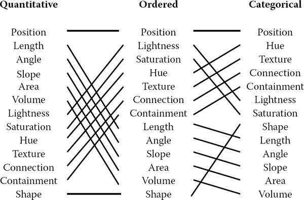
Our ability to perceive information encoded by a visual channel depends on the type of data used, from most accurate at the top to least at the bottom.
Redrawn and adapted from (Mackinlay, 1986).

The Tableau/Polaris system default mappings for four visual channels according to data type. Image courtesy Chris Stolte (Stolte, Tang, & Hanrahan, 2008), © 2008 IEEE.
Spatial position is the most accurate visual channel for all three types of data, and it dominates our perception of a visual encoding. Thus, the two most important data dimensions are often mapped to horizontal and vertical spatial positions.
However, the other channels differ strongly between types. The channels of length and angle are highly discriminable for quantitative data but poor for ordered and categorical, while in contrast hue is very accurate for categorical data but mediocre for quantitative data.
We must always consider whether there is a good match between the dynamic range necessary to show the data dimension and the dynamic range available in the channel. For example, encoding with line width uses a one-dimensional mark and the size channel. There are a limited number of width steps that we can reliably use to visually encode information: a minimum thinness of one pixel is enforced by the screen resolution (ignoring antialiasing to simplify this discussion), and there is a maximum thickness beyond which the object will be perceived as a polygon rather than a line. Line width can work very well to show three or four different values in a data dimension, but it would be a poor choice for dozens or hundreds of values.
Some visual channels are integral, fused together at a pre-conscious level, so they are not good choices for visually encoding different data dimensions. Others are separable, without interactions between them during visual processing, and are safe to use for encoding multiple dimensions. Figure 26.7 shows two channel pairs. Color and position are highly separable. We can see that horizontal size and vertical size are not so easy to separate, because our visual system automatically integrates these together into a unified perception of area. Size interacts with many channels: as the size of an object grows smaller, it becomes more difficult to distinguish its shape or color.

Color and location are separable channels well suited to encode different data dimensions, but the horizontal size and and vertical size channels are automatically fused into an integrated perception of area.
Redrawn after (Ware, 2000).
We can selectively attend to a channel so that items of a particular type “pop out” visually, as discussed in Section 20.4.3. An example of visual popout is when we immediately spot the red item amidst a sea of blue ones, or distinguish the circle from the squares. Visual popout is powerful and scalable because it occurs in parallel, without the need for conscious processing of the items one by one. Many visual channels have this popout property, including not only the list above but also curvature, flicker, stereoscopic depth, and even the direction of lighting. However, in general we can only take advantage of popout for one channel at a time. For example, a white circle does not pop out from a group of circles and squares that can be white or black, as shown in Figure 20.46. When we need to search across more than one channel simultaneously, the length of time it takes to find the target object depends linearly on the number of objects in the scene.
26.4.2 Color
Color can be a very powerful channel, but many people do not understand its properties and use it improperly. As discussed in Section 20.2.2, we can consider color in terms of three separate visual channels: hue, saturation, and lightness. Region size strongly affects our ability to sense color. Color in small regions is relatively difficult to perceive, and designers should use bright, highly saturated colors to ensure that the color coding is distinguishable. The inverse situation is true when colored regions are large, as in backgrounds, where low saturation pastel colors should be used to avoid blinding the viewer.
Hue is a very strong cue for encoding categorical data. However, the available dynamic range is very limited. People can reliably distinguish only around a dozen hues when the colored regions are small and scattered around the display. A good guideline for color coding is to keep the number of categories less than eight, keeping in mind that the background and the neutral object color also count in the total.
For ordered data, lightness and saturation are effective because they have an implicit perceptual ordering. People can reliably order by lightness, always placing gray in between black and white. With saturation, people reliably place the less saturated pink between fully saturated red and zero-saturation white. However, hue is not as as good a channel for ordered data because it does not have an implicit perceptual ordering. When asked to create an ordering of red, blue, green, and yellow, people do not all give the same answer. People can and do learn conventions, such as green-yellow-red for traffic lights, or the order of colors in the rainbow, but these constructions are at a higher level than pure perception. Ordered data is typically shown with a discrete set of color values.
Quantitative data is shown with a colormap, a range of color values that can be continuous or discrete. A very unfortunate default in many software packages is the rainbow colormap, as shown in Figure 26.8. The standard rainbow scale suffers from three problems. First, hue is used to indicate order. A better choice would be to use lightness because it has an implicit perceptual ordering. Even more importantly, the human eye responds most strongly to luminance. Second, the scale is not perceptually linear: equal steps in the continuous range are not perceived as equal steps by our eyes. Figure 26.8 shows an example, where the rainbow colormap obfuscates the data. While the range from ‒2000 to ‒1000 has three distinct colors (cyan, green, and yellow), a range of the same size from ‒1000 to 0 simply looks yellow throughout. The graphs on the right show that the perceived value is strongly tied to the luminance, which is not even monotonically increasing in this scale.

The standard rainbow colormap has two defects: it uses hue to denote ordering, and it is not perceptually isolinear.
Image courtesy Bernice Rogowitz.
In contrast, Figure 26.9 shows the same data with a more appropriate colormap, where the lightness increases monotonically. Hue is used to create a semantically meaningful categorization: the viewer can discuss structure in the dataset, such as the dark blue sea, the cyan continental shelf, the green lowlands, and the white mountains.

The structure of the same dataset is far more clear with a colormap where monotonically increasing lightness is used to show ordering and hue is used instead for segmenting into categorical regions.
Image courtesy Bernice Rogowitz.
In both the discrete and continuous cases, colormaps should take into account whether the data is sequential or diverging. The ColorBrewer application (www.colorbrewer.org) is an excellent resource for colormap construction (Brewer, 1999).
Another important issue when encoding with color is that a significant fraction of the population, roughly 10% of men, is red-green color deficient. If a coding using red and green is chosen because of conventions in the target domain, redundantly coding lightness or saturation in addition to hue is wise. Tools such as the website http://www.vischeck.com should be used to check whether a color scheme is distinguishable to people with color deficient vision.
26.4.3 2D vs. 3D Spatial Layouts
The question of whether to use two or three channels for spatial position has been extensively studied. When computer-based visualization began in the late 1980s, and interactive 3D graphics was a new capability, there was a lot of enthusiasm for 3D representations. As the field matured, researchers began to understand the costs of 3D approaches when used for abstract datasets (Ware, 2001).
Occlusion, where some parts of the dataset are hidden behind others, is a major problem with 3D. Although hidden surface removal algorithms such as z-buffers and BSP trees allow fast computation of a correct 2D image, people must still synthesize many of these images into an internal mental map. When people look at realistic scenes made from familiar objects, usually they can quickly understand what they see. However, when they see an unfamiliar dataset, where a chosen visual encoding maps abstract dimensions into spatial positions, understanding the details of its 3D structure can be challenging even when they can use interactive navigation controls to change their 3D viewpoint. The reason is once again the limited capacity of human working memory (Plumlee & Ware, 2006).
Another problem with 3D is perspective distortion. Although real-world objects do indeed appear smaller when they are further from our eyes, foreshortening makes direct comparison of object heights difficult (Tory, Kirkpatrick, Atkins, & Moöller, 2006). Once again, although we can often judge the heights of familiar objects in the real world based on past experience, we cannot necessarily do so with completely abstract data that has a visual encoding where the height conveys meaning. For example, it is more difficult to judge bar heights in a 3D bar chart than in multiple horizontally aligned 2D bar charts.
Another problem with unconstrained 3D representations is that text at arbitrary orientations in 3D space is far more difficult to read than text aligned in the 2D image plane (Grossman, Wigdor, & Balakrishnan, 2007).
Figure 26.10 illustrates how carefully chosen 2D views of an abstract dataset can avoid the problems with occlusion and perspective distortion inherent in 3D views. The top view shows a 3D representation created directly from the original time-series data, where each cross-section is a 2D time-series curve showing power consumption for one day, with one curve for each day of the year along the extruded third axis. Although this representation is straightforward to create, we can only see large-scale patterns such as the higher consumption during working hours and the seasonal variation between winter and summer. To create the 2D linked views at the bottom, the curves were hierarchically clustered, and only aggregate curves representing the top clusters are drawn superimposed in the same 2D frame. Direct comparison between the curve heights at all times of the day is easy because there is no perspective distortion or occlusion. The same color coding is used in the calendar view, which is very effective for understanding temporal patterns.

Top: A 3D representation of this time series dataset introduces the problems of occlusion and perspective distortion. Botto The linked 2D views of derived aggregate curves and the calendar allow direct comparison and show more fine-grained patterns. Image courtesy Jarke van Wijk (van Wijk & van Selow, 1999), © 1999 IEEE.
In contrast, if a dataset consists of inherently 3D spatial data, such as showing fluid flow over an airplane wing or a medical imaging dataset from an MRI scan, then the costs of a 3D view are outweighed by its benefits in helping the user construct a useful mental model of the dataset structure.
26.4.4 Text Labels
Text in the form of labels and legends is a very important factor in creating visualizations that are useful rather than simply pretty. Axes and tick marks should be labeled. Legends should indicate the meaning of colors, whether used as discrete patches or in continuous color ramps. Individual items in a dataset typically have meaningful text labels associated with them. In many cases showing all labels at all times would result in too much visual clutter, so labels can be shown for a subset of the items using label positioning algorithms that show labels at a desired density while avoiding overlap (Luboschik, Schumann, & Cords, 2008). A straightforward way to choose the best label to represent a group of items is to use a greedy algorithm based on some measure of label importance, but synthesizing a new label based on the characteristics of the group remains a difficult problem. A more interaction-centric approach is to only show labels for individual items based on an interactive indication from the user.
26.5 Interaction Principles
Several principles of interaction are important when designing a visualization. Low-latency visual feedback allows users to explore more fluidly, for example by showing more detail when the cursor simply hovers over an object rather than requiring the user to explicitly click. Selecting items is a fundamental operation when interacting with large datasets, as is visually indicating the selected set with highlighting. Color coding is a common form of highlighting, but other channels can also be used.
Many forms of interaction can be considered in terms of what aspect of the display they change. Navigation can be considered a change of viewport. Sorting is a change to the spatial ordering; that is, changing how data is mapped to the spatial position visual channel. The entire visual encoding can also be changed.
26.5.1 Overview First, Zoom and Filter, Details on Demand
The influential mantra “Overview first, zoom and filter, details on demand” (Shneiderman, 1996) elucidates the role of interaction and navigation in visualization design. Overviews help the user notice regions where further investigation might be productive, whether through spatial navigation or through filtering. As we discuss below, details can be presented in many ways: with popups from clicking or cursor hovering, in a separate window, and by changing the layout on the fly to make room to show additional information.
26.5.2 Interactivity Costs
Interactivity has both power and cost. The benefit of interaction is that people can explore a larger information space than can be understood in a single static image. However, a cost to interaction is that it requires human time and attention. If the user must exhaustively check every possibility, use of the visualization system may degenerate into human-powered search. Automatically detecting features of interest to explicitly bring to the user’s attention via the visual encoding is a useful goal for the visualization designer. However, if the task at hand could be completely solved by automatic means, there would be no need for a visualization in the first place. Thus, there is always a tradeoff between finding automatable aspects and relying on the human in the loop to detect patterns.
26.5.3 Animation
Animation shows change using time. We distinguish animation, where successive frames can only be played, paused, or stopped, from true interactive control. There is considerable evidence that animated transitions can be more effective than jump cuts, by helping people track changes in object positions or camera viewpoints (Heer & Robertson, 2007). Although animation can be very effective for narrative and storytelling, it is often used ineffectively in a visualization context (Tversky, Morrison, & Betrancourt, 2002). It might seem obvious to show data that changes over time by using animation, a visual modality that changes over time. However, people have difficulty in making specific comparisons between individual frames that are not contiguous when they see an animation consisting of many frames. The very limited capacity of human visual memory means that we are much worse at comparing memories of things that we have seen in the past than at comparing things that are in our current field of view. For tasks requiring comparison between up to several dozen frames, side-by-side comparison is often more effective than animation. Moreover, if the number of objects that change between frames is large, people will have a hard time tracking everything that occurs (Robertson et al., 2008). Narrative animations are carefully designed to avoid having too many actions occurring simultaneously, whereas a dataset being visualized has no such constraint. For the special case of just two frames with a limited amount of change, the very simple animation of flipping back and forth between the two can be a useful way to identify the differences between them.
26.6 Composite and Adjacent Views
A very fundamental visual encoding choice is whether to have a single composite view showing everything in the same frame or window, or to have multiple views adjacent to each other.
26.6.1 Single Drawing
When there are only one or two data dimensions to encode, then horizontal and vertical spatial position are the obvious visual channel to use, because we perceive them most accurately and position has the strongest influence on our internal mental model of the dataset. The traditional statistical graphics displays of line charts, bar charts, and scatterplots all use spatial ordering of marks to encode information. These displays can be augmented with additional visual channels, such as color and size and shape, as in the scatterplot shown in Figure 26.4.
The simplest possible mark is a single pixel. In pixel-oriented displays, the goal is to provide an overview of as many items as possible. These approaches use the spatial position and color channels at a high information density, but preclude the use of the size and shape channels. Figure 26.11 shows the Tarantula software visualization tool (Jones et al., 2002), where most of the screen is devoted to an overview of source code using one-pixel high lines (Eick, Steffen, & Sumner, 1992). The color and brightness of each line shows whether it passed, failed, or had mixed results when executing a suite of test cases.

Tarantula shows an overview of source code using one-pixel lines color coded by execution status of a software test suite. Image courtesy John Stasko (Jones, Harrold, & Stasko, 2002).
26.6.2 Superimposing and Layering
Multiple items can be superimposed in the same frame when their spatial position is compatible. Several lines can be shown in the same line chart, and many dots in the same scatterplot, when the axes are shared across all items. One benefit of a single shared view is that comparing the position of different items is very easy. If the number of items in the dataset is limited, then a single view will often suffice. Visual layering can extend the usefulness of a single view when there are enough items that visual clutter becomes a concern. Figure 26.12 shows how a redundant combination of the size, saturation, and brightness channels serves to distinguish a foreground layer from a background layer when the user moves the cursor over a block of words.

Visual layering with size, saturation, and brightness in the Constellation system (Munzner, 2000).
26.6.3 Glyphs
We have been discussing the idea of visual encoding using simple marks, where a single mark can only have one value for each visual channel used. With more complex marks, which we will call glyphs, there is internal structure where sub-regions have different visual channel encodings.
Designing appropriate glyphs has the same challenges as designing visual encodings. Figure 26.13 shows a variety of glyphs, including the notorious faces originally proposed by Chernoff. The danger of using faces to show abstract data dimensions is that our perceptual and emotional response to different facial features is highly nonlinear in a way that is not fully understood, but the variability is greater than between the visual channels that we have discussed so far. We are probably far more attuned to features that indicate emotional state, such as eyebrow orientation, than other features, such as nose size or face shape.

Complex marks, which we call glyphs, have subsections that visually encode different data dimensions. Image courtesy Matt Ward (M. O. Ward, 2002).
Complex glyphs require significant display area for each glyph, as shown in Figure 26.14 where miniature bar charts show the value of four different dimensions at many points along a spiral path. Simpler glyphs can be used to create a global visual texture, the glyph size is so small that individual values cannot be read out without zooming, but region boundaries can be discerned from the overview level. Figure 26.15 shows an example using stick figures of the kind in the upper right in Figure 26.13. Glyphs may be placed at regular intervals, or in data-driven spatial positions using an original or derived data dimension.

Complex glyphs require significant display area so that the encoded information can be read. Image courtesy Matt Ward, created with the SpiralGlyphics software (M. O. Ward, 2002).

A dense array of simple glyphs. Image courtesy Georges Grinstein (S. Smith, Grinstein, & Bergeron, 1991), © 1991 IEEE.
26.6.4 Multiple Views
We now turn from approaches with only a single frame to those which use multiple views that are linked together. The most common form of linkage is linked highlighting, where items selected in one view are highlighted in all others. In linked navigation, movement in one view triggers movement in the others.
There are many kinds of multiple-view approaches. In what is usually called simply the multiple-view approach, the same data is shown in several views, each of which has a different visual encoding that shows certain aspects of the dataset most clearly. The power of linked highlighting across multiple visual encodings is that items that fall in a contiguous region in one view are often distributed very differently in the other views. In the small-multiples approach, each view has the same visual encoding for different datasets, usually with shared axes between frames so that comparison of spatial position between them is meaningful. Side-by-side comparison with small multiples is an alternative to the visual clutter of superimposing all the data in the same view, and to the human memory limitations of remembering previously seen frames in an animation that changes over time.
The overview-and-detail approach is to have the same data and the same visual encoding in two views, where the only difference between them is the level of zooming. In most cases, the overview uses much less display space than the detail view. The combination of overview and detail views is common outside of visualization in many tools ranging from mapping software to photo editing. With a detail-on-demand approach, another view shows more information about some selected item, either as a popup window near the cursor or in a permanent window in another part of the display.
Determining the most appropriate spatial position of the views themselves with respect to each other can be as significant a problem as determining the spatial position of marks within a single view. In some systems, the location of the views is arbitrary and left up to the window system or the user. Aligning the views allows precise comparison between them, either vertically, horizontally, or with an array for both directions. Just as items can be sorted within a view, views can be sorted within a display, typically with respect to a derived variable measuring some aspect of the entire view as opposed to an individual item within it.
Figure 26.16 shows a visualization of census data that uses many views. In addition to geographic information, the demographic information for each county includes population, density, gender, median age, percent change since 1990, and proportions of major ethnic groups. The visual encodings used include geographic, scatterplot, parallel coordinate, tabular, and matrix views. The same color encoding is used across all the views, with a legend in the bottom middle. The scatterplot matrix shows linked highlighting across all views, where the blue items are close together in some views and scattered in others. The map in the upper-left corner is an overview for the large detail map in the center. The tabular views allow direct sorting by and selection within a dimension of interest.
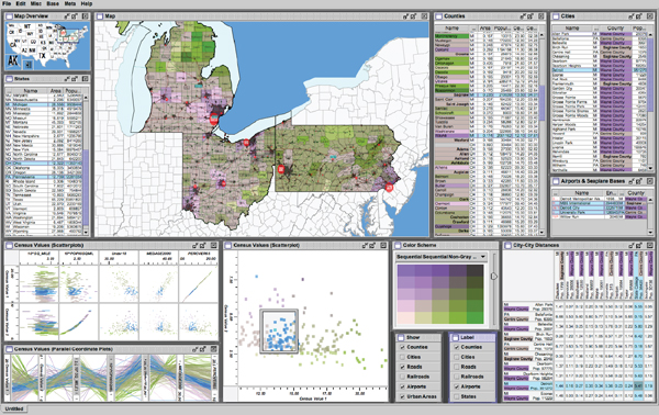
The Improvise toolkit was used to create this multiple-view visualization.
Image courtesy Chris Weaver.
26.7 Data Reduction
The visual encoding techniques that we have discussed so far show all of the items in a dataset. However, many datasets are so large that showing everything simultaneously would result in so much visual clutter that the visual representation would be difficult or impossible for a viewer to understand. The main strategies to reduce the amount of data shown are overviews and aggregation, filtering and navigation, the focus+context techniques, and dimensionality reduction.
26.7.1 Overviews and Aggregation
With tiny datasets, a visual encoding can easily show all data dimensions for all items. For datasets of medium size, an overview that shows information about all items can be constructed by showing less detail for each item. Many datasets have internal or derivable structure at multiple scales. In these cases, a multiscale visual representation can provide many levels of overview, rather than just a single level. Overviews are typically used as a starting point to give users clues about where to drill down to inspect in more detail.
For larger datasets, creating an overview requires some kind of visual summarization. One approach to data reduction is to use an aggregate representation where a single visual mark in the overview explicitly represents many items.
The challenge of aggregation is to avoid eliminating the interesting signals in the dataset in the process of summarization. In the cartographic literature, the problem of creating maps at different scales while retaining the important distinguishing characteristics has been extensively studied under the name of cartographic generalization (Slocum, McMaster, Kessler, & Howard, 2008).
26.7.2 Filtering and Navigation
Another approach to data reduction is to filter the data, showing only a subset of the items. Filtering is often carried out by directly selecting ranges of interest in one or more of the data dimensions.
Navigation is a specific kind of filtering based on spatial position, where changing the viewpoint changes the visible set of items. Both geometric and non-geometric zooming are used in visualization. With geometric zooming, the camera position in 2D or 3D space can be changed with standard computer graphics controls. In a realistic scene, items should be drawn at a size that depends on their distance from the camera, and only their apparent size changes based on that distance. However, in a visual encoding of an abstract space, nongeometric zooming can be useful. In semantic zooming, the visual appearance of an object changes dramatically based on the number of pixels available to draw it. For instance, an abstract visual representation of a text file could change from a tiny color-coded box with no label to a medium-sized box containing only the filename as a text label to a large rectangle containing a multi-line summary of the file contents. In realistic scenes, objects that are sufficiently far away from the camera are not visible in the images, for example, after they subtend less than one pixel of screen area. With guaranteed visibility, one of the original or derived data dimensions is used as a measure of importance, and objects of sufficient importance must have some kind of representation visible in the image plane at all times.
26.7.3 Focus+Context
Focus+context techniques are another approach to data reduction. A subset of the dataset items are interactively chosen by the user to be the focus and are drawn in detail. The visual encoding also includes information about some or all of the rest of the dataset shown for context, integrated into the same view that shows the focus items. Many of these techniques use carefully chosen distortion to combine magnified focus regions and minified context regions into a unified view.
One common interaction metaphor is a moveable fisheye lens. Hyperbolic geometry provides an elegant mathematical framework for a single radial lens that affects all objects in the view. Another interaction metaphor is to use multiple lenses of different shapes and magnification levels that affect only local regions. Stretch and squish navigation uses the interaction metaphor of a rubber sheet where stretching one region squishes the rest, as shown in Figure 26.17. The borders of the sheet stay fixed so that all items are within the viewport, although many items may be compressed to subpixel size. The fisheye metaphor is not limited to a geometric lens used after spatial layout; it can be used directly on structured data, such as a hierarchical document where some sections are collapsed while others are left expanded.

The TreeJuxtaposer system features stretch and squish navigation and guaranteed visibility of regions marked with colors (Munzner, Guimbretie`re, Tasiran, Zhang, & Zhou, 2003).
These distortion-based approaches are another example of nonliteral navigation in the same spirit as nongeometric zooming. When navigating within a large and unfamiliar dataset with realistic camera motion, users can become disoriented at high zoom levels when they can see only a small local region. These approaches are designed to provide more contextual information than a single undistorted view, in hopes that people can stay oriented if landmarks remain recognizeable. However, these kinds of distortion can still be confusing or difficult to follow for users. The costs and benefits of distortion, as opposed to multiple views or a single realistic view, are not yet fully understood. Standard 3D perspective is a particularly familiar kind of distortion and was explicitly used as a form of focus+context in early visualization work. However, as the costs of 3D spatial layout discussed in Section 26.4 became more understood, this approach became less popular.
Other approaches to providing context around focus items do not require distortion. For instance, the SpaceTree system shown in Figure 26.18 elides most nodes in the tree, showing the path between the interactively chosen focus node and the root of the tree for context.

The SpaceTree system shows the path between the root and the interactively chosen focus node to provide context (Grosjean, Plaisant, & Bederson, 2002).
26.7.4 Dimensionality Reduction
The data reduction approaches covered so far reduce the number of items to draw. When there are many data dimensions, dimensionality reduction can also be effective.
With slicing, a single value is chosen from the dimension to eliminate, and only the items matching that value for the dimension are extracted to include in the lower-dimensional slice. Slicing is particularly useful with 3D spatial data, for example when inspecting slices through a CT scan of a human head at different heights along the skull. Slicing can be used to eliminate multiple dimensions at once.
With projection, no information about the eliminated dimensions is retained; the values for those dimensions are simply dropped, and all items are still shown. A familiar form of projection is the standard graphics perspective transformation which projects from 3D to 2D, losing information about depth along the way. In mathematical visualization, the structure of higher-dimensional geometric objects can be shown by projecting from 4D to 3D before the standard projection to the image plane and using color to encode information from the projected-away dimension. This technique is sometimes called dimensional filtering when it is used for nonspatial data.
In some datasets, there may be interesting hidden structure in a much lower-dimensional space than the number of original data dimensions. For instance, sometimes directly measuring the independent variables of interest is difficult or impossible, but a large set of dependent or indirect variables is available. The goal is to find a small set of dimensions that faithfully represent most of the structure or variance in the dataset. These dimensions may be the original ones, or synthesized new ones that are linear or nonlinear combinations of the originals. Principal component analysis is a fast, widely used linear method. Many nonlinear approaches have been proposed, including multidimensional scaling (MDS). These methods are usually used to determine whether there are large-scale clusters in the dataset; the fine-grained structure in the lower-dimensional plots is usually not reliable because information is lost in the reduction. Figure 26.19 shows document collection in a single scatterplot. When the true dimensionality of the dataset is far higher than two, a matrix of scatterplots showing pairs of synthetic dimensions may be necessary.

Dimensionality reduction with the Glimmer multidimensional scaling approach shows clusters in a document dataset (Ingram, Munzner, & Olano, 2009), © 2009 IEEE.
26.8 Examples
We conclude this chapter with several examples of visualizing specific types of data using the techniques discussed above.
26.8.1 Tables
Tabular data is extremely common, as all spreadsheet users know. The goal in visualization is to encode this information through easily perceivable visual channels rather than forcing people to read through it as numbers and text. Figure 26.20 shows the Table Lens, a focus+context approach where quantitative values are encoded as the length of one-pixel high lines in the context regions, and shown as numbers in the focus regions. Each dimension of the dataset is shown as a column, and the rows of items can be resorted according to the values in that column with a single click in its header.

The Table Lens provides focus+context interaction with tabular data, immediately reorderable by the values in each dimension column. Image courtesy Stuart Card (Rao & Card, 1994), © 1994 ACM, Inc. Included here by permission.
The traditional Cartesian approach of a scatterplot, where items are plotted as dots with respect to perpendicular axes, is only usable for two and three dimensions of data. Many tables contain far more than three dimensions of data, and the number of additional dimensions that can be encoded using other visual channels is limited. Parallel coordinates are an approach for visualizing more dimensions at once using spatial position, where the axes are parallel rather than perpendicular and an n-dimensional item is shown as a polyline that crosses each of the n axes once (Inselberg & Dimsdale, 1990; Wegman, 1990). Figure 26.21 shows an eight-dimensional dataset of 230,000 items at multiple levels of detail (Fua, Ward, & Rundensteiner, 1999), from a high-level view at the top to finer detail at the bottom. With hierarchical parallel coordinates, the items are clustered and an entire cluster of items is represented by a band of varying width and opacity, where the mean is in the middle and width at each axis depends on the values of the items in the cluster in that dimension. The coloring of each band is based on the proximity between clusters according to a similarity metric.

Hierarchical parallel coordinates show high-dimensional data at multiple levels of detail. Image courtesy Matt Ward (Fua et al., 1999), © 1999 IEEE.
26.8.2 Graphs
The field of graph drawing is concerned with finding a spatial position for the nodes in a graph in 2D or 3D space and routing the edges between these nodes (Di Battista, Eades, Tamassia, & Tollis, 1999). In many cases the edge-routing problem is simplified by using only straight edges, or by only allowing right-angle bends for the class of orthogonal layouts, but some approaches handle true curves. If the graph has directed edges, a layered approach can be used to show hierarchical structure through the horizontal or vertical spatial ordering of nodes, as shown in Figure 26.2.
A suite of aesthetic criteria operationalize human judgments about readable graphs as metrics that can be computed on a proposed layout (Ware, Purchase, Colpys, & McGill, 2002). Figure 26.22 shows some examples. Some metrics should be minimized, such as the number of edge crossings, the total area of the layout, and the number of right-angle bends or curves. Others should be maximized, such as the angular resolution or symmetry. The problem is difficult because most of these criteria are individually NP-hard, and moreover they are mutually incompatible (Brandenburg, 1988).

Graph layout aesthetic criteria. Top: Edge crossings should be minimized. Middle: Angular resolution should be maximized. Botto Symmetry is maximized on the left, whereas crossings are minimized on the right, showing the conflict between the individually NP-hard criteria.
Many approaches to node-link graph drawing use force-directed placement, motivated by the intuitive physical metaphor of spring forces at the edges drawing together repelling particles at the nodes. Although naive approaches have high time complexity and are prone to being caught in local minima, much work has gone into developing more sophisticated algorithms such as GEM (Frick, Ludwig, & Mehldau, 1994) or IPSep-CoLa (Dwyer, Koren, & Marriott, 2006). Figure 26.23 shows an interactive system using the r-PolyLog energy model, where a focus+context view of the clustered graph is created with both geometric and semantic fisheye (van Ham & van Wijk, 2004).

Force-directed placement showing a clustered graph with both geometric and semantic fisheye. Image courtesy Jarke van Wijk (van Ham & van Wijk, 2004), © 2004 IEEE.
Graphs can also be visually encoded by showing the adjacency matrix, where all vertices are placed along each axis and the cell between two vertices is colored if there is an edge between them. The MatrixExplorer system uses linked multiple views to help social science researchers visually analyze social networks with both matrix and node-link representations (Henry & Fekete, 2006). Figure 26.24 shows the different visual patterns created by the same graph structure in these two views: A represents an actor connecting several communities; B is a community; and C is a clique, or a complete sub-graph. Matrix views do not suffer from cluttered edge crossings, but many tasks including path following are more difficult with this approach.

Graphs can be shown with either matrix or node-link views. Image courtesy JeanDaniel Fekete (Henry & Fekete, 2006), © 2006 IEEE.
26.8.3 Trees
Trees are a special case of graphs so common that a great deal of visualization research has been devoted to them. A straightforward algorithm to lay out trees in the two-dimensional plane works well for small trees (Reingold & Tilford, 1981), while a more complex but scalable approach runs in linear time (Buchheim, Juönger, & Leipert, 2002). Figures 26.17 and 26.18 also show trees with different approaches to spatial layout, but all four of these methods visually encode the relationship between parent and child nodes by drawing a link connecting them.
Treemaps use containment rather than connection to show the hierarchical relationship between parent and child nodes in a tree (B. Johnson & Shneider-man, 1991). That is, treemaps show child nodes nested within the outlines of the parent node. Figure 26.25 shows a hierarchical filesystem of nearly one million files, where file size is encoded by rectangle size and file type is encoded by color (Fekete & Plaisant, 2002). The size of nodes at the leaves of the tree can encode an additional data dimension, but the size of nodes in the interior does not show the value of that dimension; it is dictated by the cumulative size of their descendants. Although tasks such as understanding the topological structure of the tree or tracing paths through it are more difficult with treemaps than with node-link approaches, tasks that involve understanding an attribute tied to leaf nodes are well supported. Treemaps are space-filling representations that are usually more compact than node-link approaches.

Treemap showing a filesystem of nearly one million files. Image courtesy JeanDaniel Fekete (Fekete & Plaisant, 2002), © 2002 IEEE.
26.8.4 Geographic
Many kinds of analysis such as epidemiology require understanding both geographic and nonspatial data. Figure 26.26 shows a tool for the visual analysis of a cancer demographics dataset that combines many of the ideas described in this chapter (MacEachren, Dai, Hardisty, Guo, & Lengerich, 2003). The top matrix of linked views features small multiples of three types of visual encodings: geographic maps showing Appalachian counties at the lower left, histograms across the diagonal of the matrix, and scatterplots on the upper right. The bottom 2 × 2 matrix, linking scatterplots with maps, includes the color legend for both. The discrete bivariate sequential colormap has lightness increasing sequentially for each of two complementary hues and is effective for color-deficient people.

Two matrices of linked small multiples showing cancer demographic data (MacEachren et al., 2003), © 2003 IEEE.
26.8.5 Spatial Fields
Most nongeographic spatial data is modeled as a field, where there are one or more values associated with each point in 2D or 3D space. Scalar fields, for example CT or MRI medical imaging scans, are usually visualized by finding isosurfaces or using direct volume rendering. Vector fields, for example, flows in water or air, are often visualized using arrows, streamlines (McLouglin, Laramee, Peikert, Post, & Chen, 2009), and line integral convolution (LIC) (Laramee et al., 2004). Tensor fields, such as those describing the anisotropic diffusion of molecules through the human brain, are particularly challenging to display (Kindlmann, Weinstein, & Hart, 2000).
Frequently Asked Questions
- What conferences and journals are good places to look for further information about visualization?
The IEEE VisWeek conference comprises three subconferences: InfoVis (Information Visualization), Vis (Visualization), and VAST (Visual Analytics Science and Technology). There is also a European EuroVis conference and an Asian PacificVis venue. Relevant journals include IEEE TVCG (Transactions on Visualization and Computer Graphics) and Palgrave Information Visualization. - What software and toolkits are available for visualization?
The most popular toolkit for spatial data is vtk, a C/C++ codebase available at www.vtk.org. For abstract data, the Java-based prefuse (http://www.prefuse.org) and Processing (processing.org) toolkits are becoming widely used. The ManyEyes site from IBM Research (www.many-eyes.com) allows people to upload their own data, create interactive visualizations in a variety of formats, and carry on conversations about visual data analysis.