Chapter 6
Looking Good: Formatting Documents
IN THIS CHAPTER
![]() Playing around with fonts, type sizes, and other typographical niceties
Playing around with fonts, type sizes, and other typographical niceties
![]() Monkeying around with alignment, line spacing, indentation, and more
Monkeying around with alignment, line spacing, indentation, and more
![]() Taking advantage of styles
Taking advantage of styles
![]() Seeing what numbered and bulleted lists are all about
Seeing what numbered and bulleted lists are all about
![]() Inserting photos and other images into your documents
Inserting photos and other images into your documents
“The least you can do is look respectable.” That's what my mother always used to tell me when I was a kid. This advice holds up especially well in these image-conscious times. If you don't look good up front (or if your work doesn't look good), you'll often be written off without a second thought.
When it comes to looking good — whether you're writing up a memo, slicking up a report, or polishing your résumé — Docs gives you a veritable cornucopia of formatting options. This chapter gives you the skinny on these various options, including lots of hints about how best to use them.
Making Your Characters Look Good
The first step on your road to looking good is the lowly character. I know, I know — you want to try out some really big stuff, but don't forget all that blather about the longest journey beginning with a single step yadda-yadda. Besides, working with characters can make a big difference. Why, just a little bit of bolding here, a couple of italics there, throw in a font or two, and suddenly that humdrum, boring memo is turned into a dynamic, exciting thing of beauty. People from all over will be clamoring to read your stuff. You will be, in short, a star.
Getting familiar with fonts
Until now, you may not have given much thought to the individual characters that make up your writings. After all, an a is an a, am I right? Well, Docs will change all that. When you start working with different fonts, you can see that not all a's are the same (or b's or c's, for that matter).
Just what the heck is a font, anyway?
Fonts are to characters what architecture is to buildings. In architecture, you look at certain features and patterns; if you can tell a geodesic dome from a flying buttress, you can tell whether the building is Gothic or art deco or whatever. Fonts, too, are distinguished by a set of unique design characteristics. Specifically, there are four things to look for: the typeface, the type style, the type size, and the type position.
Typeface
Any related set of letters, numbers, and other symbols has its own, distinctive design, called the typeface. Typefaces, as you can see in Figure 6-1, can be wildly different, depending on the shape and thickness of characters, the spacing, and whatever the designer had for breakfast that day.

FIGURE 6-1: Some typeface examples.
 Type nerds differentiate between a typeface and a font in a way that's analogous to the difference between an architectural style and an example of that style. For instance, French Gothic is an architectural style, and the Notre-Dame Cathedral in Paris is an example of that style. Similarly, Arial is a typeface, and 12-point, bold Arial is a font. Happily, despite all this type geekery, in this chapter (and indeed throughout this book), I use the terms typeface and font interchangeably.
Typefaces come in three flavors:
- Serif: These typefaces contain fine cross strokes — typographic technoids call them feet — at the extremities of each character. These subtle appendages give the typeface a traditional, classy look. Georgia (refer to Figure 6-1) is a common example of a serif typeface.
- Sans serif: These typefaces lack these cross strokes. As a result, serif typefaces usually have a cleaner, more modern look. (Check out Arial earlier, in Figure 6-1.)
- Decorative: These typefaces are usually special designs used to convey a particular effect. For example, if your document really needs a sophisticated look for a wine-and-cheese invitation or some similarly swanky event, Corsiva (refer to Figure 6-1) is ideal.
You can also classify typefaces according to the space they allot for each character. This is called the character spacing of a font, and it can take one of two forms:
- Monospaced: These fonts reserve the same amount of space for each character. For example, look at the Courier New font, shown earlier, in Figure 6-1. Notice that skinny letters, such as i and l, take up as much space as wider letters, such as y and w. Though this strategy is admirably egalitarian, these fonts tend to look like they were produced with a typewriter. (In other words, they're ugly.)
- Proportional: These fonts, such as Arial and Georgia in Figure 6-1, allot space to each letter according to the width of the letter. So the scrawny i and l take up only a small amount of horizontal space, and wider loads such as y and w take up a larger amount of space.
Type style and size
The type style of a font usually refers to whether the characters are bold or italic. Docs also lets you set character attributes, like underlining and strikethrough. These styles are normally used to highlight or add emphasis to words or phrases.
The type size measures how tall a font is. The standard unit of measurement is the point, where an inch has 72 points. For example, the individual letters in a 24-point font are twice as tall as those in a 12-point font. (In case you're wondering, this book is printed in a 10-point font.)
To be nerdily precise about it, type size is measured from the highest point of a tall letter, such as f or h, to the lowest point of an underhanging letter, such as g or y.
Using different character sizes and styles is an easy way to fool people into thinking you're a competent professional. For example, you can make titles and section headings stand out by using bold characters that are larger than regular text. Italics are good for company names and book titles, and you can also use it for emphasizing important words or phrases.
Type position
Characters normally follow each other along each line, but you can also format the relative position of characters to produce superscripts (slightly higher than normal) or subscripts (slightly lower than normal), as shown in Figure 6-2.

FIGURE 6-2: Docs lets you change the relative position of characters to produce superscripts and subscripts.
Formatting with fonts
Okay, enough theory. Let's get down to business and see how you go about selecting different fonts for your documents. To begin with, select the block of text you want to format. You then choose the font formatting using any one of the following three methods (depending on your mood):
- On the menu bar, select Format and then Text.
- Press a shortcut key.
- Click a toolbar button.
Table 6-1 shows the Text menu commands and their corresponding shortcut keys that you can select.
TABLE 6-1 Font Formatting via Menu and Keyboard
|
Text Menu Command |
Windows Shortcut Key |
Mac Shortcut Key |
|
Bold |
Ctrl+B |
⌘ +B |
|
Italic |
Ctrl+I |
⌘ +I |
|
Underline |
Ctrl+U |
⌘ +U |
|
Strikethrough |
Alt+Shift+5 |
⌘ +Shift+x |
|
Superscript |
Ctrl+. (period) |
⌘ +. (period) |
|
Subscript |
Ctrl+, (comma) |
⌘ +, (comma) |
|
Size, Increase Font Size |
Ctrl+Shift+. (period) |
⌘ +Shift+. (period) |
|
Size, Decrease Font Size |
Ctrl+Shift+, (comma) |
⌘ +Shift+, (comma) |
If you do a lot of work with fonts, you'll appreciate the push-button convenience of the font-related buttons on the Docs toolbar. Table 6-2 shows you the available buttons for font-related chores.
TABLE 6-2 Font Formatting from the Toolbar
|
Toolbar Button |
Button Name |
What It Does |
|
|
Font |
Displays a list of typefaces |
|
|
Font size |
Displays a list of font sizes |
|
|
Bold |
Applies bold to the text |
|
|
Italic |
Applies italics to the text |
|
|
Underline |
Underlines the text |
|
|
Text color |
Displays a color palette and then applies the color you select to the text |
|
|
Highlight color |
Displays a color palette and then applies the color you select to the background of the text |
 By default, Docs offers 30 or so typefaces for your text formatting pleasure. However, Google (via its famous Google Fonts service — check out
 fonts.google.com) is home to hundreds of typefaces. If none of the default Docs typefaces speaks to your inner designer, pull down the toolbar's Font menu and select More Fonts. This scores you an immediate appointment with the Fonts dialog box, shown in Figure 6-3. If you see a font that looks good, click it to add it to the My Fonts list. When you're done, select OK.

FIGURE 6-3: Use the Fonts dialog box to choose from hundreds of choices from Google Fonts.
Avoiding the ransom note look
The downside to the easy-to-use font features in Docs is that they can sometimes be too easy to use. Flush with your newfound knowledge, you start throwing every font formatting option in sight at your documents. This can turn even the most profound and well-written documents into a real dog's breakfast. (It's known in the trade as the ransom note look.) Here are some tips to avoid overdoing the formatting:
- Never use more than a couple of fonts in a single document. Anything more looks amateurish, and will only confuse the reader.
- If you need to emphasize something, bold or italicize it in the same font as the surrounding text. Avoid using underlining for emphasis.
- Use larger sizes only for titles and headings.
- Avoid bizarre decorative fonts for large sections of text. Most of those suckers are hard on the eyes after a half dozen words or so. Serif fonts are usually very readable, so they're a good choice for long passages. The clean look of sans serif fonts makes them a good choice for headlines and titles.
Copy text formatting by “painting” it
If you've gone to a lot of trouble to format some text and you want to use the same formatting elsewhere, you don't have to start from scratch. Docs has a marvelously useful tool called Paint Format that can transfer formatting from one bit of text to another. Here's how it works:
- Select the text that has the formatting you want to use elsewhere.
-
 Click the Paint Format button on the toolbar.
The mouse pointer sprouts an icon that looks like a paint roller.
-
Select the text you want to format.
If you're working with a single word, just click the word. Otherwise, drag the pointer over the text you want to format.
Without splattering or dripping, Docs applies the formatting from the text in Step 1 to the new text.
Making Your Lines and Paragraphs Look Good
The previous section shows you how to format characters, so now I bump things up a notch and look at formatting lines and paragraphs. How will this help you look good onscreen? Well, all the character formatting in the world doesn't do you much good if your lines are all scrunched together, and if the various pieces of text aren't lined up like boot camp recruits. Documents like these look cramped and uninviting, and often get tossed in the old circular file without a second look. This section can help you avoid this sorry fate.
Getting your text ducks in a row: Aligning paragraphs
Aligning stuff is about getting your paragraphs dressed up so that they look all prim and proper. Specifically, I'm talking about lining up the left and right ends of your paragraph lines with respect to the left or right margins — or both. (I talk about margins in detail in the next chapter, but for now all you need to know is that the left margin is the blank space to the left of your document text and the right margin is the blank space to the right of your document text.)
Docs offers three alignment methods:
- On the menu bar, select Format and then Align & Indent.
- Press a shortcut key.
- Click a toolbar button.
Table 6-3 shows the Align & Indent menu commands, their corresponding shortcut keys, and the equivalent toolbar buttons for the four Docs alignment options.
TABLE 6-3 Paragraph Alignment in Docs
|
Align & Indent Menu Command |
Windows Shortcut Key |
Mac Shortcut Key |
Toolbar Button |
What It Does |
|
Left |
Ctrl+Shift+L |
⌘ +Shift+L |
|
Aligns each line on the left margin |
|
Center |
Ctrl+Shift+E |
⌘ +Shift+E |
|
Centers each line between the left and right margins |
|
Right |
Ctrl+Shift+R |
⌘ +Shift+R |
|
Aligns each line on the right margin |
|
Justified |
Ctrl+Shift+J |
⌘ +Shift+J |
|
Aligns each line on both the left and right margins; ignores the last line in a paragraph if it's too short |
Before you select an alignment option, first tell Docs what you want to format:
- To format a single paragraph, click anywhere inside that paragraph.
- To format multiple, consecutive paragraphs, select those paragraphs.
- To format the entire document, pull down the Edit menu and choose Select All, or press Ctrl+A (⌘ +A on a Mac).
With your selection made, select the menu command, toolbar button, or shortcut key to apply the alignment. Figure 6-4 puts these alignment commands through their paces.

FIGURE 6-4: Some paragraph alignment examples.
 Left-justified text is said to be ragged right because the right ends of each line in the paragraph usually don't line up. Similarly, right-justified text is called ragged left because the left ends of each line in the paragraph don't line up.
Breathing room: Changing the line spacing
You can improve the look of your document's paragraphs by adjusting the line spacing — the formatting tweak that determines the amount of space between each line in the paragraph. For example, double spacing leaves twice as much space between the lines as the standard single spacing. Increasing the spacing creates more white space in the document, which can make the document easier to read. However, don't go overboard, because if you increase the line spacing too much, your text can become harder to read because the lines are too far apart.
For example, Figure 6-5 shows the same text with three different line spacing values:
- The text on the left uses a line spacing of 0.6, and you can see that the lines are far too close together to be read easily.
- The text on the right uses a line spacing value of 2 (double spacing), and you can see that the lines are too far apart for comfortable reading.
- The text in the middle uses a line spacing value of 1.15, and you can see that the distance between each line is just right for reading.

FIGURE 6-5: Line spacing values that are too small (left), too large (right), and just right (middle).
To set the line spacing, first specify what you want to format:
- To format one paragraph, click anywhere within that paragraph.
- To format multiple, consecutive paragraphs, select those paragraphs.
- To format the entire document, pull down the Edit menu and choose Select All, or press Ctrl+A (⌘ +A on a Mac).
![]() Now select the Format menu and then select Line Spacing, or click the Line Spacing toolbar button. (If you don't see the Line Spacing button, click the toolbar's More button — the three horizontal dots; check out Figure 6-8.) You now have two choices:
Now select the Format menu and then select Line Spacing, or click the Line Spacing toolbar button. (If you don't see the Line Spacing button, click the toolbar's More button — the three horizontal dots; check out Figure 6-8.) You now have two choices:
- Select a preset line spacing value: Single, 1.15, 1.5, or Double.
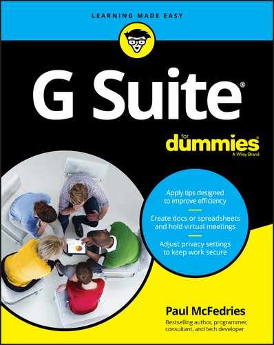
- Select Custom Spacing to open the Custom Spacing dialog box, shown in Figure 6-6. Enter a value in the Line Spacing text box and then click Apply.
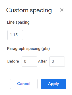
FIGURE 6-6: Use the Custom Spacing dialog box to set your own line spacing value.
Giving paragraphs some elbow room
There's a long-running debate in typographical circles about whether to add space between paragraphs. Fortunately for you, the specifics of that debate aren't important here, and I can offer the following advice:
- If you indent the first line of your paragraphs (as I describe in the later section “Indenting paragraphs”), you don't need space between them.
- If you don't indent, you need to add some space between paragraphs so that it's always clear to the reader when one paragraph ends and the next one begins.
To set the spacing between paragraphs, first specify what you want to format:
- To format one paragraph, click anywhere within that paragraph.
- To format multiple, consecutive paragraphs, select those paragraphs.
- To format the entire document, pull down the Edit menu and choose Select All, or press Ctrl+A (⌘ +A on a Mac).
![]() Select the Format menu and then select Line Spacing, or click the Line Spacing toolbar button. (If you don't see the Line Spacing button, click the toolbar's More button — the three horizontal dots; refer to Figure 6-8.) You now have three ways to go:
Select the Format menu and then select Line Spacing, or click the Line Spacing toolbar button. (If you don't see the Line Spacing button, click the toolbar's More button — the three horizontal dots; refer to Figure 6-8.) You now have three ways to go:
- Select Add Space Before Paragraph to add a 10-point space before each selected paragraph.
- Select Add Space After Paragraph to add a 10-point space following each selected paragraph.
- Select Custom Spacing to open the Custom Spacing dialog box. (Refer to Figure 6-6.) Enter a value, in points, in the Before or After text box (or in both — why not?), and then select Apply.
Keeping stuff together
One way to jar your readers is to have what appear to be extraneous lines just sitting there on the page. It might be a header at the bottom of a page, an important paragraph broken across two pages, the last line of a paragraph at the top of a page (known in the trade as a widow), or the first line of a paragraph at the bottom of a page (known as an orphan).
![]() You can prevent these pathetic creatures from haunting your documents by selecting the paragraph you want to format, selecting the Format menu, and then selecting Line Spacing or clicking the Line Spacing toolbar button. You can work with these three commands:
You can prevent these pathetic creatures from haunting your documents by selecting the paragraph you want to format, selecting the Format menu, and then selecting Line Spacing or clicking the Line Spacing toolbar button. You can work with these three commands:
- Keep with next: Ensures that the selected paragraph (such as a heading) always appears on the same page as the paragraph that follows it
- Keep lines together: Ensures that all lines in the selected paragraph appear on the same page
- Prevent single lines: Ensures that the selected paragraph has no widows or orphans
Indenting paragraphs
Indenting a paragraph means shifting some or all of the paragraph text relative to the margins. Docs offers four paragraph indentation possibilities:
- Left: Shifts the entire paragraph away from the left margin by a specified amount
- Right: Shifts the entire paragraph away from the right margin by a specified amount
- First line: Shifts just the first line of the paragraph away from the left margin by a specified amount
- Hanging: Shifts all but the first line of the paragraph away from the left margin by a specified amount
The term hanging indents sounds weird, but they can be useful. For example, hanging indents are often used for the items in a bibliography and for dictionary entries.
To set the indentation, first specify what you want to work with:
- To indent one paragraph, click anywhere within that paragraph.
- To indent two or more consecutive paragraphs, select those paragraphs.
- To indent the entire document, pull down the Edit menu and choose Select All, or press Ctrl+A (⌘ +A on a Mac)
Docs offers three left indentation methods:
- On the menu bar, select Format and then Align & Indent.
- Press a shortcut key.
- Click a toolbar button.
Table 6-4 shows the Align & Indent menu commands, their corresponding shortcut keys, and the equivalent toolbar buttons for the two left indentation options in Docs. (If you don't see the Increase Indent and Decrease Indent buttons, click the toolbar's More button — the three horizontal dots; refer to Figure 6-8.)
TABLE 6-4 Left-Indent Paragraphs in Docs
|
Align & Indent Menu Command |
Windows Shortcut Key |
Mac Shortcut Key |
Toolbar Button |
What It Does |
|
Increase indent |
Ctrl+] |
⌘ +] |
|
Increases the left indentation of the paragraph by half an inch. |
|
Decrease indent |
Ctrl+[ |
⌘ +[ |
|
Decreases the left indentation of the paragraph by half an inch. |
To set a custom indentation, follow these steps:
-
Choose Format ⇒ Align & Indent ⇒ Indentation Options.
Docs opens the Indentation Options dialog box, shown in Figure 6-7.
- To set the left indentation, enter a value (in inches) in the Left text box.
- To set the right indentation, enter a value (in inches) in the Right text box.
- Use the Special Indent list to select either First Line or Hanging, and then enter an indentation value (in inches) in the text box.
- Click Apply.
You can also set the left, right, and first-line indents by using the ruler. First, make sure the ruler is onscreen by pulling down the View menu and selecting the Show Ruler command.

FIGURE 6-7: Use the Indentation Options dialog box to set up a custom indentation.
Using the ruler features pointed out in Figure 6-8, you can make the following indent adjustments for the selected paragraph or paragraphs:
- Click-and-drag the Left Indent marker to set the left indent.
- Click-and-drag the Right Indent marker to set the right indent.
- Click-and-drag the First Line Indent marker to set the first-line indent.
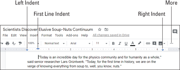
FIGURE 6-8: You can set the left, right, and first-line indents by using the ruler.
Using Styles to Make Looking Good Look Easy
As I hope I've shown so far in this chapter, formatting is essential if you want to produce good-looking documents that get noticed. The problem is that formatting always seems to take up so much time.
Suppose that you want to add a title to a document. Titles usually appear in a larger, sans serif font, so you type in the text, select it, and then use the Font and Font Size commands to set up the appropriate formatting. For good measure, you also center the title. It looks not bad, but you decide that the text needs to be bold. So you highlight the text again and then apply the bolding. Things are looking good, but then you decide to apply a larger type size. Once again, you highlight the text and then make the size adjustment. After fiddling with a few more options (maybe underlining or dark blue text would look good), you finally get the title exactly right. You've just wasted ten minutes of your busy day, but — hey, that's the reality of working with Docs, right?
Wrong. You don't have to stand for this! By learning how to use styles, you can accomplish the same chore in ten seconds instead of ten minutes. How is that possible? Well, you see, a style is nothing more than a predefined collection of formatting and layout settings. Docs comes with a few styles built-in, including a style named Title. This means that rather than fuss around with formatting options, you can instead just select the text you want to use as the title and then apply the Title style. Docs immediately applies all the Title style's predefined formatting options — just like that.
What if you don't like the default formatting of the Title style? That's not a problem because it's also easy to define your own version of each built-in style. For example, you can format some text with an 18-point, bold, dark blue, Verdana font that's centered between the left and right margins and then tell Docs to use that formatting instead of its default formatting for the Title style. You'd then enter the document title, select it, and apply the Title style. In the blink of an eye, Docs formats the text as 18-point, bold, dark blue Verdana, centered between the left and right margins. That's right: With a single command, Docs can throw any number of character, line, or paragraph formatting options at the selected text.
Style advantages
Here's a short list of just some of the benefits you gain when you use styles:
- The most obvious, of course, is the time you save. After you've invested the initial few minutes to define your version of a style, applying any style takes only a few mouse clicks.
- You eliminate the trial-and-error that goes into many formatting chores. After you've decided on a look that you like, you can capture it in a style for all time.
- If you change your mind, however, a style can be easily edited. Does this mean that you have to go back and reapply the style throughout the document? No way. Any text that’s formatted with that style is automatically reformatted with the revised style. This feature alone is worth the price of admission.
- Styles make it easy to create documents that have a consistent look and feel, because you can access your styles from any document.
- Styles reduce the number of keystrokes and mouse clicks you need to get the job done. In this age where repetitive strain injuries such as carpal tunnel syndrome are reaching almost epidemic proportions, anything that reduces the wear-and-tear on our sensitive anatomy is a welcome relief.
If it all sounds too good to be true, well, there is a downside: Styles can save you so much time that you may run out of things to do during the day. (Pause while the laughter dies down.)
Applying default Docs styles to avoid reinventing the style wheel
Before you go off in some kind of style-defining frenzy, you should first check out the default Docs styles. The default styles (as opposed to the custom versions of the styles that you create yourself) are built-in styles that come with Docs. It has these nine default styles, listed here with their keyboard shortcuts when they have one:
- Normal text: This 11-point, black Arial font is used for regular document text. Shortcut key: Ctrl+Alt+0.
- Normal text (Ctrl+Alt+0; ⌘ +Option+0 on a Mac): This 11-point, black Arial font is used for regular document text.
- Title: This 26-point, black Arial font is ideal for document titles.
- Subtitle: This 15-point, dark gray 3, Arial font is normally used for document subtitles.
- Heading 1 (Ctrl+Alt+1; ⌘ +Option+1 on a Mac): This 20-point, black Arial font is used for first-level document headings.
- Heading 2 (Ctrl+Alt+2; ⌘ +Option+2 on a Mac): This 16-point, black Arial font is used for second-level document headings.
- Heading 3 (Ctrl+Alt+3; ⌘ +Option+3 on a Mac): This 14-point, dark gray 4 Arial font is used for third-level document headings.
- Heading 4 (Ctrl+Alt+4; ⌘ +Option+4 on a Mac): This 12-point, dark gray 3 Arial font is used for fourth-level document headings.
- Heading 5 (Ctrl+Alt+5; ⌘ +Option+5 on a Mac): This 11-point, dark gray 3 Arial font is used for fifth-level document headings.
- Heading 6 (Ctrl+Alt+6; ⌘ +Option+6 on a Mac): This 11-point, italic, dark gray 3 Arial font is used for sixth-level document headings.
To apply these styles, first select the text you want to format. Docs then gives you three choices:
- Select the Styles list on the toolbar (see Figure 6-9) and then select the style you want to apply. (Note that not all default styles appear in this list. If you want to apply Heading 4 through Heading 6, you need to use either of the methods that follow.)
- Choose Format from the menu bar, select Paragraph Styles, choose the style you want to apply, and then select Apply Style, where Style is the name of the style.
- Press the style's shortcut-key combo, which I’ve included in the previous list.
FIGURE 6-9: The easiest way to apply most default styles is via the Styles list on the toolbar.
Updating a default style to taste
Well, since fine words butter no parsnips, as they say (no, they really do), let's get down to business and see how to define your own versions of the default styles. The simplest way to go about this is to first format a section of text exactly the way you want it. You can then update a default style so that it uses your formatting instead of the predefined Docs formatting. Here are the steps you need to follow:
-
Using some existing text, apply the formatting options you want to include in the updated style.
You can use any of the formatting features I discuss in this chapter.
- When you're done, make sure the cursor is inside the formatted text.
-
Choose Format ⇒ Paragraph Styles, select the style you want to update, and then choose Update Style to Match, where Style is the name of the style.
Alternatively, select the Styles list on the toolbar, hover the mouse pointer over the style you want to update, and then select Update Style to Match, where Style is the name of the style.
Docs updates the style to match your formatting and also applies that formatting to any other text in your document that currently uses the same style.
The new style only applies to the current document. If you want to use the new style in other documents, you need to save the style, and I talk about that in the next section.
Saving your updated styles
If you want to use an updated style only in the current document, that's perfectly fine. However, you might find that you want to reuse one or more of your updated styles in other documents. For example, if you've updated some styles to match corporate formatting guidelines, you'll want those updates available in every work document you create.
Docs is happy to comply, as long as you follow these instructions:
- Follow the steps in the previous section to update the default Docs styles as needed.
-
Choose Format ⇒ Paragraph Styles ⇒ Options ⇒ Save as My Default Styles.
Alternatively, select the Styles list on the toolbar and then choose Options ⇒ Save as My Default Styles.
Docs saves your updated styles.
Telling Docs to use your updated styles
If you find that a particular document isn't using your saved default styles, you can give Docs a nudge in the ribs and tell it to use your styles, by using either of these techniques:
- Choose Format from the menu bar, select Paragraph Styles, choose Options, and then select Use My Default Styles.
- Pull down the toolbar's Styles list, choose Options, and then select Use My Default Styles.
Resetting the default styles
If you make a mess of your style updates or if your style updates have served their purpose and you no longer need them, you can reset all the styles to their original Docs default formatting by using either of the following techniques:
- Choose Format from the menu bar, select Paragraph Styles, choose Options, and then select Reset Styles.
- Pull down the toolbar's Styles list, choose Options, and then select Reset Styles.
Making Lists, Checking Them Twice
Are you making a list and checking it twice? Gonna find out who’s naughty and — whoops, drifted off to the North Pole for a second! But if you do want to include a list in your document, what’s the best way to go about it? You can use separate paragraphs or headings that you number yourself or add, say, asterisks (*) at the beginning. I suppose that would work, but hold your list horses — there’s a better way. Docs has a couple of commands that are specially designed to give you much more control over your list-building chores.
Putting your affairs in order with numbered lists
If you want to include a numbered list of items — it might be a top-ten list, bowling league standings, or any kind of ranking — don’t bother adding in the numbers yourself. Instead, you can use the Numbered List command in Docs to generate the numbers for you.
Before I get to the specifics, you should know that Docs is happy to create multilevel numbered lists, where each level has its own numbering format. Here's the default numbering format (see Figure 6-10 for an example):
- The top level of the list uses regular numbers followed by periods (1., 2., 3., and so on).
- The second level of the list uses lowercase letters followed by periods (a., b., c., and so on).
- The third level of the list uses lowercase Roman numerals followed by periods (i., ii., iii., and so on).

FIGURE 6-10: An example of a default, multilevel numbered list.
To forge a numbered list of your own, follow these steps:
-
If you have some existing text that you want to convert to a numbered list, select that text.
Make sure that each “item” in your existing text is in its own paragraph.
-
Choose Format ⇒ Bullets & Numbering ⇒ Numbered List.
 Alternatively, click the Numbered List button on the toolbar. (If you don't see the Numbered List button, click the toolbar's More button — the three horizontal dots; refer to Figure 6-8.)
Docs displays a menu of numbered-list formats, as shown in Figure 6-11.
For each format, Docs shows the numbering scheme that it uses for the first, second, and third levels of the list.

FIGURE 6-11: Select Numbered List to see the available numbering schemes.
-
Select the numbering scheme you want to use.
If you selected some text in advance, Docs converts the text to a numbered list. To add an item to that list, place the cursor at the end of the last item and then press Enter or Return.
- For a second-level item, press Tab; for a third-level item, press Tab again.
- Enter your item text and then press Enter or Return to create a new item in the list.
- Repeat Steps 4 and 5 until your list is complete.
- Press Enter or Return a second time to tell Docs you don't want to enter many more list items.
Scoring points with bulleted lists
Numbered lists, of course, aren’t the only kinds of lists. If you just want to enumerate a few points, a bulleted list might be more your style. They’re called bulleted lists because Docs displays a cute little dot, called a bullet, to the left of each item.
Most bulleted lists are one level, but Docs doesn't mind creating lists that have two or even three levels. Here's the default bullet format (see Figure 6-12 for an example):
- The top level of the list uses filled-in discs.
- The second level of the list uses circles (that is, discs that aren't filled in).
- The third level of the list uses filled-in squares.

FIGURE 6-12: An example of a default, multilevel bulleted list.
To throw together a bulleted list, follow these steps:
-
If you have existing text that you want to convert to a bulleted list, select that text.
For best results, each “item” in the text should be in its own paragraph.
-
Choose Format ⇒ Bullets & Numbering ⇒ Bulleted List.
 As an alternative, you can click the toolbar's Bulleted List button. (If you don't see the Bulleted List button, click the toolbar's More button — the three horizontal dots; refer to Figure 6-8.)
Docs offers you a menu of bulleted list formats, as shown in Figure 6-13.
For each format, Docs shows the numbering scheme that it uses for the first, second, and third levels of the list.
-
Choose the bullet scheme you want to use.
If you selected text in advance, Docs converts the text to a bulleted list. To add an item to the list, place the cursor at the end of the last item and then press Enter or Return.
- For a second-level item, press Tab; for a third-level item, press Tab again.
- Enter your item text and then press Enter or Return to create a new item in the list.
- Repeat Steps 4 and 5 until your list is complete.
- Press Enter or Return a second time to tell Docs you don't want to enter any more list items.
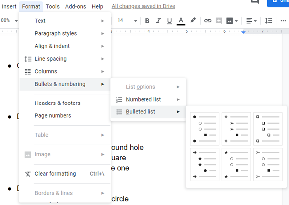
FIGURE 6-13: Click Bulleted List to see the available bullet schemes.
Image Is Everything: Adding Graphics
Television commercials assure us nowadays that “image is everything.” And because they couldn't put it on TV if it weren't true (!), you need to think about what kind of image your documents present to the outside world. I've shown so far in this chapter how a few fonts and other formatting options can do wonders for drab, lifeless text. But anybody can do that kind of stuff. To make your documents stand out from the crowd, you need to go graphical with images, photos, or other types of eye candy. Happily, Docs has the tools that not only get the job done but also make the whole thing a snap.
In fact, the image-related tools in Docs border on overkill because they give you no fewer than a half dozen ways to insert an image into a document:
- Upload from computer: Inserts an image file that resides on your PC
- Search the web: Enables you to search for and then insert an image from the web
- Drive: Inserts an image file that's stored on your Google Drive
- Photos: Inserts an image file that you've uploaded to Google Photos
- By URL: Inserts an image file that resides at a specific web address
- Camera: Inserts a photo taken via your computer's camera
In the next few sections, I walk you through the details of each method:
Although I don't cover it in this book, Docs gives you a seventh method to get graphics into a document: Select the Insert menu and then choose Drawing. This opens the Drawing window, which you can use to draw lines, arrows, shapes, and more. If you're an artist (or an artist at heart), check it out.
Okay, there's actually an eighth method for adding graphics to a document. Select the Insert menu, choose Chart, and then choose a chart type: Bar, Column, Line, or Pie. You can also select From Sheets to import a Sheets chart, which is probably the best way to go. (See Chapter 9 for the details on making charts with Sheets.)
Inserting an image from your PC
Probably the easiest way to get an image into a document is to insert a file that resides on your computer. Here's how it's done:
- Position the cursor at the spot where you want the image to appear.
-
Chose Insert ⇒ Image ⇒ Upload from Computer.
 Alternatively, click the Insert Image toolbar button and then choose Upload from Computer.
Docs displays the Open dialog box.
- Select the image file you want to insert into your document.
-
Select Open.
Docs inserts the image.
Inserting an image from the web
If the image you want to use is on the web somewhere — and you have permission to use that image — follow these steps to search for and insert that image:
- Place the cursor at the position where you want the image to appear.
-
Chose Insert ⇒ Image ⇒ Search the Web.
Alternatively, click the Insert Image toolbar button and then choose Search the Web.Docs displays the Search for Images pane.
-
In the Search for Images text box, enter some text that describes the image you want and then press Enter or Return.
Google Images goes to work looking for images that match your search text.
-
Select the image you want to use.
If you want to use multiple images, go for it: Select each image.
-
Click Insert.
Docs inserts the image (or images).
Inserting an image from Drive
If the image you want to use is stored on your Google Drive, you can insert it from there. Here's how:
- Place the cursor at the position where you want the image to appear.
-
Chose Insert ⇒ Image ⇒ Drive.
Alternatively, click the Insert Image toolbar button and then choose Drive.Docs displays the Google Drive pane.
-
Select the image you want to use.
If you want to use multiple images, don't let me stop you: Select each image you want to insert.
-
Click Insert.
Docs inserts the image (or images).
Inserting an image from Photos
If the image you want to insert is one you've upload to Google Photos, follow these steps to get the image from there to here:
- Position the cursor where you want the image to appear and then say “Stay!”
-
Choose Insert ⇒ Image ⇒ Photos.
Alternatively, click the Insert Image toolbar button and then choose Photos.Docs displays the Google Photos pane.
-
Select the image you want to use.
To insert multiple images, select each image.
-
Click Insert.
Docs inserts the image (or images).
Inserting an image from a URL
If the image you want to use is on the web, and you happen to know the address (also known as the URL — Uniform Resource Locator) of the image, you can follow these steps to insert the image:
- Use your web browser to copy the address of the image.
- Maneuver the cursor into the position where you want the image to show up.
-
Chose Insert ⇒ Image ⇒ By URL.
Alternatively, click the Insert Image toolbar button and then choose By URL.Docs opens the Insert Image dialog box.
- Paste the image address into the text box.
-
Select Insert.
Docs inserts the image.
Inserting a photo from your PC's camera
If your PC has a camera, you can persuade it to take a photo and then shoehorn that image into your document. Here's how it works:
- Get the cursor into the position where you want the photo to appear.
-
Chose Insert ⇒ Image ⇒ Camera.
Alternatively, click the Insert Image toolbar button and then choose Camera.The first time you do this, your web browser asks whether it's okay for Docs to access your PC's camera, as shown in Figure 6-14.
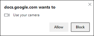
FIGURE 6-14: Sensibly, Docs needs permission to use your computer's camera.
-
Select Allow.
Docs connects to the camera and displays a live feed.
- Compose your shot as desired.
-
Select Insert.
Docs inserts the photo.
Setting a few image options
After you add an image to your document, you might need to make a few adjustments, such as changing the size, color, or the way text flows around the image. To make these and other tweaks, first select the image. Docs adds a toolbar button named Image Options, which you can click to see the Image Options pane, shown in Figure 6-15.
Here's a quick look at what you get with each category in the Image Options pane:
-
Size & Rotation: Enables you to change the width and height of the image or to scale the image larger or smaller. You can also rotate the image.
You can also resize the image directly by clicking-and-dragging any of the square handles that appear on the image sides and corners. You can rotate the image directly by clicking-and-dragging the circle that appears above the selected image. - Text Wrapping: Determines how your document text interacts with the image. Select Inline with Text to have the image appear on the same line with the text that comes just before it; select Wrap Text to have your document text flow around the image; or select Break Text to have the document text stop before the image and then continue after the image. If you go with Wrap Text or Break Text, you can use the Margins from Text options to set the distance between the text and the image.
- Position: Determines how the image is positioned on the page. Note that this category is enabled only if you select either Wrap Text or Break Text in the Text Wrapping category.
- Recolor: Enables you to apply a color effect to the image.
- Adjustments: Offers sliders that enable you to adjust the image's transparency, brightness, and contrast.

FIGURE 6-15: Select an image and then click Image Options on the toolbar to see the Image Options pane.