CHAPTER OVERVIEW
This chapter visits the basic elements to consider as you translate treatment ideas into a cohesive design strategy for your instructional piece. The process of creating the instruction's visual approach has four key components:
The assessment of the learning landscape as described in Chapter Sixteen
A brainstorming session, often known as a treatment meeting, that builds on what is known about the goals of the instruction and the learning landscape
Considerations of instructional strategy, dominant display element, and size and orientation
A preliminary layout of the visual approach
When you have completed your assessment of the learning landscape, you are ready to start putting together the visual look of your instruction.
After you assess the goal of the training and the learning environment, you are ready to plan the visual approach for the complete instructional piece. Chapter Two introduced the idea of the "display framework," a generic term to refer to all the components that make up the specific look and feel of the product. In e-learning, the display framework encompasses the graphical user interface (GUI). In print, it might be called the "treatment" For a slide show its probably most commonly referred to as the template. Whatever the look and feel are called, its formation begins with brainstorming.
Everybody loves treatment meetings. Ideas are popping, and there's an adrenaline rush in the collaboration of team members feeding off each other's creativity. Nothing is "real" yet, so spirits are often high.
Every project needs a brainstorming session about its graphic look and feel—even if that assessment does no more than establish that your project will have the exact same look as the nine other projects that proceeded it. In such cases, you may not partake in a treatment meeting per se, but treatment is an agenda item of another project startup meeting.
Art Director, project manager, instructional, graphic, software designers, content developers and artists make up the team. Even if you are a team of one—hold a session for yourself anyway. Treat yourself to the requisite finger food and beverage...and mentally kick around ideas about the look and feel that your instructional piece will have.
Coming up with relevant treatments, rather than just fanciful ideas, depends upon the information you discover or decide about the goals of the piece and the learning landscape. These are introduced in Chapter Two and further elaborated in Chapter Sixteen.
After the treatment meeting, you usually have a pretty distinct direction for how you want to position the graphic approach. But there are also some comparatively mundane items such as access to ancillary materials (glossary, references, help); typeface (or font) selections for text, page, slide, or screen numbering conventions; and so forth that you still need to consider before you begin drafting image and style ideas for the client. In agencies, the choices about graphic look and feel are sometimes formalized in a document known as a "design brief" or treatment document.
At the treatment meeting or brainstorming session (even if it is a brainstorming session of only one), much of the time is spent generating visual ideas and treatments, colors, characters, and "cool stuff." But at the base, there are several instructional and design issues that should also be considered before committing to a specific visual approach.
Clark (2003), describes the following four instructional strategies: receptive, directive, guided discovery, and exploratory. Each translates to a different type of structure and visual approach in order to support the strategy. In e-learning especially, the display design is inextricably linked to the instructional strategy. Table 17.1 recaps the four strategies and the implications of each for the visual approach.
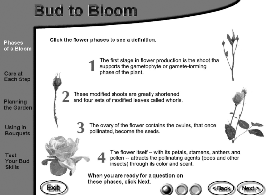
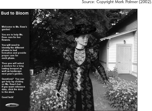
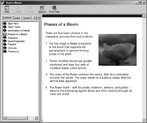
Figures 17.1 through 17.4 illustrate the different display frameworks for each of the four strategies for a small course about flower formation. In Figure 17.1, the receptive strategy, which views the learner as a passive vessel, employs a video tour through a rose garden with a narrator providing the explanatory information. In Figure 17.2, the directive strategy relies on a standard online learning format that includes presentation of definitions or steps followed by examples and practice. In Figure 17.3, the guided discovery strategy promotes a problem-centered learning environment. To support this intent, the visual approach suggests three-dimensionality and incorporates modeled and photographic images. Guided discovery multimedia often employ such a "real-world" graphic look to simulate on-the-job circumstances. Finally, in Figure 17.4, the exploratory treatment of the same content uses a straightforward nested menu display framework that allows the learner access to any material at any time.
Table 17.1. Four Instructional Strategies and Their Graphic Needs.
Strategy | Description | Learner Response and Control | Framework Graphic |
|---|---|---|---|
Receptive | Learner is exposed to information as in a lecture or linear video. | Learners are viewed as passive sponges or empty vessels that absorb content. Has little control over the pace of the instruction. | Can be elaborate, attention getting. Since there is often very little interaction, the graphics need to constantly pull the learner in. |
Directive | Learner is presented with small chunks of instruction including ample opportunity to practice. Typical strategy is to present the rule, example, and then provide a practice. | Learners are viewed as active but novices who are hand-held and walked through instruction step by step. Learners have control over the pace of the instruction, but are generally guided or restricted in terms of the sequence. | Requires standardized navigation. Also, especially in e-learning, requires standard interaction elements—buttons for answers, feedback, and so forth. |
Guided Discovery | Learner learns by doing in a "real-life" environment, with guidance and coaching provided. | Learners are viewed as active participants in their learning. Has control over pacing and sequence, through what is covered. | Graphics simulated work environments. Coaches or Guides often have an on-screen character. |
Exploratory | No prescribed path nor "best sequence." Instructional content is organized in an appropriate schema (procedurally, alphabetically, etc.) and the learners choose the best path for their needs. | Learners are viewed as experienced and capable of identifying the training and knowledge they need. Complete control in terms of pacing and sequence and what is covered. | Display must accommodate multiple possible choices at all times. Common e-learning display frameworks take on the appearance on online references. |

In training materials, either words or visuals carry the training story line and dominate the layout. As the learners move from page to page to page, they know where to look to follow the story line. As long as the "thread" remains constant throughout the instructional unit, there is no extra load for the learners. But if the design is schizophrenic, with competing emphasis for audio, text, graphics, and even animation, the experience is chaotic and not conducive to learning.
As a simple illustration, consider children's books. Picture books use graphics to tell the story, so that the child can literally decipher what happens by following the illustrations, even though there may be text on each page that also provides the message. The graphics have primacy in the visual approach and are dominant. The e-learning course shown in Figure 17.5 is graphics-dominant. The pictures carry the story line, and the text is subordinate, often only in speech balloons or integrated into the graphic.

Many books for adolescents and adults, however, tend to be text-dominant. The text often starts in the upper-left-hand corner on every page, a consistent and pre-eminent location used to make following the continuity of the story line easy. Pictures are often smaller and less emphatic. They have a supportive role. Figure 17.6 shows a text-dominant instructional piece.
As you plan your visual approach, you decide what element carries or drives the story line. Naturally, you decide based on the content, the audience, the learning environment, the platform, all those issues you investigated and determined during assessment and analysis. Decisions about which is dominant determines placement of graphics and the real estate designated to other components. In text-dominant courses, more prime real estate space is dedicated to text. The converse is true for graphics-dominant courses.

To elaborate, look at the layouts in Figures 17.7 and 17.8. These two print-based visual approaches for instruction are aimed at high-risk patients so that they can recognize skin conditions they should contact their doctor about immediately. Photographs of different cancers with defining characteristics in labels can almost carry the training without much explanatory text. The graphics-dominant layout in Figure 17.7 puts many graphics in prime locations, with only essential text below in less prime real estate. The eye starts with the graphics, which can carry the message and can communicate the essential information for the intended audience. The text-dominant version in Figure 17.8, though the same type of three-panel brochure, allocates the prime real estate to explanatory text, forcing the graphics to a less prime spot.
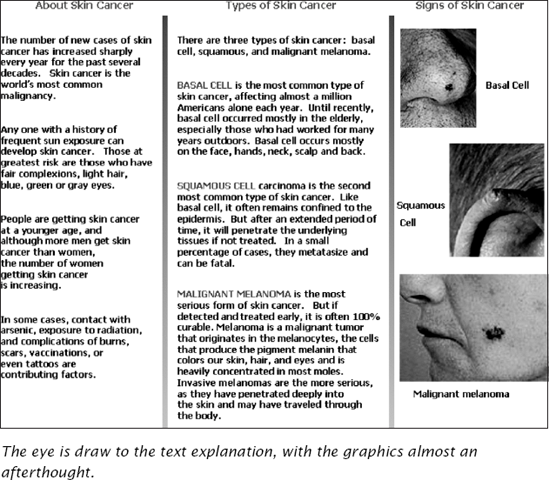
There is also less room for the graphics, a poor design decision, for these are really the essential components of this concept-based instruction.
To help determine if your instructional content is a good candidate for a graphics-driven layout, use the checklist in Table 17.2. If you answer five or six of the questions in this checklist with a "yes," your content may be a candidate for a layout that lets the picture tell the story.
Hand-in-hand with deciding whether text or graphics drive the layout is the decision about the size of the finished product. For both paper-based and e-learning packages, decisions about the size and orientation of product are critical to its look and feel. The size of the final product may also have the most far-reaching impact on the design and selection of individual graphics. Will the book be standard 8 ½ × 11? 5 × 4? Landscape? Portrait? In e-learning, should the "page" be fixed to fit completely in the display window or extend beyond it and require vertical scrolling? Some minimal vertical scrolling is considered okay; horizontal scrolling is less acceptable; and requiring both puts an extra burden on your learner (Lyons and Clark, 1999).
Table 17.2. What Makes a Good Candidate for Graphics-Dominated Layout?
Is the audience novice? | ○ | Yes? | ○ | No? |
Do the graphics tell the story (such as discriminating among the appearance of various skin cancer types)? | ○ | Yes? | ○ | No? |
Does the audience include speakers of many different languages? | ○ | Yes? | ○ | No? |
Is the instructional content relatively straightforward, presenting mostly procedures, facts, and some concepts? | ○ | Yes? | ○ | No? |
Is the explanatory text less than 20 percent of the total content? | ○ | Yes? | ○ | No? |
Can the explanatory information be handled almost entirely in rollovers, callouts, or caption text? | ○ | Yes? | ○ | No? |
Does the information need to be absorbed quickly, while performing the task? | ○ | Yes? | ○ | No? |
Obviously, size and orientation must meet the requirements of the learning environment and the learner profile. Consider the step-by-step instruction for clearing a paper jam in the office copier. The size needs to be small enough to access while attempting to clear the copier, but large enough to accommodate legible illustrations. If designed by the equipment manufacturer, the instructions can be an integral part of the machine, or on a control panel display, or even on decals inside the various parts of the machine. But if not, the size and orientation decisions need to take in consideration where the machine is located and how instructional materials can be kept with the machine. As one solution, perhaps you create a 5- × 4-inch landscape booklet that is stored in a pouch affixed to the side of the machine.
Now you are ready to get out your sketchpad and begin to think about the layout. If you are fortunate enough to work with a graphic artist or an interface designer, here's where they bring all their creative expertise to the enterprise. Depending on what the final form of the print material is (job aid, fold-out card, brochure), a print graphics designer may create a dummy, a mockup of how the product opens when held in the learner's hands.
Sometimes you don't have much control over the visual style of a piece. Perhaps your work is tightly controlled by corporate standards. Maybe other times the style of your instruction is wide open to all the creativity that the design team can bring to the project. The graphic style is often one of the chief tools for conveying the image sought. All visual elements contribute.
The typeface/font you use for headers, subheads, and body text can communicate light and chatty or classic and professional.
The color palette you choose can add an element of whimsy or of steely technical savy.
The amount of white space used in the layout not only aids in readability, but also contributes to the image the materials project. Dense type crowding a few graphics connotes an academic style. Lots of white space in the margins, between lines, around graphics, and other page elements is not only more inviting to the average reader, it also projects a more casual style than the heavy text treatment.
The type of graphic—illustration, photograph, stock images, or clip art—adds to the overall image. If line drawing illustrations dominate, the material takes on a technical style. A reliance on overexposed clip art, unfortunately, contributes to a bargain basement look.
The style of the art itself—impressionistic, baroque, pop, roccoco, cubist, or even romantic—obviously contributes to an overall style of the instructional material.
If you want to learn more about the elements of style, consider taking any of a number of seminars offered by the resources listed in Chapter Sixteen, or even enroll in art history, painting, or advertising design classes.
As you develop the style of the piece, keep in mind the cognitive principles for directing attention, managing load, and helping learners build mental models as these may provide guidance on how you use and position your elements.
Available real estate refers to the amount of space that needs to be reserved for instructional content, before space is allocated to navigational elements, decorative graphics, and theme treatment. Even though at this point it is too soon to be determining the exact layout of every page or screen in the product, you are making decisions about the general pattern for the components of your display. Where do the standard graphics go? How should the running organizational graphic be handled? Should a book's standard layout be a two-page spread to accommodate a graphics-dominant display?
These decisions become key development efficiencies in later phases of design and development. In e-learning, for example, the graphics and programming teams often develop templates that provide designers and writers guidelines on how much text will fit on various screen types. In some cases, these guidelines establish the maximum number of characters per line as well as the maximum number of lines per column. Some very restrictive e-learning courses allow only relatively small graphics and only in the upper-right corner of the display. Other courses provide many more options.
Graphics are seductive in their own right, and the tendency sometimes is to designate more real estate to them, leaving less for what sometimes seems to be dull text or a boring chart or table. As happens all too frequently, an artist can create a display framework that doesn't leave enough available space for instruction and instructional graphics.
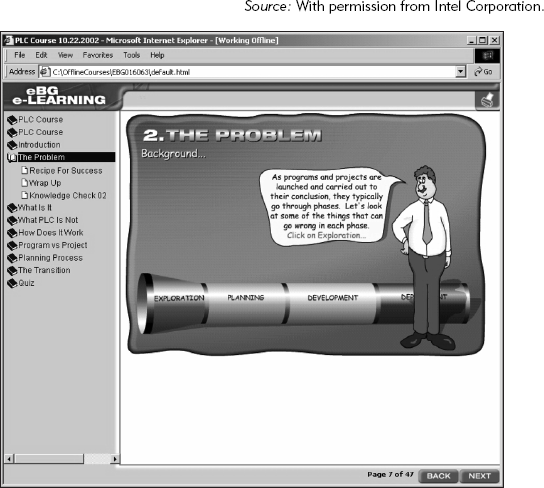
Although this tendency to leave little room for instruction is especially evident with ornate theme graphics, the screen capture in Figure 17.9 illustrates that even the most basic courses can make the mistake of emphasizing a gratuitous graphic and relegating the instructional content to a corner.

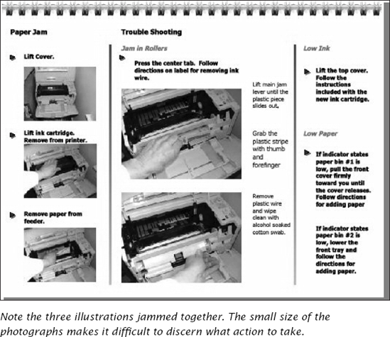
But it is not just e-learning or slideshow presentations that suffer from this problem. Often designers of paper-based materials paint themselves into the same corner. Consider Figure 17.10, which shows an example of a Quick Reference Card for clearing paper jams. Here, the graphics tell the story, but the display design leaves very little space for a series of illustrations, especially for the three in the left-hand column. The available space for graphics is too limited. Thus, the illustrations are squeezed down to the smallest size possible. Three sets of instruction in three separate columns are jammed onto one page. Solution? More pages, bigger illustrations, and line art instead of photographs.
As you or the artists are roughing out the layout, you address the need for navigational elements that help learners move through the training. Navigational graphics let learners know where they are, where they have been, and where they can go (Nielsen, 2000). In a book, these graphics may be section and chapter indicators, page number, or header and footer. Navigation can be the tabs on a quick reference card or even the graphic chapter identifiers in a book.
For e-learning and multimedia design, the navigational elements of the display framework are often, but not always, more elaborate than those used in print. Learners need to know where to click to go forward or back through an instructional chunk. They need to know how to jump to another segment, access a glossary, and find adjunct samples and research. If the e-learning provides an on-screen agent or coach, the learner needs an icon or visible device to access it. Although in most cases, these navigational elements should be readily accessible, they need to recede visually so as not to distract from the instructional content.
Good interface design is a discipline unto itself and beyond the scope of this book. Jakob Nielsen's Designing Web Usability: The Practice of Simplicity is the current de facto standard for good interface design, but there are several other key books and seminars on the subject. Suffice it to say here, however, that for every function the designers anticipate the learner performing, space in the design needs to be reserved for a button, icon, and navigational identifier to let them do so. At the same time, the display framework must support the training.
A company decides to put its basic two-day instructor-led seminar on the web. It's their first venture into e-learning, but their business objective is to start a catalog of offerings, so that this first effort sets the standards for all the others in the library. They need to get the project up and running under a tight deadline, so they decide to use six instructional designers supported by a team of programmers, graphic designers and artists. They compress the analysis, design, and development time frame and agree to take the risk associated with concurrent development (such as beginning scripting before the interface has been designed and prototyped).
During the analysis phase, the team determines that the content from the two-day seminar will be chunked into twelve modules, each as a stand-alone course accessible through a Learning Management System. Because the course will be available over the commercial Internet, they plan limited use of audio and no video at all.
Once the instructional designers have analyzed the content, the programmers have investigated the delivery platform considerations, and the graphic designers have looked at the corporate graphic guidelines, the team meets for a treatment meeting.
During the treatment meeting, the team discusses all the elements the interface will need to include, such as a learner's online notebook, glossaries, sample data, and real-life examples. They know that the entire library of offerings will be in a 1024 × 768 resolution and use the same colors and branding as the logo and Web site. They decide a directive strategy makes the most sense for the content, though they want to include within the basic architecture some exploratory elements. The content is complicated, principle-based, and needs significant explanation, so the layout needs to have significant real estate reserved for the text. The programmers decide to stay with browser technology but fix the screen size to only allow a little vertical scrolling where absolutely essential. The team agrees that once the interface is laid out, the programmers and artists will provide the instructional designers with maximum line and character counts to provide guidance on how much space they have for words. The instructional and graphic designers hammer out a compromise on the size of the text font (the artists want it smaller; the instructional designers want it bigger and bolder).
The project manager asks the graphics designer to design a few samples and schedules another meeting when they will reconvene to fine-tune the look. He asks all the instructional designers to look over the content and consider worst-case needs for text, graphics and interactions to make sure that the interface will accommodate everything the courses must include. They will also divy up assignments when they meet again. They are well on their way to determining their overall look and feel.
In Chapter Eighteen, we follow one of the instructional designers as she focuses on the graphics needed for her individual lesson.
The visual approach you determine sets the backdrop for your content and any individual graphics your lessons require. Once the backdrop is set, you and the team know the parameters and limitations against which you have to work. In the next chapter, we take a look at how to get the creative juices flowing as you delve into the specifics of planning the design for your individual content graphics. Some of these techniques are good data collection techniques or spring from the content types themselves. Others involve honing a new awareness of visual techniques.
Craig, J. (1999). Designing with Type (4th ed.). New York: Watson-Guptell.
Lipton, R. (2002). Designing Across Cultures: How to Create Effective Graphics for Diverse Ethnic Groups. Cincinnati, OH: How Design Book.
Lynch, P., and Horton, S. (1999). Web Style Guide: Basic Design Principles or Creating Web Sites. New Haven, CT: Yale University Press.
Lyons, C., and Clark, R.C. (1999). "Web-Based Training Design: Past Present and Future." InterCom, pp. 6–12.
Rosen, L., and Morville, P. (1998). Information Architecture for the World Wide Web. Sebastin, CA: O'Reilly and Associates, Inc.
White, J.V. (1990). Great Pages: A Common-Sense Approach to Effective Desktop Design. El Segundo, CA: Serif Publishing, a Subsidiary of Xerox Publishing.
Williams, R. (1994). The Non-Designer's Design Book: Design and Typographical Principles for the Visual Novice. Berkeley, CA: Peachpit Press.
CHAPTER OUTLINE

Creating Individual Visuals That Work Roles in Graphics Development
Roles in Graphics Development
Three Structures of the Design Team
Getting Beyond Clip Art: Tips to Visualize Your Individual Graphics
Start Thinking Visually from the Onset
Use Tools to Help You Capture Details Design Graphics That Will Be Used Throughout the CourseEarly in Your Process
Collect Different Visual Data Depending on the Types of Content Watch
Movies with a Visual Eye
Get the Big Picture
Work from the Visuals; Work from the Content
Sketch
Test it Out
A Case Study Continued: Sanji's Graphic