CHAPTER OVERVIEW
In this chapter, we turn our attention to the design of individual graphics. We begin by looking at the various roles and different types of design teams involved in graphics production. Then, we provide some tips for exercising your visualization muscles, starting the moment you begin to research. We also recommend collecting different source materials for your graphics based on the content types. Finally, this chapter suggests ways to activate your imagination and test out your graphic ideas.
For those of us whose talent never burgeoned beyond our finger-painting masterpieces, how art happens is often a mystery. Many of us developing instructional materials are not artists and have not worked in advertising or fields where art production is the norm. This chapter is for us. It provides a brief snapshot of how graphics get planned and gives non-artists some techniques to get their visualization juices flowing.
In the previous sections, we've discussed the communication functions and psychological events that can be aided by judicious use of graphics. We've shown how graphics can help learners absorb content that is:
Unfamiliar to the audience so that they need mental models and organizers
Overloaded with detail and desperate for
organization to minimize cognitive load
cues to focus learners' attention
Complicated, either causally or temporally, requiring indicators of movement or time
And in the two chapters immediately preceding this one, we've discussed designing an overall look and feel for your package that meets the needs of the learning landscape. Now, how do you, as a training professional, begin to create the individual visuals that these psychological requirements demand?
Who does what and when in the development of an individual graphic? At the most basic level, someone comes up with the idea; someone creates the art; and someone integrates the art into the final production material. Depending on the size and nature of the project, these functions may be done by one person or by many. Table 18.1 provides descriptions of most roles in the production of commercial art (Graphics Artists Guild Handbook, 2001). Publishers and ad agencies employ professionals specialized in every role of the production process. Schools and training departments, however, rarely have the luxury or the budget for a full-fledged cast. In some cases, it's just one creative person who does it all—designs the instruction; originates the creative vision; finds, creates, or manipulates the art; and rolls out the production, all from his or her own desktop. In these situations, the solo writer/designer/artist/ production person is obviously intimate with each facet of the process.
However, most art production for instructional materials falls somewhere in between these two extremes. As instructional designers and writers, we develop the content and pass off the work to an artist to complete our vision. For those of us inexperienced with the art world, it's easy to expect designer-level skills from every graphic artist with whom we work. But as Table 18.1 demonstrates, all artists are not graphic designers, just as all writers are not scriptwriters. Unfortunately, a common mistake is hiring an artist for a task outside his training, such as asking an illustrator to generate an e-learning interface or to visualize an abstract idea. Interface designers study human factors and have developed abilities that make them ideal for designing the graphic face of a Web site or software program. Graphic designers, as opposed to artists who render a graphic to detailed specifications, are skilled in visual problem solving. Graphic artists are often specialized in a particular medium, such as computer, print, film, or animation. Anyone who has given a rough sketch to an artist and expected improved ideas or vision beyond the original rough (as opposed to a professional execution of the ideas as expressed in the sketch) has learned the difference between a designer and an artist the hard way.
Table 18.1. Roles Involved in Art Production
Role | Responsibility |
|---|---|
Source: The tenth Edition of the Graphic Artists Guild Handbook: Pricing and Ethical Guidelines. | |
Instructional Designer | Designs the instruction and identifies what materials need visualization. |
Writer | Writes the content (may be specialized as scriptwriters for audio and video). |
Art Director | Supervises the quality and character of the visual work. Selects talent, purchase of visual work. Usually an employee of the advertising agency, publishing house, magazine, or other user of the graphic artist's work, some organizations hire freelance art directors to perform these duties. |
Graphic Designer | Visual problem solver. A professional artist who works with all graphic elements (typography, illustration, photography, and printing) to create communication materials. |
Interface Designer | Creates the graphic user interface (GUI) that allows a user to navigate a software application or Web site. Has additional training in human factors and usability. |
Art Staff (animators, cartoonists, illustrators, photographers, videographers, CG artist, graphic film artist, etc.) | Create the artwork. |
Production Coordinator | Makes sure that everything is in order before the work goes into production (under camera). |
Production staff (tweeners, pasteup, inker, color checker, etc.) | Take the art from artists and ready it for production. |
Generally, we have found that when it comes to instructional materials, individual instructional graphics get designed, either by intention or by accident, through one or a combination of three basic team structures.
The Instructional Designer/Writer As Sole Arbitrator. The instructional designer has autonomy. The instructional designer makes all decisions about graphics and either creates them or has an artist create them to specification. This approach usually occurs when the designer is a writer or teacher working alone or in a small department without a large budget. Often, but not always, the instructional materials are highly disposable, perhaps used for a single presentation or for materials that do not have high visibility. Usually, there is heavy reliance on clip art or stock photos. The graphics are often decorative or representational and topically related to the content. The instructional designer might create one or two specialized graphics or contract with an artist to create them. The danger to this approach is that the graphics are limited to the visualization ability or the skill set of the single instructional designer.
Instructional Designer and Graphic Designer/Artist As Collaborators. The instructional designer/writer identifies the general instructional goal and idea that must be communicated visually. The graphic designer is a partner, working with the instructional designer, and provides ideas and treatments to realize the abstract information. In e-learning, the programmer may also be a collaborating member of this team. This team structure occurs most frequently in organizations or groups seasoned in the development of instructional materials and for materials projected to have longer shelf life and higher visibility. Also, this collaborative effort usually works best and often occurs when there is a high percentage of original art to be generated. Transformational or interpretive graphics in which the instructional designer needs to convey the basic components for concepts, processes, and principles often require original art. The collaborative team integrates the best visualization skills that the instructional designer, the graphic designer, and even programmers have to offer.
Instructional Designer As Subordinate. In this structure, the instructional designer/ writer is a member of a larger team, perhaps driven by a manager, an art director, video director, or lead designer. Although the instructional designer may specify his or her own individual graphics, the team, led by the creative director, determines the overall treatment or even a theme approach to the material. Individual graphics must conform to the artistic direction and the parameters of the treatment. Thus, instructional designers are sometime restricted to a set or library of graphics from which to choose the ones that most closely meet their needs. For example, a training video on workplace safety with hazardous chemicals that employs a detective theme may restrict all the content graphics to conforming to a crime scene metaphor. The theme restricts depictions of chemical accidents to body outlines, tags indicating exhibits, and so forth. Large budget projects that have higher visibility, longer shelf life, or are part of an organizational strategic initiative often use this full-production team structure where the instructional designer/writer is just one component. When this approach works well and is somewhat collaborative in nature, the team is truly a team. On the other hand, risks include a compartmentalization mentality, where each team member focuses on his or her component to the exclusion of others. As a result, the individual content and graphics may not be fully integrated. Another danger in this structure is the potential for overemphasis on the treatment and theme to the detriment of the instructional content. Such an emphasis can suppress learning, as discussed in Chapters Five, Eight, and Nine. However, when there is a perfect balance between instructional and graphic design, this approach often produces a polished, sophisticated meshing of art and content.
Understanding these real-life team structures can help you overcome the institutional tides that can carry you away from graphics that can promote learning.
No matter what team structure you are in, when it comes to specifying the design of a graphic to illustrate individual content, usually the instructional designer/writer plans what it is and what it must include. Yet, most instructional designers do not have an art background or formal training in how to translate an abstract idea into a concrete visual. What shape is best? What colors to use? Will perspective help the learner focus on a key point? Popular books, such as Betty Edward's The New Drawing on the Right Side of the Brain (1999) attempt to coax out a layperson's latent drawing skills. These artistic muscle-flexing texts, while wonderful in their own right, don't address recognizing when a graphic is needed nor how to find or design an appropriate one. Three books by Edward Tufte dramatically state the need to render abstract ideas into a visual language. The Visual Display of Quantitative Information (1989) focuses on displaying numeric information, or relational graphics. Envisioning Information (1990) switches to "pictures of nouns" or what we would term representational, organizational, or interpretive graphics. His latest, Visual Explanations (1997) is, as he suggests, about verbs, or what we have discussed here as graphics that have transformational or interpretive communication functions. Although many of his guidelines are not based on controlled research studies, he eloquently makes the case for needing better graphics to communicate. Kurt Hanks, in his Rapid Viz books, attempts to strengthen visualization skills through drawing instruction. Other popular design books such as Donald Norman's hallmark The Design of Everyday Things (1989) inspire readers to consider usability as part of design. None of these, however, is a magic wand to turn the non-artist into a visual problem solver.
A graphic designer is trained to think visually through thousands of studio hours spent problem solving. "Render this still life realistically." "Apply Josef Alber's color theory and create an illusion of movement using only identically sized squares and color." "Create an ad campaign that makes the Clean Air Act sexy to young people." They learn techniques to bring attention to some elements by using contrast, in shapes, colors, and size. They learn to de-emphasize elements by how they arrange them, using perspective or simple groupings. They understand how to use text as a visual element within the graphic itself or how to balance blocks of text against a visual, focusing on the graphic aspects of those blocks of words. They skillfully wield the four basic design principles: proximity to show connection; alignment to show hierarchy and relationship; repetition to illustrate unity; and contrast to draw attention, to cue, or to create interest (Williams, 1994). These four principles apply to space, type, color, and shape (Lohr, 2003).
One book cannot give you the equivalent of enrolling in a commercial art school or a school of design, but here are some general steps you can take to help you see where to make the instruction more visual. Throughout this book, we have provided many principles and guidelines, examples and recommendations. Summarized in Table 18.2, what follows are some tried and true ways to prime your visualization pump and start seeing where, when, and how to present individual graphics.
During the research or data collection phase of the project, note where the sources used visuals to good effect. It almost goes without saying that if an article you read used a visual that helped your comprehension, chances are good that that same graphic will help your learners' understanding. On the other hand, if in your research you encounter a graphic that promises to illustrate a key concept, but you found it confusing or misleading, you can assume that it will not be successful as executed. In that vein, test the graphic with others who are similar to the intended learning audience. Did it work (or not work) for them as well as it did for you? Have them explain why or why not. If they have prior content knowledge, a visual that is confusing to you might work fine for them.
Table 18.2. Tips for Getting Your Visualization Juices Flowing.
Tip | Examples | |
|---|---|---|
Start Thinking Visually from the materials |
| |
Use Tools to Help You Capture Details |
| |
Collect Different Data for Different Content Types |
| |
Procedures |
| |
Concepts |
| |
Facts |
| |
Processes |
| |
Principles |
| |
Watch Movies |
| |
Get the Big Picture |
| |
Work from Visuals, Work from Content |
| |
Sketch |
| |
Test It Out |
| |
While you are researching, pay attention to your own visualization techniques. If some passage makes you start trying to diagram, flowchart, or mind map the relationships of ideas, your learners may also need some sort of visualization for the same point. If subject matter experts (SMEs) are a primary resource, as you interview them during data collection, note whenever they resort to sketching out illustrations on a whiteboard, flip chart, notepad, or napkin to explain points to you. Even if the SMEs' final "artwork" isnt much to behold, the act of drawing itself represents a need for visual communication of an idea. Or, if part of your research involves touring content-related facilities, register why and what is critical to be seen.
Don't be shy about asking visuals-related questions of your SME (or even yourself). Ask, "If you had to draw out this concept (relationship, etc.) for a learner, how would you do it?" The SME may welcome the opportunity.
Invest in digital cameras and audio and video recorders and get comfortable using them as data collection tools. Take photos of the flip charts, the white-board, or any other difficult-to-preserve surface that a SME has drawn on. Use these as you would any other reference material. Artists and designers are always on the lookout for "idea books" or collections that stimulate their image-producing subconscious. So, even if you find only a tiny percentage of the charts, lists, graphs, and scrawls are relevant, you have an "idea deck" that can stimulate ideas for both you and your graphic artist to build upon.
Take photos of onsite locations, equipment being used, and "crime scenes" for case studies. Remember that these are not intended to be in the final product; this photography is merely another data collection technique, such as the way audio recording interviews are used for content development. The photos will help you develop the content and also spark ideas for what needs to be visualized in your materials.
Certain types of graphics such as organizers and explanatory visuals need to be designed early in the development process, as they may be carried through the design of several lessons, affect several visuals, and perhaps even influence the overall look and feel of your product. To work well, these types of graphics should be integrated throughout all the related materials. Story line graphics—such as case studies that build throughout the content or other elaborate treatments—need to be developed early so that every individual on the team (even if it is a team of two) has access to the specific pieces of the story line. Doing so also helps create a seamless integration of content and graphics. But if these overarching graphics are developed late in the process, they often require the content to be reworked, an inefficiency that could be prevented.
Given the type of content you are teaching, focus on collecting different resources for your graphic ideas. Always be on the alert for your worst-case visual need such as the largest graphic, the oddest shape, the most complicated animation, or even the most unusual color palette. Its needs may have an impact on your plans for other graphics.
Procedures. For procedures, review the equipment, objects, or system applications used in the procedure to assess their intrinsic real estate needs. A piece of equipment that has a horizontal profile, such as the dashboard of a car, may require a different usage of space than a narrow vertical object such as a wiring rack. Get samples of as many of the equipment states as possible: capture how the equipment or screens change with each action step. Also, rather than get a product-centered orientation, get a task-centered view of the procedure. As simple as this sounds, doing so is often difficult. Perhaps the training is for a product that is new and has never been used in the field. Or perhaps you are designing training for a generic product, the use of which depends solely on the customer. Some possible solutions include asking your SMEs for help in creating a generic case study that addresses most major users. This generic case study will help prevent the inclusion of industry-specific detail that may distract your general users. With enough budget and time, another solution is to create several case studies, geared to the different industries or user types.
Procedural graphics, even abstract holistic organizers illustrating views from first step through last, need to correlate what the learner is supposed to be doing, responding to, and avoiding at each step along the way. Procedure courses often require more real estate—on paper or on screen—than other types of training. Many procedural courses teach computer application skills, which require full screen captures that are legible and allow enough space for helpful explanations and tutorial information. Other courses need to illustrate what equipment looks like before the step is taken and how it looks after it is completed correctly. In some cases, it is important to also illustrate how the equipment or product looks if the step is performed incorrectly, perhaps after a warning or caution has been ignored.
Concepts. When collecting data for concept graphics, do not forget the counter, or non-example. Sometimes it provides a key to how to present graphics illustrating what a concept is by helping you visualize what it isn't. When gathering detail, be sure to take photos of items commonly misidentified as belonging to the concept class. Ask your SMEs what features or details of the non-example commonly confuse users into misidentifying it. Use this information to help you determine what should be emphasized with various cuing techniques.
Facts. Concrete facts are most often visualized with a representational graphic. During data collection, a snapshot is your best tool for visualization because it can tell you what needs to be emphasized, whether the fact needs to be rendered more simplistically to remove what Tufte calls "chart junk," that irrelevant detail that merely confuses the learner. If you are dealing with multiple discrete facts such as product features, use organizational visuals to help learners quickly associate common feature categories with specific products.
Processes. Process graphics are generally organizational, transformational, or interpretive (rather than exact screens or pieces of equipment). Alternatively, they may be concrete, illustrating how something looks as it passes through various chambers of equipment, as in a process diagram of internal combustion in an automotive engine. If visuals do not exist in your source materials, part of your task for visualizing the graphic is documenting the flow or process itself. The very act of creating a diagram for a new process often surfaces issues or illogical steps. So be prepared for several rounds of revisions to the graphic, based on content changes.
Think of a process as a trip through space or time, with stops along the way. As part of your data collection, determine what types of images best represent those stops to your audience. Unlike procedures, processes do not require space for a one-for-one explanation correlating to each action the learner must take. But they do need some explanation of each stage with the process. Overviews of processes work best when they include any textual cuing within the graphic itself.
Principles. During the data collection phase, you may find specific checklists, troubleshooting guides, or other job aids used that may be keys to the graphics needed in a principle-based lesson. Principle-based training is best when it is job-based, so collect all the visual detail you can about the work environment, the types of problems the learner will encounter (such as the various physical manifestations of a disease or the facial expression of a patient reluctant to talk about the disease), and perhaps even the tools that the learner may use to apply the principles.
While you can use your data collection process to gather ideas, you can also gain inspiration from outside sources. Look at competitive materials designed for the same purpose and audience. Sometimes an infusion of new inspiration comes from even farther afield. Make a date with yourself to do some visual brainstorming. With an eye toward "borrowings" for your project, watch movies and visit museums, galleries, libraries, and bookstores to get fresh takes on how to present information. Thumb through idea books—magazines and periodicals—to see how they illustrate key content. For example, the USA Today Weather Book is splendid stimulant for visualizing processes. Browse the Web for other techniques, but be careful, such "trips" can be all-absorbing and distracting. Finally, pick up design books to help you start thinking in terms of color, layout, type, movement, and sequence.
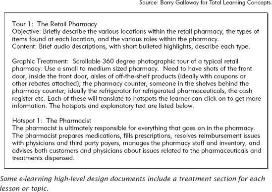
As you work through the design process, putting together your outline or high-level design document, create ticklers to make yourself think about graphics. In e-learning, some designers include a graphics specification segment for each topic in the outline (see Figure 18.1). This device forces them to think about the best ways to communicate the content, verbally and visually as an integrated whole, before they roll up their shirtsleeves and dive in. Set up a brainstorming meeting with artists or with designers and start with the simple question: "What do I need to make visual?"
Once the outline or high-level design is complete, step back and look at the whole. Ask yourself if the graphics for all the topics work together or are they disjointed. Are there opportunities for common themes or the reuse of graphics? Consider the graphics throughout the instructional materials as a whole in the same way you would look at a written outline of topics. Do the graphics flow from one to another? Is there consistency across graphics? Do any of the graphics unduly emphasize minor points to the disadvantage of more important considerations? Have any unusual real estate considerations surfaced that may cause you to rethink the overall display framework for the entire piece?
There are also software tools that can help you get the big picture. Simple charting tools such as Visio provide templates for mind-mapping, flowcharting, office furniture arrangement, and so forth. These software tools can help you step back and see how all your elements fit together.
Depending on early contextual decisions, you may find it necessary to amass roughs of your visuals before you actually begin the content development. If graphics are to carry the story line, as they might in teaching a procedure, think the procedure through and either collect or rough out the sequence of visuals you need to communicate the steps. Writing the text for either audio or visual presentation will support the information communicated pictorially. On the other hand, if printed or on-screen text carries the story line, there's less need to have the visuals lined up before you begin. However, in these cases, as you design and write, use some of the techniques mentioned above to force you to visualize the textual and graphic components as they will be laid out.
Draw it. This exercise is for you and does not have to be shared with anyone. The process of arranging the various elements of the drawing in the context of the page or screen will help stimulate what can be done or cannot done. Even if your drawing skills never progressed beyond coloring books, this exercise will stimulate your visual eye and help you make sure the verbal and visual are integrated. Especially for text-dominant treatments, it's easy for an instructional designer/writer to get into a rut of producing paragraph after paragraph of text in an unending river of words. However, chunking out the content in a facsimile of the final product can highlight where the materials will be enhanced by a graphic that adds cognitive interest.
Other individual graphics, such as an illustration of a process, can be designed at the same time as the detailed content is developed. Note, however, that although you can separate somewhat the development of the content and the graphic, have them reviewed together as one piece. They are two parts of the whole. If the art and content are reviewed separately, reviewers may approve the text/audio content and then separately approve the graphic. But when those same reviewers see the final version with the graphics and content integrated, they are sometimes disappointed and have comprehension difficulties. If these reviewers are the clients, they often demand changes at the thirteenth hour. Avoid the trap of changing graphics based on subjective discussions about color, appeal, or even style. Test out the content and graphic combination on representatives of the target audience and see if they make comprehension mistakes. Do not be sidetracked by subjective comments made by those not actually trying to learn from the graphic and the content.
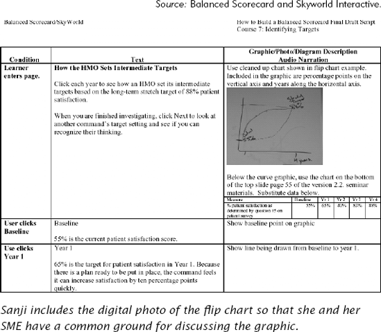
As one of the six instructional designers on the team introduced in the previous chapter, Sanji attends a presentation on the subject matter. The presentation is videotaped and copies are to be given to all the writers. At its conclusion, Sanji also takes digital photos of the flip charts on which the presenter drew explanations throughout his talk. From experience, she knows that sometimes the videotape does not capture everything she needs. Finally, she also obtains copies of the presentation slideshow he used and any other supporting documentation.
As Sanji designs the content, she often flips through her digital photos for inspiration and clarification. One photo captured a graph that crystallized the stages within a process that supported the principle-based task her lesson teaches (See Figure 18.2.). It becomes a starting point for her design of a dynamic graphic to be incorporated in her lesson. She includes her photo in her scripts so her SME can see how she wants to use the graphic with the text.
From reading this book, Sanji knows she needs to engage the learner interactively. She knows she needs to eliminate extraneous data (chart junk) from the graphic, so she will indicate to the artist to drop the bottom curve of the graph that the presenter drew on the flip chart. She also needs a technique that allows the learner to see several different pop-up text boxes and the chart at the same time.
To get ideas, she goes surfing through online learning Web sites and checks her own library to remind herself of techniques that have worked in the past. While she is at the museum with her children, she notices that one of the interactive kiosks lets her daughter chart the population growth of deer by changing the food supply.
Back at work, Sanji designs her chart, employing some of the ideas she has discovered. Her learners can watch the chart develop as they click on the various years, just as her daughter did with the food supply graphic at the museum. From her Internet browsing, she also has some examples of where to place explanatory segments to keep the chart and the text simultaneously visible.
She tests out her sketch with her SME, who likes the idea but suggests she try it out with someone not as familiar with the process as himself. Sanji does so, getting good feedback, which she incorporates into her sketch. She is ready to communicate the design to the artist for execution. In the next chapter, we will see just how Sanji does that.
To plan and specify individual graphics to support content, you need to think visually. Instructional designers tend to be verbal and think in terms of words. If you are fortunate enough to collaborate with a graphic designer, you will begin to view the world with a new perspective. But if you are not, in this chapter we have touched lightly on a few of the techniques you can use. As with many skills, the more you do it, the better you will become.
Hanks, Kurt and Larry Belliston (1990). Rapid Vis: A Method for the Rapid Visualization of Ideas. Menlo Park, CA: Crisp Publications, Inc.
Harris, Robert (2000). Information Graphics: A Comprehensive Illustrated Reference. Atlanta, GA: Management Graphics.
Malcom, Craig (2002). Thinking Visually: Business Applications of 14 Core Diagrams. London, New York: Contiuum.
Margulies, N., Nusa Maal, Margaret J. Wheatley (2002). Mapping Inner Space: Learning and Teaching Visual Mapping. Tucson, AZ: Zephyr Press.
Williams, Robin (1994). The Non-Designer's Design Book: Design and Typographical Principles for the Visual Novice. Berkeley, CA: Peachpit Press, Inc.
CHAPTER OUTLINE

Who Needs to Know
Communicating the Look and Feel
Samples
Communicating Ideas for the Development of Individual Graphics
Communicating Graphic Layout Plans
Flavors of Storyboards—Layout Design in e-Learning
Difference Between a Storyboard and a Script
Communicating Graphics to Production Staff
Case Study: Sanji Talks to the Artist