
CHAPTER OVERVIEW
In this chapter, we follow two instructional designers as they apply the guidelines from the previous sections and a systematic approach to visualize their instruction. Although the case studies are fictionalized, they are a composite of details from real projects and designs.
In the first case, Naomi designs training for a system application in a large corporate setting for novice users to be delivered in multimedia and in print.
In the second case, George creates an e-learning training course for a financial investing club's Web site. George has some programming and graphics skills, so he feels he can handle almost all of the development, though he may need to contract out a few pieces.
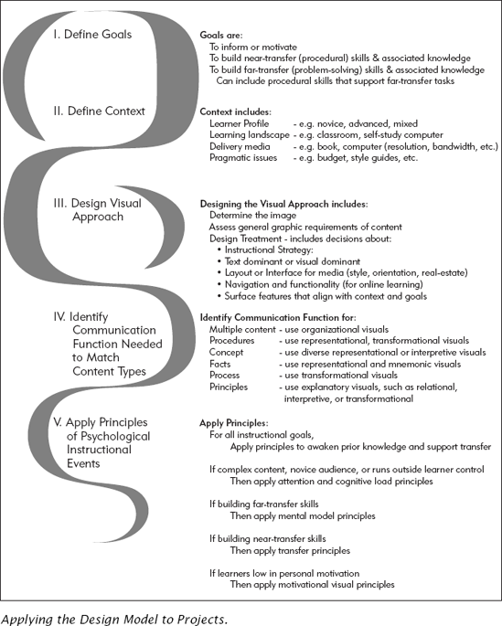
Naomi works in the training department for a corporation that has recently purchased its own custom-developed purchasing and customer loyalty program software. Her boss assigns Naomi the task of developing training for the employees who answer the phones and maintain the loyalty participants' entries. The department already conducts the telephone answering and customer relationship training. Naomi is to develop the training on the systems component. She follows the systematic approach presented in Figure 20.1.
Her department conducted a needs assessment before Naomi was even assigned the project, so her first task is to verify their findings about the business need and the instructional goal:
- Business need:
To provide value-add for loyal customers, call center personnel must ensure participant data is accurate, while smoothly and seamlessly answering calls.
- Instructional goal:
Call-center employees will, with 99 percent accuracy, search on, filter, add, and edit loyalty participant information.
Once she verifies these, Naomi then identifies the instructional goal: skill building for near-transfer, procedural tasks.
Next, Naomi investigates the context. As she does so, she establishes the following.
Learner Profile. There is high turnover in the call centers, as high as 40 percent in some years. New employees are hired constantly, and there is an ever-present need for immediate training just to get the new employees ready to work the phones. Typically, the new employee is young, English-speaking, often female, and does not have prior knowledge of the loyalty program participant database software.
Learning Environment. On the job, the employees work in small cubicles in an open space, wearing headsets so that their hands are free to access the computer. Their call-answering equipment keeps them continuously supplied with a steady stream of customer requests, purchases, and complaints. In each call center, there is a separate room with computers set up for small group instruction or self-paced training, either developed by the company or purchased off-the-shelf. Learners can take courses on CDs there or even at their cubicles where their computers also are equipped with CD-ROM drives, sound cards, and earphones. The call centers are open seven days a week, with three shifts of workers to accommodate customer calls anytime of the day or night.
Delivery Platform. Since the task is software based, Naomi determines that to be job-oriented, the practices need to be simulations or exercises using a live system. In order to prevent data contamination, the learners cannot practice with the "real" database. But still, for at least part of the training, Naomi decides that computers are a logical delivery platform. The customer loyalty software was designed for 800 × 600 resolution, which has become the default resolution throughout the call centers. Naomi decides that multimedia is a good match for the learner profile, the need for high fidelity to the real system, and the requirement of anytime access to training. She is also cognizant that any e-learning her organization develops must be AICC/SCORM compliant. Even though her course is multimedia, she will work with the programmers to make sure her structure supports the organizational standard.
Naomi also knows that the use of audio in the course will have a significant impact on her graphics. Audio gives her more real estate, since she won't have to allocate as much space to text. It also will allow her to reduce cognitive load and focus the learner on the key elements of the graphical representations of screens. Based on the proximity to the training room, the presence of earphones and soundcards on each employee's workstation, she decides the trade-offs favor the use of audio.
Pragmatic Issues. Because the training is supporting a key corporate mission, Naomi has a solid, but not extravagant, budget for artwork. Further, although the training is important, it is not a high-visibility project. Thus, Naomi does not need to get approval from anyone outside the training department for her graphics or her content treatment. Finally, since the corporation already produces a number of multimedia courses, her training will use the same style and guidelines. She does, however, have a tight and unforgiving schedule because the training must be disseminated nationwide to all call centers two weeks before the new version of the system goes live.
Naomi knows that learners need to be able to perform flawlessly the first time they are on the system. Whatever training she designs needs to have signifi-cant simulations and practices using data that closely approximates what the learner will encounter on the job.
Determine Image the Materials Should Project. Naomi decides the image should be professional, but accessible, since many of the learners will be new hires. She knows that the display framework will need to communicate the importance of the job to the corporation, even though the task itself may seem trivial or insignificant to the uninitiated. She's tempted to use bold and colorful graphics to motivate, but she's afraid bright shapes and colors will overpower the system screens. She decides to use them judiciously and counts on the audio to help grab and hold the learners attention.
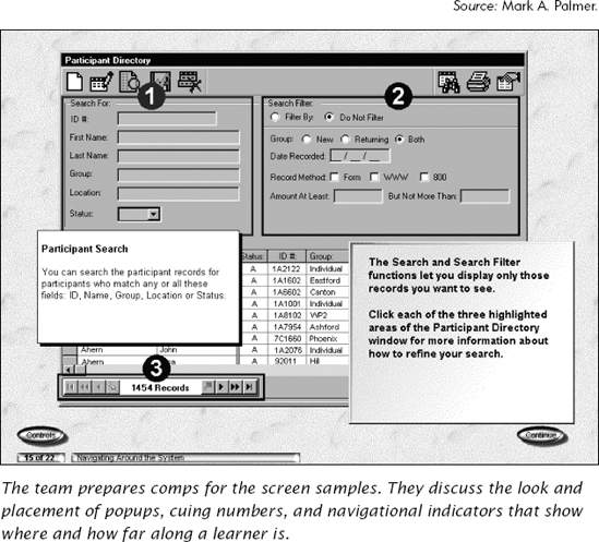
Preliminary Assessment of the Graphic Requirements of Content. Naomi decides that most graphics in the multimedia will be the system screens or representational graphics of the different types of people behind the phone calls. Her worst-case graphic is one particularly crowded system screen used for multiple tasks. She also knows she probably needs separate graphics to explain the individual sections of the screen, but there isn't enough real estate. She knows she'll need help solving this design problem.
Design Treatment. Naomi meets with the programmer and artist assigned with her to the project. Collaboratively they design the navigation interface and structure of the multimedia (see Figure 20.2). Because the skills are procedures and the learners are novice, the team decides on a directive instructional strategy that employs some learner control. Since the learners are novice, the content is itself highly graphic and audio provides the narrative, they decide that any supporting text will appear on a text box in the lower right-hand corner. Content displays (without system screens) will have a slightly different look (a raised blank rectangle) than displays centered on system screens.
They decide to use representational graphics of professionals to model the learners once they are on the job. They decide to use photos of customers, where appropriate, as the little people within the database. Stock photos, in the hands of the artist, will provide a crisp, clean look to the display framework. The graphic artist checks to see what art the corporation already owns, either in the training or in corporate communications group. The team agrees that they can afford a small purchase of royalty-free stock photos if they need to.
They agree to use animation for the demonstrations or for simple figures to illustrate key points. Because of the learner population, the team feels comfortable using red lines to highlight and red arrows to cue. The shapes of the cuing devices will be distinct in case there are any color-blind learners. Naomi wants the cuing to be bold to focus attention and attract interest. Finally, the artist and programmer suggest a solution to the real estate need for teaching graphics and the system screen, which they will mock-up as samples and then in a small prototype.
Even though the content is mostly procedural, the associated knowledge includes both concept and process content. Also, based on the job analysis, the distinct procedures (search using different filter criteria, entering data, or updating data) are done in various combinations. So each of the procedures initially can be taught independently of each other, and then combined in several business case scenarios, both in the lesson demonstrations and for practice exercises.
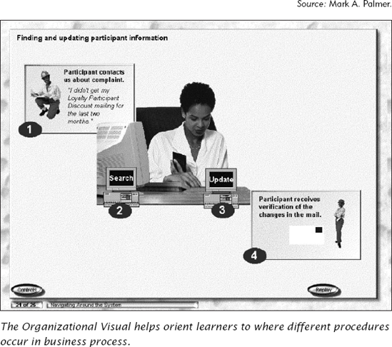
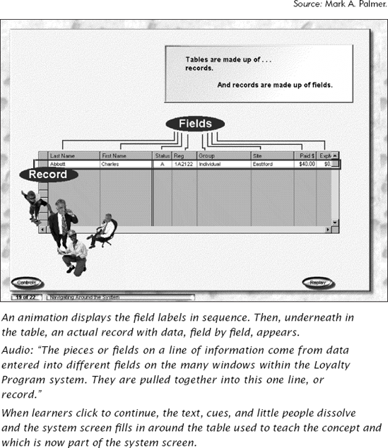
b0Multiple Content: Organizational Visuals. The interface design itself provides the learners with some grounding of how the multiple-content type pieces fit together, but there will be times that other organizational visuals can help as well. To introduce the search and update procedures, Naomi decides that a process visual will help orient them to how the tasks fit together (see Figure 20.3). The team also decides to use a bird's-eye view graphic of particularly complicated screens to orient the learner to the screen's components.
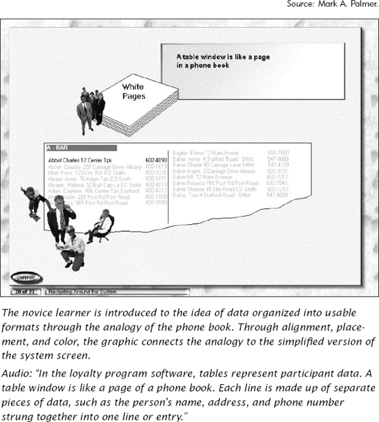
Concepts. For instruction about associated concept content, the team decides to use representational graphics based on the actual screens, but simplified in order to minimize cognitive load and support transfer. Naomi decides that some concepts could use an analogy to help novice learners more readily understand the key points (see Figure 20.4). She plans to use placement, color, and alignment to reinforce the association among graphics and the system screen. In some cases, the team may need to also use an interpretive graphic, but again they decide to teach most concepts in terms of the system screen elements. Where applicable, the learner will see the concept information in isolation, and then with a morphing transition see it as it appears within the system (see Figure 20.5).
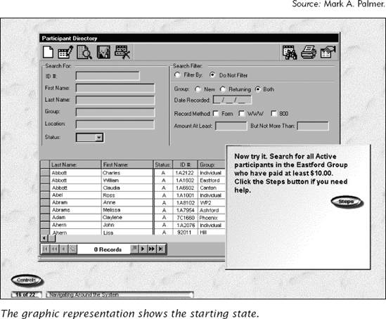
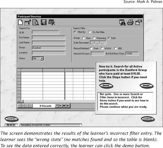
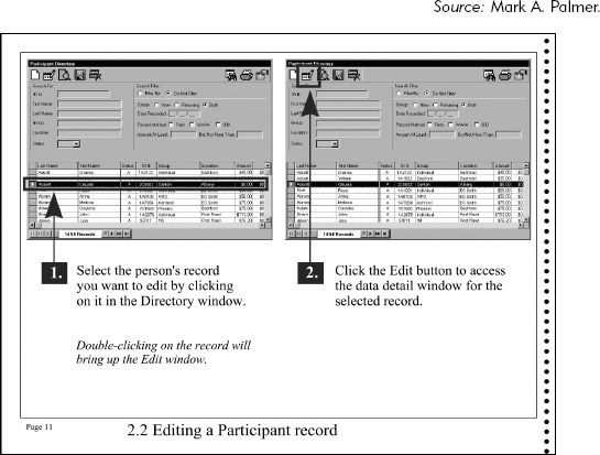
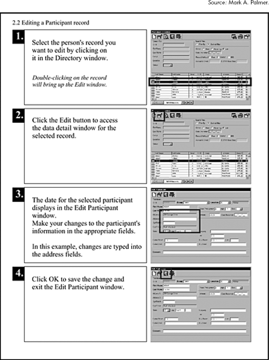
Procedures. For the procedures themselves, the team decides to use representational graphics of the actual system screens. To keep the training visually distinct from the real system on the desktop, they center the screens on a textured background. This bordering effect will help avoid confusion should the learners take the training on their workstations. The dynamic aspect of the animation and interactions will allow the learners to see how their actions effect the results of their search and the participant database (see Figures 20.6 and 20.7).
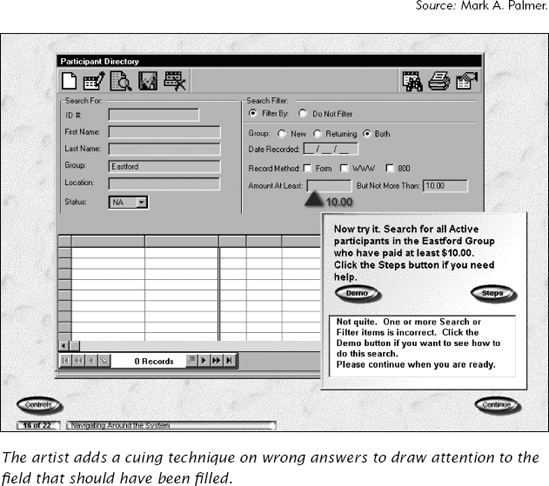
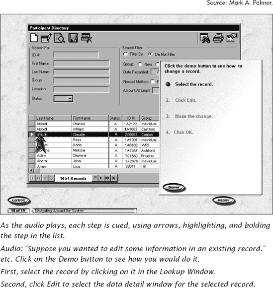
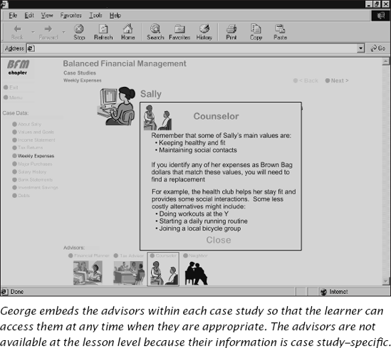
Attention. Because the team decided on a course-wide treatment to support attention, through arrows and red line highlighting, Naomi has a clear idea of the basic approach. In some situations, she knows she will need additional attention techniques, such as callouts embedded in the graphic to point out specific content. After she tests out the interaction illustrated in Figure 20.7, Naomi decides she wants to draw attention to the correct entry field on the wrong answer feedback (Figure 20.8).
Load. Naomi applies the modality principle by using a narrator. The audio launches as each screen displays. Since audio is transient, she provides memory support with brief on-screen text summaries of the main points as well as with replay functionality. The narrator will describe the content, and short text descriptives of the key points appear on-screen. The text will appear sequenced after or during the audio and on a separate layer closer to the learner, to clearly illustrate that it is not part of the system screen. A replay button allows learners to replay the graphic animation (and audio) associated with each screen display.
The team agrees to demo all procedures, breaking each demo down into a few steps, since the learner is a novice and working memory can hold 7 ± 2. Naomi assumes that she can safely avoid overtaxing even her most overwhelmed learner by keeping the total number of steps within any demo to no more than five (see Figure 20.9).
Activate Prior Knowledge. As Naomi develops her content, she is consistently on the lookout for sections where the novice learners might benefit from graphics that activate prior knowledge. The phone book analogy she uses in Figure 20.4 to introduce basic database concepts is one example.
Transfer and Cognitive Motivation. Naomi likes the graphic technique of morphing the concept graphic into the system screen as a way of reinforcing the conceptual underpinnings of the system. She also builds practices using graphic representations of the actual screens to support transfer. The initial exercises start as basic problems, but as the exercises build, Naomi adds complexity by including graphics of customers, audio of their telephone requests, and asking learners to respond by interacting with the representational screen graphics.
Naomi accommodates accessibility users by also providing a separate, print publication that contains the same instruction. After the multimedia development is complete, Naomi starts designing a print version employing a graphics-dominant approach and similar attention, load, transfer, and motivation techniques. With the help of her artist, she designs a freestanding reference that calls out exactly what needs to be done for each task. The visual approach is graphics-dominant, with the graphics the first thing the learner sees on each page and carrying the story line. She relies on the attention graphics of callouts, labels, and highlighting arrows to supplement the instruction (see Figure 20.10). She also designs a job aid for quick reference. Her job aid is text dominant, where the learner can read down through the steps. The graphics provide supporting illustration (see Figure 20.11). When she completes her assignment, all the pieces of the package are tested in a pilot. Graphics and content are adjusted based on the results and the pilot feedback.
A four-corners regional investment club contracts George, a freelance instructional designer, to design a course on financial basics for their Web Site.
Their business goal is to offer education to their membership and the general public. They don't care about tracking or any record keeping. Although their motivation is somewhat altruistic, they also want to attract dues-paying members by offering small, free courses on money basics. One of their key educational points for their first effort is: "Only when money is used in ways congruent with individual values and goals does it have meaning. Money in itself means nothing." And so, true to their nature, they want the courses to provide real value and not be just advertising glitz.
George establishes the overall goals:
- Business need:
Provide money management education and value to club membership and interested guests.
- Instructional need:
When learners complete the course, they will be able to determine their goals, values, their income and their spending, and whether their money decisions are aligned.
Given these goals, George determines that the course is to inform and to build far-transfer, problem-solving skills and associated knowledge.
Next, George surveys the learning landscape.
Learner Profile. Based on his survey of the investment club's existing membership, George knows he needs to accommodate novice or intermediate learners who have enough interest to seek out an investment club. He makes several assumptions that the learners are English-speaking, interested in managing their own money, and are located in the four corners region of the western United States.
Learning Environment. Since the program is available via the club's Web site, George cannot anticipate every possible platform that the learners have. He decides to target the most common browser and connectivity of the average home users.
Pragmatic Issues. The club doesn't have a large budget. The lessons will be offered without charge, so they want George to focus on good design and programming; for art, they'd like George to use what is freely available. They don't have a schedule but would like comps or screen shots for their next national conference, in three months' time.
Image. George knows that the art needs to be branded to identify the investment club's national affiliate, Better Financial Management (BFM). So he gets the national organization's logo, color scheme, and style guides. He does not need to include branding for the four-corners chapter, since the club doesn't feel the need to have any graphic identification.
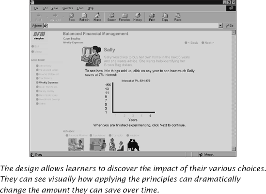
Preliminary Assessment of the Graphic Requirements of the Course. He decides that even though his art budget is practically non-existent, he needs at least an original interactive graphic charting for the learner how much even small savings can add up over time. It can be a real grabber and motivator and help the learner interpret the key concepts. George quickly recognizes that dynamic graphics, which vary based on learner input, could be the heart of the course's value. He decides to approach the client, saying, "I would be remiss if I did not mention that by not having much in the art budget, you may be missing an opportunity to really entice potential members."
The client, grateful for George's honest input, agrees but decides that since this is such a new venture for them, they'd rather wait and see how the first offering goes. If it is successful, they will update the course and build others as well. They might be able to spring for one or two interactive graphics, but not many. Although he disagrees, George accepts their decision and decides to do what he can to make this first effort enough of a success to warrant future offerings.
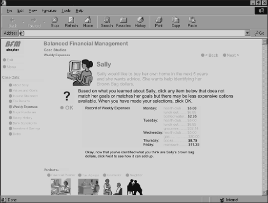
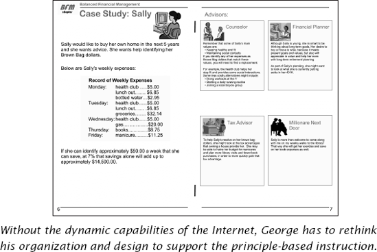
From analyzing the content, George knows he has some real estate issues with potentially very crowded screens. He also wants to have graphics represent different advisors and potentially different types of people who need help managing their money. The advisors and their advice need to be simultaneously visible (contiguity principle) with the instructional text within the case study (see Figure 20.12).
Design Treatment. George decides that a guided discovery course architecture makes the best sense for the diverse audience. Getting learners engaged in solving real financial problems will be more motivational than a traditional tutorial approach to learning. In addition, guided discovery provides learner control for the intermediate audience. His design provides plenty of support for the novice learner as well. Since the training is not required, but completely optional for learners already interested, the navigational design and graphics should not be restrictive. The guided discovery approach also is aligned with the club's business purpose of helping individuals make appropriate financial decisions.
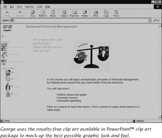
George turns his attention to designing the display framework for the course and how it will fit into the investment club's existing Web site. George notes the basic image the site projects and plans to use some of the same components in his course to provide continuity. In the instructional lessons, he decides to center the clip art graphic on the screen as one would a header in a chapter. He knows its not the best design, but because his graphics budget is so limited, he decides to try it out.
He looks through all of his source materials to assess what might be his worst-case real estate usage. He has three types of information that might need to be simultaneously accessible—the lesson content, the case studies, and the advisors. But because he does not want to dedicate the entire page to navigation, he decides to nest the advisors on each case study (see Figure 20.13). They are available in relationship to a particular case, but not when the learner is in a lesson topic. The navigation, though not elegant, telegraphs to the learners where they are in the overall course structure. The interface itself provides an organizational graphic of how all the various components are related.
Given the client's response, the content, the purpose, and the platform, George decides a text-dominant layout will work best. He decides to take a middle-of-the-road approach because of the delivery platform. He works with a programmer to create the course in Web-native "tools" in order to support the browser and bandwidth most common to home users. The entire course will be text and graphics, without audio or video.
Multiple Content: Organizational Visuals. Most of George's multiple content graphic treatment is handled through the interface graphics.
Principle-Based Training. George's instructional content is principle-based. Principle-based training often requires original art to communicate relationships, to show the transformation of items over time, or space to help learners interpret complex ideas. Georges dilemma is that he has little or no budget. Because he knows he is limited to the clip art the client owns, he uses it primarily as representational figures for the case studies and the advisors. Since the task is principle-based, he concentrates on simple lists and charts for explanatory visuals that can aid the learner to envision the input, the transformations, and the outcomes. He can create some charts and lists on his own, and he has the okay to develop an interactive graph that allows learners to calculate savings over time, intrinsically motivating for the types of learners who would access an investment club Web site.
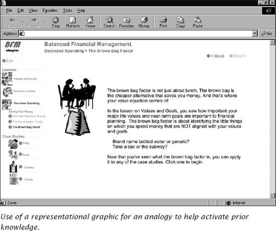
Awaken Prior Knowledge and Support Transfer. To awaken prior knowledge, George decides to use graphics, both in his clip art selections and in his tables and charts, to illustrate a metaphor for a central concept that small regular savings can add up. He calls his metaphor the brown bag factor (see Figure 20.14). He also selects graphics that suggest analogies, such as money down the drain.
If Building Far-Transfer Skills, Apply Mental Model Principles. To help learners build mental models that they can apply to their own financial decisions, George uses a problem-centered learning design. He includes short case scenarios in which the learner is asked to provide financial advice. He also includes a relational graphic that illustrates how small savings can add up over time (see Figures 20.15 and 20.16).
The investment club likes the e-learning module. Based on its success, they ask George to create a booklet that they can hand out at their informational seminars that they hold throughout the region.
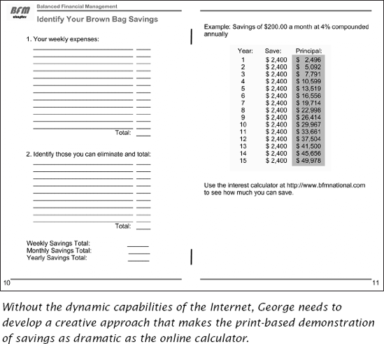
Once the delivery platform changed to a paper-based medium, George needs to reorganize the information. He decided to break up the case studies and use parts within each lesson as illustrations. In the case study segments, he uses a two-page spread, with the case study information on the left-side page and a four-block layout for the advisors on the right-hand side (see Figure 20.17). He no longer can use dynamic animations and interactive calculators, and so he devises worksheets for the learner to fill out with examples that they can reference as they determine their savings plans (see Figure 20.18).
Naomi and George represent two quite different scenarios in which a systematic design model and the guidelines of this book were applied to plan graphics that promoted the instructional goals within each unique learning landscape. We hope that the guidelines and the visual design model we have described in this book will help you find a happy medium between wall-of-words lessons lacking visuals altogether and excessive thematic treatments that use elaborate graphics in ways that disrupt learning processes.
To provide an overview of planning the overall look and feel of individual graphics, and layout. (Table 20.1).
Table 20.1. The Three Facets of the Visual Design.
Facet | Description | Also Known As: |
|---|---|---|
Display Framework | The overall look and feel of the instructional material. It establishes coursewide graphic conventions such as style, typeface/font, color palette, size and orientation, etc. |
|
Individual Graphics | Specific graphics with specific communication and psychological functions to support instructional content. |
|
Layout | The integration of the specific graphic into the overall look and feel of the instructional materials. |
|
Analyze the environment (learning landscape) in which the materials will be used (factory floor, employee desktop, classroom, etc.)
Determine crucial aspects of the delivery medium (bandwidth, monitor resolution, projection)
Identify key production issues that can impact the execution of graphics (budget, production equipment, schedules, industry standards)
Determine treatment including
Instructional strategy
Media that carries the storyline (graphics or words)
Size and orientation
Rough-out standard layout incorporating preliminary decisions about
Style
Use of real estate
Functional needs (for e-learning)
Identify team structure and individual team members and responsibilities
Start visualizing graphics from the onset of your project
Use tools to help capture visual ideas while researching content
Collect different visual data depending on the content type
Consult outside resources—movies, museums, galleries, libraries, the Internet
Review how all the individual graphics fit together in the big picture
Sketch the idea
Test it out on both subject matter experts and representatives of the target audience
Locate and identify existing standards and style guides that control art for the organization
Create project specific standards and guidelines through samples, prototypes, templates, and appropriate documentation
Specify individual graphic needs through treatment descriptions, photoshoot lists, examples, and sketches
Communicate layout requirements through text instructions, scripts, and storyboards.