CHAPTER OVERVIEW
This chapter introduces a model for planning your graphics systematically. To use a systematic approach does not mean ignoring the need for creativity, but as advertising legend David Ogilvy (1983) states, "Creativity strikes me as a high-falutin word for the work I have to do between now and Tuesday."
We describe a five-phase design process that weds upfront decisions regarding the goals, delivery media, and audience to subsequent decisions regarding the instructional and psychological needs of individual content-specific visuals. This design model provides a framework to help you begin visualizing graphics that support learning: In it, you
Define the Goal
Define the Visual Context
Design the Visual Approach
Identify the Communication Function of Visuals to Match Content Type
Apply Principles of Psychological Instructional Events to Visual Design Decisions
We introduce the model here in order to set the stage for Sections Two and Three of this book. Later, in Section Four, we look at how this planning model overlaps the development process and the "how tos" of designing the visual treatment for the course and lesson levels.
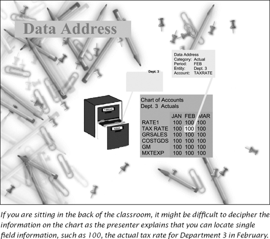
Ever been in the back of the class and strained to see a slide similar to the one in Figure 2.1? You might have been frustrated trying to interpret a tiny chart with tiny text while plenty of space was devoted to decoration. If you ever had that experience, you probably realized that the space-hogging decoration was created before anyone really thought about the environment in which the slideshow would be used or considered the individual graphics the slideshow had to accommodate. As another example, consider a course which looks like a random patchwork of photographs, cartoons, three-dimensional images, as well as the same clip art you have seen in hundreds of slideshow presentations and homegrown documents. In either case, these weak designs are not just the results of subjective taste but also of the instructional designers not using a systematic approach to planning their overall look and feel.
On the other hand, successful instructional designers are more deliberative. They consider the environment where the instruction will be used. They gauge the requirements for the yet-uncreated individual visuals. They try out some designs for the general look and feel. They then assess the communication needs of the instruction and identify the types of psychological events of learning that they need to support. This process is a little bit like decorating the rooms in a new home. To create the look and feel for the entire house, a decorator studies each room's unique requirements in terms of size, shape, use, and relationship to others in the home. He looks at the furniture and other possessions that need to fit within the style of each room and the other décor of the house. He also considers the architecture and style of the home as a whole as well as the available space, budget, and preferences of the owners.
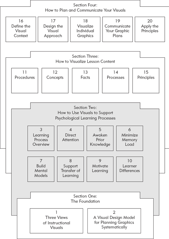
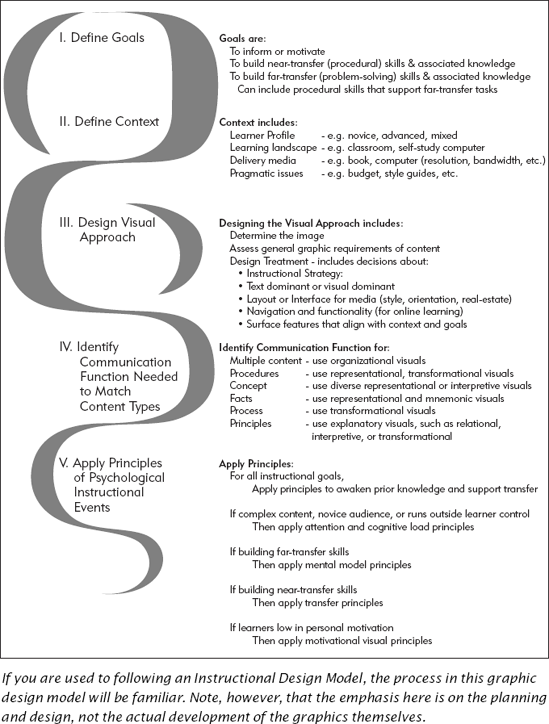
The design model in Figure 2.2 summarizes a process that helps you ensure that you are planning your graphics to best support instructional needs. The five-phase model starts with defining the instructional goals and ends with planning individual visuals that communicate content effectively, support psychological learning processes, and fit into the overall visual landscape of your training.
The first three phases in Figure 2.2 illustrate how this front-end analysis effort nails down the parameters and requirements for all course graphics. In Phase One, the training professional or design team defines the goals of the instructional materials. Is the instruction primarily to inform or motivate? Or is it to build skills and provide the associated knowledge needed in order to do so? In Phase Two, the team defines the context in which the instructional materials will be used. And in Phase Three, the team previews the graphic needs of the entire course to assess the specific space requirements of individual graphics. Phase Four concentrates on the individual content—identifying the type of communication functionality that your content requires. Finally, Phase Five focuses on what graphics and graphical elements are needed to support psychological events of learning.
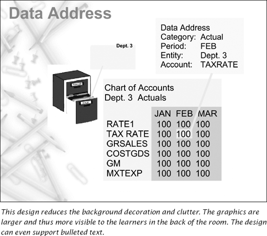
Suppose the training professional who created Figure 2.1 had consciously followed this design model. She might have defined the goal of the instruction to build the knowledge needed for the procedure of locating and updating a chart of account information. She would have recognized that her design needed to accommodate some fairly detailed tables and charts. Next, her analysis of context might have identified the visual limitations of her audience, the type of monitor or projection unit, the room, and even the screen size and howfar the learners might typically be sitting from the screen. As she began to design the visual approach, she would have identified the real estate (space, location, and emphasis) requirements of the graphics to be displayed, the role of visuals and text, and any design treatment issues such as the need for an organization graphics. Her resulting design might have looked more like the one in Figure 2.3.
Good designers start by looking at the goals of the instruction and the graphic needs of the entire package, be it book, slideshow, e-learning module, or single-page job aid. They identify delivery and production constraints—page size, budget, bandwidth, learners' computer resolution, characteristics of the learning environment such as the learners' workspace, classroom, or study area. They profile their audience, identifying key learner characteristics such as prior knowledge, primary language, visual acuity, cultural heritage, and interest in the instructional goals.
Only then do they begin to create the overarching design of the package, the display framework—what e-learning designers often call the "look and feel" or graphic interface and what videographers call the "treatment" into which the individual graphics must fit. The next sections look at how instructional designers can do that systematically.
As with any major decision about training design, visual design for instruction starts with the anticipated outcomes. The instructional goals that drive the design of most training materials are
To inform or motivate (often described as building awareness)
To build procedural skills and teach the associated knowledge required
To build problem-solving skills and teach the associated knowledge required
Defining the goal of your instruction determines the direction of your graphic design process. Information or motivation campaigns are often high profile. When organizations launch new initiatives, they often introduce them with awareness training. Customer satisfaction, quality control, or corporate strategy initiatives are common examples. Product knowledge programs to create awareness and motivation for the sales force are another example. Because these programs are central to the company's vision, they often have big budgets, high visibility, and require slick graphic treatment.
On the other hand, when the goal of the training is skill building, especially for internal processes such as insurance claims adjudication or automotive engine diagnostics, the emphasis is on accuracy and currency of the instructional content as well as effectiveness of the instructional strategies used. Generally, these types of courses are the bread and butter offerings and have lower budgets and less visibility.
Skill-building courses may focus on building procedural knowledge, also known as near-transfer skills. Much software training falls into this category. The goal is to help learners perform step-by-step tasks in a consistent manner. Other skill-building courses are more concerned with building principle-based knowledge also known as far-transfer skills. Tasks that involve problem solving and judgment, such as deciding whether to fund a bank loan applicant or selling a new product, are far-transfer tasks. It's important to clarify whether the course is near or far transfer or a combination of both because the instructional approach is quite different for each (Clark, 2003).
It seems basic, but simply articulating the goals of the course is a crucial first step, especially in making sure there is a consensus about what is the outcome of the training program. Sometimes the sponsor sees the goal as building awareness and motivation, but the instructional designers realize it should be to build skills. So make sure you define and agree on the true goal of the training early in the process. Otherwise, your client or the sponsoring organization may be looking for glitter, sizzle, and dancing pop bottles when what is really needed is a clean animation of a procedure or process.
If a graphic can't be seen, it has no impact. If it can't be viewed because of low bandwidth, poor lighting, or because the learner is color-blind, your message is lost. As you define your context, you will need to define your audience, the physical surroundings in which the visuals will be used, and the delivery medium such as book or computer screen where it will be displayed. And of course, the greatest visual designs in the world are always shaped by the practical realities—the budget, the resources, the deadlines, and the corporate guidelines. Let's look briefly at each of these factors that shape the visual landscape. You will find more details in Section Four—How to Plan and Communicate Your Visuals.
Consider the target audience's prior knowledge of the course content. Research shows that visuals benefit low prior knowledge learners the most. Exert more time and effort on visual design for courses designed to teach novices than you would on courses intended for advanced learners or as refreshers. Analyzing the learners as to their culture, age group, or education also helps you identify any potential problems they may have perceiving visuals. The classic example is a target audience of older adult males, who statistically have a higher percentage of color blindness than any other segment of the population. Consider, for example, a computer-based training (CBT) course that indicates correct answers in green text and incorrect answers in red. If no other cuing technique is used (such as labels, shapes, or color intensity), the color-blind male has difficulty discerning which answers are correct and which are not. Still, year after year, designers create interfaces that rely on precisely this color-coding schema of "green is good; red is bad" without any redundant cuing device such as shape, consistent placement, or labels.
We traditionally think of the learning environment as the classroom or the computer. But in these days of just-in-time training and on-the-job performance support, the learning environment can be the learners' desks in the office, their break room in a manufacturing plant, or even their work area—be it a cubicle, specific patient treatment equipment in a hospital, or a station on the assembly line. Because of this variety, the learning environment itself has a strong impact on the appropriate surface features for the display framework.
Perhaps the learning environment is a garage bay for busy mechanics. Knowing this is the learning environment, the training professionals can create graphics with clear, simplified, and bold surface features that can be interpreted despite grease and ink smudges. As another example, if a designer assesses the environment for technicians in clean rooms, where the workers are encumbered with gloves and faceplates or masks, they can design bold graphics that make the instructional content easily discerned through Plexiglas.
The delivery medium is a major factor that shapes your visuals. The delivery medium refers to the material or equipment on which the material is displayed. Suppose the material is a line-drawn cartoon. The cartoon can be delivered on any number of media: on a page in a book or manual, a computer screen, a flip chart, a transparency on an overhead projector, or the chalk- or whiteboard at the front of the room.
The delivery platform that requires the most scrutiny so that the end product is not compromised is, of course, the computer with its wide variety of configurations and connectivity. Perhaps you have taken an e-learning module and experienced a long download time for a highly ornate graphic (and may have even abandoned the training after becoming frustrated by the wait). In Chapter Sixteen, Define the Visual Context, we describe some of the specific issues you will need to consider about the delivery platform.
Very few instructional projects start with a blank check or are created in a vacuum. Usually, there are budgets, timetables, accessibility requirements, and even corporate style guides that must be adhered to. Some training materials, such as materials that support yearly software releases, are essentially disposable. They have small budgets, immovable deadlines, and often must conform to a set of standards already in place. All these pragmatic considerations can severely restrict your graphic design. Be realistic about these issues and don't try to design the Taj Mahal on a pauper's paycheck.
Once the team has defined the goal and completed its initial analysis of the environment, it is ready to put on the design hat. Every instructional package has a "look and feel." Even if the "look" is no more than a mishmash of random choices, it is a style. Ideally, however, the look and feel are the culmination of careful consideration of all the elements we identify in this chapter.
At the beginning of this chapter, we talked about the importance of assessing the requirements of the individual graphics before settling on a treatment or display framework that ultimately must accommodate them. This need is especially great in big projects, with multiple instructional designers, writers, and artists, where it is imperative to assess the requirements of as many of the individual graphics as possible. Seasoned training professionals also typically assess what they deem the worst-case graphic—in terms of real estate, page orientation, colors, and functionality needs.
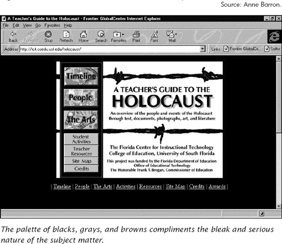
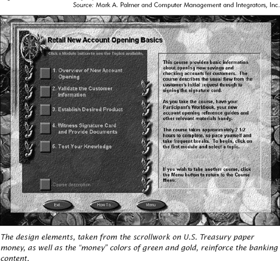
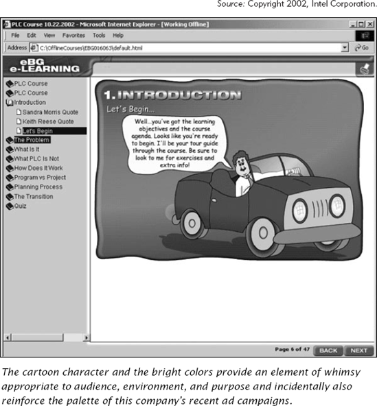
Look at the three e-learning display frameworks (Figures 2.4, 2.5, and 2.6). You can see color versions on the companion CD. Each has been designed only after careful consideration of its content and context. The display for Figure 2.4, through use of somber colors and severe lines, communicates the seriousness of the Holocaust content. In Figure 2.5, the colors, the monetary design motifs, and the traditional type fonts project a professional formality suitable for the banking industry. Figure 2.6 uses a cartoon-like display with instructional content contained in speech balloons.
The display framework communicates an image that influences the piece's credibility. In rhetoric, this image would be considered the persona, or personality of the speaker. In visual arts, it is the image. Often the sponsoring organizations have strong opinions about this image. Companies often want their training to be a reflection of the corporate culture. For example, some organizations may believe a comic book treatment undermines the seriousness of the subject matter or projects a less-than-professional image. On the other hand, other organizations may feel that same comic book treatment may make the material accessible and less overwhelming to the learner. Determine the image the sponsor wishes to project.
In this phase of our design model, you evaluate your content to determine individual graphics that will illustrate key instructional points. In Section Three, How to Visualize Lesson Content, we describe the visuals that are best suited to help learners acquire five content types: procedure, concepts, fact, process, and principle (Clark, 2000). In the development of large projects, particularly in e-learning, at this point the interface may already have been designed and the parameters within which you must work are established. Now you focus on how best to illustrate a key point. To do so effectively, refer to your job and task analysis, identifying the content types and the best visuals to represent them.
For example, if your course goal is to teach procedures, you will want to use representational and transformational graphics to illustrate demonstrations of how to apply steps to the computer screens or equipment involved in the procedure. If your instruction is going to be presented on a computer, you may use animations to show the step the learner should take and the consequence of taking that step (the step-action consequence cycle). If your instruction is going to be presented on paper, you may want to display a series of screen shots across the top of the manual pages with text callouts in each screen that summarize the action the learner will take. As we mentioned in Chapter One, Three Views of Instructional Visuals, research demonstrates that as long as the graphic communicates the action, learning is equivalent, whether the visuals are line drawings on paper or video animations.
In Section Two, How to Use Visuals to Support Psychological Learning Processes, we provide more detail on how to best use visuals to support six key instructional events of learning. These include ways to use graphic elements and treatments in individual visuals to help learners: focus attention, activate prior knowledge in memory, minimize cognitive load (avoid overloading working memory), build new mental models, maximize transfer of learning, and support motivation in ways that do not disrupt learning.
For example, if you are designing a computer course to teach how to use a new software system, you may decide to use animations to demonstrate the procedure. But we know that animations can easily result in cognitive overload. To help manage that load you can provide explanations via audio narration rather than on-screen text, insert a pause and replay button to provide for learner control of action sequences, and use visual cues to draw attention to the parts of the screen being discussed.
In this first section we laid the groundwork for the next three sections of this book by summarizing three views of visuals based on (1) their surface features, (2) their communication, and (3) their psychological functions. We also introduced a design model that should help you adapt a systematic process to planning your visual approach. In the next section, we will look at six key psychological events of learning, describing research-based guidelines for designing visuals that support each one.
To provide a foundation for the book by describing three ways to describe graphics and by overviewing a visual design model.
The effectiveness of a visual depends on the interactions among three components in any learning environment: features of the visual, goal and content of the instruction, differences among individual learners.
Features of the Visual
Surface features based on the appearance of the visual
Communication features based on what information the visual contains
Decorative
Representational
Mnemonic
Organizational
Relational
Transformational
Interpretive
Psychological features based on how a visual interacts with psychological processes involved in learning
Attention
Prior Knowledge
Mental Load
Mental Models
Transfer
Motivation
Goals and Content of the Training
To build awareness (facts, concepts and processes)
To build procedural skills (procedures, facts, concepts, and processes)
To build problem-solving (principle-based) skills (principles, facts, concepts, and processes)
Individual Differences Among Learners
Prior Knowledge of the Content
Visual Literacy
Spatial Aptitudes
The design of any visual will be shaped by the learning landscape of which it is a part including the delivery media, organizational standards, and resources available. To avoid underutilization of graphics, you need to plan visuals as a part of this learning landscape. A design model provides a framework to help you visualize effective graphics. It includes the following stages:
Defining the instructional goal
Defining the visual context
Designing the visual approach
Identifying the communication functions needed to match the goals and content of the lessons
Designing visuals to support the psychological events involved in instruction