CHAPTER OVERVIEW
After you have your ideas for your graphics, you need to communicate the ideas to those who create the art, approve it, and produce it. Several tools (samples, style guides, standard documents, templates, and storyboards) at different stages of the project help you do so. You may need to communicate how the overall package should look and feel, what an individual graphic should be, and how that individual graphic integrates or lays out with the other elements of the page or screen.
This chapter looks at:
Who needs to know what and when
Methods for communicating the overall look and feel
Methods for communicating plans for individual graphics
How to communicate layouts that incorporate the individual graphic within the overall look and feel
Unless you can create all your own art and do your own production work, you have to communicate your graphic ideas to various people. You need to show your client your ideas to gain approval. You may need a subject matter expert (SME) to review the graphic idea for technical accuracy. The artist needs to know what exactly you want in the visual. And the production team, which in the case of e-learning includes programmers, will need file names, location notes, and sequencing specifications to put the final product together. Table 19.1 provides an overview of what you need to communicate to each of these players.
Depending on your specific project, you may be involved in communicating all three different facets of art for your project: the product's look and feel, the individual graphics used in the body of the work, and the layout of the individual pages or screens within the product. Other times, you may only be responsible for communicating plans for individual graphics. Whichever is the case, occasionally you can use the same communication tools for all these facets and audiences, but other times you may need to augment the primary communication tools.
Often your work must conform to a set of corporate guidelines and standards. These guidelines may be limited to branding issues of color, font, and logo, or they may include actual graphics, dimensions, and other parameters governing your product, as in a family or series of related titles. During development, you may even be required to work to templates that strictly dictate how the individual pages or screens should look. Usually the tools that define and communicate the look and feel to the team are style guides, standards, and templates. Whenever you are working within parameters laid out by these tools, you are on the receiving end of graphics communication. Table 19.2 provides a brief explanation of these tools and some of the other names by which you may hear them referenced.
Other times, especially when involved in a first effort, you are actually establishing what these communication tools are. As discussed in Chapter Seventeen, this design phase occurs early in the development process to prevent unnecessary reworking of graphics or content. The team shares its vision with the client for the look and feel through a set of samples, and especially for e-learning, a prototype. Once the samples or prototype are approved, they are the basis for the style guide, standards, and templates for the project.
Table 19.1. Who Needs to Know What?
Team Member | What They Use the Graphic Specification For: | In Order To: |
|---|---|---|
Writer/ Instructional designer | Think through and work out the Designe specific and stay "honest" to the instruction. The process/of specifying the graphic keeps the designer "on hook" to make sure that content (visual and verbal) teaches | Communicate exactly whatis specified to SMEs, clients, artists, and programmers |
SME, Reviewer, Client |
|
|
Artist | Understand exactly what the designer is specifying, for example:
|
|
Production | Understand where the graphic is to be placed as well as any special considerations in terms of its being viewed |
|
Table 19.2. Standard Look and Feel Documents.
Document | May Be Known As: | What It Includes: |
|---|---|---|
Style Guides |
| General Company or Organization-wide specifications about:
|
Standards Document |
| Layout and color requirements for a product's look and feel, including:
|
Note: May be includedin a standards document | Exact replicas of the layout that designers can use to create their document pages, e-learning designs, or PowerPoint slides |
To be truly effective, your samples should approximate the finished product in terms of medium, size, and layout. These samples, often called layouts, roughs, or comps (comprehensives), do not have to include the actual text, graphic, or audio, but they should illustrate exactly how all these fit together. For example, if your product is a 4 × 5 spiral-bound job aid with tabs, then the samples should have the same dimensions and elements. For a book, approximate as closely as possible the finished product, in terms of page size, column width, and gutter (space between columns). Creating a new e-learning design sometimes requires two passes, static samples, and then a small functioning prototype. The sample screens communicate the "look." Once those have been communicated to the client, revised, often revised again, and finally approved, the team can create a fully functional prototype. The prototype is programmed in the same language that the final product will be and provides "the feel" Especially for highly interactive e-learning, static screens are simply not robust enough to communicate what the final product will be like.
If you are responsible for overall look and feel, focus on the key pieces in your suite of samples. For a short electronic slide show presentation or print job aid, you may need to mock-up only one or two screens or pages. For a robust e-learning program or print-based manual, you may need to mockup several pages that make up a subset of the overall product, sometimes called a shell. No matter what your delivery medium, your sample set should include types of major sectional organizers as well as the basic layout templates for the body content.
The Major Section Organizers—You want to communicate how the whole product is unified, so create samples to show how a look is translated throughout modules, chapters, lessons, topics, and even subtopics.
The Content Displays for the Body of the Material—You also want to communicate how the content will appear. These samples show how graphics and text are displayed. You may have several variations to support the different needs of your content. In the e-learning prototype, include the visual handling of pop-up windows, interactions, animations, and video.
Layout of Activities—If you use a particular type of activity or exercise format throughout the product, include a sample. In an e-learning prototype, include the major types of interactions you expect to use (multiple choice, multiple select, drag and drop (matching), and dichotomous, for examples true/false). It's important to rough out every component including items such as the placement of question instructions, options and feedback, and wherethe learner will click to answer the question.
Any other graphic or treatment techniques for special features—If you plan to include any unusual graphics or layout designs for examples, terminology, step-by-step charts, demos or case studies, show samples of these to your client for approval and to your production team to make sure that what you plan can be executed.
To get the exact graphic you need, you must create it yourself, find it already made, or have an artist develop it. Many an idea for an individual graphic has been communicated via a sketch on a paper napkin, accompanied by hand gestures and talking. In fact, "voice" is a prime component when collaborating with an artist about graphics. This approach by itself works fine if there is no need for review and approval by others before development or for management and production after. Alone, however, specifications delivered aurally are too ephemeral. They can't be shared or referenced after the fact. Aural specifications cannot efficiently be used for multiple audiences because artists, reviewers and production people need the graphic specifications at different times and in different contexts.
So at the very least, create a sketch of your graphical idea, and include as much information as possible, such as what the graphic needs to convey, examples, surface features, and treatment. If text is incorporated into the graphics, be sure to include exact copy. If your plan calls for mixed media, where, for example, the artist is compositing stock photos, include a description or examples of the type of image needed or identify the exact photo by file name or identifier. For a glimpse at an artist's perspective on communication, see Table 19.3.
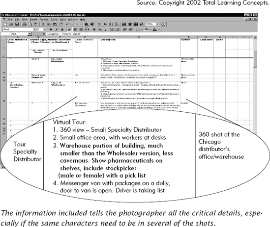
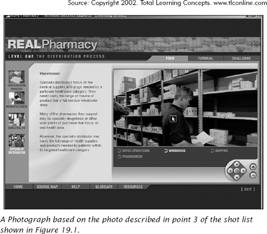
If your design calls for original photographs, you need to provide the photographers with a list of required shots, especially if you are unable to accompany them on the photo shoot. Shot lists are often simple spreadsheets organized by geographic location where the photos need to be taken, with specific instructions as to what is needed Sometimes they are quite elaborate, identifying any characters that may need to appear in the different shots for consistency. These lists can also become production management tools later in the process. Figure 19.1 shows part of the photo shoot list for the e-learning project shown in Figure 19.2.
Table 19.3. an artist's perspective.
Artists Speak |
|
|
|
|
|
|
The graphic is rarely the entire instructional piece, unless it is an organizational graphic such as the London subway diagram. If you are creating a stand-alone instructional graphic, the review, approval, and production communication isrelatively straightforward, though by no means simple. You can use the artist's marker comprehensives, online mockups, or even the actual art itself to communicate your ideas for review and approval. You don't have to worry about communicating the context in which the graphic will be viewed.
However, usually your individual graphics are part of a larger instructional product that has other graphic elementsand textual content. In print publications, the instructional designer might communicate layout needs through notes embedded in the manuscript. The production artists take those instructions and then communicate back through galley proofs. The instructional designer marks these galleys up to, at the very least, communicate which graphics need to be kept with theirassociated explanations and where a page break undermines instruction. To control the integrity of their instruction, someinstructional designers mock-up their own page layout using any of the desktop publishing tools such as Quark™, Pagemaker®, Framemaker®, or even Word. Of course, the downside is that most instructional designers are not experts in typefaces, layout, and the other disciplines of publishing.
In e-learning, with its multiple components competing for screen real estate and sequencing description, you need a tool that lets you design and communicate not only the graphic, but the graphic in context: how it is laid out on the screen, when it appears, what areas may be clickable, and so forth. The most common tool for communicating this information i the storyboard.
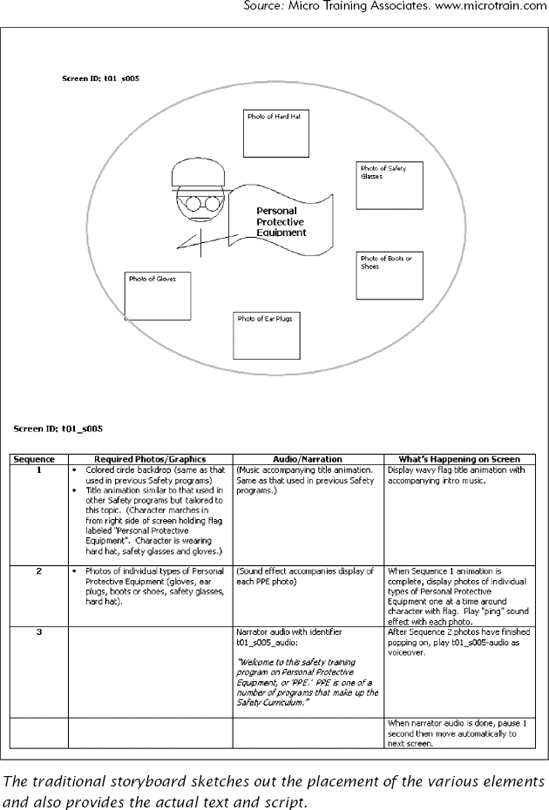
You can use storyboards as a communication tool for developing almost any type of instruction medium. Storyboarding was first used in film production as a technique to visualize the story line, show the film angle and shot details, but it has been quickly adapted for designing e-learning modules as well. When the storyboard is used for review and approval purposes, it contains a visual layout area that ideally has the same aspect ratio (vertical and horizontal ratio) as does the actual delivery vehicle. In e-learning, the storyboard also communicates the exact words to be displayed on-screen or narrated. Usually a page or two of a storyboard represents one page or screen of the final product (see Figure 19.3).
Storyboards are also the final blueprint from which the software is created. The storyboard communicates production information such as the discrete frame page number for programming purposes, the file names of the media (video clips, animation files, sound effects), and any programming notes required for that particular page.
In order to help reviewers with limited visualization abilities, some instructional designers create storyboards in online tools such as slideshow presentation software where they mock-up the online display with actual text and sketches, or even the actual graphics. Figure 19.4 shows a slideshow storyboard in PowerPoint. On the slide itself is the general layout of the content. In the PowerPoint notes section below the slide, the designer includes audio scripts and programming notes. Another online storyboarding technique is to use the actual programming tools, or a templating interface, in order to communicate to reviewers as realistically as possible what the final product will be. This rapid prototyping approach is useful when the development schedule is tight and for clients who have trouble visualizing the finished product from documents. But it is riskier than other approaches and works best in environments where development is done in small teams of individuals with high tolerance for chaos or where the content is relatively stable.
Scripts are another adaptation from the world of film. These communication tools are often used to communicate the sequencing and actual content of courses that contain both audio and text. Often these are in a three-column format, with a column for programming information; another for text or audio; and a third for a description of the intended graphic to be displayed. Figure 19.5 shows a three-column script. The main difference between scripts and storyboards is that scripts do not show layout.

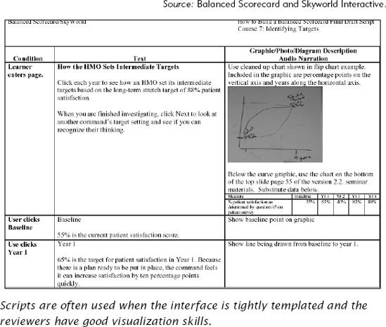
There are trade-offs to using a scripting or storyboarding approach to communicate visual ideas. For e-learning projects where the layout is predetermined and highly templated, a script can speed production. Tables 19.4 and 19.5 compare the advantages and disadvantages of storyboards and scripts from the perspective of communicating to artists, reviewers, clients, and production teams.
In highly automated projects, where much of the work is templated, the task of compiling the final product may fall to administrative staff or production people. These individuals may not be aware of the instructional purpose of the graphic or even of the content. They work from tightly controlled scripts or storyboards and do not have the ability or the responsibility to make decisions outside it. They cannot or may not change the placement of a graphic in case the text runs over to the next screen.
Table 19.4. Trade-Offs of Using a Storyboard for Communicating Design for Individual Graphics.
Storyboard | ||
|---|---|---|
Role | Advantages | Disadvantages |
Writer/Instructional Designer |
|
|
Artists |
|
|
SME/Reviewer/Client |
|
|
Production Team |
|
|
Table 19.5. Trade-Offs of Using a Script for Communicating Design for Individual Graphics.
Scripts | ||
|---|---|---|
Role | Advantages | Disadvantages |
Writer/ Instructional Designer |
|
|
Artists |
|
|
SME/Reviewer/Client |
|
|
Production Team |
|
|
If this is the case in the production of your e-learning project, you may need to fine-tune your communication—leaving nothing to chance—or otherwise be prepared for surprises. Experienced production schedules include a writer/instructional designer and programmer revision pass before the materials go to client review. Unfortunately, another current view is that the instructional designer/writer is only needed through the storyboarding stage. Thus, there is no check to see that the individual graphics as well as the layout are executed as the writer/instructional designer intended.
Finally, some of the tools you may use to communicate your graphics ideas may end up doing double duty for the production team. Shot lists for the photographer are one example. These tools tell the photographer what to photograph, but they tell the production team the graphics, file name, library location, format, and even size. The tools track status, production responsibility, and where the graphic fits into the overall design.
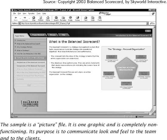
While Sanji is working on her content, the graphic interface designer and programmers are fine-tuning the interface through client reviews. After the treatment meeting, the interface designers create three samples that they show the client based on the client's own logo, corporate colors, and Web graphics style guide (see Figure 19.6). The client reviews the samples and asks the graphics interface designer to take some of the elements from each sample and combine them for the final look. From that design, they create several templates.
While those decisions are going on, Sanji is concurrently working on her own lesson content. As Chapter Eighteen illustrated, she communicates her graphic ideas to the SME through the draft script (also shown in Figure 19.5). Once the templates are complete, she finds one that allows her to use almost the entire screen for her interactive graphic.
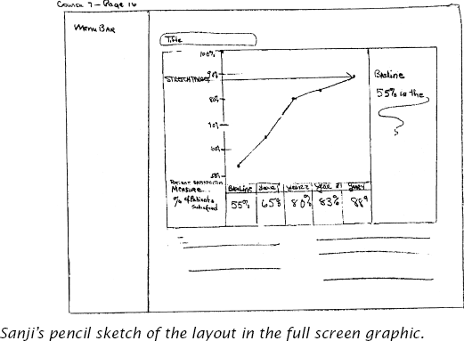
Sanji thinks everything will fit, but she still sketches out the layout for the artists to help communicate placement of pop-up text and dimensions of her chart (see Figure 19.7). In doing so, she finds that she really has to prune her text.
The graphic designer previously reviewed Sanji's scripts in preparation for his face-to-face meeting with Sanji and understands the content of the course. He is therefore able to visually solve some of Sanji's problems and real estate issues. He takes the script and her layout sketch and develops the art (see Figure 19.8). He sends it to Sanji for review and after incorporating her edits sends it to the client for review and approval.
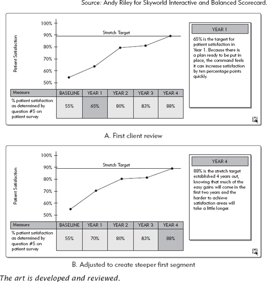
On review of just the interactive graphic, the client has additional changes based on testing it with the other reviewers. One request is to increase the incline of the graph's first segment to more effectively illustrate the rapid results in the first year. After these revisions are incorporated and again reviewed, the art is ready for final production.

During production, the text and art are brought into the templates that the programming team generated. The completed lesson is hooked to the Learning Management System. The client reviews it online to see the integration of text, graphic, and functionality (see Figure 19.9).
The next chapter follows two different training professionals as they apply the principles discussed throughout the four sections of this book. One instructional designer develops a financial basics e-learning course for an investment club. The other develops procedural materials, in both print and multimedia, for software used in a customer service group.
White, J.V. (1982). Editing by Design (2nd ed.). R.R. Bowker Company.
White, J.V. (1988). Graphic Design for the Electronic Age: The Manual for Traditional and Desktop Publishing. Watson-Guptill Publications.
White, J.V. (1991). Graphic Idea Notebook. Rockport Publishers.
Distributed by North Light Books: F&W Publications, Inc.
CHAPTER OUTLINE

The End-User System Application Training
Establish the Instructional Goal
Determine the Context
Design the Visual Approach
Identify the Communication Function of Visual to Match Content Types
Apply Principles of Psychological Instructional Events to Visual Design Decisions
Alternative Training Delivery Medium
The Investment Club's Financial Basics Training
Define Goals
Determine the Context
Design Visual Approach
Identify Communication Function of Visuals to Match Content Types
Apply Principles of Psychological Instructional Events to Visual Design Decisions
Alternative Training Delivery Medium