
Chapter 12. Enhanced looks
- Adding custom nodes to views
- Using third-party view extensions
Views draw the user’s attention, either by how they look or how they behave. It doesn’t matter if you’re a newcomer to Java Swing or a seasoned expert—there will be times when the standard widget set exposed by the JDK isn’t enough to create a compelling user interface or to provide an incredible experience.
Fortunately, Swing components are extensible. There are multiple third-party components out there—some commercial, some open source. You can also change how standard and custom components look by applying new Look & Feel classes. If you don’t know what “Look & Feel” means in Swing, think of themes and skins.
In this chapter, you’ll learn how views can be extended by registering additional nodes that will handle custom components. You’ll also learn how the view build process can be modified at specific points. Finally, we’ll enumerate and explain some of the official SwingBuilder extensions harbored by the Griffon project.
12.1. Adding new nodes
You now know that SwingBuilder is a thin abstraction layer over Java Swing. This layer only covers the standard set of Swing components. Or does it? There are ways to register custom components directly on views (remember widget(), container(), and bean() from chapter 4?). There’s also the option to register factories in an addon (as seen in the previous chapter), which requires you to build and package an addon.
But there are other ways to add new nodes to a view. We’ll discuss them in the following order:
- Adding new node factories— This is the quickest method, and we’ll cover it first.
- Using implicit addons— This method goes a step further as it increases code reuse.
- Making your own builder— This technique is the most versatile.
12.1.1. Registering node factories
As you know, SwingBuilder relies on node factories to manipulate and instantiate nodes. You may register as many node factories on a view script as needed. The advantages of registering a node factory are as follows:
- The node name is reusable everywhere in the script after the factory has been registered. This isn’t the case when using the special nodes container(), widget(), and bean().
- Factories determine how an instance is created. This is a useful feature when the component you want to instantiate doesn’t provide a no-args constructor.
- Factories have additional methods that let you tweak parent-child relationships, how properties are set on a target instance, and so forth.
Let’s assume for a moment that you’d like to add a textField component that has the ability to display a prompt. A quick search on the web should yield xswingx (http://code.google.com/p/xswingx/) as a result. Browsing the code, you’ll discover JXText-Field, a component that extends JTextField. You can add a node that knows how to handle this component as follows:
import org.jdesktop.xswingx.JXTextField
registerBeanFactory("promptField", JXTextField)
promptField(prompt: "Type something here", columns: 20)
You’ve taken a shortcut here. The method registerBeanFactory() takes two parameters: a string that will become the node name, and a class that’s assumed to be a javax.swing.Component subclass. You can use this shortcut because JXTextField follows the JavaBeans conventions because it extends from JTextField, which also follows the conventions.
There’s a more general version of the previous method that can be used to register any implementation of the groovy.util.Factory interface. This is its signature:
registerFactory(String name, groovy.util.Factory factory)
xswingx is a project that provides a set of components that, according to its creator, were missing from the popular SwingX project. Although you can certainly embed these particular components with the technique we just demonstrated, there’s an easier way to do it. We’ll revisit xswingx when we discuss official extension later in this chapter.
As a matter of fact, SwingBuilder will resolve all registerBeanFactory() calls to a registerFactory(); it wraps the supplied component subclass into an appropriate ComponentFactory.
All this talk about factories and we haven’t showed you what a factory looks like! The following listing shows the contract of groovy.util.Factory.
Listing 12.1. The groovy.util.Factory interface
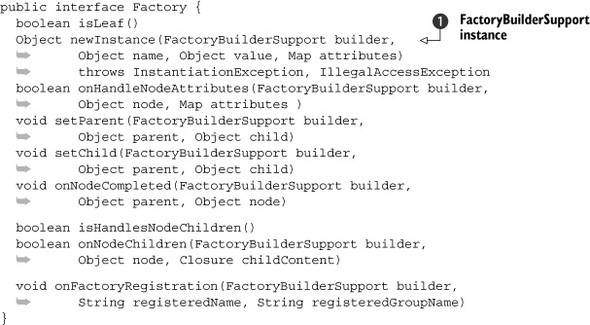
Note that almost all methods take a FactoryBuilderSupport instance  . As you may remember, SwingBuilder is a subclass of FactoryBuilderSupport, and Griffon’s CompositeBuilder works with subclasses of FactoryBuilderSupport. Coincidence? Of course not! CompositeBuilder knows how to handle factories of any type.
Let’s drill down into each of the factory’s methods from the factory implementation perspective:
- isLeaf()—This method controls whether the node handled by this factory supports nesting of other nodes. Returning true will mark the node as a leaf node. You’ll get a RuntimeException if you attempt to nest a child node in a leaf node.
- newInstance()—Perhaps the most important method that must be implemented, newInstance() is responsible for creating instances. You have access to the current context via the builder parameter, the node’s name via the name parameter, the node’s value (if any) via the value parameter, and any property that was set using Map syntax via the attributes parameter. When implementing this method, we recommend that you remove attribute keys for each value in the attributes map that was used to create the target instance; otherwise they’ll be set again by the method we’ll discuss next.
- onHandleNodeAttributes()—This method is responsible for setting any remaining properties that may not have been handled when newInstance() was called, and sets them on the target instance. Note that it returns a Boolean value. If the return value is false, the builder will ignore any remaining properties that the factory did not process explicitly. If the return value is true, the builder will attempt to set any properties that are still left on the Map. Overriding this method can be useful in various circumstances, such as when a type conversion must be executed before setting a property’s value or when there are multiple setters for a particular property name.
- setParent() and setChild()—These methods handle the relationships between nodes. The former is called when the current node is the parent node, and the latter is called when the current node is the one being nested inside another.
- onNodeCompleted()—This method is your last chance to modify the node before the builder continues with the next sibling node found in the script. This is the perfect time to perform cleanup or assign lazy relationships, because all child nodes have been processed at this point. The builder context comes in handy when you need to keep track of private node data.
If all this seems a bit daunting, don’t worry. You’ll find plenty of code examples in the various SwingBuilder factories (http://mng.bz/jYi1). We’re sure you’ll encounter plenty of goodies and code snippets in that link that can help you.
The remaining methods are rarely used outside of very specialized factories:
- isHandlesNodeChildren() and onNodeChildren()—These are used to let the factory take control of the node’s nested closure instead of the builder. This is how the withWorker() node (remember it from chapter 7?) processes nested closures that are mapped to the various life cycle methods on a Swing-Worker instance.
- onFactoryRegistration()—You can use this method to perform sanity checks right after the factory has been added to a builder.
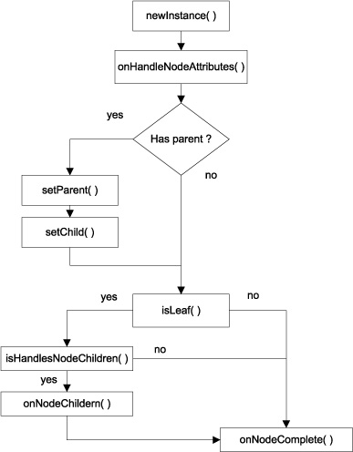
Figure 12.1 shows the flow followed by a factory’s methods when the builder requests a node to be built.
Figure 12.1. Factory methods used during node building. The setChild() method is called on the parent factory if it exists.
If you’re thinking of creating your own factories for handling custom components, we suggest you create a subclass of groovy.util.AbstractFactory as a starting point. It implements all factory methods except newInstance() with default behavior. To create a factory for a custom component that requires a constructor argument based on an orientation parameter, for example, you’d do the following:
import com.acme.MyCustomComponent
class CustomComponentFactory extends AbstractFactory {
  Object newInstance(FactoryBuilderSupport builder, Object name, Object value, Map attributes)
    throws InstantiationException, IllegalAccessException {
    String orientation = attributes.remove('orientation') ?: 'left'
    return new MyCustomComponent(orientation)
  }
}
And that would be it!
This technique is useful for reusing the node many times in the same script. But what if you need to reuse the node across scripts? Registering the node on each script is a clear violation of the DRY (Don’t Repeat Yourself) principle—there must be another way.
As a matter of fact, there are two other ways to solve this problem. The first involves an implicit addon, and the second is to make your own builder. Let’s look at the implicit addon option first.
12.1.2. Using an implicit addon
The implicit addon technique for adding nodes requires you to touch a configuration file. Recall from chapter 4 that griffon-app/conf/Builder.groovy contains the configuration for all nodes available to the CompositeBuilder. This means all you have to do is somehow register a set of factories.
Let’s look again at the default contents of Builder.groovy after a new application has been created:
root {
    'groovy.swing.SwingBuilder' {
        controller = ['Threading']
        view = '*'
    }
}
Here you can see the root prefix. That prefix name is a special one; it instructs CompositeBuilder to put all nodes into a default namespace. Node names will be available without any modifications.
What if there was another special prefix that instructed the builder to process an implicit addon? It turns out that there is! That special prefix is features, and it can hold all the properties an addon descriptor can define, except events and mvcGroups. This means you’re left with factories, methods, props, attributeDelegates, preInstantiateDelegates, postIntantiateDelegates, and postNodeCompletionDelegates. Phew! That’s still quite a lot!
To register a node for MyCustomComponent using an implicit addon, you only need to append the code shown in the following listing to Builder.groovy.
Listing 12.2. Defining a custom node using an implicit addon in Builder.groovy
features {
   factories {
      root = [
         myCustomComp: new MyCustomComponentFactory()
      ]
   }
}
A node named myCustomComp will be available to all view scripts now. You specify root as a prefix; this avoids node name collisions. The root prefix is special because it’s handled as if there were no prefix specified; in other words, it’s empty, and the node name can be used as is. If you set any other value as a prefix, it should be used when referring to the node.
The following snippet shows an example of setting a different node prefix:
features {
   factories {
      my = [
         button: new MyCustomButton()
      ]
   }
}
Now you can refer to this particular component as mybutton() in any view, as the following example depicts:
panel {
    mybutton(text: 'Click me!')
}
One neat trick that you can apply when registering a node factory is taking advantage of conventions. If the component you need to register behaves like a regular Java Swing component—if it has a no-args constructor and extends from JComponent or any of its superclasses—you can skip creating a factory and declare the component class, as follows:
features {
   factories {
      my = [
         clicker: javax.swing.JButton
      ]
   }
}
That wasn’t so bad, was it? You can apply this trick to factories defined in a regular addon as well.
But as neat and concise as implicit addons are, they have one disadvantage: you can’t share the node registration with other applications. In order to do that, you’ll have to create a plugin/addon combination. We covered plugins and addons in the last chapter. What’s new is that you must define a factories block, similar to the one demonstrated for implicit addons back in listing 12.2, but in this case you don’t need to define a node prefix at all. Here’s how it’s done for the MigLayout plugin/addon:
import groovy.swing.factory.LayoutFactory
import net.miginfocom.swing.MigLayout
class MiglayoutGriffonAddon {
   def factories = [
      migLayout: new LayoutFactory(MigLayout)
   ]
}
That wasn’t so bad either. Creating your own builder, on the other hand, requires more effort, but just a little more. Fair warning: we’re going to dive deeper and deeper into the intricacies of builders and metaprogramming. But don’t feel discouraged by this; creating a builder is a simple task, despite all the magic that occurs behind the curtains.
12.1.3. Creating a builder
This is perhaps the most thorough option you have at your disposal. Creating a builder means you have full control over which node factories get registered and how. You also have the option to register as many delegates as needed. This sounds similar to addons, doesn’t it? The main advantage of creating a builder is that you can distribute your builder to be used outside of a Griffon application. Why would you want to do that? Think of IDE integration for one, or the ability to use your builder with a simple Groovy script. As a matter of fact, this is how SwingXBuilder (and some of the official extensions you’ll see later in the chapter) came to be in the first place.
Builders should extend from FactoryBuilderSupport. This ensures that the builder has all it needs to process factories and delegates, leaving you with the responsibility of adding as many factories as you like.
Say you’d like to create a builder for a MyCustomComponent and other cool components you may have lying around. The following listing shows what such a builder could look like.
Listing 12.3. Basic builder implementation
class CoolBuilder extends FactoryBuilderSupport {
    CoolBuilder(boolean init = true) {
      super(init)
    }

    void registerCoolWidgets() {
        registerFactory('myCustomComp', new MyCustomComponentFactory())
        registerFactory('pushButton', new PushButtonFactory())
    }
}
Take note of the builder’s constructor. Every builder created in this way will automatically search for methods that follow a naming convention; the assumption is that these methods will register factories on the builder. We can appreciate the convention being applied to the registerCoolWidgets() method. This naming convention is as follows:
void register<groupName>() { ... }
This means that every method that starts with the word register, doesn’t return a value, and takes no arguments will be automatically called after the builder instance is created. If that method happens to make a call to registerFactory(), those node factories will be added to the builder. You can use this approach to call anything you’d like during node registration; for example, you can make calls to register any delegates needed by the builder.
There’s an additional benefit to automatic registration: all node factories and delegates declared in a single register<groupName> method will share the same group-Name. What are groups you ask? As seen in chapter 4, all builder nodes are put together in groups, which facilitates the task of selecting which nodes can be activated or applied to other MVC members. A perfect example is the Threading group declaration found in Builder.groovy—you may recall that this configuration line makes it possible for controllers to gain access to SwingBuilder’s threading facilities.
Once you’re happy with the state of your builder, it’s time to add it to an application. You can use a plugin to deliver the builder, as if it were an addon. Make sure you write appropriate install and uninstall instructions in the plugin’s install and uninstall scripts. What’s more, you can use the same code that create-addon puts in those scripts; just substitute the addon reference for your builder’s. If you get lost somehow, you can inspect existing builder plugins for additional clues.
That’s it for adding nodes. You now know more about the magical things that happen during the node-building process, but there’s more. We’ve mentioned builder delegates a few times in this and the previous chapter; perhaps it’s time to inspect them further and discover exactly how they come into play.
12.2. Builder delegates under the hood
As you surely know by now, FactoryBuilderSupport is the base class for all builders that rely on factories to build nodes. Factories encapsulate a great part of a node’s build cycle, as you saw in the previous section. But it’s the builder that orchestrates when and how those factories are called.
It all starts by matching what appears to be a method name to a node name backed by a factory. Node names are pretended methods, because there’s no way that Factory-BuilderSupport can know in advance which node names will be used. FactoryBuilder-Support relies on a Groovy metaprogramming technique called method missing, which works as follows. Whenever you call a method on a Groovy class, the Meta Object Protocol (MOP) follows a series of paths searching for a suitable way to invoke the method. If no match is found, it will attempt calling a special method named method-Missing(). If such a method is provided by the class (there’s no default implementation for this method as handling this type of call is an optional operation), then it’s up to the implementer to decide how the call should be handled.
This is basically what FactoryBuilderSupport does. Whenever a method is invoked and it isn’t found by regular means, methodMissing() kicks in. The builder will attempt to resolve the node name to a factory, and if a match is found it will then kick start the node build cycle. But if no match is found, you’ll get a MissingMethod-Exception as a result of the method call.
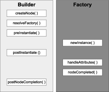
Once a factory is resolved, the build cycle continues; the builder will call out specific methods defined internally. Some of those methods expose extension points via the closure delegates. Figure 12.2 shows the sequence of method calls exchanged between builder and factory in order to build a node.
Figure 12.2. Builder and factory engaged in the node build cycle. Delegates are called on each phase that matches their name.
Without further ado, these are the types of delegates you may add to a builder:
- PreInstantiate delegates
- PostInstantiate delegates
- Attribute delegates
- PostNodeCompletion delegates
We’ll discuss each delegate type in the order the builder encounters them during the build cycle.
12.2.1. Acting before the node is created
PreInstantiate delegates are the first to be invoked, right before the node is created. This is their signature:
{FactoryBuilderSupport builder, Map attributes, value -> ... }
The most typical use for this type of delegate is to perform sanity checks on the attributes that are generic to all nodes.
For example, you might want to check that an attribute named orientation always has exactly one of the following string values: "left" or "right". If for some reason that isn’t the case, your delegate may attempt a conversion or set a default value. After this, every node that requires a valid value for its orientation property will have it. Here’s what this delegate would look like:
builder.addPreInstantiateDelegate { builder, attributes, value ->
   String orientation = attributes.orientation?.toString()?.toLowerCase()
   if(orientation in ['left', 'right'])
       attributes.orientation = orientation
   else
       attributes.orientation = 'left'
}
The advantage of adding a delegate of this type is that you can effectively update attributes without needing to change the code of a single factory.
12.2.2. Tweaking the node before properties are set
PostInstantiate delegates are the counterparts of the previous type. They go into effect once the node has been built but before the builder has had a chance to set any remaining attributes on it. This is their signature:
{FactoryBuilderSupport builder, Map attributes, node -> ... }
Note the slight change in the signature compared with the previous type. The third argument is the node that has just been built.
What are delegates of this type good for? Well, you could perform additional specific sanity checks on attributes, now that you know which node was built. You could also inspect the node hierarchy in order to tweak parent-child relationships or to add a temporal variable to the parent context—this variable could later be processed by the parent’s factory or another delegate.
Access to the current builder context is key to getting the job done. Here’s how you can do it:
builder.addPostInstantiateDelegate { builder, attributes, node ->
   builder.context?.special = attributes.remove('special') ?: false
}
This delegate provides a hint for the parent factory so that it knows the current node (its child) must be processed in a special way. But what if the factory doesn’t have code that can handle this flag? The next two delegates can help remedy this situation.
12.2.3. Handling node properties your way
Perhaps you remember seeing an id property being used on view scripts from time to time. This property doesn’t belong to any component class; rather, it’s handled by the builder using an attribute delegate. Attribute delegates are guaranteed to be called after a node instance has been created but before any properties are set by the factory or the builder. This means you can apply synthetic properties to a node, like the id property.
Attribute delegates have the following signature:
{FactoryBuilderSupport builder, node, Map attributes -> ... }
Note the subtle change in the order of arguments when compared to the postInstantiate delegates.
The following snippet shows how SwingBuilder handles the id attribute set on any node, in case you were wondering:
{FactoryBuilderSupport builder, node, Map attributes ->
    String id = attributes.remove('id')
    if(id) builder.setVariable(id, node)
}
These are likely the type of delegates that you’ll encounter the most. SwingBuilder has a few of them (besides the id-handling one), and other builders have their own, as you’ll soon find out when we discuss CSS for Swing components later in this chapter.
There’s one last delegate type that needs to be discussed.
12.2.4. Cleaning up after the node is built
PostNodeCompletion delegates are rarely seen, as most factories prefer to handle cleanup code in their own onNodeCompleted() method. But in the event that you need to perform cleanup operations that may affect several nodes, these delegates are the perfect solution. They don’t get a chance to process a node’s attributes, as they all should have been consumed by now, so their signature is as follows:
{FactoryBuilderSupport builder, parent, node -> ... }
This means it’s a good idea to store temporal data on the builder’s current context, using any of the other three delegates we just discussed. For example, this is how you can recall the special flag we set on the postInstantiate delegate example:
{FactoryBuilderSupport builder, parent, node ->
    if(builder.context.special) {
        parent?.postInit(node)
    }
}
This snippet assumes that the parent node has a postInit() method that should be called only when the current node has been marked as special. You can choose to remove a child element, change the node’s appearance, or build a new object on the fly. Quite frankly, the possibilities are endless once you get the hang of the build cycle.
You might want to explore the vast space of third-party Swing components now that you know more about the inner workings of builders and their delegates, but before you embark on that wonderful journey, let’s take a closer look at some Griffon-related projects and plugins that can make your life easier. It also makes sense to run a survey of the existing Griffon plugins (http://artifacts.griffon-framework.org/plugins) before you start to build your own. It would be sad to invest your time creating a builder or plugin for a set of components that have been covered by an official extension already, wouldn’t it?
12.3. Quick tour of builder extensions in Griffon
SwingBuilder isn’t the only builder that can be configured in a Griffon application. You know this because we just discussed how custom builders can be created. We’ve also mentioned SwingXBuilder a few times now. As a matter of fact, there are plenty of builder extension options. We’ll briefly cover the main builders you’re most likely to encounter in a daily basis. Let’s start with SwingXBuilder because you already know a bit about it.
12.3.1. SwingXBuilder
In chapter 7, we explained that SwingXBuilder provides additional threading facilities in the form of the withWorker() node, an abstraction over SwingLabs’ SwingWorker and JDK 6’s SwingWorker. There’s more to SwingXBuilder than that. The SwingX project was born as an incubator for ideas and components that might eventually find their way into the JDK. SwingWorker is one of the few that made the transition.
You’ll find a number of interesting components in the SwingX component suite. Many were designed as replacements for existing Swing components; for example, JXButton replaces JButton. SwingX offers more than just components, though. It also provides a Painters API that lets you override how a component is painted on the screen without needing to create a subclass of said component.
The easiest way to install SwingXBuilder (http://griffon.codehaus.org/SwingXBuilder) on an application is by installing its companion plugin. That’s right, let the framework do the hard work for you; the plugin will configure the builder on the application’s metadata and config files. It will also copy required libs and dependencies when needed. Invoke the following command at your command prompt to install the plugin and builder:
$ griffon install-plugin swingx-builder
Once you have it installed, you’re ready to work.
One last piece of information before you begin—remember we said that some SwingX components were designed as replacements? Well, SwingXBuilder took that into consideration, which means that some of its node names may clash with Swing-Builder’s. That’s why this builder is configured with a different prefix: jx. Whenever you see a node name that starts with that prefix, it’s a node that has been contributed by SwingXBuilder.
Figure 12.3 shows a simple application that contains two main elements: a header and a TaskPane container. The header component uses the Painters API. This painter, in particular, is a compound of three other painters:
- The first painter provides the base color, a very dark shade of gray—almost black.
- The second painter provides the pinstripes. You can change and tweak the stripes’ angle, color, spacing, and more.
- The last painter provides a glossy look. Everything looks better with a bit of shine.
Figure 12.3. A simple application composed of SwingX components. The header’s visuals were updated by a set of painters.
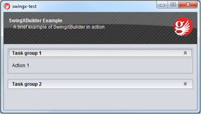
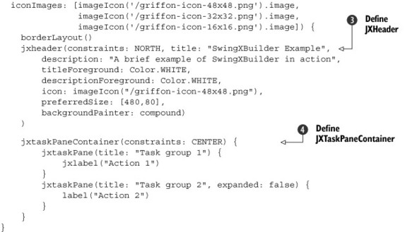
The TaskPane container emulates the behavior seen on earlier versions of the Windows file explorer. It’s a TaskPaneContainer, and as its name implies it serves as a place to embed TaskPanes. There are two TaskPanes in this container. Clicking Task Group 2 will expand its contents (with a smooth animation); clicking it again will collapse it. You can embed any Swing components in a TaskPane.
What’s that? What about the code, you say? It couldn’t be any easier, as shown in the next listing.
Listing 12.4. Some SwingXBuilder components in action
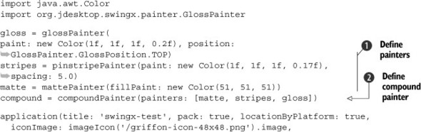
First, the painters are defined . SwingXBuilder exposes a node for each of the basic painters you’ll find on the Painters API. Then the compound painter is
created  ; it only requires a list of painters to be used. At
  the header component is built. Note that all it takes is setting a few properties on that component. Setting the compound
painter is done as with every other property—there’s no magic to it. Finally the TaskPanes are added to their container
the header component is built. Note that all it takes is setting a few properties on that component. Setting the compound
painter is done as with every other property—there’s no magic to it. Finally the TaskPanes are added to their container  . Note that the first TaskPane refers to a jxlabel node, whereas the second refers to a label node. This means that the first pane should have a JXLabel instance and the second should have a JLabel instance. The use of the jx prefix makes switching from one type of node to the other a simple task.
What’s more, the CompositeBuilder makes mixing nodes from two builders a trivial task. The alternative would be quite verbose in terms of keeping the appropriate builder references and node contexts in check. If Griffon did not provide a Composite-Builder then Views would look like this:
swingx.jxpanel {
    swing.borderLayout()
    swingx.jxheader(constraints: NORTH, title: "SwingXBuilder",
        description: "Life without CompositeBuilder",
        titleForeground: Color.WHITE,
        descriptionForeground: Color.WHITE,
        icon: imageIcon("/griffon-icon-48x48.png"),
        preferredSize: [480,80],
        backgroundPainter: compound)
    )
    swing.panel {
        swing.gridLayout(cols: 1, rows: 2)
        swing.button('Regular Swing button')
        swingx.jxbutton('Enhanced SwingX button')
    }
}
This snippet assumes there are two pre-existing builder instances; swing points to a SwingBuilder instance, whereas swingx points to a SwingXBuilder instance. Notice how you must qualify nodes with their respective builders in order to get the expected result.
Make sure you check out SwingX’s other components. In particular, we’re sure you’ll find these interesting:
- JXErrorPane—Useful for displaying errors caused by an exception. Highly configurable.
- JXTitlePanel—A JPanel replacement that comes with its own title area.
- JXTable—Row highlighting and sorting are but a few of its features. Some of its features have been merged into JDK’s JTable.
- JXHyperLink—A button that behaves like a hyperlink as seen on web pages.
The next builder we’ll cover is also quite popular.
12.3.2. JideBuilder
The announcement of the JIDE Common Layer (JCL) project (http://java.net/projects/jide-oss/) becoming an open source project back in 2007 surprised many. Up to that point, JIDE was a closed source component suite developed by JIDE Software. Many components have been open sourced since the announcement. You’ll find some easily recognizable components, like split buttons (a component that’s both a button and a menu), lists that can display check boxes (without the need of a custom renderer), and combo boxes that support autocompletion, just to name a few. Despite the number of components in the JCL, it only represents about 35 percent of the components provided by JIDE Software; the rest are available through the purchase of a commercial library. JideBuilder, like the previous builders we’ve discussed, provides a set of components ready to be used in Griffon Views. JideBuilder covers all components available in JIDE CL; the commercial components aren’t supported by the builder. But should you need to support any of the commercial components, the task of adding them to the builder isn’t that difficult: you just need to register a factory for each component on the builder itself, and of course have a valid JIDE license available in your settings.
To install the builder, install its companion plugin. This is a recurring theme, isn’t it? We did mention that plugins come in handy, and, as you’ll soon see, all officially supported builders can be installed via plugins. The following command should do the trick:
$ griffon install-plugin jide-builder
Take a look at the builder’s documentation site (http://griffon.codehaus.org/JideBuilder) to find out more about the components that are now at your disposal. We’re sure you’ll find SplitButton useful, especially for an application that requires enterprise-like behavior. Here are some other components that fall into that category:
- AutoCompletionComboBox—A combo box that comes with an autocompletion feature. Options will be selected as you type on the combo box’s input field.
- TriStateCheckBox—Useful when enabled and disabled settings are not enough.
- SearchableBar—Adds searching capabilities to tables and trees.
- DateSpinner—A spinner component that knows how to work with dates.
Figure 12.4 presents an application that showcases three JIDE components: checkBoxList, jide-Button, and jideSplitButton.
Figure 12.4. An application built with JIDE components. The checkBoxListis at the left. Four JideButtons, each with a different style applied, are at the right. The fifth and last button is a JideSplitButton, a combination of button and menu.
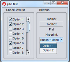
The list on the left in figure 12.4 doesn’t require additional properties to be set in order to display a checkbox per entry. Just set the data you need, and that’s all.
The first four buttons on the right belong to the same type, but they’re rendered with different styles. Hovering over Toolbar gives the button raised edges, like the ones Toolbox has. Hovering over Flat doesn’t change its appearance; it remains flat. Hovering over the fourth button, Hyperlink, gives the text an underline.
Button + Menu is the special button we’ve been talking about: a combination of button and menu. If you keep the button pressed, a popup menu appears, as shown in figure 12.4. The code is straightforward, as the following listing shows.
Listing 12.5. JIDE’s CheckBoxList and buttons
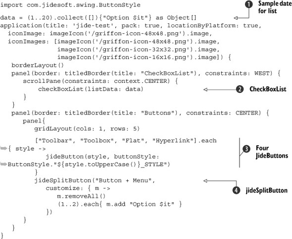
Just pass an array of objects or a model as data to create CheckBoxLists .
JideButtons have a style property that controls how they’re rendered to the screen. You can see a fairly common Groovy trick used to read a constant field from a Java class that follows a pattern. In this case, each element on the styles list serves
as the button’s text and as the basis to read a constant field on the ButtonStyle class.
Creating the menu of a JideSplitButton is a matter of defining a closure for its customize property. Notice that all menu items are removed first, and then some are added. Duplicate menu items will start piling up
every time you display the menu if it’s not done this way. This is due to JideSplitButton’s behavior of keeping a reference to the menu it created the first time.
The next builder is sure to catch your eye.
12.3.3. CSSBuilder
Hold on a moment! Is that CSS as in Cascading Style Sheets? As in a technology that’s typically associated with web content but not desktop? The answer is, happily, yes! Styling desktop components by means of CSS, or a CSS-like solution, is one of those goals that desktop developers often look for, besides better threading and binding.
CSSBuilder is a wrapper on a handful of classes that belong to the Swing-clarity project (http://code.google.com/p/swing-clarity/), whose creators are Ben Galbraith and Dion Almaer, from ajax-ian.org fame. Those guys used to work on the desktop side before riding the Ajax wave revolution.
The CSS support provided by Swing-clarity is able to parse CSS2 selectors and colors. On top of Swing-clarity, CSSBuilder adds support for 71 or more custom properties that are specific to Java Swing. Figure 12.5 depicts a trivial application where all the visual components have received a facelift via CSS.
Figure 12.5. A CSS-styled Griffon application. Each section has a border applied, labels use italics, and buttons have bolded text. Button 1.2 and Label 2.2 share red as their foreground color.
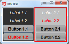
In figure 12.5, the left side’s background is darker than the right. Labels have an italicized style, whereas buttons have a bold weight. All buttons share the same background color regardless of where they’re placed. One button and one label have a red foreground color. The text on all components is centered. Are you ready to see the CSS for this? The following listing contains all that we just described, in CSS format.
Listing 12.6. Swing CSS stylesheet

As you can see, CSSBuilder lets you apply a generic style to all components. The custom swing-halign property is but one of the many Swing-specific properties you can use; this one, in particular, will center the text of a component.
Next, you can see CSS properties for the left and right groups, with background and border settings. Notice that groups use a selector that starts with a # character; its nature will be revealed soon in the view code. Next, you can see button  and label
  properties. They’re defined using another type of selector that matches the class name of the target component. Last, you
can see another selector
properties. They’re defined using another type of selector that matches the class name of the target component. Last, you
can see another selector  that defines a foreground property with red as the value.
The view code is simple, as the following listing attests.
Listing 12.7. A CSS styled view
There isn’t a lot of information here that suggests that this view can be styled with CSS, other than the obvious cssClass property . Hold on a second: that property is applied to a JLabel and a JButton, but those components know nothing about CSS. Their node factories also know nothing about CSS. How, then, is the application
able to apply the correct style?
The answer lies in attribute delegates. CSSBuilder registers a custom attribute delegate that intercepts the cssClass attribute and applies the style. Remember when we said that groups use a special selector? Well now you know how it can be
defined . As a rule, any node that has a name property defined (this is a standard Swing property, by the way) will be accessible via the # selector (like #group1 and #group2), whereas any node that defines a cssClass property will be accessible via the dot (.) selector (like .active).
There are additional features to be found in CSSBuilder, such as jQuery-like component finders using the $() method. Make sure you review the builder’s documentation (http://griffon.codehaus.org/CSSBuilder) to learn more about all the properties and methods.
You must perform two additional tasks before trying this example for yourself:
- Save the CSS stylesheet in a file with a conventional name and location. Save the contents of listing 12.6 as griffon-app/resources/style.css. Don’t worry, you can to use a different name and location if needed, but placing the file there with that particular name will save you the trouble of additional configuration.
- Tell the CSS system which elements need to be styled. Look carefully at listing 12.7 and you’ll see that the application node has an id declared with the value mainFrame. You’ll use this id to instruct the CSS system that the frame and its contents need styling.
Open griffon-app/lifecycle/Startup.groovy in your favorite editor. We’ve chosen this life cycle script because all views have been constructed by the time it’s called.
This means the mainFrame will be ready to be styled.
Type the following snippet into the script, save it, and run the application:
import griffon.builder.css.CSSDecorator
CSSDecorator.decorate("style", app.builders.'css-test'.mainFrame)
We’ve covered component suites and component styling so far. Let’s jump into graphics and drawings for a change.
12.3.4. GfxBuilder
The JDK comes with a number of drawing primitives and utility classes that are collectively known as Java 2D (http://java.sun.com/docs/books/tutorial/2d). Because every Swing component is drawn using Java 2D, it makes sense to review what you can do in Java 2D—if you want to go the long route, that is. Java 2D suffers from the same problems you’ll encounter in plain Swing code. That’s why GfxBuilder was born in the first place, just as SwingBuilder was for Swing.
Based on this information, you can expect GfxBuilder to provide a node for each of the Java 2D drawing primitives (like Rectangle, Ellipse, and Arc). It also provides nodes for setting antialiasing (removing those ugly jaggies, http://en.wikipedia.org/wiki/Jaggies), rendering hints, area operations, and much more. The following list summarizes the types of nodes that are available to you when using GfxBuilder:
- Canvas— The surface area where you place your drawings.
- Standard shape nodes— Rect, circle, arc, ellipse, path.
- Additional shape nodes— Asterisk, arrow, cross, donut, lauburu, and more; these shapes come from the jSilhouette (https://github.com/aalmiray/jsilhouettegeom) shape collection.
- Standard and custom strokes— Think of strokes as shape borders.
- Area operations— Add, subtract, intersect, xor.
- Utility nodes— Such as color, group, clip, image.
What really makes using GfxBuilder a better experience than just plain Java 2D (other than the use of Groovy features) is that it comes with a scene graphs baked right in. Scene graphs allow graphics to be defined in retained mode, whereas Java 2D works in direct mode. Direct mode means that graphics primitives will be drawn to the screen as soon as the code that defines them is processed. Retained mode means that a scene graph is created and a node is assigned to each drawing instruction. The scene graph controls when the graphics should be rendered to the screen and when they should be updated. This relieves you of the burden of keeping track of areas that need to be redrawn or updated—the scene graph does it for you.
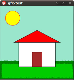
Figure 12.6 is a computerized rendition of what many of us drew as children at elementary school: a red-roofed house sitting on a patch of green grass, with the sun shining over it and a clear blue sky.
Figure 12.6. A simple drawing made with geometric objects. There are three rectangles, one triangle, and one circle, with different colors and strokes applied.
We know—it’s a bit childish. It will surely never grace the halls of a respected art gallery, but one can dream, right? Still, this picture is a composition of geometric shapes, colors, and strokes. How complicated can it be? We’ll let the code speak for itself in the next listing.
Listing 12.8. Drawing a happy house with Groovy

That’s pretty straightforward, isn’t it? A background color turns out to be the blue sky. There’s a patch of green grass, complete with some grass leaves (the wobbly stroke). The house is composed of a white wall, a red roof, and a brown door. Last, the sun shines over the whole scene.
Perhaps it’s lost in the code’s simplicity, but notice that Swing nodes (application and canvas) and graphics nodes (group, rect, circle, and so on) merge in a seamless way. There’s no artificial bridge between them. We know we’ve said this a few times already, but this is precisely the kind of power that Griffon’s CompositeBuilder puts at your fingertips.
Although there are other features to be found in GfxBuilder (which could fill a chapter of their own), we must keep things simple. Suffice it to say that every gfx node is also an observable bean, and almost every property triggers a PropertyChangeEvent, which means you’ll be able to use binding with them. Another powerful feature is the ability to define your own nodes via node composition, and not just by subclassing a node class.
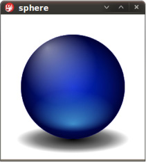
Figure 12.7 is a remake of an example shown in Chet Haase and Romain Guy’s Filthy Rich Clients book (http://filthyrichclients.org; highly recommended if you want to learn the secrets for good-looking and well-behaving applications). It’s a sphere created from circles and gradients alone; in other words, 2D primitives giving the illusion of a 3D object.[1]
1 Of course, everything you see in this book and your screen are 2D primitives. Still, the sphere looks like you can almost grab it.
Figure 12.7. A sphere drawn with nothing more than two circles and four gradients
This time the code is partitioned in two: the view and a custom node that knows how to draw spheres. Let’s look at the view first (see the next listing), because it’s the simplest of the two.
Listing 12.9. The SphereView view script
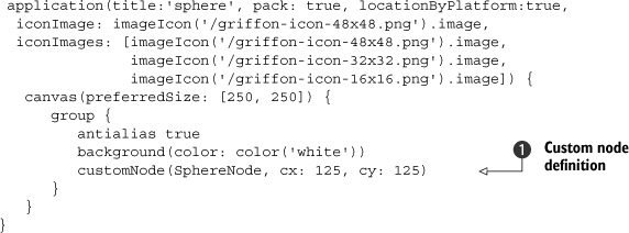
As you can see, the view code is similar to the first GfxBuilder example. This time, there’s a new node used to render a sphere object. The customNode node takes either a class or an instance of CustomNode: in this case SphereNode, whose entire definition is found in the next listing.
Listing 12.10. SphereNode definition
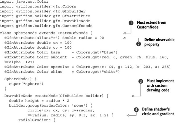
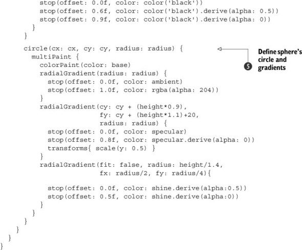
These are the code highlights. First, every custom node must extend the CustomGfx-Node class . Second, creating observable properties on custom nodes is similar to creating observable properties on Model classes . The only difference is the usage of @GfxAttribute instead of @Bindable. Third, every custom node must have drawing code that renders the node ; you’ll find that you can use the same nodes as if they were regular drawings—even other custom nodes! Then the gradients
are created at and . In particular, the second of these shows a unique feature: multipaints. If it were not for multipaints, which are a series of paint instructions all applied
to the same shape, you’d have to define a circle for each gradient. This would complicate matters, as some of those gradients
are scaled and transformed according to the base circle. It’s easier to calculate the transformations this way.
12.3.5. Additional builders
There are more builders and plugins than the ones we just explained, and it’s possible that more builders have been added since this book saw print. You’ll find a detailed list of available builders at http://griffon.codehaus.org/Builders.
A quick survey of the builders that were left out of the book’s scope follows.
FlamingoBuilder
The Flamingo (http://java.net/projects/flamingo/) component suite was created and is maintained by Kirill Grouchnikov (www.pushing-pixels.org)—the same mastermind behind the Substance look and feel project that makes Swing applications look great. Perhaps the most interesting component found in this suite is JRibbon, a pure Java implementation of the Ribbon component found in Microsoft Office 2007. There’s also SVG support for creating icons and other goodies that complement the Ribbon component.
MacWidgetsBuilder
MacWidgets (http://code.google.com/p/macwidgets) is a project started by Kenneth Orr, whose aim is to provide components that follow Apple’s Human Interface Guidelines. They’re 100 percent Java but blend seamlessly with Apple’s look and feel, even when not running on Apple’s OS X! That’s right—with MacWidgets you can create an application that looks like a native OS X application but runs on Windows or Linux. How crazy is that? Amazing!
TridentBuilder
Trident (http://kenai.com/projects/trident/pages/Home) is a general-purpose animation library created and maintained by the powerhouse that is Kirill Grouchnikov. Trident takes off where Chet Haase’s Timing Framework ends, and then adds many more things. Trident follows Timing Framework in spirit, but it isn’t based on the latter’s codebase at all. Kirill has put a lot of effort into this animation library. It’s small and practical, to the point that it’s now the one used by both Substance and Flamingo to drive their animation needs. Be sure to follow Kirill’s blog and watch some of the videos related to Trident, Flamingo, and Substance that he has created over the years (http://vimeo.com/kirillcool).
SwingxtrasBuilder
This is a collection of projects that don’t warrant a builder of their own because their individual sets of components are rather small. Here you’ll find xswingx, which we discussed earlier in this chapter. There’s also L2FProd Commons (http://l2fprod.com/common), providing task panes, an outlook bar, and a properties table. SwingX’s task panes are based on L2FProd’s—the code was contributed from one project to the other. There’s also Balloon tip (http://java.net/projects/balloontip/). If you ever wanted to have a friendly pop-up like the ones you see appearing on your operating system’s task bar, then the components provided by Balloon tip are the way to make it happen.
AbeilleForm Builder
This builder was discussed briefly in chapter 4. It’s the workhorse behind the Abeille Forms plugin. You may recall that Abeille Forms Designer is an open source alternative for designing forms and panels that relies on JGoodies FormLayout or the JDK’s GridBagLayout to place components on a Swing container.
12.4. Summary
In this chapter, you learned how to enhance a view script. You can do it by adding new nodes, for which there are also a number of alternatives: there’s the direct approach of registering a node factory on a view script; then there’s the more reusable option of using an implicit addon, which has the advantage of reusable nodes across scripts; and finally, there’s the “make your own builder” option, which gives you the advantage of using nodes outside of Griffon applications.
Then we reviewed the different strategies FactoryBuilderSupport exposes to customize the node build cycle without needing to modify existing factories. There are four types of delegates that come into play at specific points of the build cycle. Each one can complement the others, depending on what your needs are.
Last, we surveyed the list of extensions in the form of builders. There are many third-party component suites out there. These builders reduce the time you’d have to spend hunting for custom components; they also reduce your learning curve, because they follow the same conventions as SwingBuilder.
In the next chapter, we’ll unite Griffon and Grails to build a Griffon Bookstore application that uses Grails web services as a persistence mechanism.