We will follow a standard workflow of analyzing, visualizing, modeling, and evaluating our models on our audio data. Once all the data is downloaded, you will notice that there are a total of ten folders containing audio data samples in WAV format. We also have a metadata folder, which contains metadata information for each audio file in the UrbanSound8K.csv file. You can use this file to assign the class labels for each file or you can understand the file naming nomenclature to do the same.
Each audio file is named in a specific format. The name takes the [fsID]-[classID]-[occurrenceID]-[sliceID].wav format, which is populated as follows:
- [fsID]: The freesound ID of the recording from which this excerpt (slice) is taken
- [classID]: A numeric identifier of the sound class
- [occurrenceID]: A numeric identifier to distinguish different occurrences of the sound within the original recording
- [sliceID]: A numeric identifier to distinguish different slices taken from the same occurrence
Each class identifier is a numeric number that can be mapped to a specific class label. We will expand more on this shortly. Let's start with some basic exploratory analysis of our audio data. You can refer to the Exploratory Analysis Sound Data.ipynb Jupyter Notebook from our GitHub repository in case you want to run the examples yourself.
To start with, we load up the following dependencies, including the librosa module, which you might need to install if you don't have it:
import glob
import os
import librosa
import numpy as np
import matplotlib.pyplot as plt
from matplotlib.pyplot import specgram
import pandas as pd
import librosa.display
import IPython.display
import soundfile as sf

%matplotlib inline
The librosa module is an excellent open source Python framework for audio and music analysis. We recommend that our readers check out this framework in more detail. We will be using this for analyzing as well as extracting features from audio data in subsequent sections. Let's load one folder of data now for analysis:
files = glob.glob('UrbanSound8K/audio/fold1/*')
len(files)

873
We can see that each folder roughly contains 870+ audio samples. Based on information from the metadata and readme files, we can now create a class ID for name mapping the audio sample categories:
class_map = {'0' : 'air_conditioner', '1' : 'car_horn',
             '2' : 'children_playing', '3' : 'dog_bark',
             '4' : 'drilling', '5' : 'engine_idling',
             '6' : 'gun_shot', '7' : 'jackhammer',
             '8' : 'siren', '9' : 'street_music'}
pd.DataFrame(sorted(list(class_map.items())))
Let's take ten different audio samples belonging to each of these classes now, for further analysis:
samples = [(class_map[label],
           [f for f in files if f.split('-')[1] == label][0])
                                       for label in class_map.keys()]
samples

[('street_music', 'UrbanSound8K/audio/fold1108041-9-0-11.wav'),
 ('engine_idling', 'UrbanSound8K/audio/fold1103258-5-0-0.wav'),
 ('jackhammer', 'UrbanSound8K/audio/fold1103074-7-0-0.wav'),
 ('air_conditioner', 'UrbanSound8K/audio/fold1127873-0-0-0.wav'),
 ('drilling', 'UrbanSound8K/audio/fold114113-4-0-0.wav'),
 ('children_playing', 'UrbanSound8K/audio/fold1105415-2-0-1.wav'),
 ('gun_shot', 'UrbanSound8K/audio/fold1102305-6-0-0.wav'),
 ('siren', 'UrbanSound8K/audio/fold1106905-8-0-0.wav'),
 ('car_horn', 'UrbanSound8K/audio/fold1156194-1-0-0.wav'),
 ('dog_bark', 'UrbanSound8K/audio/fold1101415-3-0-2.wav')]
Now that we have our sample data files, we still need to read in the audio data into memory before we can do any analysis. We noticed that librosa was throwing an error for some of the audio files (because they were of very short length or sample rates). Hence, we leverage the soundfile Python framework to read in the audio files to get their raw data and their original sample rate. You can get more information about the soundfile framework here: https://pypi.org/project/SoundFile/ if needed.
Audio sample rate is defined as the number of samples of audio carried per second, which is usually measured in Hz or kHz (one kHz being 1,000 Hz). The default sampling rate for librosa is 22,050 Hz, which is what we will be re-sampling all our audio data into to maintain consistency. The following code helps us read in the data and also shows the total length of the raw audio data:
def get_sound_data(path, sr=22050):
data, fsr = sf.read(path)
data_22k = librosa.resample(data.T, fsr, sr)
if len(data_22k.shape) > 1:
    data_22k = np.average(data_22k, axis=0)
    return data_22k, sr

sample_data = [(sample[0], get_sound_data(sample[1])) for sample in
                samples]
[(sample[0], sample[1][0].shape) for sample in sample_data]
[('street_music', (88200,)), ('engine_idling', (88200,)),
 ('jackhammer', (88200,)), ('air_conditioner', (44982,)),
 ('drilling', (88200,)), ('children_playing', (88200,)),
 ('gun_shot', (57551,)), ('siren', (88200,)),
 ('car_horn', (5513,)), ('dog_bark', (88200,))]
It is quite evident that most of the audio samples are around four seconds in duration but some have a really short duration. The beauty of Jupyter Notebooks is that you can even embed the audio in the notebook itself and play it using the following snippet.
For data in sample_data:
print(data[0], ':')
IPython.display.display(IPython.display.Audio(data=data[1[0],rate=data[                                              1][1]))
This creates the following:

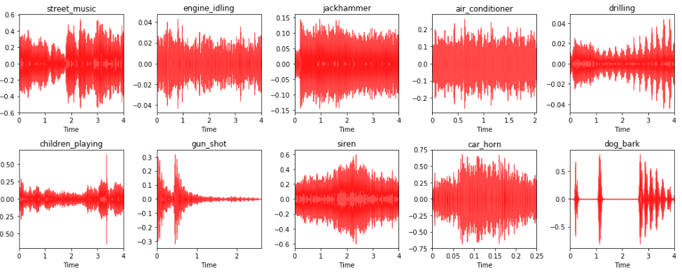
Let's now visualize what these different audio sources look like by plotting their waveforms. Typically, this will be a waveform amplitude plot for each audio sample:
i = 1
fig = plt.figure(figsize=(15, 6))
for item in sample_data:
    plt.subplot(2, 5, i)
    librosa.display.waveplot(item[1][0], sr=item[1][1], color='r',
                             alpha=0.7)
    plt.title(item[0])
    i += 1
plt.tight_layout()
The created plots will appear as follows:

You can clearly see in the preceding diagram the different audio data samples with their source labels and their corresponding audio waveform plot. This depicts some interesting insights. Sources like engine_idling, jackhammer, and air_conditioner typically have a constant sound, which doesn't change over time. Hence, you can notice the constant amplitude in the waveforms. The siren and car_horn also usually have a constant audio waveform with intermittent increases of amplitude. The gun_shot usually have a huge noise in the beginning, followed by silence. And the dog_bark comes in intermittent intervals. Hence, sounds have short intervals of high amplitude besides silence. Can you find any more interesting patterns?
Another interesting visualization technique for audio data is spectrograms. Typically, a spectrogram is a visual representation technique for representing spectrums of frequencies from audio data. They are also popularly known as sonographs and voicegrams. Let's visualize our audio samples as spectrograms:
i = 1
fig = plt.figure(figsize=(15, 6))

for item in sample_data:
    plt.subplot(2, 5, i)
    specgram(item[1][0], Fs=item[1][1])
    plt.title(item[0])
    i += 1
plt.tight_layout()
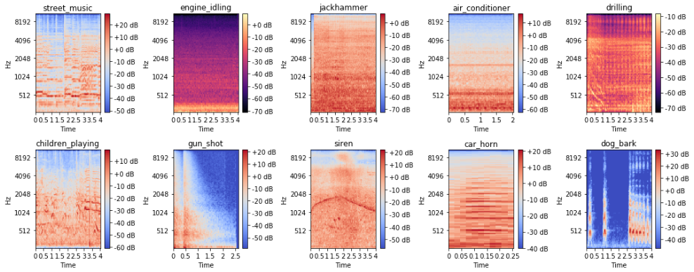
The spectrograms appear as follows:

We can see how audio data can be represented as a nice image representation with a spectrogram, which could be useful for models like Convolutional Neural Networks (CNNs) to extract features from, as we can definitely see some marked differences in the spectrograms across the different audio sources. However, we will be using a mel spectrogram, which is usually better than a basic spectrogram because it represents the spectrogram on a mel-scale. The name mel comes from the word melody. This indicates that the scale is based on pitch comparisons. The mel-scale is thus a perceptual scale of pitches that have been judged by listeners to be equal in distance from one another. This is extremely useful if we are using CNNs to extract features from these spectrograms. The following snippet depicts mel spectrograms:
i = 1
fig = plt.figure(figsize=(15, 6))
for item in sample_data:
    plt.subplot(2, 5, i)
    S = librosa.feature.melspectrogram(item[1][0], sr=item[1]
    [1],n_mels=128)
    log_S = librosa.logamplitude(S)
    librosa.display.specshow(log_S, sr=item[1][1],
    x_axis='time',y_axis='mel')
    plt.title(item[0])
    plt.colorbar(format='%+02.0f dB')
    i += 1
plt.tight_layout()
The mel spectrograms appear as follows:

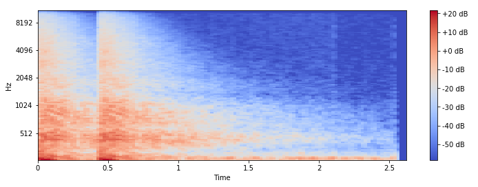
We can see that with the mel-scale, the spectrograms are much easier to distinguish based on the audio sources. Let's now focus on a few specific visual techniques that we will be using as our base sources for feature engineering in the next section. To start with, let's look at what our gun_shot audio sample looks like as a mel spectrogram:
y = sample_data[6][1][0]
S = librosa.feature.melspectrogram(y, sr=22050, n_mels=128)
log_S = librosa.logamplitude(S)
plt.figure(figsize=(12,4))
librosa.display.specshow(log_S, sr=22050, x_axis='time', y_axis='mel')
plt.colorbar(format='%+02.0f dB')
The spectrogram appears as follows:

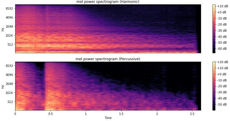
The spectrogram is consistent with how the audio waveform plot is for this audio source. Another interesting aspect of audio is that usually any audio time series data can be decomposed into harmonic and percussive components. These can present completely new and interesting representations of any audio sample. Let's get these components and plot them as spectrograms:
y_harmonic, y_percussive = librosa.effects.hpss(y)
S_harmonic   = librosa.feature.melspectrogram(y_harmonic,sr=22050,
                                              n_mels=128)
S_percussive = librosa.feature.melspectrogram(y_percussive,sr=22050)
log_Sh = librosa.power_to_db(S_harmonic)
log_Sp = librosa.power_to_db(S_percussive)

# Make a new figure
plt.figure(figsize=(12,6))
plt.subplot(2,1,1)
librosa.display.specshow(log_Sh, sr=sr, y_axis='mel')
plt.title('mel power spectrogram (Harmonic)')
plt.colorbar(format='%+02.0f dB')
plt.subplot(2,1,2)
librosa.display.specshow(log_Sp, sr=sr, x_axis='time', y_axis='mel')
plt.title('mel power spectrogram (Percussive)')
plt.colorbar(format='%+02.0f dB')
plt.tight_layout()
The spectrograms will appear as follows:

You can see the two different components of our audio sample shown as two distinctive spectrograms, depicting the harmonic and percussive components respectively.
Another very interesting depiction of audio data is to use a chromagram, which shows the pitch intensities of the audio sample signal based on the twelve different pitch classes—namely {C, C#, D, D#, E, F, F#, G, G#, A, A#, and B}. This can be an excellent visual tool for depicting the various pitch intensities in the audio signal over time. Typically, a Fourier transform or a Q-transform is done on the raw audio signal before building a chromagram:
C = librosa.feature.chroma_cqt(y=y_harmonic, sr=sr)
# Make a new figure
plt.figure(figsize=(12, 4))
# Display the chromagram: the energy in each chromatic pitch class
# as a function of time
librosa.display.specshow(C, sr=sr, x_axis='time', y_axis='chroma',
                         vmin=0, vmax=1)
plt.title('Chromagram')
plt.colorbar()
plt.tight_layout()
The chromogram will appear as follows:

We can clearly see the various pitch intensities of our gun_shot audio sample over time, which will definitely be effective as a base image for feature extraction. We will use some of these techniques for feature extraction in the next section.
