Chapter 2. Tables, Charts & Graphs
Presenting Information with Visual Clarity

CHOOSING THE RIGHT GRAPHIC FORMAT 38


AN OVERVIEW OF DIFFERENT CHART TYPES 44


BUILDING A STACKED BAR CHART 52


BUILDING AN ORGANIZATIONAL CHART 61

Choosing the Right Graphic Format
If your audience is wading through text-based statistical information on the screen then they’re not paying attention to what you are saying. Instead, convert your data into a visual. The most important factor in determining which data graphic you choose is clarity. Choosing the right one can help your audience decipher your data and direct them to a specific point that you are trying to make.
Guide Your Audience
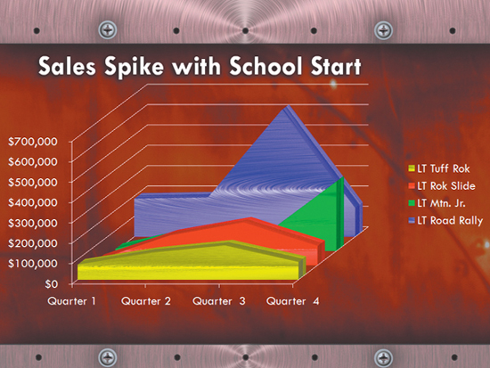
We’ve seen slide or chart titles that simply say something to the effect of “sales trends” above a bar or line chart. The chart may visibly display an upward or downward trend, but what do you want the audience to focus on? Titling your slide something like “Sales Spike with School Start” gives it a one-two punch that will guide them. Growth may already be obvious in your chart, but your audience can make a more complex determination based on your title and your data combined.
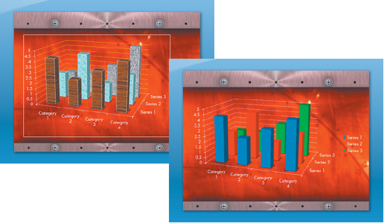
Keep It Simple with a Clustered Column
If you want to compare amounts of data (perhaps the number of bikes sold online versus at retail stores), a vertical column chart can do this very clearly. It’s also possible to demonstrate multiple comparisons clearly with a bar chart that uses color and labeling to differentiate. For example, you can quickly demonstrate the sales performance of three different bikes sold online versus at retail stores using a clustered column chart. Although 3-D charts look slick, be careful. Many times a fancy 3-D chart can make instant comprehension of data more difficult.
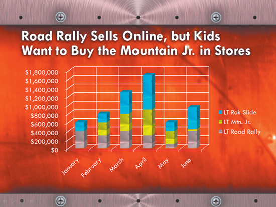
Use Stacked Columns for Multiple Items
Stacked column charts can demonstrate how multiple items arrive at a total when combined. For example, we could see the total sales of three bikes over the course of six months and at the same time see which bike was the better seller during any particular month.
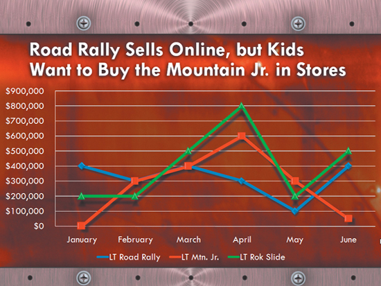
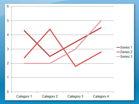
Use Line Charts for Time
When there are multiple changes that need to be illustrated over time, a line chart often works best. The audience can follow the progression of change and very easily pinpoint where the change occurred. You can also visually compare multiple components using color or line thickness to differentiate data. Again, be careful with the ability to move into the 3-D realm here. Line charts can become very confusing when they are viewed at an angle.
Combine Chart Types
You can build a visual story by combining two different messages in the same chart. For example, you can use a clustered column chart to show actual sales over the course of a year for each bicycle. You can then overlay a line chart to show what the projected sales for each bicycle were. This combination can help lead the audience to some conclusions about the success of a product over time based on what was initially expected.
Clarify Duration with Bar Charts
If you want to show the wear on a bicycle tire or anything else over time, turn your columns on their sides by selecting a bar chart. Your audience reads left to right and it’s easier to comprehend things over time this way (think timeline). Multiple comparisons are also easy to decipher at a glance. For example, we could measure bicycle tire wear for a 110-mile race as well as heat buildup and vibration for several different tires to determine the best overall performance. ![]()

Creating Tables
Organizing Text for Visual Clarity
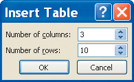
1. Add a Table
A table is a great way to organize a lot of text so it is easier to read through and comprehend. With a table, you use columns to organize words and numbers. These columns help to establish relationships between categories of numbers. Additionally, a table can offer a quick synopsis of the data. Adding a table to a slide is very easy as long as you know how many cells you will need. To determine this, do a quick pen-and-paper sketch of what you think will go into the table. While you can always modify the table in the future, it’s a good idea to get started by making the design as close as possible to what you’ll need for the end product. To get started, open the Ch2_Long_Trail.pptx presentation, and click on the slide 6 Thumbnail. Next, choose the Insert tab. In the Tables group, click the Table button and choose Insert Table. The Insert Table window opens and prompts you for input. Enter 3 into the Number of columns field and 10 into the Number of rows field. Click OK to add the table.
Add It Up. If you need to add a row to the end of a table, you can click in the last cell of the last row. Press the tab key to create (and move to) a new row.
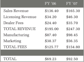
Text can be manually entered into a table or pasted from another document. To get practice with navigating through a table, you will enter text. In the table you have created, enter the information at left. You can type in a field, then press tab to shift to the next cell.
Copy and Paste. If you’ve already entered the information into a Word document or an Excel spreadsheet, you can copy those cells to your clipboard. This information can then be pasted into your PowerPoint slide. We’ve included the text data for this slide in the chapter folder as an Excel spreadsheet named Table 1.xlsx.
3. Use Styles
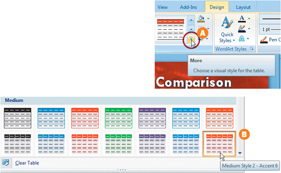
One way to quickly format a table is to use styles. A table style combines multiple styling options (such as colors and formatting) into a single click. PowerPoint provides you with a gallery of styles to browse and choose from. On slide 6, click on your newly created table so it is selected. The Table Tools Design tab is automatically selected. In the Table Styles group you have several choices (hover your mouse over the different styles to see them previewed). Click the More button A to preview the full list of styles. From the Medium group, choose Medium Style 2 – Accent 6 B and click once. The table is now formatted with the style; a few additional changes will further enhance its clarity.
4. Apply Additional Formatting
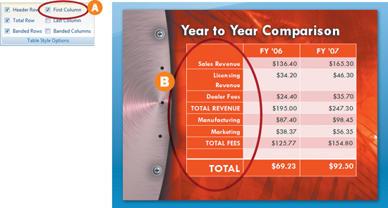
By formatting cells, we can further clarify the data layout. With the table still selected, select the Table Tools Design tab. Check the box next to First Column in the Table Styles option A; this darkens the first column, which helps distinguish it as labels. Then check the box next to Total Row, which bolds the last column and reverses the text over a solid color. These two changes help format the text information more clearly B.
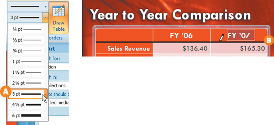
PowerPoint allows you to change the colors of borders. These changes can be useful to draw attention to specific cells and highlight information. First, let’s offset the header row of the cell by underlining it. Click on the table to select it and then choose the Table Tools Design tab. In the Draw Borders group modify the following options: set the Pen color to black, change the Pen Style to a solid line; then set the Pen Weight to 3 points A. The pointer currently looks like a pencil, which will allow you to draw the borders manually. Click, and draw a border under the first three cells B.
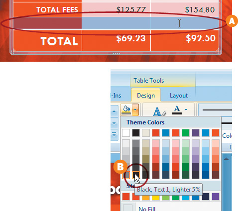
6. Change the Shading of Cells
By formatting one of the rows in our table, we can further highlight information. Highlight the ninth-row cells by clicking in the first cell and dragging to the right A. Next we’ll change the color of the cells to make them look more like a dividing bar. Select the Table Tools Design tab and then choose the Table Styles group. Click on the shading menu, which looks like a paint bucket, and choose a dark shade of gray such as the Black, Text 1, Lighter 5% B. The row is now filled with a dark gray and clearly divides the total row from the earlier rows.
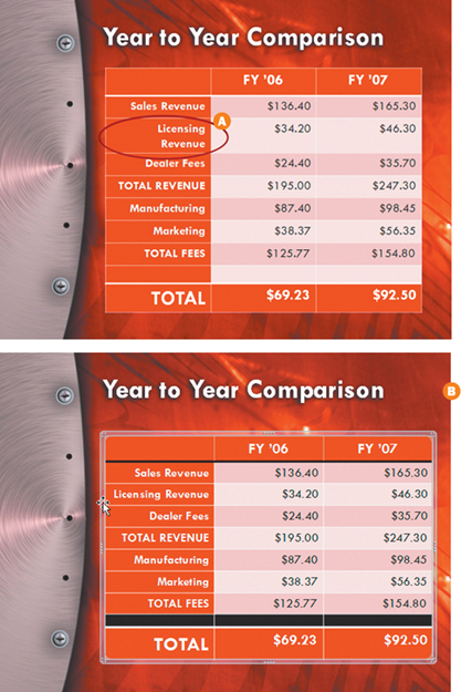
The table needs to be modified to fit on the page. In the first column, the words Licensing Revenue have wrapped onto two lines A. This creates a design anomaly as none of the other cells appear this way. You will want to correct irregular line breaks, as they disrupt the clean presentation of data; fix by adjusting the size of the table. Click the right edge of the table (be sure to click in the center where the cursor will change to a double arrow) and drag to the right until you reach the edge of the slide. Next click on an edge of the table (not on a handle) making sure that the cursor is a four-way arrow. Click and drag to reposition the table on the slide. Position the table so it is optically centered between the left and right edges as well as between the space below the title and the bottom edge of the slide B. ![]()
Using a Spreadsheet. If you need to use formulas on a PowerPoint slide (like one that calculates the values of a row), you can use an Excel spreadsheet instead of a table. From the Insert tab, you can click Table and choose to insert an Excel Spreadsheet. While this adds the benefit of formulas and calculations, it limits your design options. Most of the table formatting commands in PowerPoint are unavailable when you use an Excel spreadsheet.
An Overview of Different Chart Types
Before you add a chart to your presentation, you should have a clear understanding of the many options you’ll be presented with. PowerPoint 2007 offers 11 different categories and 73 unique chart styles. To the uninitiated (and even the savvy) this many choices can be truly intimidating. Let’s take a look at some guiding principles for selecting the right chart type.
Column
The column chart is a popular option and is frequently used to present data that was arranged using rows or columns. This is very helpful for showing changes over time, such as figures that compare year-end financial results. The most common layout places categories of information along the horizontal axis, with the value entries falling along the vertical axis. PowerPoint offers several choices for column charts, including flat, 3-D, and pyramid shapes.
Line
Line charts are similar to column charts as they work well for data that is arranged in columns or rows in a worksheet. What differentiates them is that they can display continuous data over a range of time, which makes them excellent for showing trends. For a line chart to work properly, category data must be available in even increments (such as months or quarters), which are then spread along the horizontal axis. The value data is also evenly spread along the vertical axis. The points on the graph are then connected with a line; multiple colors can be used to illustrate multiple trends clearly.
Pie
A pie chart works well to show the proportionate relationship of a single column or row to the whole. The chart represents the data series in proportionate sums, showing slice by slice what percentage of the whole pie is represented. The total of all the slice percentages comes to 100 percent. A pie chart works very well when the object of the chart is to show a relationship between entries (such as the results from a survey). Pie charts can be 2-D or 3-D depending upon the style of your slides.
Better Pie Charts. Be careful when creating pie charts so your graphic doesn’t get too cluttered. Many more than eight categories, and you’ll have a difficult-to-read chart. The same holds true if very many of the values are extremely small. For clarity, you can pull a section of a pie chart out to offset it and add emphasis.
Bar
A bar chart can translate data from rows or columns into plotted bars. These are useful for comparing two or more individual items. The bar chart is a good option if you have long names for axis labels or if you are illustrating a value of duration. Options for creating bar charts include cylinder, cone, and pyramid.
Area
Area charts can show data from rows and columns, and they are particularly well suited for showing the magnitude of change over time. An area chart can be used for showing financial or population growth, as it conveys both a change in individual value and a cumulative change in total value.
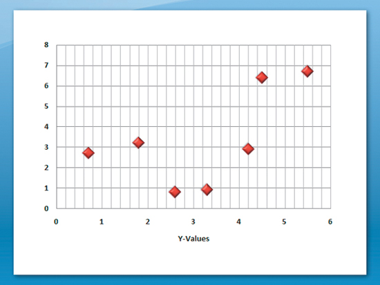
X Y (Scatter)
A scatter chart is a useful way to show the relationships among the values of a table. A scatter chart uses two-value axes, and uses number values on both the x- and y-axis. The data tends to be displayed in uneven intervals (hence “scattered”) across the chart. The charts are most commonly used to show statistical or scientific data.
Stock
A stock chart is usually used to show the fluctuations of the stock market. It allows you to show information such as the High/Low and Close values of a specific stock. You have to organize the data in a particular order. Fortunately when you add the chart, the spreadsheet is already set up properly. To make sure the chart functions correctly, be careful not to modify the number of columns or the High/Low Close labels.
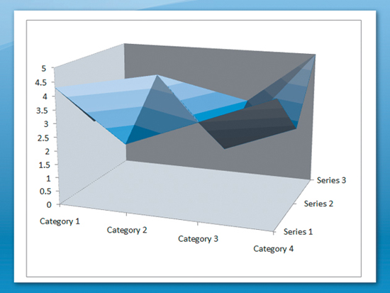
Surface
Surface charts can be difficult to read. They are most useful for displaying the optimum combinations between two sets of data. Colors and patterns are used to indicate areas that share the same range of values. Surface charts are often used to illustrate data like temperature readings. The chart is similar to the effect of wrapping a rubber sheet over a 3-D Column chart. In order to work properly, both categories and series data should be numeric values. A surface chart is not commonly used for financial and sales presentations; it is more useful to the scientific community. These charts are used to show relationships among large amounts of data that would otherwise be difficult to comprehend.
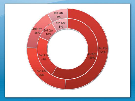
Doughnut
A doughnut chart, like a pie chart, shows the relationship of parts to a whole. Unlike a pie chart, it allows more than one column or row to be plotted. A doughnut chart is not the easiest to read, and is used far less frequently than other options like a stacked column or bar chart, which use the same principles.
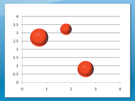
Bubble
A bubble chart is similar to a scatter chart. Your data must be listed so that x values appear in the first column and y values in the second. A third column (generally a percentage) is used to modify the size of the bubble. Bubble charts are not very common and are not always easily understood by audiences.
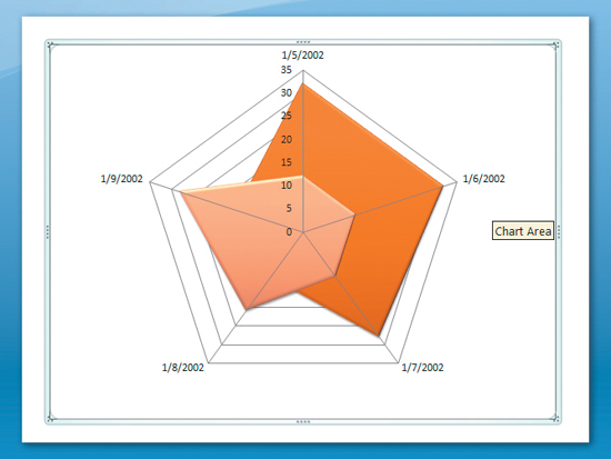
Radar
A radar chart can be used to compare the aggregate values of multiple data series from a table. A radar chart is a specialty chart and is not commonly used. ![]()
Building a Pie Chart
PowerPoint Makes Building and Stylizing a Pie Chart Simple
1. Insert a Chart
There are two main ways to create a dynamic chart in your presentation. You can go to the insert tab in the Ribbon and then click the Charts button in the Illustrations group. The Insert Chart window will appear and allow you to select a chart style. If the presentation template that you’re using has a general content or chart placeholder, you can click the Charts icon to create your chart. To get started, click the slide 5 Thumbnail.
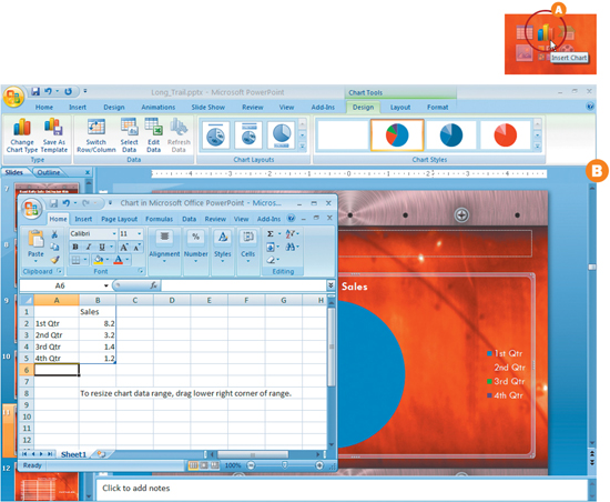
2. Insert a Pie Chart Placeholder
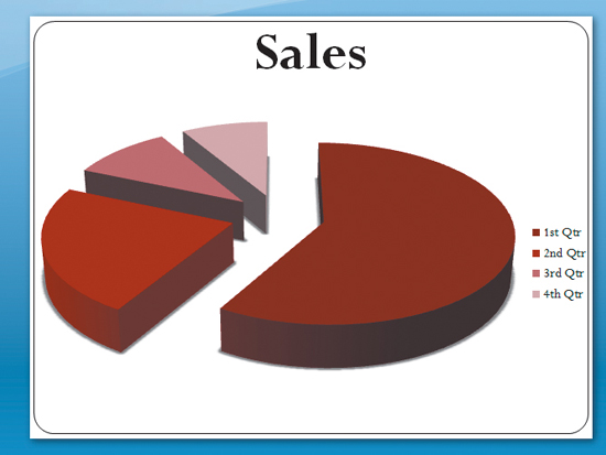
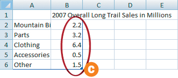
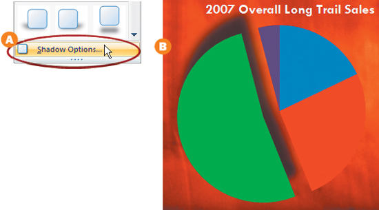
Slide 5 in your presentation will have a general-content placeholder that contains icons for Tables, Charts, SmartArt, Pictures, Clip Art, and Movies. Click the Insert Chart icon A. This will open up the Insert Chart window. Select the first thumbnail in the Pie group and click OK. A placeholder pie chart will be placed on the active slide as an Excel document simultaneously opens with placeholder content B. Click in the B1 cell and modify the chart title to read, “2007 Overall Long Trail Sales in Millions.” Modify A2–A6 to read Mountain Bikes, Parts, Clothing, Accessories, and Other. In Cells B2–B6, type in 2.2, 3.2, 6.4, 0.5, and 1.5 C. Now close the Excel document.
3. Modify the Inserted Chart
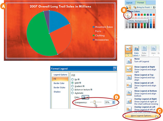
You’ll notice that the text on the chart title and legend is hard to read. That’s an easy fix. When selected, the chart will have a semi-transparent bounding box to let you know that it’s active A. Click the Format tab in the Ribbon. In the WordArt Styles group, click the Text Fill button and select a white color swatch from the drop-down menu B. In the Layout tab, click the Legend dropdown menu in the Labels group and click More Legend Options C. Select the Fill button and then select Solid fill. Change your Color to black and your Transparency to about 35 percent D.
4. Add Emphasis with Titles
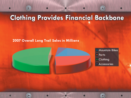
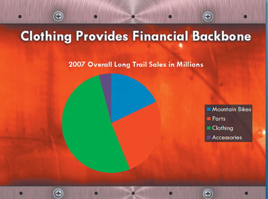
We need to draw attention to the fact that the Long Trail clothing line is outselling all other products. The first step is to direct the audience’s attention to our specific agenda. By using a title like “Clothing Provides Financial Backbone,” we guide our audience to a specific conclusion with our chart backing it up visually. Keep titles short and to the point. Imagine that you are writing newspaper headlines.
5. Add Emphasis with Explosions
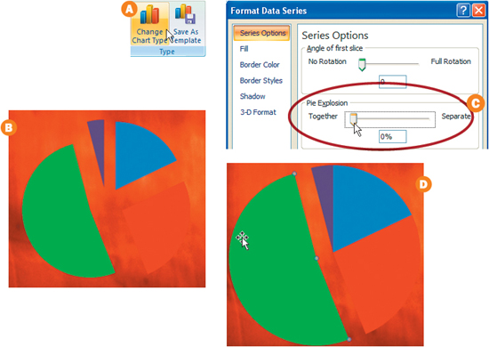
Unless you have a license in pyrotechnics, we’ll just use an exploded Pie chart. Click on your Pie chart and then click the Design tab in the Ribbon. Open up the Change Chart Type window by clicking the corresponding button in the Type group A. In the Pie group, click the Exploded Pie icon and then click OK. You’ll notice that all of the pie pieces have exploded B. We just want to emphasize the clothing slice. Make sure all of the pieces are selected and then click the Layout tab. Click the Format Selection button in the current selection group. Adjust the Pie Explosion slider until it is at 0%, or closest to the Together label on the left C. Next, select just the Clothing (green) piece and pull it away from the rest of the pie D.
Nudging Objects. If you need to move an object just a tiny bit, then select the object and use the arrow keys. For even more precise control, hold down the Ctrl key and then use the arrow keys.
6. Add Dimension with a Drop-Shadow
With the Clothing piece still selected, click the Format tab in the Ribbon. Then click the Shape Effects drop-down menu in the Shape Styles Group. From this window you can select a drop-shadow preset or customize the shadow by selecting the Shadow Options button A. Select the Shadow Options button and then select Shadow in the Format Data Point window. Adjust your Shadow settings until the Clothing piece appears to float above the rest of the pie pieces B.
With your chart selected, click the Design tab, and then click the Change Chart Type button in the Type group. Select the Exploded pie in 3-D thumb-nail and click OK A. You can also add to the 3-D look by clicking on the chart and then selecting the Format Selection button in the Current Selection group in the Format tab B. Click the 3-D Format button and experiment with different Bevels and Surfaces. To adjust the rotation and perspective, click the 3-D Rotation button in the Background group under the Layout tab and experiment with different options C. ![]()
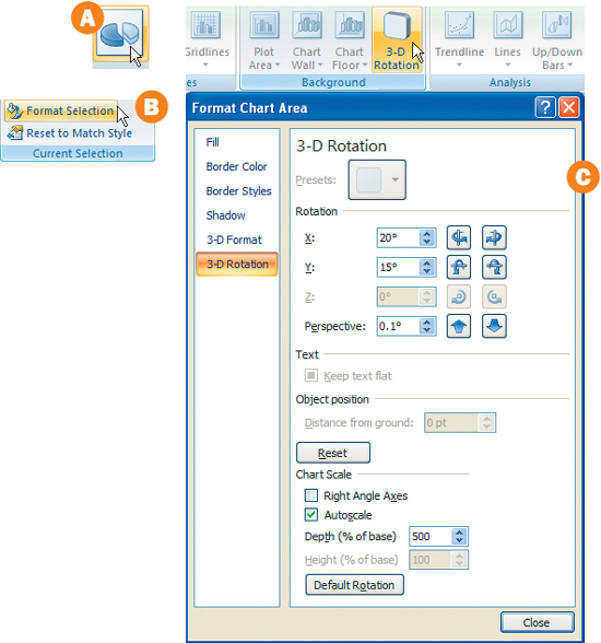
Key In Parameters. Sometimes the 3-D Rotation sliders and other sliders in PowerPoint will not deliver the desired result. Try skipping the sliders and typing in a parameter.
Building a Stacked Bar Chart
Using an Existing External Excel Chart in PowerPoint
1. Start with an Existing Excel Chart
It’s common to receive data in an Excel document that needs to be imported into a presentation. We’ll take an existing Excel document and create a chart within Excel that can be pasted and modified in PowerPoint. To get started, open the Sales_by_Bike.xls Excel document in your Chapter 2 project folder, and select the chart data by clicking in cell A-1 and then shift-clicking in cell E-6.
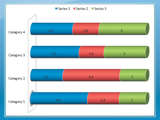
Click the Insert tab in the Ribbon and select the Column drop-down menu in the Charts group. Select the Stacked Column in the 3-D thumbnails in the 3-D Column group A. Excel will create a chart based on the existing data on sheet 1 in your document. Things may get a little confusing with the chart sitting right on top of your worksheet B. To move the chart to its own work sheet, select the chart and then click the Move Chart button in the design tab of your Ribbon. In the Move Chart window, select the New Sheet radio button and name your chart Sales by Bike and then click OK C. Your Sales by Bike chart will now reside on its own sheet.
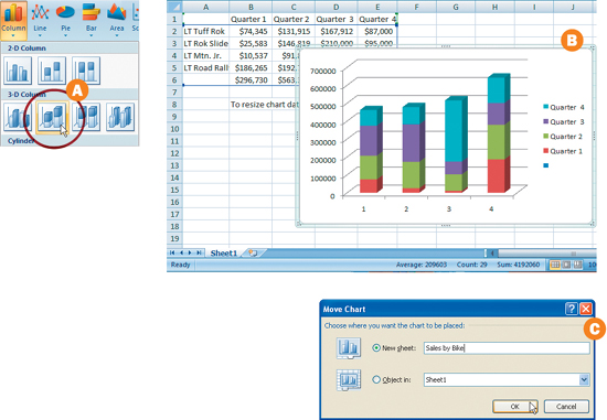
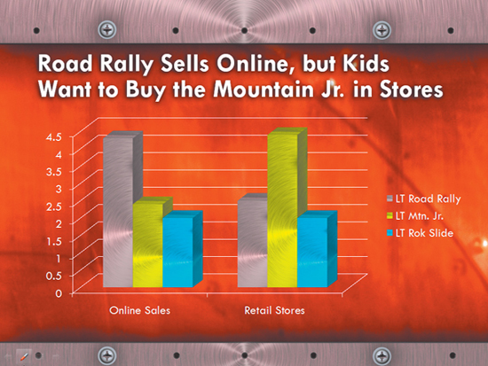
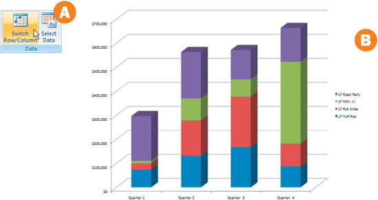
3. Adjust Legends
You’ll notice that the legends in your chart don’t really explain exactly what you want them to. In the Design tab of your Ribbon, click the Switch Row/Column button in the Data group A. Now the chart correctly conveys total bike sales by quarter and what percentages of total sales were made up by each bike model B. Save your Excel worksheet.
4. Copy and Paste into PowerPoint
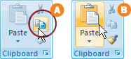
Select the chart in Excel and click the copy button in the Clipboard group within the Home tab A. Open the Ch2_Long_Trail_pptx presentation inside the Chapter 2 folder that you copied to your computer, and click the slide 8 Thumbnail. Click inside the content placeholder area on your slide and then click the Paste button in the Clipboard group of your Home tab B.
5. Adjust the Chart to Match Your Style
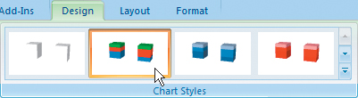
You’ll notice that when it was pasted in, the chart retained the font style and chart style that were created in Excel. To modify the text quickly, simply click on the chart and select a thumbnail in the Chart Styles group under the Design tab in your Ribbon. Experiment with some of the other chart styles until you’re satisfied with the result.
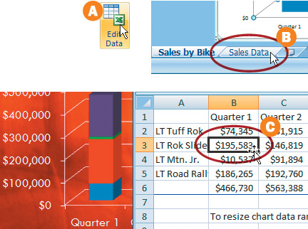
6. Adjust the Data
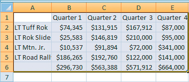
If you need to adjust the data, select the chart and click the Edit Data button in the Data group (within the Design tab) A. This will launch your Excel worksheet. It turns out that the LT Rok bike actually sold more than the data shows. Open up the data sheet by clicking the Sales Data tab at the bottom of your worksheet B. Select cell B-3 and enter $195,583. The change is then reflected in your PowerPoint chart C.
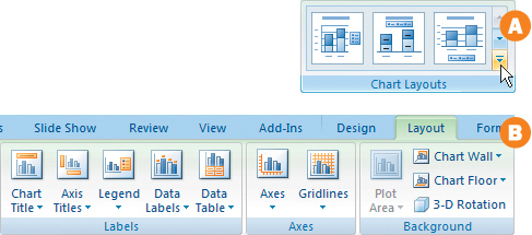
7. Chart Layout
Under the Design tab in your PowerPoint application, you’ll see that there are presets available in the Chart Layouts group A. Experiment with these until you’ve found a layout that fits your presentation. For more control over the chart layout, with the chart selected, click the Layout tab in your Ribbon. From inside this tab, you can control the Chart and Axis Titles, Data Labels, Axes, Gridlines, and more B.
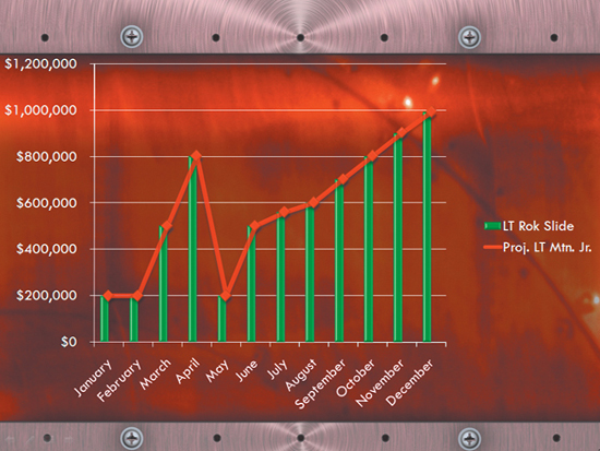
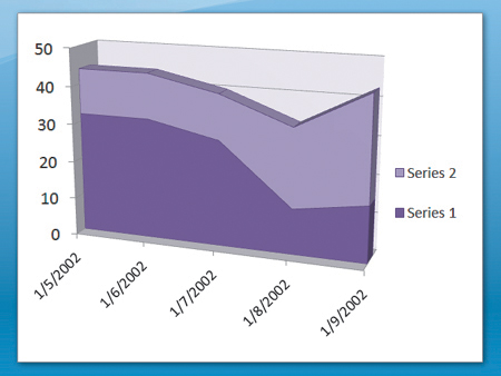
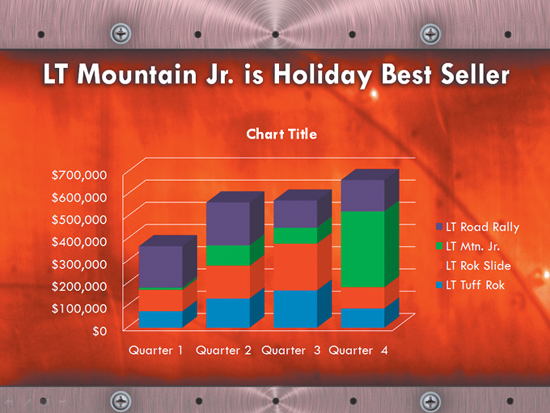
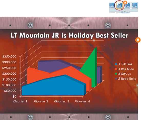
The Change Chart Type button in the Design Tab is a powerful tool. Take a step back and put yourself in the shoes of your audience. If your message is that sales of the LT Mountain Jr. Bike really take off during the holidays, then maybe a 3-D Area Chart will illustrate that point more effectively. Select your chart and then click the Change Chart Type button in the Type Group under the Design tab. Select the 3-D Area thumbnail in the Area group A. Now your audience will be more aware of the dramatic sales spike for the LT Mountain Jr. in the fourth quarter B. ![]()
Make It Pop. To make the chart stand out from the background, stretch the chart’s bounding box to the edges of your slide. In the Format tab, select a solid color in the Shape Fill drop-down menu by selecting the More Fill Colors button and adjust the transparency until your text and charts pop.
Highlights of SmartArt
One of the most powerful visual tools in PowerPoint is SmartArt. SmartArt makes it possible to enter and format text in an easy, clear, and visually pleasing graphic. These customizable, dynamic, built-in graphics will conform to your established look and help you decide quickly how to organize your information to emphasize your point.
When to Use SmartArt
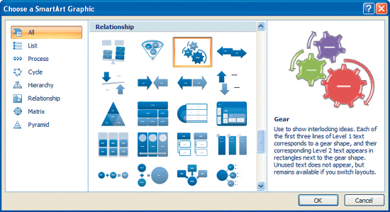
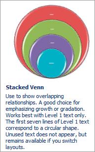
SmartArt will do most of the work for you when you have a slide with bullets or text that can be simplified or made more understandable within a graphic. If you’re not really sure whether your data lends itself to a graphic, select the text and give it a try. SmartArt is the fastest and most elegant way to create a visual representation of anything from an organizational chart or decision tree to lists, processes, or matrixes. SmartArt should not be used to represent numerical data; it’s best to use Charts for those.
A Comprehensive List
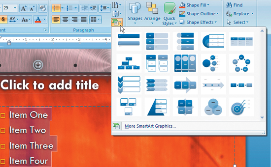
There are seven main categories in SmartArt: List, Process, Cycle, Hierarchy, Relationship, Matrix, and Pyramid. Within each category are several different ways of graphically representing your information. When you’ve decided upon a SmartArt category, browse through each chart style and click a thumbnail. PowerPoint will show you a larger color example and suggest when it’s best to use each style.
Converting a List to a Graphic
One amazing feature of SmartArt is its ability to instantly convert an existing list to an attractive graphic. You can select your list in PowerPoint and then click the Convert to SmartArt Graphic button in the Paragraph group of your Home tab. A window will open, showing you the most common options available for your list. Roll over each thumbnail to view what your list might look like if it were converted to a particular style. If none of the styles appeal to you, you can always select the More SmartArt Graphics button.
Starting from Scratch
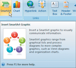
Many times you’ll have a concept that you would like to explain graphically, but you’re just not sure how to approach it. In the Insert Tab, click the SmartArt button in the Illustrations group. If you browse the gallery of SmartArt options, there is a good chance that you’ll find an option to help illustrate your idea. Once you’ve identified a good match, select it and click OK. Now you can begin to modify the chart to match your goals.
Entering Text Two Ways
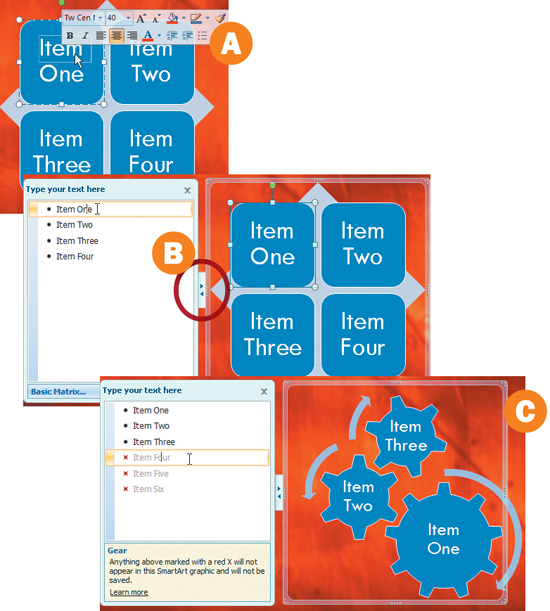
There are two ways to enter text into a SmartArt graphic. One is to double-click directly into the text field and modify the text from within the graphic A. If you’re used to a page layout or illustration program this will probably be the most intuitive. Another way is to click the arrows on the left of the SmartArt bounding box to reveal the Text pane B. Here you can enter text in a standard PowerPoint fashion. The Text pane has pre-determined fields that will populate your SmartArt graphic dynamically as you type. You’ll notice that in some SmartArt choices red Xs instead of bullets will start to appear if you add too many items. This is because some SmartArt graphics can only contain a few fields (for instance, the Gear allows only three entries) C. If you really like the Gear or any other SmartArt graphic, remember that you can always add another graphic and modify it to work with the one that is already on the slide.
Mixing In a Little Style
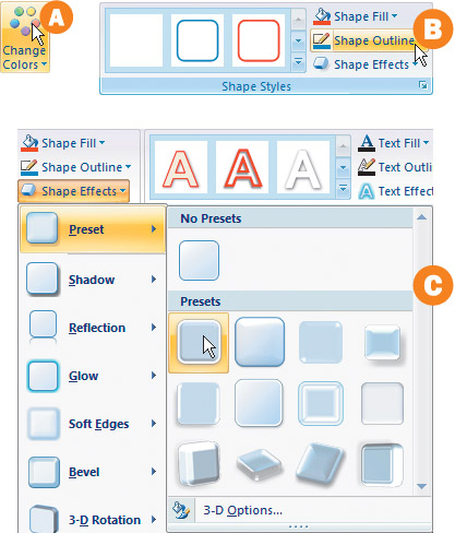
Once you have the SmartArt graphic inserted into your slide that you think communicates your idea the best, you might want to mix in a little style. You can select your graphic and then modify the colors and style of illustration in the SmartArt Styles group under the Design tab. You’ll find an assortment of color choices by selecting the Change Colors button A. Don’t let those choices limit you. By selecting any of the graphical elements within a SmartArt Graphic, you can modify the color, transparency, and more in the Shape Styles group under the Format tab B. By clicking the Shape Effects button you’ll find thumbnails that represent different illustrative style presets to choose from C. ![]()
Too Much of a Good Thing. Just because it’s really easy to convert a list in PowerPoint into a graphic doesn’t mean that you should do it for every list. If you want to add clarity or emphasize a list, convert it to SmartArt. If you have too many lists converted to SmartArt, then they will all blend together in the minds of the audience and lose their effectiveness.
Working with SmartArt
Build an Attractive and Editable Informational Graphic
1. From Bullets to Graphics
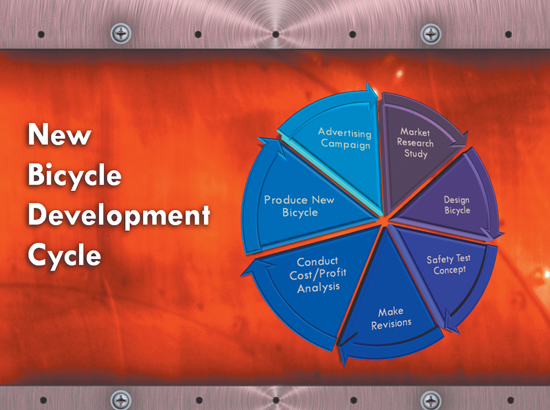
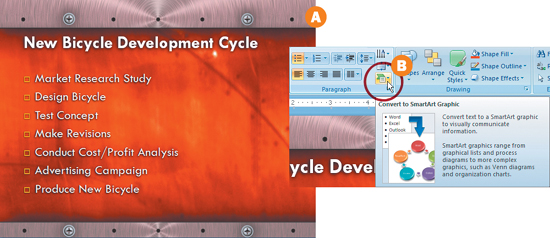
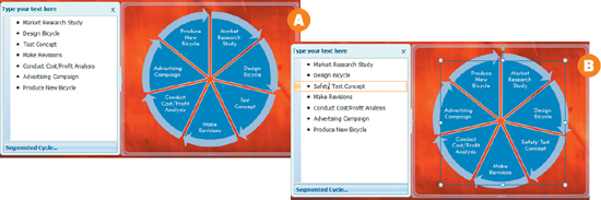
Go to slide 9 in the Slides list. You’ll notice that the headline says, “New Bicycle Development Cycle,” but the slide is just a series of bullets. It doesn’t suggest that the development process is repeated A. There is a quick way to remedy this problem: we can convert the bullets into a diagram. First, select all of the bulleted text. Then click the Home tab in the Ribbon. Hidden within the Paragraph group is a tiny icon called the Convert to SmartArt Graphic button B. Click the button once and a drop-down menu will appear. Roll over each thumbnail. You’ll see how your bullets can be modified into several different diagrams.
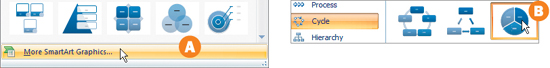
To accurately portray the development cycle of a new bicycle, we want to make it clear that after a bicycle is produced, we continue to do market research and improve our products. We’ll need to select a template that is cyclical. Click the Convert to SmartArt button again, and then select More SmartArt Graphics A. In the Cycle group, select the Segmented Cycle thumbnail and click OK B.
3. Make Text Edits
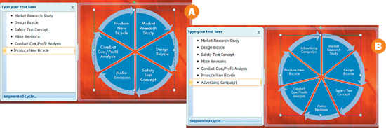
There are two ways to make a text edit to a portion of the diagram. One way is to double-click directly on the text and make the edit from within the diagram. Another approach is to open up the Text Pane and dynamically edit text or add text to your graphic A. If the Text pane is not open already, click the arrows to the left of your SmartArt bounding box. From within the Text Pane insert your cursor in front of Test Concept and add the word “Safety” B. Your diagram is dynamically updated with the text that you’ve entered.
4. Add or Move Content
Select the bullet that says “Advertising Campaign” and delete it from your text pane A. SmartArt will dynamically resize the diagram to accommodate fewer steps in the process. Now place your cursor at the end of the last bullet and hit Enter. Type “Advertising Campaign” next to the bullet that you’ve just created. Your SmartArt diagram reflects the change immediately B.
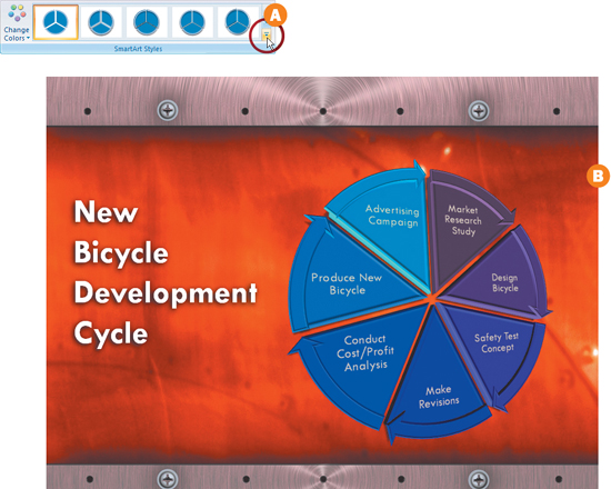
To add some dimension to your diagram, select the SmartArt graphic and then click the Design tab in the Ribbon. Click the More button at the bottom of the scroll bar in the SmartArt Styles group A. Slowly roll over the thumbnails to see how your diagram looks with different presets applied. Select a thumbnail that is close to what you are looking for and click it. Then select a color preset from the gallery that is available when you click the Change Colors button in the SmartArt Styles group B. ![]()
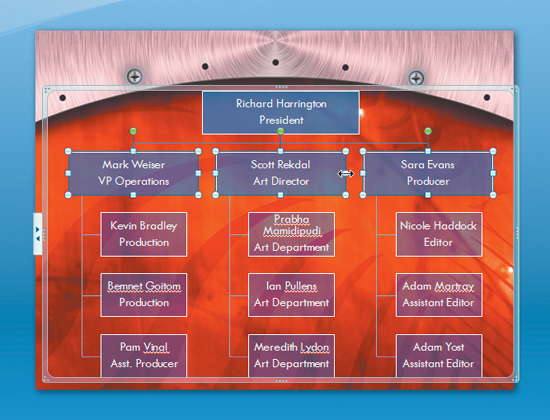
Building an Organizational Chart
An Organizational Chart Can Show the Makeup of a Company
1. Access the Organizational Chart
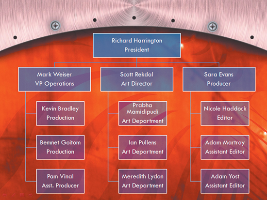
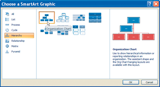
PowerPoint 2007 brings many changes. One of those is the stand-alone Organizational Chart Maker that was used to create standard “org charts” for Office documents. The org chart (along with many other informational graphics) is now part of the SmartArt tools. Click on slide 10 to select an empty slide to hold the chart. Select the Insert tab in the Ribbon and from the Illustrations tab choose SmartArt. When the SmartArt window opens, choose the Hierarchy category and select Organizational Chart. Click OK to add the chart.
2. Modify the Organizational Chart Structure
Unless your company has the exact number of employees as the default layout, you’ll likely need to modify the SmartArt graphic. In the case of this Organizational Chart, you will modify it to have one box on top, followed by three subordinates who each have three subordinates who report to them. Select the second box on the slide and then press delete to remove it.
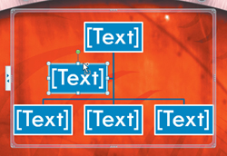
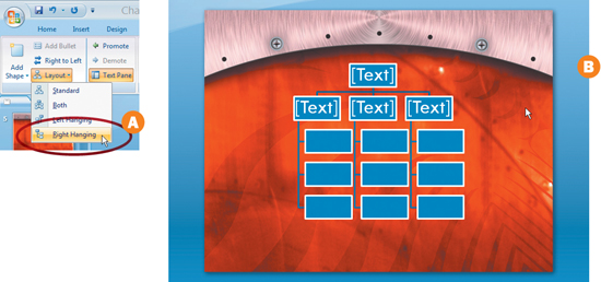
3. Add Subordinates
Select the first box in the second row so it is active (click on the outer border). From the SmartArt Tools Design tab choose Layout in the Create Graphic group. Set the layout to Right Hanging (this will add boxes in a vertical column below the manager box) A. Click the Add Shape button in the Create Graphic group three times to add three subordinates. Switch to the next manager and repeat the Right Hanging layout and Add Shape commands. Repeat for the third manager as well B.
4. Adjust the Size and Style of the Chart
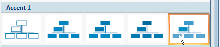
The SmartArt graphic can be much better sized, positioned, and styled to fit in with the overall design of this presentation. Click and pull the corners of the SmartArt box to size and position it on the page. Next, from the SmartArt Tools Design tab click the Change Colors button. Set the chart to a contrasting color, such as the Transparent Gradient Range from the Accent 1 category.
Once your chart is built, it is time to populate it with information. Click in the [Text] block in the first box to add type; you can enter your own data or use the information below to fill in the chart. After typing a name, you can press Enter to add a title.
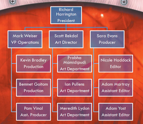
6. Adjust Size for Optical Clarity
In order to improve the layout, you can increase the amount of space between each column. One of the easiest ways to do this is to increase the size of the boxes. Drag the side handles of the top box so the text fits on two lines. Next click on the first box in the second row; then hold down the shift key and click on the other two (so all three boxes are actively selected). Then click and drag an edge handle on one of the second-row boxes to make it bigger. All three boxes will resize and make the columns appear cleaner. ![]()