
2. Manage Color

In This Chapter
Introduction to color management
Choosing color settings for Illustrator
Synchronizing the color settings
Choosing the proper color settings for Illustrator is a crucial step before creating artwork. In this chapter, you’ll learn how to use color settings to manage and maintain color consistency among documents and output devices, synchronize the color settings of all your Adobe Creative Cloud programs, change document color profiles, and finally, soft-proof your artwork onscreen for the chosen output device.
Introduction to color management
Problems with color can creep up on you when the various hardware devices and software packages you use treat color differently. If you were to open an Illustrator graphic in several different imaging programs or Web browsers, the colors might look completely different in each case, and might not look the same as they did onscreen in Illustrator. Print the graphic, and the results could be different yet again. In some cases, you might find such discrepancies to be slight and unobjectionable, but in other cases, they could wreak havoc with your design and turn your project into a disaster.
A color management system can solve most of these problems by acting as a color interpreter. Such a system knows how each device and program understands color and, by using color profiles (mathematical descriptions of the color space of each device), makes the proper adjustments so the colors in your files look the same as you move them from one program or device to another. Illustrator, Photoshop, and other programs in the Adobe Creative Cloud use the standardized ICC (International Color Consortium) profiles to tell your color management system how specific devices use color. Whether you’re planning a traditional print run or will be using the same artwork for multiple purposes (such as for Web and print), your work will benefit from color management.
In Illustrator, you’ll find most of the color management controls in the Edit > Color Settings dialog. It gives you access to preset management settings for various publishing situations, including press and Web output, and also lets you choose custom settings. There are two main areas in the basic dialog:
![]() The Working Spaces options govern how RGB and CMYK colors are displayed in your document and serve as the default color profiles for new Illustrator documents.
The Working Spaces options govern how RGB and CMYK colors are displayed in your document and serve as the default color profiles for new Illustrator documents.
![]() The Color Management Policies options for RGB and CMYK color files govern how Illustrator manages color when you open a document that doesn’t have an attached color profile, or if the document’s profile doesn’t match the current color settings in Illustrator.
The Color Management Policies options for RGB and CMYK color files govern how Illustrator manages color when you open a document that doesn’t have an attached color profile, or if the document’s profile doesn’t match the current color settings in Illustrator.
Choosing the correct color settings will help keep your document colors consistent from the onscreen version to final output. The options in the Color Settings dialog may appear complex at first, but you and your documents will benefit if you take the time to learn about them.
Note: For commercial print output, ask your print shop to recommend specific color management settings to ensure a smooth color management workflow.
Calibrating your display
In an LCD (liquid crystal, or flat panel) display, a grid of fixed-size liquid crystals filters color from a light source in the back. Although the color profile that is provided with a typical LCD display (and that is installed in your system automatically) describes the display characteristics accurately, over time — a period of weeks or months — the colors you view onscreen will gradually become less accurate and will need adjustment.
The first step toward achieving color consistency is to calibrate your display. Although you can adjust the brightness setting on an LCD monitor, it’s best to leave that setting alone and give your display a periodic tune-up using an external calibration device instead. This device, or calibrator, will produce a profile containing the proper settings (white point, black point, and gamma) for your particular display. The Adobe color management system, in turn, will interpret the colors in your Illustrator document and display them more accurately based on that profile.
Calibrators range widely in cost, from a $100-to-$300 colorimeter to a much more expensive (but more precise) high-end professional gadget, such as a spectrophotometer. Even with a basic colorimeter and its simple step-by-step wizard, you will be able to calibrate your display more precisely than by using subjective “eyeball” judgments.
Among moderately priced calibrators, some currently popular and reliable models include Spyder4Pro and Spyder4ELITE by Datacolor and i1Display Pro by X-Rite.
![]() On our blog, at www.elaineandpeter.com, we show you how to use a Spyder device.
On our blog, at www.elaineandpeter.com, we show you how to use a Spyder device.
Note: Don’t be tempted to use the calibration utility that’s built into your computer system — it’s not going to give you accurate results. If you want to achieve good output from Illustrator, you owe it to yourself to invest in a hardware calibrator. Even the least expensive external device is superior to the internal controls.
What are Color Spaces and Profiles?
![]() Each device, such as a camera or computer display, is able to capture and reproduce a particular range (or gamut) of color, known as its color space.
Each device, such as a camera or computer display, is able to capture and reproduce a particular range (or gamut) of color, known as its color space.
![]() The mathematical description of the color space of each device is called the color profile. The color management system uses the color profile to define the colors in a document.
The mathematical description of the color space of each device is called the color profile. The color management system uses the color profile to define the colors in a document.
![]() Illustrator uses the document profile to display and edit artwork colors, or if the document doesn’t have a profile, Illustrator uses the current working space profile (the profile you will choose in the Color Settings dialog) instead.
Illustrator uses the document profile to display and edit artwork colors, or if the document doesn’t have a profile, Illustrator uses the current working space profile (the profile you will choose in the Color Settings dialog) instead.
Calibrate Your Display, and Keep It Calibrated!
![]() Computer displays become uncalibrated gradually, and you may not notice the change until the colors are way off. To maintain the color consistency of your display, stick to a regular monthly calibration schedule. (Our calibration software reminds us to recalibrate via a monthly onscreen alert. If yours offers this option, you should take advantage of it.)
Computer displays become uncalibrated gradually, and you may not notice the change until the colors are way off. To maintain the color consistency of your display, stick to a regular monthly calibration schedule. (Our calibration software reminds us to recalibrate via a monthly onscreen alert. If yours offers this option, you should take advantage of it.)
![]() Also, be sure to recalibrate your display if you adjust its brightness and contrast settings (intentionally or not), change the temperature or amount of lighting in your office — or repaint your office walls!
Also, be sure to recalibrate your display if you adjust its brightness and contrast settings (intentionally or not), change the temperature or amount of lighting in your office — or repaint your office walls!
Choosing color settings for Illustrator
To choose color settings for Illustrator
1. Choose Edit > Color Settings (Cmd-Shift-K/Ctrl-Shift-K). The Color Settings dialog opens (A, page 19).
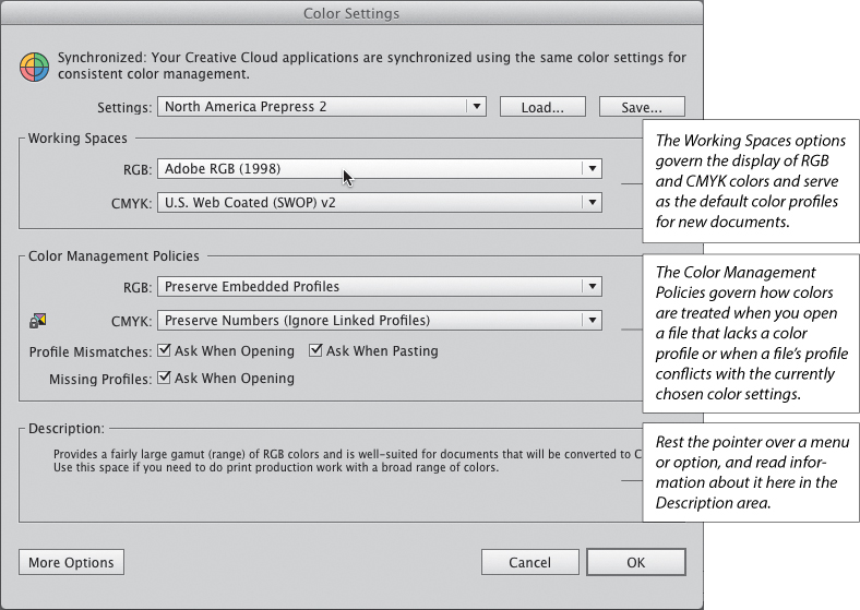
A When you choose a preset from the Settings menu in the Color Settings dialog, the other options are chosen for you automatically. You can customize any preset by choosing settings.
2. Choose a preset from the Settings menu. Briefly, the five basic presets are as follows:
Monitor Color sets the RGB working space to your display profile. This is a good choice for video output, but not for print output.
North America General Purpose 2 meets the requirements for screen and print output in the United States and Canada. All profile warnings are off.
North America Newspaper manages color for output on newsprint paper stock.
North America Prepress 2 manages color to conform with common press conditions in the United States and Canada. This is the recommended preset for commercial print output. The default RGB color space that is assigned to this setting is Adobe RGB (1998). When CMYK documents are opened, their color values are preserved.
North America Web/Internet is designed for online output. All RGB images are converted to the sRGB IEC61966-2.1 color space.
3. At this point you can click OK to accept the predefined settings or you can proceed with the remaining steps to choose custom settings.
4. The Working Spaces menus govern how RGB and CMYK colors will be treated in documents that lack an embedded profile. You can either leave these settings as they are or choose custom options. The RGB options that we recommend using are discussed below (see also the third tip after step 7 on the following page). For the CMYK setting, you should ask your output service provider which working space to choose.
Adobe RGB (1998) encompasses a wide range of colors and is useful when converting RGB images to CMYK images. This working space is recommended for inkjet and commercial printing, but not for online output.
ProPhoto RGB contains a very wide range of colors and is suitable for output to high-end dye sublimation and inkjet printers.
sRGB IEC61966-2.1 is a good choice for Web output, as it reflects the settings for an average computer display. Many hardware and software manufacturers use it as the default space for scanners, low-end printers, and software.
5. From the RGB and CMYK menus in the Color Management Policies area, choose a color management policy for Illustrator to use when the profile in a document doesn’t match the current color settings you have chosen for Illustrator:
Off to prevent files from being color-managed when imported or opened.
Preserve Embedded Profiles if you will be working with both color-managed and non-color-managed documents and you want each document to keep its own profile.
Convert to Working Space if you want all your documents to be converted to the current color working space. This is usually the best choice for Web output.
Choose Preserve Numbers (Ignore Linked Profiles) to have Illustrator preserve embedded profiles (and the numeric values of colors used in the file) for CMYK documents but ignore profiles for linked CMYK imagery.
For Profile Mismatches, check Ask When Opening to have an alert appear if the color profile in a file you’re opening doesn’t match the working space for Illustrator. If you choose this option, you can override the current color management policy via an alert dialog upon opening a document.
Check Ask When Pasting to have Illustrator display an alert when a color profile mismatch crops up as you paste or drag and drop a color image into your document. If you choose this option, you can override the current color management policy via an alert dialog when pasting.
For files that have Missing Profiles, check Ask When Opening to have Illustrator display an alert offering you the opportunity to assign the current working spaces profile or a custom profile to files as you open them.
6. Optional: If you’ve chosen custom color settings that you want to save for later use, click Save. To have your custom file appear on the Settings menu, save it in the default location.
7. Click OK.
![]() To learn about the various alert dialogs that may appear onscreen as you open a file, see page 63.
To learn about the various alert dialogs that may appear onscreen as you open a file, see page 63.
![]() To reuse your saved settings, choose the file name from the Settings menu in the Color Settings dialog. To load a settings file that wasn’t saved in the Settings folder (the default location) and therefore isn’t listed on the Settings menu, click Load, locate the desired file, then click Open.
To reuse your saved settings, choose the file name from the Settings menu in the Color Settings dialog. To load a settings file that wasn’t saved in the Settings folder (the default location) and therefore isn’t listed on the Settings menu, click Load, locate the desired file, then click Open.
![]() We recommend that you avoid the Working Spaces settings of Apple RGB and ColorMatch RGB, which were designed for displays that are no longer standard. Also avoid the Monitor RGB [current display profile] and ColorSync RGB profiles, both of which rely on the viewer’s display and system settings, a situation that can undermine color consistency.
We recommend that you avoid the Working Spaces settings of Apple RGB and ColorMatch RGB, which were designed for displays that are no longer standard. Also avoid the Monitor RGB [current display profile] and ColorSync RGB profiles, both of which rely on the viewer’s display and system settings, a situation that can undermine color consistency.
Designing for the Color-Blind
At some point in your career, you may be hired to design graphics, such as signage, that are fully accessible to color-blind viewers. In fact, some countries require signage in public spaces to comply with the Color Universal Design (CUD) guidelines. The View > Proof Setup > Color Blindness – Protanopia-Type and Color Blindness – Deuteranopia-Type commands in Illustrator simulate how your document will look to viewers who have common forms of color blindness.
In case you’re not familiar with those two terms, for a protanope, the brightness of red, orange, and yellow is dimmed, making it hard for such a person to distinguish red from black or dark gray. Protanopes also have trouble distinguishing violet, lavender, and purple from blue because the reddish components of those colors look dimmed. Deuteranopes are unable to distinguish between colors in the green-yellow-red part of the spectrum and experience color blindness similar to that of protanopes, without the problem of dimming.
Adobe Illustrator Help offers these tips for creating accessible signage:
![]() Give the objects a wide stroke in black, white, or a dark color.
Give the objects a wide stroke in black, white, or a dark color.
![]() Apply patterns.
Apply patterns.
![]() Use orange-red instead of pure red.
Use orange-red instead of pure red.
![]() Use bluish green instead of yellowish green.
Use bluish green instead of yellowish green.
![]() Avoid gray.
Avoid gray.
![]() Avoid the color combinations of red and green, yellow and bright green, light blue and pink, and dark blue and violet.
Avoid the color combinations of red and green, yellow and bright green, light blue and pink, and dark blue and violet.
Synchronizing the color settings
If the color settings differ among the Adobe Creative Cloud programs that you have installed on your system (such as between Illustrator and Photoshop or InDesign), the words “Not Synchronized” will display at the top of the Edit > Color Settings dialog in Illustrator.A If you have a Creative Cloud subscription or have installed multiple Adobe programs (including Adobe Bridge), you can use the Color Settings dialog in Bridge to synchronize the color settings of all the color-managed Adobe programs in your system.
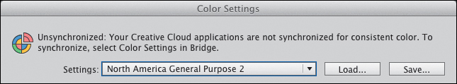
A This alert in the Color Settings dialog informs us that the color settings in our Creative Cloud applications aren’t synchronized with one another.
Note: Before using Bridge to synchronize the color setting among your Adobe programs, make sure you’ve chosen the proper settings in Illustrator (see pages 17–19).
To synchronize the color settings among your Adobe Creative Cloud applications
1. On the Application bar in Illustrator, click the Go to Bridge button.![]()
2. In Bridge, choose Edit > Color Settings (Cmd-Shift-K/Ctrl-Shift-K). The Color Settings dialog opens,B showing the same list of settings as found in the Color Settings dialog when Advanced Mode is unchecked.
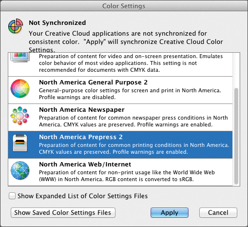
B Use the Color Settings dialog to synchronize the color settings of all the Adobe Creative Cloud applications that are installed in your system.
3. Click the settings preset you chose in Illustrator, then click Apply. Bridge will change (synchronize) the color settings of the other Adobe Creative Cloud applications to match the selected preset.
Changing the document profile
When a file’s profile doesn’t match the current working space or the file is missing a color profile altogether, you can use the Assign Profile command to assign the correct one. You may notice visible color shifts if the color data of your file is reinterpreted to match the new profile, but rest assured, the color data in the actual document is preserved.
To change or delete a document’s color profile
1. With a file open in Illustrator, choose Edit > Assign Profile. The Assign Profile dialog opens.A
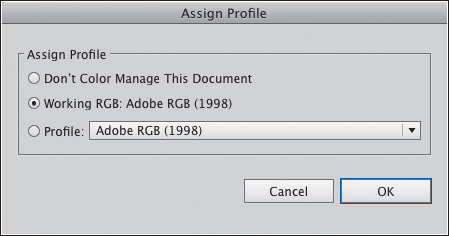
A Use the Assign Profile dialog to either delete a file’s color profile or assign a new one.
2. Do one of the following:
To remove the color profile from the document, click Don’t Color Manage This Document. The current working space will now control the appearance of colors in the artwork.
If your document doesn’t have an assigned profile or if its profile is different from the current working space, click Working [document color mode and the name of the current working space] to assign that profile.
To assign a different profile to your document, click Profile, then choose the desired profile from the menu. This won’t change or convert any color data in your artwork.
3. Click OK.
![]() The profile chosen in the Assign Profile dialog is also listed as the Document Profile in the Color Management panel of the File > Print dialog.
The profile chosen in the Assign Profile dialog is also listed as the Document Profile in the Color Management panel of the File > Print dialog.
Proofing a document onscreen
Another step in color management is to get an idea of how your artwork is going to look in print or online. You can do this by viewing a soft proof of your document onscreen. Although this method is less accurate than viewing a press proof or viewing the file in a browser, it can give you a general idea of how your artwork would look if it were printed using CMYK inks or displayed online on a Windows or Macintosh display.
To proof colors onscreen for commercial printing or online output
1. From the View > Proof Setup submenu, choose a type of output display to be simulated:
Working CMYK [current working space] to simulate colors for the commercial press that is currently chosen on the CMYK menu under Working Spaces in the Edit > Color Settings dialog in Illustrator.
For an RGB document, choose Legacy Macintosh RGB (Gamma 1.8) to simulate colors for online output using the legacy Mac gamma (1.8) or Internet Standard RGB (sRGB) to simulate colors using Windows gamma (2.2) as the proofing space.
For an RGB document, choose Monitor RGB to simulate colors using the custom display profile for your monitor.
For the Color Blindness options, see the sidebar on page 18.
To create a proofing model for a specific output device, choose Customize. The Proof Setup dialog opens.A Check Preview. From the Device to Simulate menu, choose the color profile for your target output device, then uncheck Preserve CMYK (or RGB) Numbers. With this option off, Illustrator colors will appear as though converted, and you’ll need to choose a Rendering Intent (see the sidebar). The Display Options (On-Screen) are available for some profiles. Simulate Paper Color simulates the soft white of actual paper, based on the current proof profile, and Simulate Black Ink simulates the dark gray that many printers produce when printing black. Click OK.
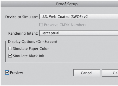
A Use the Proof Setup dialog to choose custom options for soft-proofing your Illustrator files.
2. The View > Proof Colors command will be checked automatically, enabling you to see the soft proof onscreen. The name of the device being simulated will be listed in the document tab. Uncheck the command when you’re done.
The Rendering Intents
![]() Perceptual changes colors in a way that seems natural to the human eye, while attempting to preserve the appearance of the overall document. This is a good choice for documents that contain continuous-tone images.
Perceptual changes colors in a way that seems natural to the human eye, while attempting to preserve the appearance of the overall document. This is a good choice for documents that contain continuous-tone images.
![]() Saturation changes colors with the intent of preserving vivid colors, but in doing so may compromise color fidelity. Nevertheless, it’s a good choice for charts and business graphics, which normally contain fewer colors than continuous-tone images.
Saturation changes colors with the intent of preserving vivid colors, but in doing so may compromise color fidelity. Nevertheless, it’s a good choice for charts and business graphics, which normally contain fewer colors than continuous-tone images.
![]() Absolute Colorimetric maintains the color accuracy only of colors that fall within the destination color gamut (i.e., the color range of your printer), but in doing so sacrifices the accuracy of colors that are outside that gamut.
Absolute Colorimetric maintains the color accuracy only of colors that fall within the destination color gamut (i.e., the color range of your printer), but in doing so sacrifices the accuracy of colors that are outside that gamut.
![]() Relative Colorimetric is the default intent for all the Adobe presets in the Color Settings dialog. It compares the white, or highlight, of your document’s color space to the white of the destination color space (the white of the paper, in the case of print output) and shifts colors where needed. This is the best Rendering Intent option for documents in which most of the colors fall within the color range of the destination gamut, because it preserves most of the original colors.
Relative Colorimetric is the default intent for all the Adobe presets in the Color Settings dialog. It compares the white, or highlight, of your document’s color space to the white of the destination color space (the white of the paper, in the case of print output) and shifts colors where needed. This is the best Rendering Intent option for documents in which most of the colors fall within the color range of the destination gamut, because it preserves most of the original colors.